










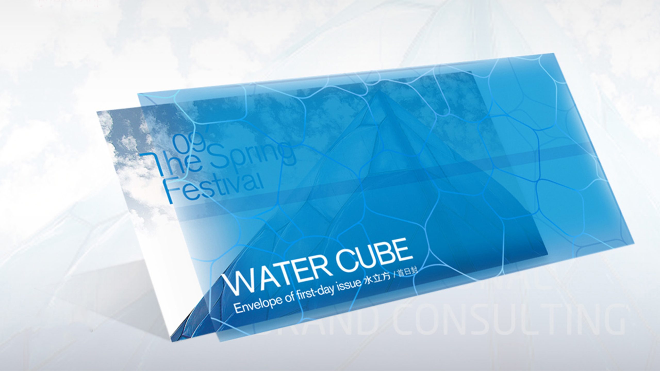
This project built the brand and visual identity system for the National Aquatics Center, the “Water Cube”.
The aim was to reframe the cultural expression of an Olympic landmark through the visual language of water, presenting the Water Cube's international image in a new way for the post-Olympic era.
The design balances structure and flow: rational geometric order defines the spatial logic, while fluid light and shadow convey vitality and inclusiveness.
design challenge
As an iconic building, the Water Cube's visual assets are firmly fixed in the public mind; the design had to carry forward the Olympic spirit while breaking free of familiar impressions. The brand spans diverse operations, from sports and cultural events to tourism, exhibitions and performing arts, requiring a systematic visual framework to support communication across every context. The visuals needed architectural logic, artistic character and international reach, staying recognizable at global events and in cultural exchange. The core challenge: how to use design to redefine the Water Cube's visual spirit, allowing “structure” and “flow” to coexist.
Strategy and philosophy
The project is built on the core idea of “Fluid Structure”. Visual concept: inspired by the molecular structure of water and the hexagonal geometry of the building's façade, we abstracted a graphic system of “fluid order”. Color: a blue gradient leads, supported by silver-gray and translucent white, evoking purity, technology and a global outlook. Graphic language: the “bubble cell structure” is translated into a system of visual symbols, using transparent overlays and geometric lines to express water's spatial depth and layers of light. Typography and layout: a modern sans-serif with generous white space and international layout proportions reinforces a sense of architecture and breathing room. Brand voice: restrained, rational and clean, yet emotionally fluid, capturing “the form of water, the feeling of light, the beauty of space”. Core idea: let the spirit of water become part of the structure.
Design presentation
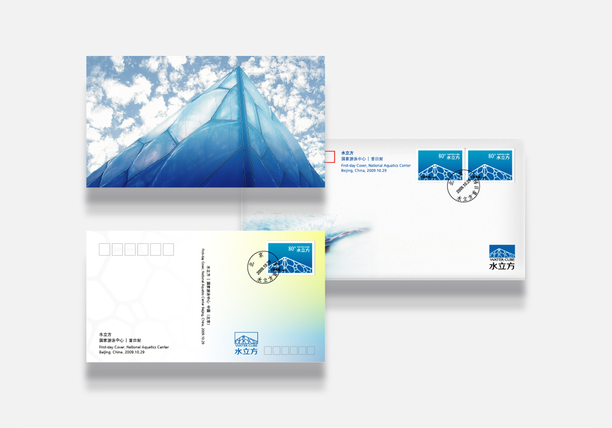
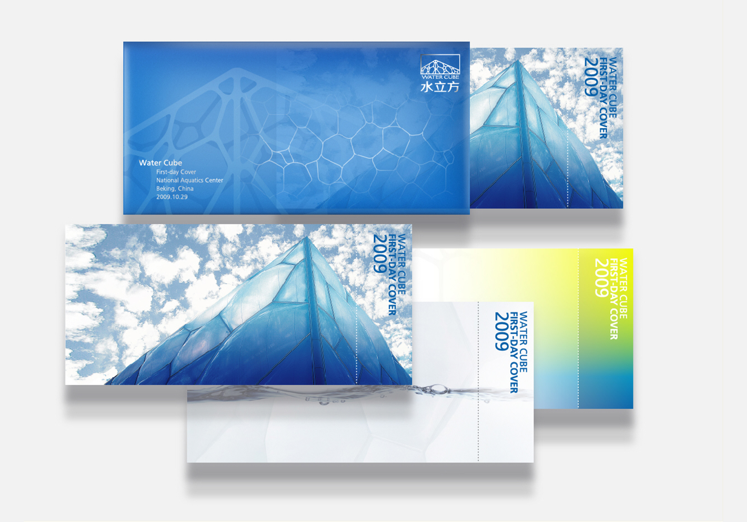
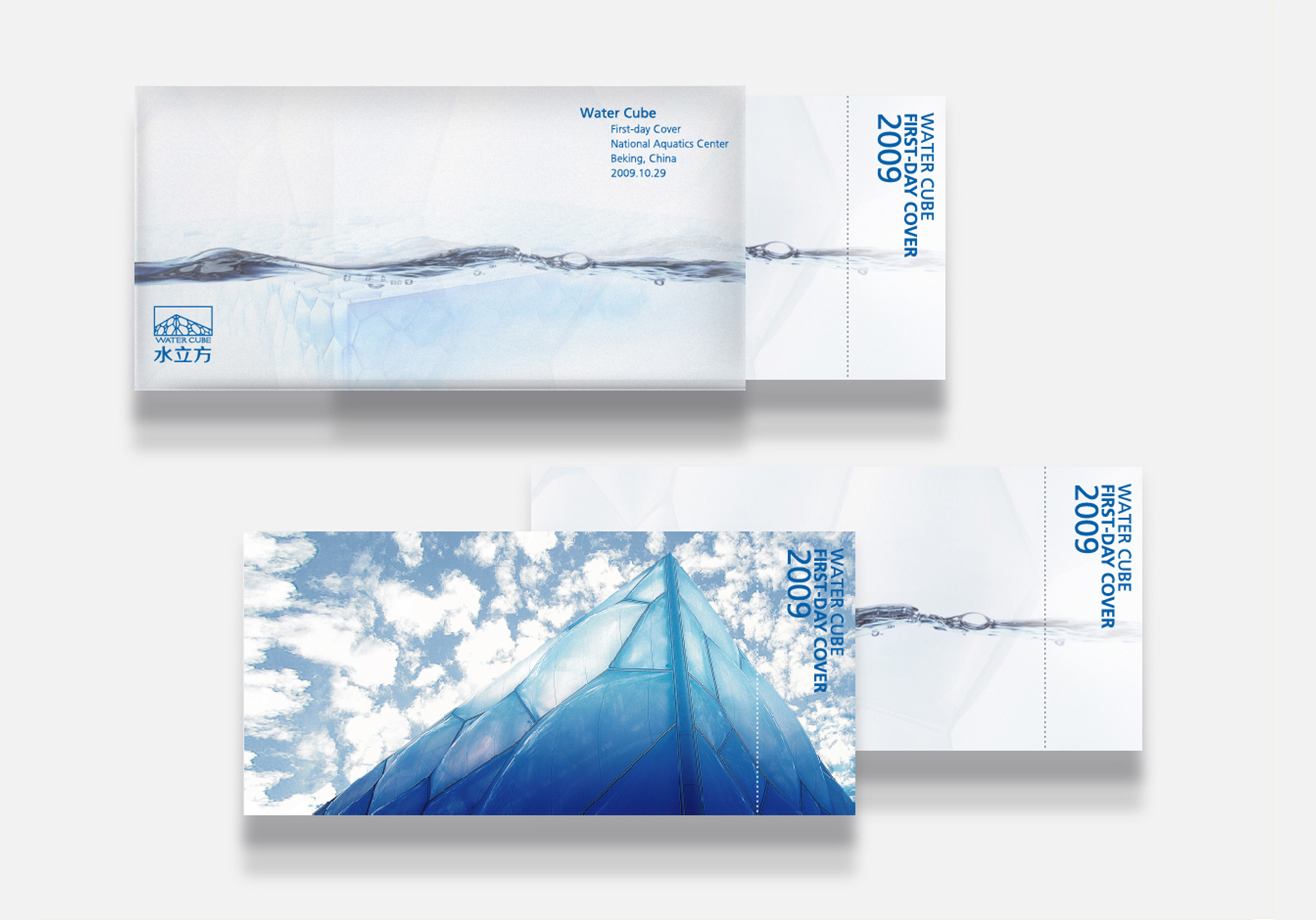
Core visual system: a “bubble cell array” forms the central visual symbol, extending into the base texture for posters, wayfinding and publications; in motion, flowing light simulates “the breath of water”. Applications: Brochures: covers feature a glossy blue gradient with an embossed hexagonal grid, echoing the building's skin. Wayfinding: clear acrylic combined with frosted metal, with backlit lettering that gives the space a sense of floating. Event visuals: extended to exhibition backdrops, souvenir packaging, digital interfaces and more. Materials and finishes: translucent paper stocks, spot UV and silver-blue foil enhance the reflective quality of water and the tactility of architecture. The overall design is clean, pure and modern, carrying forward the spiritual order of the Olympic architecture.
Achievements and Impact
Once complete, the Water Cube brand system was adopted across cultural communications, international exhibitions and cultural tourism operations, forming a distinctive “architecture as brand” visual identity. The project transformed the Water Cube from an Olympic symbol into an international cultural venue brand, with its visual language becoming a benchmark for the fusion of architectural art and cultural communication.