










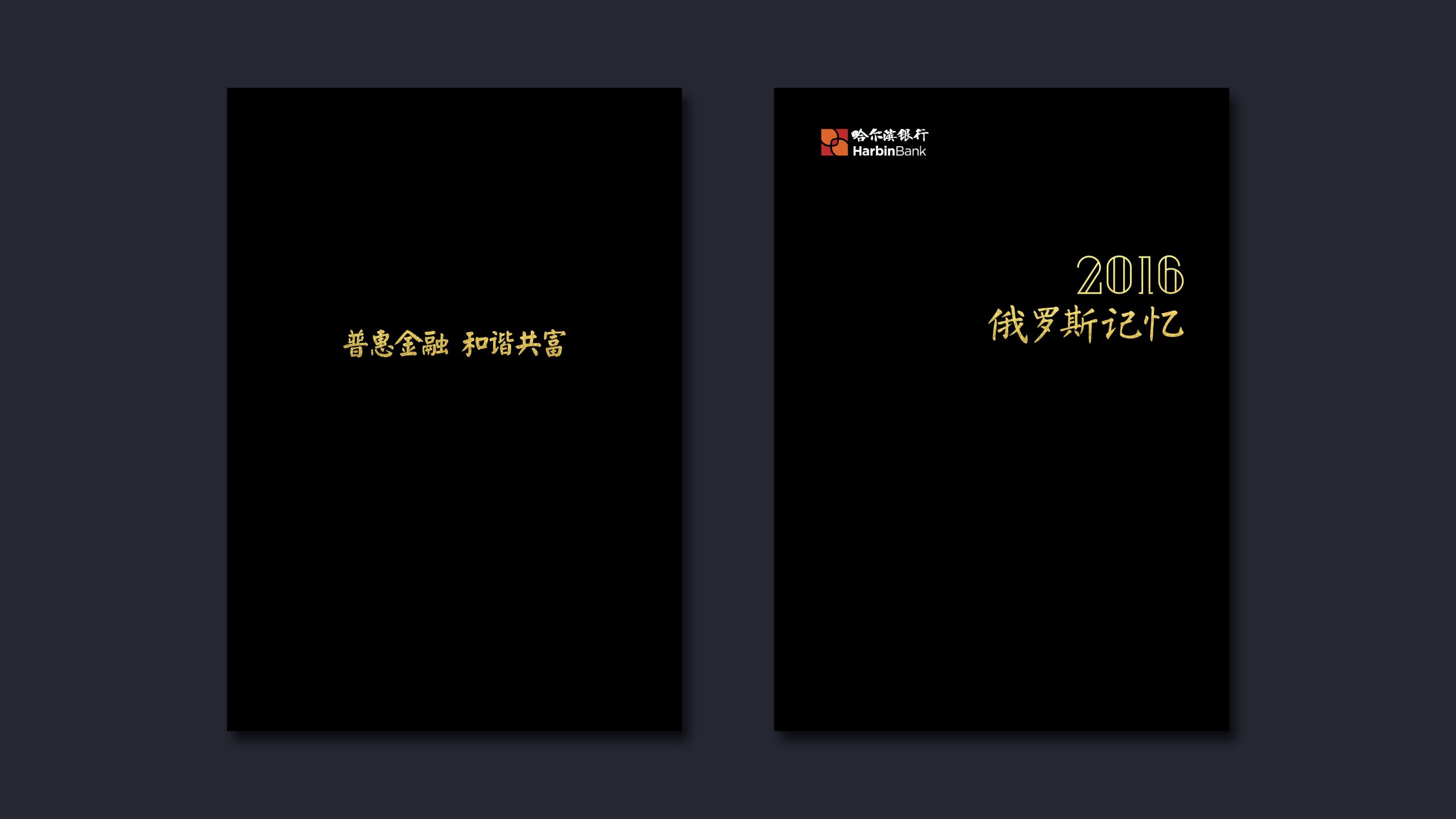
A systematic design of Harbin Bank's annual report and brand brochure.
The goal was to express Harbin Bank's brand philosophy of “prudent operations, serving the real economy and innovative growth” to professional financial publishing standards, infusing the visual language with “urban warmth × financial rigour” to give the brand the stature of an international financial institution.
Themed “Trust · Growth · Shared Success,” the publication uses structured information, precise data and warm, refined visuals to build a premium image for a regional financial brand.
design challenge
High content density: the report spans operating data, financial statements, corporate governance, social responsibility and future strategy, requiring a clearly layered information logic. A distinctive brand position: as a regional commercial bank that also serves national and cross-border business, Harbin Bank needed a visual language with both local warmth and international standing. A delicate visual balance: striking the right equilibrium between gravitas and modernity, rationality and approachability, was the project's core challenge.
Strategy and philosophy
The project is built on the core idea of “Rational Order × Regional Warmth”, creating an annual report system that carries both Harbin's local character and the logic of finance. Structure: an international publishing-grade 12-column grid establishes a unified information architecture and hierarchy for clearer, more efficient reading. Visual language: linear compositions and spare geometry express financial stability, complemented by photography of the city's light and shadow to convey the brand's commitment to the local economy. Color: Harbin Bank red leads as the primary identity color, supported by pale gray and metallic silver to signal trust and modern quality. Data visualization: operating data and business structure are rendered in graphic form, including donut charts, bridge charts and trend lines. Typography: a clean, modern sans-serif pairing for Chinese and English preserves the dignity and legibility of Chinese text within international reading conventions. Core idea: let order carry trust, and let design reveal the human warmth of finance.
Design presentation
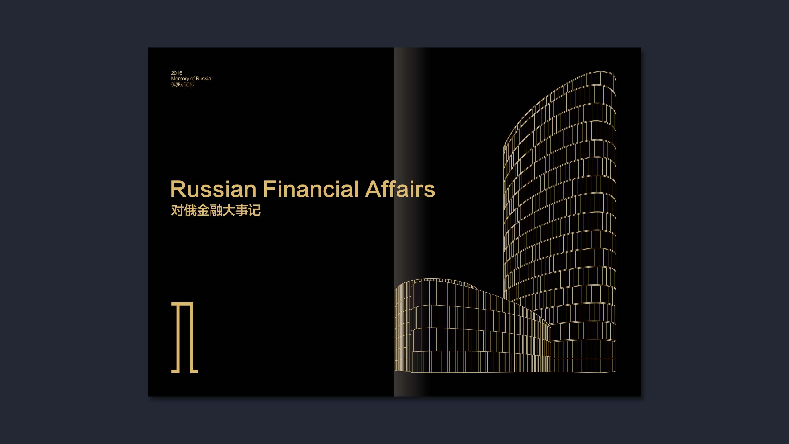
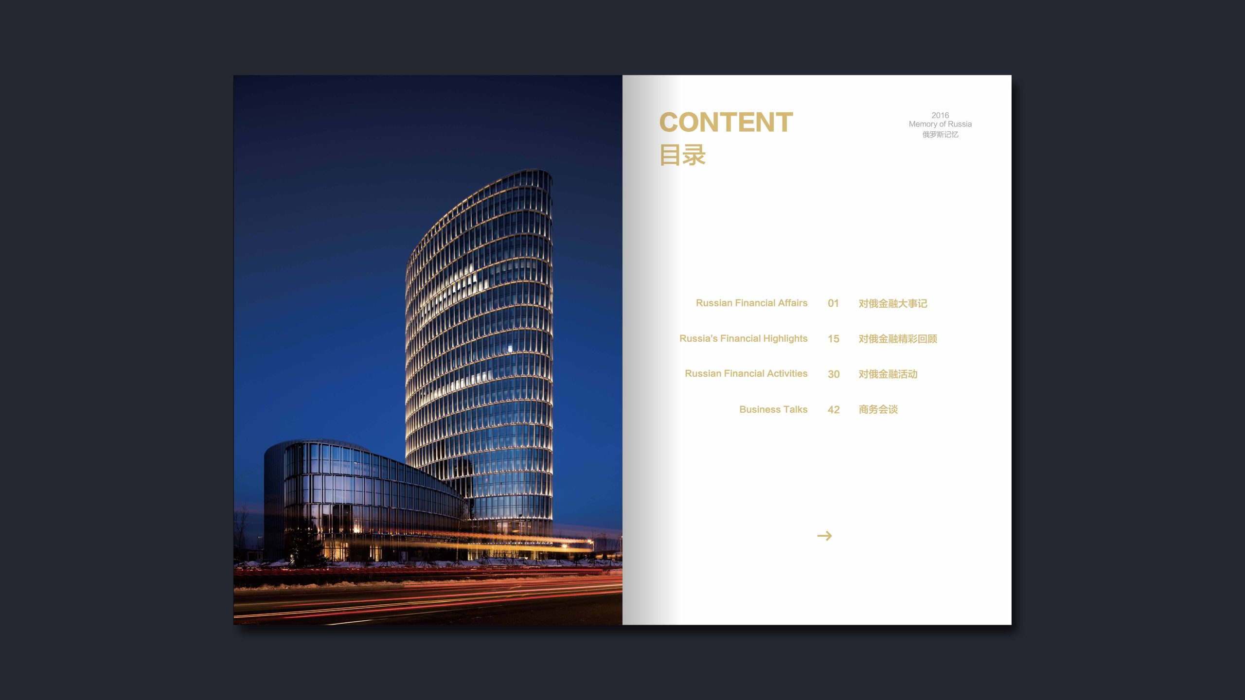
Cover: a minimal geometric composition pairs Harbin Bank red with selective embossed metallic lines, symbolizing financial stability and the pulse of growth. Chapter structure: 1. Company Overview; 2. Business Review; 3. Finance & Governance; 4. Social Responsibility; 5. Future Strategy.
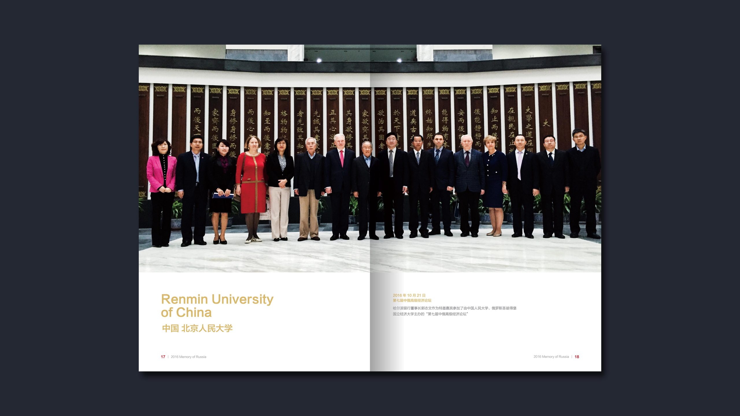
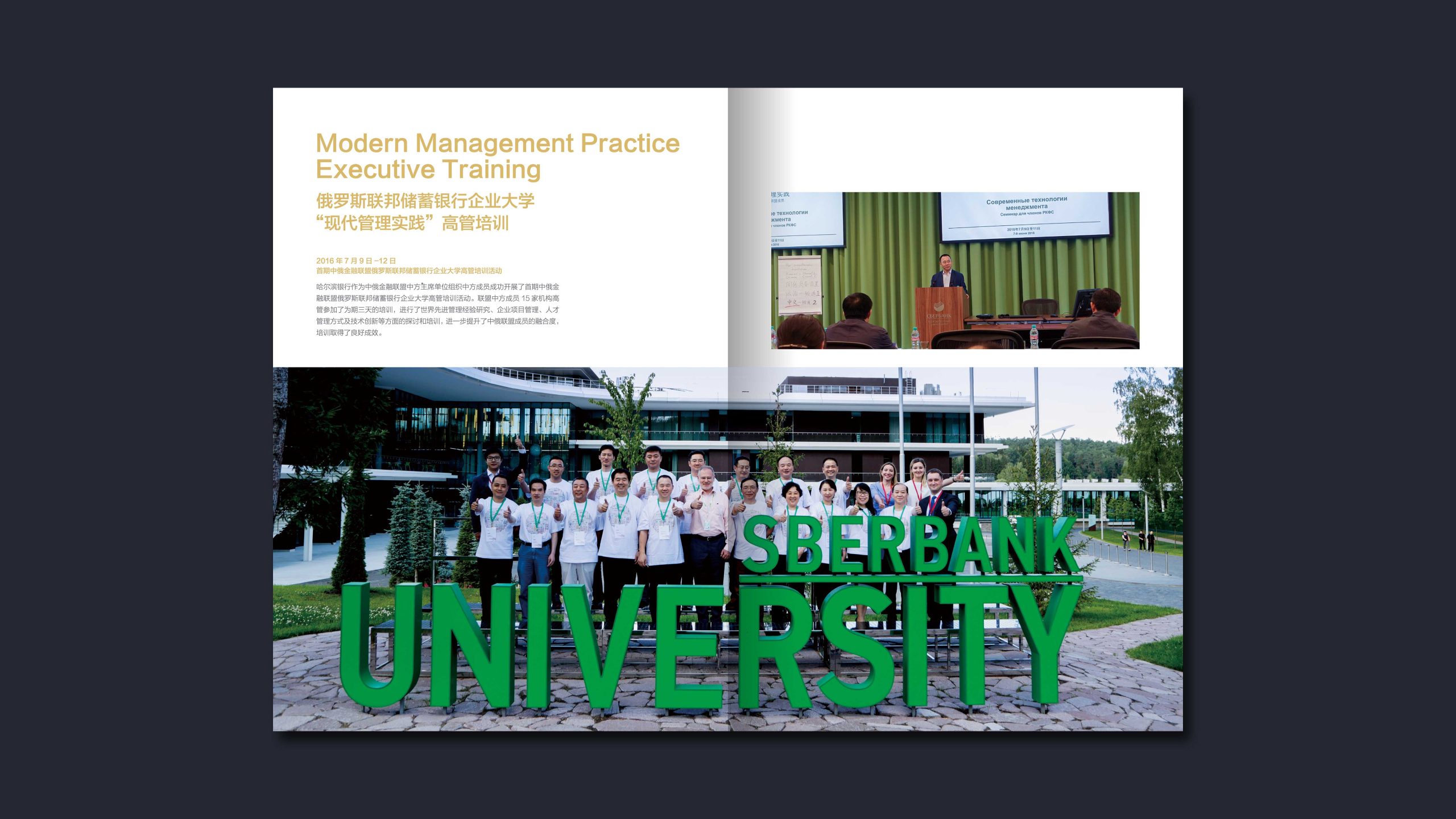
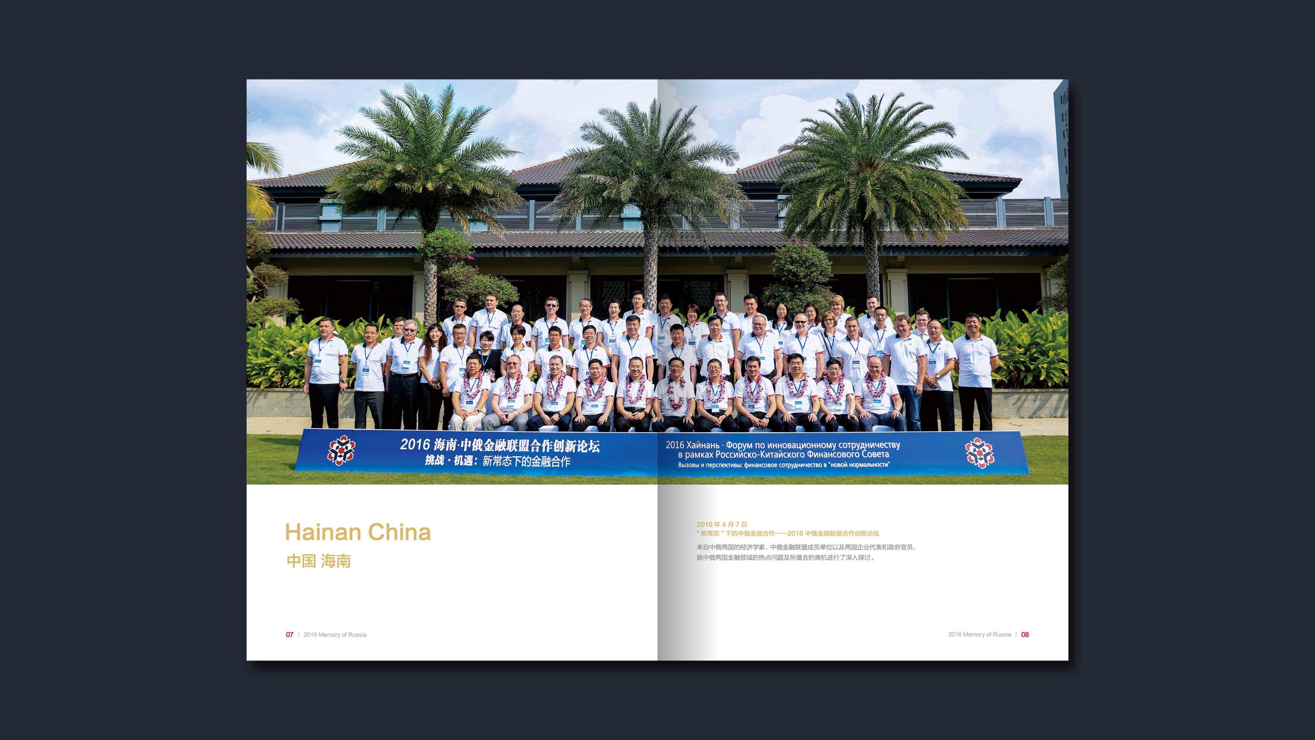
Inside pages: modular layouts, infographic charts and generous white space. A 60:40 text-to-image ratio keeps the content logical and gives it room to breathe. Charts and imagery: operating data is expressed in a financial graphic language, while city photography uses warm–cool contrast to evoke Harbin as the “Ice City”, reinforcing the brand's regional identity. Production: matte-laminated cover with silver foil and an embossed logo; heavyweight matte coated stock for the inside pages, ensuring a premium reading and tactile experience. The overall style speaks in a financial brand voice that is “Professional × Steady × Warm”.
Achievements and Impact
Released with an international publishing-grade visual system, the Harbin Bank annual report performed strongly across investor relations, regulatory disclosure and CSR communications. The design systematically unified the brand's visual standards, improving the efficiency of investor communication and strengthening public trust. The project shaped a Harbin Bank brand image that combines financial rigor with the city's cultural depth, giving it a distinctive identity among its peers.