










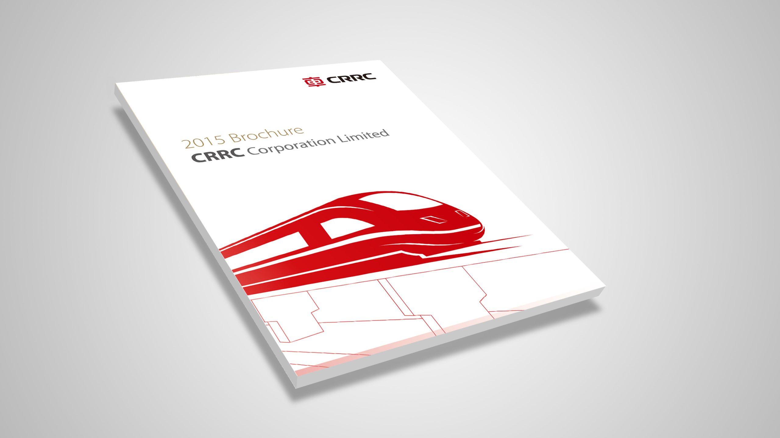
An overseas strategy brochure for CRRC, designed to present its brand positioning and strategic footprint in global rail transit through an international visual language.
Through systematic structure, data-led storytelling and an international publishing voice, the design reinforces CRRC’s brand transformation “from Made in China to global service.” The brochure is built around the concept of “The Power That Connects the World,” highlighting CRRC’s comprehensive strength and capacity for innovation worldwide.
design challenge
As the world’s largest supplier of rail transit equipment, CRRC needed its overseas communications to work on several levels at once: showcasing the group’s international footprint and partnerships; demonstrating its technical strength and system-solution capabilities; structuring information to be both expert and internationally readable; and keeping the brand consistent and contemporary in the eyes of global audiences. The challenge: how to use design to reshape the visual language of a “global Chinese brand,” making it authoritative yet able to hold its own in international dialog.
Strategy and philosophy
The project is anchored in one design idea: “Structure for Global Confidence.” Visual logic: content is reorganized through grids and modular structures into a layout system that works across languages. International voice: typography, white space and proportion follow international publishing standards, matching the reading habits of global audiences. Infographic system: a dedicated infographic language visualizes data, partnership networks and technology platforms. Color strategy: CRRC Red leads, supported by silver-gray and deep blue, signaling expertise, strength and international trust. Visual motifs: abstract lines and extending track forms symbolize “the power that connects the world.” The core idea: make design the language of international trust.
Design presentation
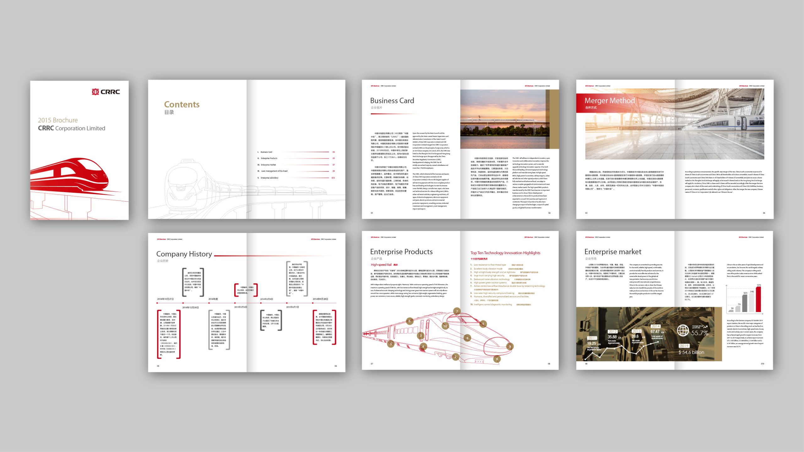
Cover: abstracted track lines and a globe structure form the key visual, rendered in metallic silver and CRRC Red to symbolize global connectivity. Interior structure: a 12-column grid organizes the content in sequence: Company Overview – Technology Platforms – International Cooperation – Project Footprint – Future Strategy. Infographics: maps, data flows, ring charts and proportional graphics present the overseas business footprint and partner network. Typography: Chinese and English set side by side in an international sans-serif, maintaining a rational sense of order. Finishing: matte black cover with silver-foiled track lines and spot UV; interior pages on heavyweight matte coated stock for rich color and precise charts. The overall style expresses “international order × systems thinking × technological character.”
Achievements and Impact
The brochure has become CRRC’s core brand asset for overseas promotion and international conferences. Through an international design system and data-led information architecture, the CRRC brand shifted from “product exporter” to “global solutions provider.” A unified visual system and international publishing voice strengthened CRRC’s brand image, giving its “Go Global” strategy greater visual persuasiveness and communication consistency.