










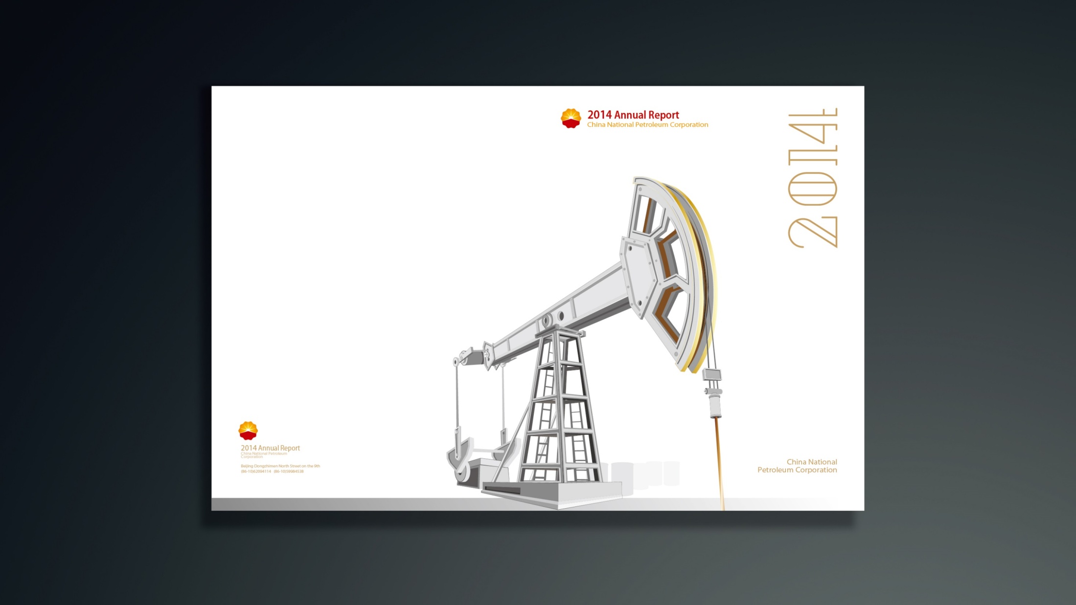
An overseas annual report and brand brochure for China National Petroleum Corporation (CNPC). The goal was to present the company’s professional image and global footprint as a world energy leader, using international publishing standards and a global communications voice.
Built around the concept “Energy for the Future,” the publication uses structured information and a restrained visual language to convey CNPC’s international responsibility and sustainability strategy.
design challenge
As a global energy company, CNPC needed an overseas annual report that met several demands in both content and form. International financial and regulatory standards: information structure, financial disclosure and the bilingual system all had to follow internationally accepted formats. Diverse reading cultures: addressed to overseas investors, partners and international media, the tone had to balance professional rigor with cultural warmth. Visual order versus brand recognition: it had to retain the gravitas of a state-owned enterprise while bringing the modernity and fluidity of international publishing. The core challenge: how to make a national energy brand understood and trusted in a global language.
Strategy and philosophy
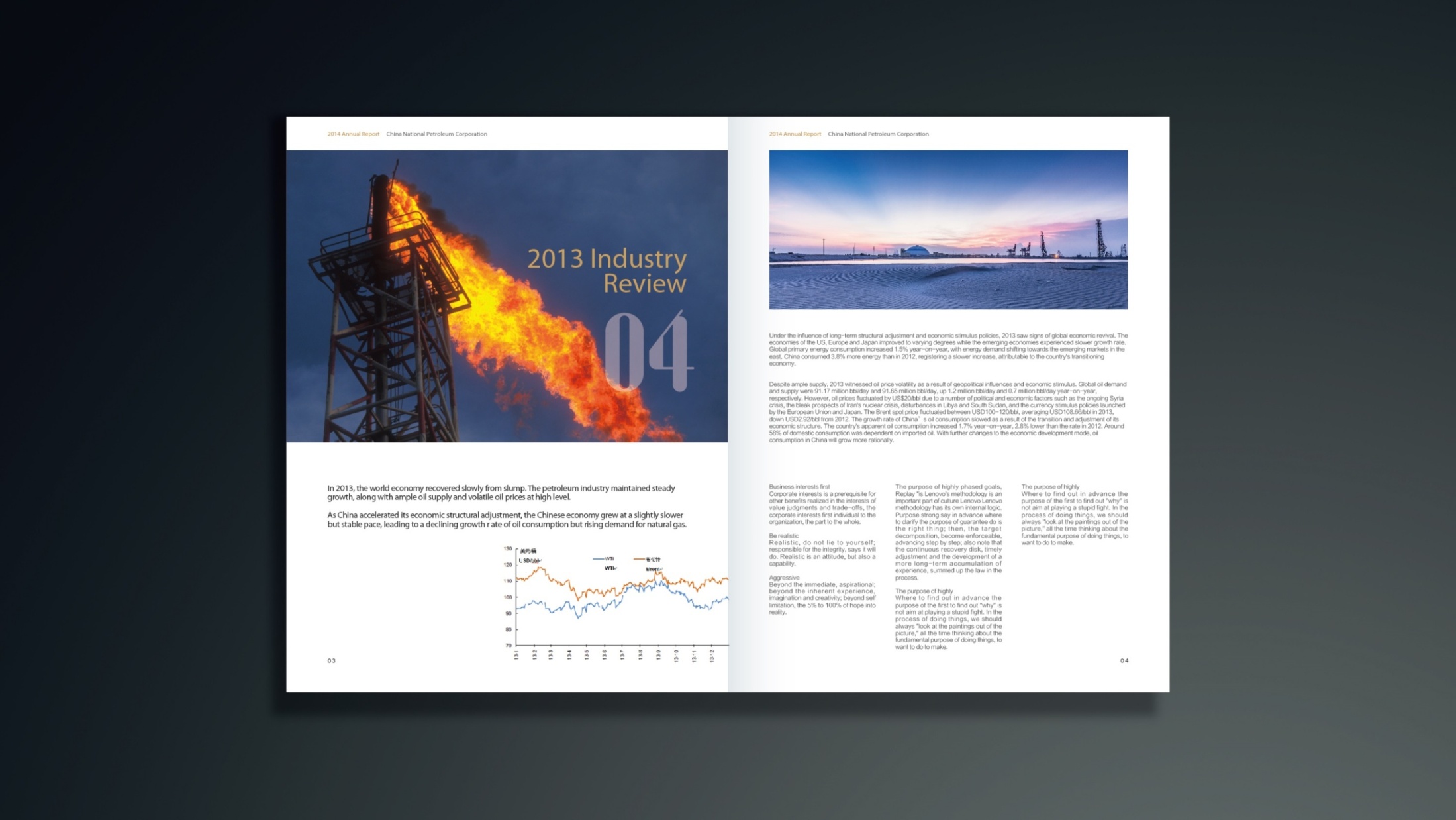
The project is anchored in one design idea: “Structure of Trust.” Visual logic: an international-standard grid and modular layout keep information exceptionally clear across languages. Visual language: clean linear charts, energy-flow diagrams and abstract map elements express the ordered beauty of energy moving around the world. Color system: CNPC’s brand red and gold lead, supported by deep gray and petroleum blue, creating an atmosphere of strength and restraint. Infographic system: information design turns data on production, reserves, exports and partnership projects into an intuitive international graphic language. Brand voice: an internationally rational tone throughout, playing down promotional rhetoric and building professional trust. The core idea: express the order of energy through data structure, and convey international trust through design logic.
Design presentation
Cover: abstracted energy trajectories and global network lines form the key graphic, paired with metallic gold and a deep blue gradient to symbolize energy flow and global cooperation. Chapter structure: 1. Company Profile; 2. Global Business Footprint; 3. Financial Review; 4. Sustainability;
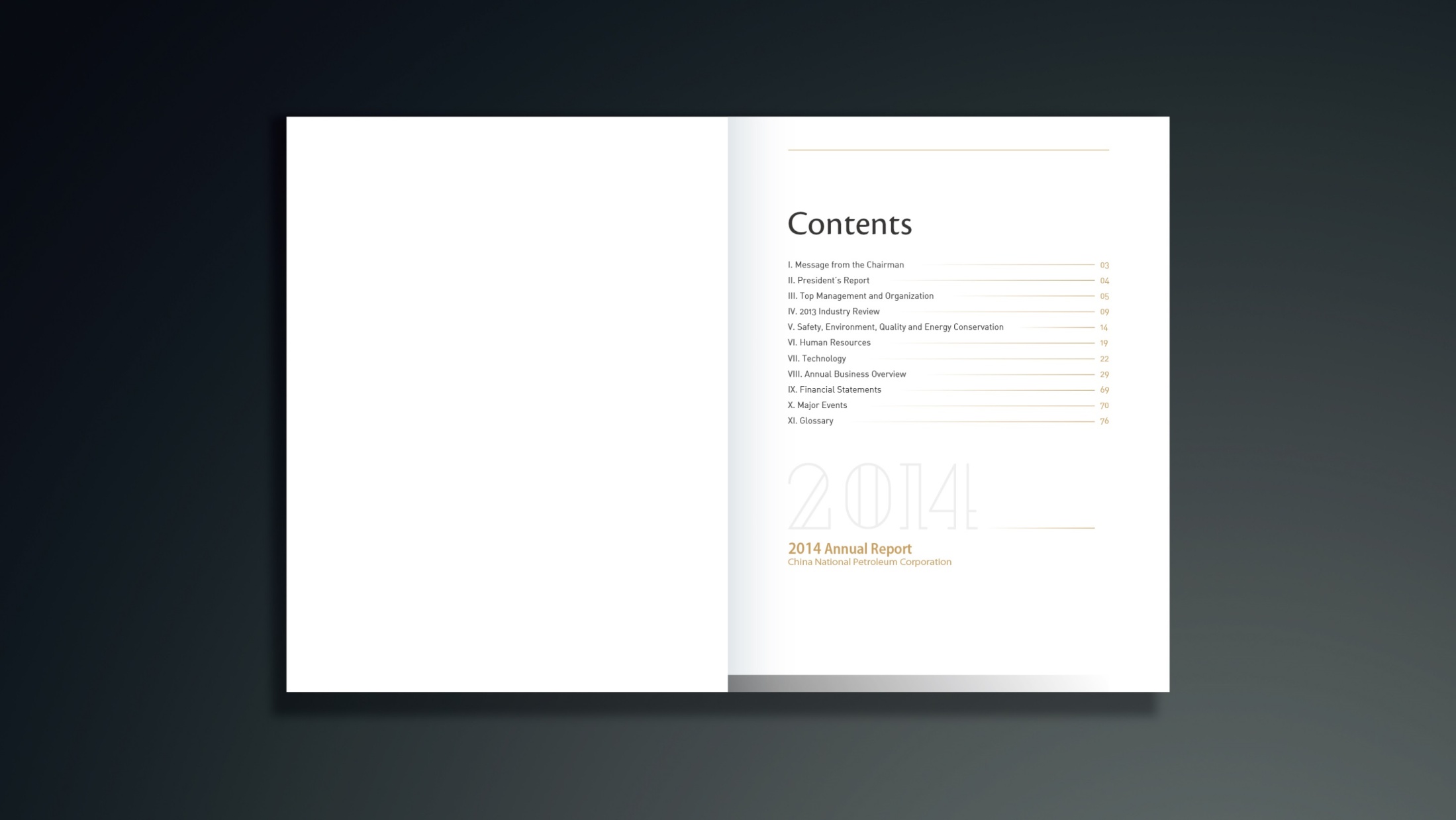
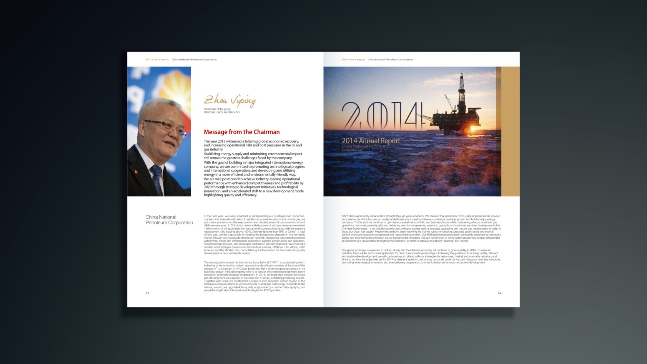
5. Future Strategy. Layout system: an international 12-column grid with English and Chinese side by side; body text and data set in columns with generous white space for a smooth reading rhythm. Infographics: energy-flow diagrams, global partnership maps, production statistics and carbon-neutrality target curves, all rendered in a consistent linear style. Materials and finishing: black-and-gold matte laminated cover with spot gold foil and an embossed logo; interior pages on heavyweight matte coated stock to sharpen the contrast between charts and text. The overall look is restrained, precise and international, conveying the professional authority and cultural confidence of an energy brand.
Achievements and Impact
The overseas annual report is widely used in international investor relations, energy cooperation forums and overseas exhibitions. By combining international publishing grammar, a data visualization system and a unified brand-color logic, the design established a visual standard for CNPC’s international communications. The project gave the brand greater credibility, professionalism and linguistic consistency in global communications, and has become a benchmark for international visual design in the energy sector.