










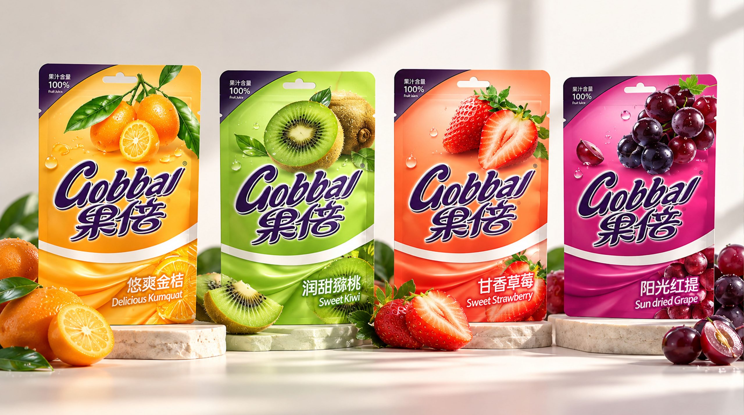
This juice brand is a beverage brand with natural fruits, real flavors and a relaxed and healthy lifestyle as its core. It is committed to integrating the color, aroma and nutritional experience of fresh fruits into daily drinking scenes. As consumers pay more and more attention to the quality, source of raw materials and health value of drinks, juice is no longer just a thirst-quenching product, but has gradually become an important carrier to express vitality, pleasure and quality of life.
This brand image is based on "Fresh Fruit × Colorful Life" and uses bright and rich packaging colors, real and full fruit images and distinctive serial designs to establish a young, natural and dynamic brand image. Different flavors use different colors and fruit combinations, which not only enhances product recognition, but also allows consumers to intuitively feel the natural origin and rich flavor of the juice, making the product from an ordinary drink to a brand symbol that connects health, taste and happy life.
Brand spirit
The brand spirit of this juice brand is based on nature, vitality and sharing, forming a brand DNA with youthful temperament and warmth of life.
Natural × Fresh × Vitality
Real × Sharing × Pleasurable Experience
Natural represents the brand's emphasis on fruit raw materials and product quality, freshness reflects the refreshing taste and natural flavor brought by juice, and vitality symbolizes a young, active and energetic life. Authenticity represents the brand's clear expression of product information and juice content, sharing reflects the emotional connection between people, and pleasant experience is the core feeling that the brand hopes consumers will get during every drinking process.
The colorful fruit series not only represents different flavors, but also symbolizes the rich and diverse choices in life. The brand hopes to bring consumers a more relaxed, natural and energetic drinking experience with real fruits and bright colors, making every glass of juice a fresh mood in daily life.
design concept
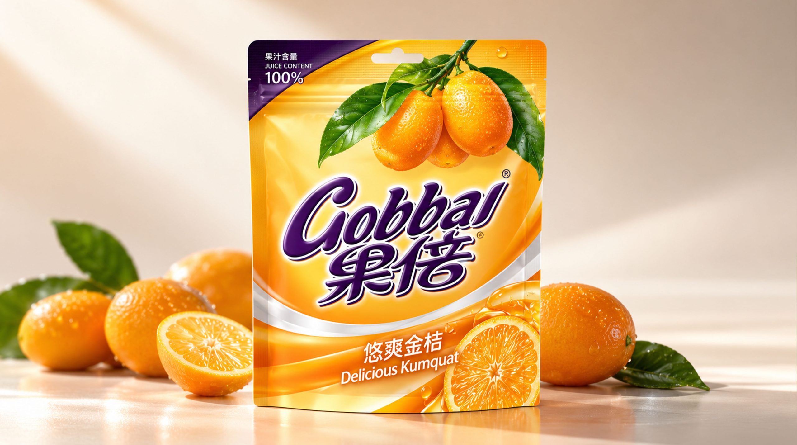
The brand's design philosophy can be summarized by "real fruity taste × colorful life". The design uses the fruit itself as the most important visual content, focusing on presenting real fruits such as oranges, grapes, kiwis, and strawberries, and enhancing the freshness and drinkability of the juice through full shapes, bright colors, and natural water drop details.
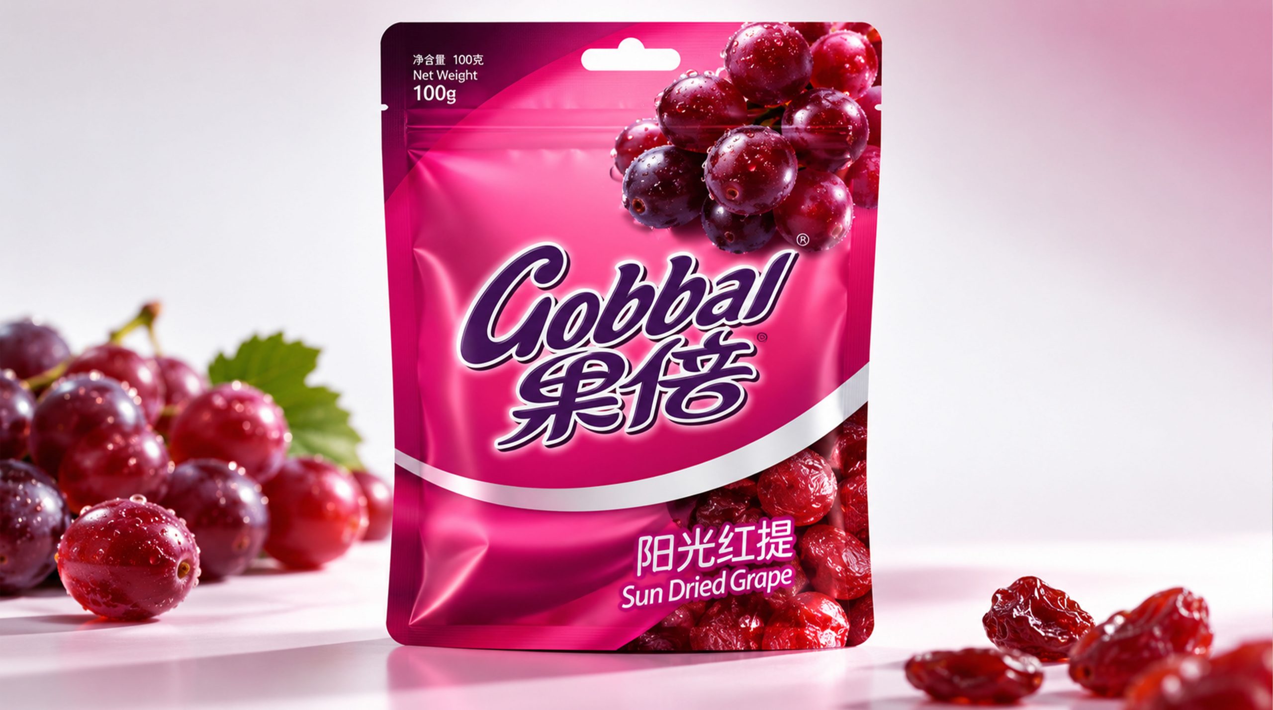
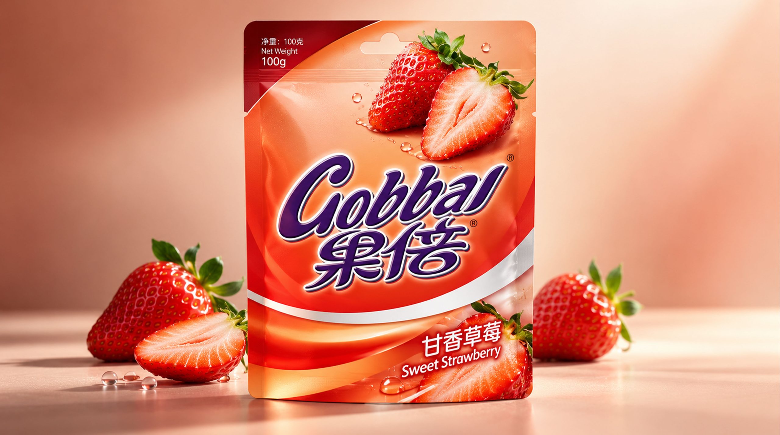
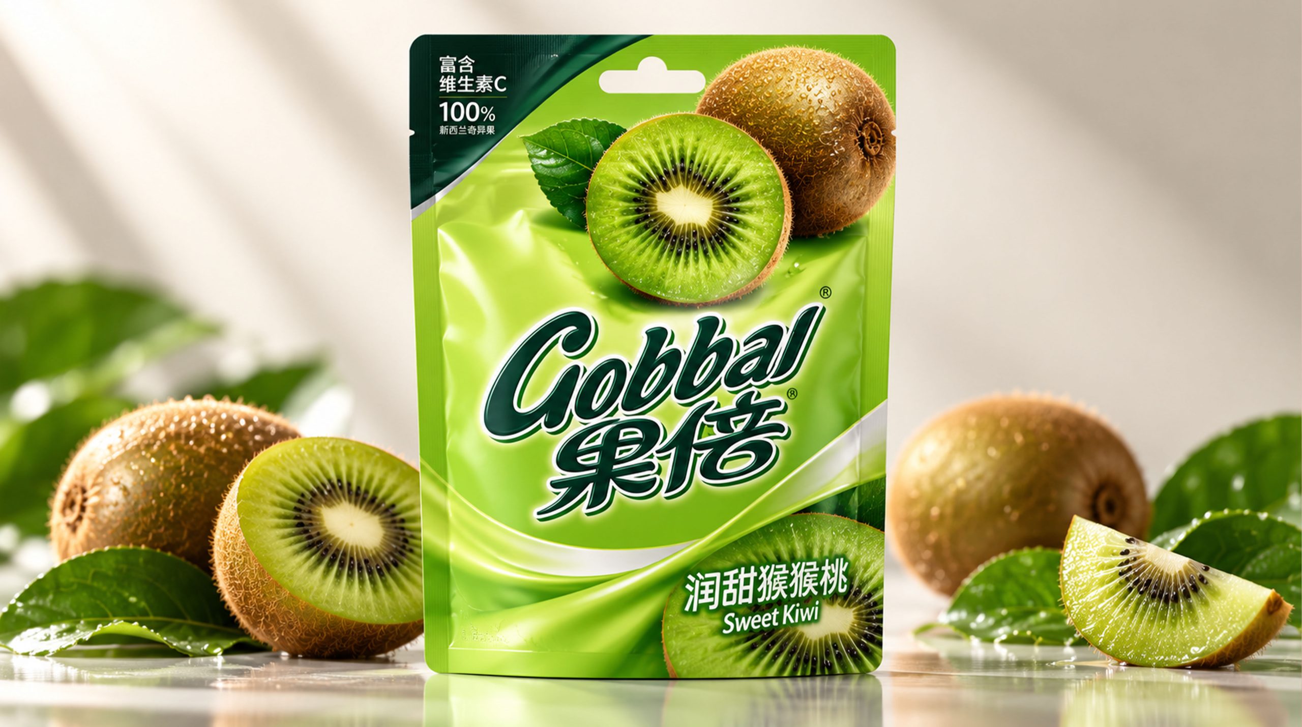
The packaging uses large areas of highly saturated colors to differentiate products, and different flavors correspond to different theme colors. Orange embodies sunshine, sweetness and refreshing, green embodies nature, health and vitality, red embodies passion, richness and rich fruit flavor, and purple embodies the mellow and unique grape flavor. A variety of color combinations give the product a strong visual impact on the shelf and make it easier for consumers to quickly identify different flavors.
The dark purple chamfered area above the packaging forms a unified brand recognition structure, which not only breaks the visual monotony of large-area fruit images, but also provides clear carrying space for product information such as "100% juice content" and "Fruit Juice". The oblique cut composition has a certain sense of dynamics, symbolizing the flow process of fruit from natural growth to freshly squeezed into juice, reflecting the brand's fresh, direct and vibrant product characteristics.
visual language
The visual language of the juice brand follows the design principles of “bright, authentic, youthful, and easily identifiable”.
Color and structure:
The brand builds product series with high-brightness colors such as orange, green, red, and purple. Each color corresponds to a fruit or flavor, forming a clear product distinction. The large area of theme color can enhance the visual appeal on the shelves and also convey the fresh, sweet and energetic brand temperament of the juice.
The packaging structure adopts a combination of "obliquely cut color blocks × central fruit image × bottom brand information". The dark area above forms a stable brand recognition area. The middle part uses fruit images as the visual focus, and the bottom completes the product description with product name, flavor and specification information. The overall information level is clear, taking into account both visual impact and reading efficiency.
Logo and Graphics:
The brand logo is presented in a decorative font with a handwriting and flowing feel, reflecting the natural, friendly and dynamic brand character. The purple glyph contrasts sharply with the bright packaging background, allowing the brand name to remain highly recognizable amidst the complex fruit imagery.
White labels or blank areas are used to highlight product names and brand information, conveying a pure, authentic and clear visual experience. The rounded outline of the label echoes the natural shape of the fruit itself, making the overall design dynamic while retaining a certain affinity.
Fruit graphics:
Fruit images are the core visual motif of the brand. The design uses large-scale, close-up photography of the fruit to highlight details such as pulp texture, peel color, water droplets and leaves, allowing consumers to intuitively feel the freshness and rich flavor of the fruit.
Fruits such as oranges, grapes, kiwis and strawberries appear in the packaging in different combinations, which not only shows the source of the product’s raw materials, but also establishes a distinct taste association. Fruit graphics can be extended according to different products and used in posters, advertisements, social media, shelf displays and terminal materials to form a unified and communicative brand visual system.
Fonts and typography:
The brand name uses a handwritten font to reinforce the friendly, natural and relaxed brand image. Product information uses clear and easy-to-read modern fonts to ensure that information such as “100% juice content”, flavor names and product specifications can be quickly recognized by consumers.
The English "Fruit Juice" and the Chinese juice information cooperate with each other to convey product attributes and international visual temperament. Maintaining a clear hierarchical relationship between Chinese and English, numbers and graphics gives the packaging a visual effect that is young, clear and has strong shelf communication.
language and tone
The brand's language is direct, relaxed and energetic, emphasizing the balance between authentic expression and enjoyable experience. Brand copy should clearly convey fruit origin, juice content, taste characteristics and product information, avoiding complex and overly modified expressions, so that consumers can quickly understand the product value.
In brand communication, expressions can be carried out around keywords such as "fresh fruit", "real fruit flavor", "daily vitality" and "refreshing bite". For example, "Real fruit you can drink", "Pack freshness into every box", "One bite of fruity fragrance, full of vitality", etc., convey a natural, pleasant and life-like brand attitude.
The brand language does not seek to be overly professional or serious, but communicates with consumers in a concise, bright and friendly way. English auxiliary copywriting such as "100% Fruit Juice", "Fresh Fruit Taste" and "A Fresh Start" can strengthen the product's juice attributes and international expression, allowing the brand to maintain a unified language style in packaging, advertising and digital communication.
Brand Experience
The brand experience of this juice brand runs through multiple touch points such as product packaging, terminal display, digital platform and daily drinking. From the first time consumers see the packaging, to choosing the flavor, opening it for drinking and sharing, every step should reflect the freshness, vitality and affinity of the brand.
Packaging experience:
The packaging uses highly saturated colors, real fruit photography and clear product information to enhance visual appeal and purchase convenience. Different flavors are distinguished by independent theme colors and fruit combinations, allowing consumers to quickly identify different products such as orange juice, grape juice, kiwi juice and strawberry juice.
The overall structure of the carton packaging is simple and impactful, and the oblique color blocks and fruit images form an obvious visual momentum. The packaging surface can be combined with gloss film, local highlights or delicate printing technology to express the moist and fresh texture of the fruit, further enhancing consumers' imagination of the taste of the product.
Space experience:
The brand’s display on supermarket shelves, convenience stores, catering spaces and pop-up events can continue the visual language of the colorful fruit series. When products of different colors are arranged together, they can form a distinctive color wall and enhance the overall recognition of the brand.
Terminal displays can be paired with elements such as fruit slices, leaves, water drops, and refreshing backgrounds to create a natural, bright, and vibrant consumption atmosphere. Through a unified color and image system, consumers can quickly identify the brand no matter what purchasing environment.
Digital experience:
On official websites, mobile apps and social media, brands can extend their visual image through dynamic ways such as fruit switching, color changes and juice flow. Different flavors can correspond to different interactive content, allowing consumers to choose according to their mood, scene or taste preference.
The combination of product photography, drinking scenes and lifestyle content can enhance the brand's social communication power, allowing consumers to share products while also sharing a relaxed, healthy and energetic attitude toward life.
Product experience:
Juice products build consumers' brand awareness of freshness, taste and trustworthiness through real fruit images, clear product information and rich flavor choices. The portable packaging form is suitable for a variety of life scenarios such as home drinking, outdoor travel, breakfast pairing and sharing with friends, making juice a simple and enjoyable drink choice in daily life.
brand statement
"Pack fresh fruit into every piece of happiness."
The image of the juice brand is not only a visual combination of bright packaging and fruit images, but also a life expression about nature, vitality and daily pleasure. The design combines the natural flavors of the fruit with a modern beverage experience through bright colors, authentic fruit photography, clear product information and approachable brand language.
Different colors represent different tastes and different moods of life. Orange is sunshine and sweetness, green is nature and refreshing, red is passion and sharing, and purple is mellow and unique. The rich colors and fruit graphics together form a distinct visual memory of the brand, allowing the product to be quickly recognized among many drinks.
Through a unified packaging system, terminal display and brand communication, the brand will establish a young, natural, authentic and dynamic visual image. It not only provides juice drinks, but also delivers a more relaxed, healthy and colorful lifestyle, allowing consumers to feel the fresh energy from real fruits every time they open and drink.