










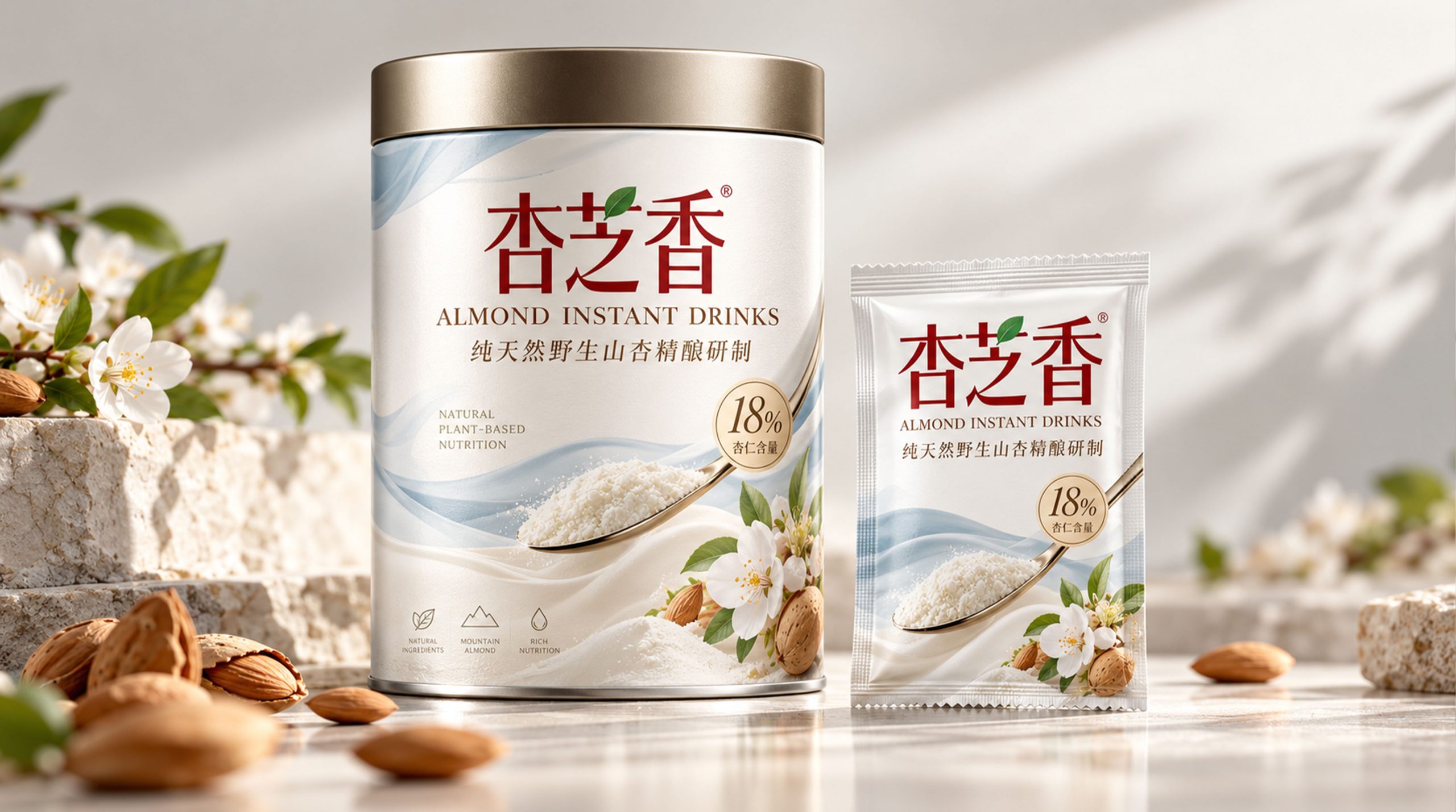
The brand is a plant-based nutritional drink brand with natural almonds, plant nutrition and convenient drinking methods as its core. It is committed to combining the natural flavor of nuts, modern nutritional concepts and daily life style. As consumers continue to pay more attention to healthy eating, plant-based products and light-burden living, almond drinks are no longer just traditional beverages, but have gradually become an important choice for breakfast, office, travel and daily nutritional supplements.
This brand image is based on "natural almonds × light nutrition" and uses soft milky white tones, light blue and green natural colors, almond flowers and leaf graphics to establish a pure, healthy, gentle and quality visual image. The packaging design emphasizes the natural origin and nutritional properties of the product, transforming almond drink from a simple prepared food into a plant-based beverage brand that connects nature, health and modern life.
Brand spirit
The brand spirit of this almond drink brand is based on nature, nutrition and quality, forming a brand DNA with affinity and warmth of life.
Natural × Nutrition × Purity
Plants × Care × Light Life
Natural represents the brand's emphasis on the origin of almond raw materials and products, nutrition reflects the brand's concern for consumers' daily health needs, and purity conveys simplicity and peace of mind in product formula, taste and visual image. Plants symbolize the brand's natural attributes, care reflects the brand's understanding of consumers' lifestyles, and light life represents a low-burden, comfortable and healthy eating attitude.
The brand hopes to make consumers feel natural, gentle and reliable through the real image of almonds, soft packaging colors and clear product information. Each cup of almond drink not only meets daily drinking needs, but also conveys a life philosophy of calmness, health and quality of life.
design concept
The brand's design philosophy can be summarized by "Natural Nourishing × Modern Simplicity." The design uses almonds as the core visual element, and expresses the natural origin and plant attributes of the product through the combination of almonds, almond flowers, green leaves and plant branches. The almond graphic is not only a visual expression of the product’s raw materials, but also symbolizes solidity, richness and natural gifts.
The entire packaging uses large areas of white space and soft colors to create a clean, light and comfortable visual atmosphere. The milky white background reflects milk-like delicacy and purity, the light blue conveys refreshing, rational and modern feeling, and the light green represents nature, plants and health. Golden thin lines and circular information badges are used to emphasize product quality and nutritional content, giving the packaging a certain sense of sophistication amid simplicity.
The product name uses eye-catching red Chinese fonts to strengthen brand recognition and visual memory. The combination of Chinese and English information with typesetting not only conveys the international attributes of the product, but also helps consumers quickly understand core information such as "almond drinks", "plant-based" and "natural nutrition". The overall design forms a balance between naturalness and modernity, reflecting the brand's product positioning of purity, health and quality.
visual language
The brand's visual language follows the design principles of "nature, purity, nutrition, and modernity."
Color and structure:
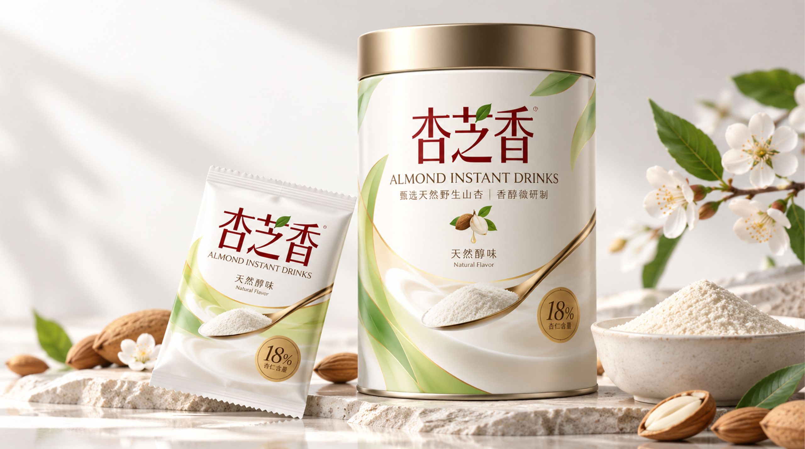
Milky white is used as the main background color to convey the soft, pure and friendly brand temperament; light blue reflects refreshing, rational and modern sense; light green symbolizes plants, nature and vitality; gold is used as an auxiliary color to reflect the preciousness of almond raw materials and product quality. The overall color brightness is soft and avoids excessive stimulation, which is in line with the comfortable and healthy product image of plant-based nutritional drinks.
The packaging adopts the composition of "white background × red brand text × almond plant graphics × gold information badge". Large areas of white space give the packaging a sense of breathing and also highlight the product name and graphic elements. The concise layout structure allows consumers to quickly obtain product type, nutritional content and taste information, reflecting the brand's clear and rational communication method.
Logo and Graphics:
The brand name is presented in a red Chinese font with traditional temperament. The font structure is stable and eye-catching, conveying the brand's reliability and affinity. Green leaves are partially integrated to connect the text with natural elements and strengthen the attributes of plant-based products.
Plant graphics:
Almonds, almond blossoms, branches and leaves, and milky white liquid forms serve as important graphic motifs for the brand. Almonds represent the raw materials of the product, white flowers symbolize purity and nature, green branches and leaves represent vitality and health, and the soft flow lines of the drink represent the delicate, smooth and mild taste.
Plant graphics can be extended in different ways such as photography, hand-drawn line drawings or simplified illustrations, and used for packaging backgrounds, advertising posters, shelf displays, gift box design and digital communication to form a unified and natural brand visual system.
Fonts and typography:
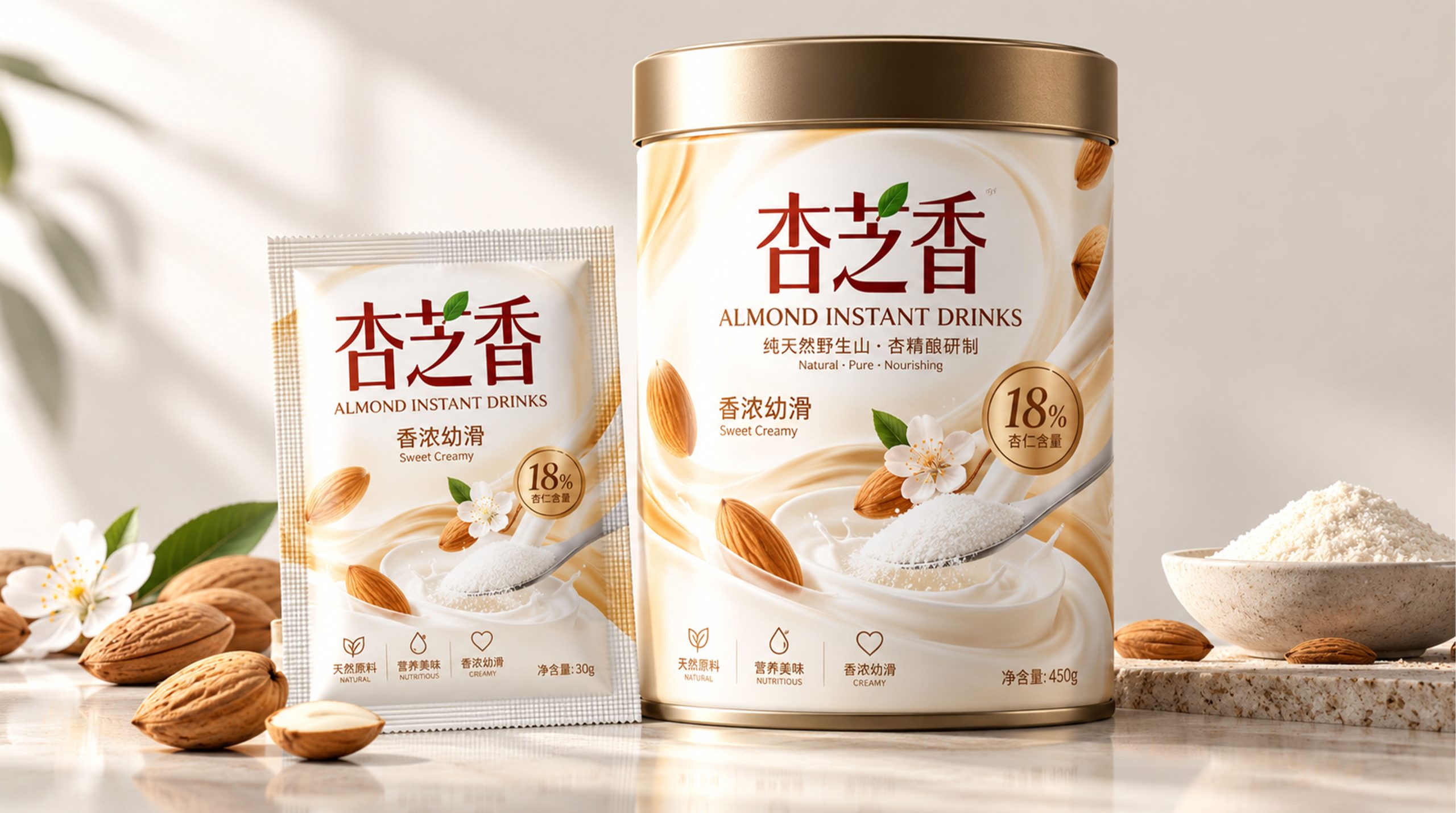
The Chinese brand name uses eye-catching red fonts, which has strong recognition and cultural affinity; the English "ALMOND INSTANT DRINKS" uses simple modern font layout, reflecting the internationalization and professional attributes of the product. Product information is presented in clear and easy-to-read fonts, highlighting core concepts such as "Natural", "Pure" and "Nourishing". The circular badge is used to present nutrition or content information such as "18%" to form a visual symbol with a sense of quality certification. Icons and auxiliary text are modularly arranged around product features to make the packaging hierarchy clear and have both information function and decorative effect.
language and tone
The brand's language is natural, gentle and authentic, emphasizing the balance between nutritional information and lived experience. Product copy should clearly convey raw materials, taste, plant attributes and nutritional value, avoid complex and exaggerated expressions, and allow consumers to quickly understand product features.
In brand communication, expressions can be carried out around keywords such as "natural almonds", "plant nutrition", "delicate and smooth" and "light life". For example, "Take natural almonds and enjoy a cup of gentle nourishment", "Natural plant nutrition, easily integrate into every day", "Delicate almond fragrance, start a healthy life", etc., conveying the brand's natural, friendly and reliable product attitude.
English auxiliary copywriting, such as "Natural · Pure · Nourishing", "Plant-Based Nutrition", "Sweet Creamy", etc., emphasizes the natural origin, plant-based attributes and mild taste of the product, allowing the brand to maintain a unified, concise and international language style in different markets and communication channels.
Brand Experience
The experience of this almond drink brand runs through multiple touch points such as product packaging, terminal display, drinking scenes and digital communication. From consumers seeing the packaging, selecting products, to preparing drinks and sharing experiences, every step should reflect the brand's naturalness, quality and life-like warmth.
Packaging experience:
The packaging uses soft milky white, light blue, and light green to create a clean, comfortable and quality visual effect. Almond, flower and green leaf elements allow consumers to intuitively understand the origin of the product, while the golden frame and circular badge enhance the product's sense of sophistication and trust.
The independent small packaging is easy to carry and prepare, and is suitable for various scenarios such as breakfast, office, travel and daily leisure. The product information on the packaging is clear and easy to read, allowing consumers to quickly understand the product ingredients, nutritional proportions and drinking methods, improving convenience during purchase and use.
Space experience:
The brand's display on supermarket shelves, convenience stores, coffee spaces and health food stores can continue the visual system of milky white, light blue and green, with almonds, flowers, leaves and drink graphics to create a natural, clean and comfortable consumer atmosphere.
Different product specifications can be differentiated through color, icons and typography hierarchy, allowing consumers to quickly identify the product range while maintaining overall packaging uniformity and brand recognition.
Digital experience:
Across official websites, mobile apps and social media, brands can extend their natural story through visual content such as almonds growing, flowers opening, liquid flowing and the brewing process. The combination of product information, nutritional knowledge, drinking scenes and healthy life content can help consumers understand the value of plant-based drinks more comprehensively.
Product experience:
Almond drinks use natural raw material images, mild taste expression and convenient preparation methods to build consumers' awareness of product health, safety and quality. Whether it is hot drinks, cold drinks, or paired with breakfast and snacks, the products can be naturally integrated into modern life and become an easy and gentle nutritional choice in daily diet.
brand statement
"Take natural almonds and enjoy light nourishment."
The brand's visual image is not only a combination of milky white packaging, almond graphics and plant elements, but also an expression of natural nutrition and healthy life. The design combines the natural properties of almonds with a modern beverage experience through soft colors, clear typography, authentic ingredient graphics and quality details.
Milky white represents purity and gentleness, green represents plants and vitality, light blue represents refreshing and modernity, and gold symbolizes the value of raw materials and product quality. Almonds, flowers and leaves together form the natural memory of the brand, allowing the product to convey a comfortable, elegant and friendly life style while conveying nutritional information.
Through a unified packaging system, terminal display and brand communication, the brand will establish an image of natural, pure, nutritious and modern plant-based drinks. It not only provides convenient almond drinks, but also advocates a more relaxed, healthy and quality-focused lifestyle, allowing consumers to feel the gentle nourishment from nature in every preparation and drink.