










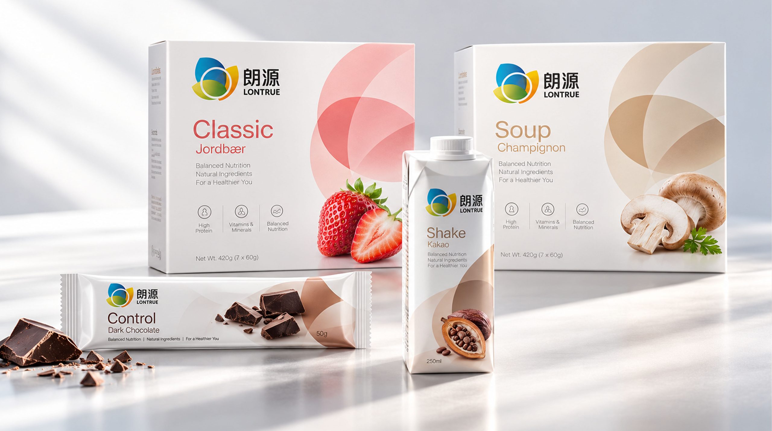
LONTRUE is a brand with nutritious food, meal replacement products and healthy lifestyle as its core. It is committed to combining natural ingredients, scientific nutrition and modern convenient diet. The brand pays attention to consumers' needs for balanced nutrition, low-burden diet and healthy living, and provides more convenient and healthy nutritional choices for different life scenarios through nuts, grains, fruits, vegetables and plant ingredients.
From meal replacement drinks, nutrition bars to plant-based products, LONTRUE hopes to establish a natural, professional, young and international brand image. The packaging design is based on simple layout, fresh colors and real ingredients images, conveying the brand concept of "natural formula, balanced nutrition, healthy life", transforming the product from a single food into a healthy brand that connects nutrition, life and self-management.
Brand spirit
LONTRUE's brand spirit is based on nature, nutrition and quality, building a healthy, professional and trustworthy brand DNA.
Natural × Nutrition × Quality
Science × Convenience × Healthy Life
Natural represents the brand's emphasis on the source of food ingredients and product formulas, nutrition reflects the brand's concern for consumers' daily dietary needs, and quality represents the brand's continued insistence on product taste, production technology and user experience. Scientifically reflecting the brand's professionalism in nutritional ratios and product research and development, it conveniently meets the pace of modern life. Healthy life is the long-term value that the brand hopes to bring to consumers. LONTRUE not only provides convenience food, but also hopes to help consumers establish more scientific and relaxed eating habits through clear nutritional information and rich product types, and achieve a balance between nutrition and deliciousness in their busy lives.
design concept
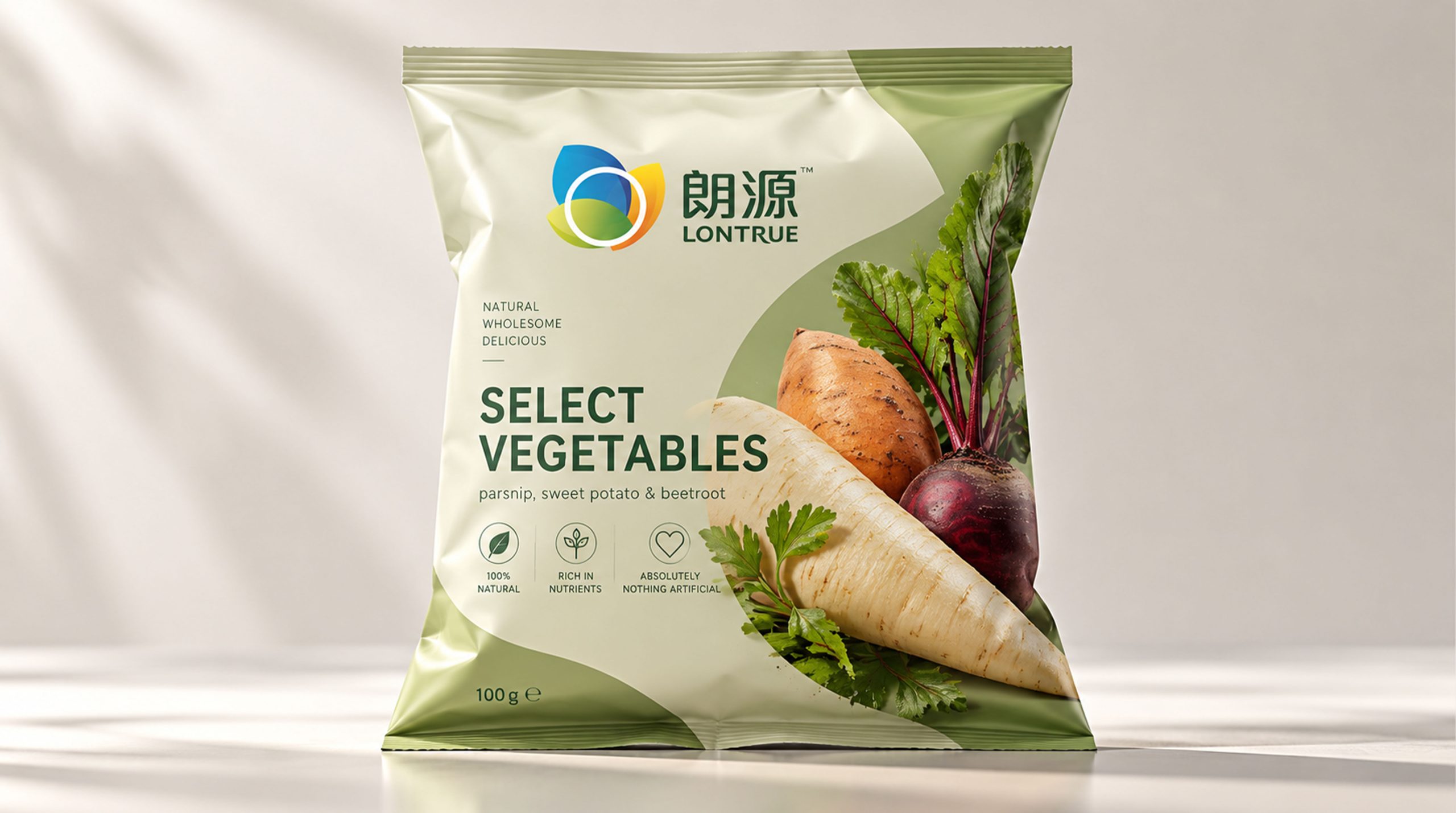
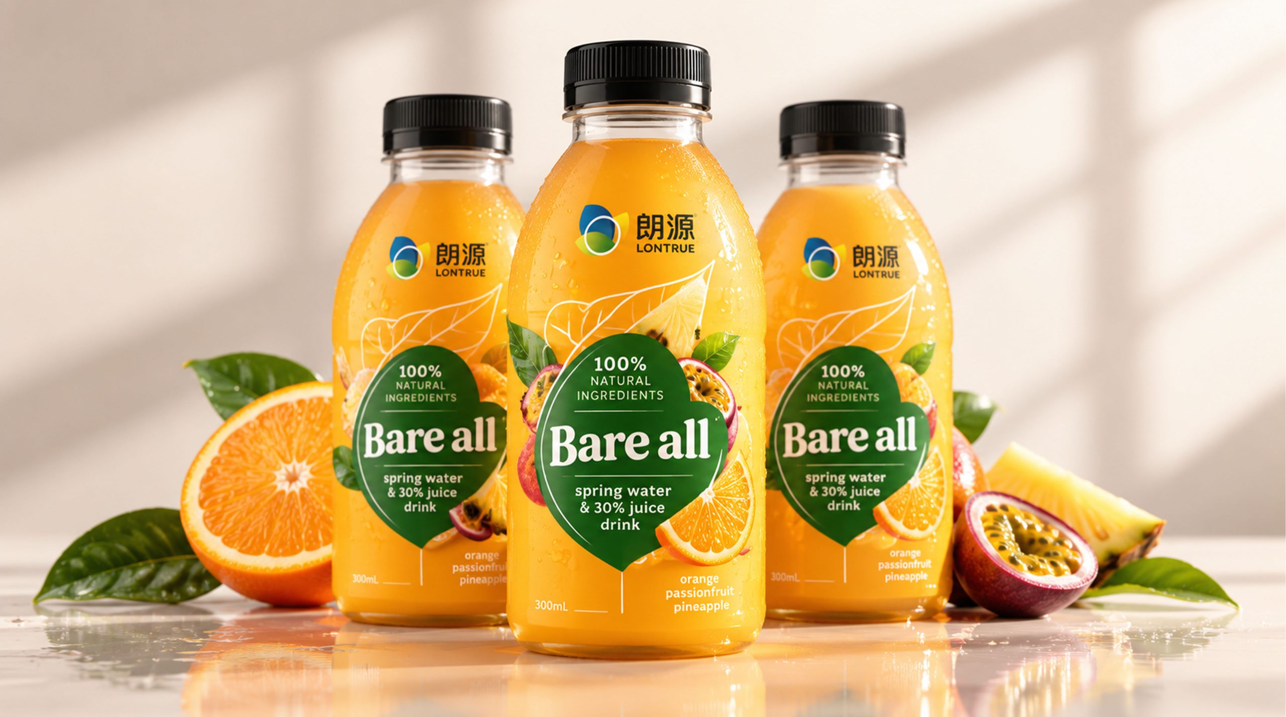
LONTRUE's brand concept can be summarized by "natural raw materials × modern nutrition". The packaging design uses real ingredients as the main visual elements, integrating images of nuts, berries, cereals, vegetables and plant leaves into the packaging to highlight the natural attributes and rich nutrition of the product.
Different products are distinguished by different theme colors: light green embodies plants, freshness and health; light blue conveys purity, lightness and science; pink embodies softness, vitality and fruit flavor; and off-white creates a natural, gentle and high-quality visual atmosphere.
Large areas of white space and concise text in the packaging make product information clearer. Product names, nutritional characteristics, ingredient information and usage methods are laid out in clear hierarchies to avoid complicated decorations, allowing consumers to quickly understand product functions and applicable scenarios.
visual language
LONTRUE's visual language follows the design principles of "natural, clear, light and professional".
Color and structure:
The brand mainly uses natural colors such as light green, off-white, light blue, pink and brown. Green represents plants and vitality, blue represents purity and science, pink represents fruits and joy, off-white conveys health, gentleness and quality, and brown corresponds to natural raw materials such as nuts, grains and cocoa.
The overall packaging is based on a light-colored background and a large area of white space, highlighting the images of ingredients and product names, forming a concise and comfortable brand visual effect.
Logo and Graphics:
The LONTRUE logo adopts a circular graphic structure composed of blue, yellow and green, with multiple color modules connected to each other, symbolizing the integration of different nutritional ingredients, different ingredients and diverse health needs. The circular structure represents completeness, balance and circulation, and also reflects the brand's commitment to building a comprehensive nutritional system.
The Chinese brand name is used together with the English "LONTRUE" to enhance the brand's recognition and international characteristics. Food graphics:
Nuts, berries, vegetables, grains and plant leaves serve as important visual motifs for the brand, used to express the natural origin of the product. Photography of real ingredients can enhance the credibility and food association of the product, allowing consumers to intuitively feel the natural, fresh and rich nutritional value.
Fonts and typography:
Brand names and product names use simple and modern fonts to ensure that the information is clear and easy to read. English auxiliary copy such as “Natural”, “Wholesome”, “Delicious”, “Balanced Nutrition”, etc. convey the natural, balanced and healthy product characteristics.
The bottom of the package can illustrate protein, vitamins, minerals, balanced nutrition and other information through icons to help consumers quickly understand the value of the product and reflect the brand's professional and transparent communication method.
language and tone
LONTRUE's brand language is natural, rational and friendly, emphasizing the balance between nutritional information and life experience. Product copy should accurately express ingredients, nutrition, taste and usage, avoid exaggerated propaganda, and build consumer trust in a true and concise way.
Brands can express themselves around keywords such as "natural ingredients", "balanced nutrition", "easy supplements" and "add points to a healthy life". For example, "natural ingredients, balanced nutrition", "making healthy eating easier", "one portion of nutrition, satisfying the energy of the day", etc., conveying a relaxed, positive and reliable brand attitude. English copywriting such as "Natural Ingredients", "Balanced Nutrition" and "For a Healthier You" further highlight LONTRUE's internationalization and health food attributes, allowing the brand to maintain a unified language style in different markets.
Brand Experience
LONTRUE's brand experience runs through multiple touch points such as product packaging, terminal displays, digital platforms and daily meals. From consumers choosing products, understanding nutritional information, to preparing drinks and daily consumption, every step should reflect the naturalness, professionalism and convenience of the brand.
Packaging experience: Product packaging uses a unified logo system, natural colors and ingredient graphics. Different flavors and product types are distinguished by color and ingredients. Meal replacement drinks, nutrition bars, plant-based products and prepared foods form a clear product family, which not only has a unified brand identity, but also facilitates consumers to make quick choices.
Spatial experience: In supermarkets, convenience stores, gyms and health food stores, brands can continue the visual system of light backgrounds, plant graphics and clear information to create a natural, bright and healthy consumer environment. Different products are neatly displayed to form a complete nutritional product series, strengthening the LONTRUE brand impression.
Digital experience: On the official website, mobile applications and social media, brands can spread content around healthy eating, nutritional combinations, light eating life and product usage scenarios. Help consumers establish a more scientific understanding of healthy eating through charts, ingredient introductions and nutritional knowledge.
Product experience: Whether it is meal replacement drinks, nut energy bars or plant-based nutritional products, LONTRUE provides consumers with easy and healthy daily choices through clear formula information, convenient packaging formats and natural taste expression.
brand statement
"Natural nutrition, easy living."
LONTRUE's brand image is not only a combination of fresh colors, real ingredients and simple packaging, but also an expression of healthy eating and modern lifestyle. The design integrates nutritional science with everyday life through natural imagery, balanced messaging and crisp visual language. Green represents plants and vitality, blue represents purity and professionalism, pink represents fruits and vitality, and off-white conveys comfort and quality. The diverse ingredients and unified logo together form LONTRUE's brand identity system, symbolizing the brand's continued focus on nature, nutrition and healthy living. Through unified packaging design, product experience and brand communication, LONTRUE will establish a natural, professional, young and trustworthy nutritional brand image to provide consumers with a simpler, balanced and healthier lifestyle.