













PEETS
Brand Essence
The Peet’s Coffee brand spirit can be defined by these keywords:
- Classic × Innovation × Individuality
- Premium × Refined × Heritage
- Natural × Selective × Rigorous
These keywords sum up the essence of Peet’s Coffee packaging. Classic reflects the brand’s respect for coffee tradition and heritage; Innovation reflects its modern breakthroughs in packaging and product presentation; and Individuality comes through in distinctive packaging and use of color, expressing the brand’s unique market position.
Brand Philosophy
The core idea behind the Peet’s Coffee packaging is “modern art meets classic coffee culture”. Through bold, high-contrast colors and patterns, the designers bring a traditional beverage together with a contemporary design language, creating packaging that is artistic yet unmistakably premium.
Every detail of the packaging honors the brand’s carefully selected beans while expressing its modern, innovative spirit. Through evolving patterns and considered color choices, the design breaks free of conventional packaging and sets a new direction for coffee packaging.
Visual Language
The Peet’s Coffee packaging conveys the brand’s premium, artistic character through a distinctive visual language:
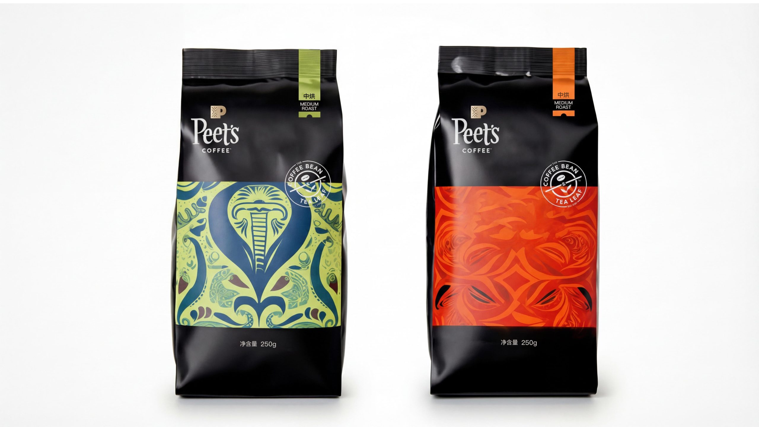
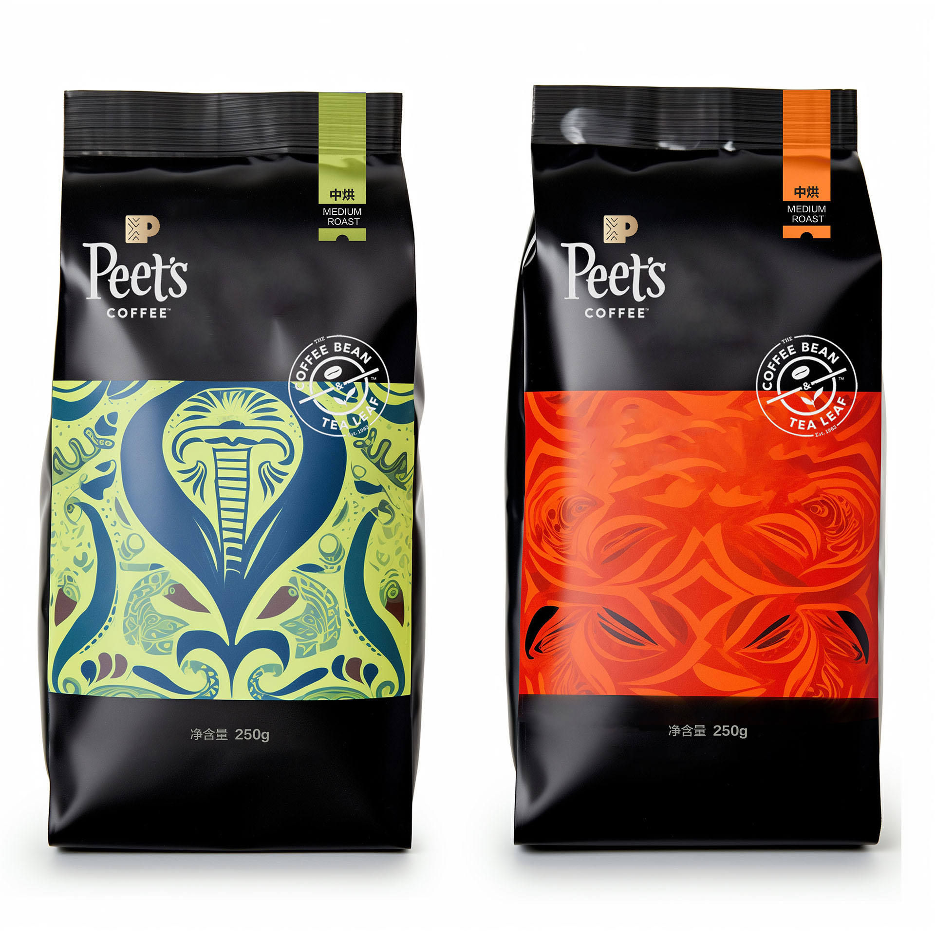
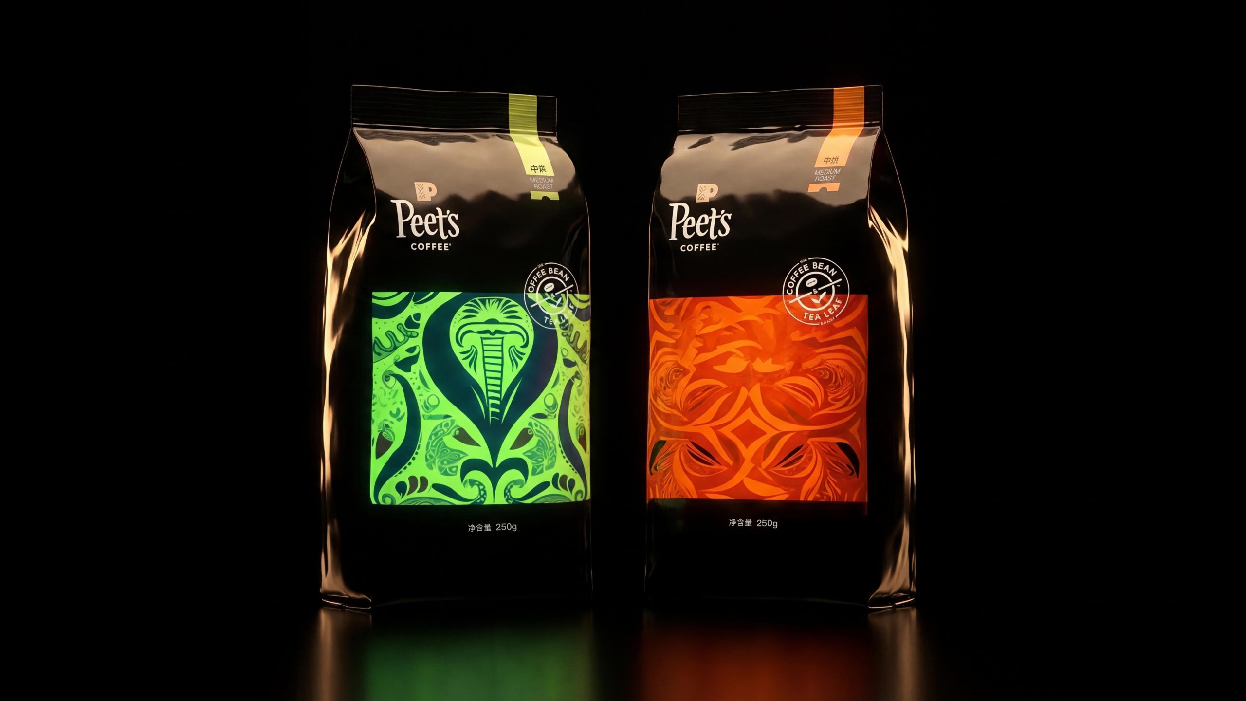
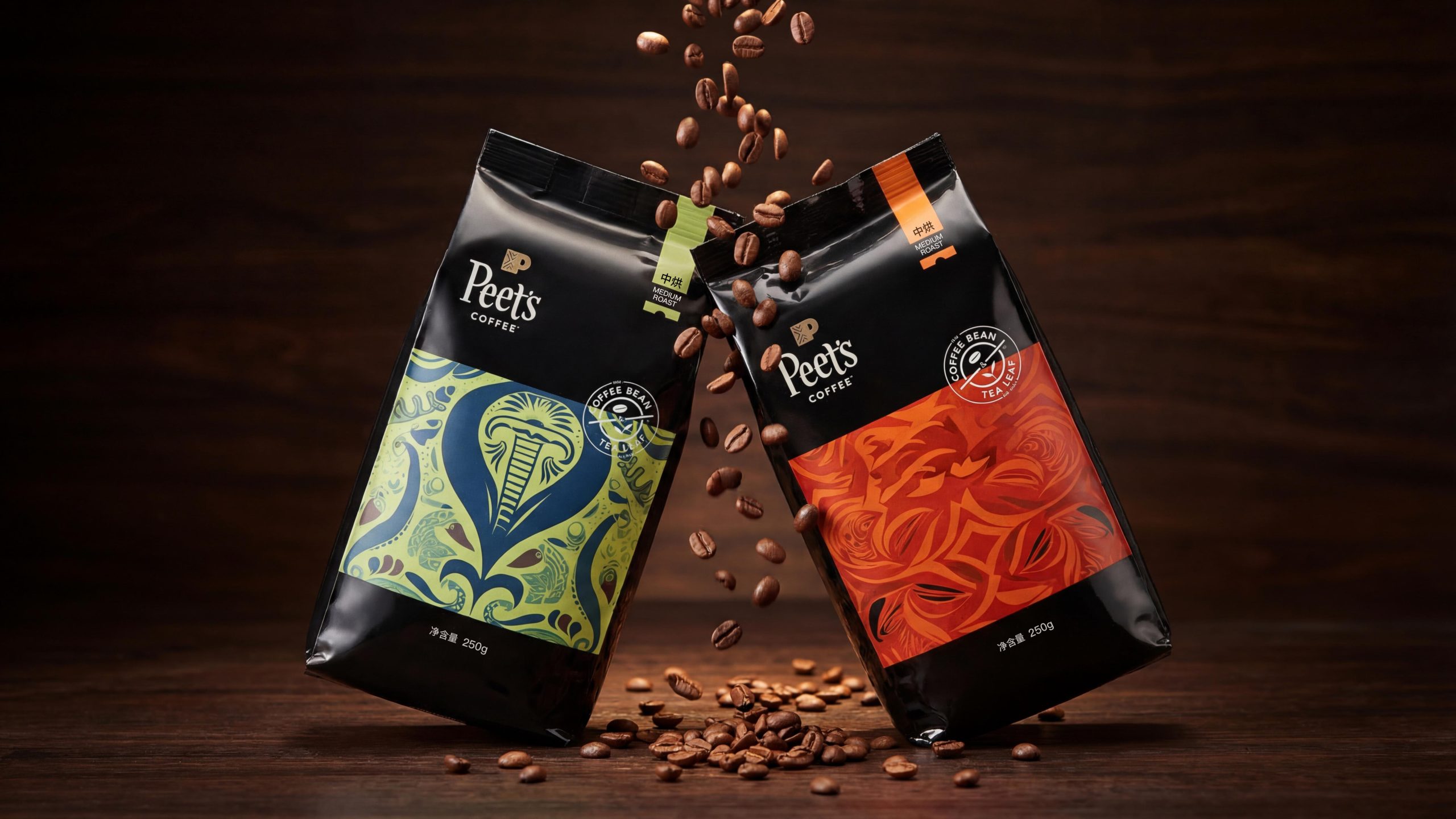
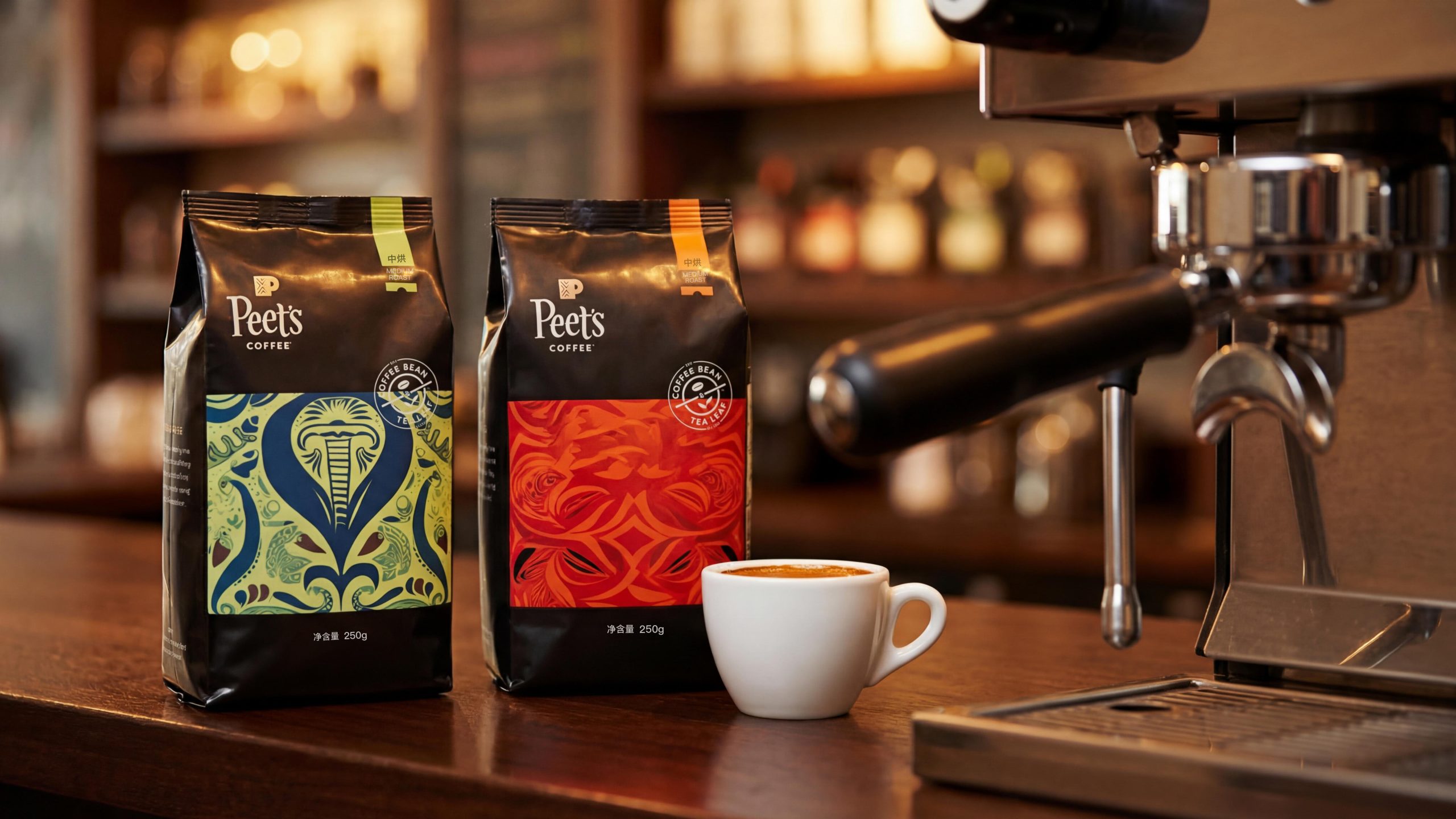
- Color System:The palette is anchored in black with vivid accent colors. Black evokes the depth and premium character of coffee, while bright colors catch the eye of younger consumers. Green and orange inject energy, making the packaging feel modern and distinctly individual.
- Pattern and Texture:The intricate patterns and flowing lines on the front of the bag are inspired by the natural form of the coffee bean. Blending geometric elements with abstract natural shapes, they reflect the brand’s innovative spirit and commitment to artful design.
- Logo:The Peet’s Coffee logo is set in a clean, confident sans-serif with a modern, powerful feel. Its placement and scale respond to the surrounding pattern and color, creating overall visual balance and symmetry.
- Pack Structure:The bag is defined by dimensionality and sheen, underscoring the coffee’s premium quality. The contrast of matte and gloss finishes adds depth and visual appeal.
Tone of Voice
The Peet’s Coffee brand voice is concise and strong. Typography on the pack prioritizes clarity and precision, avoiding unnecessary ornament and putting the product’s quality and value first. Key information such as Medium Roast is clearly presented, communicating the roast and flavor profile.
The overall tone is confident yet approachable, direct without being loud, reflecting the composed character of a premium coffee brand. Coffee bean icons paired with roasting details create both visual and emotional resonance.
Brand Experience
Beyond visual and tactile pleasure, the Peet’s Coffee packaging delivers a complete brand experience:
- Visual Experience:Bold patterns and color pairings give the packaging strong shelf appeal. Each blend’s packaging has its own artistic, modern character, greatly strengthening brand recognition.
- Tactile Experience:Material choices elevate the overall finish. High-quality paper and smooth surfaces offer a premium feel in the hand and let consumers sense the brand’s uncompromising attention to detail.
- Emotional Experience:Distinctive colors and patterns not only catch the eye but also spark curiosity about the brand story and coffee culture. With every purchase and every cup, consumers experience a seamless blend of premium quality, innovation and art.
Brand Statement
“A seamless blend of tradition and innovation, revealing the refinement and artistry of coffee.”
With this packaging, Peet’s Coffee has created a modern, artful brand image. Clean design combined with contemporary art elements showcases the coffee’s premium quality and reflects the brand’s deep commitment to innovation and cultural heritage.