










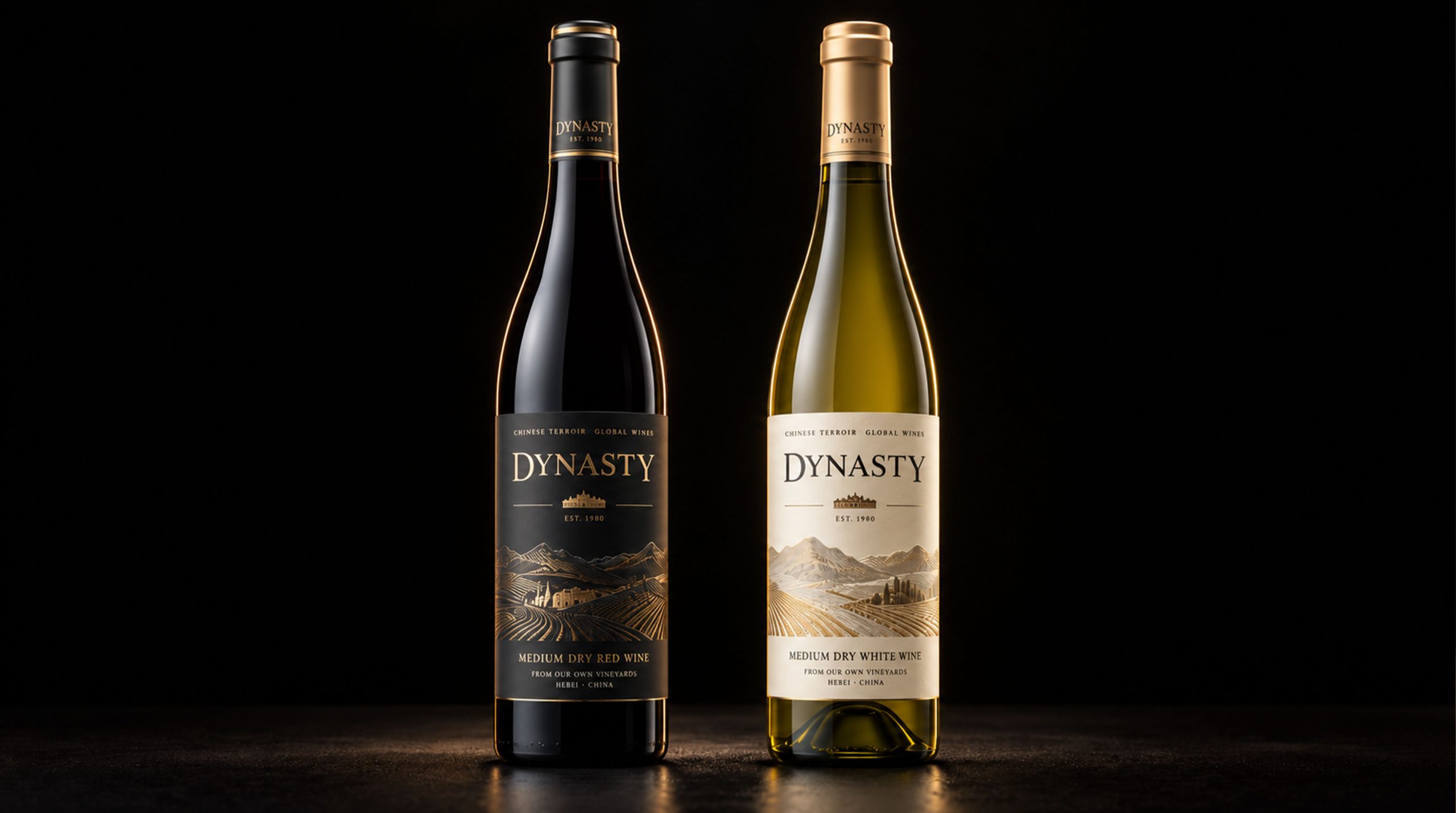
Dynasty Wine is one of the pioneer brands in the Chinese wine industry and has won recognition from consumers around the world for its long history and excellent quality. Since the 1980s, Dynasty Wine has been committed to inheriting classic winemaking techniques and combining them with modern production techniques to launch wine products that meet international standards. The brand has now occupied a place in many international markets and has gradually become one of the leaders in the Chinese wine industry. In the face of increasingly fierce market competition, Dynasty Wine adheres to the principle of parallel tradition and innovation, and is committed to enhancing its brand image and creating unique market competitiveness.
Brand Essence
The brand spirit of Dynasty Wine is rooted in its profound historical background and unremitting pursuit of quality. Through the following keywords, we can clearly understand the brand spirit of Dynasty Wine:
Classic × Innovation × Exquisite
Quality × Heritage × Fashion
Trust × Ingenuity × Nobility
These keywords shape the brand temperament of Dynasty Wine: classic represents the brand’s profound historical accumulation, innovation reflects its continuous exploration of modern winemaking technology, and exquisiteness conveys the brand’s strict control of details and quality. Through the combination of quality and heritage, Dynasty Wine has established a professional and distinguished image in the global market.
Brand Philosophy
The brand concept of Dynasty Wine can be summarized as "the perfect fusion of tradition and modernity". We strive to reflect the long history of traditional brewing culture and the innovative spirit of modern design in product packaging design. Through exquisite and artistic design elements, the brand's cultural heritage and characteristics of advancing with the times are conveyed. From bottle design to packaging details, we strive to show the balance between tradition and innovation in every aspect, ensuring that consumers can experience the modern and fashionable atmosphere while perceiving the brand's history.
Packaging Structure and Details
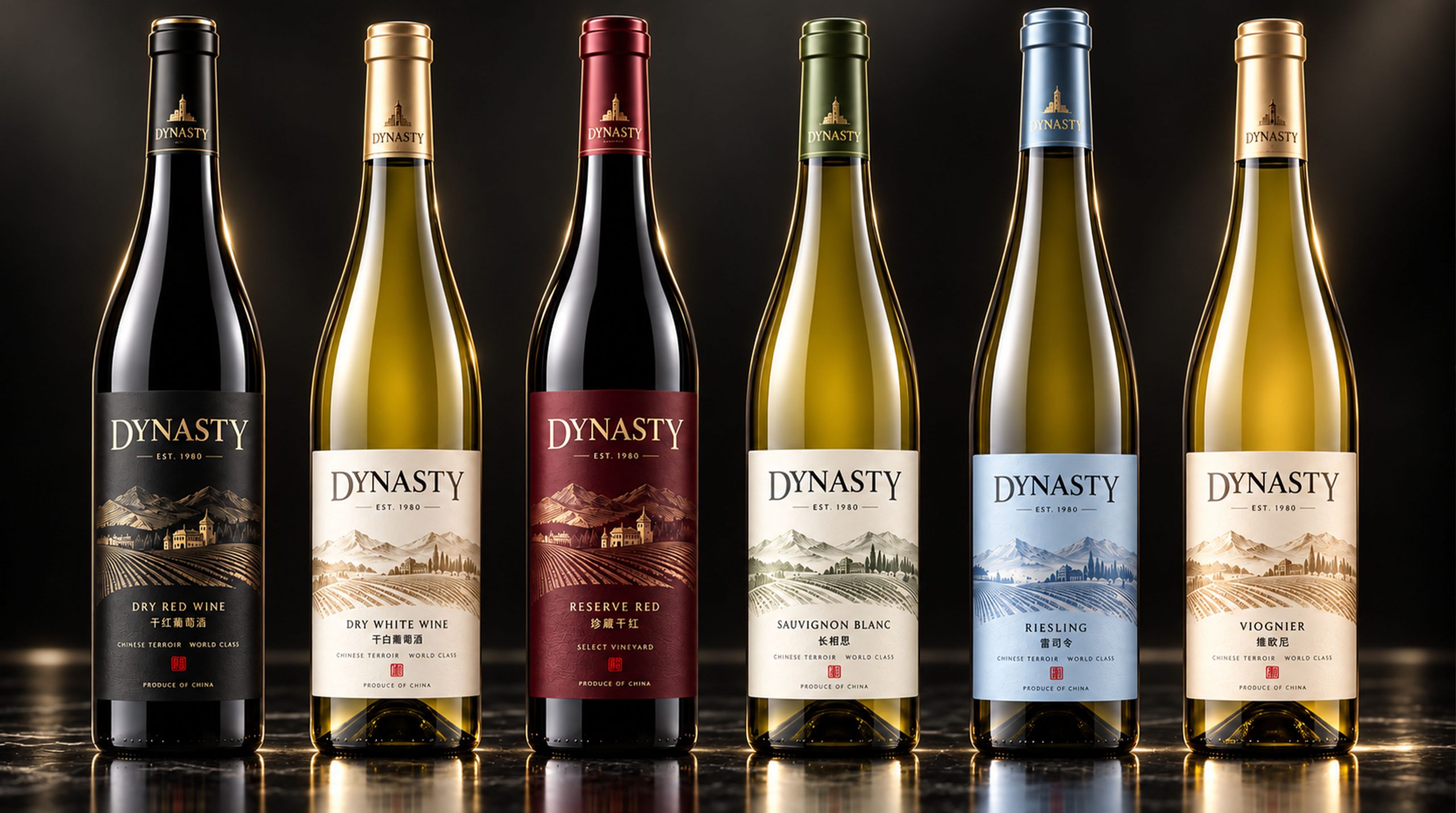
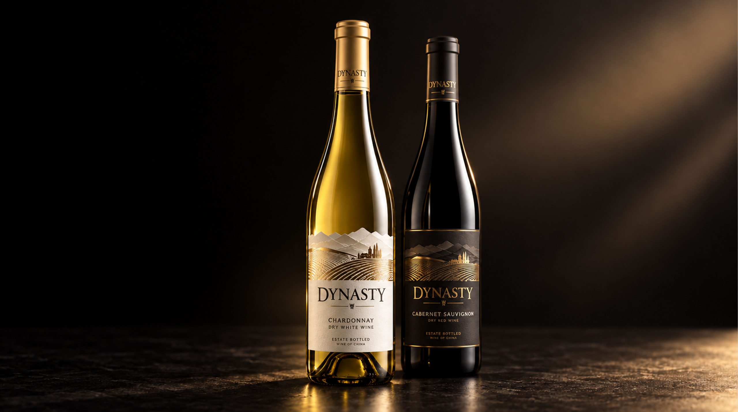
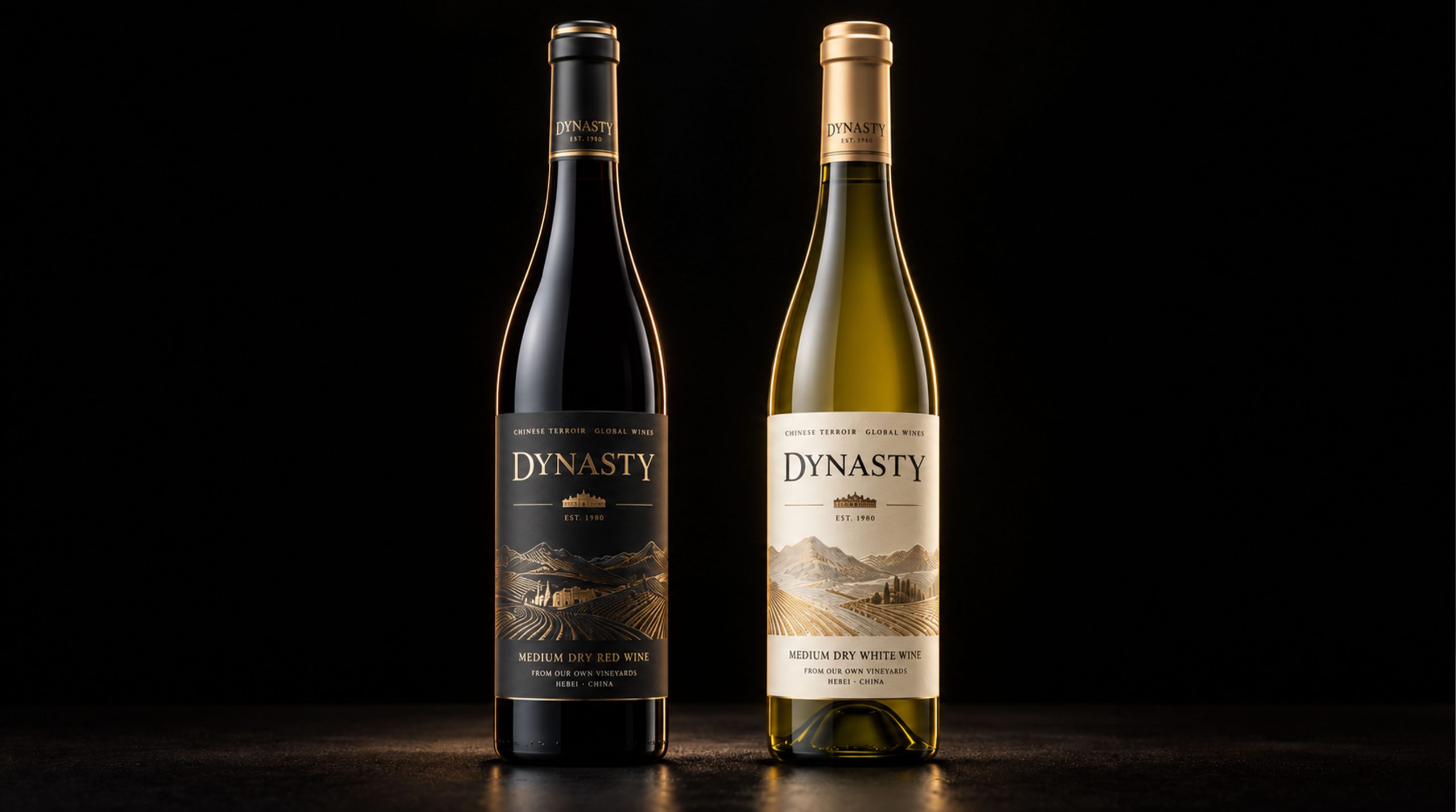
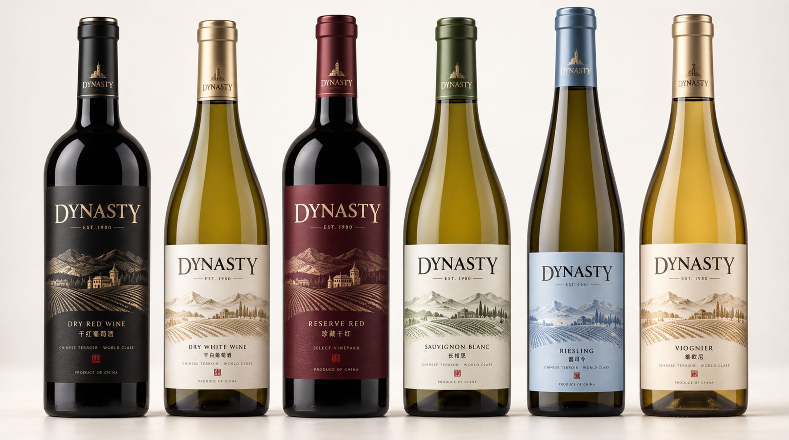
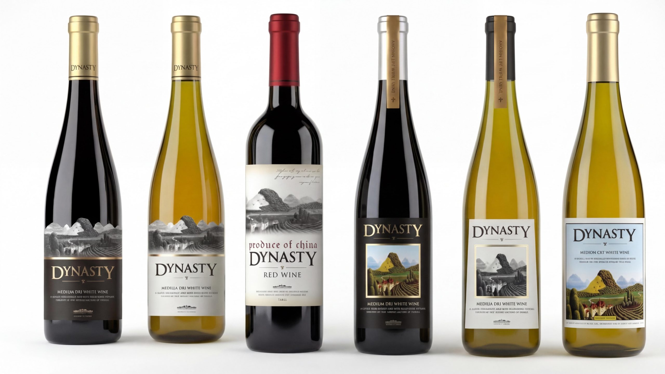
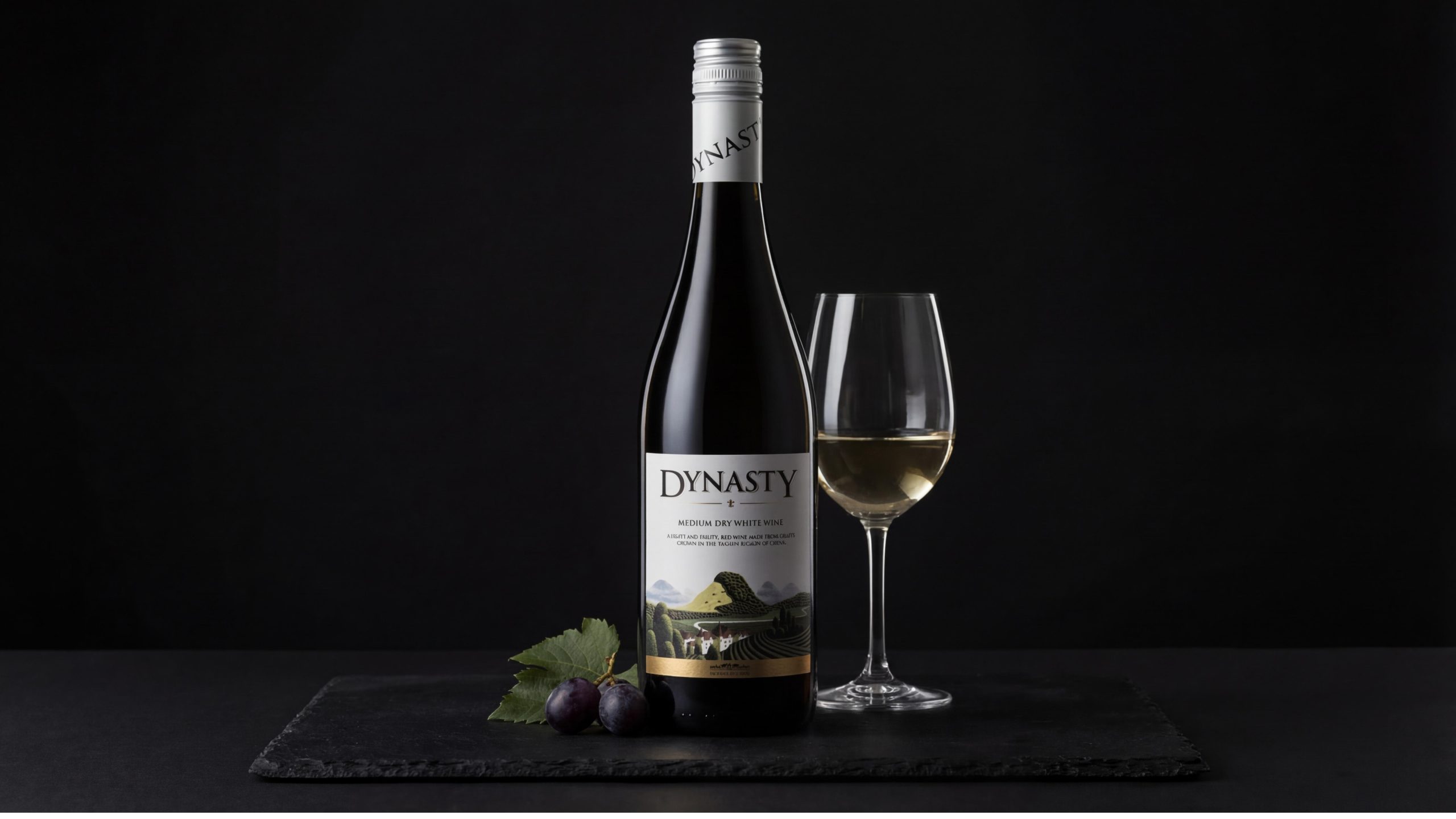
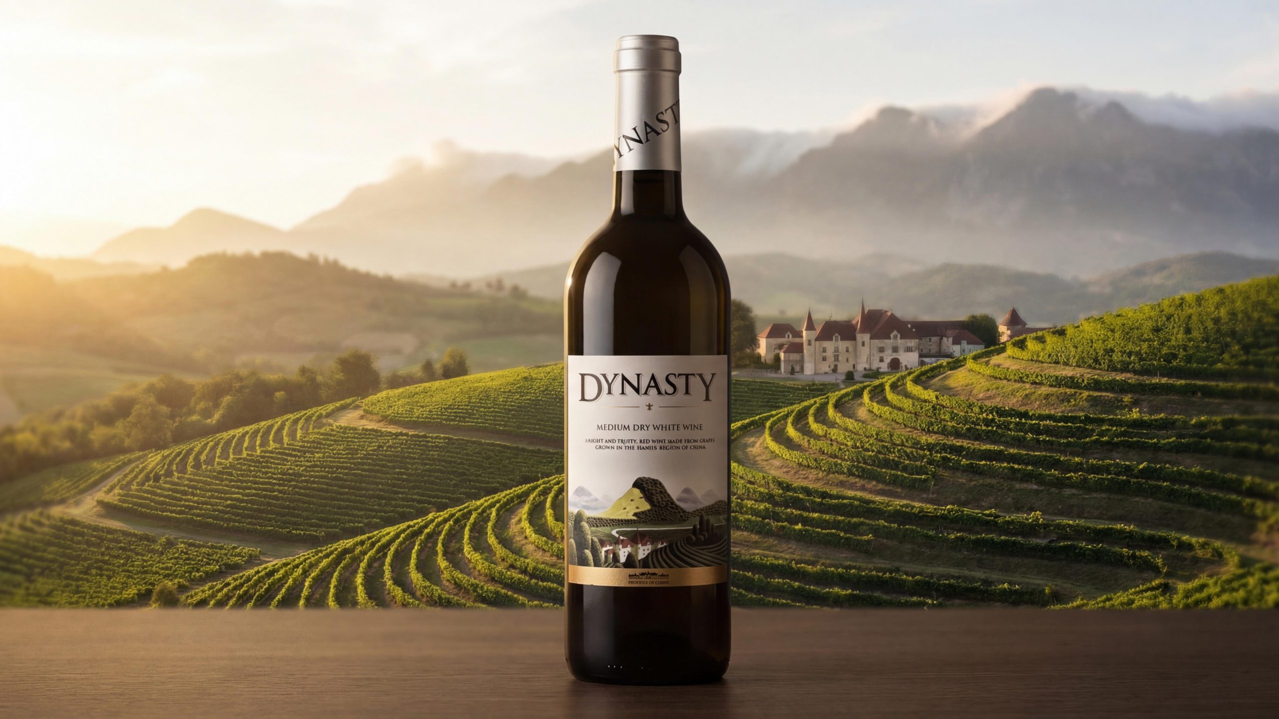
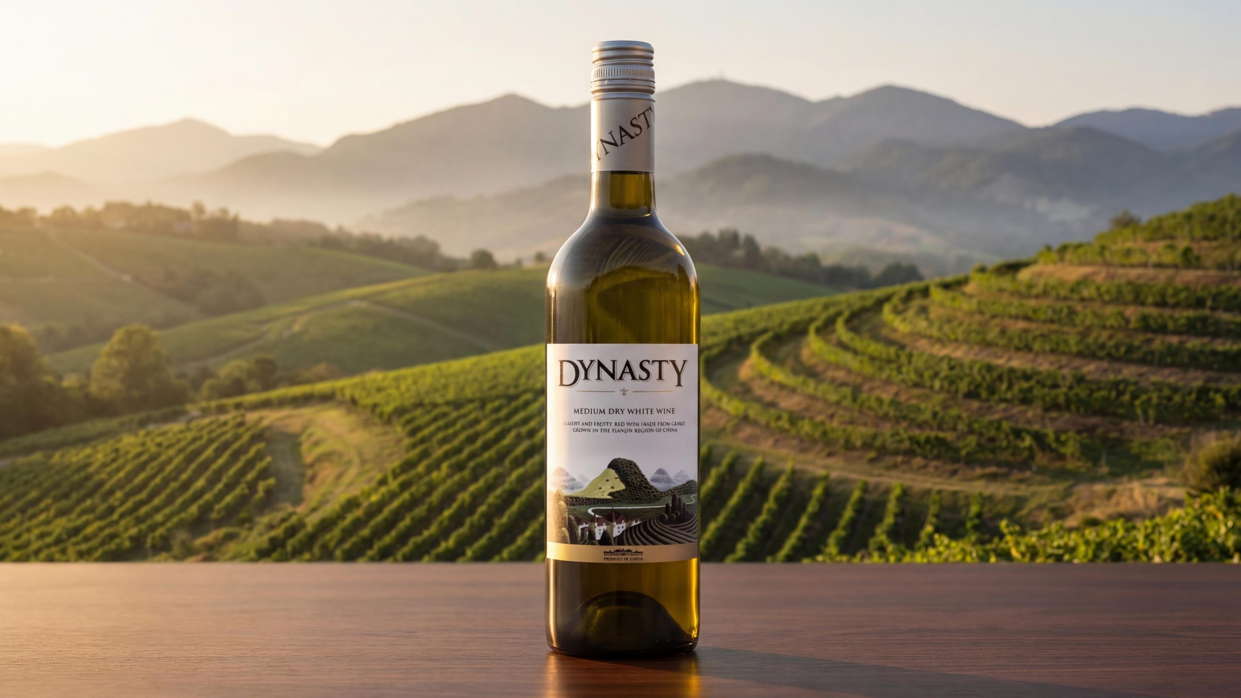
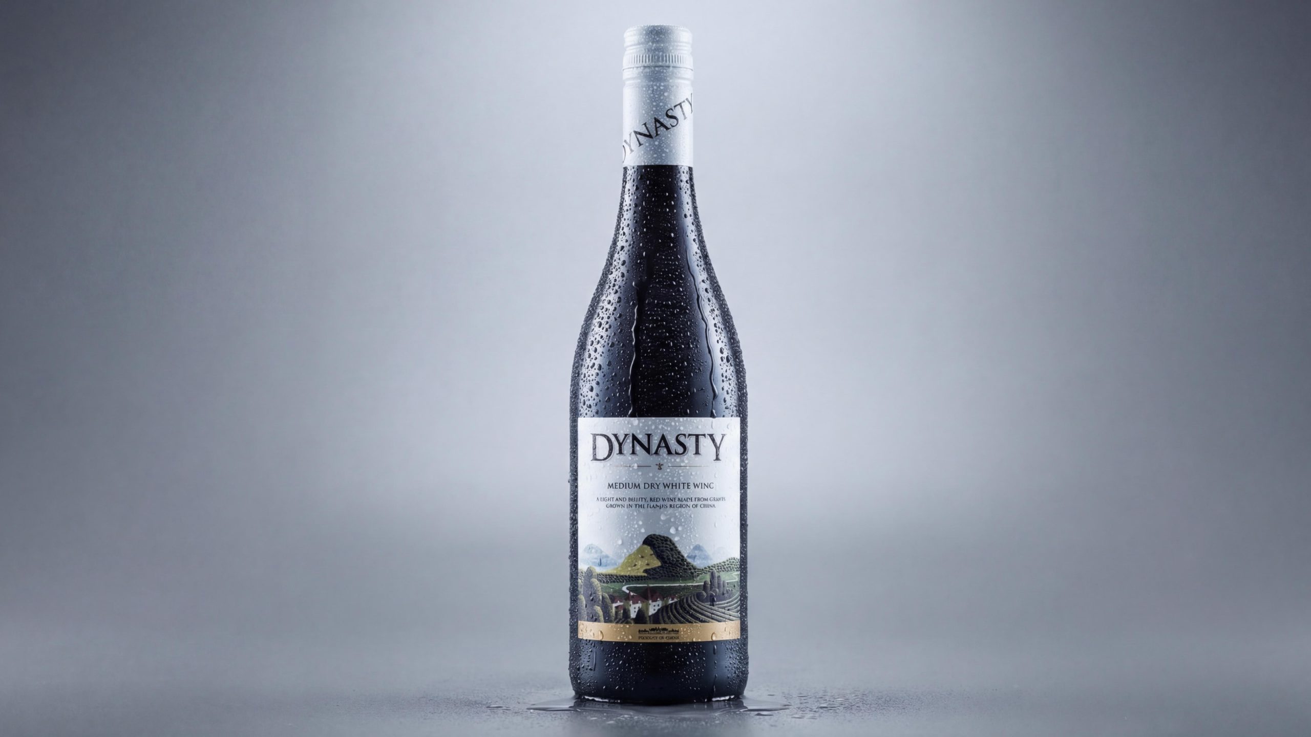
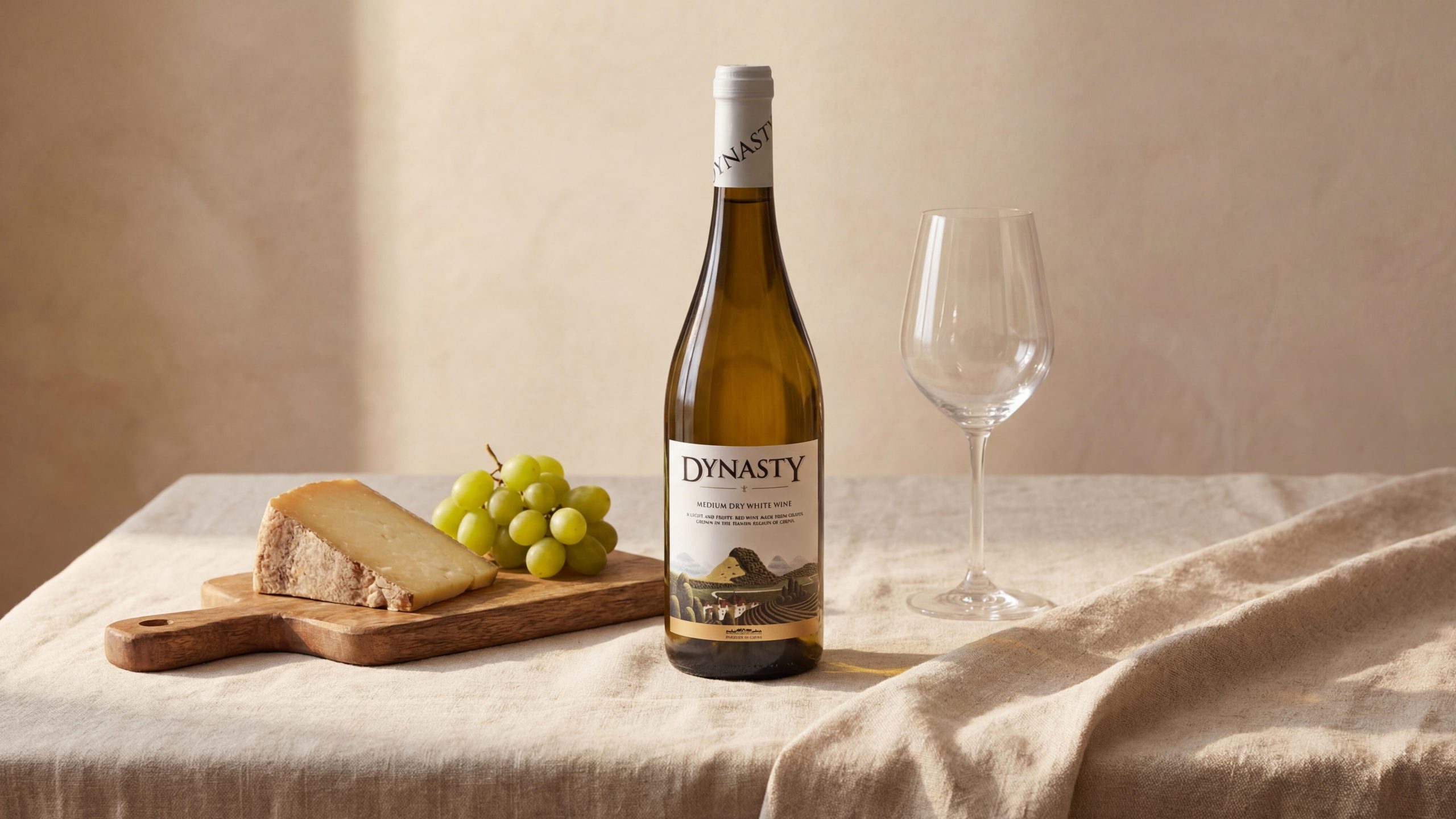
DYNASTY's packaging system uses the standard 750ml Bordeaux bottle as the core carrier, and uses sophisticated label printing technology and differentiated bottle cap colors to complete the visual expression of the product line:
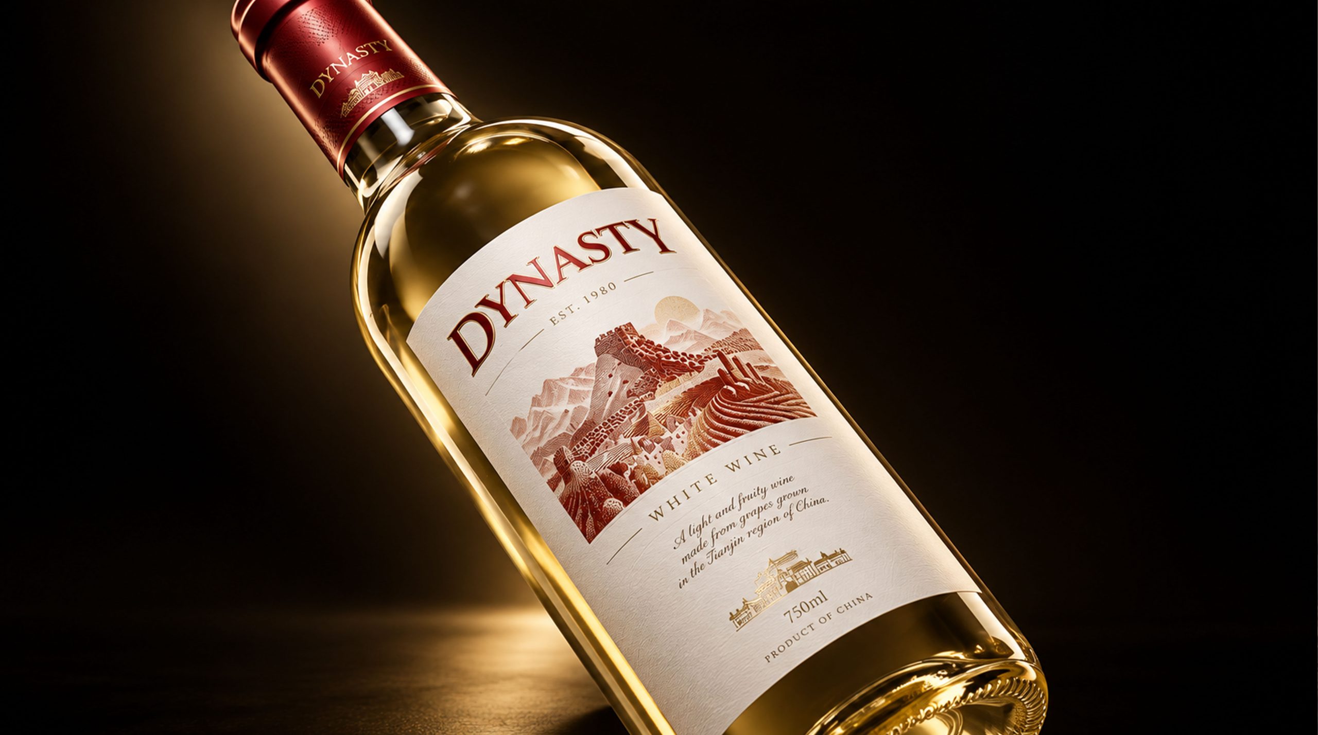
Bottle body: A standard 750ml Bordelaise-shaped dark green glass bottle with slender longitudinal lines and rounded shoulders. The bottom of the bottle is made with a standard scoring process. The bottle of white wine may be made of light green or transparent glass to show the light golden luster of the liquid through the bottle wall; the standard color of red wine is dark green glass. The bottle capacity is 750ml, the height of the bottle is about 30cm, and the mouth of the bottle is sealed with a cork.
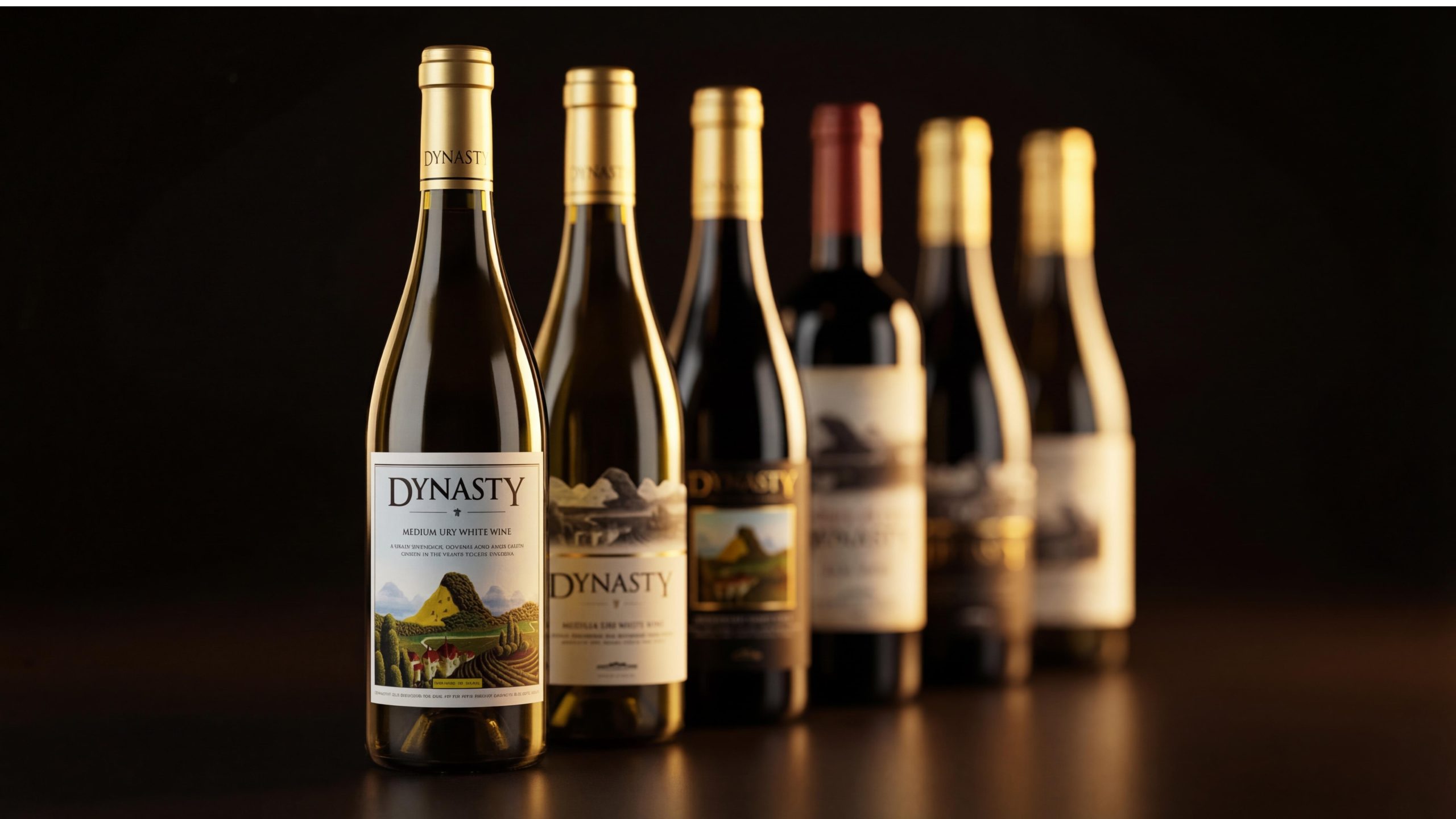
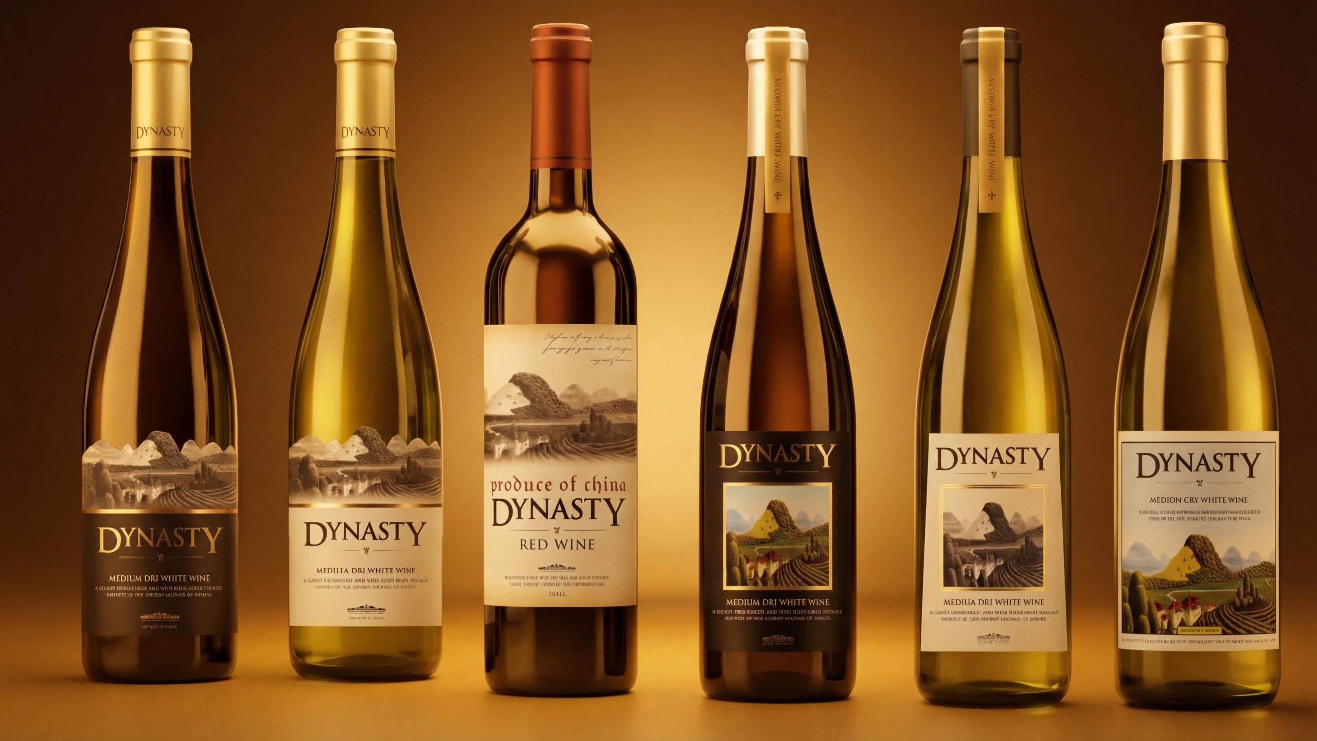
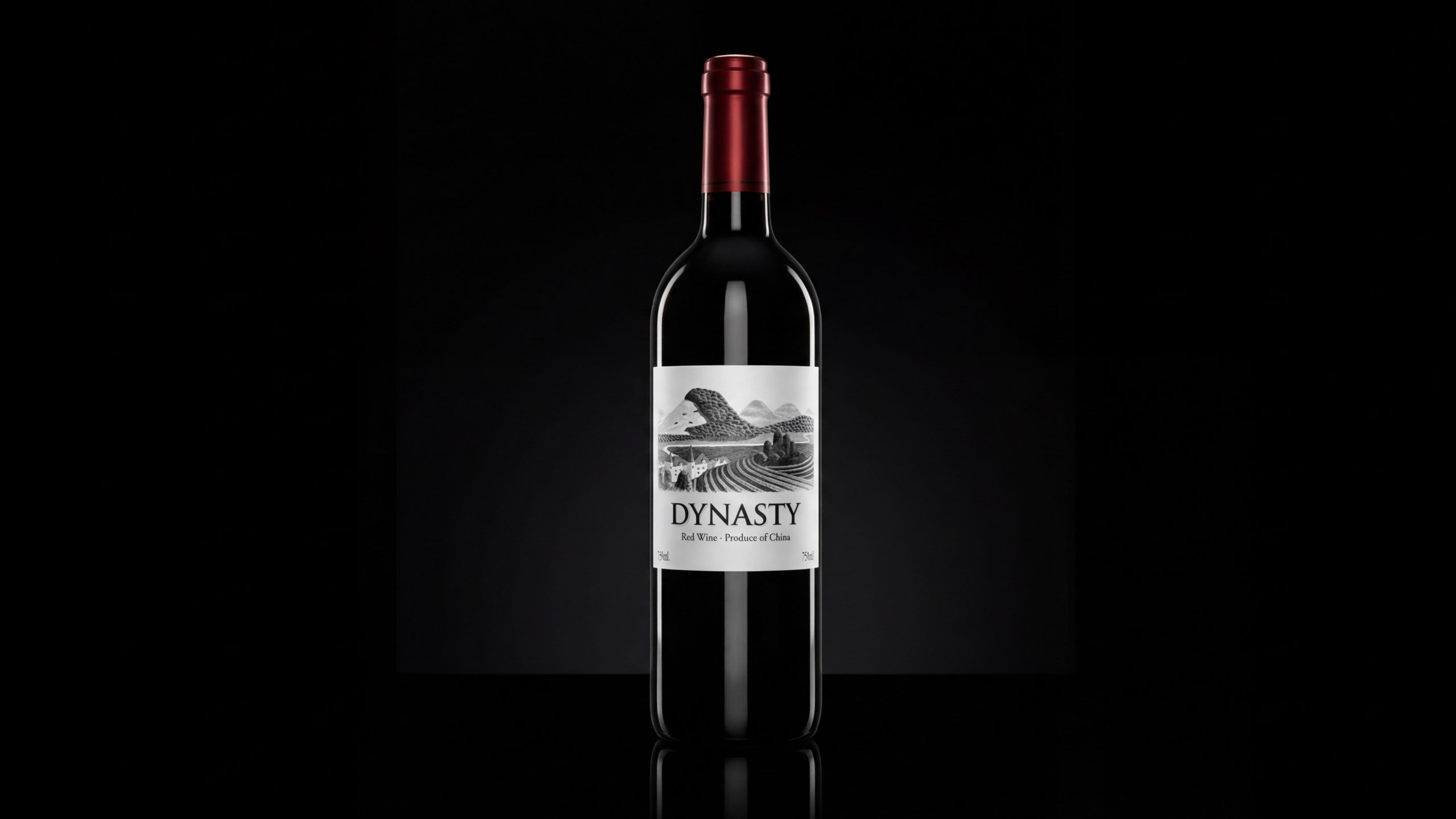
Label: The label is made of high-whiteness cloth paper as the base material. The paper surface has a subtle longitudinal fabric texture. The touch is between paper and cloth, giving the label a "handicraft" texture that goes beyond ordinary coated paper. The label size is estimated to be about 10cm × 8cm, which is relatively long vertically. The custom illustrations in the upper half are completed with high-precision multi-color offset printing. The color version is presumably printed with more than six colors (CMYK + spot color gold + local craftsmanship) to ensure that the green-gold gradient of the mountains and the detailed colors of the harvest figures reach the restoration accuracy of artistic printing. The black-and-white version is completed with monochrome black ink + multi-level grayscale printing, which requires extremely high dot accuracy to ensure that the transition zone of grayscale is delicate but not rough. The golden thin line between the illustration and the text area is printed with spot-color gold ink or hot stamping process, with a line width of about 0.3mm, maintaining gloss and precision despite the rough texture of the textured paper. The "DYNASTY" brand name is presumably completed using a gravure printing or hot stamping process. The letters are slightly recessed on the paper, and a subtle three-dimensional effect can be perceived under side light. The edge of the label is micro-cut or pressed, and the edge is smooth but not rough, giving it a precise handcrafted feel.
Bottle cap: The bottle cap is made of aluminum rubber cap (screw cap type or heat shrink type) that wraps the bottle mouth and cork. The white wine version is mainly made of gold aluminum caps, and the word "DYNASTY" is embossed on the surface. The warm luster of gold is consistent with the warm tones of the color illustrations; the red wine version is mainly made of dark red aluminum caps, and the depth of the red creates color tension with the coldness of the black and white illustrations; some sub-lines are matched with silver aluminum caps. The color choice of the bottle cap is the first visual signal for consumers to identify red/white wine from a distance on the shelf - a gold cap is white, a red cap is red, simple and intuitive.
Back label: The back label on the back of the bottle is presumably printed on the same textured paper, carrying information about the origin, variety description, year, alcohol content, content, manufacturer information, barcode and other regulatory requirements. The format is simple and regular, continuing the font and color system of the front label.
Tone of Voice
The text language of DYNASTY runs through the calm and restrained style of a "winery owner" - no chatter, no noise, no title for yourself, just like a person who has been standing in the vineyard all his life, and does not need to prove to anyone how good his wine is - you will know it when you drink it.
The brand name "DYNASTY" is presented in pure English, without the Chinese word "DYNASTY" attached to the front of the label - this choice implies that the brand places itself in the aesthetic context of international wines, rather than the local context of domestic wines. The word choice of the English name itself has completed the entire brand narrative: "DYNASTY" - dynasty, history, inheritance, dignity. One word is a complete brand universe.
The wine body type labels "MEDIUM DRY WHITE WINE", "Red Wine · Produce of China" and "WHITE WINE" are presented in the standard format of international wine labels, with a standardized and restrained tone. The words "MEDIUM DRY" define the sugar content style of the wine in the most precise professional terms, without making any perceptual modifications.
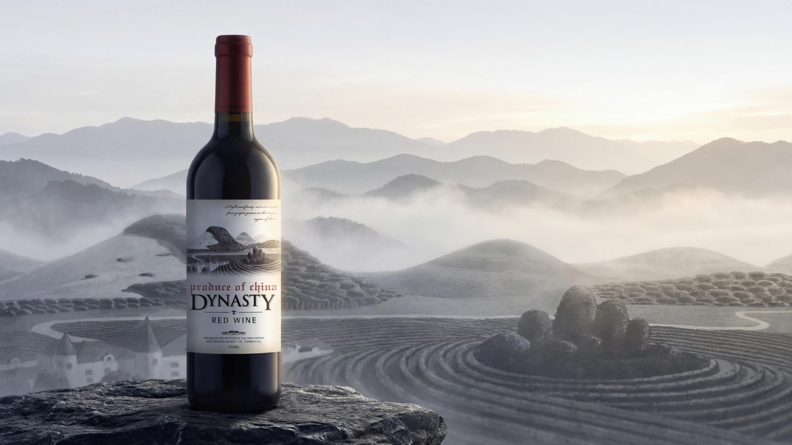
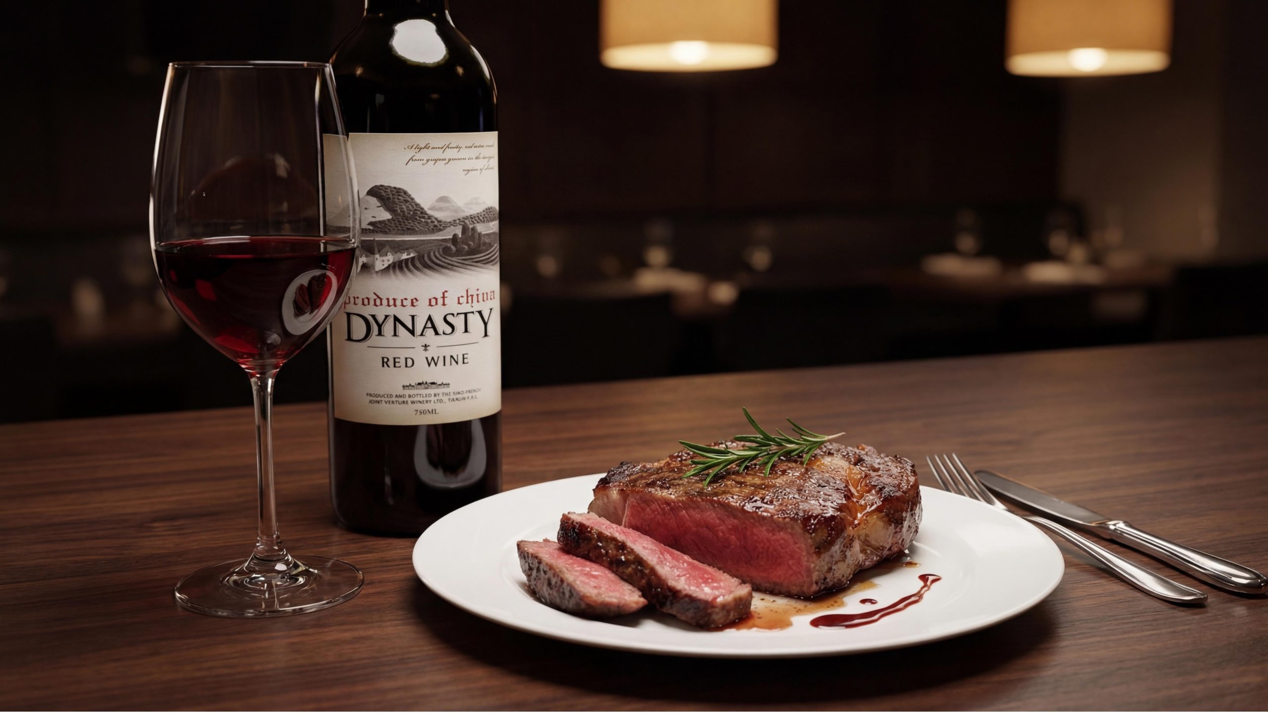
The terroir description text "A light and fruity red wine made from grapes grown in the Tianjin region of China" is the only "narrative" element in the entire text system. It is presented in italic serif type and the font size is very small, just like a whisper left by the owner of the winery on the bottle. "Light and fruity" uses the simplest two adjectives to describe the taste, and "made from grapes grown in the Tianjin region of China" uses the most precise geographical labeling to complete the statement of origin. This sentence is not sexy or exaggerated. It does not say "extreme", "rare" or "top". It just calmly states a fact - and this calmness itself is the greatest confidence.
The four words "PRODUCE OF CHINA" are placed at the bottom of the label in very small fonts, like a seal of origin. In a market environment where domestic wines generally avoid labeling of origin, DYNASTY puts "China" on the label in the most unavoidable way - an attitude that transcends the binary opposition of "domestic vs. imported": I do not avoid my place of origin, because my place of origin is my pride.
Brand Experience
DYNASTY has built a complete "terroir journey" experience for consumers from three dimensions: visual, tactile and ritual - solemn, quiet, like opening a vineyard landscape:
Visual experience: DYNASTY’s label is a notable “narrative outlier” on the wine shelf. Among wine labels that are dominated by heraldry, architectural photos, abstract graphics or pure text, a narrative illustration of a complete scene is embedded in the bottle like a miniature oil painting - the complete narrative of mountains, fields, people and clouds allows consumers to "read" the label, not just "see" it. When white wine and red wine are juxtaposed, the color version and the black and white version of the same painting are like the two faces of the same vineyard under sunlight and moonlight - this "same painting in two colors" strategy makes the two bottles of wine form a natural "pair" relationship visually, encouraging consumers to purchase as a pair. The color contrast between the gold bottle cap and the red bottle cap is the first signal to identify red/white wine from a distance.
Tactile experience: The texture of the label's textured paper is the core of the tactile experience - when your fingertips touch the surface of the label, you can feel the subtle longitudinal fabric texture. This tactile feeling goes beyond the smoothness of ordinary coated paper labels and conveys tactile cues of "handmade", "natural" and "precision workmanship". If the "DYNASTY" brand name is printed in gravure, you can feel the slight depression of the letters when your fingertips pass over them, just like touching an autographed letter. The glass touch of the bottle body provides the unique coolness and weight of a wine bottle, and the rounded curve of the bottle shoulder conveys a "trustworthy volume" in the palm of the hand. The cold micro-touch of the bottle cap’s aluminum material and the slightly convex texture of the embossed words provide precise tactile feedback when fingers rotate the bottle cap.
Ritual experience: DYNASTY's bottle opening ceremony is based on the "painting style" as the emotional prototype. When a consumer takes a bottle of DYNASTY off the shelf and flips it over to look at the label, the narrative scene of the custom illustration gradually unfolds in front of his eyes - the mountains in the distance, the terraces in the middle ground, and the harvesting figures nearby, like a panoramic painting of a vineyard slowly unfolding in his hand. This “painting-reading” experience adds a unique emotional dimension to purchasing decisions—consumers are not just choosing a bottle of wine, but also choosing a painting, a story, and a valley. The series of actions of unscrewing the aluminum cap and pulling out the cork when opening a bottle is the most classic ritual sequence in wine culture, and DYNASTY adds a unique meaning to this ritual with the narrative of terroir illustrations: What you open is not just a bottle of wine, but a bottle of liquid containing the sunshine, land and human hands of the Chinese valley.
Brand Statement
A painting, a vineyard. The mountains are missing, people are harvesting them, and the wine is in bottles. DYNASTY takes the terroir of the Tianjin production area in China as the brand foundation, uses a narrative custom illustration that combines mountains, terraces and harvesting figures as the visual soul, uses "DYNASTY" in customized serif capital fonts as the visual anchor of the brand's dignity, and uses the "two colors on the same painting" strategy of color and black and white versions to complete the unification and differentiation of the red and white lines. It does not say "top", but instead draws a mountain, a field, and a group of people bending over to pick. It does not say "inheritance," but calls its name "Dynasty." It does not say "Chinese wine," but calmly writes "PRODUCE OF CHINA" at the bottom of the label. Every bottle of DYNASTY is a liquid continuation of a local painting - mountains watch over the gaps, people pick among the vines, and the wine is in the bottle in your hand.