










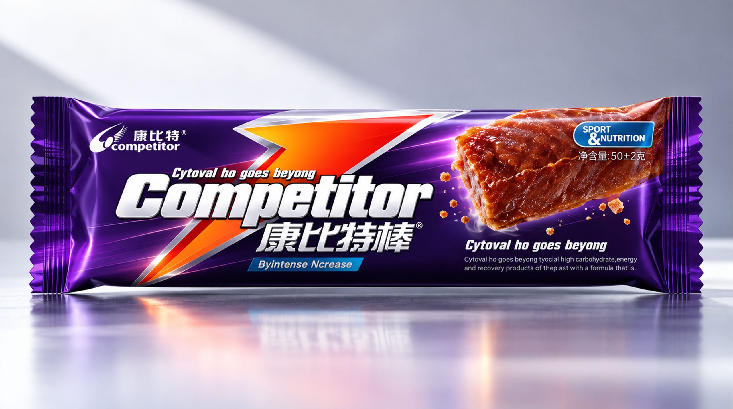
COMPETITOR is a brand with sports nutrition, energy supplement and professional health as its core. It is committed to providing scientific, convenient and efficient nutritional products for sports people. The brand targets various scenarios such as fitness, training, outdoor sports and high-intensity work. It combines nutritional science with modern sports lifestyle to convey a positive, healthy and continuous breakthrough brand image.
This packaging design takes "sports energy, nutritional supplement, and self-breakthrough" as the core. Through dark technological background, strong color light strips and eye-catching product images, it highlights the brand characteristics of Kangbite's professionalism, vitality and high performance.
Brand spirit
Combit’s brand spirit can be summarized as:
Energy × Movement × Breakthrough
Science × Nutrition × Vitality
Energy represents the nutritional support provided by Kangbit for sports status. Sports reflects the brand's positive and healthy life attitude, while breakthrough symbolizes consumers' continuous transcendence of themselves and challenging their limits. Science and nutrition reflect Combit's professional capabilities in the field of sports nutrition, while vitality conveys the brand's youthful, enterprising and action-packed temperament.
design concept
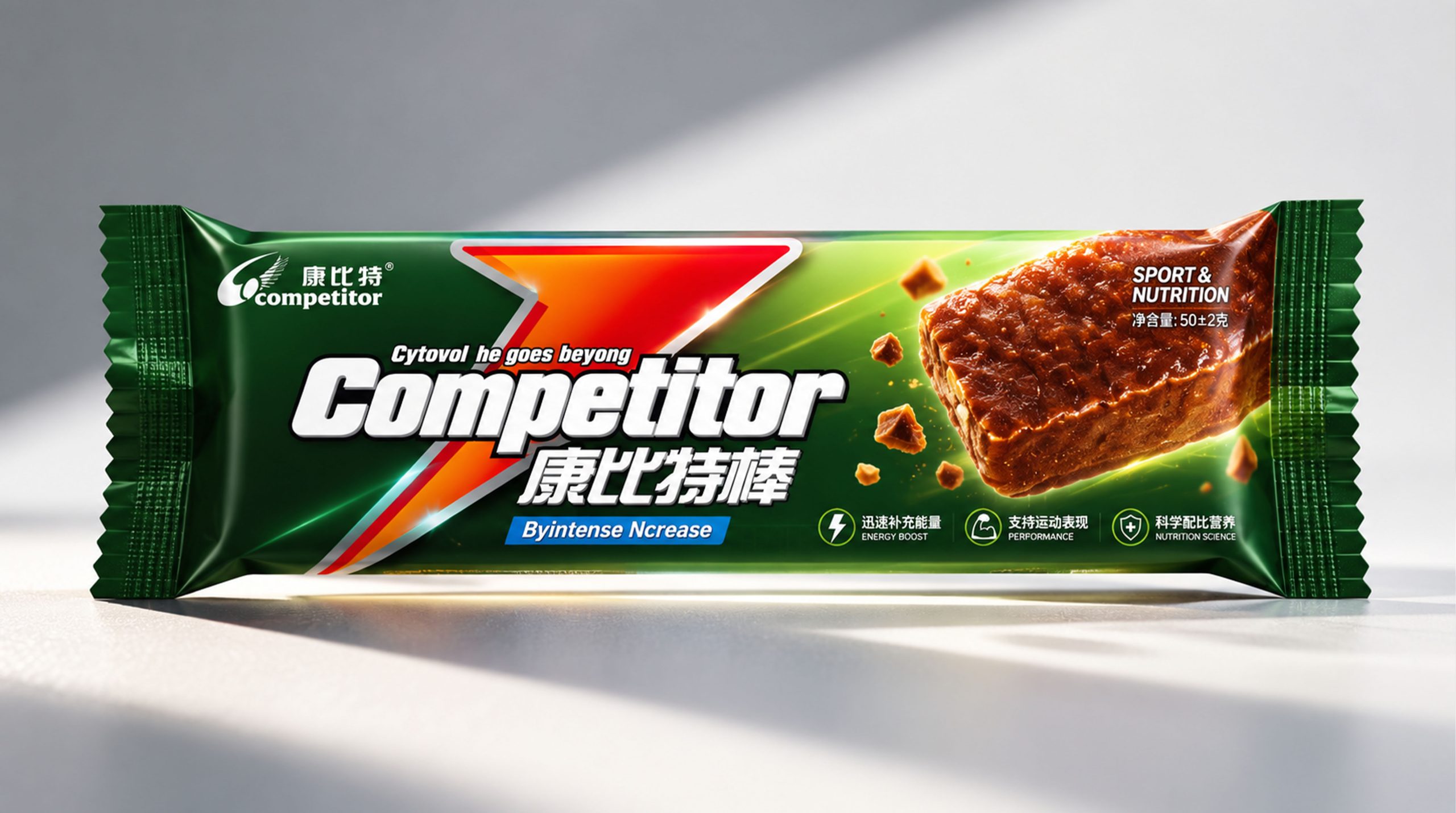
Combite's brand philosophy can be expressed through "professional nutrition × sports passion". The packaging design is inspired by the speed of movement and energy release, and uses diagonal lines, arrow structures and colorful light effects to express the process of rapid energy transfer and continuous improvement of sports status. The product image serves as the visual center of the packaging, highlighting the real texture and eating experience of the energy bar. The purple, green, red and orange light bands intersect with each other to form a strong dynamic relationship, symbolizing the brand value of Combit that constantly breaks through the boundaries of sports and helps consumers stay active.
visual language
Color and structure:
Purple represents technology, professionalism and power; green symbolizes health, nature and nutrition; red and orange reflect speed, enthusiasm and energy. The dark background contrasts sharply with the high-gloss light strips, enhancing the visual recognition of Combit products on shelves and in sports scenes.
Logo and Graphics:
The front of the package takes the COMPETITOR brand logo as the core. The Chinese "COMPETITOR" and the English "COMPETITOR" together form the brand identity. Arrows, streamlines and geometric sections symbolize forwardness, speed and breakthrough, reflecting Compet’s brand positioning of serving sports people and supporting continuous performance.
Fonts and typography:
"COMPETITOR" is presented in an eye-catching font to enhance the recognition of the brand name; "COMPETITOR" is used as an English auxiliary name to convey a sense of internationalization and professionalism. Product names and sports nutrition information are typed in bold or italic fonts to create a visual effect with a sense of speed and power.
language and tone
Combite's brand language emphasizes directness, professionalism and action. The copywriting revolves around keywords such as "sports nutrition", "energy supply", "improving performance" and "breaking through limits", clearly conveying product functions and brand value. English auxiliary copywriting such as "SPORT & NUTRITION", "ENERGY BOOST", "BEYOND YOUR LIMITS", etc., strengthens Combit's sports attributes and international image. The overall language is concise and powerful, reflecting the brand's professional, positive and efficient communication style.
Brand Experience
Combite product packaging adopts bright colors, clear information and portable structure, and is suitable for scenarios such as fitness training, outdoor sports, event supplies and daily energy supplements. The combination of real-life images of energy bars and dynamic light strips allows consumers to intuitively feel the energy and nutritional value of the product. In gyms, sports events, outdoor activities and digital platforms, Combit can continue the purple, green, red light strips and arrow graphics to form a unified brand visual system. Through sports content, nutritional knowledge and product experience, consumers' recognition of Combit's professionalism and reliability is further enhanced.
brand statement
"Kombit, break through the limits and release energy."
Combit integrates sports passion and nutritional science through sports light effects, energy colors and professional typography. The packaging not only reflects the portability and functionality of the product, but also conveys the brand spirit of active sports, continuous progress and self-transcendence, making Combit a trustworthy nutritional supplement brand for sports people and active lifestyle consumers.