










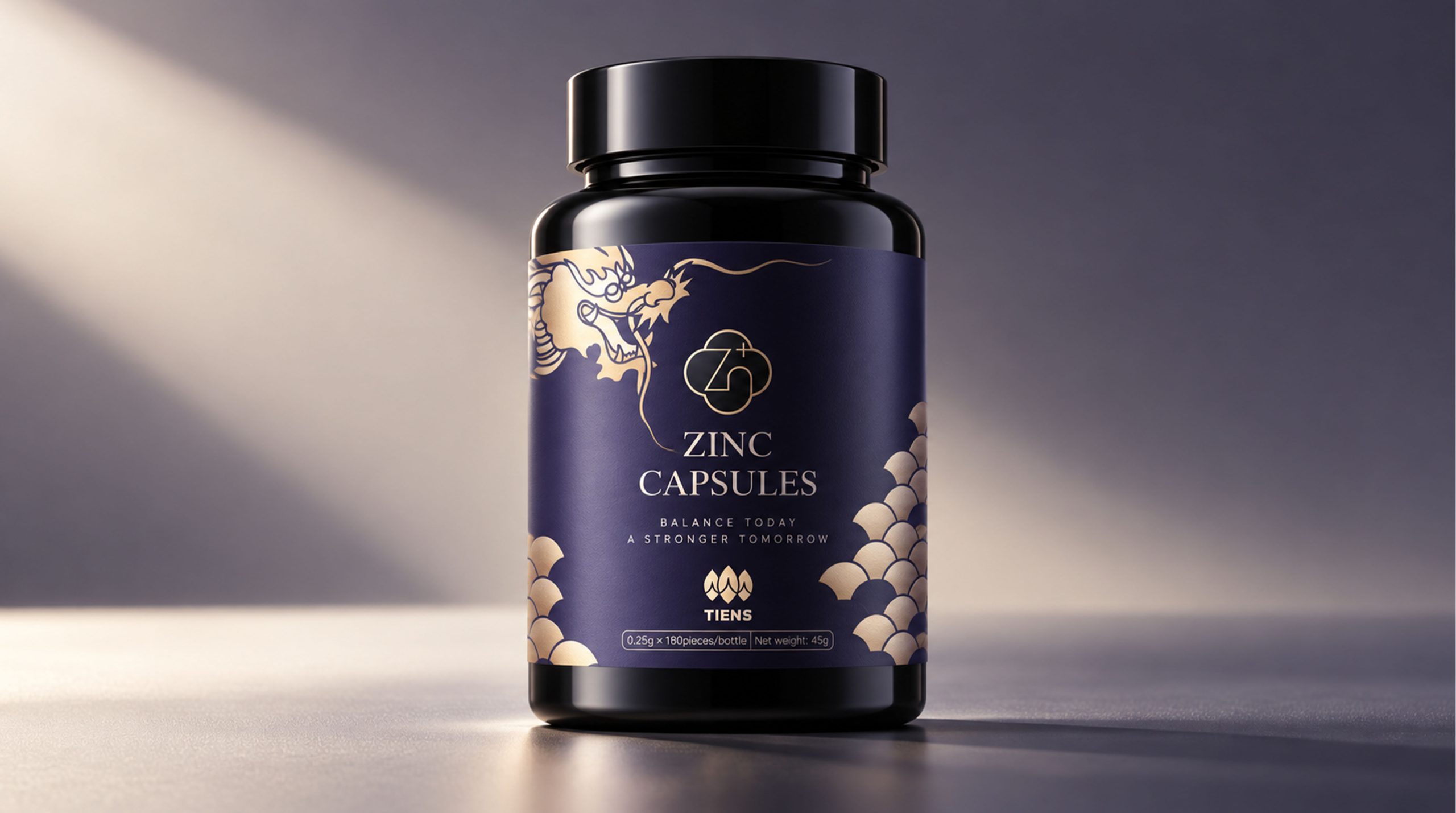
TIENS is an international brand with health products, nutritional health care and life science as its core. It is committed to combining natural resources, modern nutrition technology and healthy lifestyle. As the concept of healthy consumption continues to upgrade, brands no longer only focus on the product function itself, but also pay more attention to the cultural value, aesthetic experience and emotional temperature conveyed by the product.
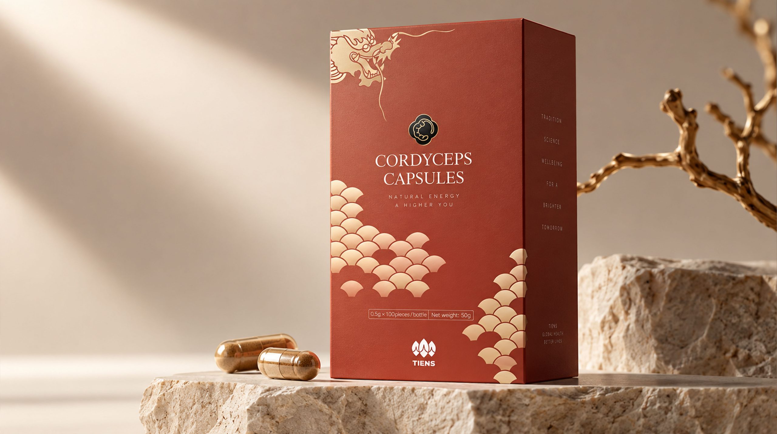
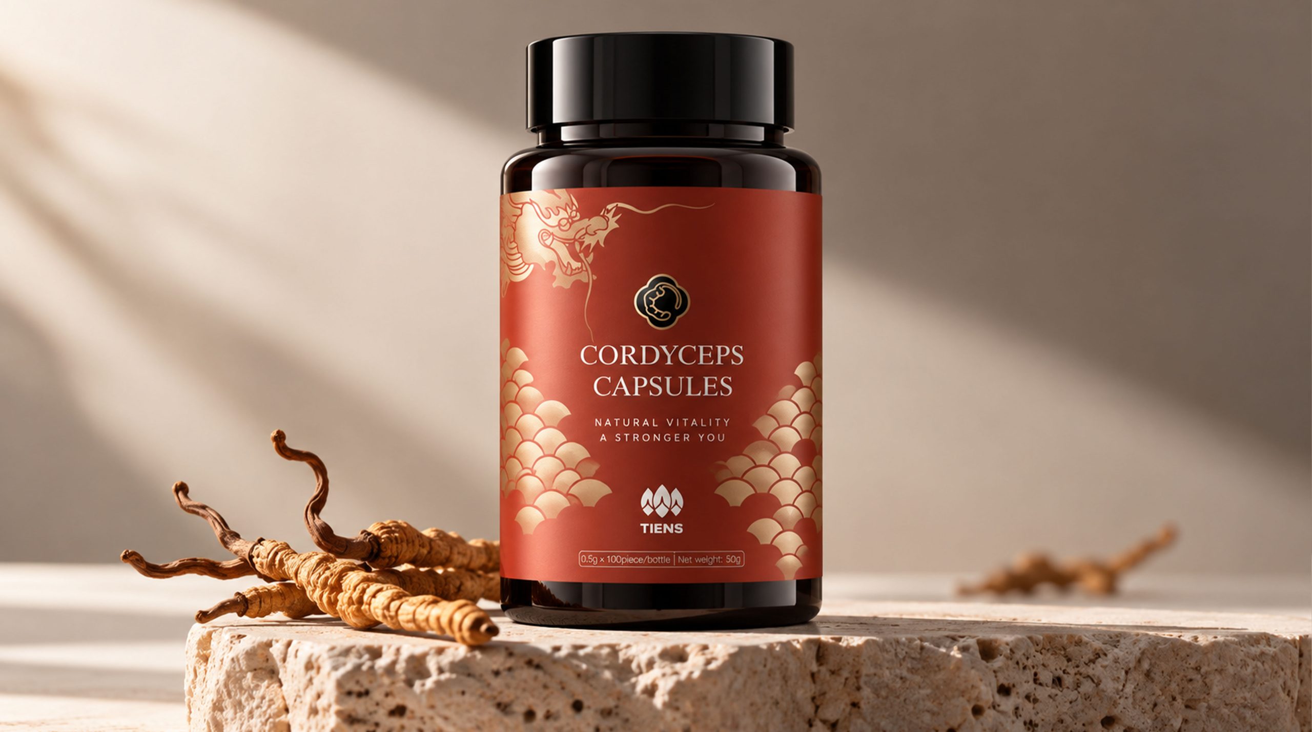
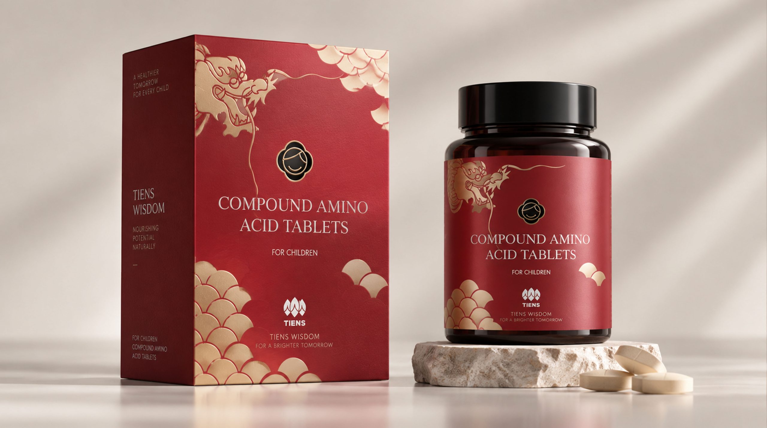
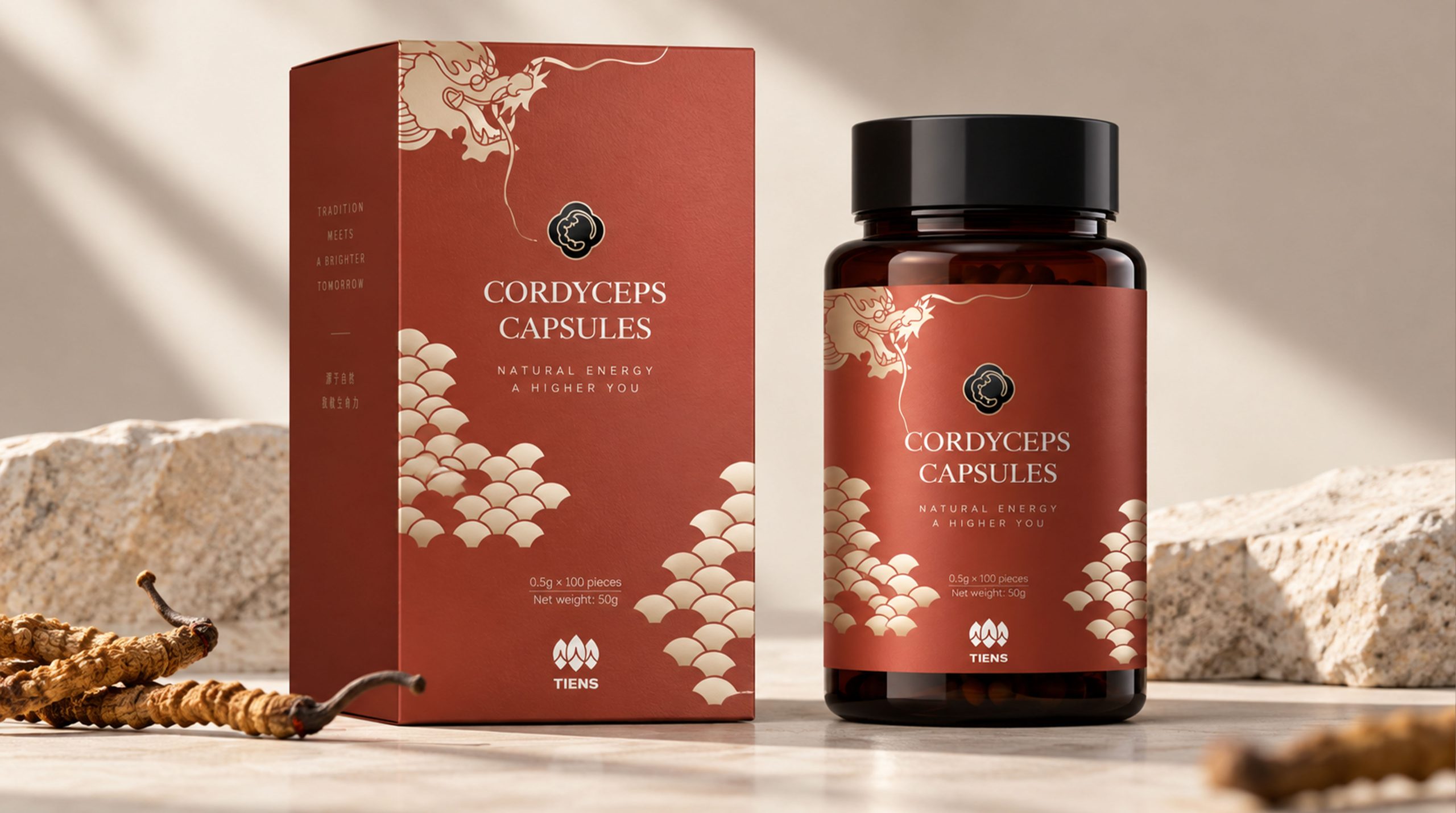
This brand visual design is based on traditional oriental culture, using plant patterns, golden line drawings, dark base plates and modern layout methods to reconstruct the brand's visual image in the health industry. The design not only emphasizes nature, professionalism and quality, but also hopes to convey a calm, restrained and oriental temperament health concept, transforming the product from a single nutritional carrier into a brand symbol that connects nature, life and physical and mental balance.
Brand spirit
The brand spirit of Tiens is based on the values of nature, quality and health care, forming a brand DNA with oriental cultural temperament and international vision.
Natural × Professional × Quality
Heritage × Technology × Healthy Life
Nature represents the source of the product and the brand's respect for the laws of life, professionalism reflects modern nutrition technology and R&D capabilities, and quality represents the brand's continued insistence on product standards, user experience and consumer trust. Heritage and technology together constitute the two forces of brand development, and healthy life is the value experience that the brand ultimately hopes to bring to consumers. The overall brand image does not pursue excessive publicity, but uses stable colors, exquisite details and culturally significant graphics to present a healthy brand temperament that is trustworthy and worthy of long-term choice.
design concept
The design concept can be summarized as "natural force × oriental order". The design hopes to establish a balance between the visual memory of traditional culture and the use needs of modern health products, so that the brand not only has cultural heritage, but also meets the aesthetic expectations of contemporary consumers for simplicity, quality and professionalism.
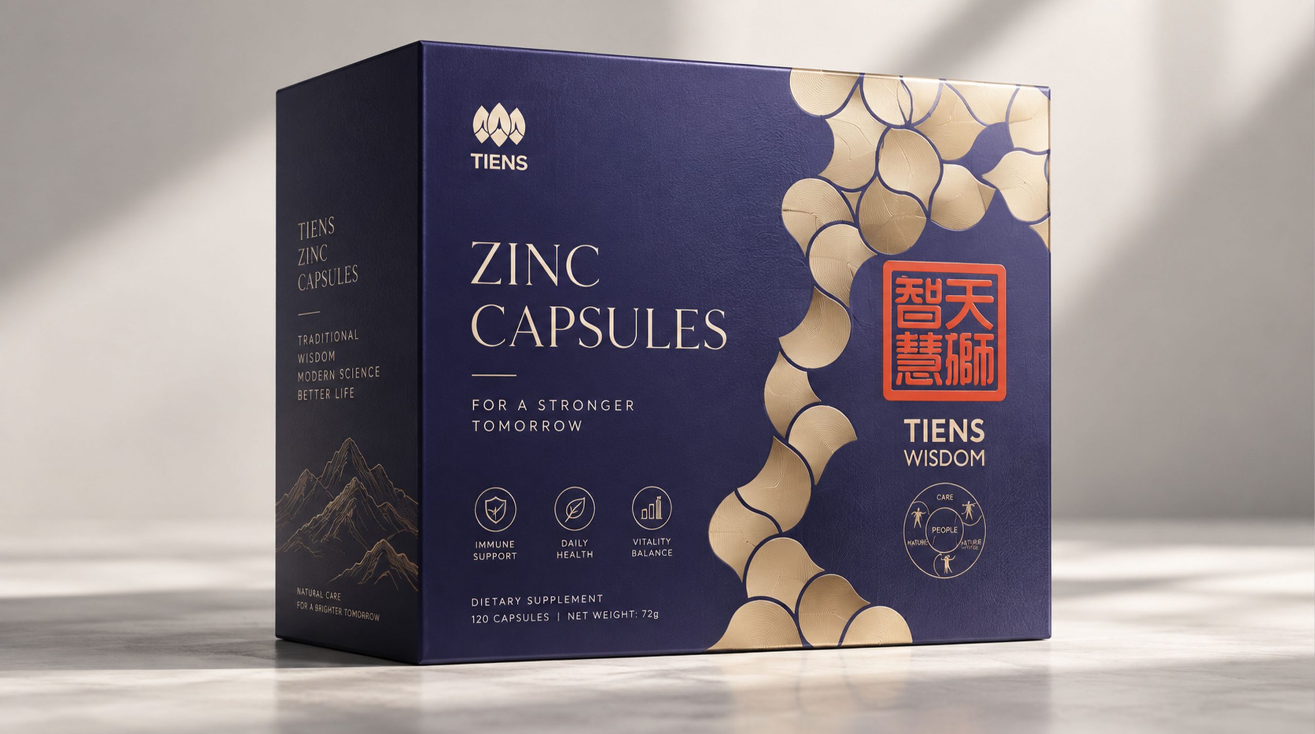
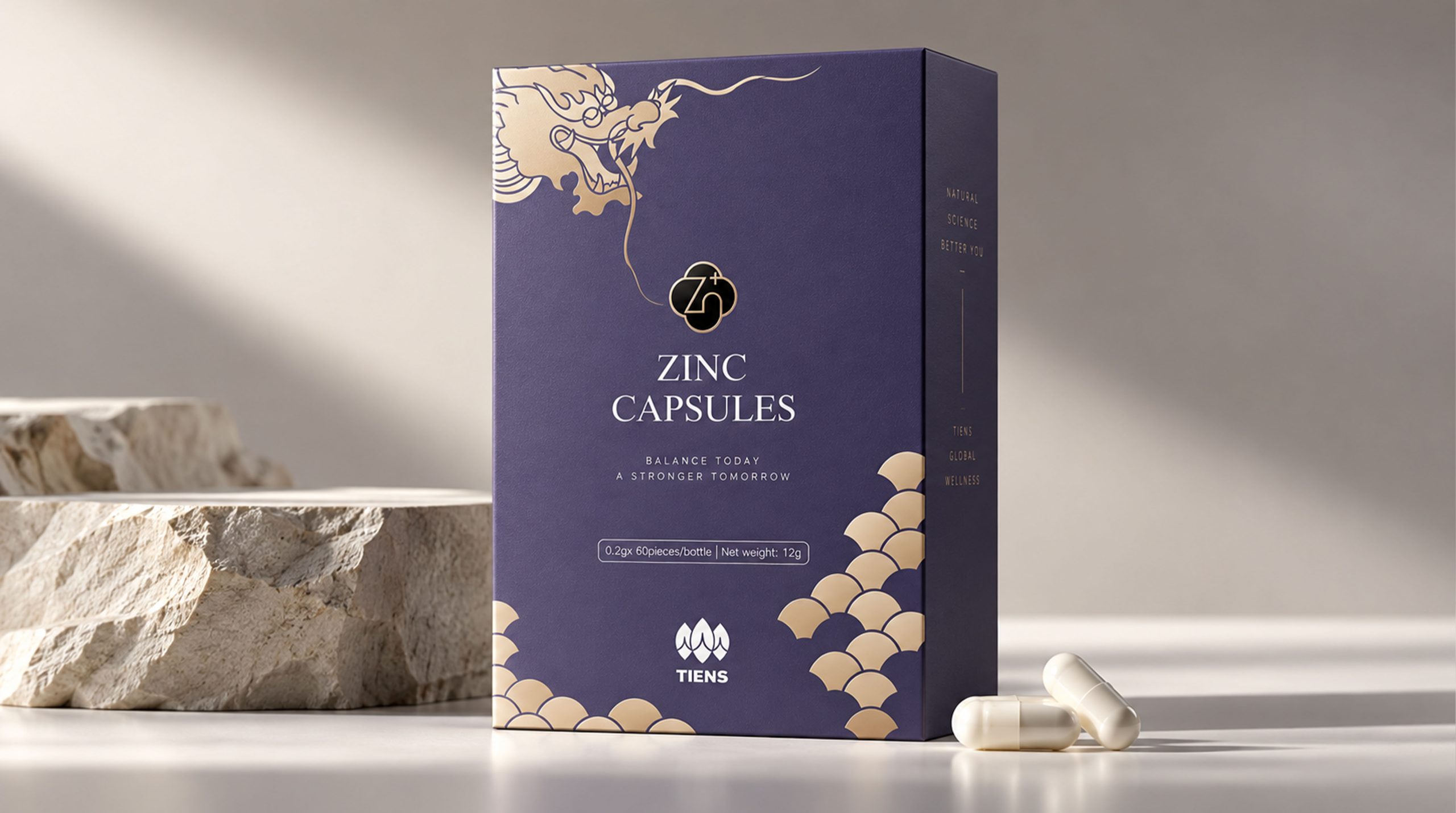
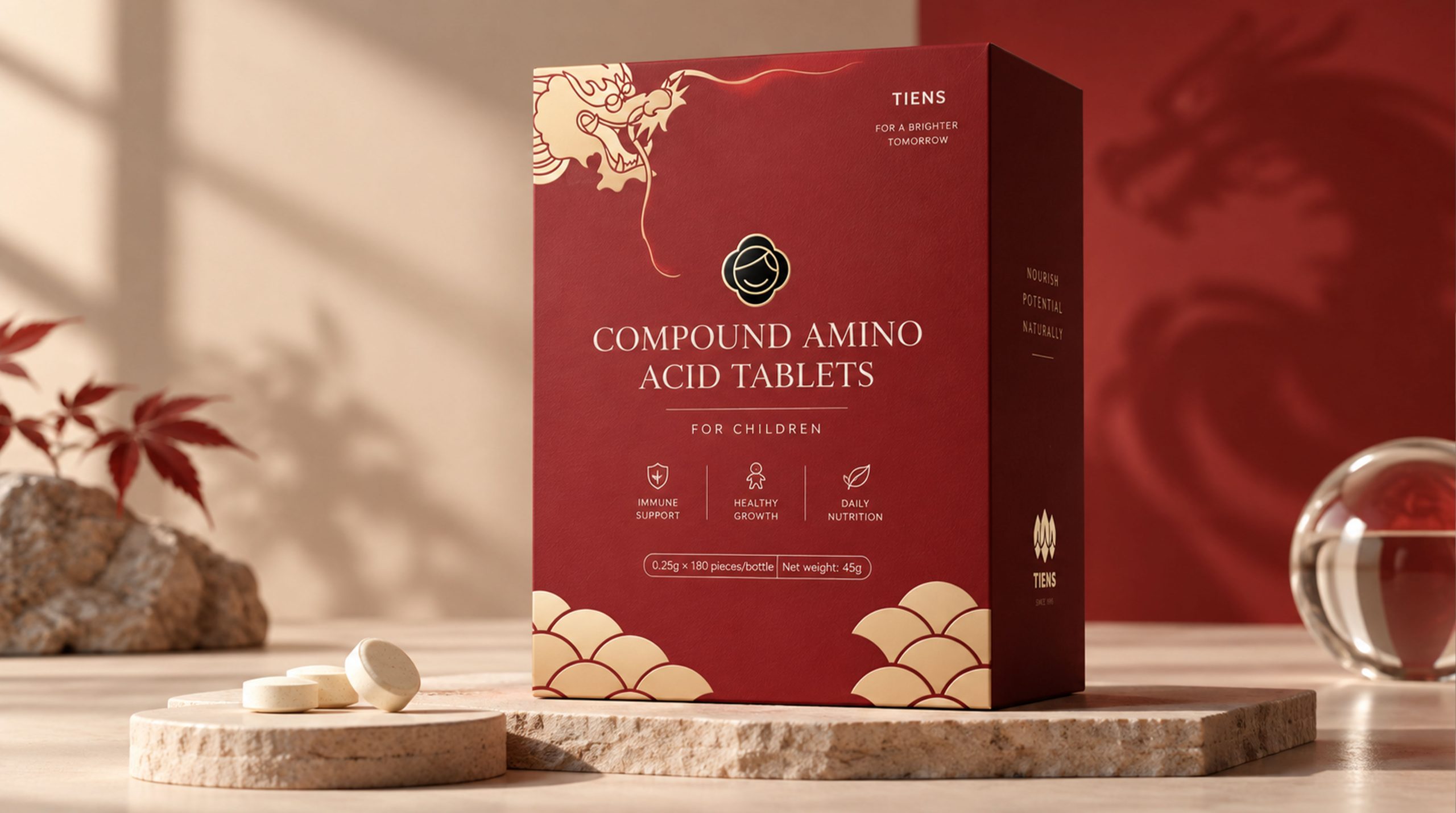
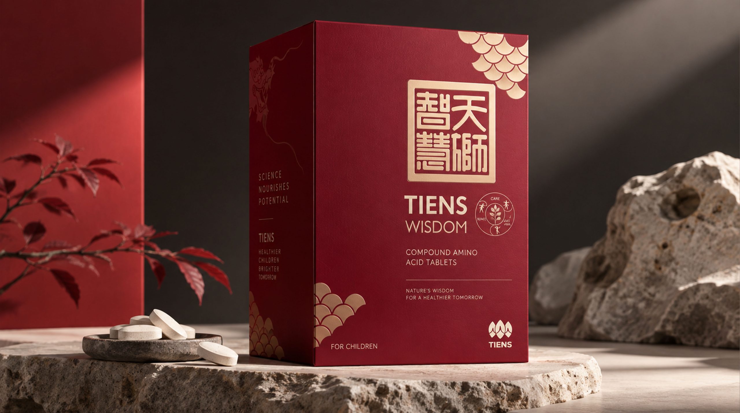
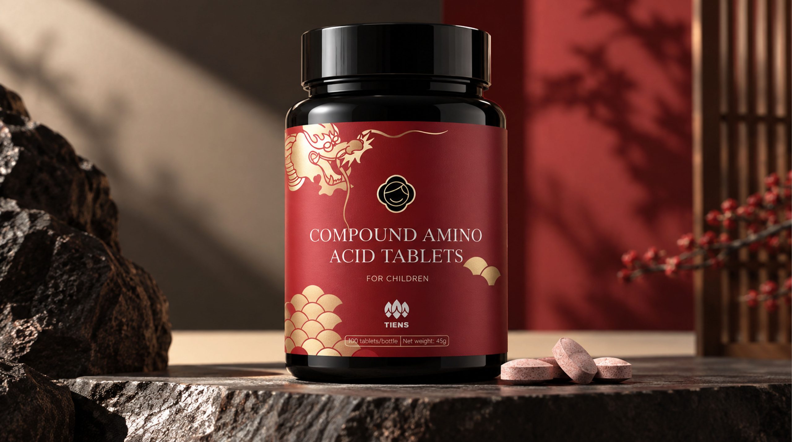
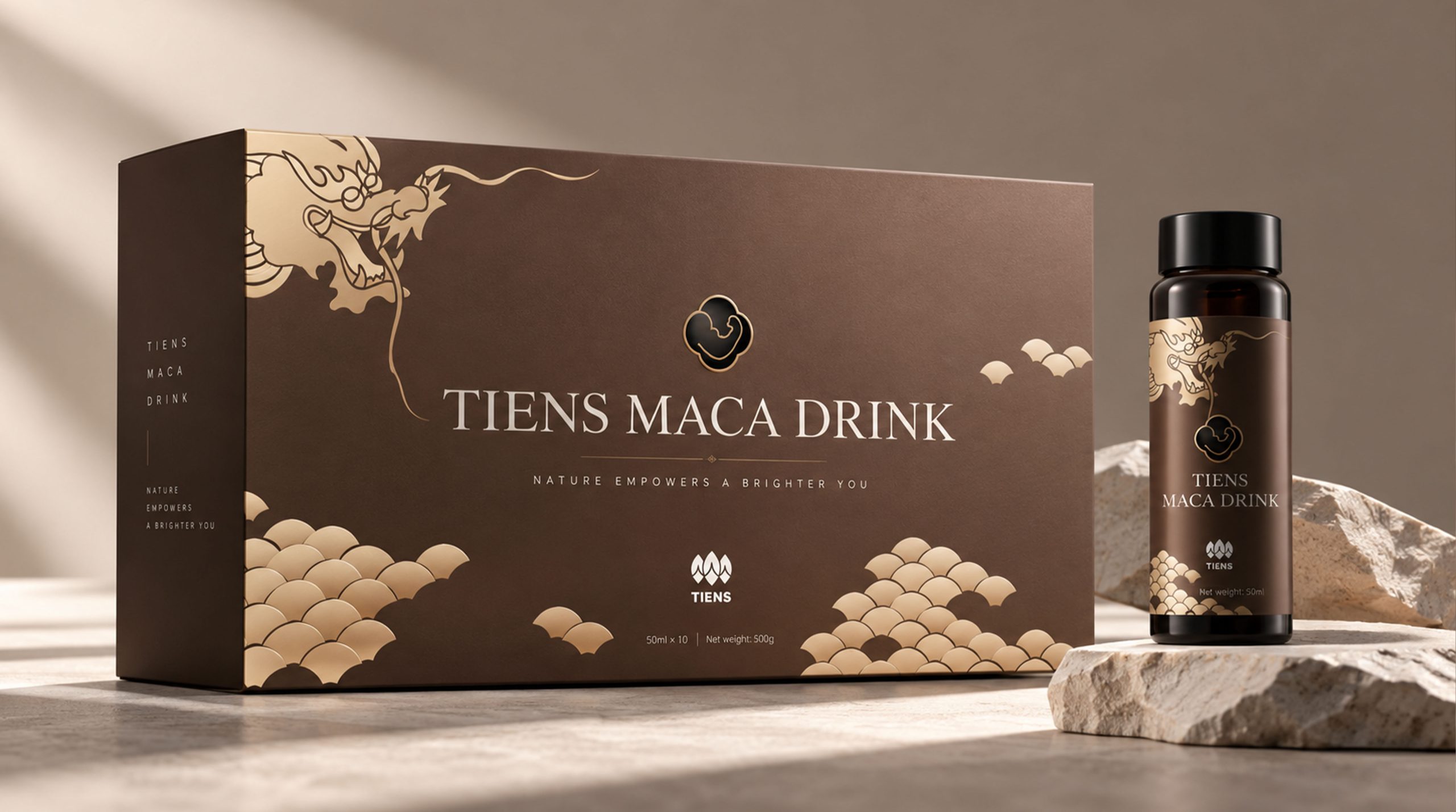
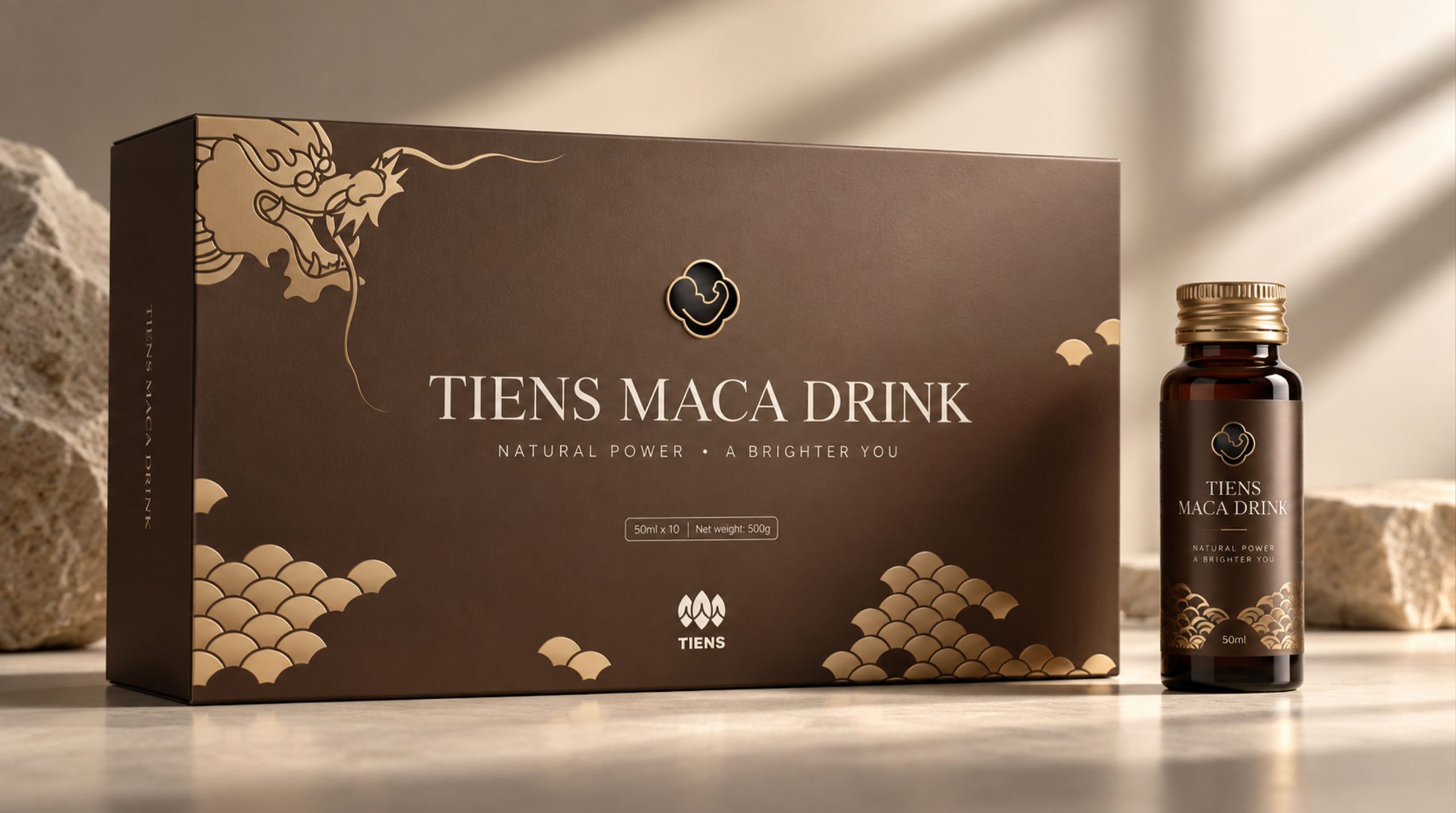
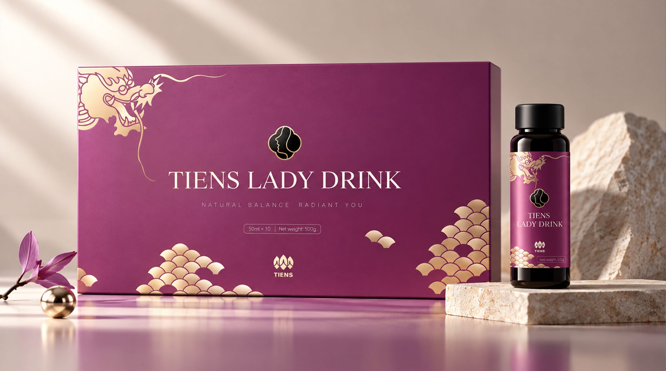
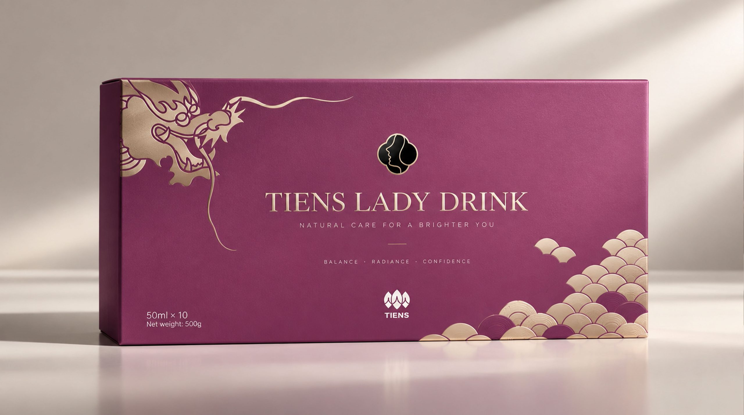
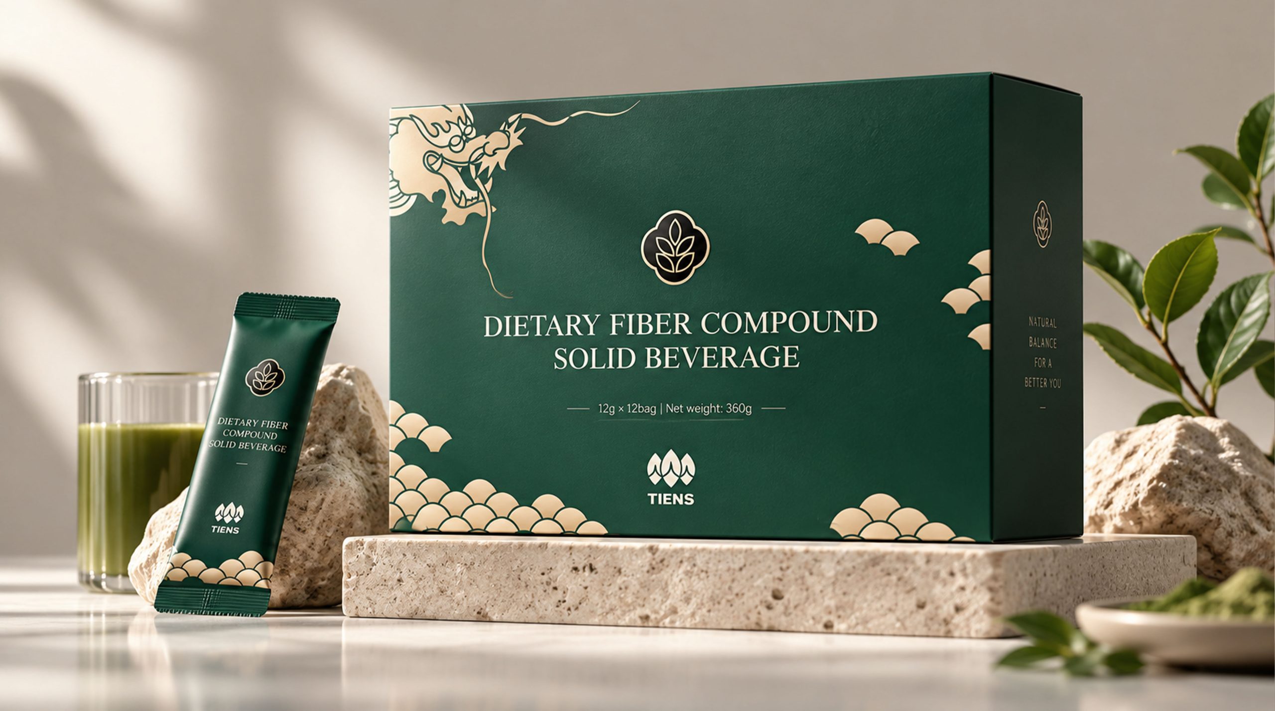
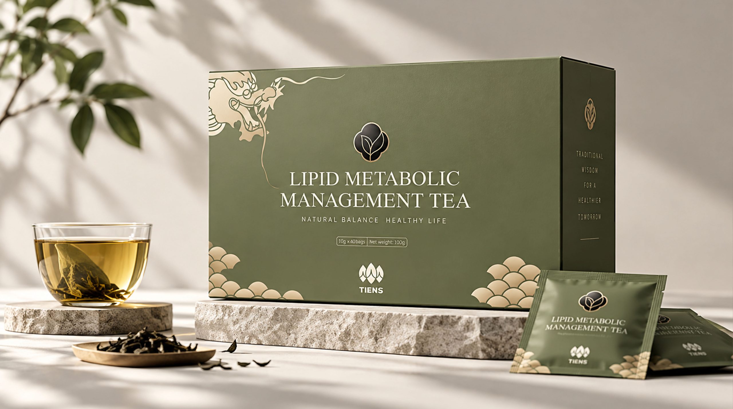
The packaging design is based on large areas of color blocks and white space, and the brand name, product information and decorative graphics are arranged in an orderly manner to build a clear and stable visual hierarchy. The central area adopts a black graphic logo with a badge-like feel to enhance the recognition and authority of the product; the surrounding plants, flowers and branches and leaves patterns represent natural growth, life cycle and healthy nourishment.
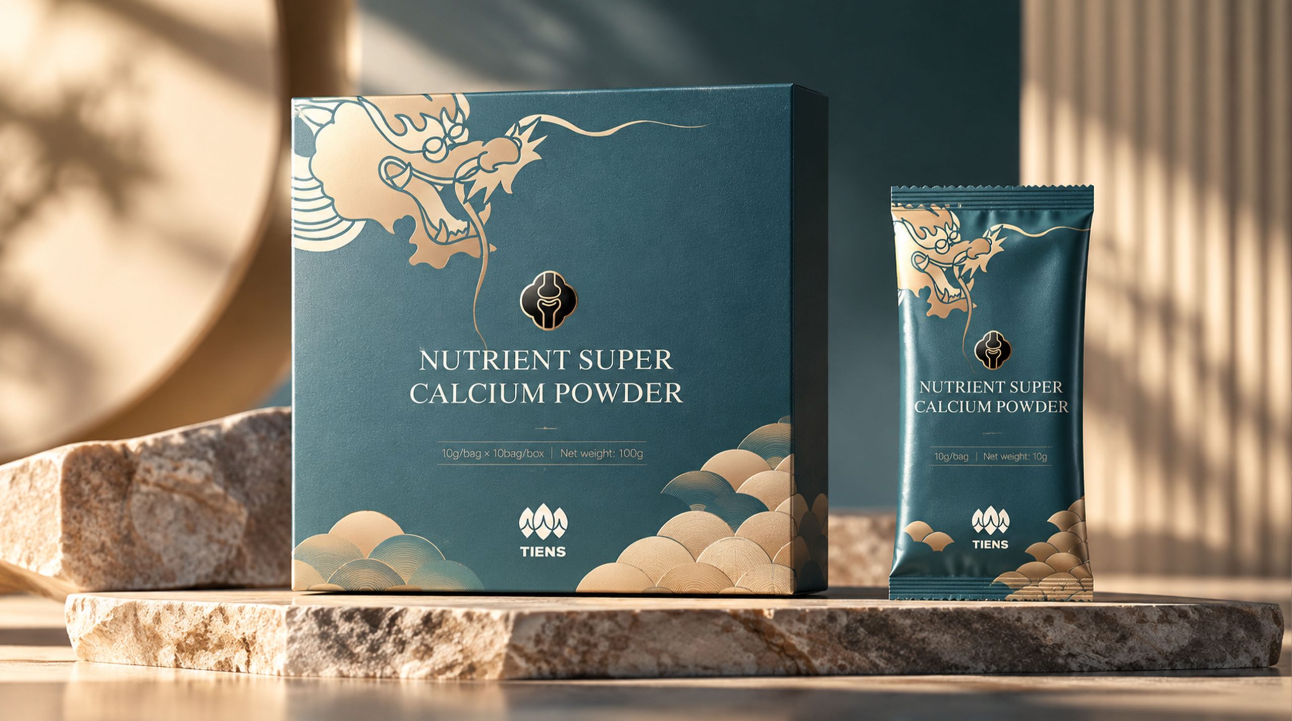
The golden line drawing in the design not only strengthens the quality of the packaging, but also conveys the preciousness of natural ingredients and the accumulation of brand value. Different colors such as red, green and brown correspond to vitality, nature and stability respectively, making different product series clearly differentiated while maintaining the consistency of the overall brand image.
visual language
Tiens' visual language follows the design principle of "modernization of traditional elements and quality of natural images".
Color and structure:
Reddish brown conveys warmth, vitality and oriental cultural temperament, reflecting the affinity of healthy products; dark green symbolizes nature, life and balance, highlighting plant origin and natural attributes; dark brown color embodies calmness, professionalism and quality, and is suitable for expressing high-end and mature product positioning. The use of gold as an auxiliary color not only enhances visual sophistication, but also gives the packaging a certain sense of elegance and preciousness.
Logo and Graphics:
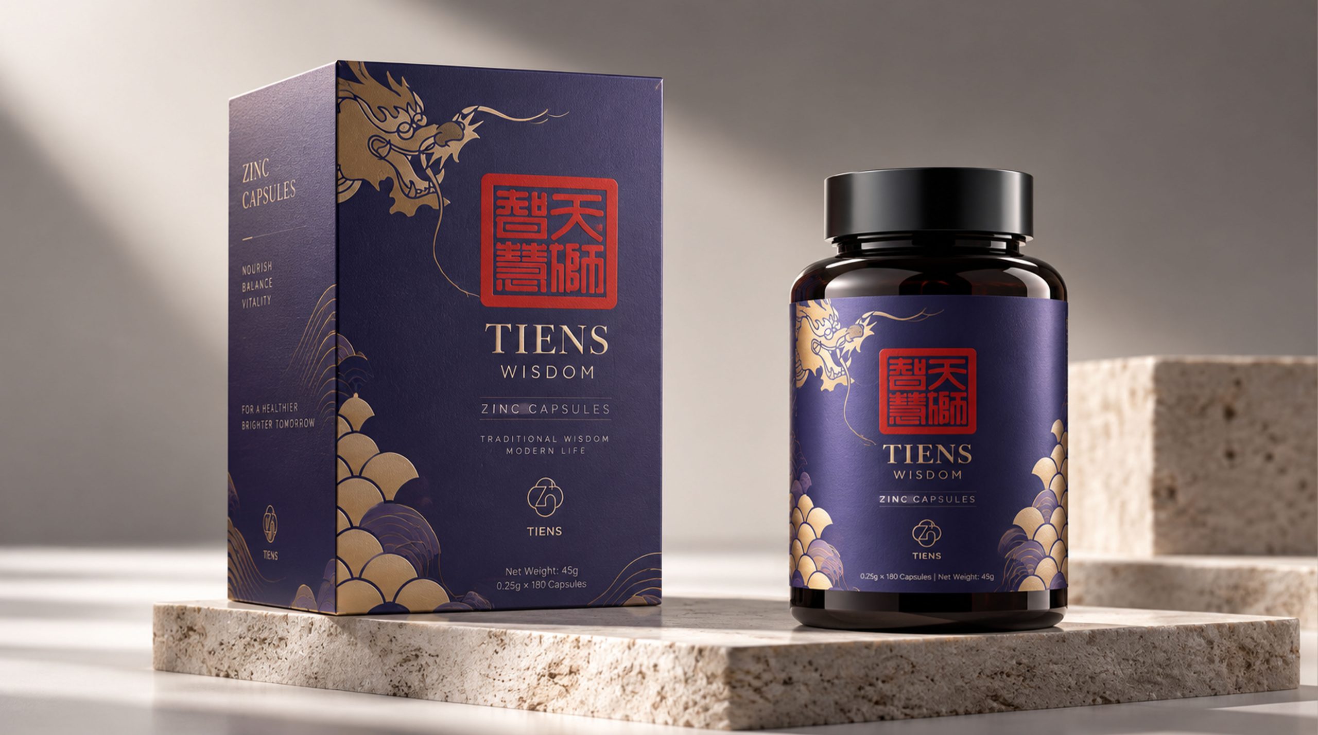
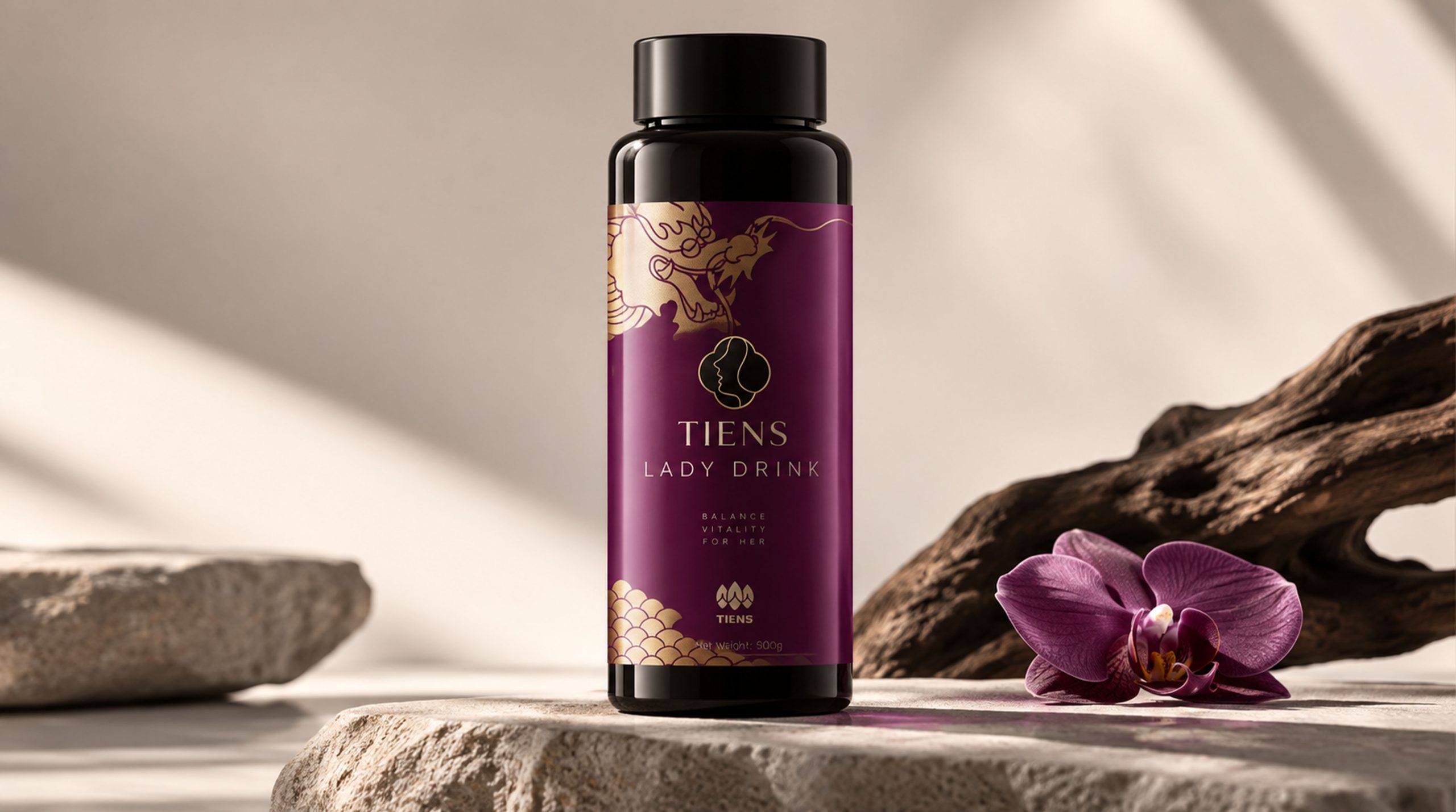
The central badge graphic is carried on a black or dark background, and gold lines are used to outline internal patterns with plants, characters or life symbols, forming a clear and memorable brand identity. The peripheral flowers, leaves and continuous patterns are drawn from traditional oriental decorative arts. After being simplified and repeated, they form a brand graphic system with a sense of order.
Traditional patterns:
Continuous plant patterns are used on the edges and local areas of the packaging, which not only has a decorative effect, but also symbolizes the continuation of life and the cycle of health. The patterns appear in a regular arrangement, giving the product a unified visual sense of family and strengthening the cultural attributes of the brand.
Fonts and typography:
The brand's English name "TIENS" is presented in a concise and clear English font, combined with the serif or modern product name layout, reflecting the international characteristics of the brand. Chinese and English information are arranged in a centered or vertical hierarchy, and the overall layout is restrained and neat, forming a simple and high-quality visual effect.
language and tone
Tiens' brand language should maintain the characteristics of professionalism, restraint and gentleness, and emphasize the balance between scientific expression and humanistic care. Product information needs to clearly explain the ingredients, functions and usage, and avoid exaggerated efficacy descriptions and excessive marketing language to establish a true, rational and trustworthy brand communication method.
In promotional copy, brands can use warm expressions such as "natural nourishment", "balanced life", "originating from nature, serving health", but the overall tone should be kept concise and steady, and no overly exaggerated or mysterious words should be used. English information emphasizes internationalization and professionalism, allowing the brand to adapt to the reading habits of different markets and consumer groups.
Every brand communication should reflect respect for consumers' health needs, not only demonstrate the R&D and quality capabilities behind the products, but also convey a calm, positive and quality-of-life attitude.
Brand Experience
Tiens' brand experience runs through multiple touch points such as product packaging, offline space, digital platforms and consumer services. Through unified colors, patterns, fonts and language systems, the brand maintains stable visual identity and emotional expression in different scenarios.
Packaging experience:
The packaging is mainly in dark or natural colors, and reflects the sophistication of the product through golden thin lines, local patterns and high-quality materials. Cartons, bottles and gift boxes can be differentiated in series using different color systems, allowing consumers to quickly identify product categories and usage scenarios during the purchase process. The concise layout and moderate white space also make the product more visually pure and modern.
Space experience:
Offline stores, health service spaces and exhibition areas can continue the dark green, brown, off-white and gold elements in the packaging, and match them with wood, stone or metal materials to create a natural, professional and comfortable space atmosphere. Plant patterns can be used as wall decorations, partition graphics or guide elements to enhance brand continuity in the space.
Digital experience:
On official websites, mobile apps and social media, the brand visual system can be extended through patterns, colors and badge graphics. Clear product information, concise page structure and gentle brand tone work together so that consumers can feel the brand's professionalism and care in the digital environment.
Product experience:
From capsules and nutritional drinks to health gift boxes, the product itself should form a unified relationship with the packaging design. The exquisite opening method, reasonable information presentation and comfortable use experience together constitute consumers' complete understanding of brand quality.
brand statement
"Take the power of nature and nourish balanced life."
Tiens' brand image is not only an update of the packaging appearance, but also a re-expression of nature, health and modern lifestyle. The design combines the aesthetic spirit of traditional culture with the professional attributes of modern health products through oriental plant patterns, deep and gentle colors, golden line drawings and modern typography.
The brand not only pays attention to the preciousness of natural resources, but also attaches great importance to the support of modern technology for healthy life. It not only retains the implicitness and order in Eastern culture, but also targets global consumers through international text and concise design language.
Through this visual system, Tiens can establish a more unified, stable and culturally identifiable brand image, making every product a carrier of natural power, professional quality and healthy life. In the future development, the brand will continue to connect nature, technology and consumers with reliable products and sincere services, and become a trustworthy international health brand.