










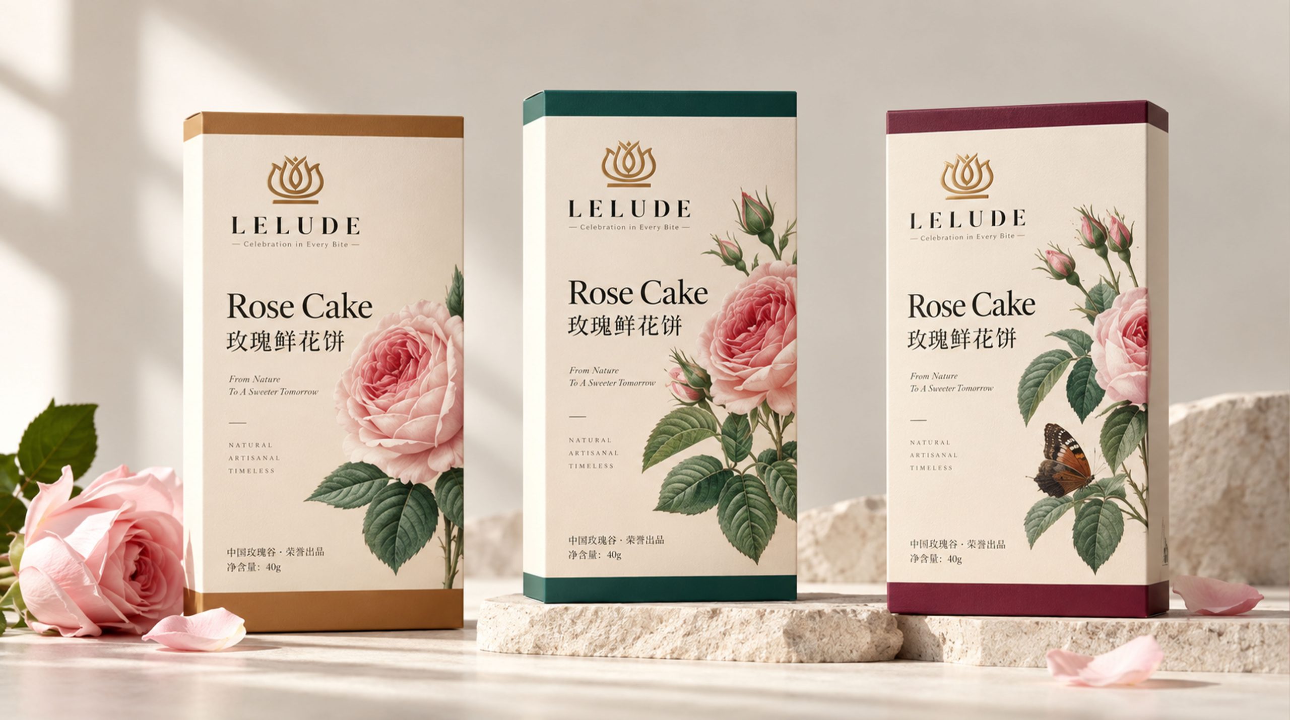
BLOOM is a brand with natural flowers, exquisite desserts and life aesthetics as its core. It is committed to combining the natural beauty of flowers, the pleasant experience of desserts with modern packaging design. The brand not only pays attention to the product itself, but also pays attention to the emotional feelings of consumers in the process of tasting, sharing and gift-giving. It hopes to add a sense of tenderness, romance and ritual to daily life through products with aesthetic value.
In the new brand image, BLOOM takes "flower bloom" as the core concept and integrates natural elements such as roses, petals, plant branches and leaves into packaging and visual communication. The brand uses soft colors, exquisite compositions and concise text expressions to establish a natural, elegant and modern brand image, transforming the products from simple desserts and food into lifestyle carriers that convey emotions, share beauty and express feelings.
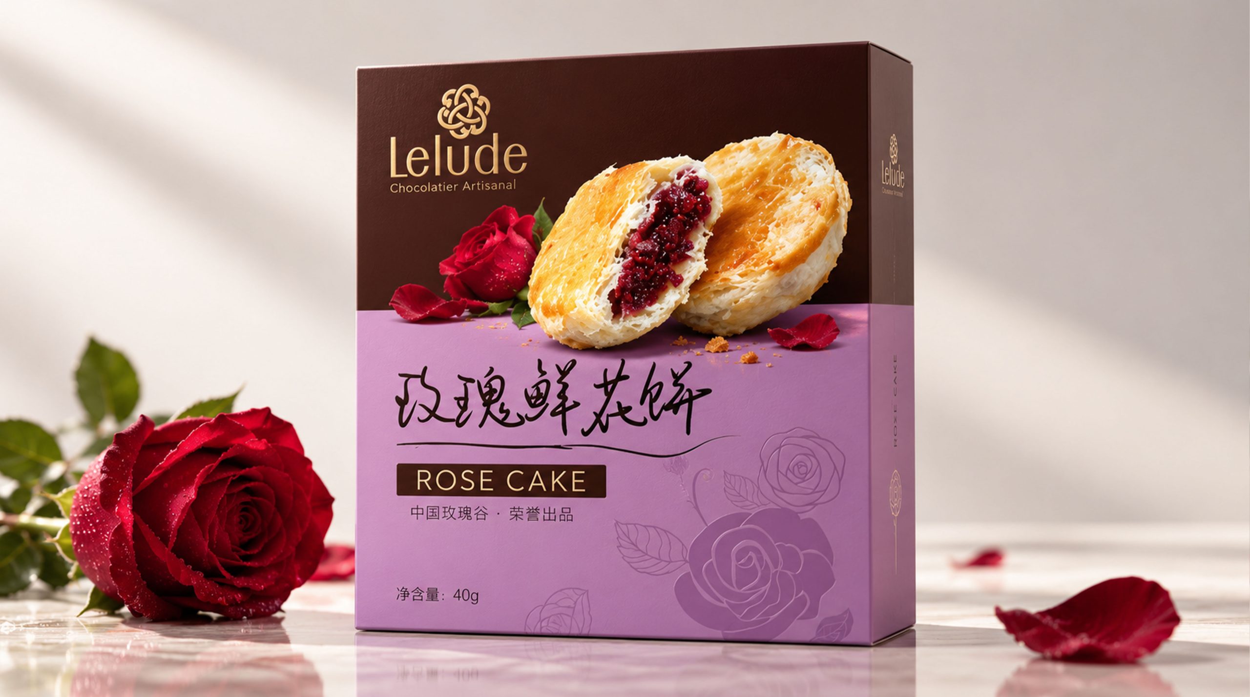
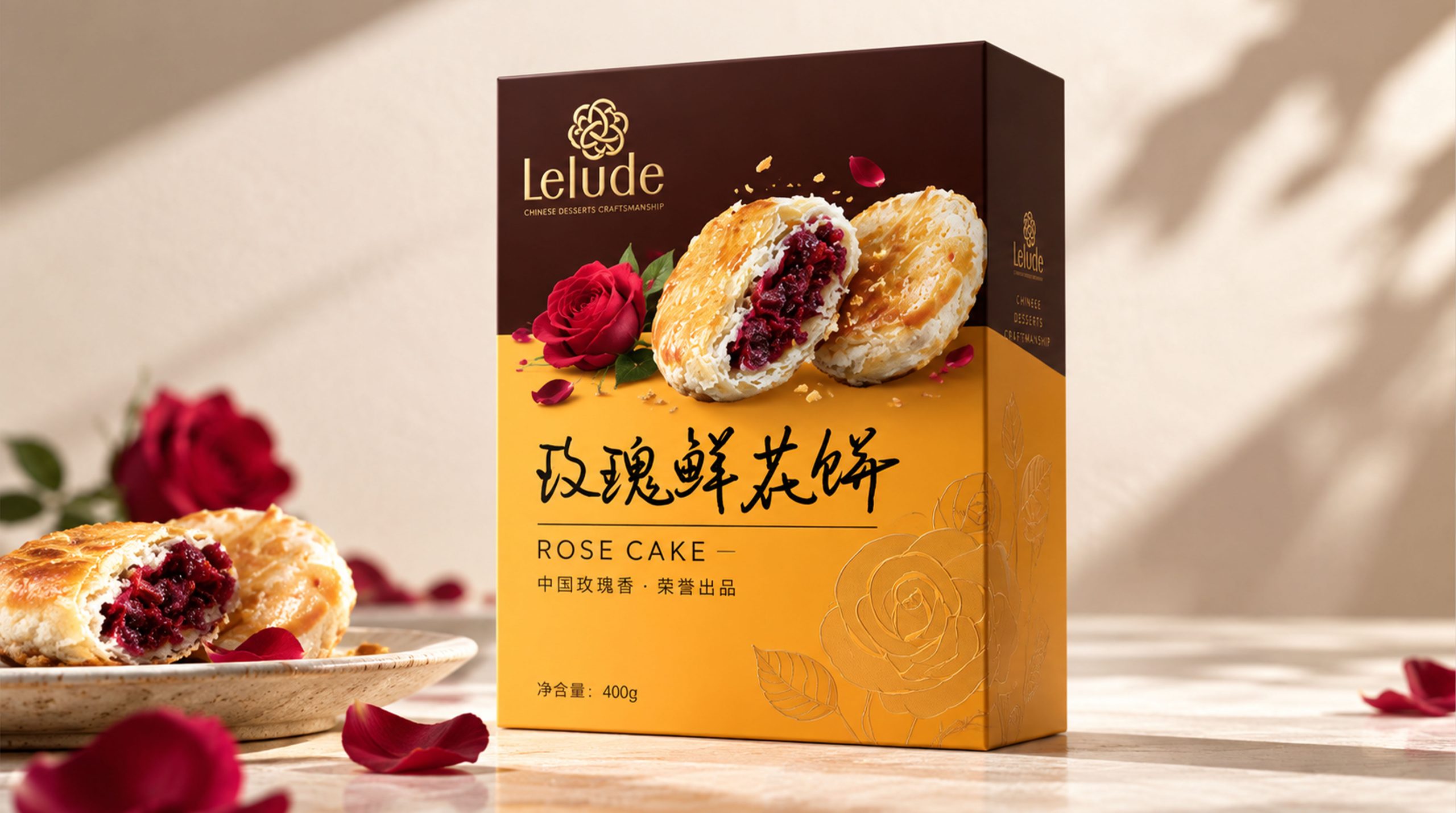
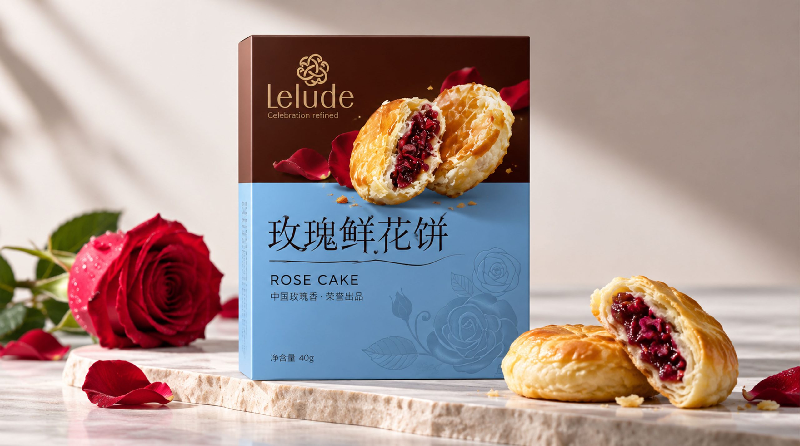
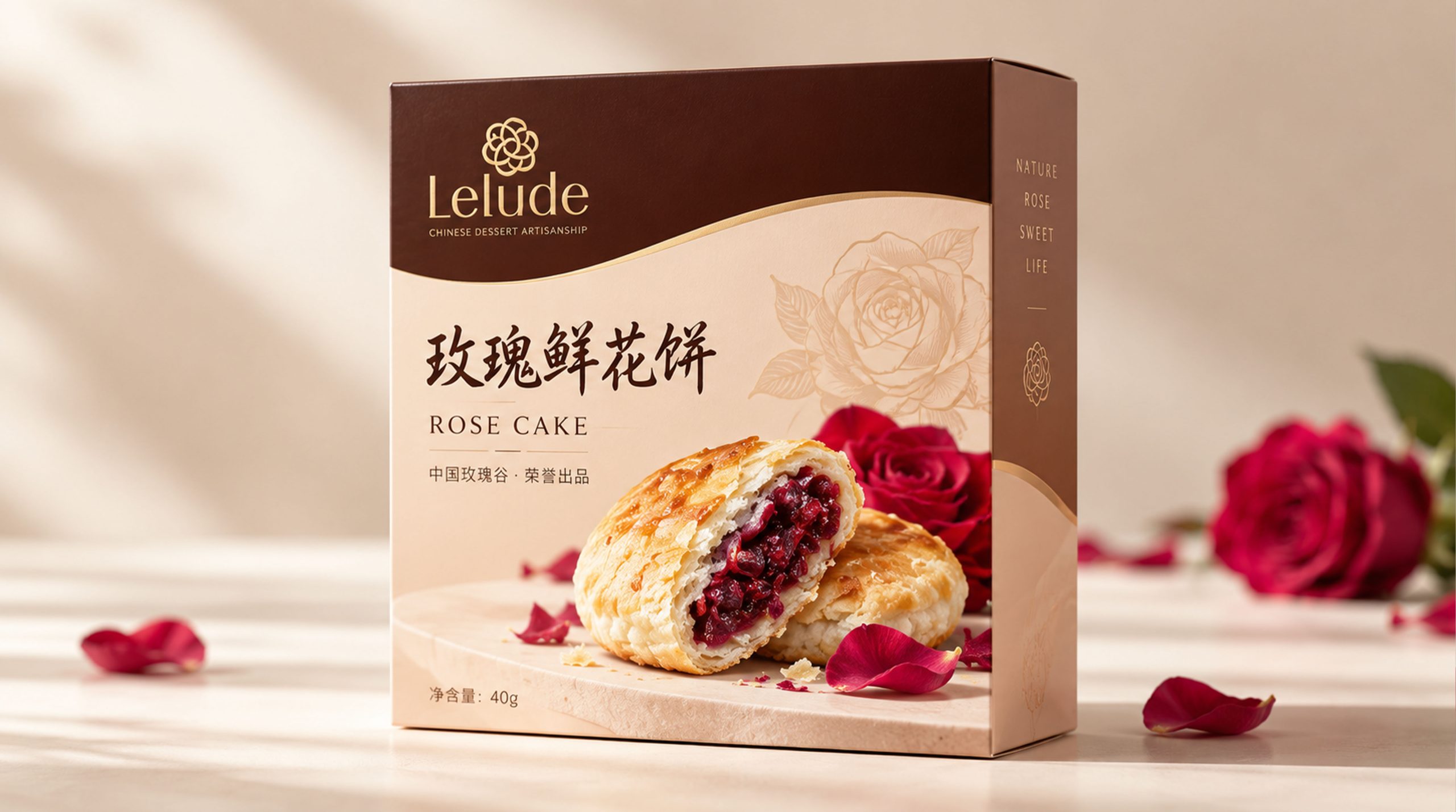
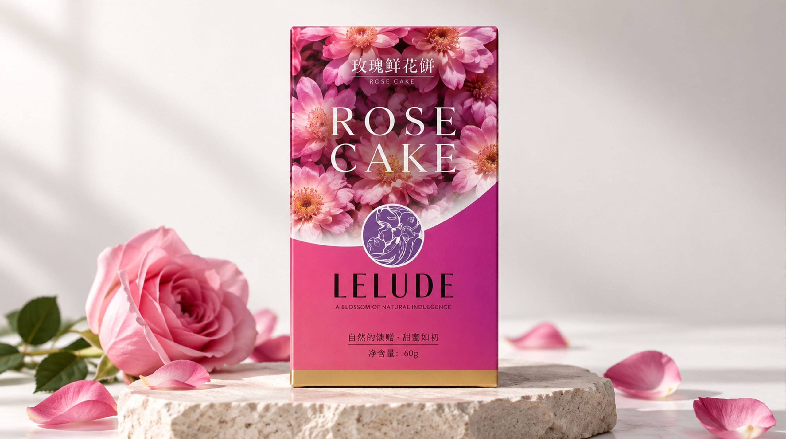
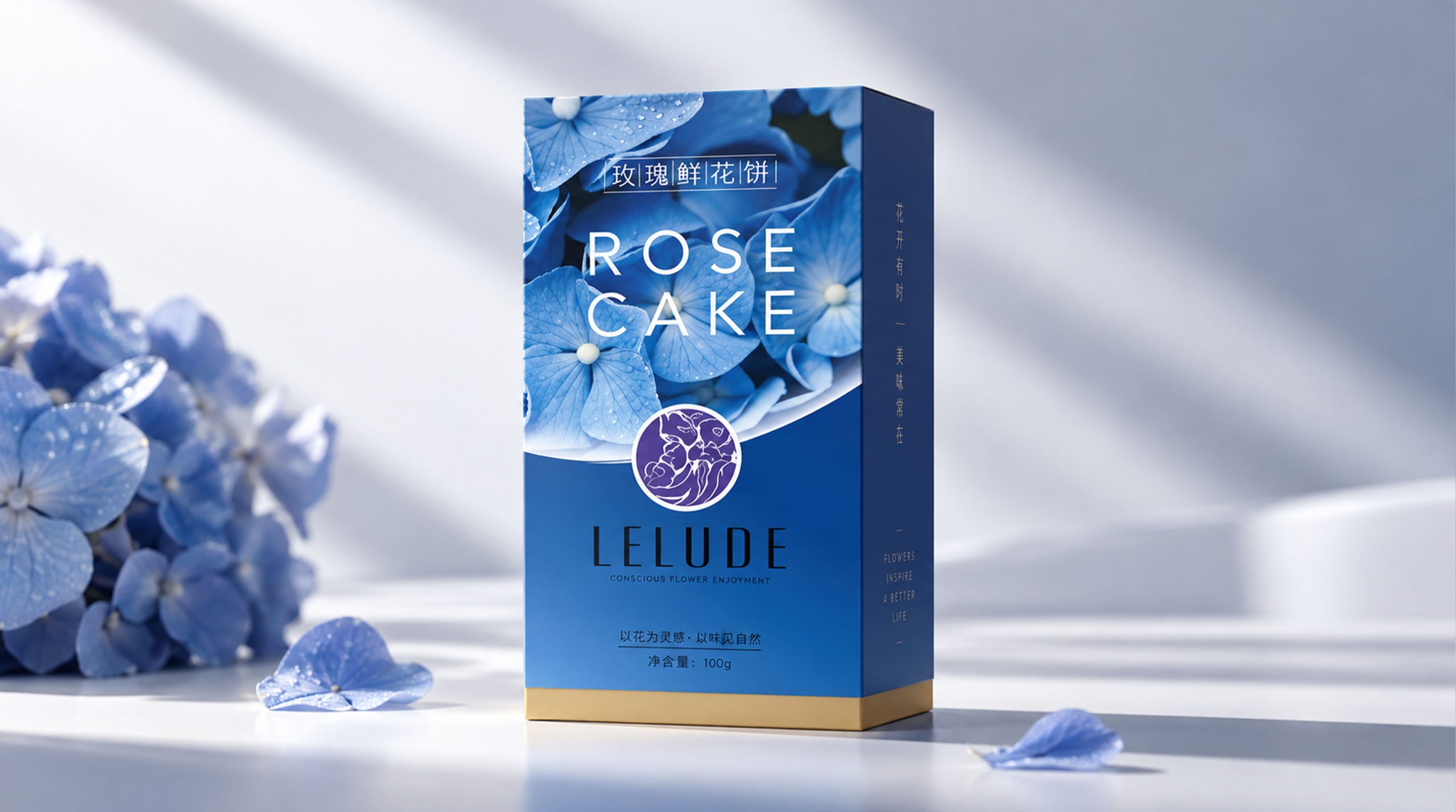
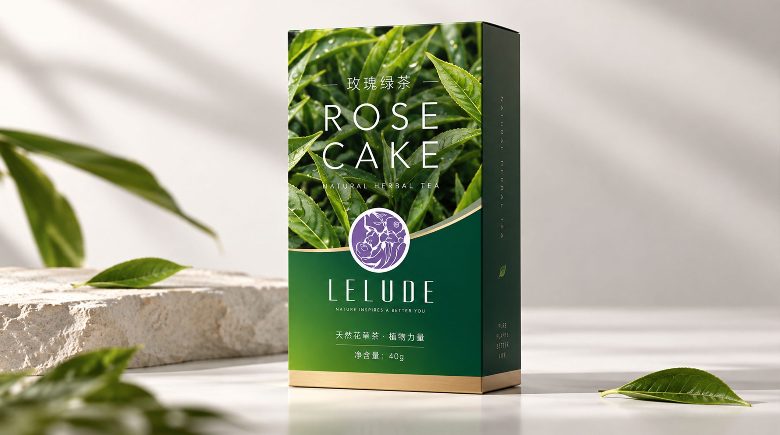
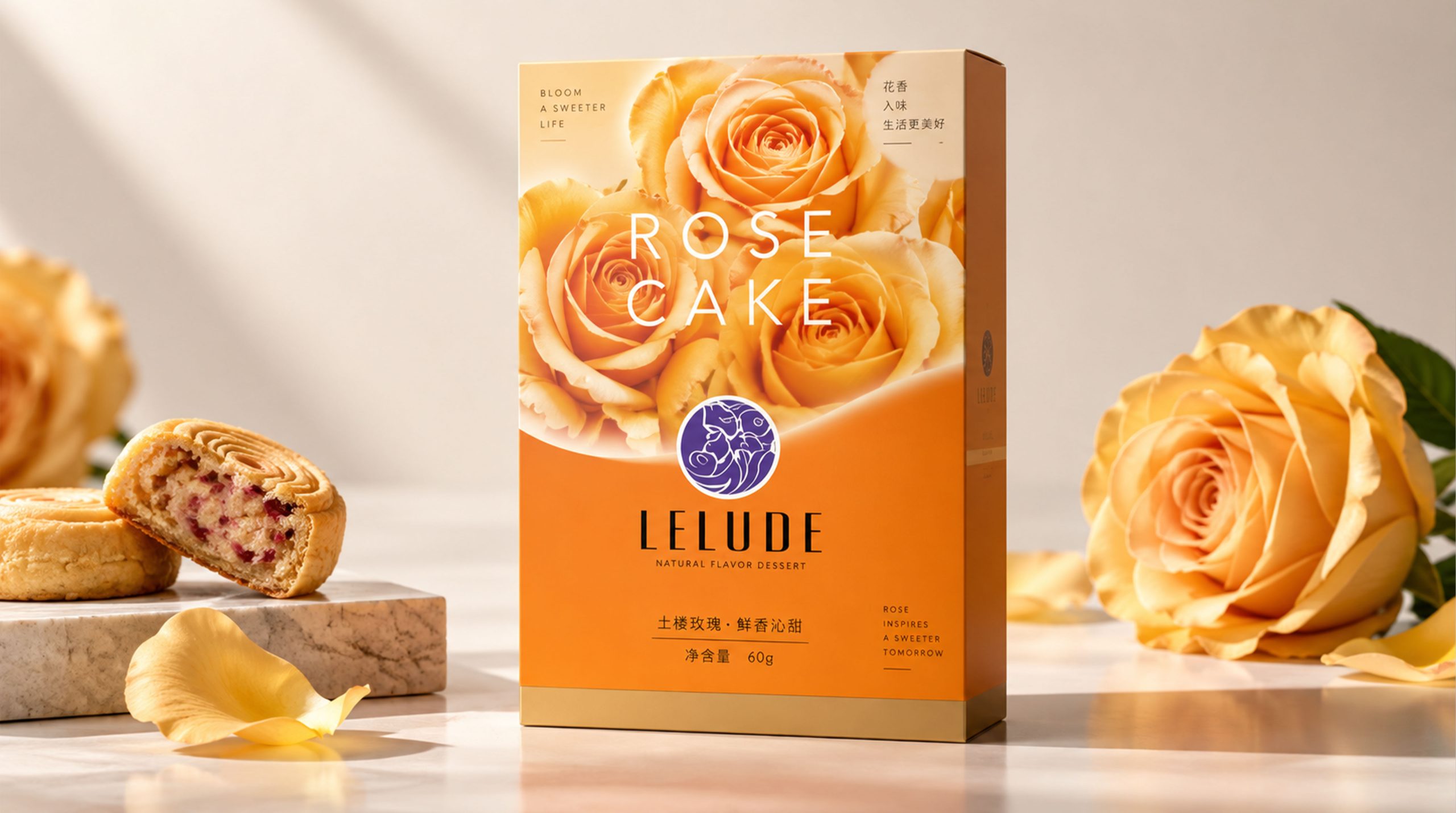
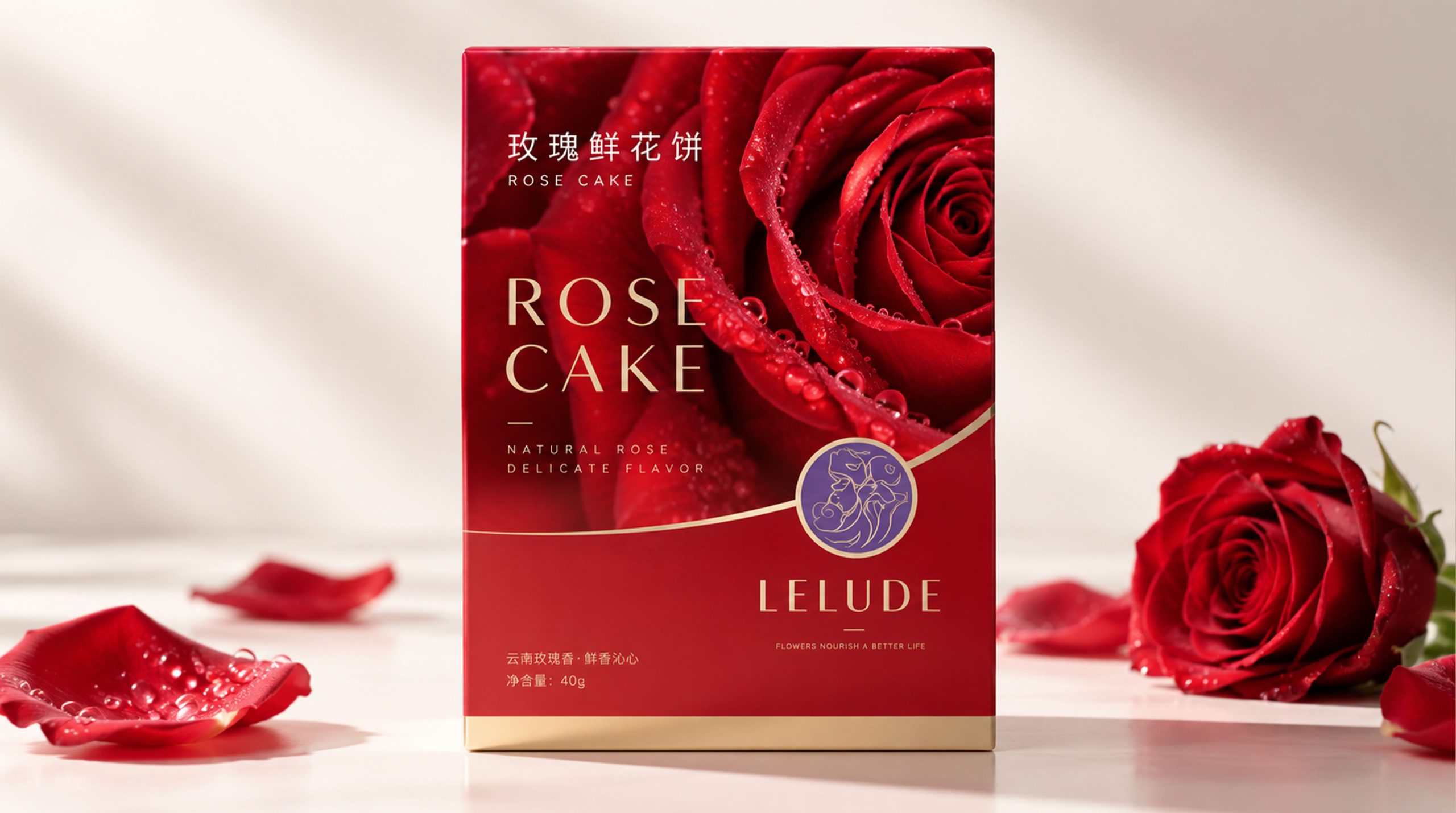
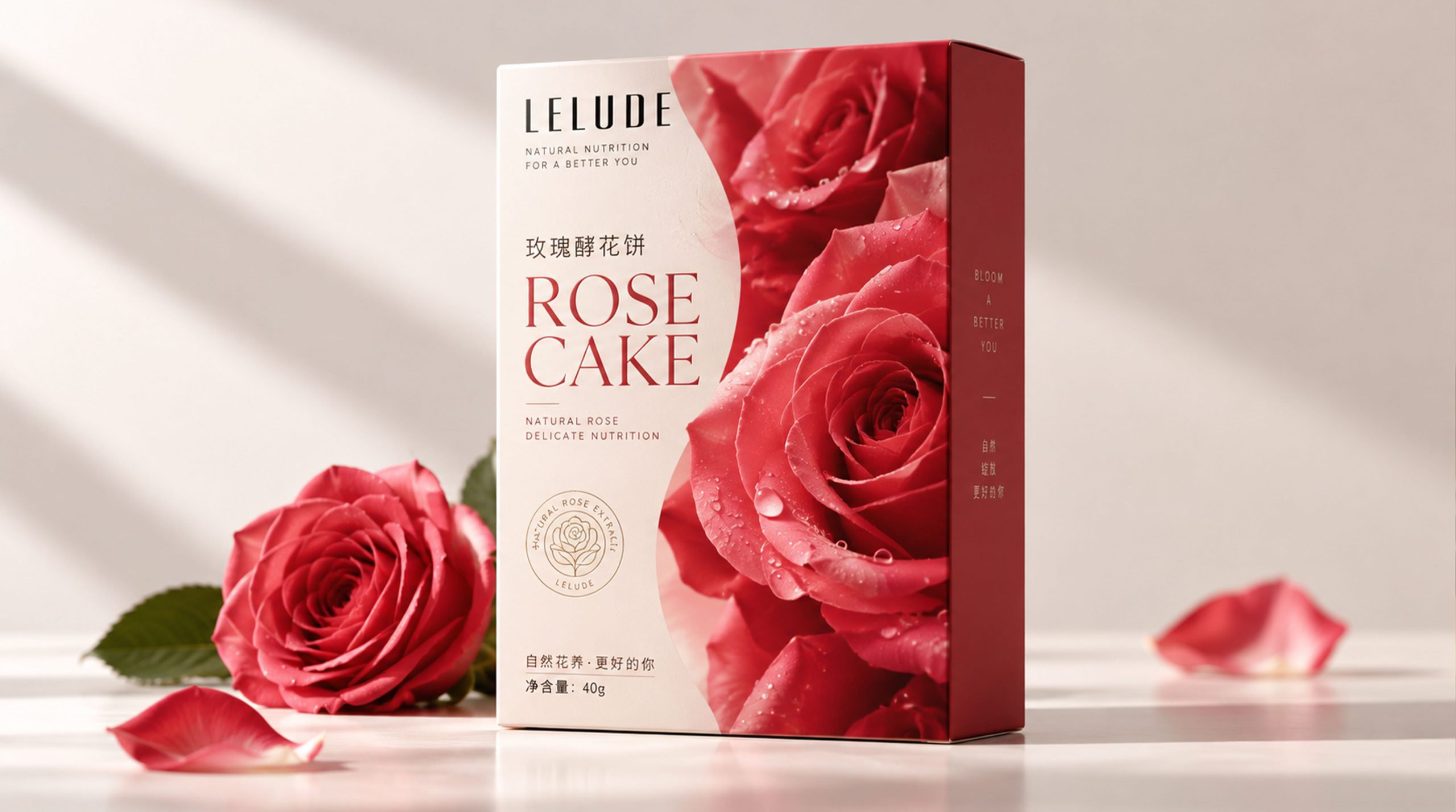
Brand spirit
BLOOM's brand spirit is based on nature, pleasure and quality, forming a brand DNA with life warmth and aesthetic temperament.
Natural × sweetness × quality
Flower × Share × Emotional Temperature
Nature represents the brand's focus on real raw materials and the beauty of plants, sweetness reflects the relaxation and pleasure the product brings to consumers, and quality represents the brand's continued insistence on taste, materials and production processes. Flowers symbolize growth, blooming and beauty, sharing reflects the emotional connection between people, and emotional temperature is the core value that the brand hopes to convey in every purchase, taste and gift.
BLOOM does not emphasize excessive and complicated luxury, but hopes to create a light, romantic and quality life experience through exquisite and restrained design, so that consumers can feel the beauty of nature, the temperature of desserts and the moments worth cherishing in daily life in the products.
design concept
BLOOM's brand concept can be summarized as "natural growth × exquisite life". The design draws visual inspiration from the blooming state of flowers, combining the open petals and soft curves with the sweet attributes of the product to present a natural, elegant and vital brand image.
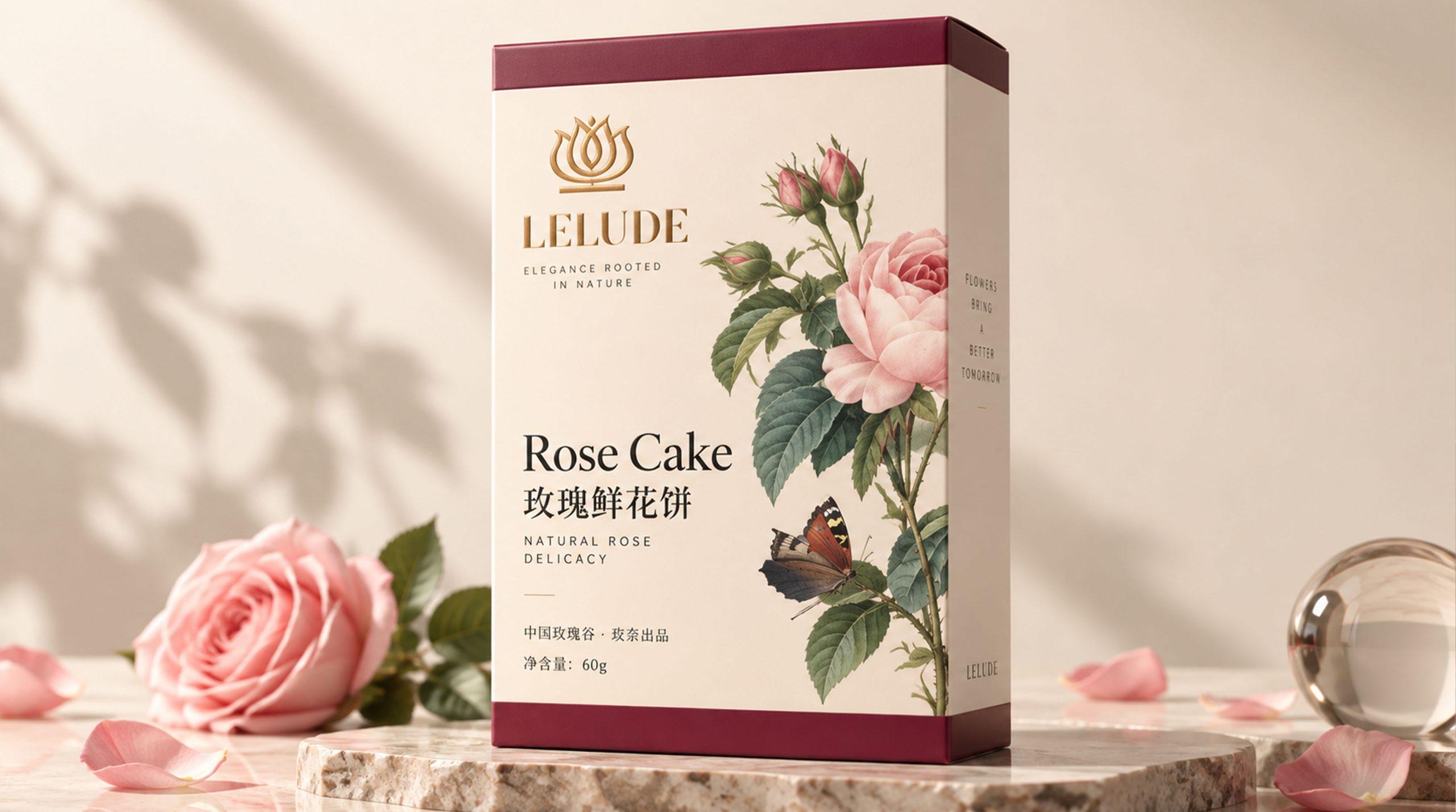
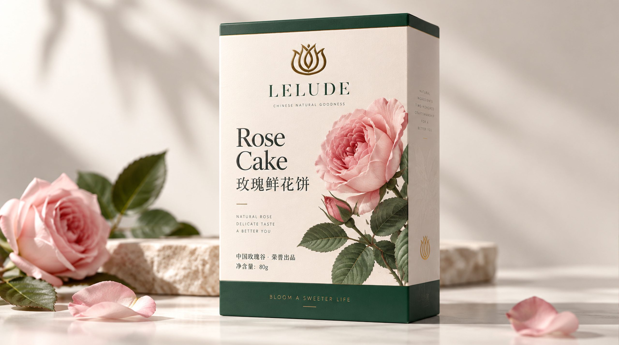
The packaging design is based on a clear layout structure, using large areas of white space, soft colors and partial floral patterns to create a relaxed and high-end visual atmosphere. Maintain an appropriate distance between product names, brand information and decorative elements, allowing consumers to quickly identify the product while feeling the delicate and comfortable aesthetic order in the packaging.
The design does not pursue a complete reproduction of the flower, but expresses the layers, texture and open state of the petals through photography, line drawing, silhouette and partial enlargement. Flowers are not only the visual subject of the product, but also a symbol of the brand spirit, representing everyone's process of growing, blooming and discovering beauty in life.
visual language
BLOOM's visual language follows the design principles of "natural and real, soft and elegant, simple and modern".
Color and structure:
The brand uses cream white, light pink, rose red, warm orange and natural green as its main colors. Cream white conveys purity, softness and lightness of the brand; light pink embodies tenderness, romance and feminine emotions; rose red represents passion, love and fresh vitality; warm orange symbolizes sunshine, vitality and the pleasure brought by desserts; natural green embodies plants, health and natural sources.
Different products can use different theme colors according to taste, flower type or usage scenario, making the product series clearly differentiated while maintaining a unified brand identity.
Logo and Graphics:
The brand logo adopts a simple image of a flower or petals, and uses circles, arcs and symmetrical structures to form a recognizable visual symbol. The petals are connected to each other, forming a graphic relationship of openness, tolerance and continuous growth, which symbolizes the brand's focus on natural beauty and also embodies the emotional meaning of sharing and connection between people.
Flower graphics:
Roses, petals, leaves and branches are important graphic motifs for the brand and can be presented in the packaging through photography, hand-drawn line drawings or bas-reliefs. Floral graphics can be used as the main visual, or can be partially extended on the packaging edges, inner pages, seals and detail areas to form a continuous brand decoration system.
Fonts and typography:
The brand's English name "BLOOM" is presented in a simple and high-quality English font, with moderate spacing, to convey a modern, elegant and international brand image. Product names can use serif fonts with soft temperament or simple modern fonts, and Chinese information can be typeset in clear and easy-to-read fonts to ensure the identification efficiency of packaging information.
The overall layout emphasizes white space and hierarchical relationships to avoid overcrowding, so that the product presents a visual temperament that is simple but not monotonous, refined but not exaggerated.
language and tone
BLOOM's brand language is characterized by gentleness, lightness and sincerity, emphasizing the connection between product experience and emotional expression. The brand copy does not pursue exaggerated publicity, but conveys the beautiful relationship between flowers, desserts and life through short, natural and picturesque language.
In product introductions, brands can express themselves around keywords such as "floral fragrance, sweetness, sharing, heartfelt feelings, and daily rituals", such as "make life sweeter", "bloom for moments worth celebrating", "a sip of floral fragrance, a good mood", etc. The overall language remains restrained and friendly, avoiding excessive modification, so that consumers can naturally feel the warmth of the brand.
English auxiliary copywriting such as "BLOOM A SWEETER LIFE", "NATURAL FLAVOR", "DELICATE TASTE", etc. emphasizes natural flavor, exquisite taste and sweeter lifestyle, allowing the brand to maintain a unified, relaxed and contagious expression in different consumption scenarios.
Brand Experience
BLOOM's brand experience runs through product packaging, physical space, digital platforms and gift-giving scenes. From the first time consumers see the packaging to the entire process of opening the product, tasting desserts and sharing gifts, every link should reflect the brand's meticulousness and warmth.
Packaging experience:
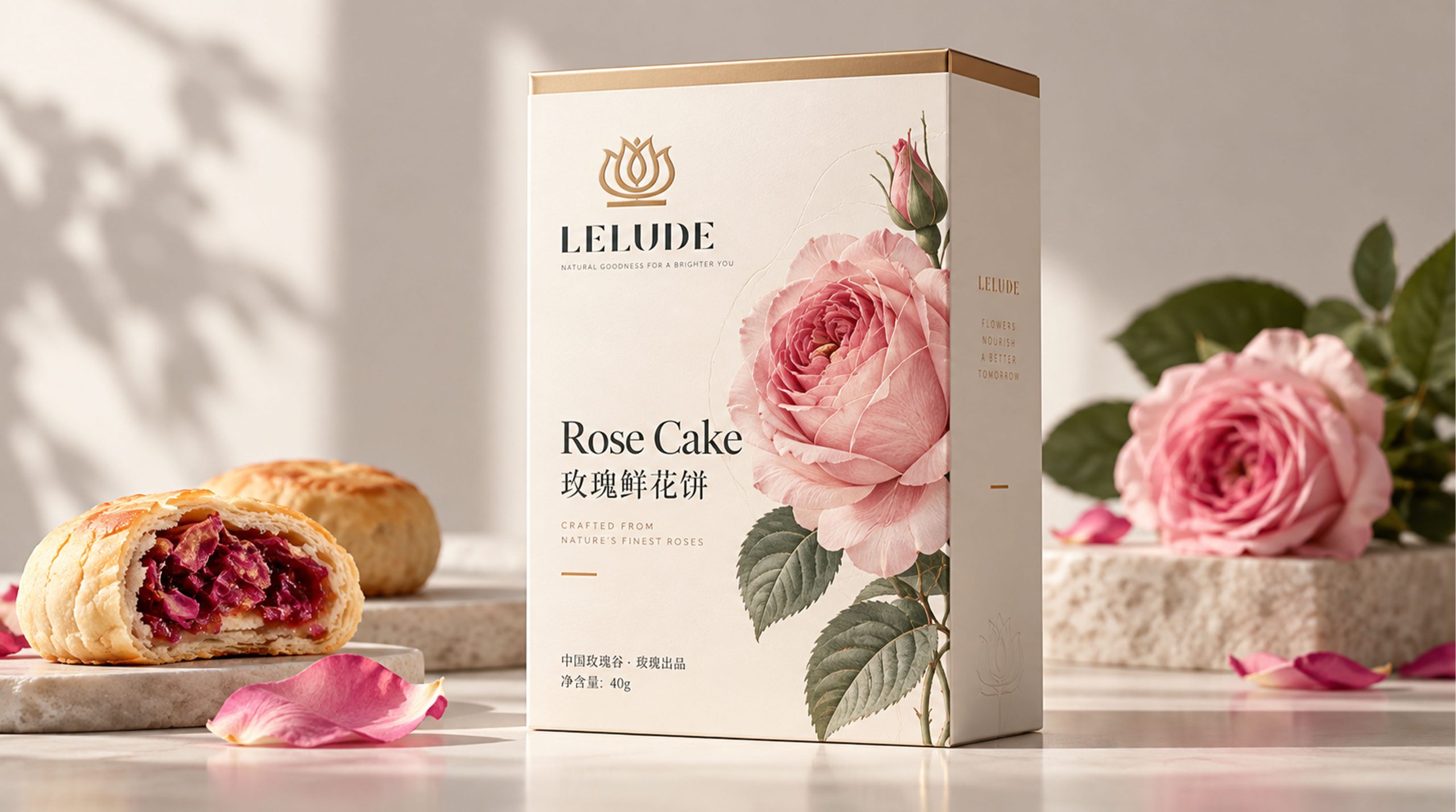
The packaging uses high-quality paper, fine printing and moderate local craftsmanship to reflect the sophistication of the product. The combination of soft background colors and bright floral graphics gives the product strong visual appeal on shelves and gift scenes. The box surface helps consumers quickly understand the product through clear product names, taste information and floral images, while establishing a natural and sweet brand association.
Space experience:
Offline stores, dessert spaces and pop-up displays can continue the cream white, light pink, warm orange and plant green colors in the packaging, and match them with wood, glass, ceramics and soft lighting to create a warm, comfortable and life-aesthetic space atmosphere. Floral graphics can be applied to walls, counters, packaging displays and wayfinding systems, allowing consumers to feel the complete brand story in the space.
Digital experience:
On official websites, mobile apps, and social media, brands can extend their visual image through dynamic ways such as flowers opening, petals falling, and color gradients. The combination of product photography, edible scenes and holiday content can enhance consumers' emotional memory of the brand and form visual content suitable for sharing and dissemination.
Product experience:
Whether it is rose-flavored desserts, flower-themed gift boxes, or daily snacks and holiday limited products, the natural feeling and joy of the brand should be conveyed through taste, packaging and copywriting. Products not only satisfy taste needs, but also become an emotional medium to express gratitude, celebration, companionship and blessings.
brand statement
“Let life bloom and make every bite sweeter.”
BLOOM's brand image is not only a visual combination of flowers and desserts, but also an expression of nature, sharing and life aesthetics. The design integrates the beauty of nature with the dessert experience through soft colors, open floral graphics, simple typography and warm brand language.
Flowers symbolize the blooming of life, desserts represent the joy of life, and packaging becomes a carrier of emotions and intentions. The brand hopes to provide consumers with a relaxing, gentle and memorable experience every time they taste and share.
Through a unified visual system and detailed product experience, BLOOM will establish a natural, elegant, modern and emotional brand image. It not only sells desserts, but also conveys a more leisurely and sweet lifestyle, making the brand a gentle choice for consumers to express their feelings, celebrate daily life and discover beauty.