










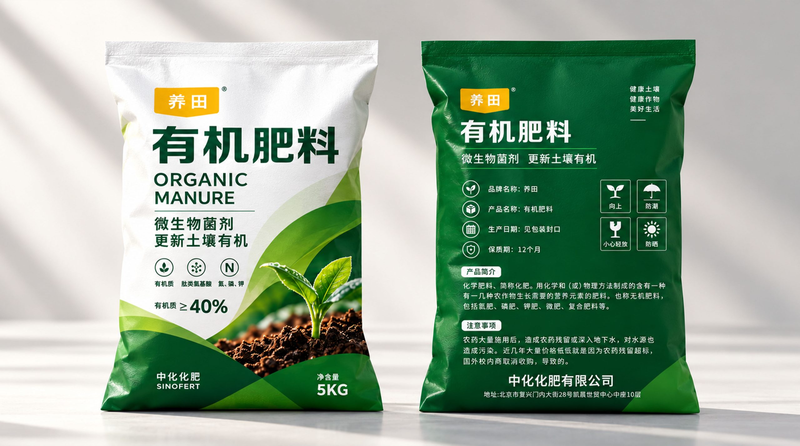
Sinofert is one of the important brands in domestic agricultural inputs and modern agricultural services. It has long provided professional products and services focusing on soil health, crop growth and sustainable agricultural development. This "Yangtian" organic fertilizer packaging design takes "healthy soil, healthy crops, and a better life" as its core values, and reshapes the packaging image of traditional fertilizer products through a visual system that is more natural, professional, and modern agricultural.
The design hopes to break the problems of excessive complexity, information congestion, and visual homogeneity in agricultural fertilizer packaging, and establish product identification in a more concise, clear, and natural way, so that the packaging not only reflects the professional strength of Sinofert Fertilizer, but also intuitively conveys the product attributes of "organic, ecological, soil improvement, and healthy planting."
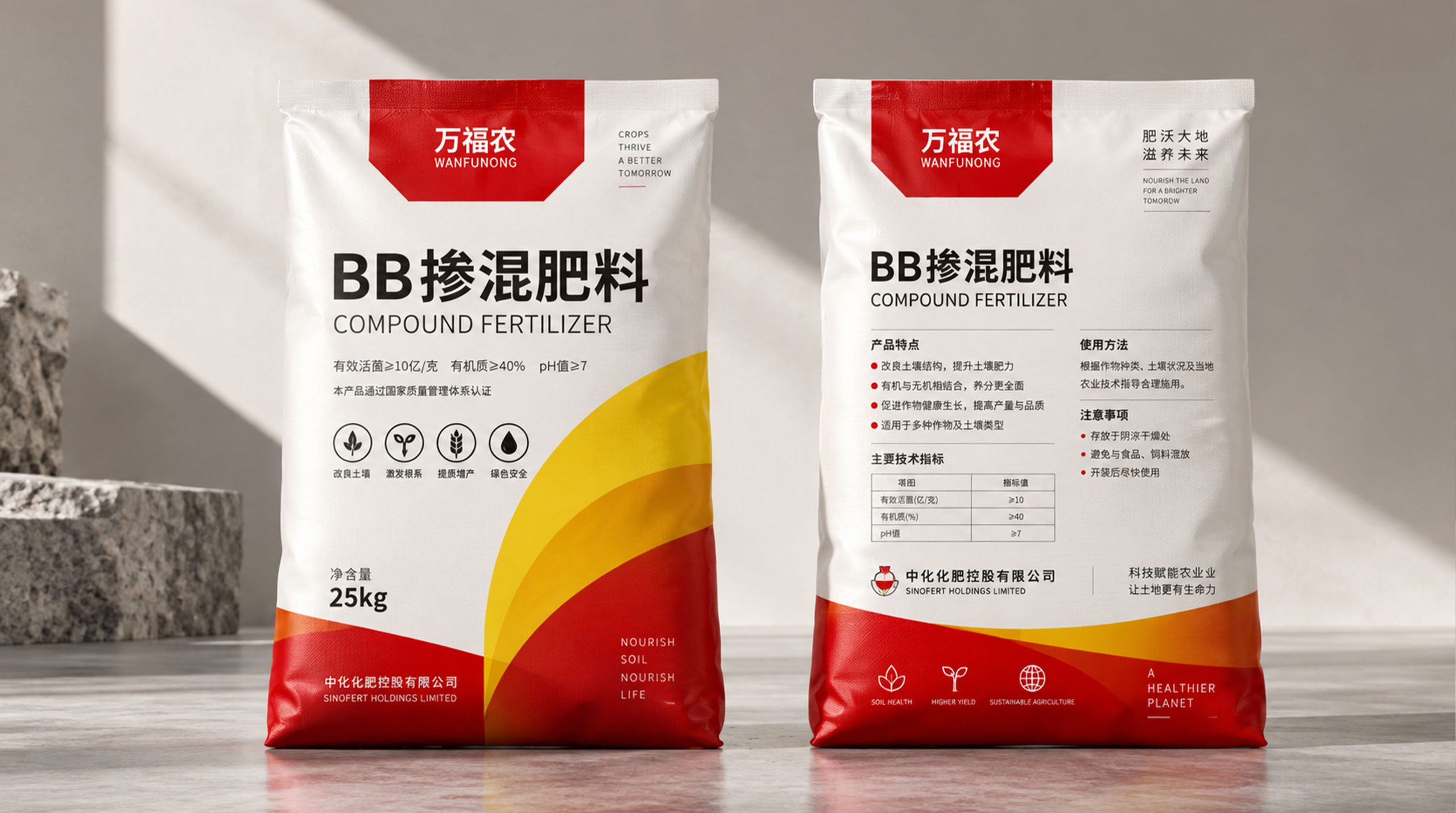
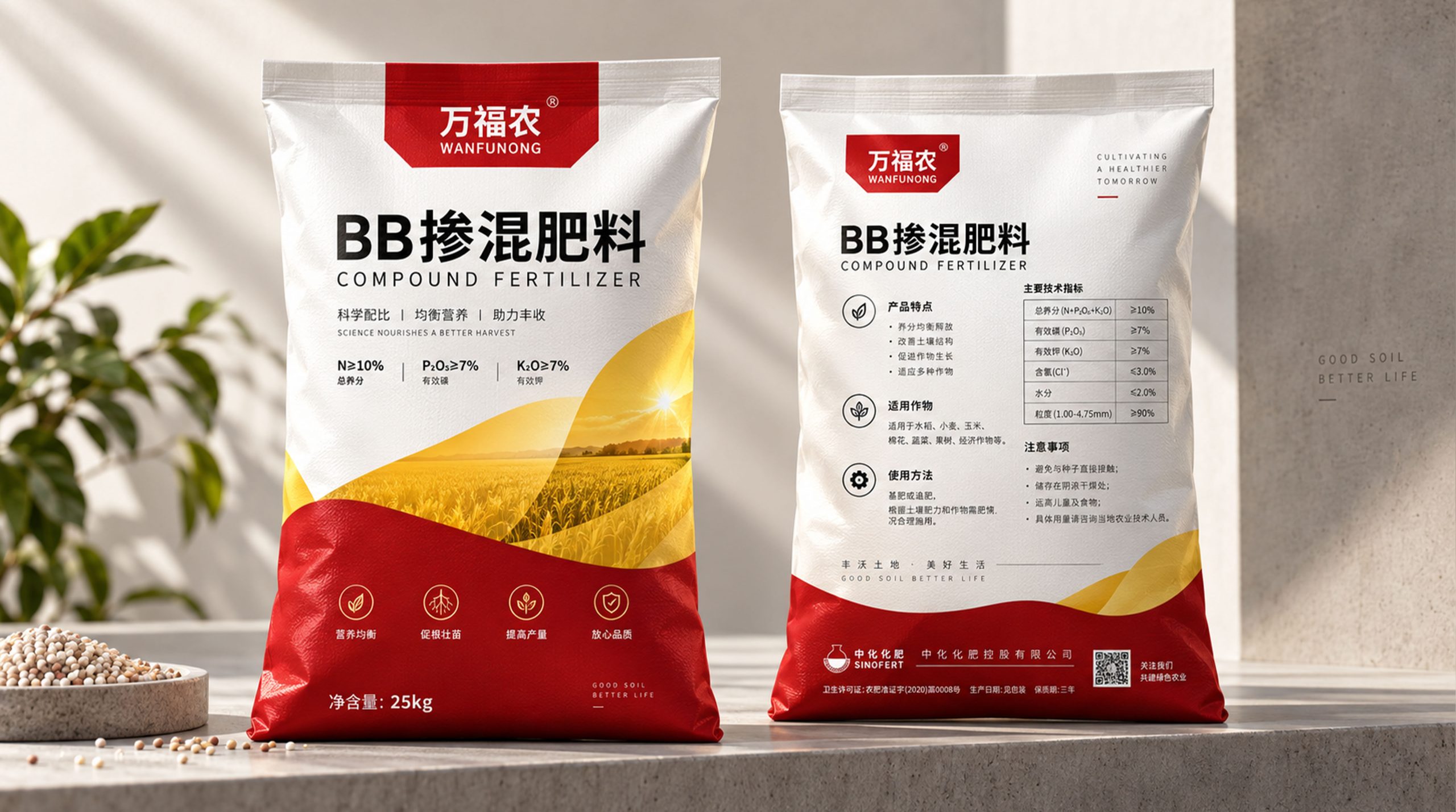
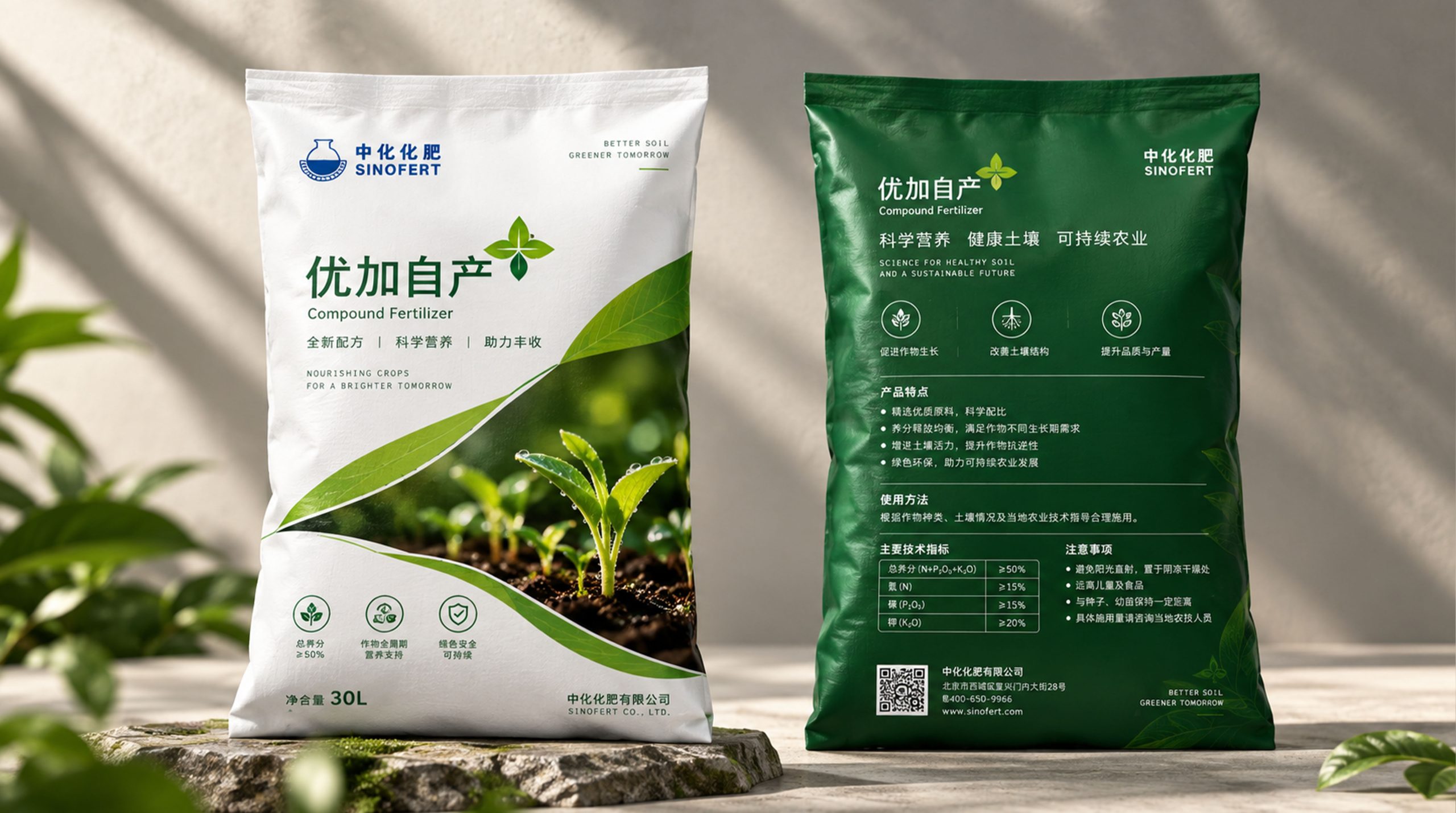
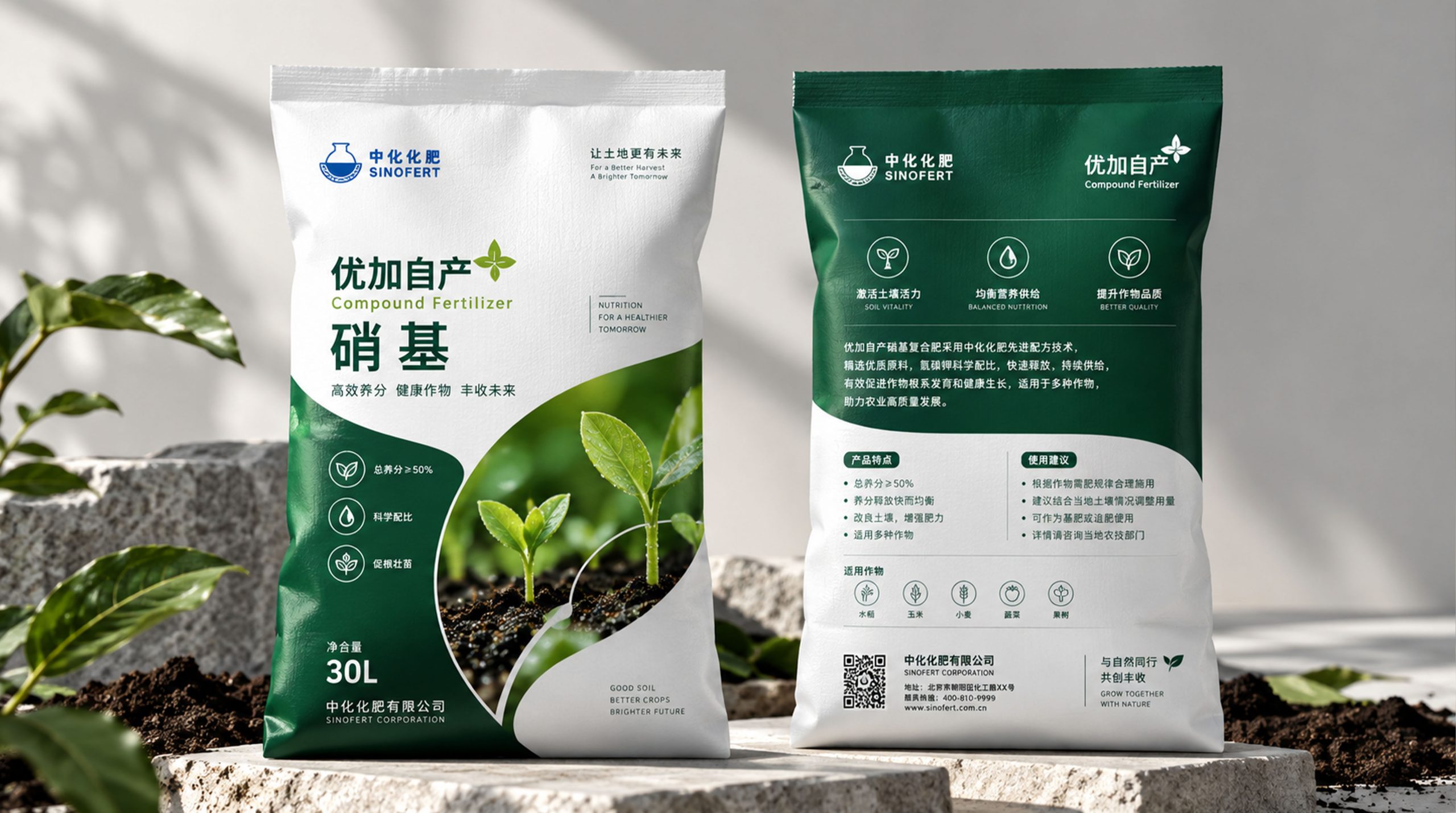
Brand spirit
The brand spirit of organic fertilizers can be summarized as:
Land × nourishment × growth
Professional × Technology × Quality
Green × Health × Sustainability
"Farming" not only represents the fertilizer product itself, but also emphasizes the focus on the long-term value of the land. Through scientific fertilization and organic matter replenishment, the soil regains its vitality and is upgraded from a single "fertilizing the crops" to a systematic agricultural concept of "nourishing the land, nourishing the soil, and nourishing crops". Greenness and health reflect the brand's concern for modern ecological agriculture, while expertise and technology continue Sinofert's long-term brand trust in the agricultural field.
design concept
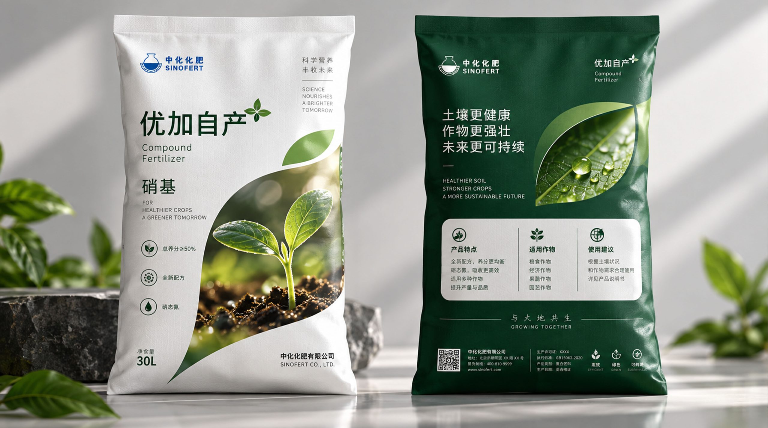
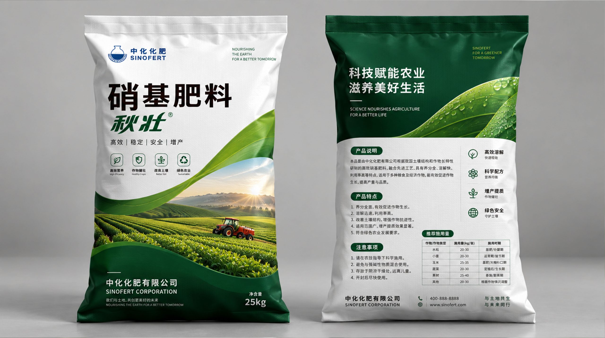
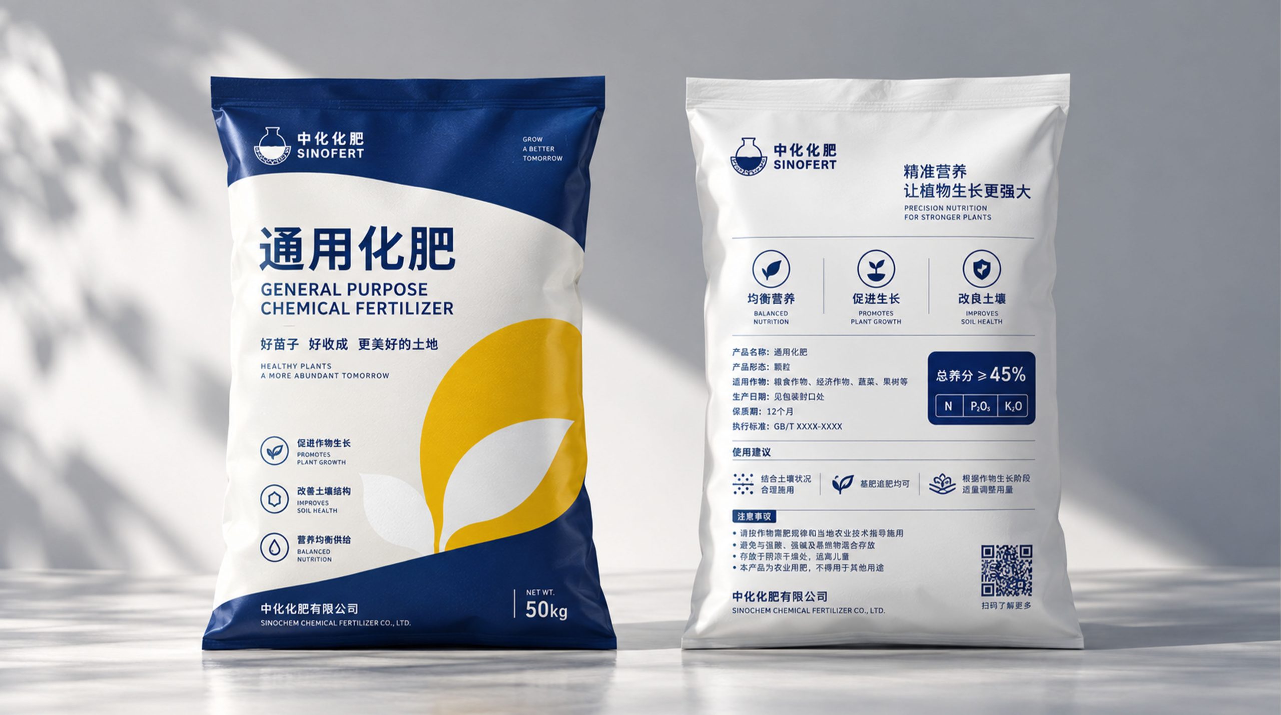
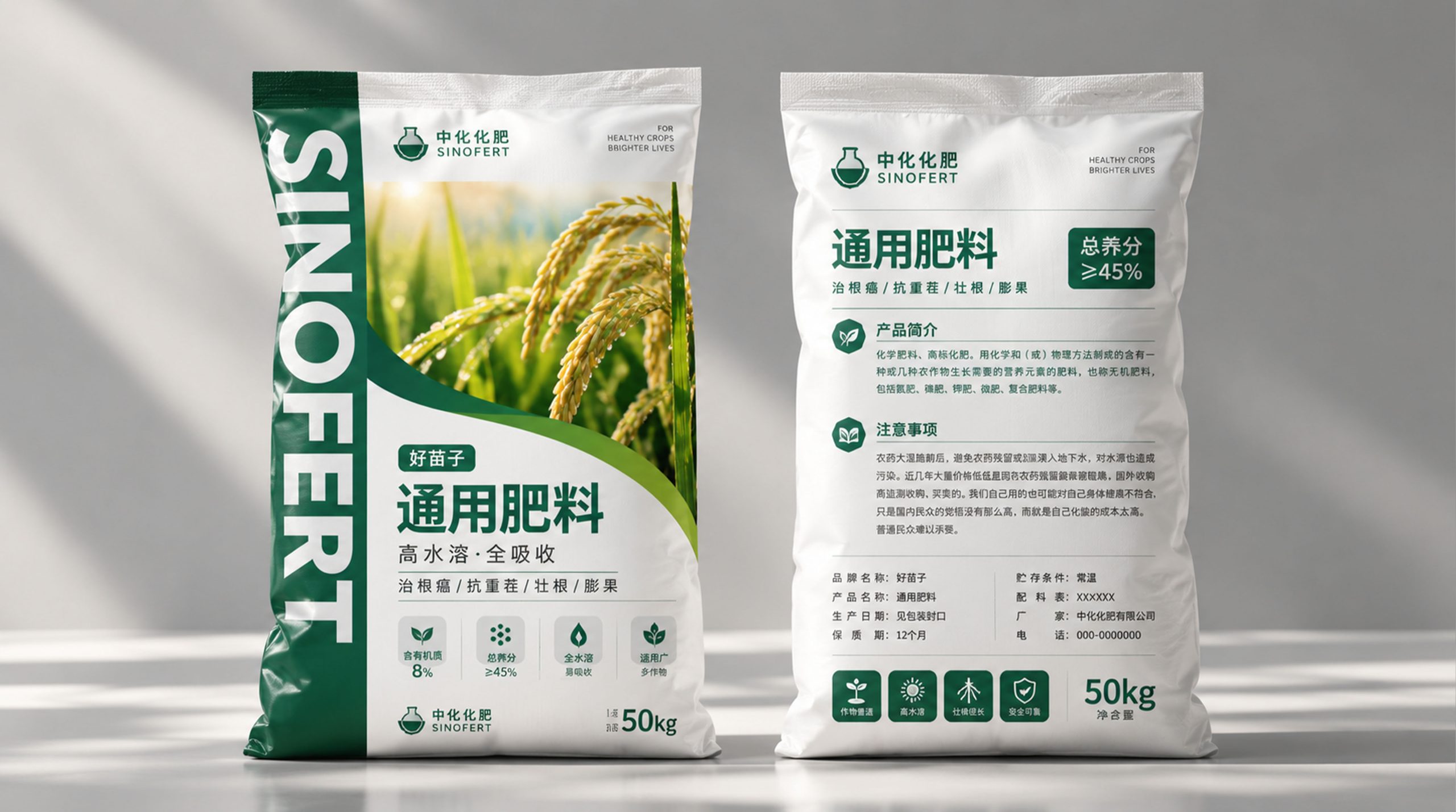
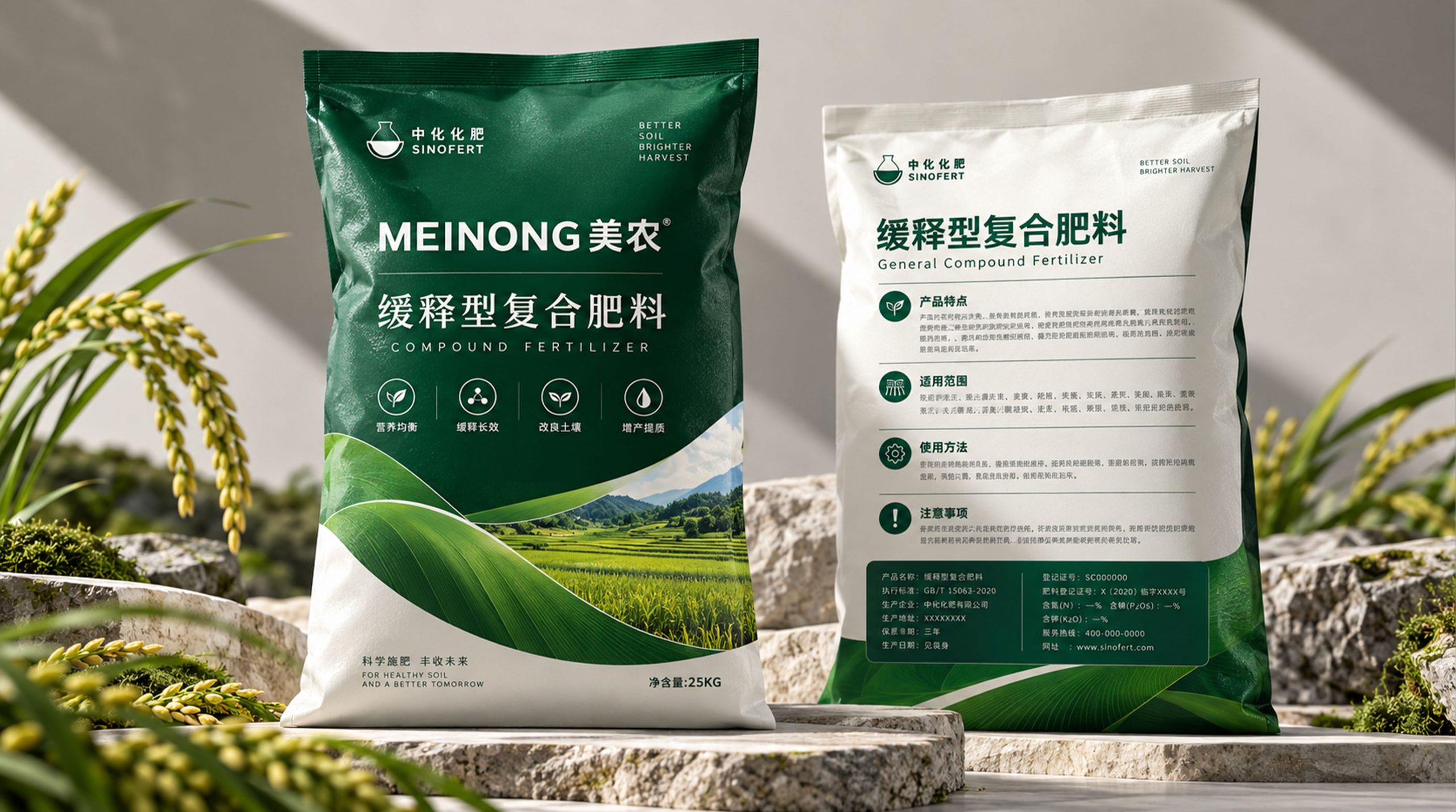
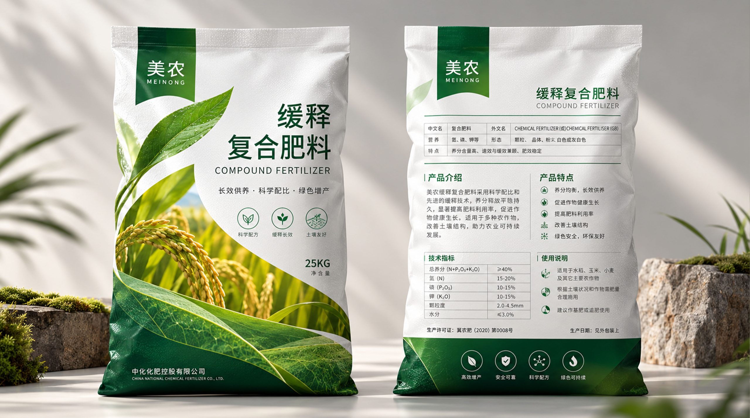
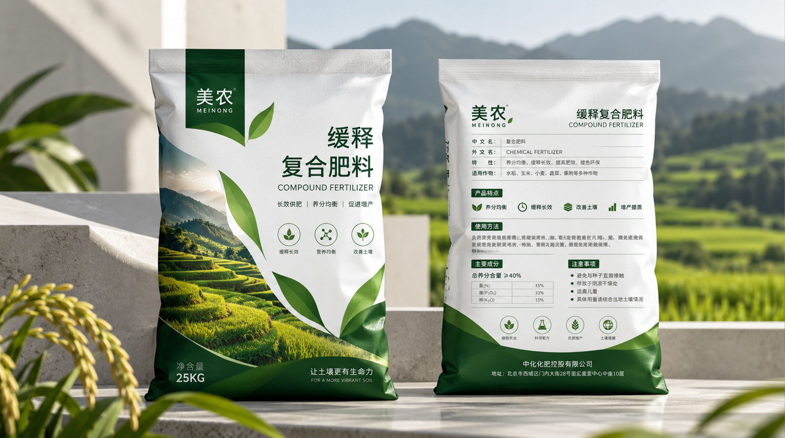
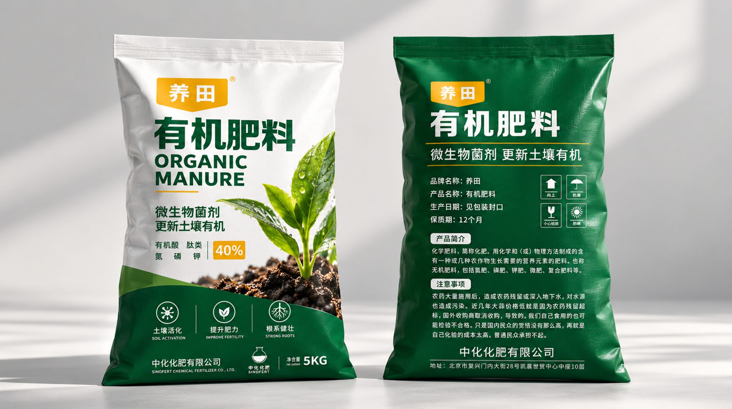
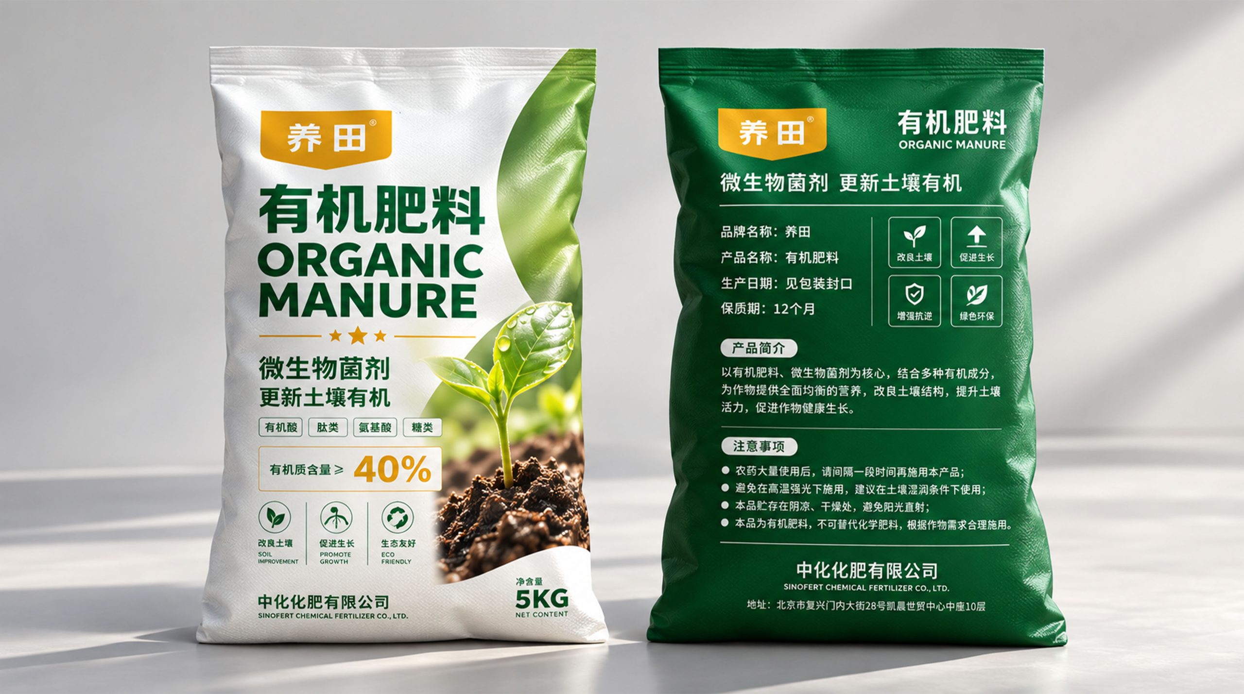
This packaging takes "let the land grow again" as the core design concept, and establishes "soil-buds-green life" as the most important visual narrative of the packaging. The front uses a large area of white as the visual basis to weaken the heavy and complicated visual impression of traditional agricultural packaging, while using dark green to build the professional attributes of the product. The bottom of the picture uses real soil and new shoots as the visual focus, showing the moment when life sprouts from the soil, and intuitively expressing the product value of organic fertilizers for improving soil and nourishing crops.
The design does not create a so-called "agricultural feel" through excessive decoration. Instead, it uses white space, natural images, geometric color blocks, and clear information levels to create a more modern and trustworthy agricultural brand image, so that the products can have stronger shelf recognition while maintaining professionalism.
visual language
The overall packaging establishes a unified visual language around green ecology, land vitality and modern agriculture.
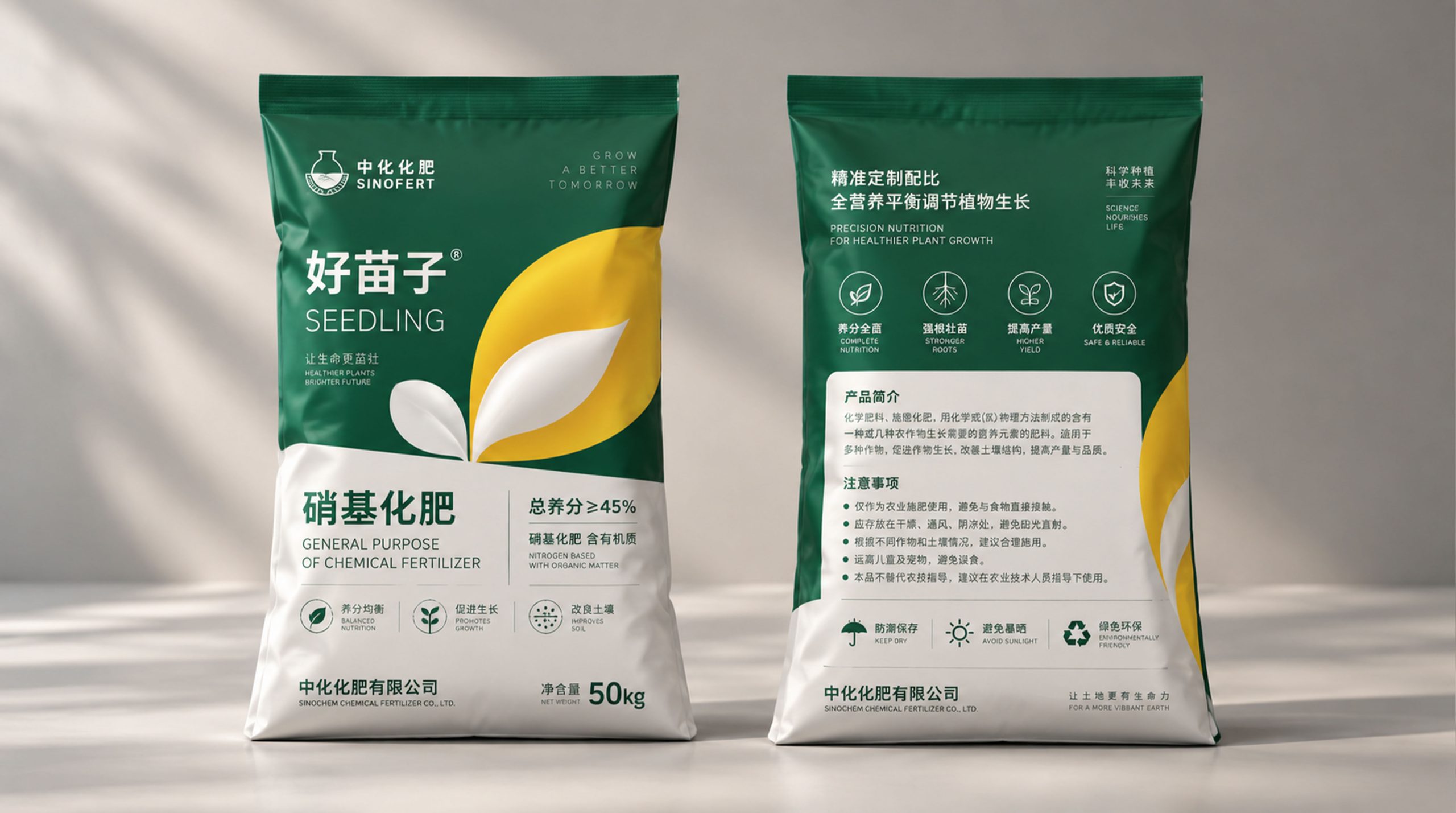
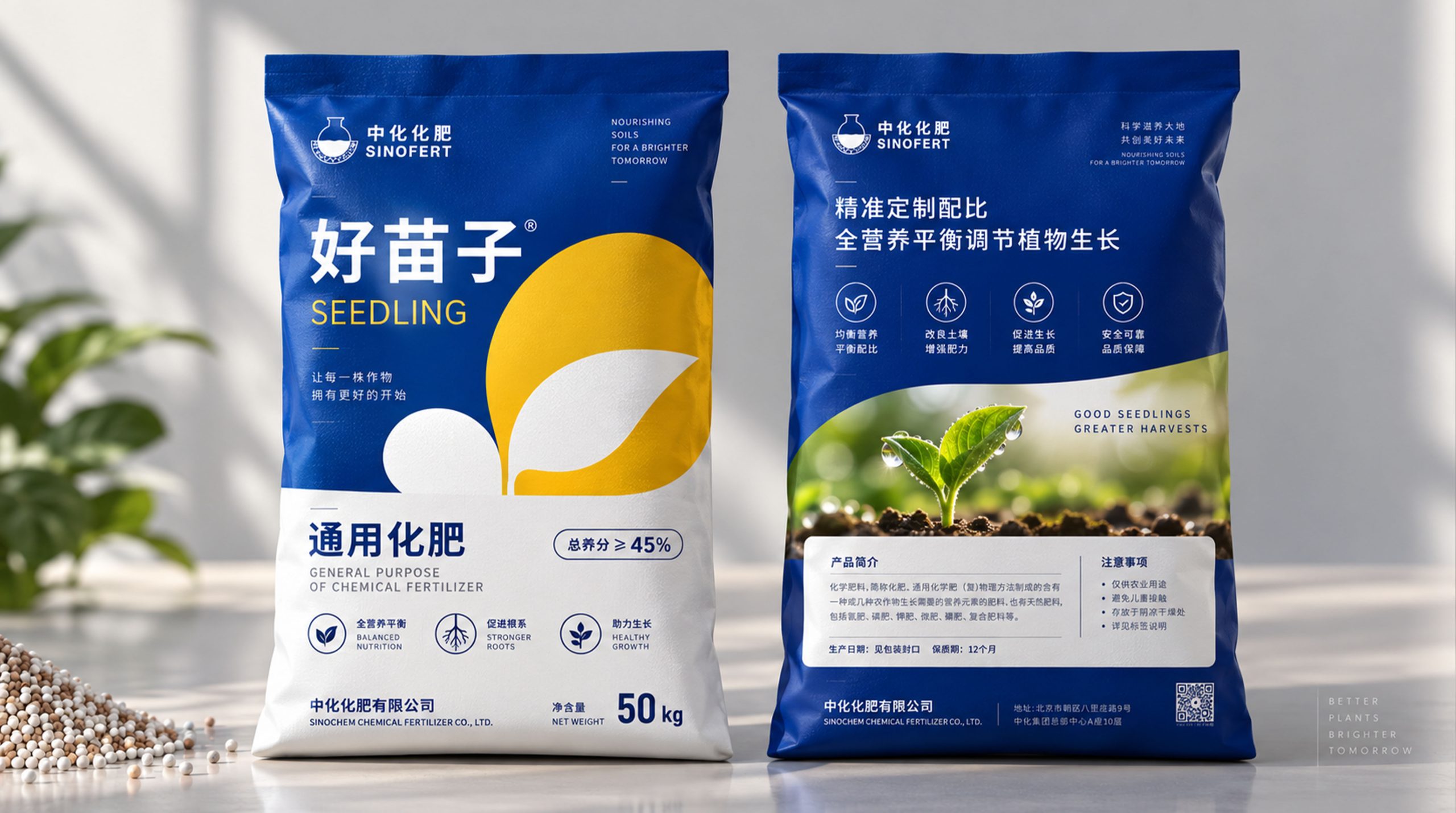
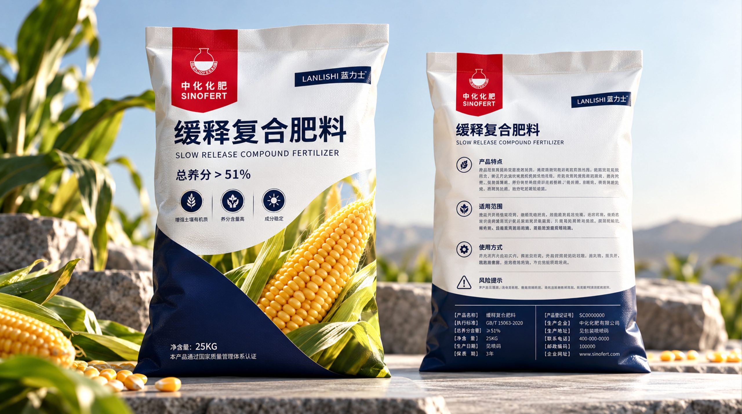
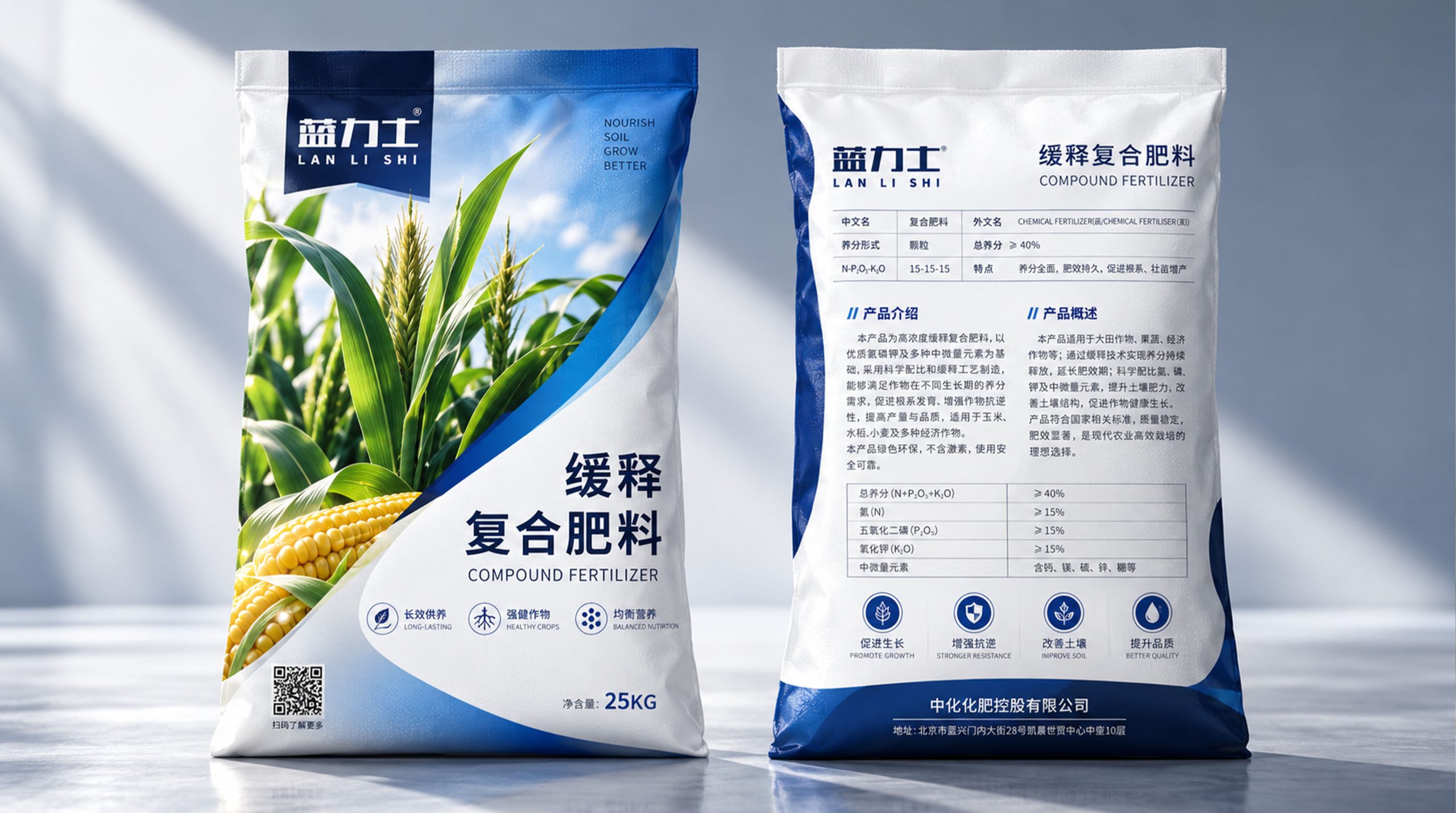
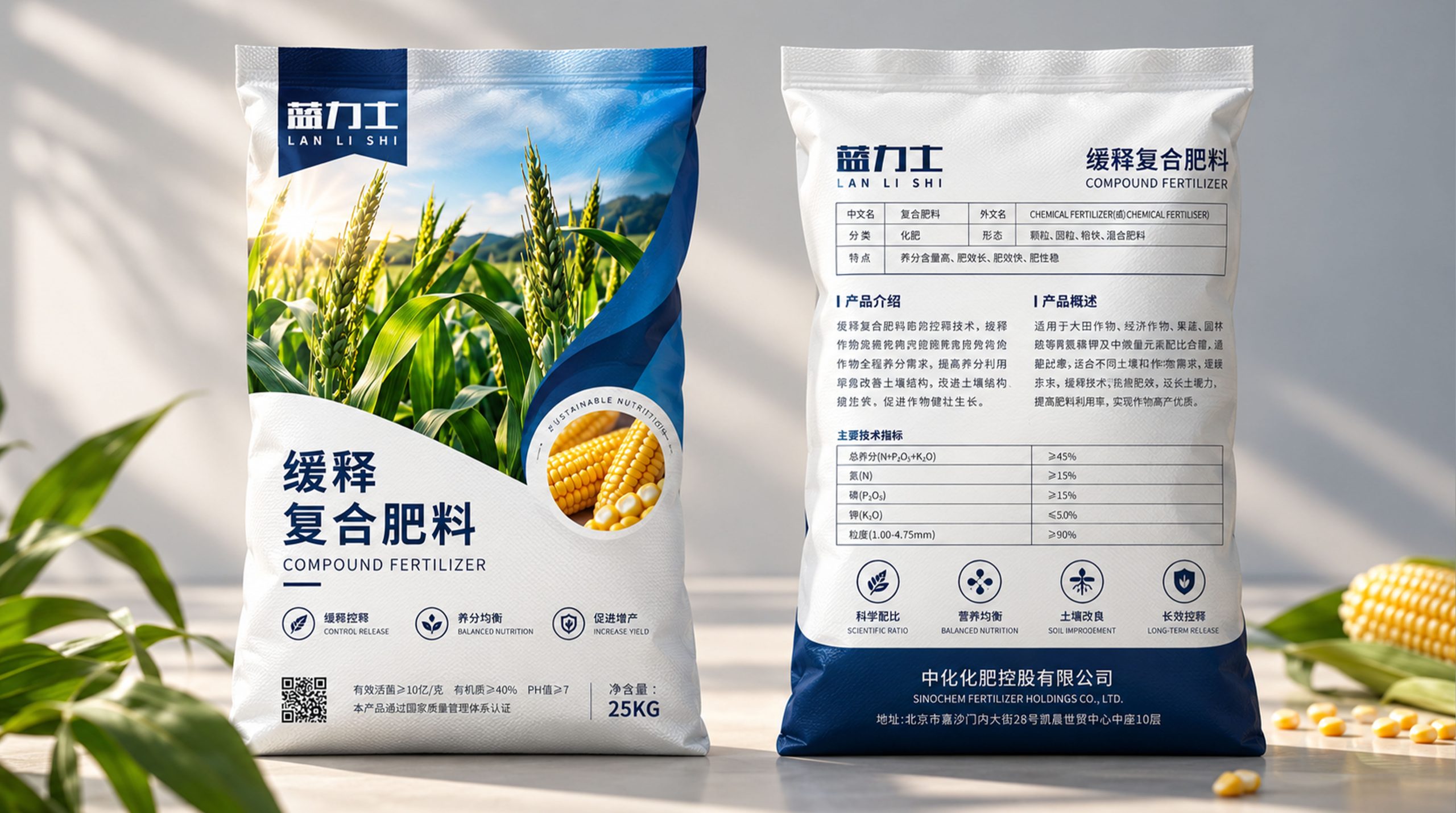
Color system: The packaging uses dark green, natural green and pure white as the main visual colors. Dark green represents land, agriculture and professional quality, light green represents plant growth and natural vitality, and large areas of white bring a clean, healthy and rational visual experience. The "Yangtian" brand logo at the top adopts a highly recognizable orange-yellow color, forming a clear visual memory point in the green system, and also symbolizing sunshine, maturity and harvest.
Graphic design: The layered green geometric surfaces below the packaging form an abstract visual relationship between land, leaves and growth paths, which are combined with real images of buds and soil to unify "nature" and "technology". Different shades of green gradually extend upward from the bottom of the packaging, symbolizing the process of nutrients entering the plant from the soil and promoting the continuous growth of life.
Information level: "Organic Fertilizer" as the core product name uses large font size and high contrast typesetting to enable consumers to identify the product category at the first time; "Microbial inoculants, renew soil organic", "Organic matter ≥ 40%", "5KG" and other functional and specification information are arranged in hierarchical order according to their importance to enhance the efficiency of information reading. The English word "ORGANIC MANURE" further enhances the modernity and standardized visual characteristics of the packaging.
Front and back system: The front is responsible for brand recognition and product value communication, while the back turns to a more rational and systematic information design. Product names, production dates, shelf life, storage methods and precautions are all organized through a modular structure and combined with unified functional icons to make complex agricultural product information more intuitive and standardized, forming a complete packaging experience from visual attraction to professional information reading.
tone and language
The brand language of the packaging emphasizes professionalism, directness and trustworthiness, avoiding excessive marketing expressions, and instead focuses on the information that agricultural users are most concerned about.
"Microbial agents·Renew soil organically" directly explains the core value of the product; "Healthy soil, healthy crops, good life" further extends from product functions to brand value, linking fertilizers, land, crops and quality of life. The overall language is concise and rational. It not only maintains the professionalism that a brand of agricultural production means should have, but also adds warmth through the name "Yangtian" which has the connotation of oriental agricultural culture. The brand not only emphasizes the fertilizer effect, but also conveys the long-term philosophy of "nurturing the land first, then cultivating all things".
Brand Experience
This packaging not only solves the problem of visual beauty, but also hopes to establish a complete set of modern agricultural product experience.
Visual experience: Through high-purity white, large areas of green, and images of natural soil and buds, a clear, healthy, and vital first impression is formed, and a higher visual recognition is established in the traditional fertilizer packaging environment.
Information experience: Through font size, color blocks, icons and modular structure, product names, functional selling points, parameter specifications and usage information are clearly classified, reducing the cost for consumers to obtain information, so that professional agricultural products can also have a clearer and friendly reading experience.
Quality experience: The packaging controls the number of decorative elements as a whole, highlights the professional background of Sinofert with simple and stable graphic proportions, and upgrades the product from traditional agricultural input packaging to a more modern, standardized and branded direction.
Emotional experience: The image of sprouts growing from moist soil transforms the originally rational fertilizer product into a more lifelike visual expression, allowing consumers to directly associate with fertile land, healthy crops and harvest scenes, thereby establishing a positive and reassuring brand association.
brand statement
"Nurt a fertile soil and nurture all things to grow."
"Yangtian" organic fertilizer packaging uses land as its root, green as its language, and new shoots as the symbol of life, integrating Sinofert's professional agricultural strength and modern ecological planting concepts into a unified visual system.
Packaging is not just an external container for fertilizer, but also a medium for communication between the brand and the land - from improving the soil to nourishing crops, from focusing on current yields to focusing on the long-term vitality of the land, making "farming" truly a brand expression about healthy soil, green agriculture and sustainable growth.