










The China Sustainable Development Association is a national social organization approved by the state. With the purpose of "promoting the coordinated development of economy, society and environment", it is committed to sustainable development strategic research, policy advocacy, international cooperation and public education. It is a core industry organization in the field of sustainable development in China.
The brand name directly carries the mission of the organization - "China" indicates the national identity, "Sustainable Development" points out the core concept of the trinity of economic development, social equity and ecological protection, and "Association" clarifies the attributes of the industry organization. Qingmei Future was commissioned to lead the brand identity design.
The design goal of the brand logo is to convey the brand image of "green sustainability, harmonious symbiosis" through the visual language of ecological balance, sustainable recycling and diverse symbiosis.
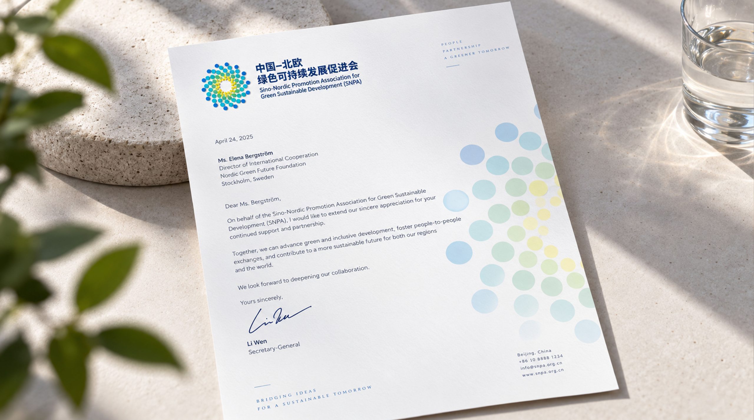
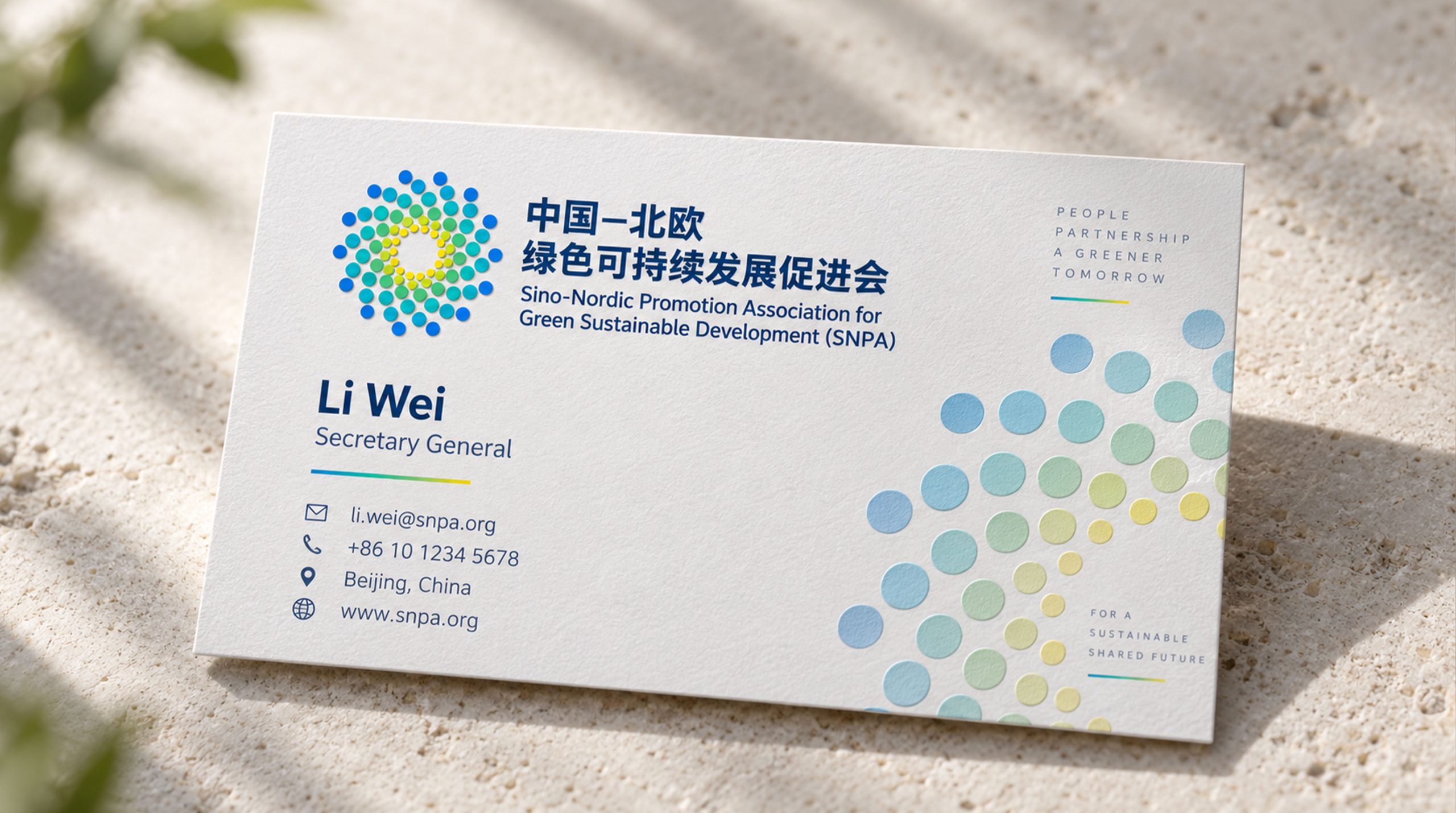
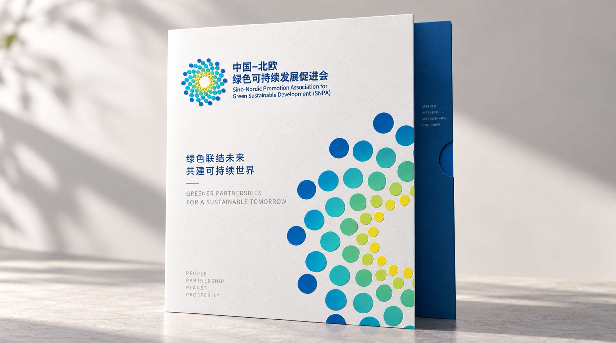
design concept
The logo takes "Cycle of Sustainability" as its core concept, interweaving the three pillars of sustainable development - economy, society and environment - into an uninterrupted closed-loop structure with three circular arcs. The Möbius strip-style infinite cycle is the most accurate visual metaphor for "sustainability" - there is no starting point, no end, sustainable development and endless cycles.
graphic language
The main body of the graphic consists of three flowing arcs forming a three-leaf circulation structure. The three arcs represent the three major dimensions of sustainable development: economic prosperity, social equity and ecological protection. Three arcs are arranged at an equal angle of 120 degrees. Each arc naturally starts from the end of the previous arc, forming a closed loop that is connected end to end and circulates endlessly - the economy supports society, society relies on the environment, and the environment feeds back the economy. The three are mutually causal and inseparable.
The flow direction of the arc is unified as clockwise rotation, conveying positive forward development momentum. The thickness of each arc remains consistent, conveying the equal importance of the three dimensions - sustainable development does not favor any one, and the economy, society and environment are equally important and indispensable. The intersection of the three arcs forms a triangular central space, which is like the core protected by the three forces - the sustainable future of mankind.
The overall outline of the figure is a perfect circle, and the circle symbolizes the earth, integrity and harmony. The three-leaf structure is evenly distributed in the circle, like the dynamic balance of economic, social and natural systems on the earth. The overall composition builds a "ring of sustainability" with a closed-loop structure of "three-stream circulation and endless sustainability".
Font composition
The Chinese version of "China Sustainable Development Association" uses a correct, modern boldface with even and steady strokes, striking a balance between the solemn authority of a national institution and the affinity of a public welfare organization. The English "CHINA ASSOCIATION FOR SUSTAINABLE DEVELOPMENT" is arranged in standard uppercase sans serif font to ensure standard recognition in international sustainable development cooperation.
color system
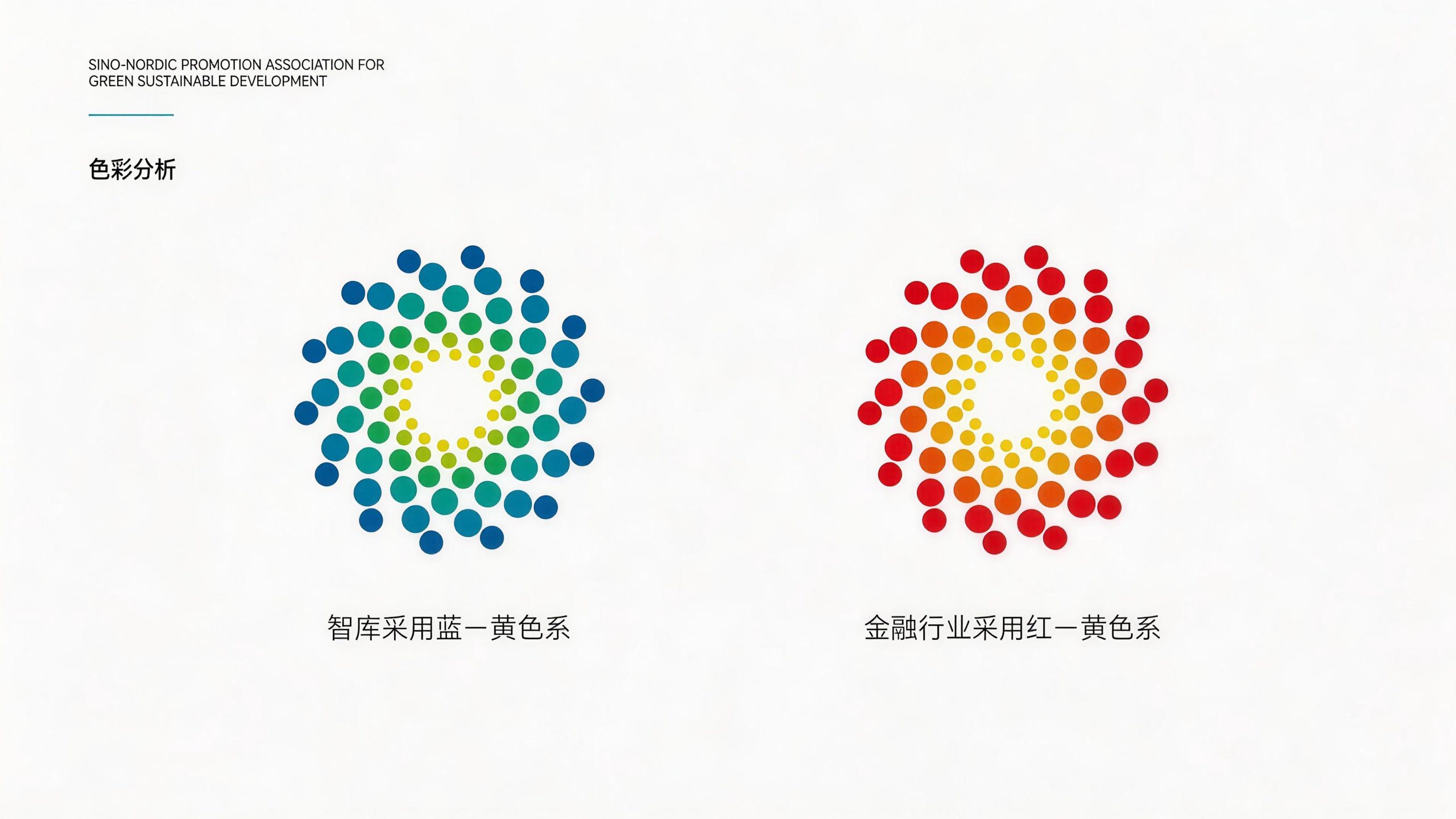
The main color, sustainable green #1B813E, represents ecology, life, sustainability and natural harmony. Green is the absolute core color in the field of global sustainable development - the United Nations Sustainable Development Goals, environmental protection agencies and green organizations in various countries all use green as the main color of their logos. Choosing this color directly establishes a visual connection between the brand and the cause of sustainable development. Auxiliary development blue #2471A3 represents economic development, technological progress and rational governance. Blue injects rational thinking in the economic dimension into the green ecological background. Auxiliary Humanity Orange #E67E22 represents social justice, humanistic care and public participation. The warm color injects human warmth into the cool green and blue combination. The three colors correspond to the three pillars - green is the environment, blue is the economy, and orange is the society, forming a complete color system for sustainable development. Pure white #FFFFFF as standard base color.
Application extension
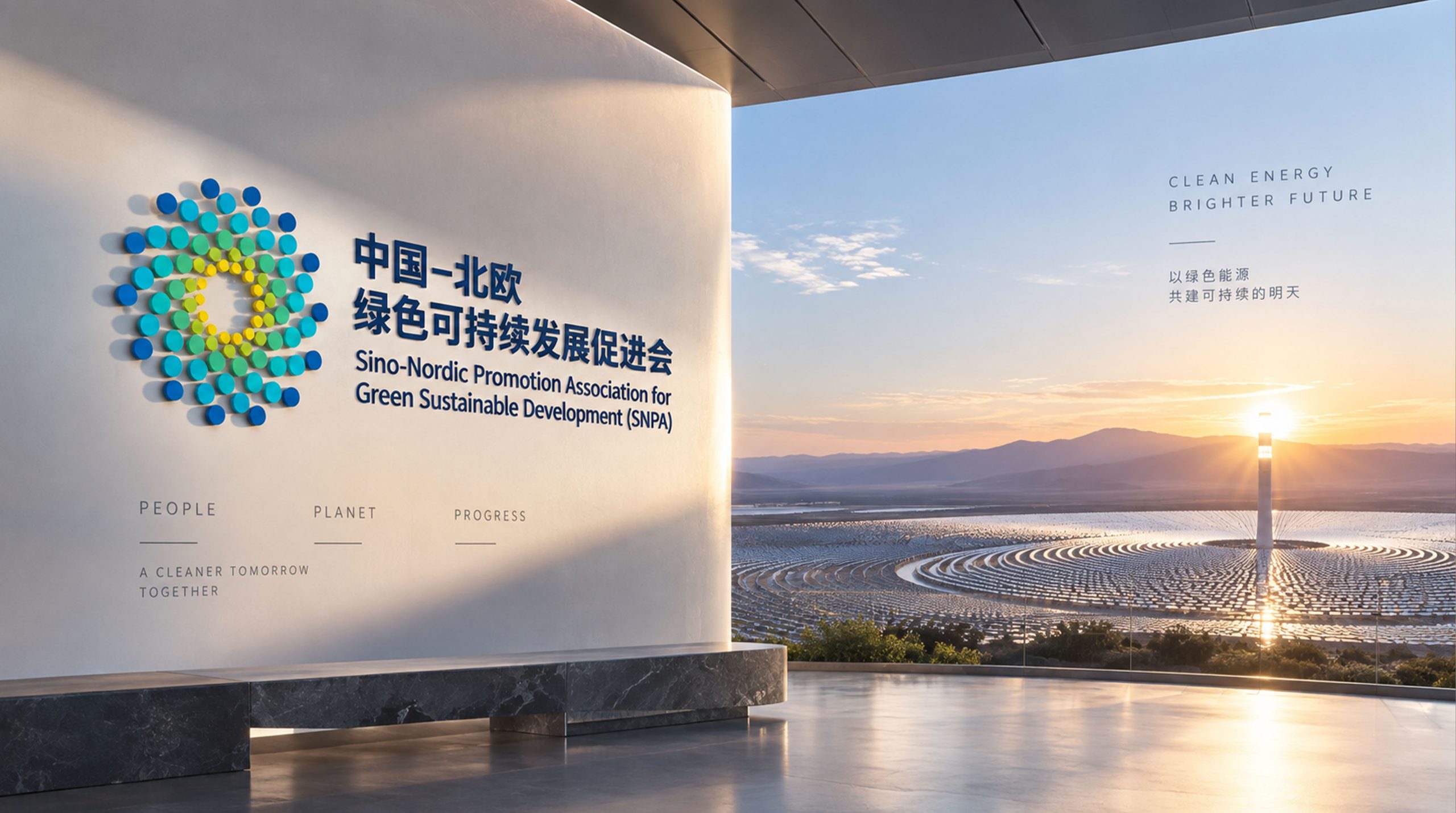
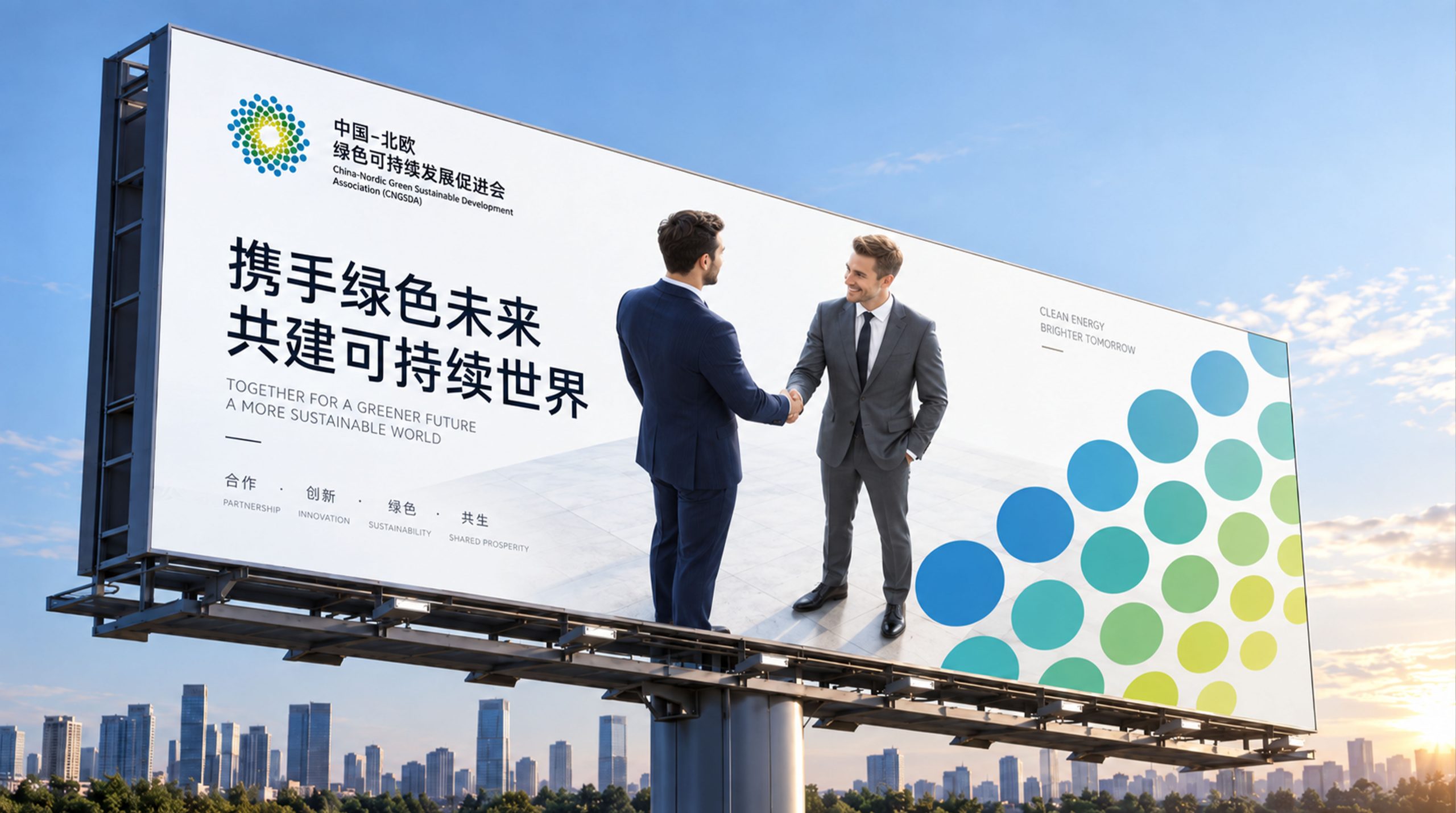
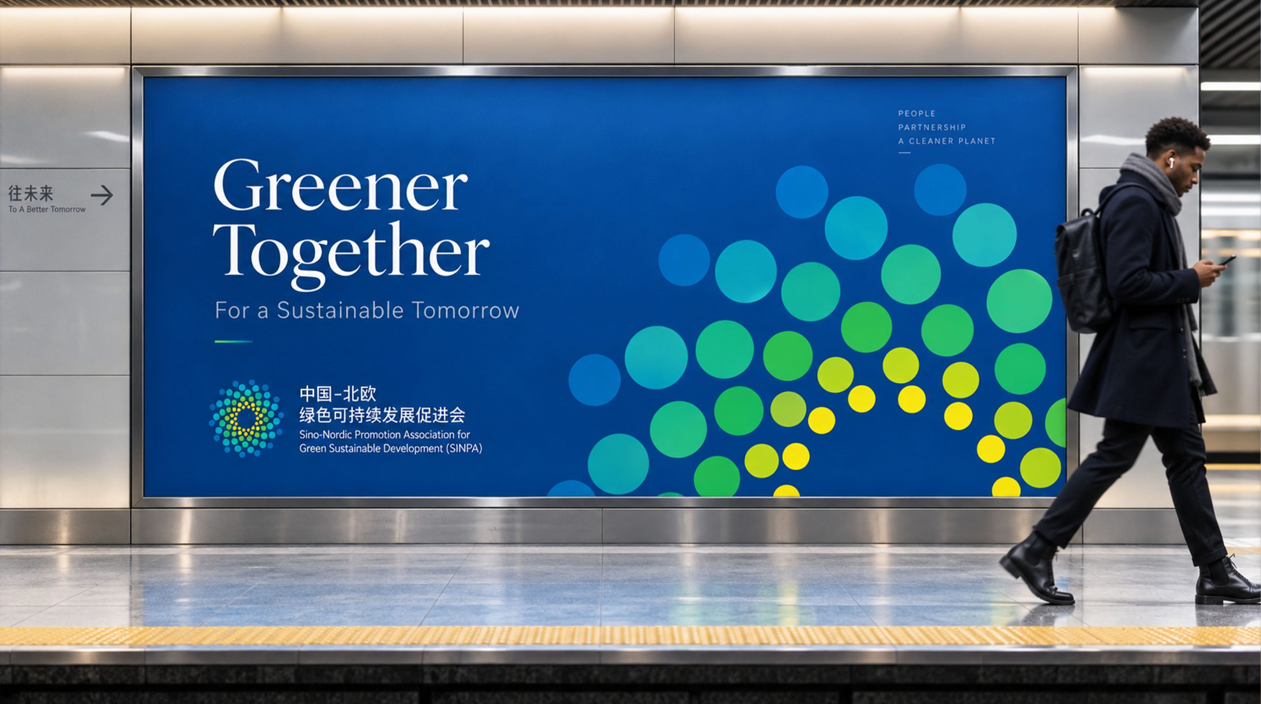
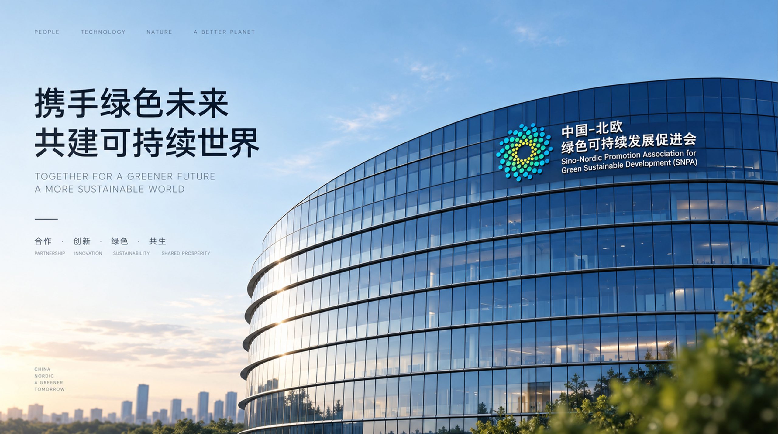
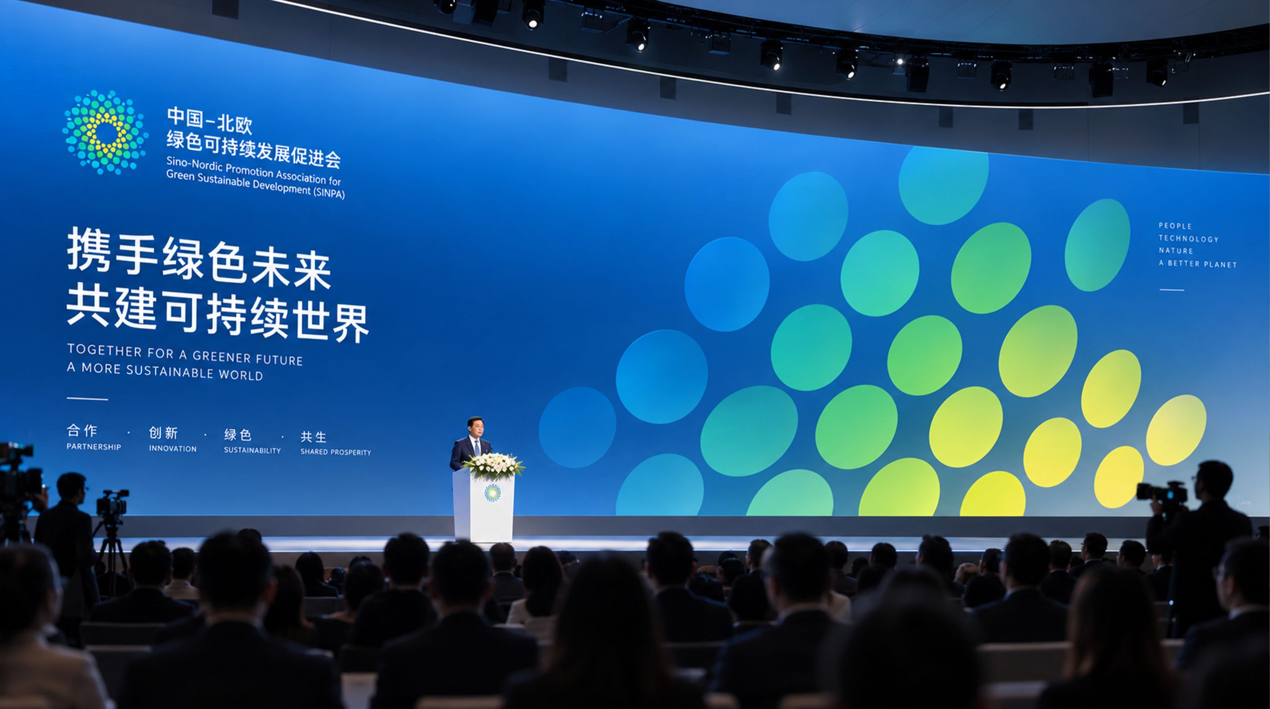
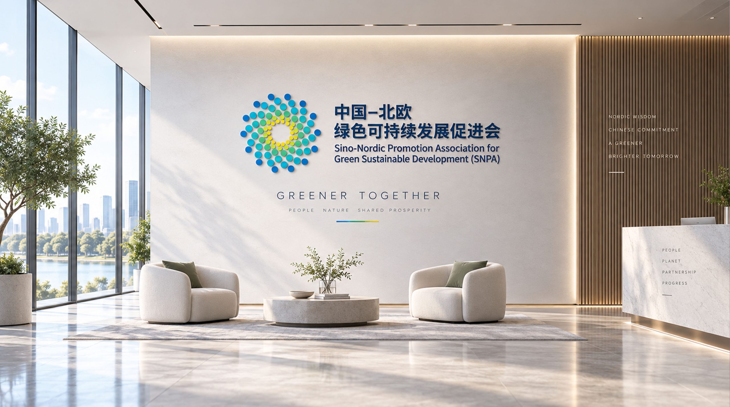
The logo can be widely used in the logos of the association’s headquarters and local branches; annual reports, policy research white papers and industry standard documents; official websites, information release platforms and social media images; sustainable development forums, United Nations-related conferences, international cooperation projects and government cooperation images. In large-scale sustainable development forums, the three-color arcs can be filled with economic data, social cases and ecological images respectively, making the brand symbol a dynamic information carrier for the concept of sustainable development. In the dynamic vision, three arcs flow into the field in sequence and connect from beginning to end to form a closed loop. The circular rotation never stops, symbolizing the eternal pursuit of sustainable development.
brand meaning
The logo contains three core images: Ecological Balance - the sustainable green and circular structure convey the ecological concept of harmonious coexistence between man and nature; Triple Bottom Line - the three arcs convey the core proposition of coordinated development of economy, society and environment; Infinite Sustainability - the closed-loop structure conveys the career spirit of sustainable development that has no end and is always on the road. The overall design conveys the brand vision of "green sustainability, harmonious coexistence".
Improper usage (protected under the Act)
Do not change the number, bisection angle or circulation direction of the three arcs; do not change the hue of the main color of sustainable green; do not interrupt the closed-loop structure or disjoint the beginning and end of the arc; do not add gradients, shadows or decorative effects that are inconsistent with the sustainable development style; keep white space ≥ 25% of the graphic diameter; the minimum display width shall not be less than 25mm.
design results
After the release of the logo, China Sustainable Development Association's brand unity and public awareness in the field of sustainable development across the country have significantly improved. With its visual language of conveying ecological balance and three-dimensional progress, the "ring of sustainability" has become the core identification symbol of the brand system, showing the brand vision of "green sustainability, harmonious coexistence".