










Dayin Group is a comprehensive enterprise group with financial investment and diversified industrial operations as its core. Its business covers financial services, asset management, industrial investment and industrial operations. It is committed to empowering the real economy with the power of capital and creating long-term value with professional management.
The brand name "Da Yin" is grand in character - "Da" means grandeur and pattern, symbolizing the group's size and strategic vision; "Yin" means silver, gold and silver, which is directly related to the core attributes of finance and wealth, conveying the brand's deep roots in the capital field. Qingmei Future was commissioned to lead the brand identity design.
The design goal of the brand logo is to convey the brand image of "the road is simple, the bank and the trust are long-term" through the visual language of financial heaviness, group structure and steady trust.
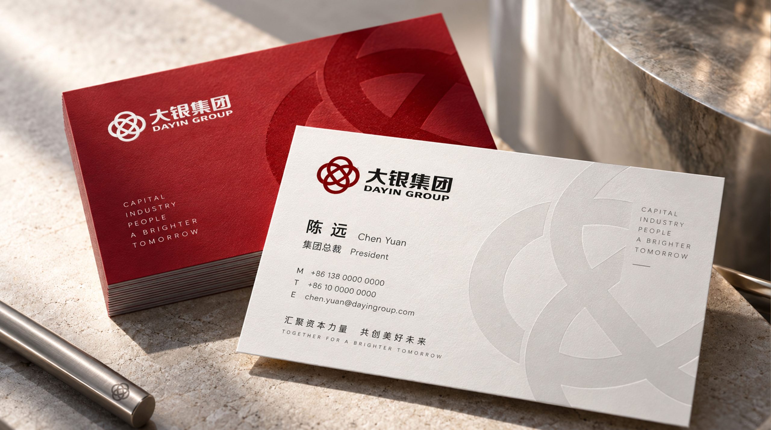
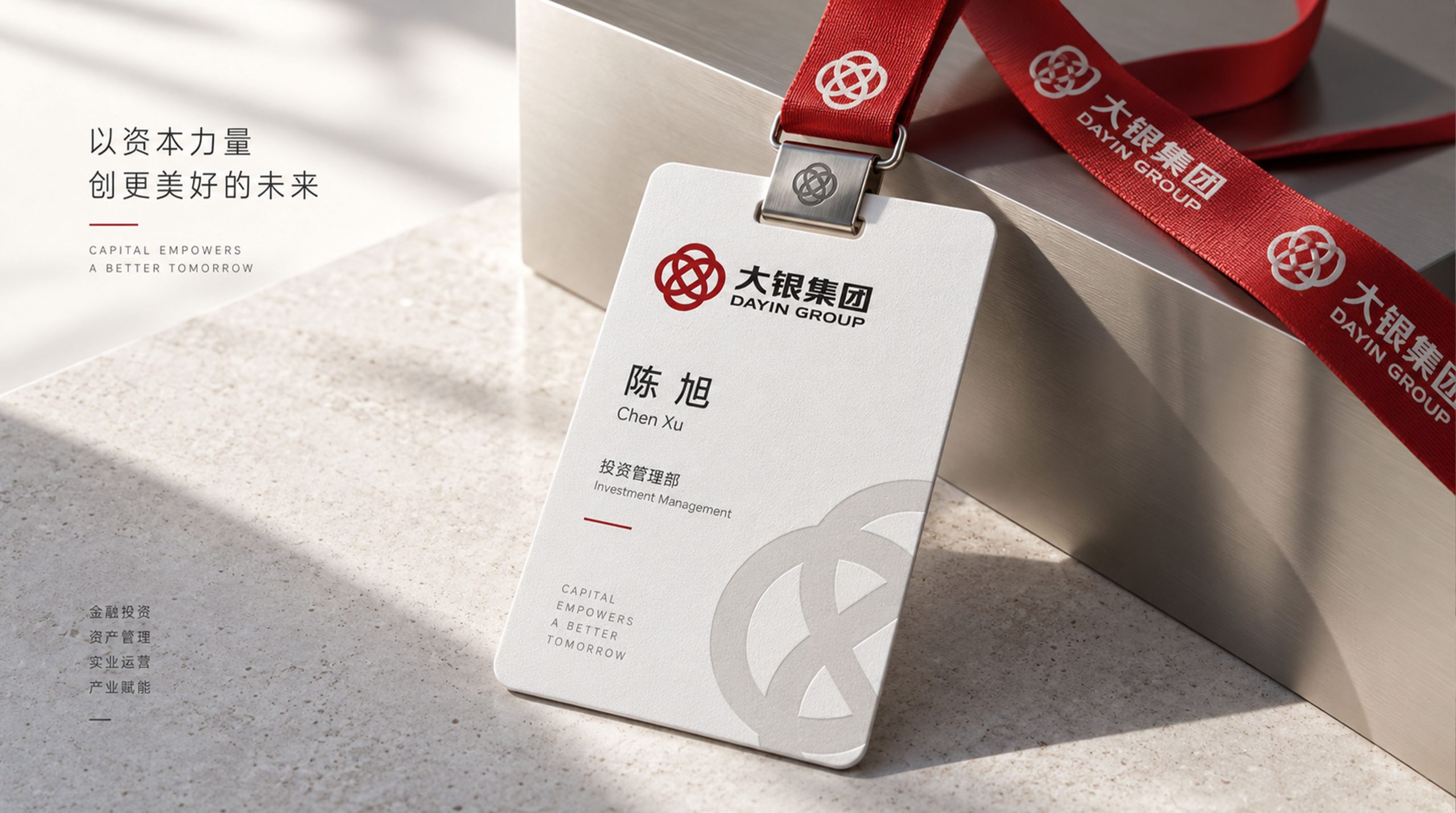
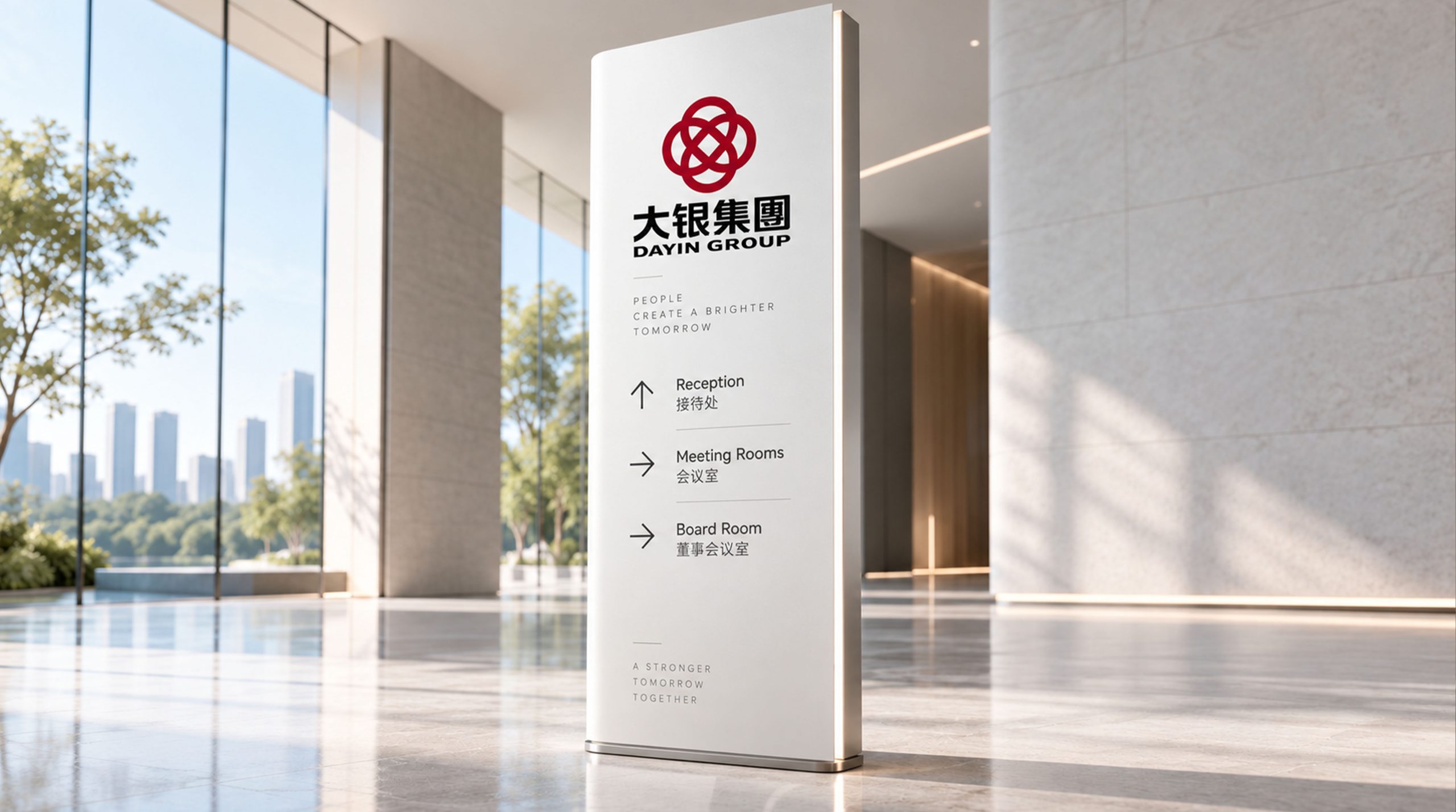
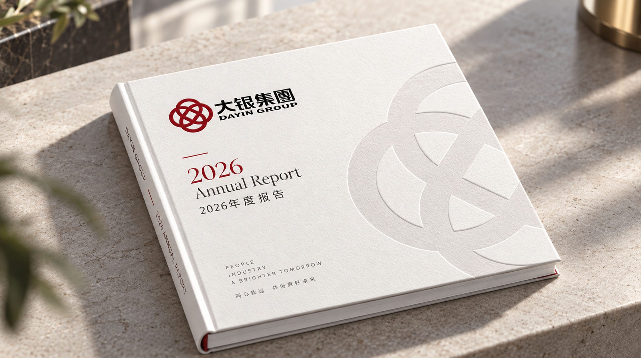
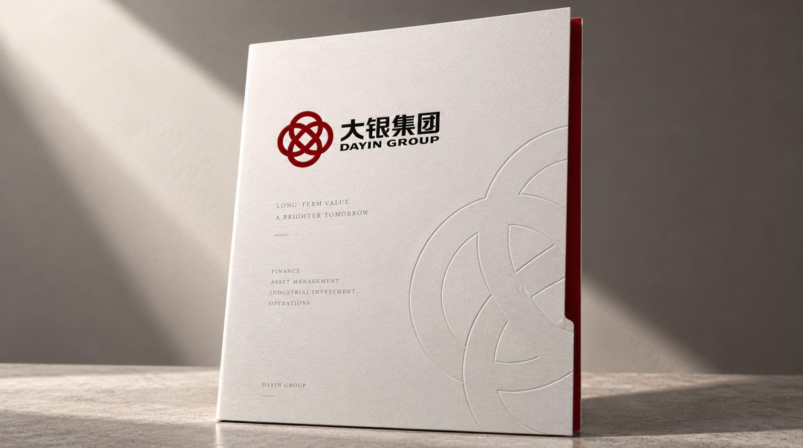
design concept
The logo takes "Seal of Dayin" as its core concept and integrates the solemn shape of traditional Chinese seals with the grand structure of the Chinese character "Da". The seal is the highest symbol of credit and authority in Chinese business civilization - a seal is a promise worth a thousand dollars. With the seal as the core of the logo, it directly conveys the financial group's brand creed of "keeping promises, keeping promises, and keeping values."
graphic language
The basic structure of the graphic is a square outer frame. The outer frame is like the border of a seal, with square corners and straight sides, conveying the standardization of the group's operations and the rigor of the system. The proportions of the outer frame are nearly square, and the squareness and solidity are like the solid foundation of a financial institution.
The main graphic inside the outer frame is the calligraphy variant of the brand's core word "Da". The character "Da" is presented in strokes that combine the charm of calligraphy and geometric order - the horizontal strokes are as wide as the earth, and the horizontal strokes are as wide as the arms opening up to embrace the world, conveying the group's corporate structure of "opening up to all rivers and being magnificent". The horizontal drawing of the word "Da" is parallel to the upper edge of the outer frame. The ends of the stroke extend toward the lower corners of both sides of the outer frame, almost touching the edge of the frame, making the word and frame integrated. The word "Da" fills the square seal, conveying that the group's business is full and full of strength.
The strokes of the word "Da" are presented with the thick feeling of a center-stroke pen, with a slight change in the strength of calligraphy at the beginning and end of the stroke, retaining a touch of manual warmth in the geometric regularity - this is a group with historical heritage, not a cold digital machine. The overall composition uses a square seal structure with "words in the seal and characters supporting the seal" to build a "tripod seal".
Font composition
The Chinese "Dayin Group" adopts solemn modern Song style, with thin horizontal lines, thick vertical lines and clear strokes. The word "big" is broad and majestic, the gold word "silver" flashes with financial background, and the word "group" is calm and closed. The English "DAYIN GROUP" is arranged in a standard uppercase serif font with a broad and steady font to ensure professional recognition of the brand in business cooperation and capital markets.
color system
The main color is silver and gold #9E7A38, which represents wealth, nobility and financial value. The golden color is like the luster of precious metals at the intersection of silver and gold - it is calm and restrained rather than flashy and public, conveying the financial group's business philosophy of "keeping a low profile and preserving wealth, accumulating wealth and making progress". Auxiliary black ink #1A1A1A is used for brand wordmarks and basic system elements. The absolute calmness of black provides the most powerful support for the nobility of gold. The combination of gold and black is the most classic color combination for high-end financial brands. Auxiliary silver gray #B0B0B0 is used as a transitional tone for auxiliary information levels and brand systems, echoing the brand semantics of the word "silver". Pure white #FFFFFF as standard base color. The overall color uses gold and black as the dual core, reflecting the brand temperament of "noble, stable, and important financial tool".
Application extension
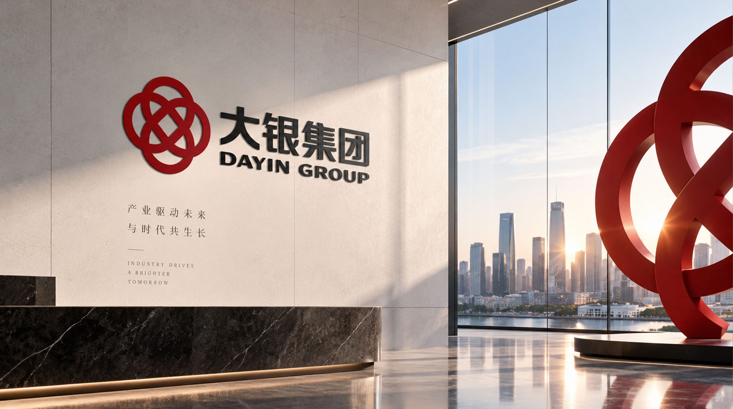
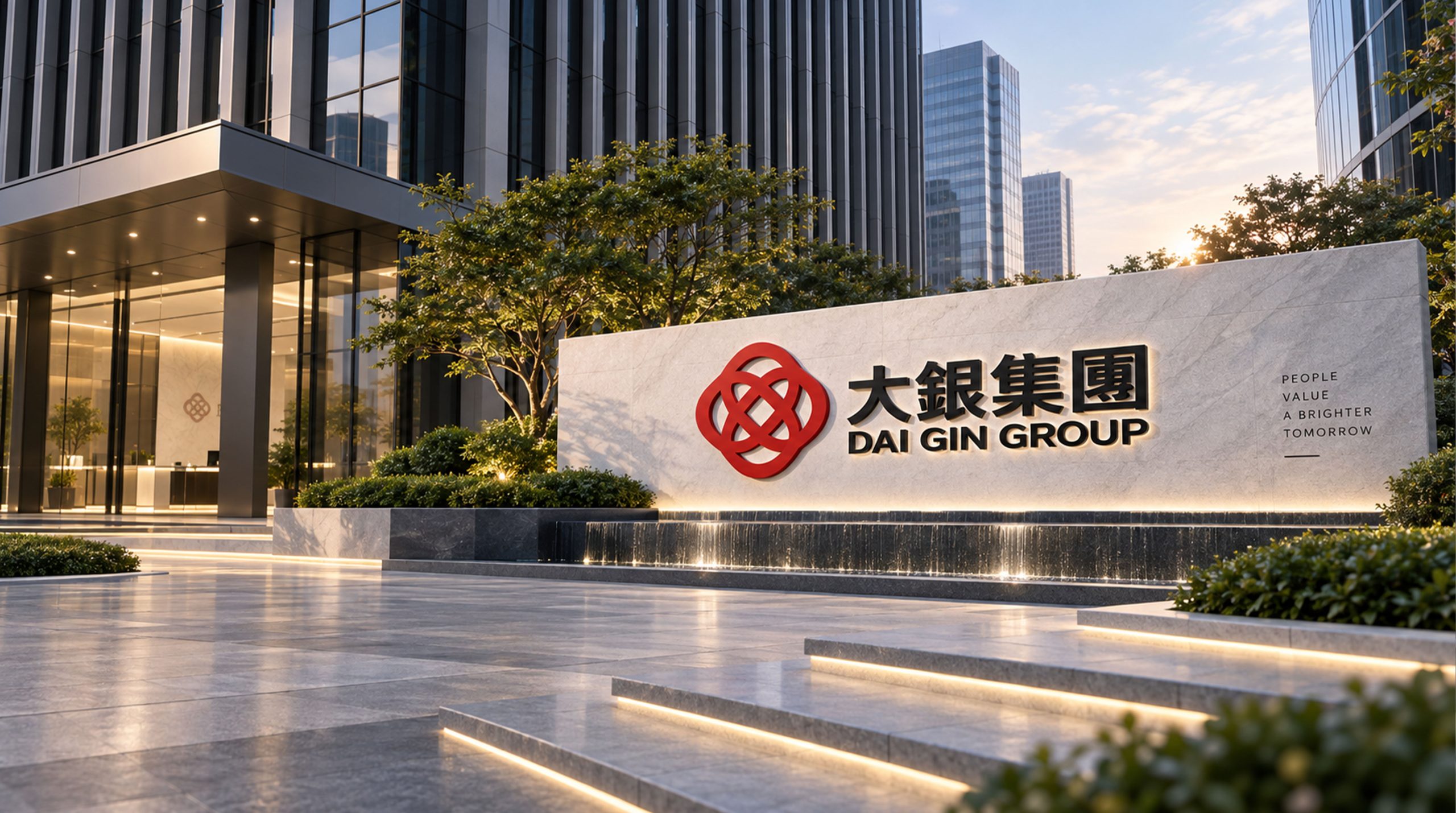
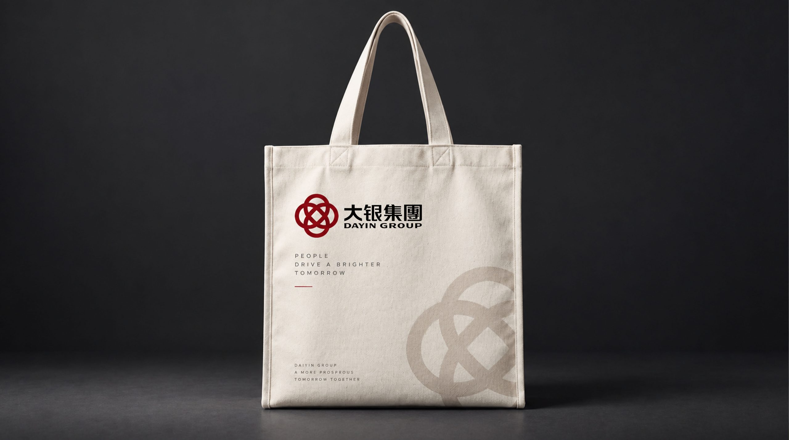
The logo can be widely used in the logo of the group headquarters building and branches in various places; on the covers of investment plans, asset management reports and shareholder communications; on official websites, digital platforms and business communication materials; on the image of financial industry summits, investment forums and government cooperation projects; on high-end business cards, corporate brochures and brand gifts. In the lobby of the group headquarters, the square seal logo is presented in the center of the image wall using copper casting or stone carving techniques. The golden fonts exude a restrained metallic luster on the dark background, conveying the historical depth and quality confidence of the large financial group. In the dynamic vision, the outer frame of the square seal is completed one by one with the force of engraving, and the word "big" in the seal is completed in one go with the rhythm of calligraphy, just like a financial reprint is being solemnly cast.
brand meaning
The logo contains three core images: Grand Vision - the majestic structure of the word "big" conveys the group's size and strategic vision; Financial Seal - the square seal shape conveys the financial institution's credit commitment of "a seal is a letter, a promise is worth a thousand dollars"; Solid & Enduring - the gold-black tone and square composition convey the group's historical accumulation and long-term value creation capabilities of decades of steady operations. The overall design conveys the brand vision of "the road to simplicity, the bank to the long-term".
Improper Usage (Protection Specification)
Do not change the square proportion of the outer frame or replace right angles with rounded corners; do not modify the stroke structure of the word "Da" or the proportional relationship with the outer frame; do not change the hue of the main color of silver and gold; do not add gradients, strokes or decorative effects inconsistent with financial style; do not split the outer frame and use the word "Da" alone; keep the white space ≥ 25% of the height of the graphic; the minimum display width shall not be less than 25mm.
design results
After the release of the logo, Dayin Group's brand recognition and market authority have been significantly improved in the fields of financial investment and diversified industries. "Seal of Dingli" has become the core identification symbol of the brand system with its visual language that combines financial heaviness and Chinese seal culture, showing the brand vision of "the road to simplicity, the bank and trust to the long-term".