











Zhonghaiyang is a clean energy company with CSP and new energy technology as its core. It focuses on the research and development of solar thermal power generation systems, core equipment manufacturing and CSP engineering services. It is committed to promoting the green transformation of the global energy structure with solar technology.
The three characters of the brand name "Zhonghaiyang" contain a grand energy vision - "Zhong" represents China's strength and industry responsibility, "Hai" means the vastness of the sea, symbolizing the infinite space of the new energy market, and "Yang" means the sun, which directly refers to the core energy of the brand - solar energy. Qingmei Future was commissioned to lead the brand identity design.
The design goal of the brand logo is to convey the brand image of "chasing the sun and energy future" through the visual language of solar technology, clean energy and global landscape.
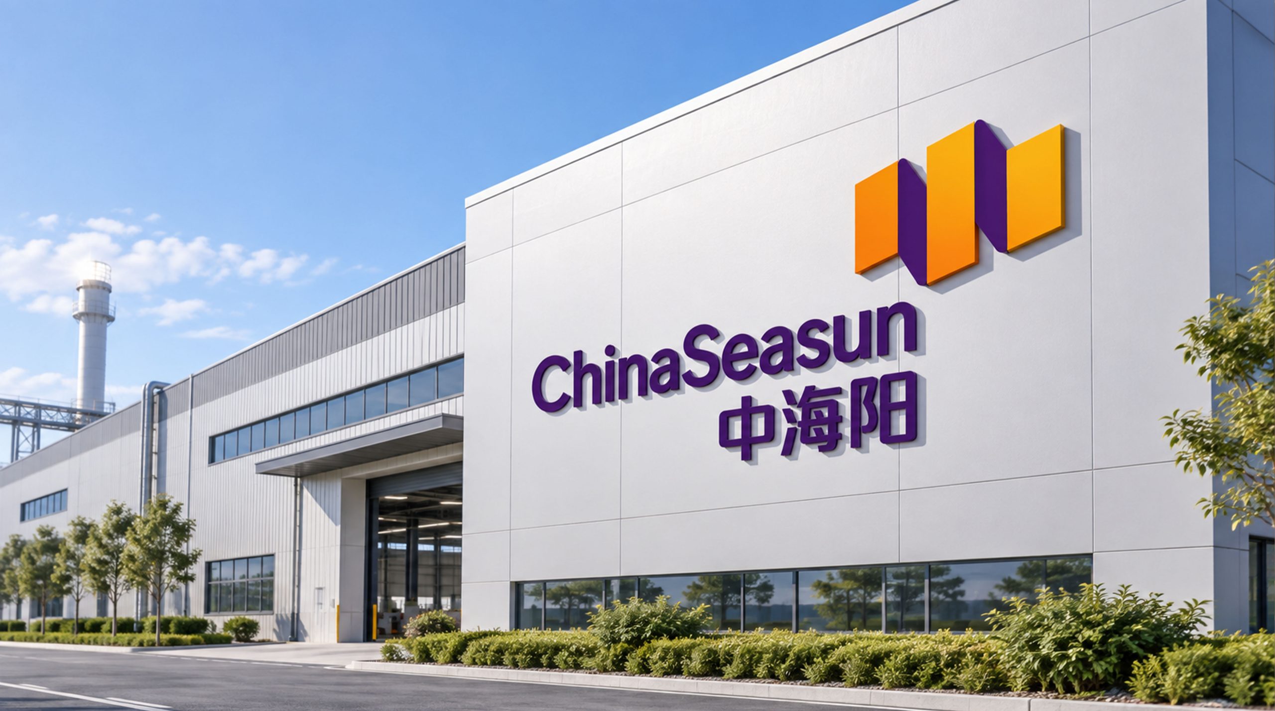
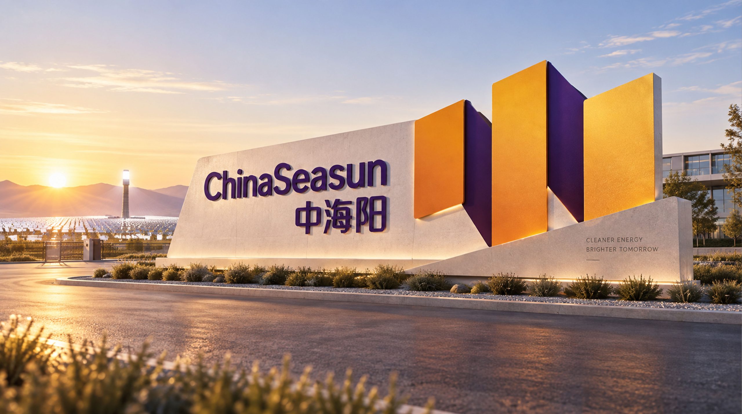
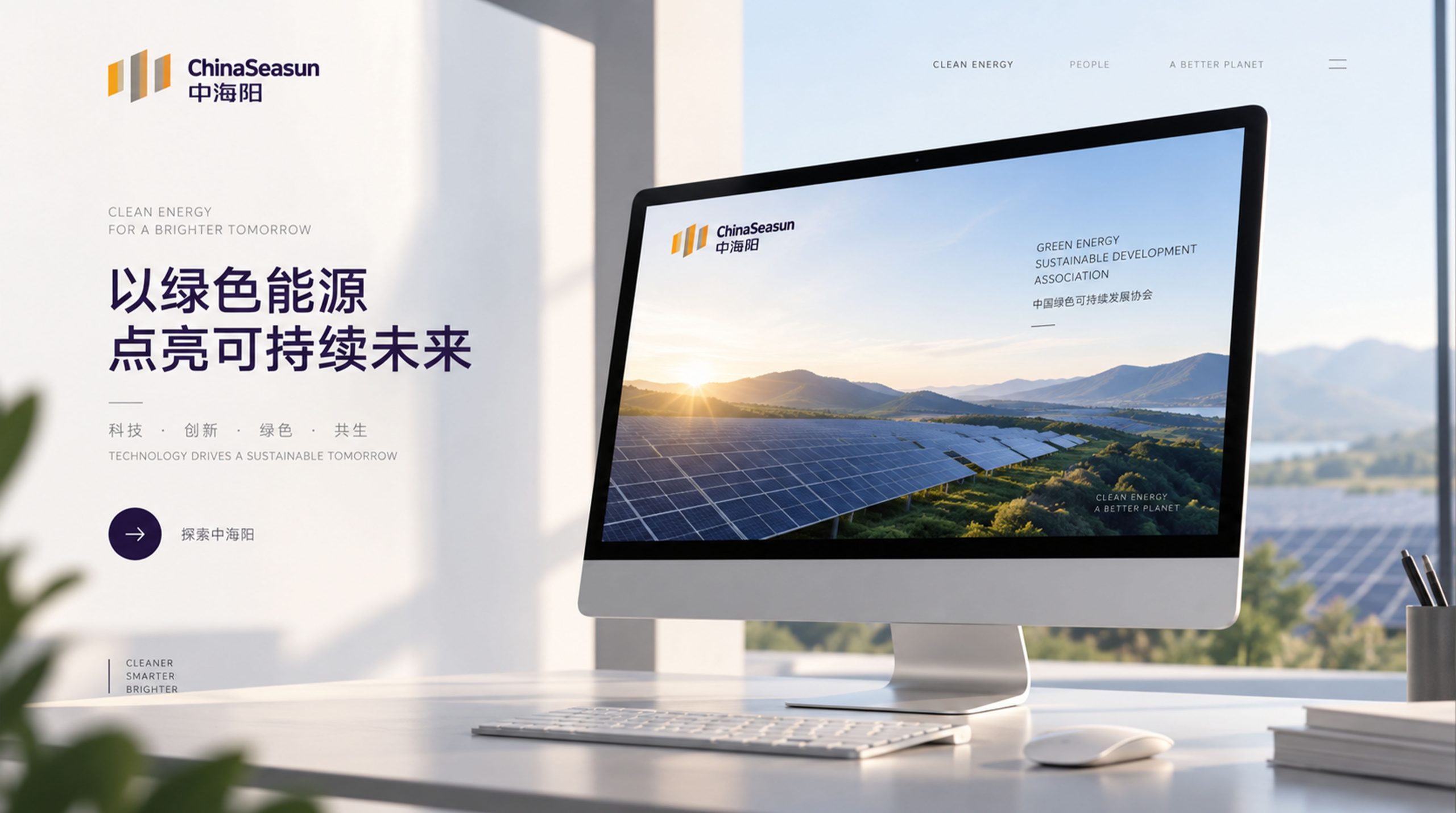

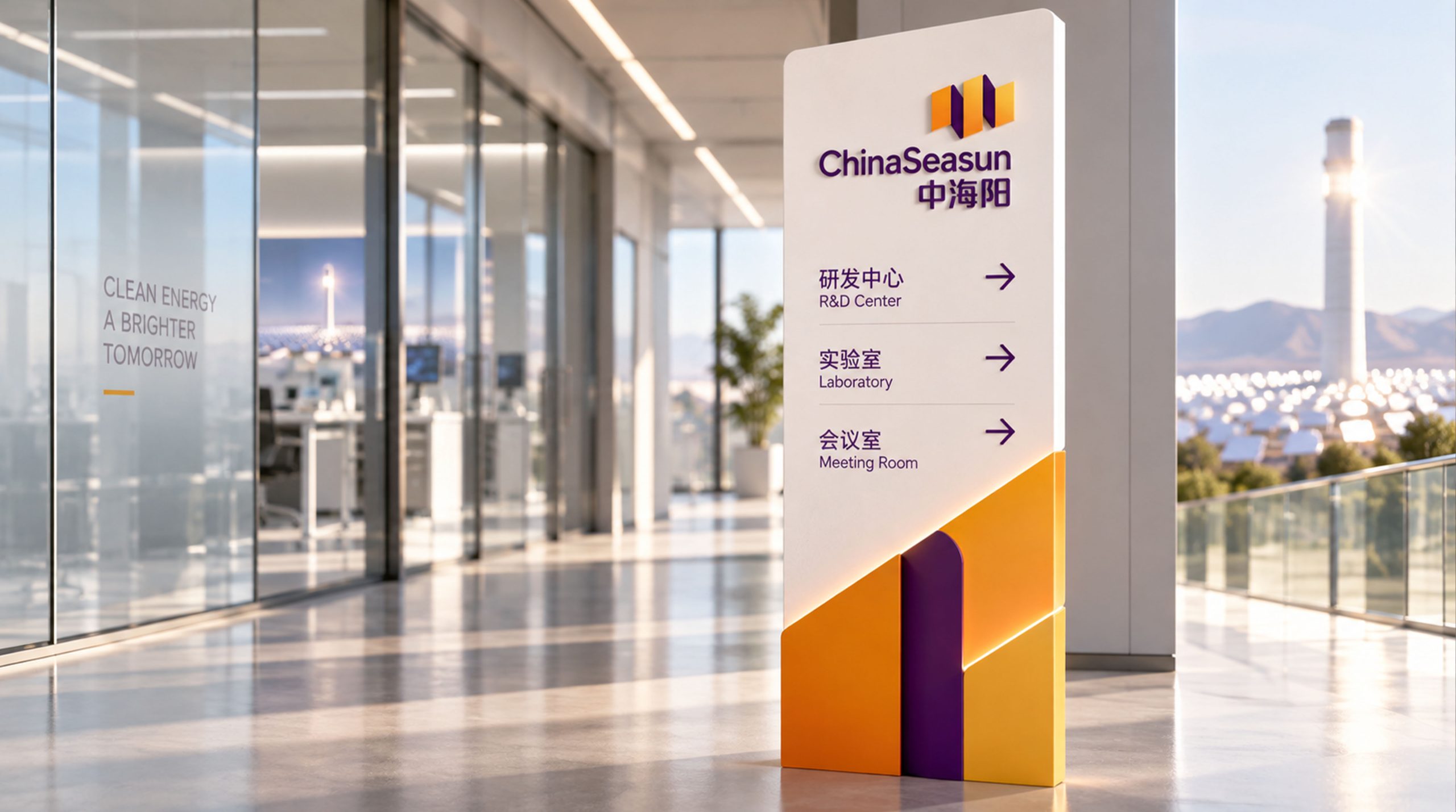
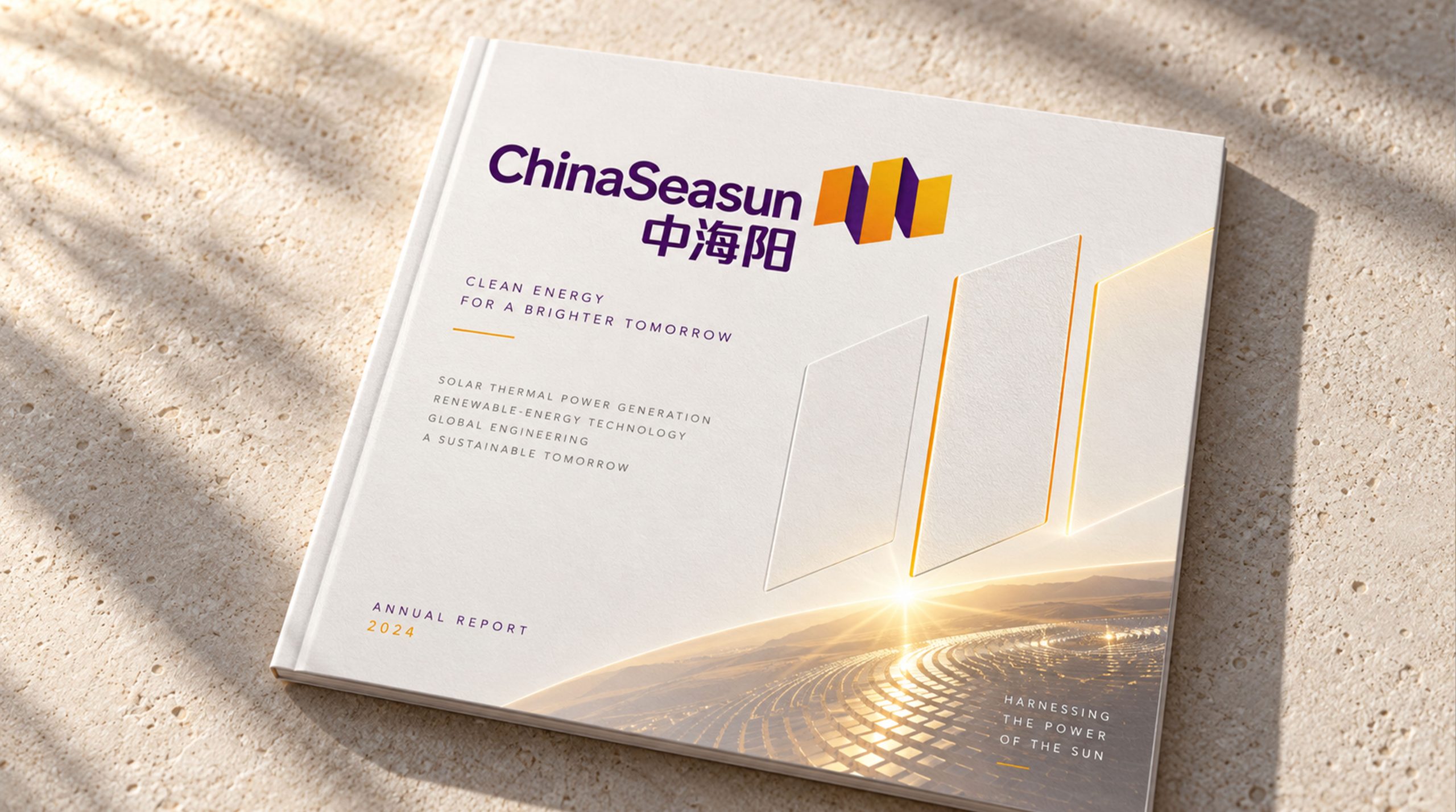
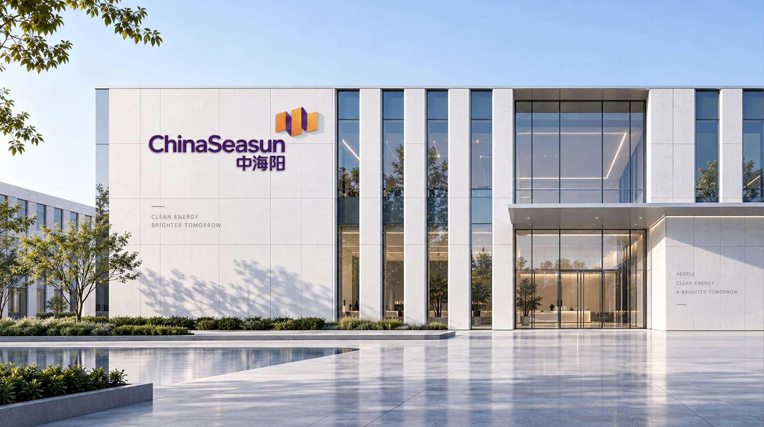
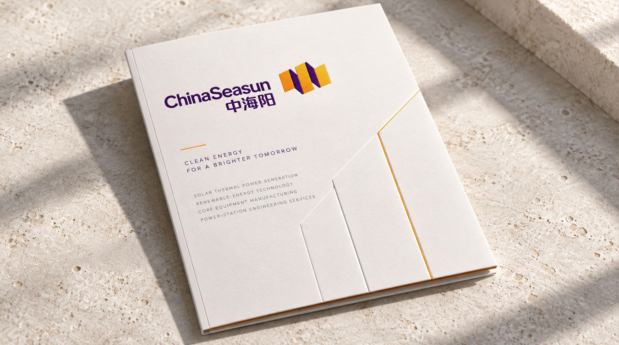
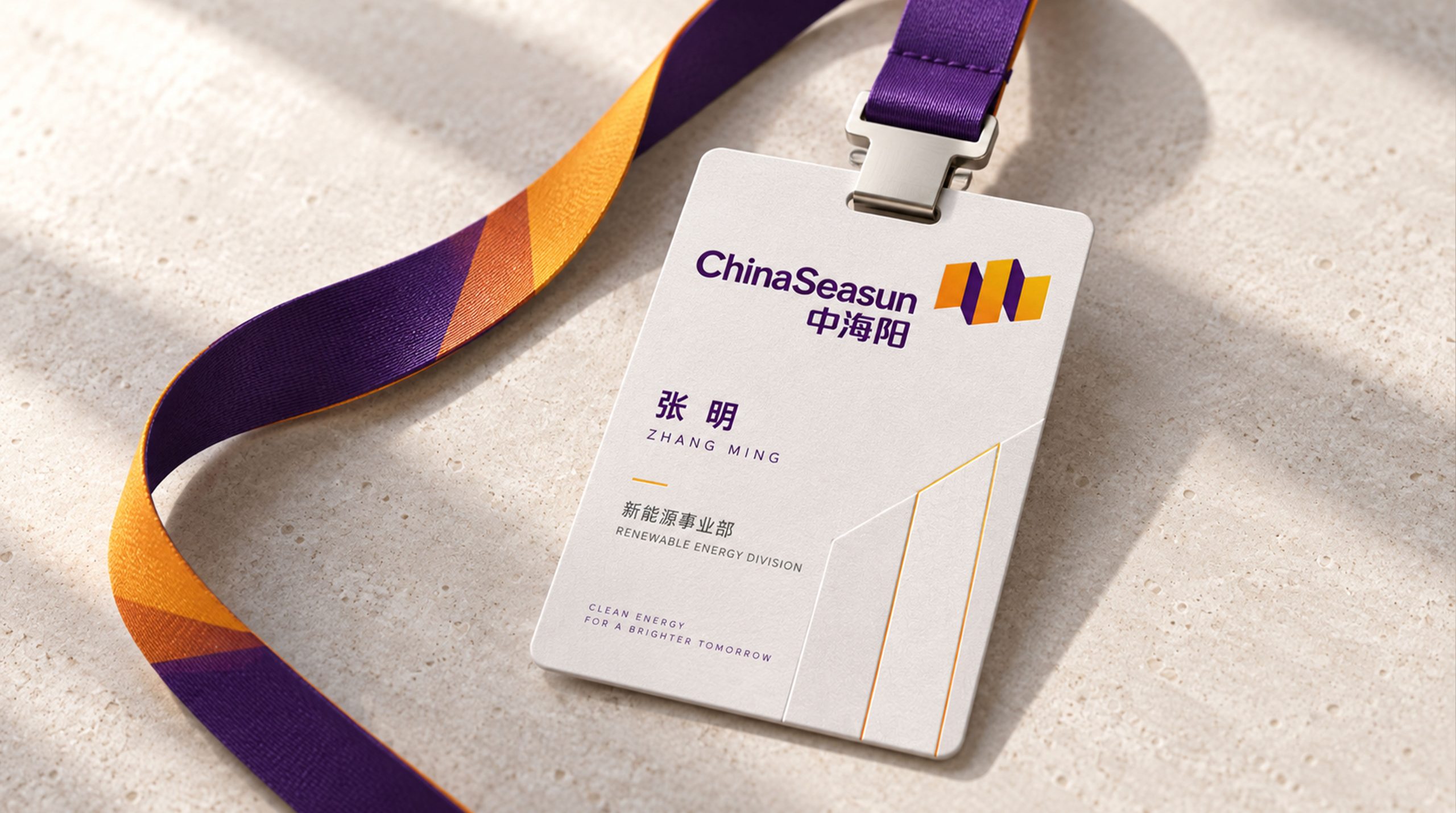
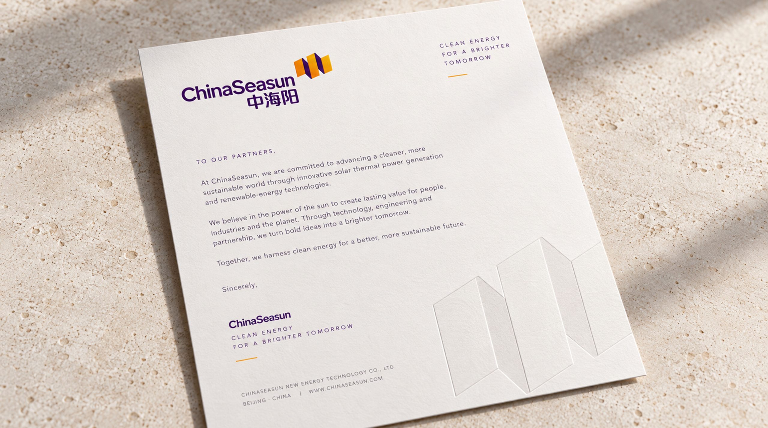
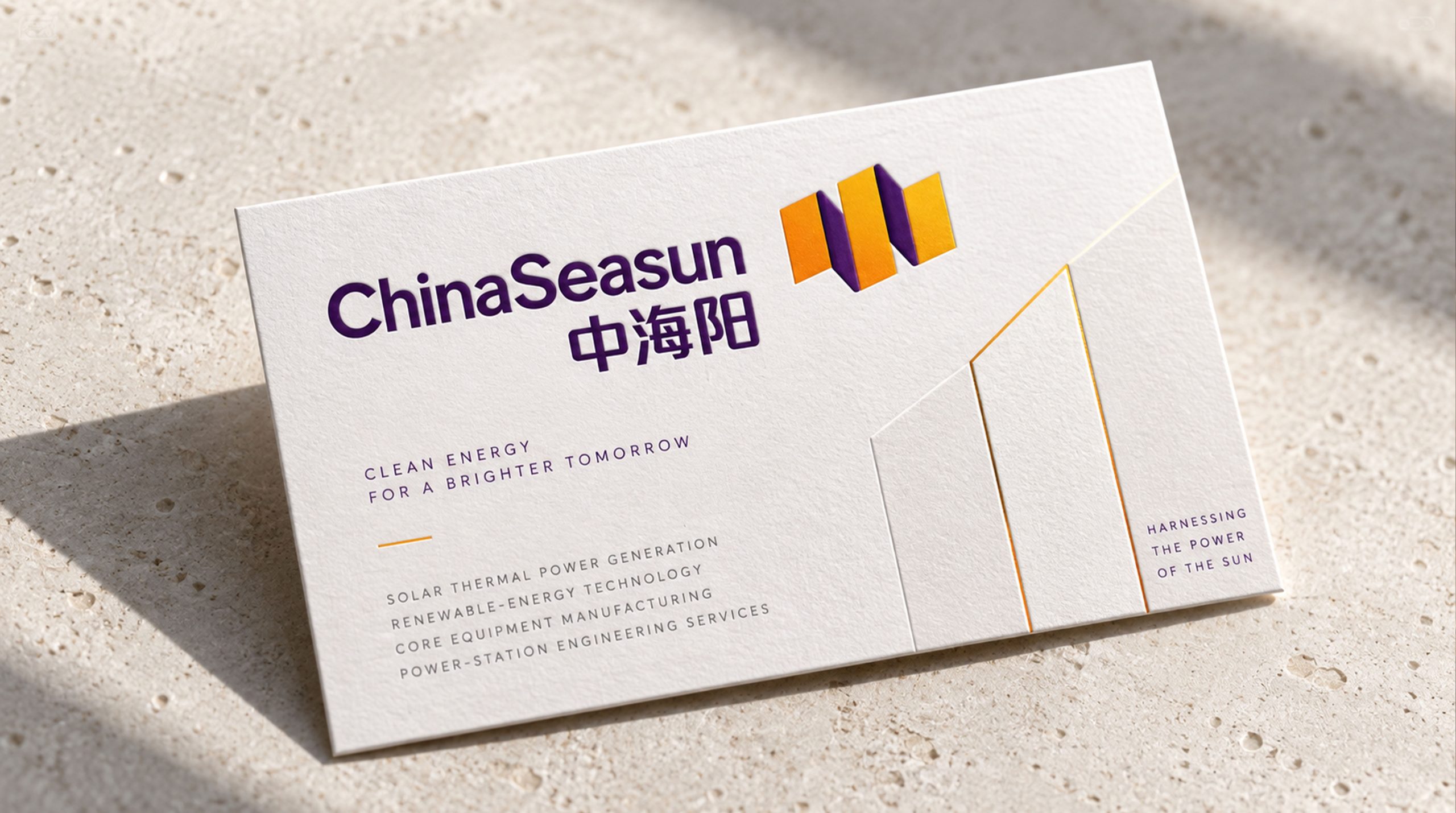
design concept
The logo takes "Concentrated Sun" as its core concept and transforms the core technical principle of photothermal power generation - concentrated light and heat - into a brand visual symbol. Photothermal power generation uses mirrors to focus sunlight on one point to generate high-temperature heat energy. This physical process of "thousands of beams of light converging into one point" itself is highly visual. It is not only an intuitive expression of technology, but also the best metaphor for the brand's strategic spirit of "focusing on the core and condensing energy".
graphic language
The main body of the graphic has a luminous circle as its core, which represents the sun, the source of energy for all Zhonghaiyang's technologies and products. The round shape is presented in bright warm tones, with subtle radial gradients inside to create a luminous texture like a ball of light, like a star releasing energy.
Several arc-shaped rays of light surround the periphery of the circle, and the rays of light converge from all sides toward the center of the circle, just like the spectacular scene where hundreds of heliostats in a solar thermal power station reflect sunlight and focus it on the top of the heat collecting tower. Light does not radiate outward from the center, but converges from the outside to the center - this "centripetal concentration" directionality is the core technical feature that distinguishes photothermal power generation from photovoltaic power generation, and is also the key identification point that distinguishes Zhonghaiyang's brand identity from other solar energy companies.
The light-gathering arcs are arranged at equal angles, and the arcs gradually become thicker from the outer end to the center of the circle, just like the energy density of the light beam continues to increase during the focusing process. The even spacing between the arcs conveys the precise engineering order of the photothermal technology system. The overall graphic outline is radial and circular, just like the array of mirrors overlooking a photothermal power station from space - spectacular, precise and full of technological power.
Font composition
The Chinese "Zhonghaiyang" uses a modern sans-serif font, with simple and powerful strokes and an open structure. The character "Zhong" is calm and centered to convey the power of the country, the character "Hai" has a wide structure to convey the broad pattern, and the character "yang" is bright and stretched to convey the energy of the sun. The English "CHINA HI-SUN" is arranged in standard uppercase sans serif font, and the "SUN" in "HI-SUN" directly points out the core business of solar energy.
color system
The main color, concentrated orange #E87A1E, represents the core technology of solar energy, thermal energy and photothermal power generation. Orange is like the high-temperature light produced at the concentration point after being focused by the sun - hot, abundant and energy-dense, directly related to the technical nature of photothermal power generation. Auxiliary technology blue #0F5289 is used for technical documents and engineering images in the brand system to convey the professional rationality and systematic capabilities of energy technology companies. The combination of orange and blue forms a dual brand signal of "heat + technology". Auxiliary Clean Green #3A9A5B is used for clean energy and environmental protection concept elements in the brand system. Pure white #FFFFFF as standard base color. The overall color is orange and blue, reflecting the brand temperament of "photothermal technology and clean energy".
Application extension
The logo can be widely used in corporate headquarters and on-site identification of solar thermal power stations; technical white papers, project plans and investor relations materials; official websites, industry digital platforms and social media images; international clean energy summits, solar thermal power generation forums and government cooperation project images. At the site of the solar thermal power plant, the logo is presented as a large metal nameplate on the base of the heat collecting tower. The light-concentrating graphic echoes the real mirror field array behind it, and the brand symbol and core products are unified in the same space. In the dynamic vision, several arc-shaped rays of light quickly converge from the periphery of the picture to the center. The central light ball gradually lights up and is full of energy, symbolizing Zhong Haiyang's use of concentrating technology to condense the infinite energy of the sun.
brand meaning
The logo contains three core images: CSP Technology - the concentrated arc conveys the core technical principle of "concentrating light and heat" in photothermal power generation and the brand's technological leadership; Energy Concentration - the centripetal graphic structure conveys the brand's strategic spirit of focusing on core business and condensing all resources; Clean Future - the sun graphics and clean colors convey the corporate mission of promoting the green transformation of global energy with solar energy. The overall design conveys the brand vision of "chasing light and pursuing energy for the future".
Improper Usage (Protection Specification)
Do not change the convergence direction of the spotlight arc or change it to diverge outward; do not change the circular proportion of the central light sphere; do not change the hue of the main color of spotlight orange; do not add strokes, shadows or decorative effects that are inconsistent with the energy technology style; do not separate the light sphere and the spotlight arc for separate use; keep the white space ≥ 25% of the graphic diameter; the minimum display width shall not be less than 25mm.
design results
After the release of the logo, China Haiyang's brand recognition and technological influence in the field of solar thermal power generation and clean energy have been significantly improved. "Sunlight", with its visual language that accurately conveys the principles of photothermal technology and the mission of clean energy, has become the core identification symbol of the brand system, showing the brand vision of "Chasing the Sun, Energy Future".