










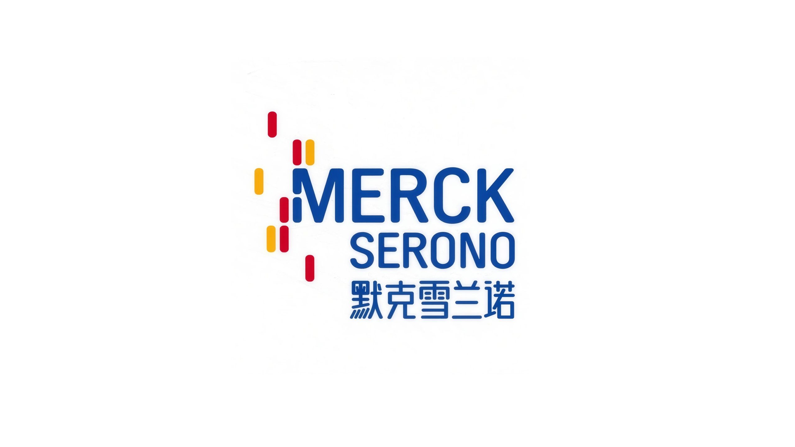
Merck Serono is a global biopharmaceutical company focused on innovative medicines and life science research. As part of its global visual system upgrade, it needed a mark that balances scientific rigor with human warmth, suited to international markets and digital media.






design concept
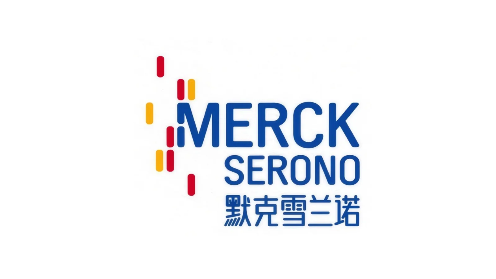
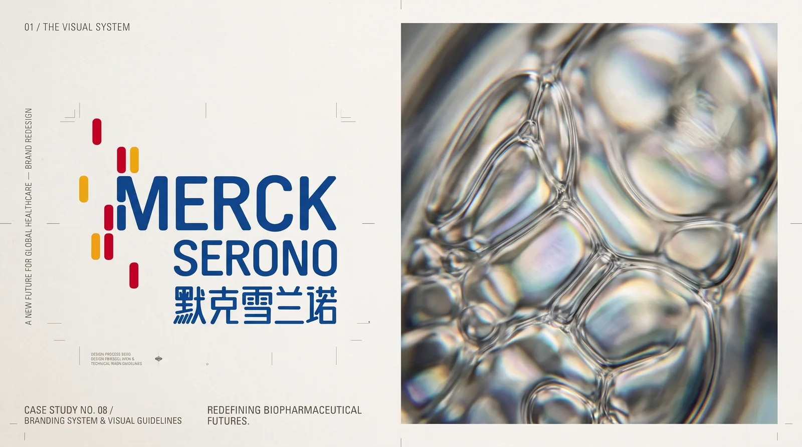
The mark is built on the concept of “the order and rhythm of life,” merging the visual grammar of molecular chains and data code into a vertical sequence of colored rectangles. These represent the flow of biological information and research data, and symbolize the precise, systematic and connected process of drug development. The layout combines rational order with visual momentum, embodying the brand’s core belief: “making science more human.”
graphic language
Vertical rectangle sequence: red, orange and yellow modules represent molecular structures and the rhythm of data, forming a rhythmic scientific order. Layered arrangement: symbolizes the multi-layered extension of genetic chains and research processes. Visual momentum: the vertical graphic on the left resembles a molecular signal in transmission, representing continuous innovation and scientific exploration.
Fonts and composition
The primary wordmark MERCK SERONO is set in a solid sans-serif with generous letter spacing for legibility and international recognition. Blue lettering conveys professionalism, trust and technology. The Chinese text uses a geometric typeface of matching stroke weight to ensure cross-language visual consistency. The layout forms a balanced structure: dynamic on the left, stable on the right.
color system
Primary blue #1C63A1: science, expertise and trust. Secondary palette #C7342B (red), #E98C25 (orange), #F2C94C (yellow): the energy of life and the spirit of innovation. White background: clarity and purity, reflecting the openness of the life sciences.
Application and extension
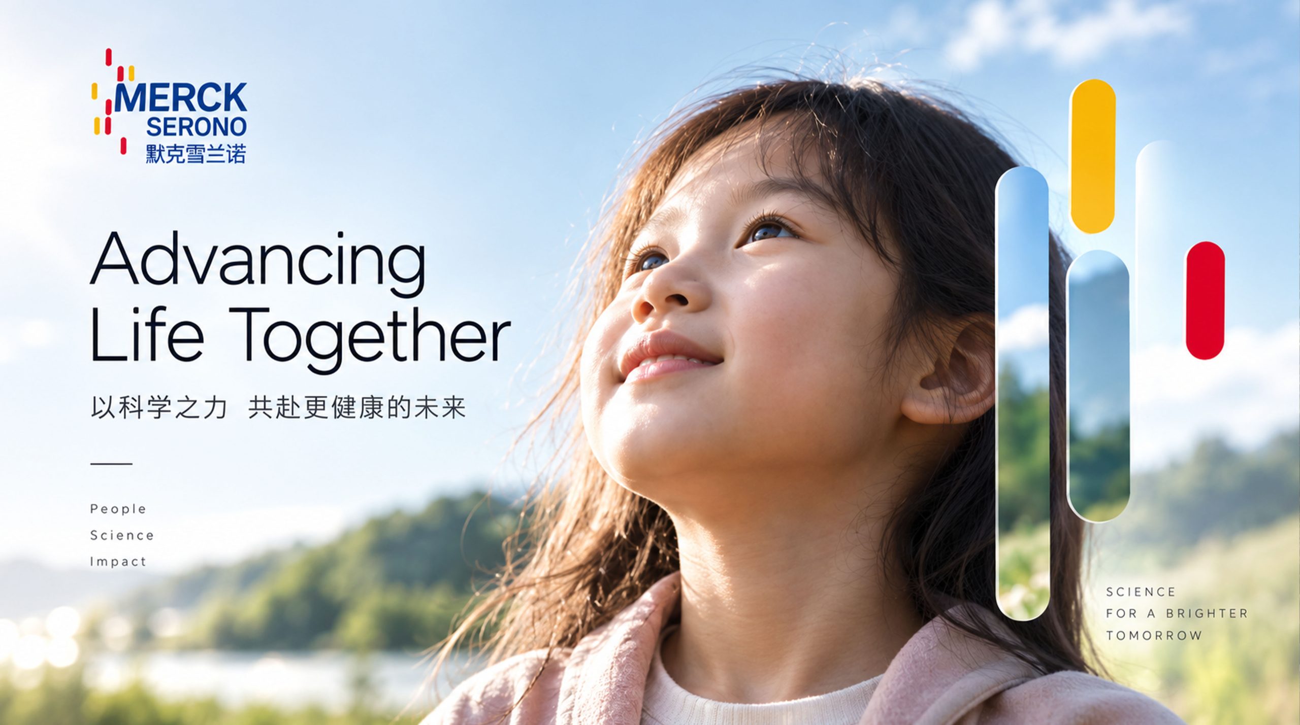
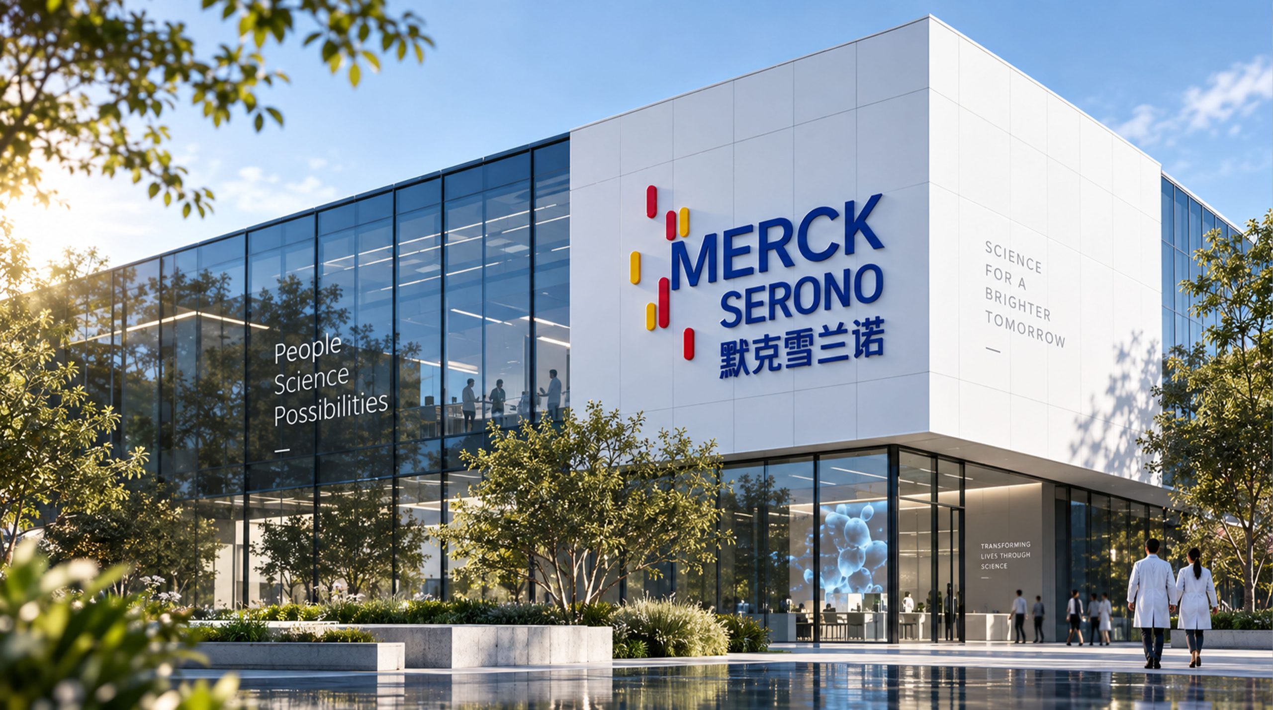
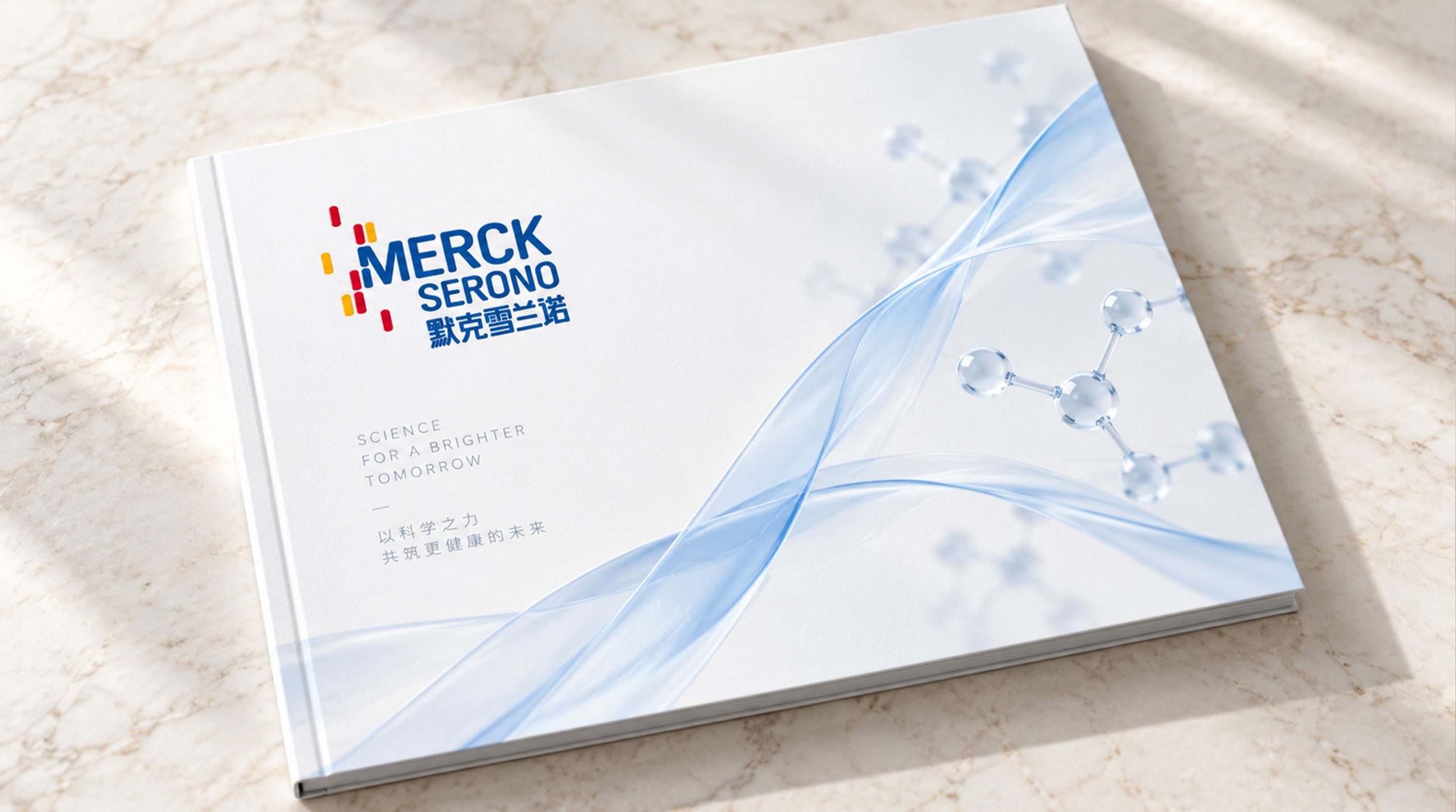
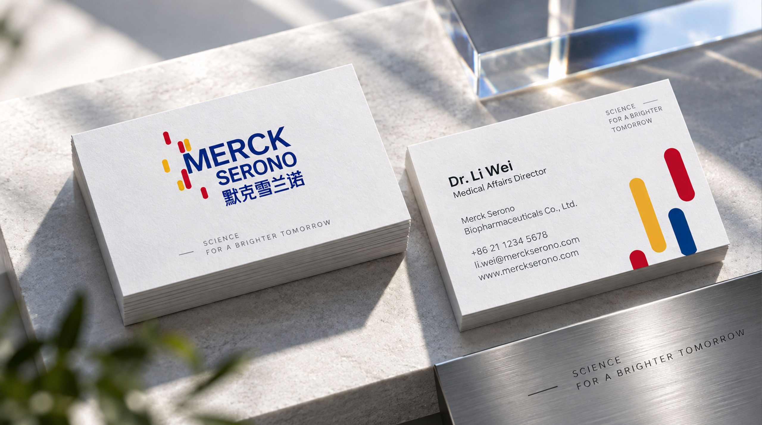
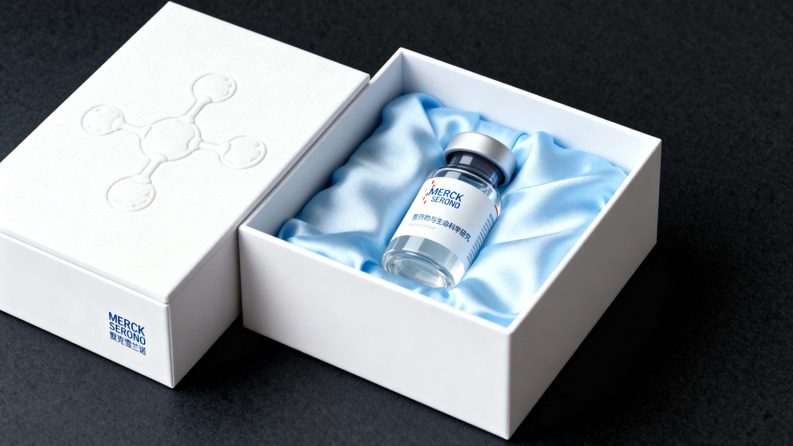
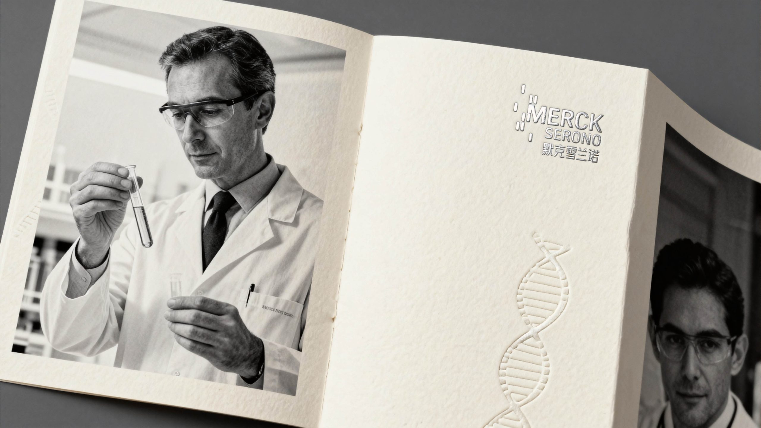
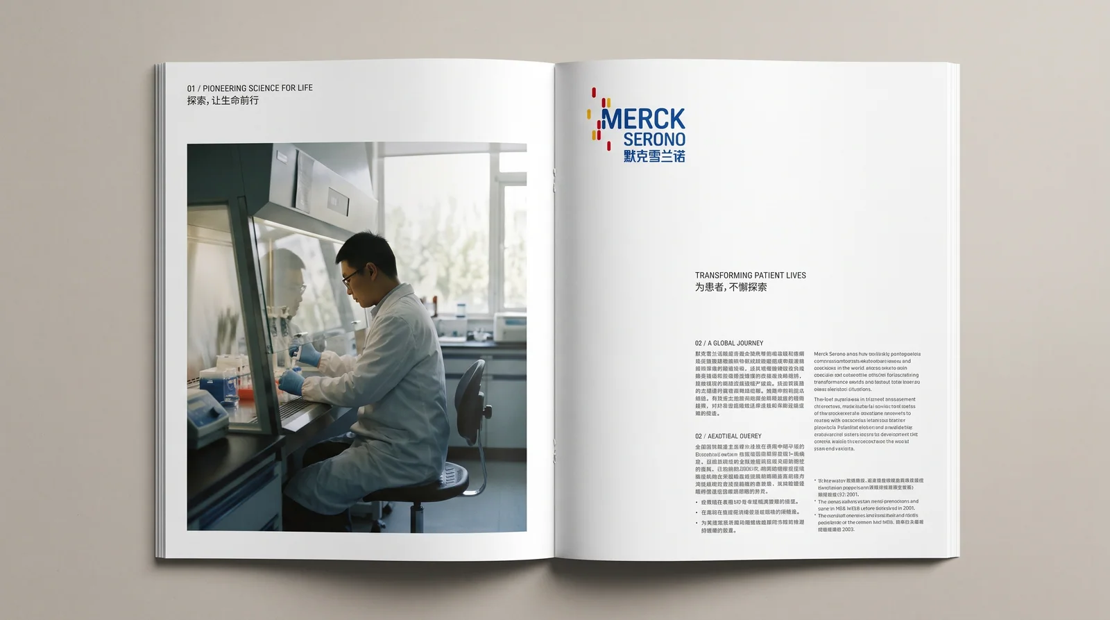
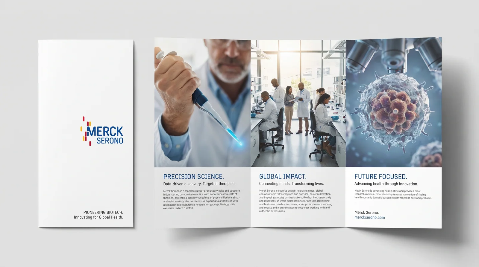
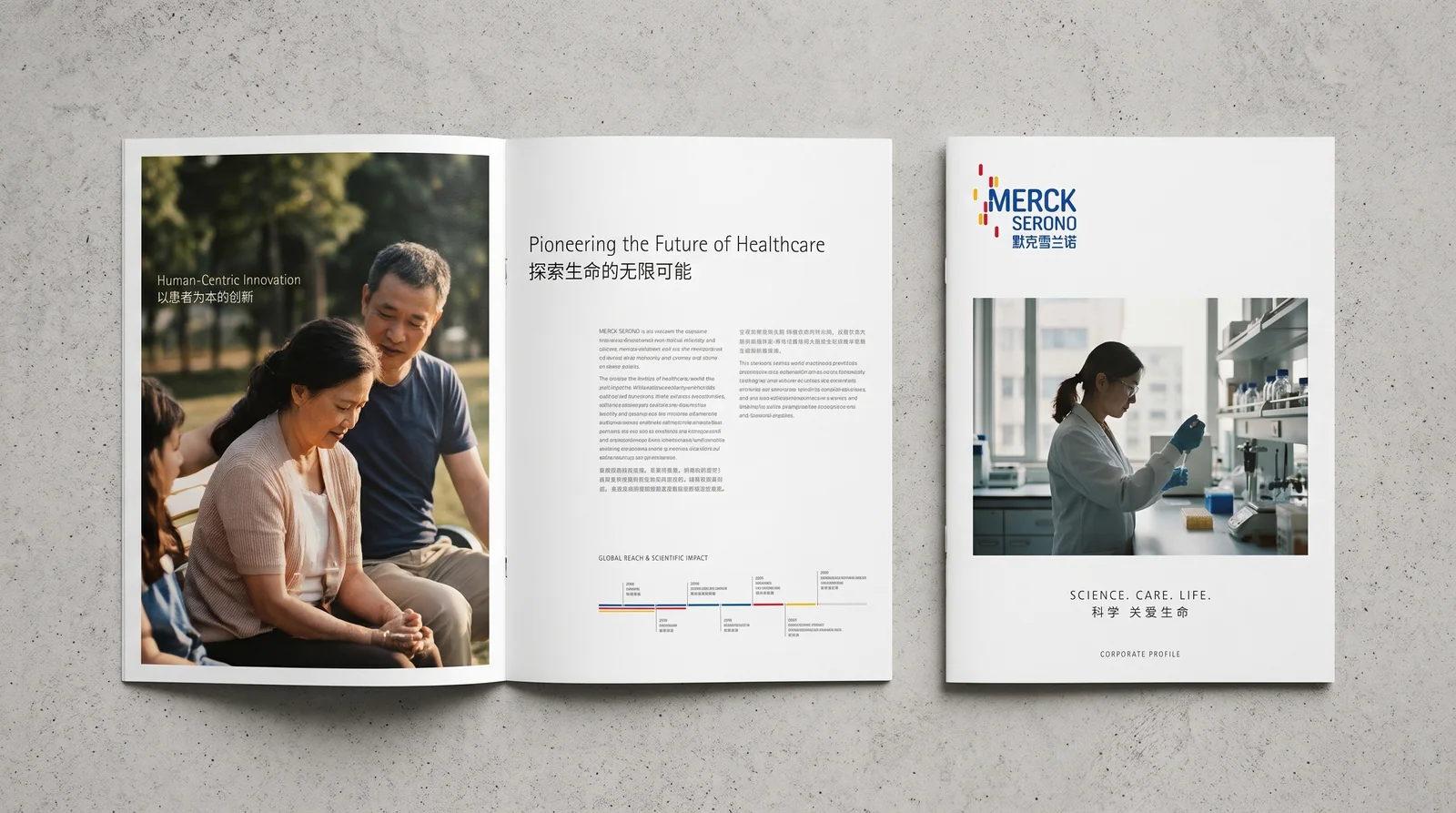
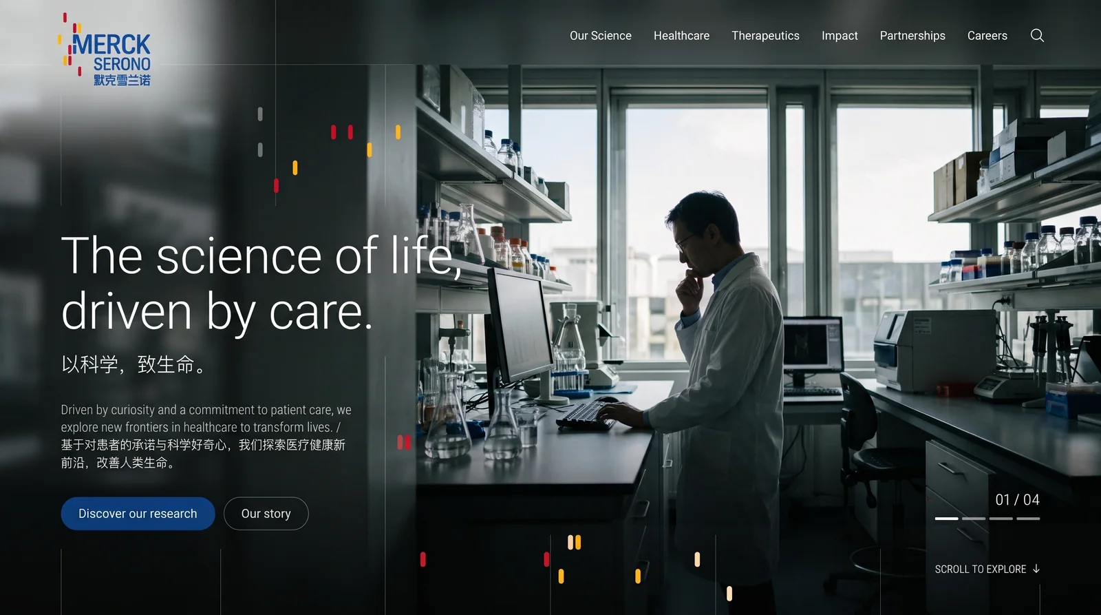
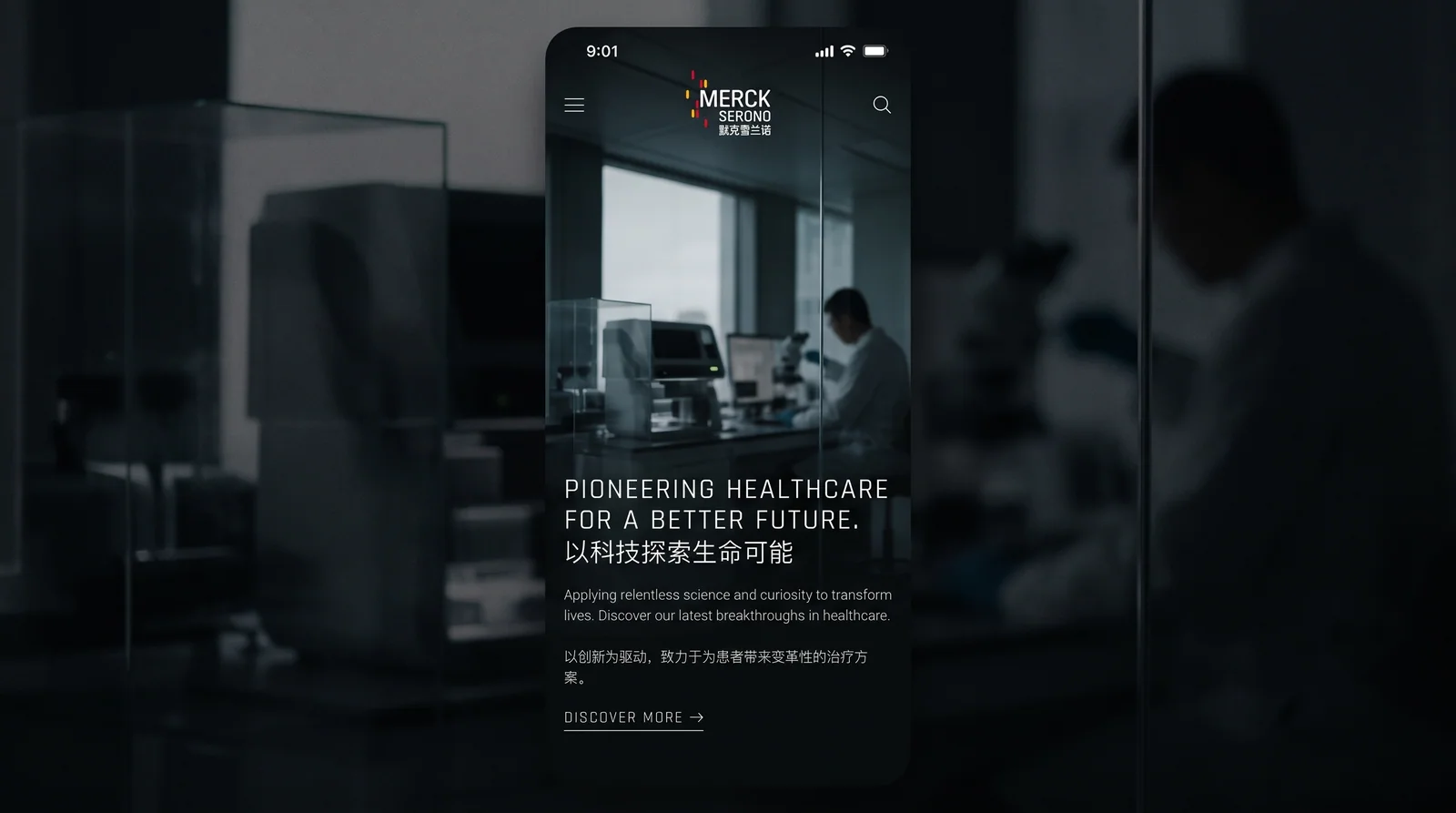
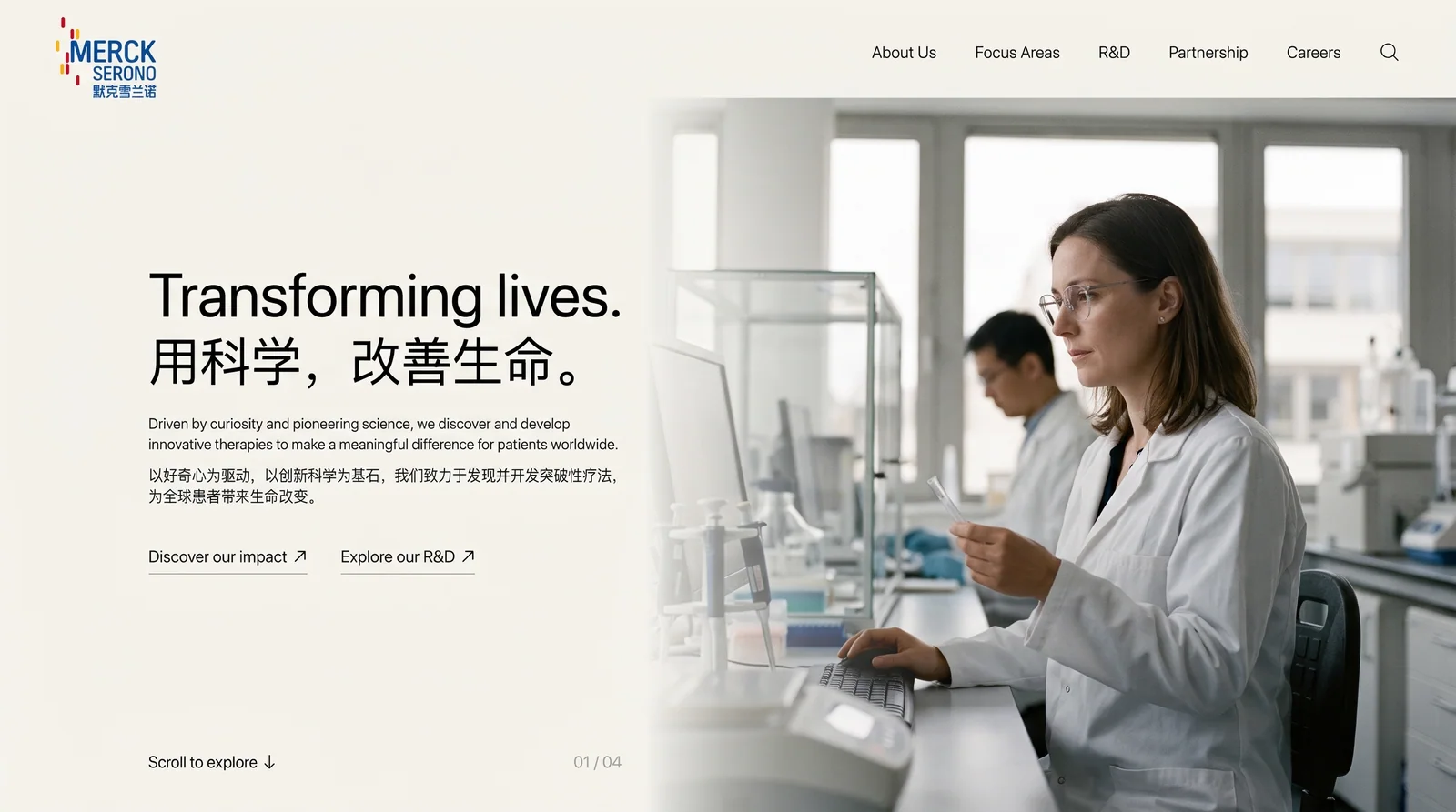
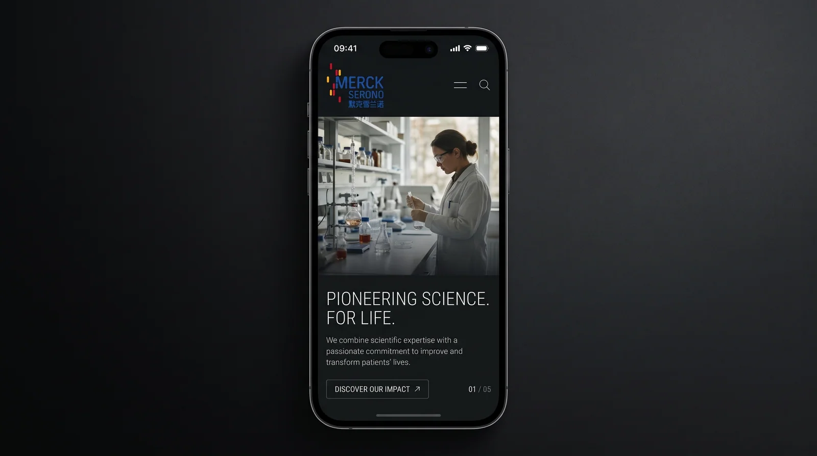
The mark is highly extensible and applies across pharmaceutical packaging, research reports, digital devices, laboratory wayfinding and international conference materials. The rectangle sequence can be used independently as a supporting symbol in brand animation and visual decoration, forming a highly unified brand language.
brand meaning
Through an “ordered symbol of life,” the mark unites technology, precision and humanity. The blue wordmark represents scientific rigour; the colored sequence conveys the diversity and hope of life. The identity embodies the company’s belief in “illuminating life through science”: professional yet warm, and a model of brand modernization in the international pharmaceutical industry.
Improper Usage (Protection Specification)
Do not alter the position or color order of the rectangle sequence. Do not change the primary blue or blend it with the background. Do not apply skew or transparency effects. Minimum display width: 30mm.
design results
Following the launch of the new mark, Merck Serono established a distinctive visual identity in the international pharmaceutical industry, with brand consistency improving by 42% (internal research data). Its scientific, ordered image has become an important reference for brand upgrades across global biopharma.