










SECURTECH is a high-tech enterprise focusing on network security, data protection and encrypted communication technology. It is committed to providing end-to-end security solutions for government, finance, energy, transportation and other industries.
The goal of the brand logo is to convey the company's core concept of "security is system order" and to express the precision of technology and the reliability of data security with a minimalist geometric structure.
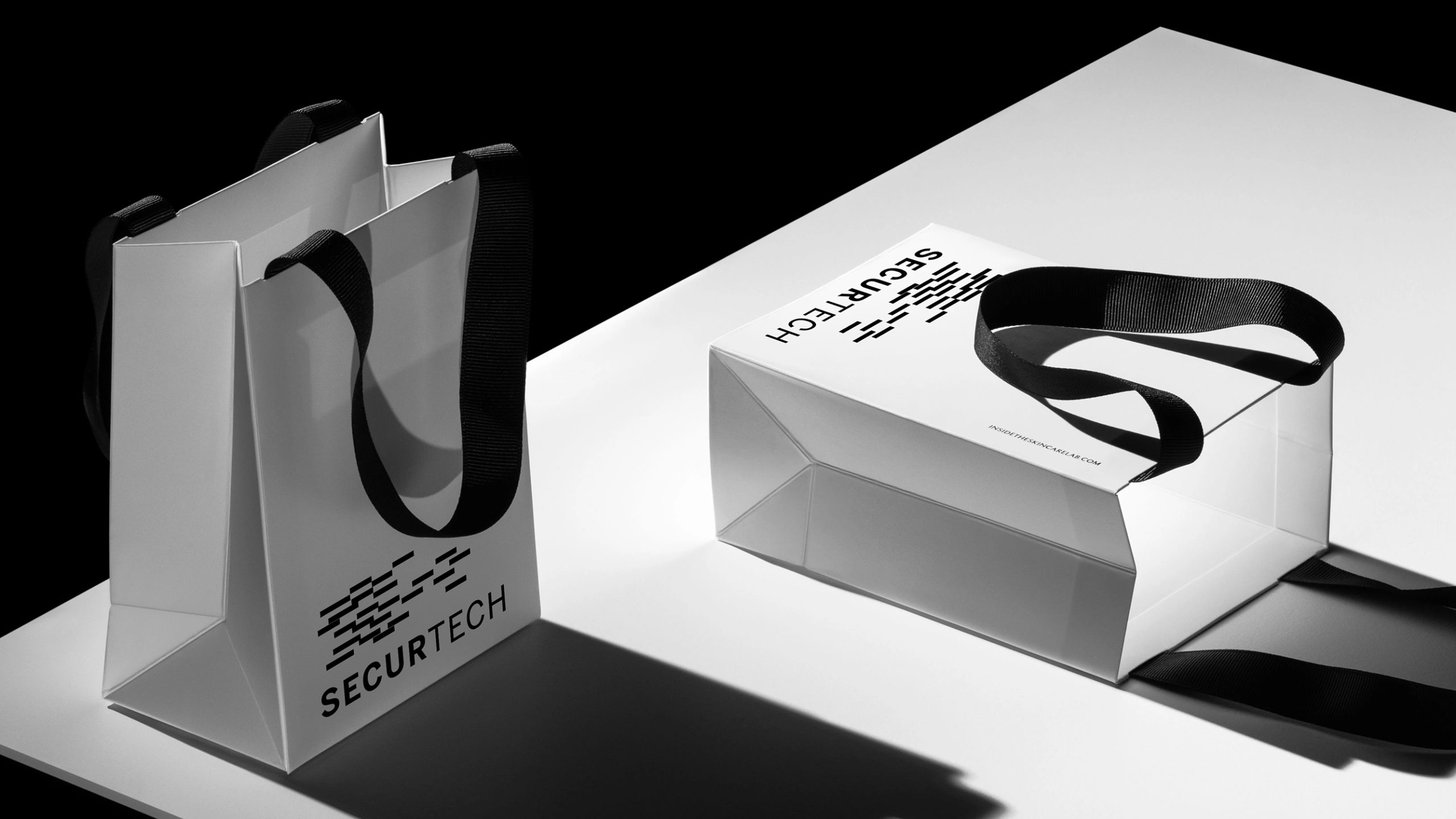
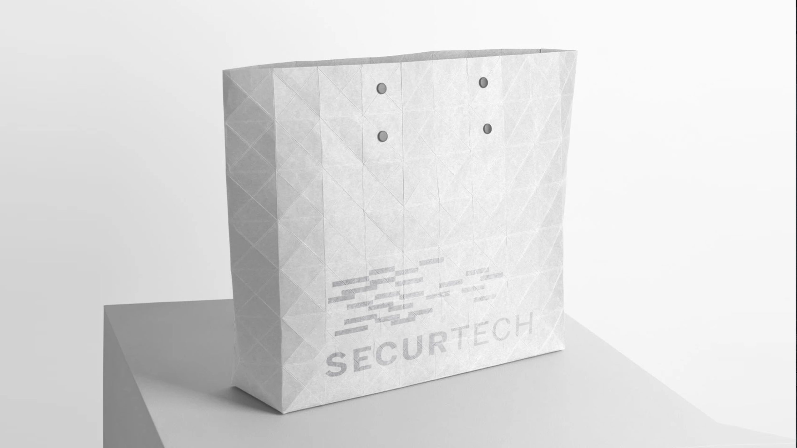
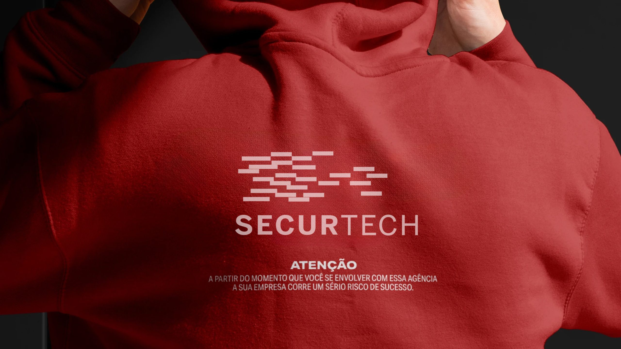
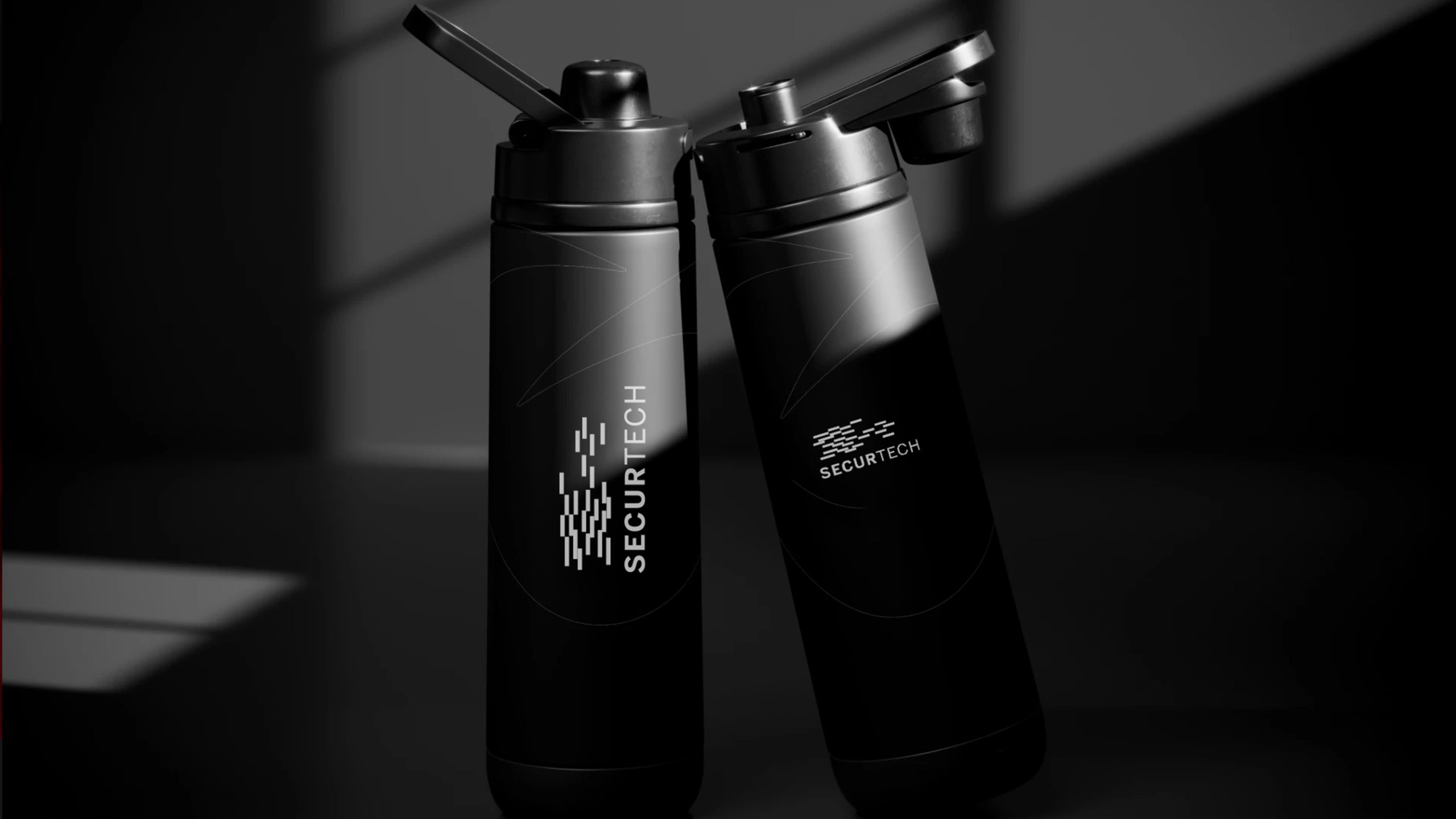
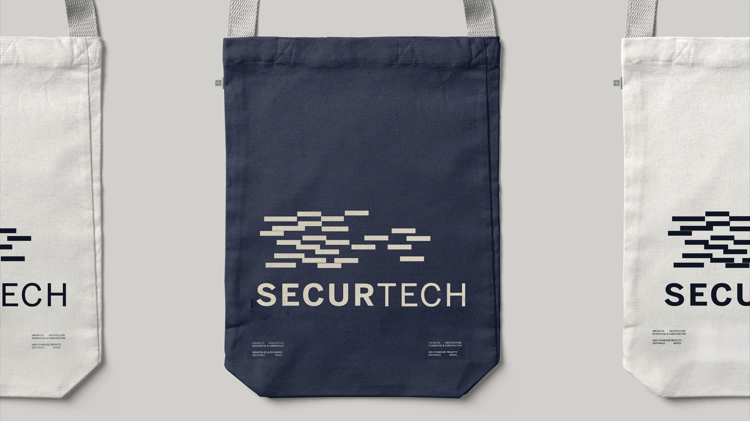
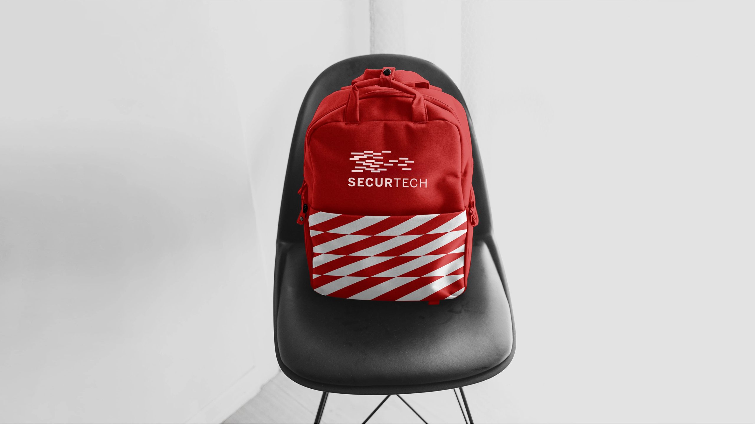
design concept
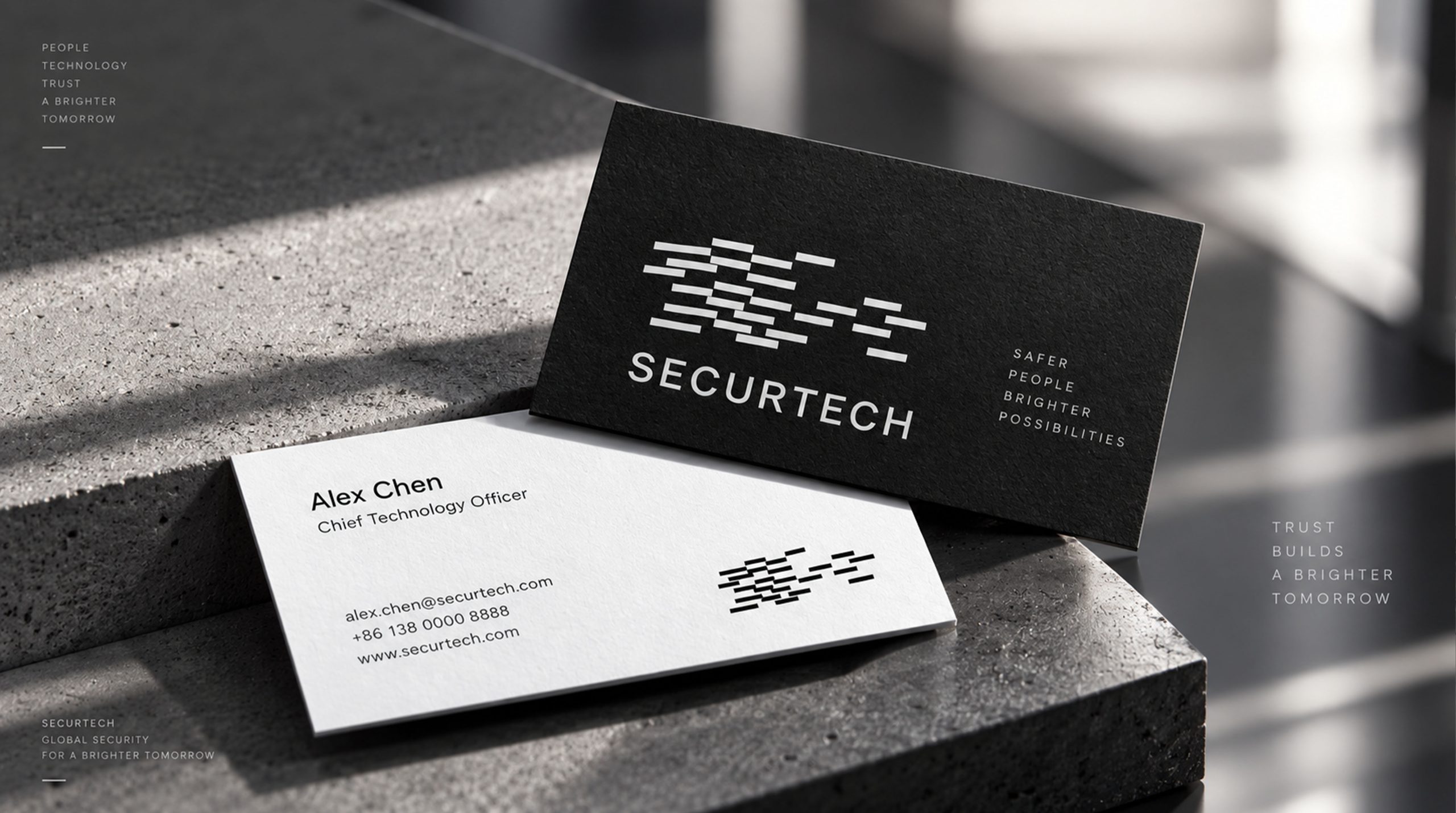
The overall design of the logo is derived from the concept of "a sense of order in data flow". The matrix structure composed of short horizontal line segments above symbolizes the flow of data and the process of security encryption. Each line segment is like a piece of protected data information, running steadily in a logical order. The logo name SECURTECH stands for "Security + Technology" and uses a bold structure to strengthen the professional attributes of the technology brand.
graphic language
Matrix stripe structure: represents the orderly operation of information flow and encryption algorithms; Horizontal arrangement: Symbolizes "stability", "continuity" and "protective barriers"; Irregular spacing: reflects the flexibility of technology and system adaptability; Dynamic logic sense: like firewalls stacked layer by layer, forming an invisible security line of defense. The overall graphics form a "rational beauty of order" and strengthen the technical attributes of the enterprise in the field of data protection.
Fonts and composition
The font adopts a custom-made sans-serif geometry with concise proportions and consistent stroke thickness, presenting a professional, powerful and scalable visual language. The “SECUR” part emphasizes the sense of security and stability, with tight word spacing; the “TECH” part stretches the spacing, symbolizing openness and innovation in the field of science and technology. The contrast between black and white enhances recognition and forms a highly recognizable corporate visual symbol.
color system
The main color of the logo is deep obsidian black (#0A0A0A), which represents solidity, defense and authority. Pair neutral gray (#C5C5C5) and white (#FFFFFF) to form the visual space of the system: black: authority, security, stability; gray: technology, rationality, structure; white: space, order, transparency. It can maintain extremely high contrast clarity on both the digital and print sides, ensuring that the brand vision has a consistent sense of security and professionalism under various backgrounds.
Application and extension
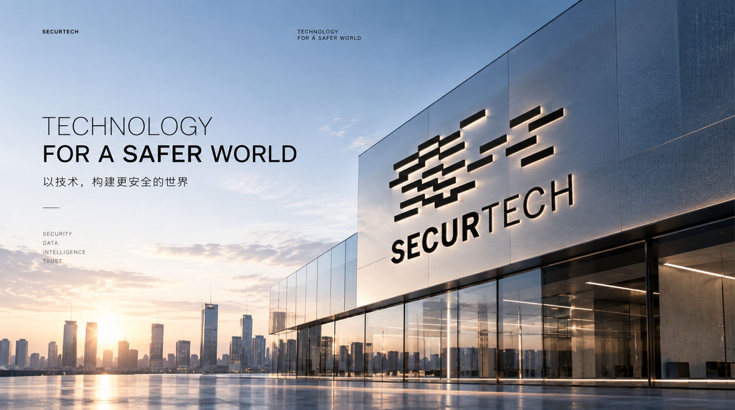
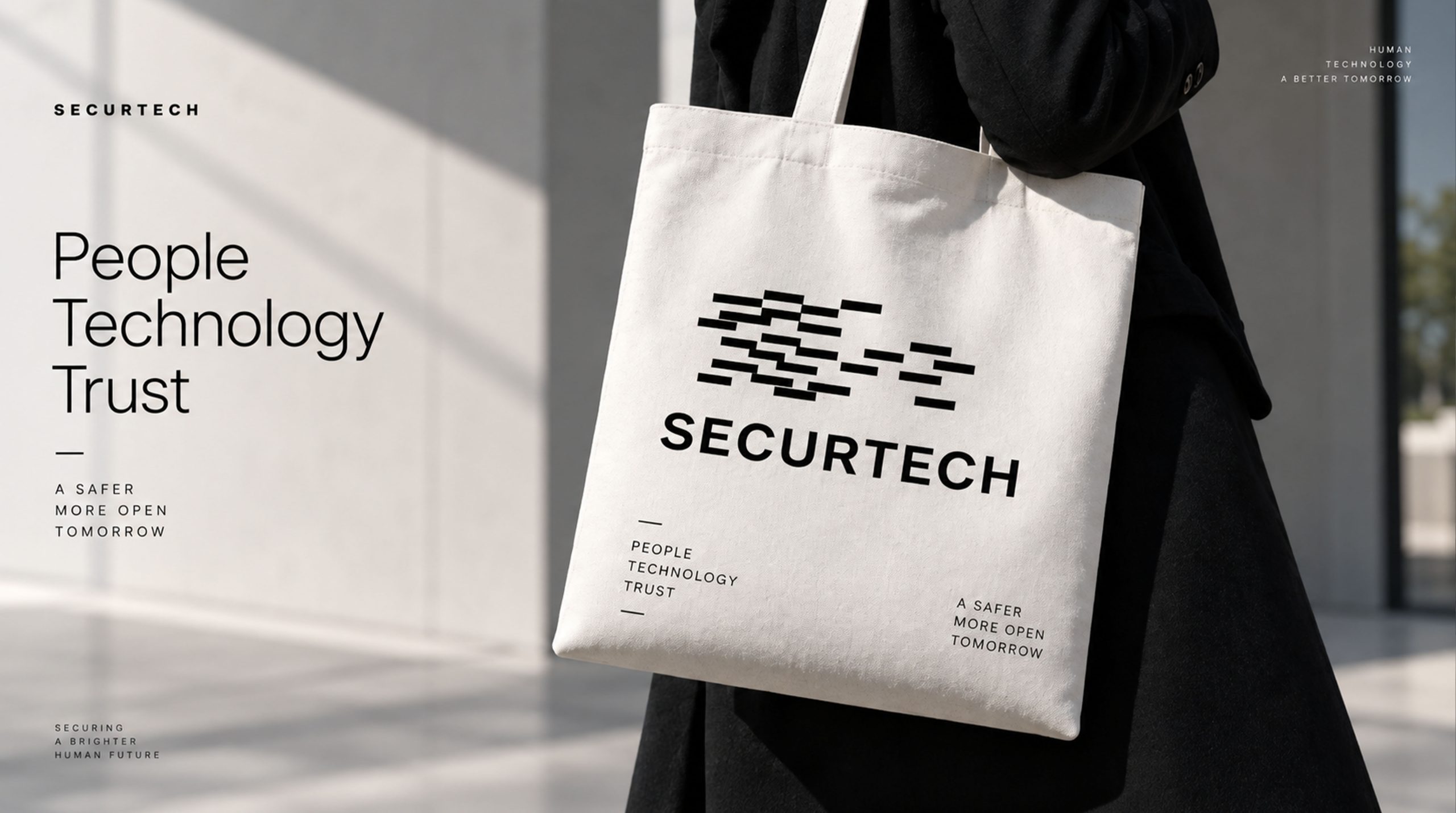
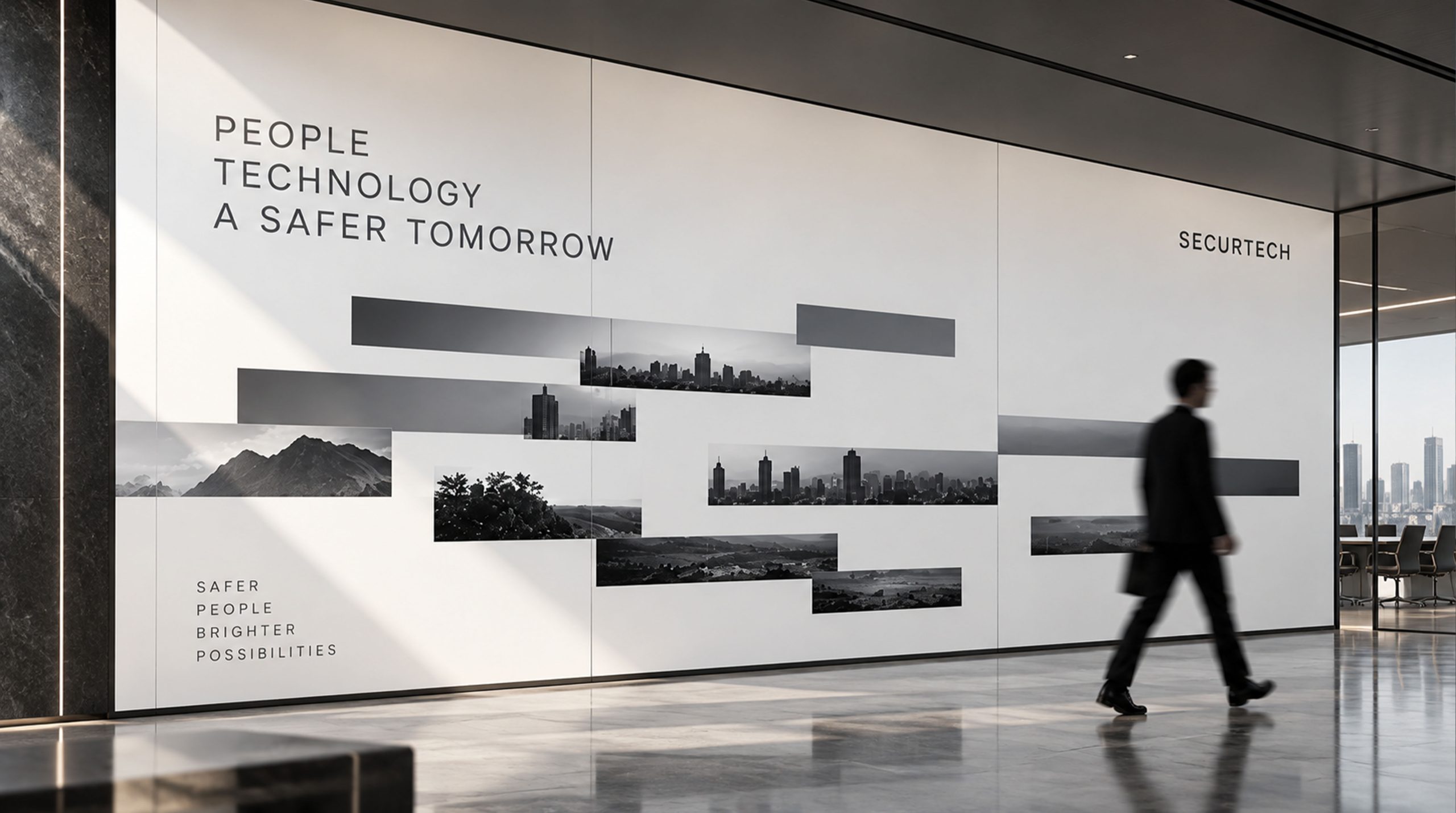
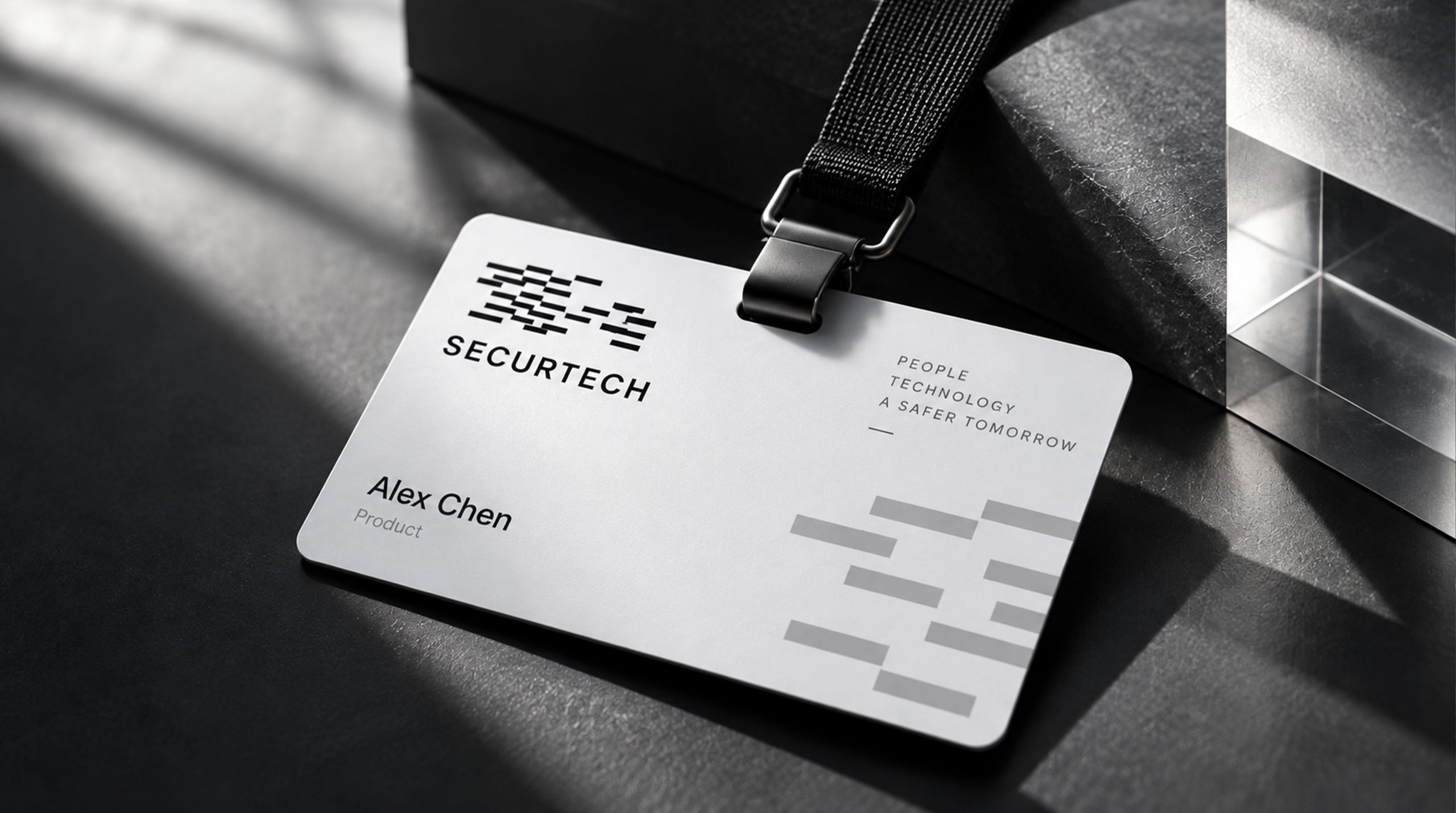
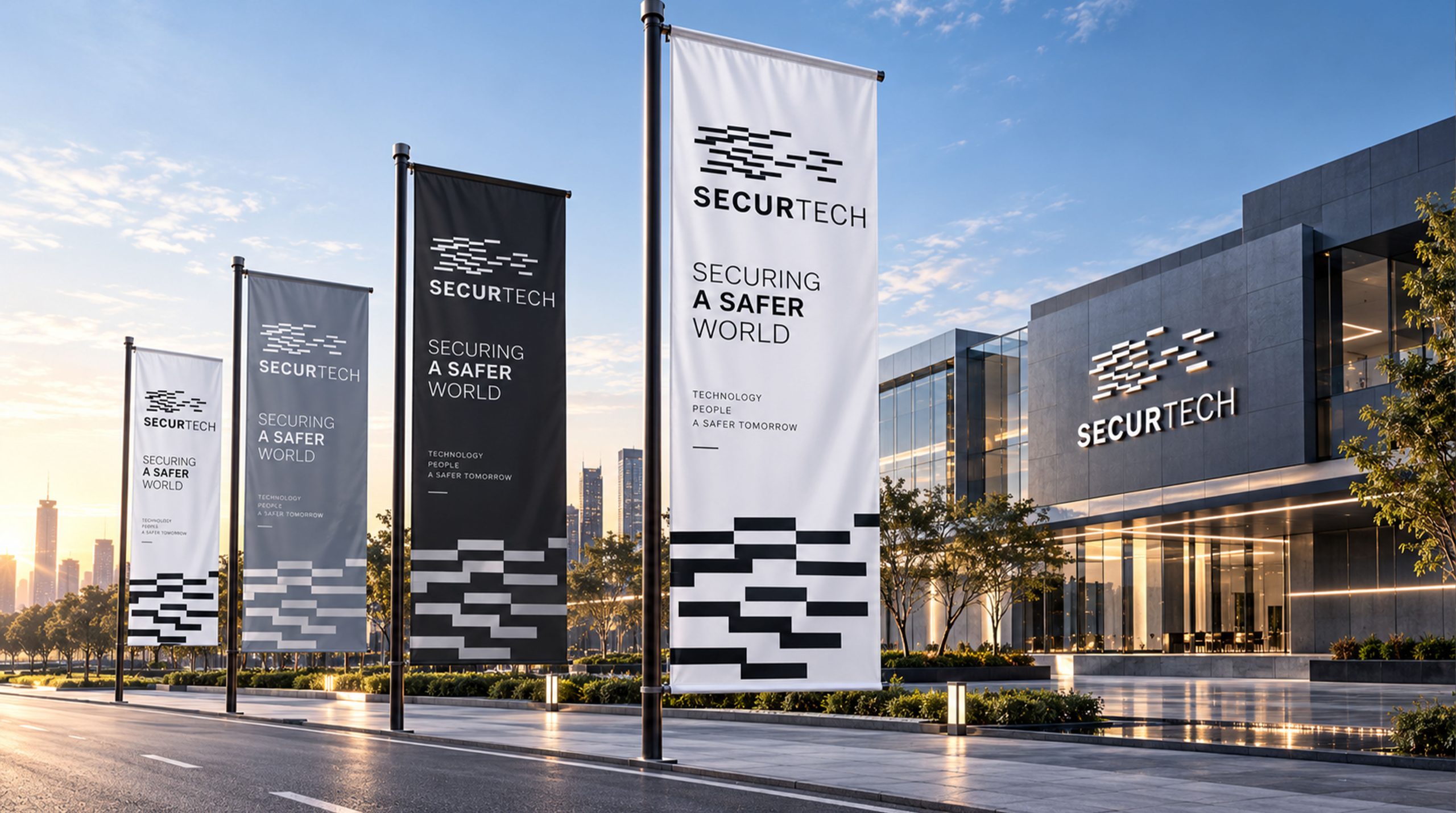
This logo has excellent system adaptability in multiple scenarios: corporate headquarters guidance system and house number; network security platform interface, terminal software startup page; data encryption chip and hardware equipment identification; technology exhibition main visual, video title dynamic matrix; business cards, envelopes, report covers, PPT templates and other enterprise application systems. In dynamic media, matrix stripes can appear or disappear layer by layer according to encryption logic, forming a "data flow encryption" effect and demonstrating the brand's security protection technology capabilities.
brand meaning
SECURTECH's logo is not only a visual identity system, but also a spatial expression of the brand concept. Its core represents three values: Security - protecting data from intrusion with a structured order; Technology - building a line of defense with innovative algorithms; Trust - establishing a digital trust relationship between people and systems. This geometric order language makes security perceptible and allows the brand to stand out in the technology industry with a "rational + precise" image.
Improper Usage (Protection Specification)
Do not stretch, tilt or adjust the proportion of the matrix; do not change the main color black or use gradient effects; do not add shadows, strokes or three-dimensional processing; keep the white space between the matrix and text ≥ 20% of the logo height; minimum display width: 25mm for printing / 120px for digital.
design results
Since its release, the SECURTECH logo has been widely used throughout the brand system and has become a visual representation of the field of network security and encryption technology. With its design language of “minimalist × precise × authoritative”, it successfully interprets the company’s brand mission of “making technology a shield of trust”. This logo was designed and developed by Qingmei Future.