










Dr. Peng is a technology company specializing in telecommunications and digital technology services. It is committed to connecting the digital world with technological innovation and promoting the future development of smart communications with professional services.
The brand hopes to present a balanced state of "technological expertise x international vision" through a visual system that combines a sense of technology with an international temperament.

design concept
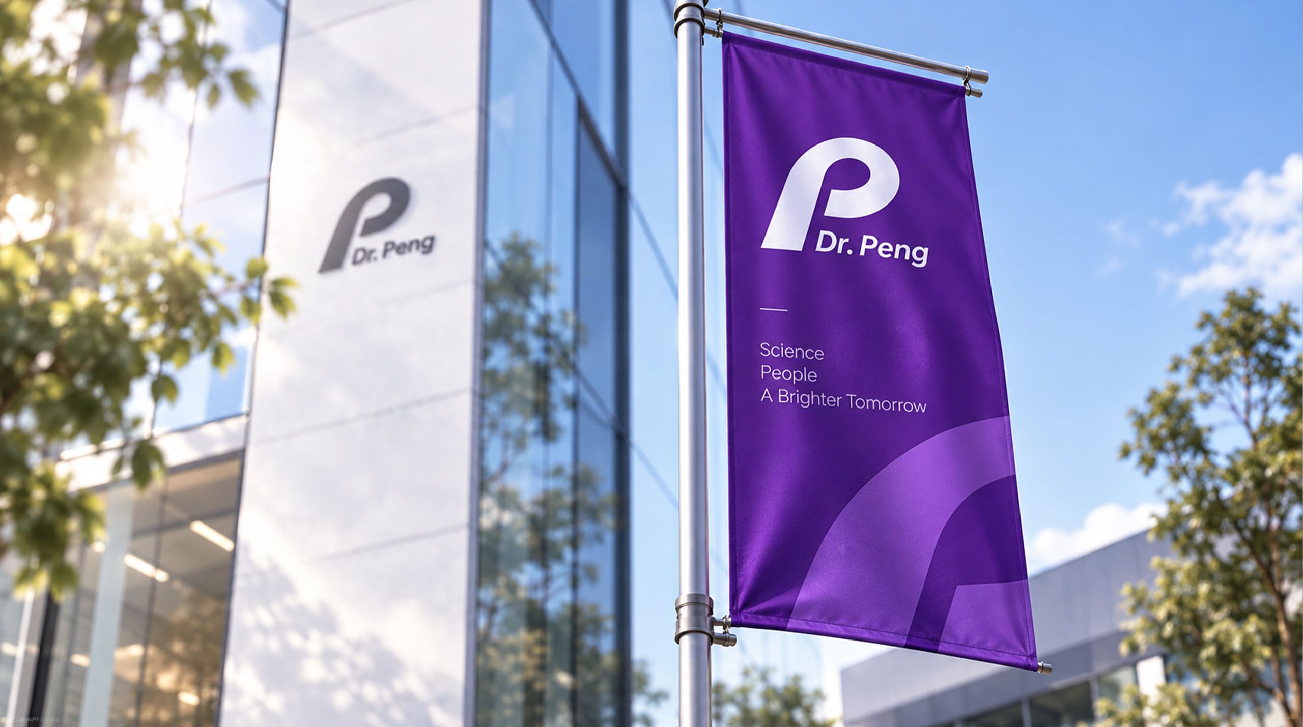
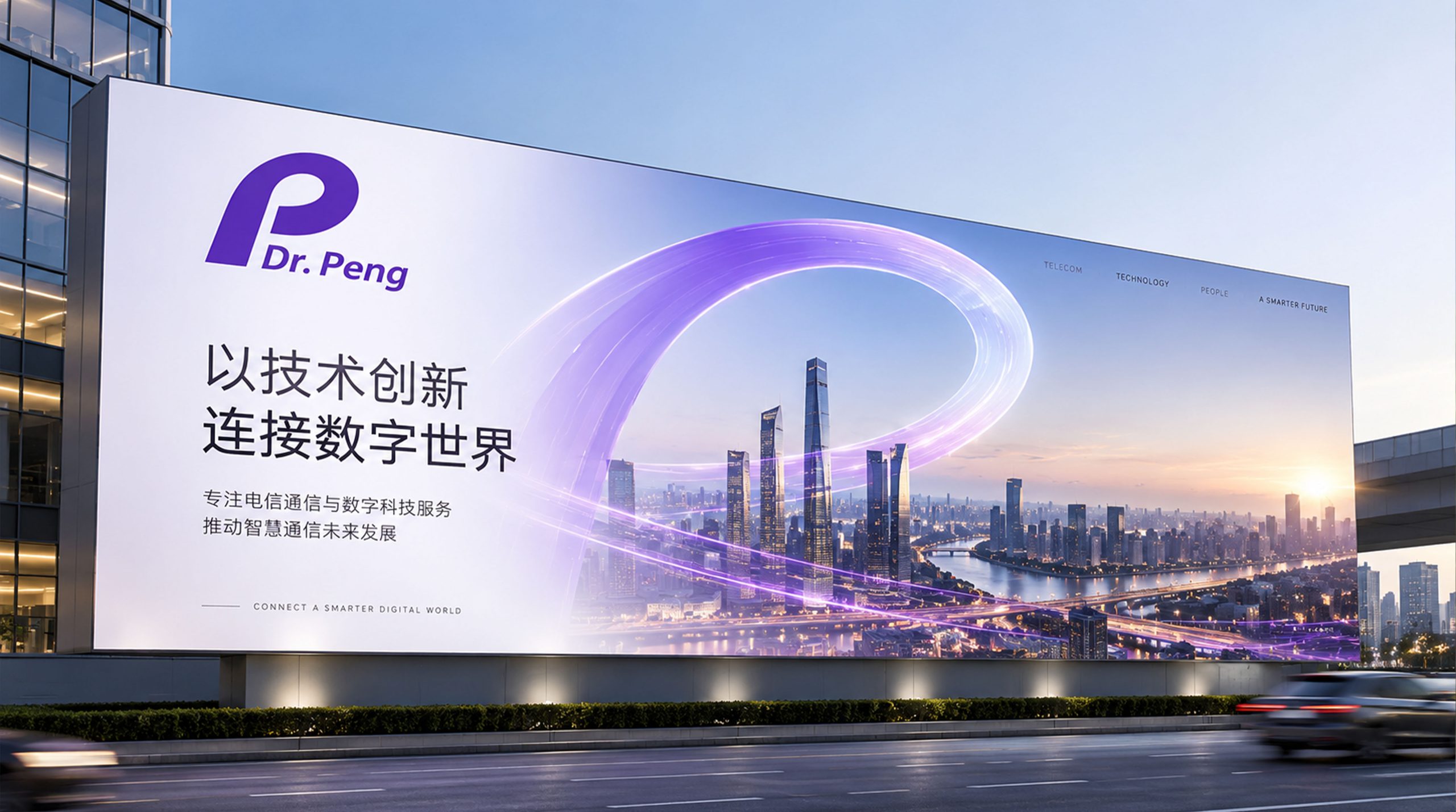
The core concept of the logo comes from the concept of "Boundless Future". The design is based on the initial letter "P", which symbolizes the core identity of the brand name "Peng" and the soaring meaning of "Peng", which represents lofty ideals and excellence. The letter "P" adopts a simple and rounded geometric shape, reflecting the modernity of telecommunications technology and the international brand temperament. The overall shape not only has the professional image of a technology company, but also is full of the unique personality of the brand, implying Dr. Peng's brand mission of continuing to connect the world with the power of technology and leading communications innovation. The purple color choice breaks through the blue convention of the traditional telecommunications industry, demonstrates the brand's differentiated positioning and innovative spirit, and makes the logo more international and memorable.
Graphic composition and color system
The structure of the letter "P": represents the initial letter of the brand and the brand meaning of "Peng"; rounded geometric shape: modern and concise lines convey the professionalism and affinity of technology; open design: the opening shape of the letter symbolizes the connection of communication and the circulation of information. Minimal composition: the design language of eliminating complexity and simplifying presents the high-end temperament of an international brand.
The brand name "Dr.Peng" uses a modern italic sans-serif font with smooth fonts and elegant proportions, consistent with the modern temperament of the logo. The prefix "Dr" conveys the brand's "authority in the profession". The overall horizontal arrangement strengthens visual recognition and international communication attributes.
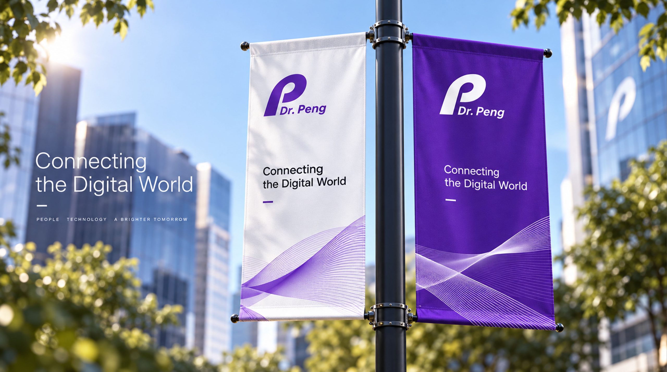
Technological purple #7B2D8E: symbolizes innovation, wisdom and differentiated positioning; gradient purple #9B4DCA#6A1B7A: represents technology, vitality and brand personality; pure white #FFFFFF: symbolizes purity, professionalism and communication authenticity. Purple is unique in the color system, forming a visual balance of "professionalism and innovation", "tradition and breakthrough", and building a unique and international brand impression.
Application extension and brand significance
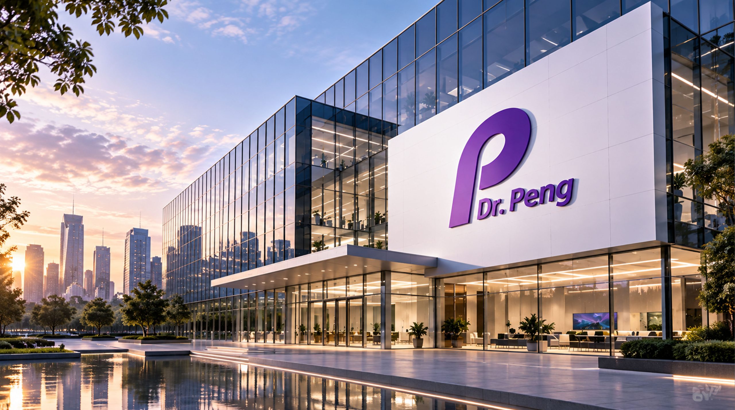
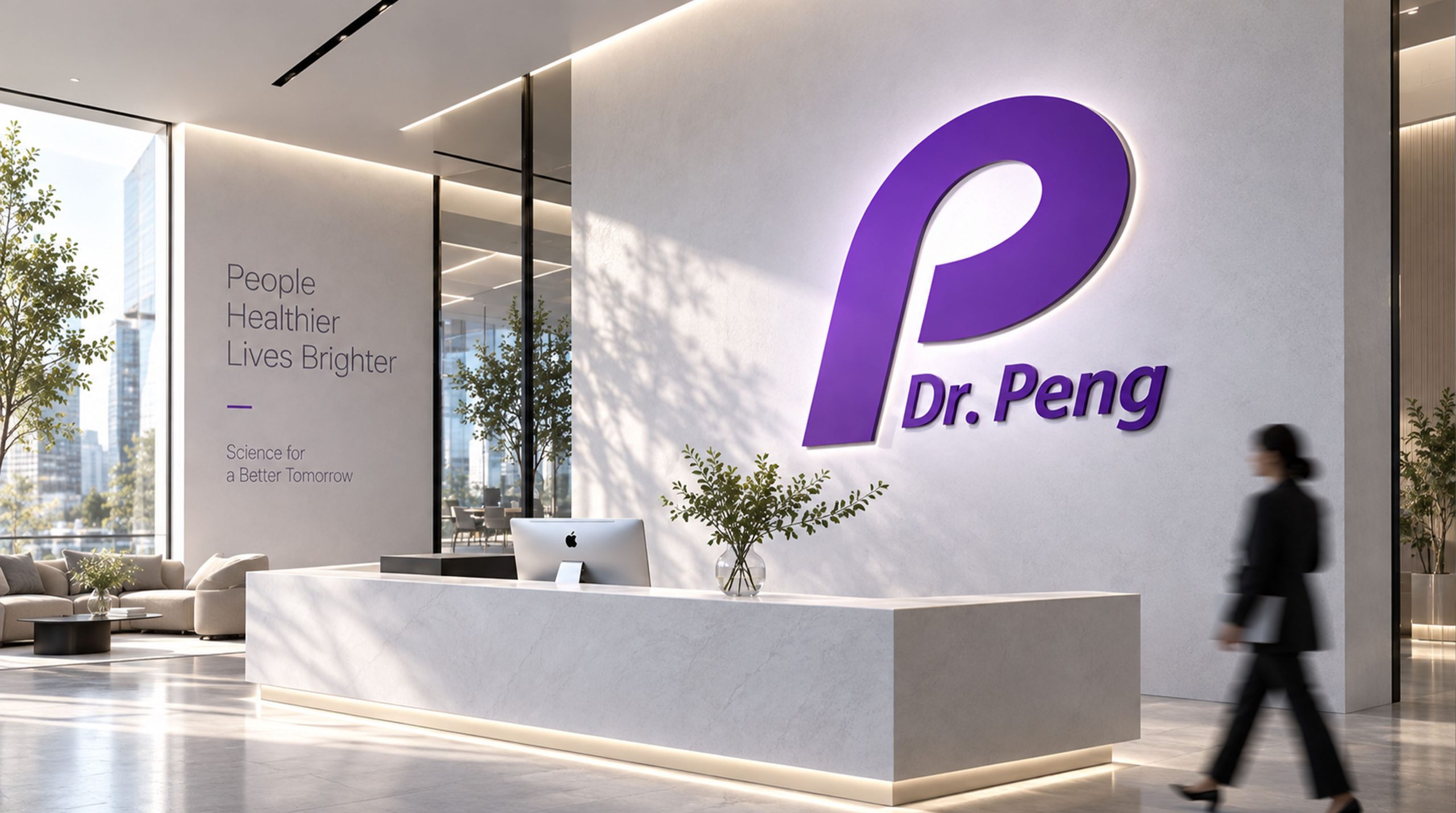
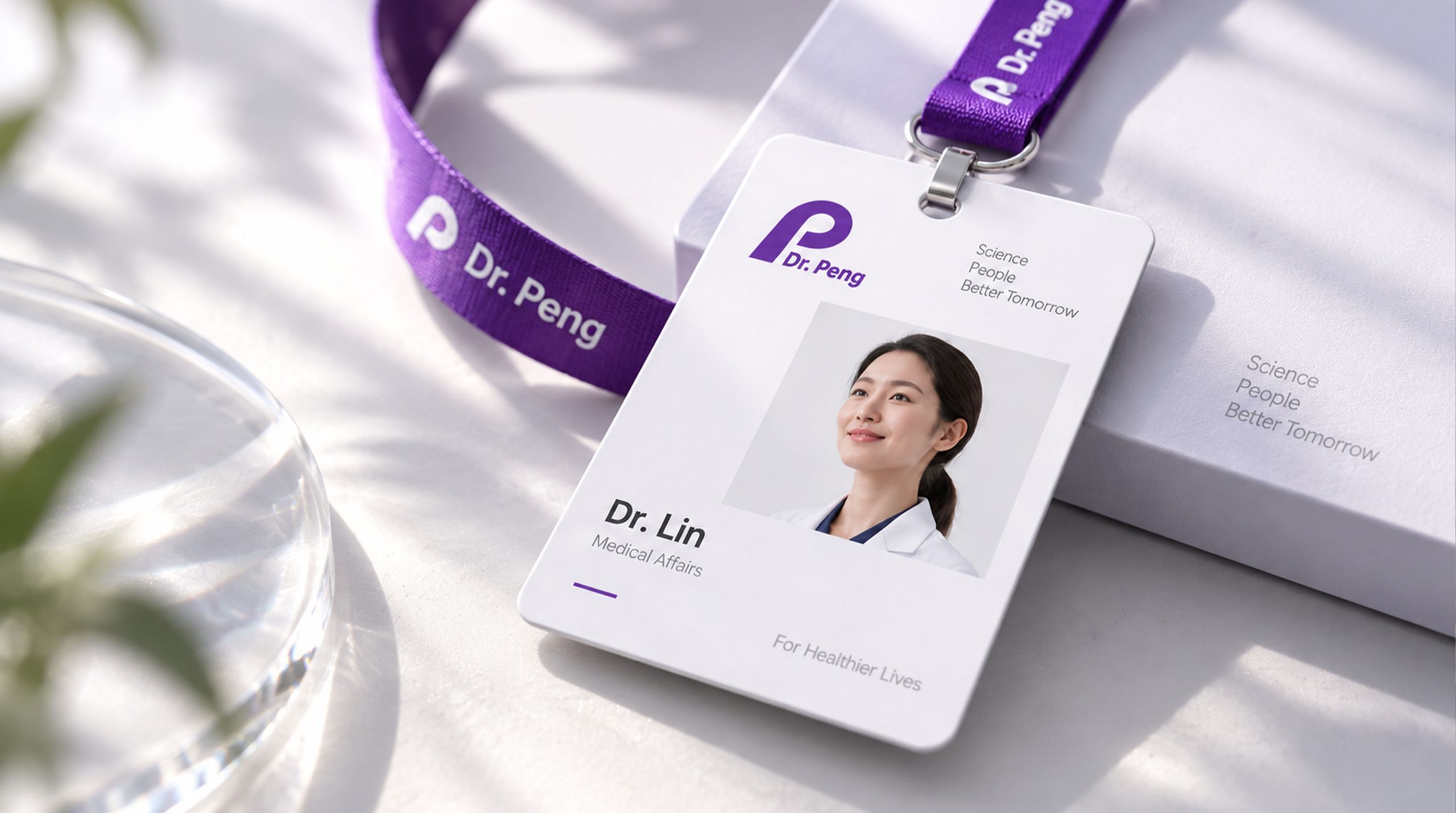
The logo has strong cross-field adaptability: corporate level: used in brand launches, industry forums, annual reports and strategic cooperation; product level: suitable for communication equipment, service interfaces and customer material identification; spatial level: in corporate headquarters, wayfinding systems and brand experience centers to form a unified visual language dynamic version, the letter "P" can be used as a "signal pulse" or connected flow animation, symbolizing the continuous innovation of communication technology.
The Dr.Peng logo embodies the dual value of "technological expertise x international vision": the letter "P" → the core identification of the brand; purple → the differentiated positioning of innovation; minimalist composition → the symbiosis of professionalism and internationality. This is not only a brand identification symbol, but also a visual expression of a scientific and technological philosophy to connect the infinite future with Pengcheng's ambition.
design results
After the release of the new visual system, Dr. Peng became an iconic brand image in the domestic telecommunications technology field. Purple letters and minimalist compositions are widely used in industry exhibitions, brand communication, and international marketing promotions. With the visual expression of "technological structure × international language", it has established a new aesthetic standard for the telecommunications industry. This case represents the mature expression of the brand in the design direction of telecommunications technology, digital communications and system visual language, achieving the unification from "brand design" to "technology philosophy".