










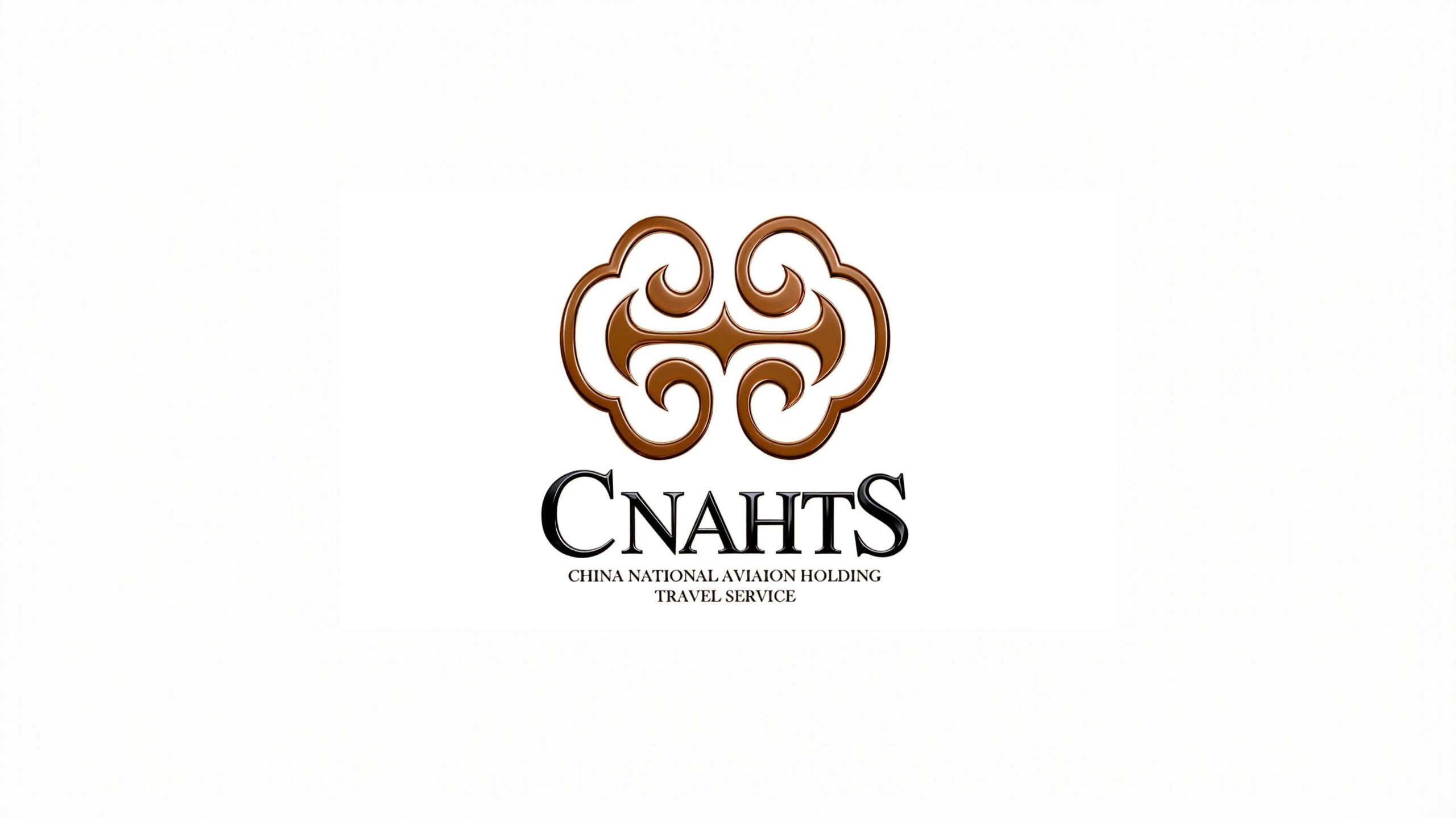
CNAHTS (China Aviation Group Tourism Hotel) is a state-owned enterprise brand focusing on aviation tourism and high-end hotel services. It is committed to protecting passenger travel experience with international service standards and connecting a better future with quality accommodation.
The brand hopes to present a balanced state of "aviation quality x oriental elegance" through a visual system that combines oriental cultural heritage and international professional temperament.


design concept
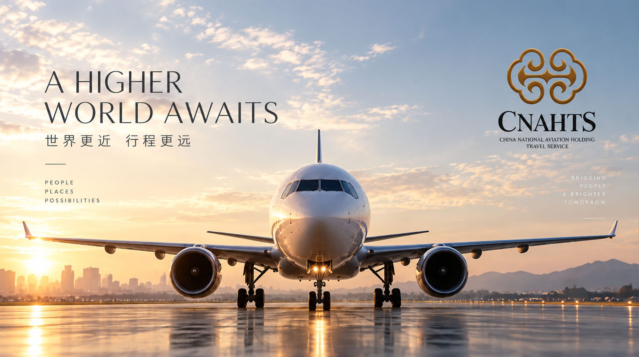
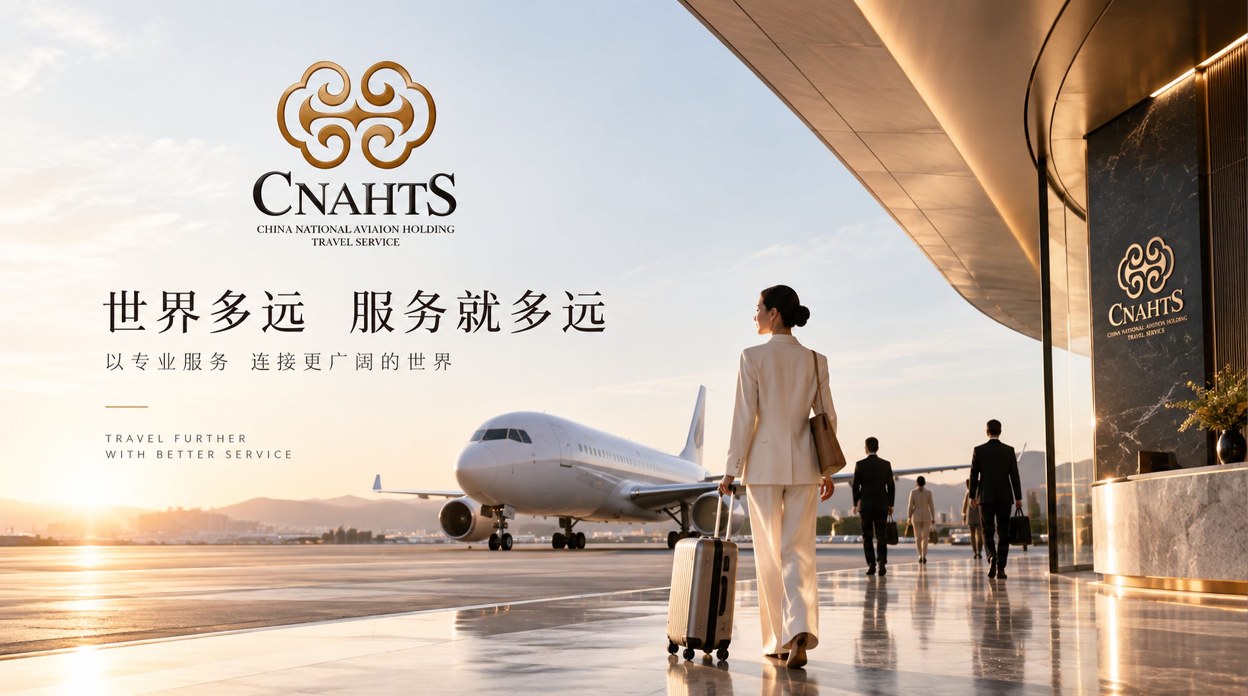
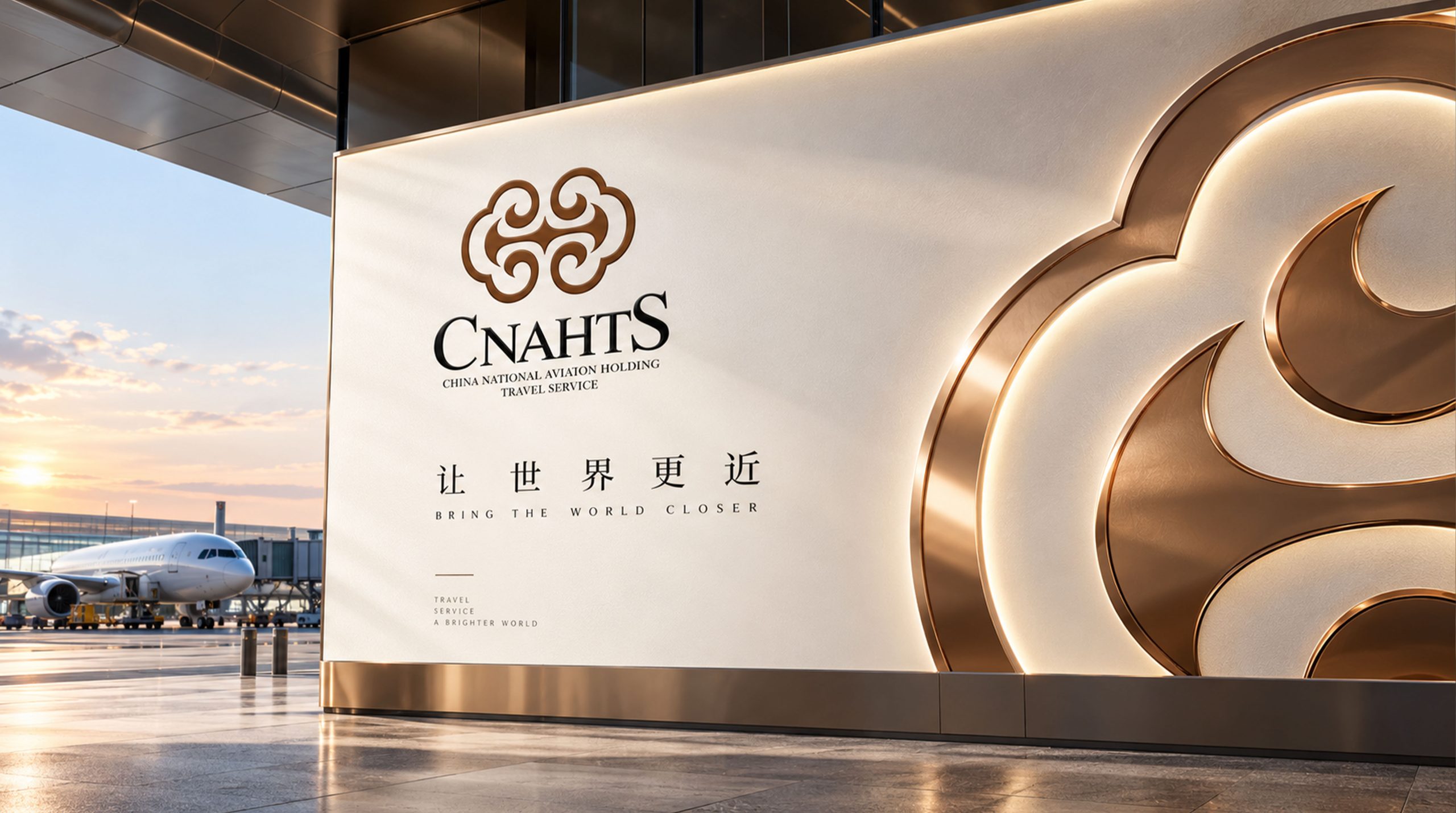
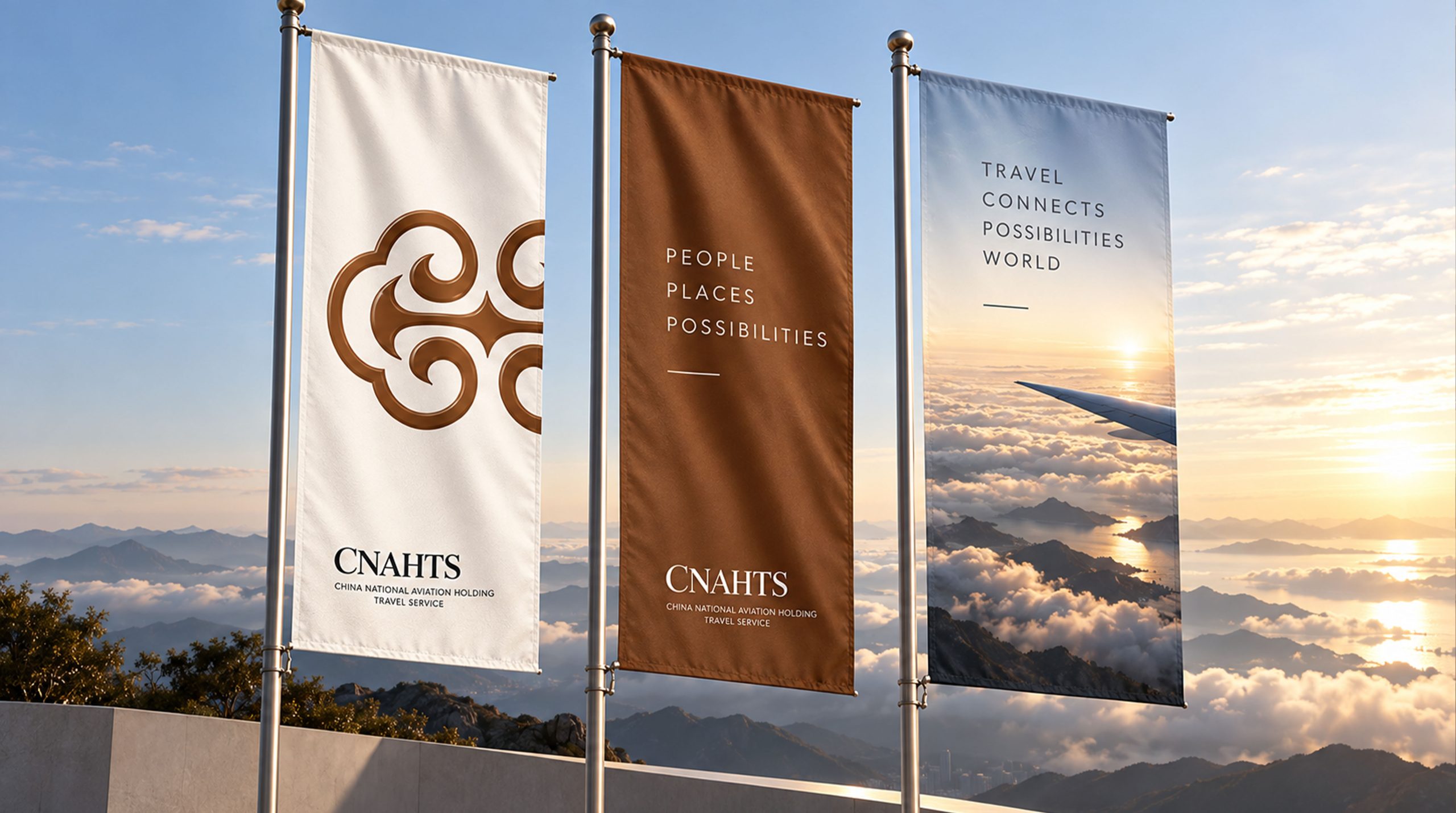
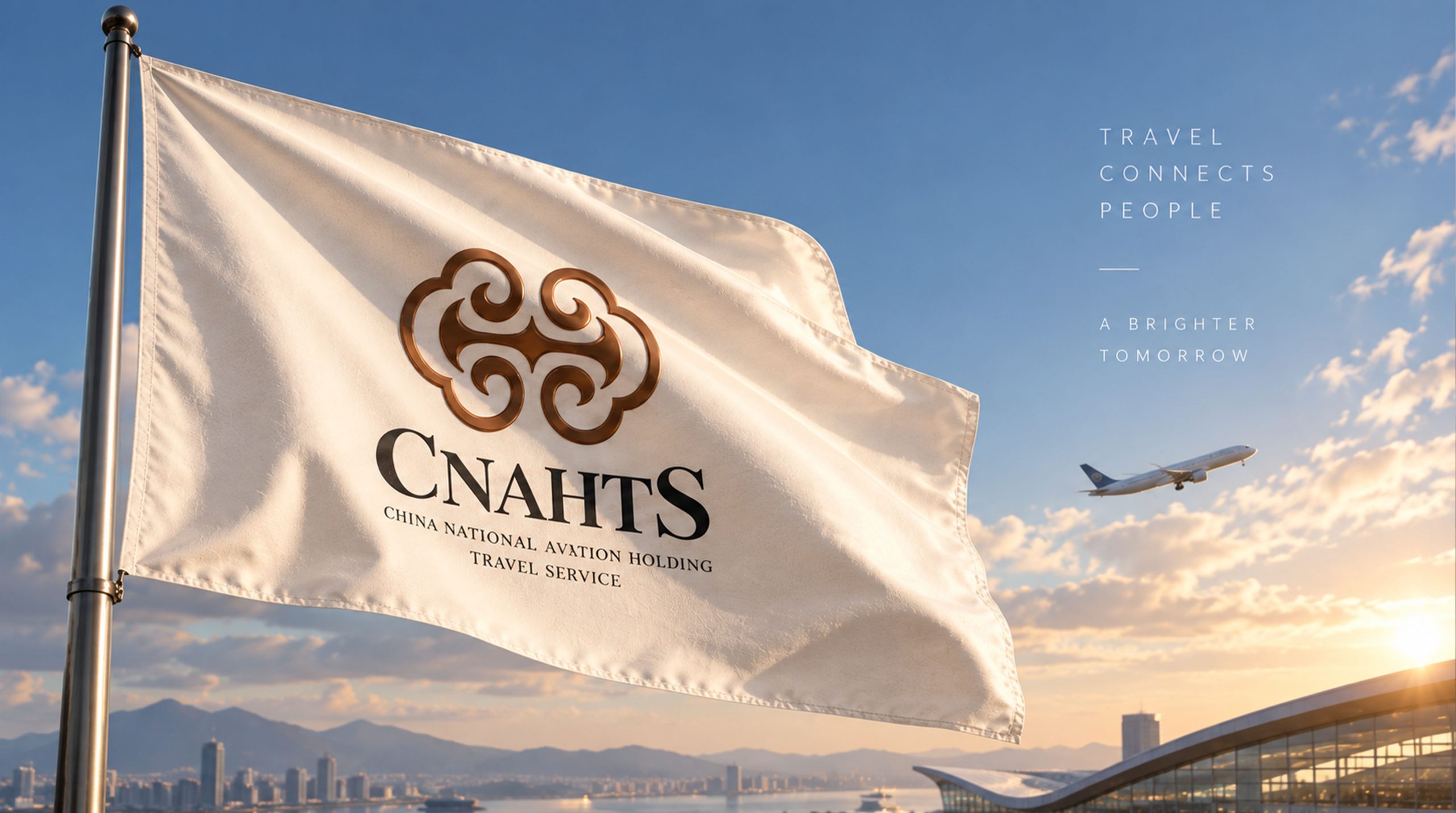
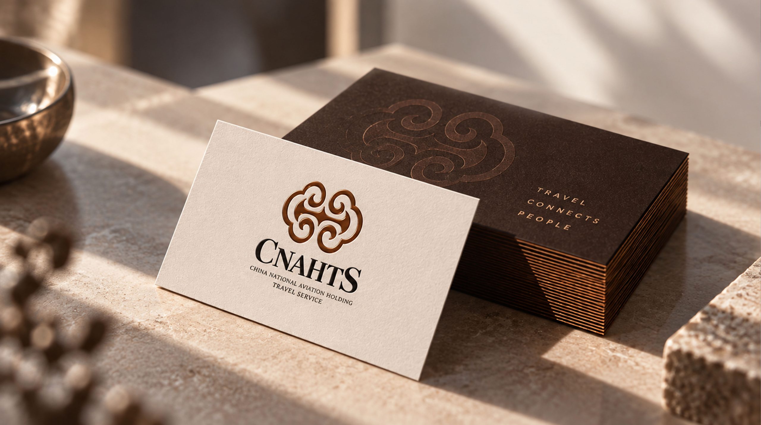
The core concept of the logo comes from the concept of "Auspicious Clouds". The design is based on the traditional Chinese auspicious cloud pattern. The two connected clouds symbolize the integration of aviation tourism and hotel services, representing auspiciousness and soaring. The moiré shape not only coincides with the industry attribute of "flying in the clouds" of the aviation industry, but also conveys the auspicious meaning of Chinese culture. The overall shape not only has the cultural heritage of oriental aesthetics, but also is full of the professional tension of an international brand, implying the brand mission of China Aviation Group Tourism Hotel to continue to serve global travelers with aviation quality. The bronze metallic texture shows the brand's high-end positioning and historical heritage, giving the logo both an international vision and Chinese cultural confidence.
Graphic composition and color system
The double-connected structure of auspicious clouds: represents the integration of aviation and hotels, symbolizing career development and good fortune; Ruyi cirrus shape: traditional cloud patterns present the Chinese cultural heritage and oriental aesthetic charm; symmetrical balance: the left-right symmetrical composition conveys the brand's steady professionalism and service balance; three-dimensional metal texture: the bronze luster presents high-end positioning and a sense of history.
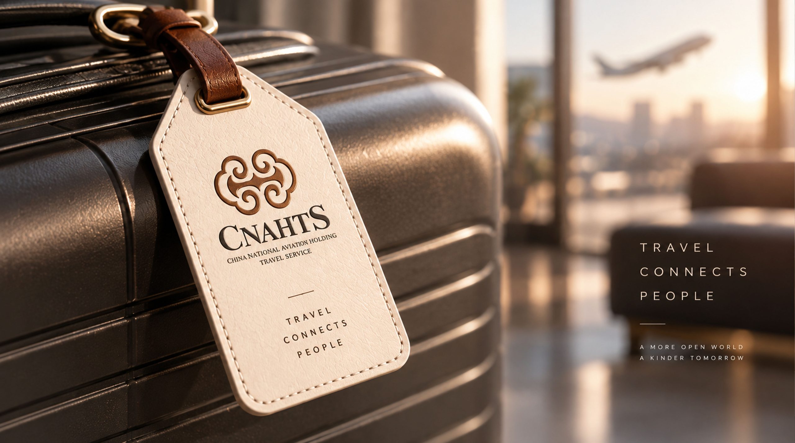
The brand name "CNAHTS" uses a modern serif font with elegant shape and balanced proportions, consistent with the oriental temperament of the logo. The full English name "China National Aviation Holding Travelservice" uses a classic serif font to convey the brand's "internationalization in tradition". The combined Chinese and English versions are arranged up and down, with the overall center in the middle, to enhance visual stability and international communication attributes.
Bronze gold #8B5A2B: symbolizes nobility, inheritance and oriental quality; glossy gradient #A0724D#6B4423: represents history, richness and cultural heritage; pure white #FFFFFF: symbolizes purity, professionalism and service authenticity. The bronze color flows in the gradient, forming a visual balance of "tradition and modernity. Oriental and international", and building a high-end and culturally connotative brand impression.
Application extension and brand significance
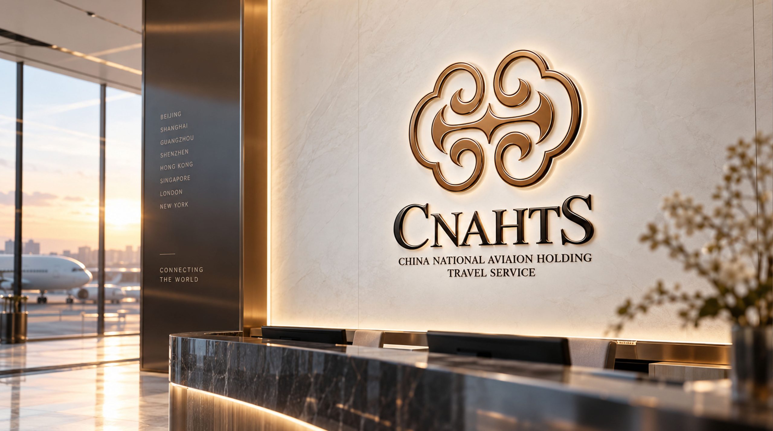
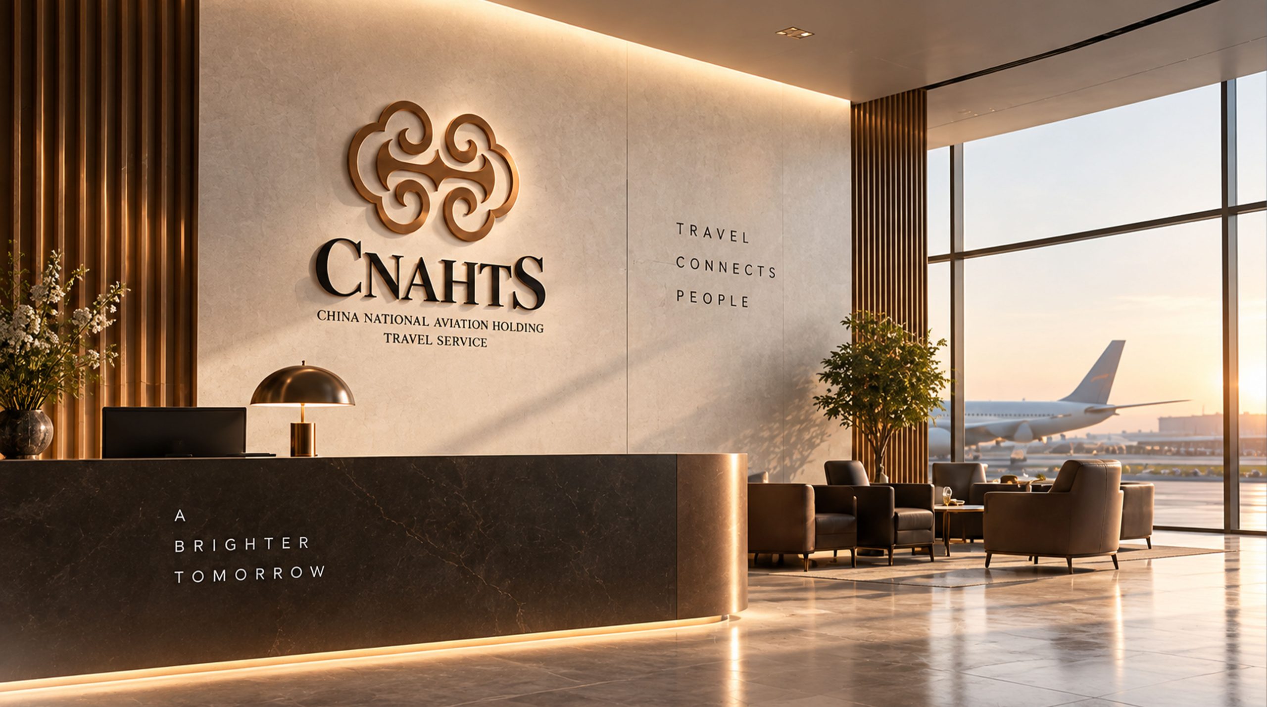
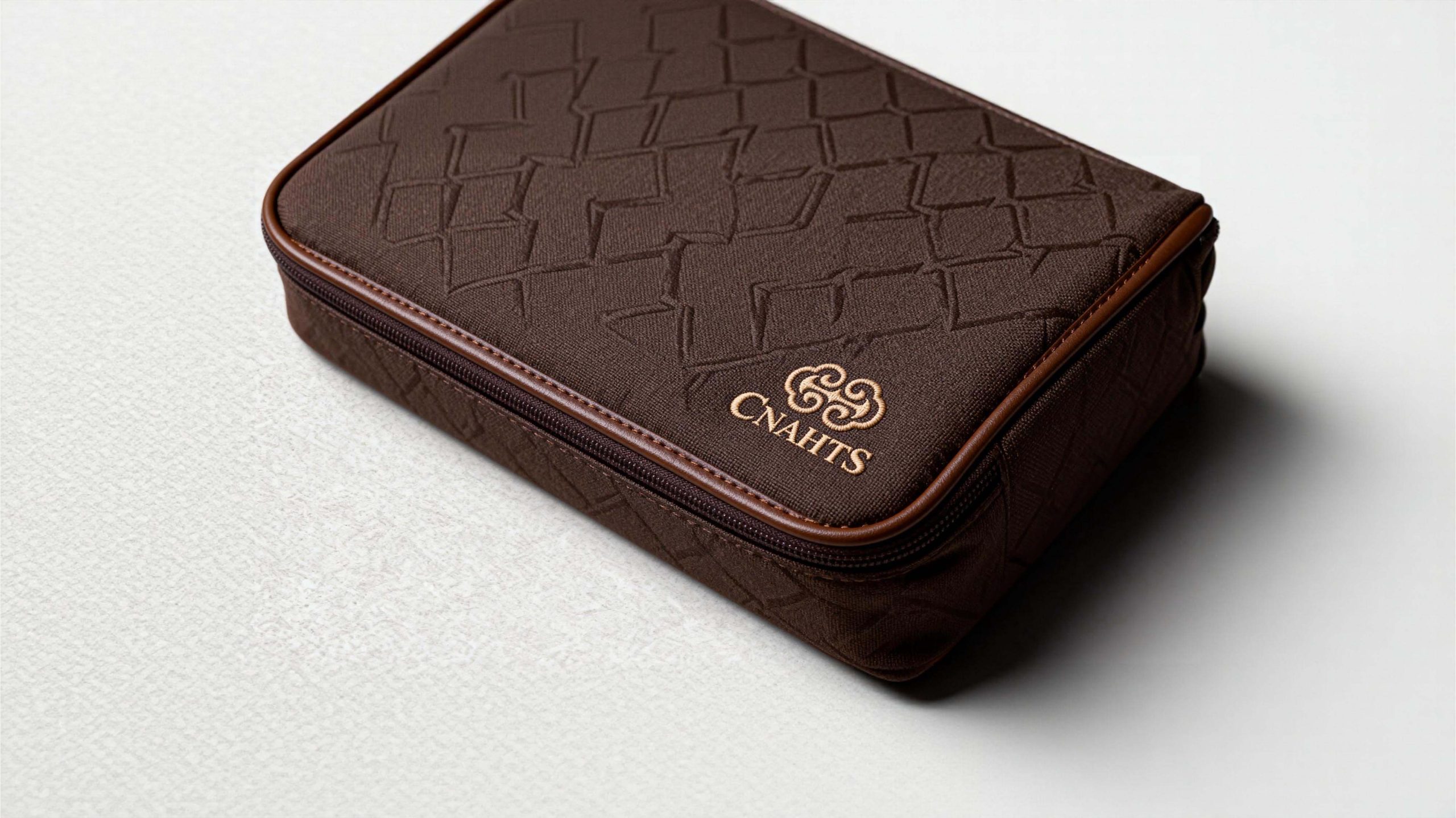
The logo has strong cross-field adaptability: Enterprise level: applied to brand launches, industry forums, annual reports and strategic cooperation; product level: suitable for hotel supplies, guest room logos and membership card design; spatial level: in the hotel lobby, wayfinding system and brand experience space to form a unified visual language dynamic version, the auspicious clouds can be used as "clouds rolling and relaxing" or auspicious flowing animations, symbolizing the best wishes for the air journey.
The CNAHTS logo embodies the dual values of "aviation quality x oriental elegance": the auspicious cloud pattern → the core of cultural heritage; the bronze color → the noble commitment to quality; the symmetrical composition → the symbiosis of professionalism and balance. This is not only a brand identification symbol, but also a visual expression of a service philosophy - carrying the beautiful journey in the shape of auspicious clouds.
design results
After the release of the new visual system, CNAHTS has become an iconic brand image in the domestic aviation, tourism and hotel field. The auspicious cloud pattern and bronze tones are widely used in hotel image, brand communication, and international promotion. With the visual expression of "Oriental structure × international language", it has established a new aesthetic standard in the aviation hotel field. This case represents the mature expression of the brand in the design direction of aviation tourism, high-end hotels and system visual language, achieving the unification from "brand design" to "service philosophy".