










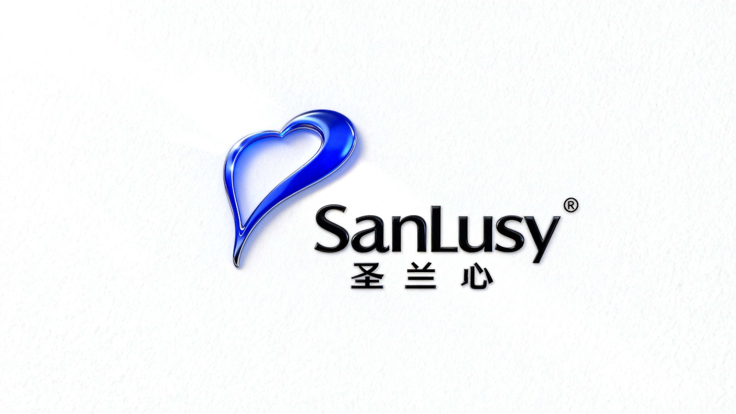
SanLusy is a brand that focuses on health care and quality life products. It is committed to protecting family health with attentive service and connecting beautiful life experiences with professional quality.
The brand hopes to present a balanced state of "care x professional cleanliness" through a visual system that combines emotional warmth and professional temperament.



design concept
The core idea of the logo is derived from the concept of "Sacred Heart". The design is based on smooth heart-shaped lines, which cleverly echoes the word "heart" in the brand name "Shenglan Heart", symbolizing the brand's core values of dedicated service and representing care and sincerity. The heart-shaped blue metal texture shows the brand characteristics of "cleanliness and professionalism", and the streamlined shape is like a smart water drop, symbolizing purity and vitality. The overall shape not only has a warm emotional connection, but also is full of professional quality tension, implying the brand mission of Shenglanxin to continue to protect health with sincerity and serve life with quality. The semantic association between the heart-shaped pattern and the brand name forms a strong brand memory point.
Graphic composition and color application
Heart-shaped line structure: represents the brand's core concept of "carefulness" and caring spirit; smooth curve shape: as agile as a water drop, symbolizing purity, cleanliness and vitality; three-dimensional metal texture: showing professional quality and high-end positioning with blue chrome plating effect; semantic association: the heart-shaped pattern and the word "heart" in "Shenglan Heart" form a brand memory anchor.
The brand name "SanLusy" uses a modern sans-serif font with smooth fonts and balanced proportions, consistent with the logo's agile temperament. The Chinese "Holy Orchid Heart" uses simple boldface to convey the brand's "affinity in professionalism". 1. The registered logo strengthens the authority of the brand. The combination of Chinese and English is arranged horizontally and unified as a whole, strengthening visual recognition and international communication attributes.
Professional blue #1E5AA8: symbolizes cleanliness, professionalism and trustworthy quality; gloss gradient #4A90D9#1E5AA8: represents purity, vitality and quality brilliance; pure white #FFFFFF: symbolizes cleanliness, health and authenticity of life. Blue flows in the gradient, forming a visual balance of "professionalism and warmth", "cleanliness and vitality", and building a trustworthy and warm brand impression.
Application extension and brand significance
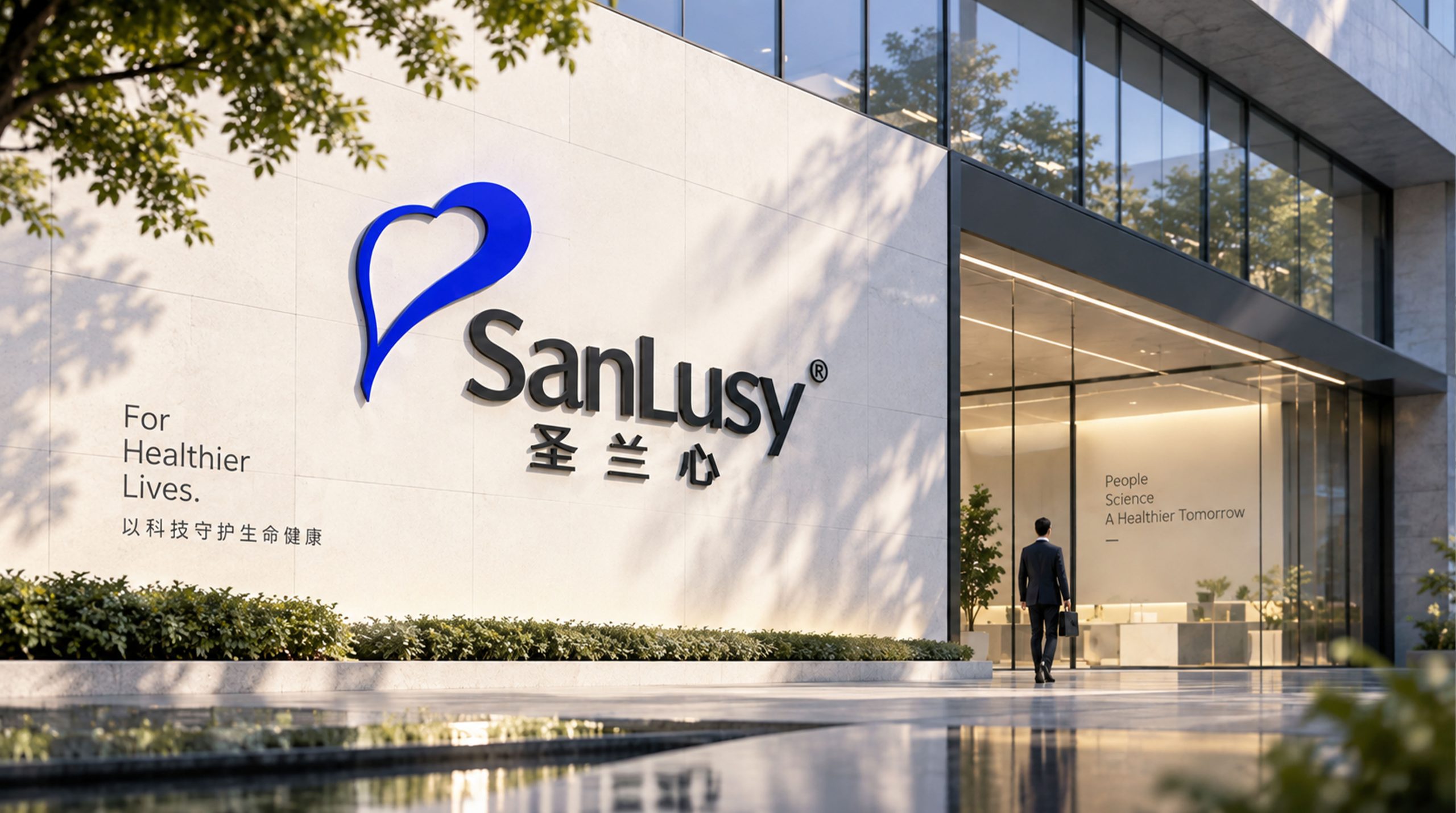
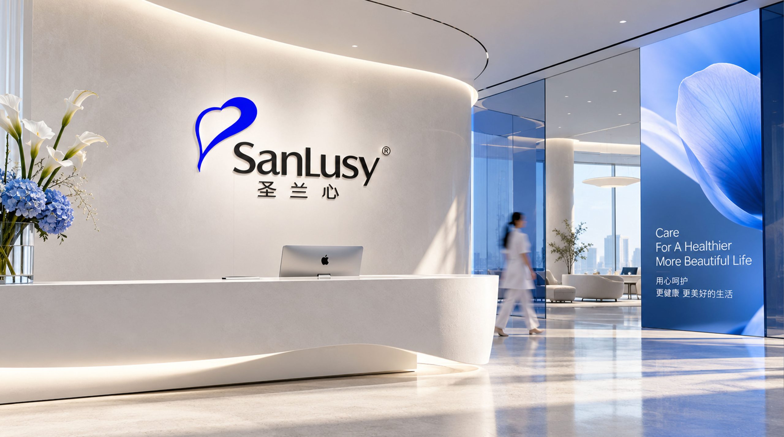
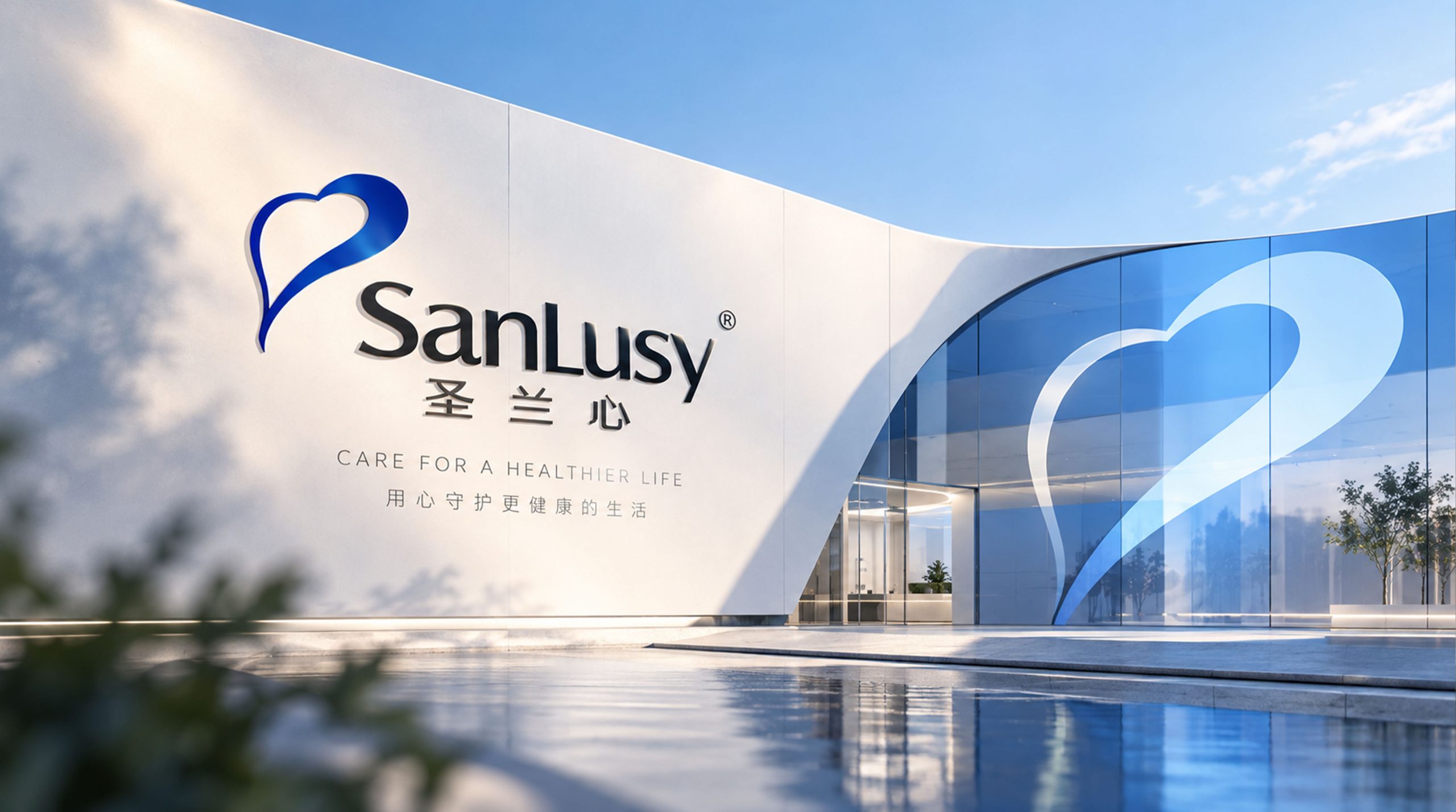
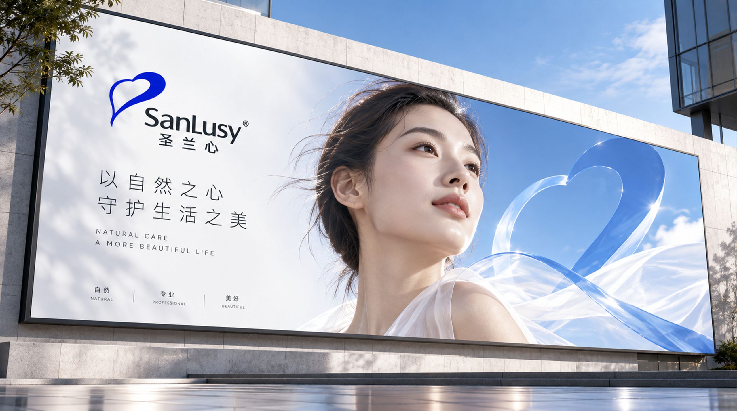
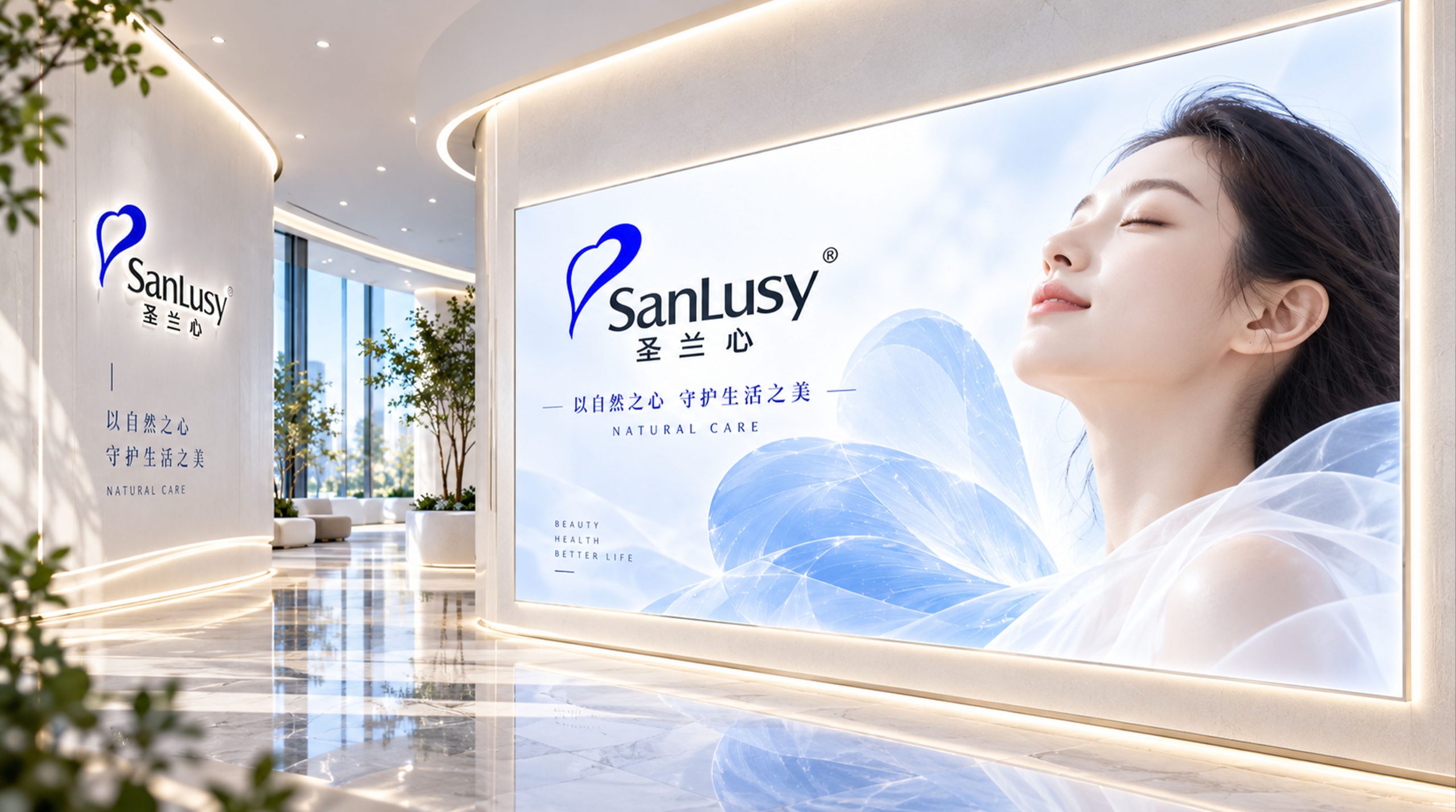
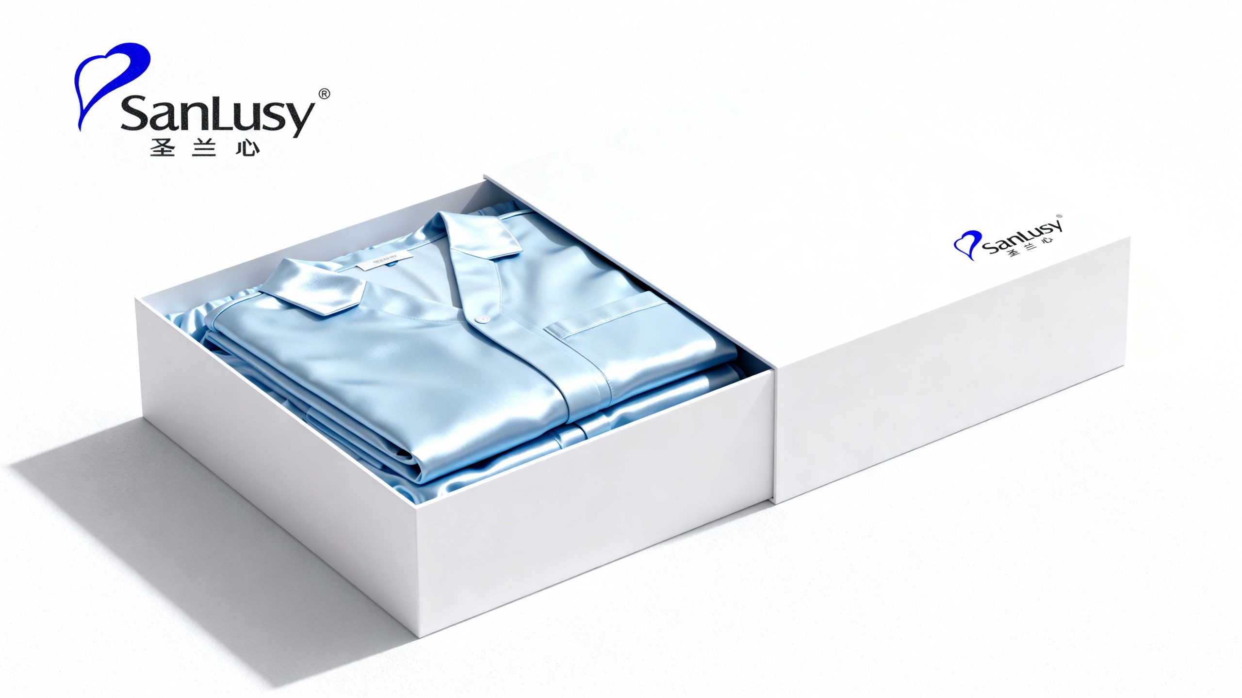
The logo has strong cross-field adaptability: corporate level: applied to brand launches, industry exhibitions, annual reports and strategic cooperation; product level: suitable for product packaging, manuals and terminal display signs; spatial level: in store image, guidance system and brand experience center to form a unified visual language dynamic version, the heart shape can be used as a "pulsating flash" or glossy flowing animation, symbolizing the continuous protection of attentive service.
The Saint Orchid Heart logo embodies the dual value of "caring for professional cleanliness with heart": heart-shaped pattern → the emotional core of care; blue → professional quality commitment; smooth curve → the symbiosis of purity and vitality. This is not only a brand identification symbol, but also a visual expression of a service philosophy to protect a better life with a holy heart.
design results
After the release of the new visual system, Lyceum has become an iconic brand image in the health care field. The blue heart shape and smooth curves are widely used in product packaging, brand communication, and marketing. With the visual expression of "emotional structure × professional language", it has established a new aesthetic standard in the nursing industry. This case represents the mature expression of the brand in the direction of health care, quality life and system visual language design, achieving the unification from "brand design" to "caring philosophy".