










Huatech is an international technology company focusing on electronic technology and intelligent solutions. It is committed to connecting the global market with technological innovation and promoting the future development of digitalization with quality products.
The brand hopes to present a balanced state of "technological strength x international brand" through a visual system that combines international vision and high-end quality.
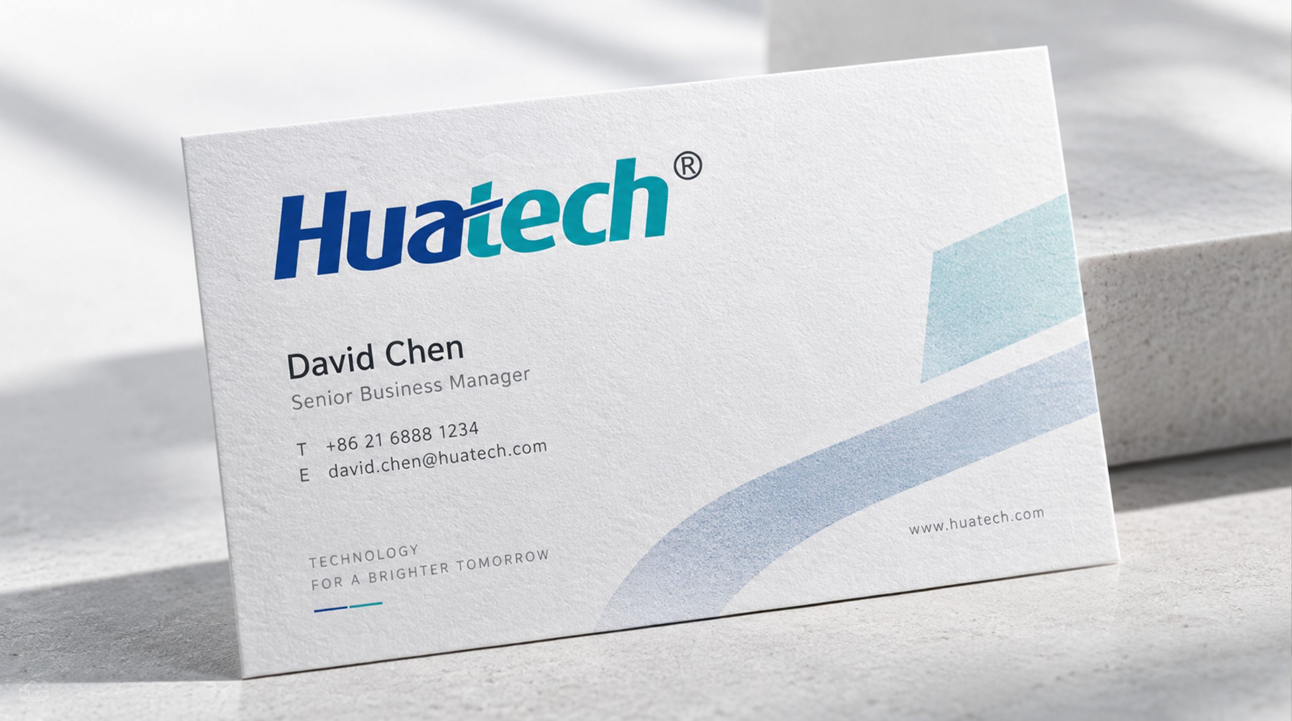
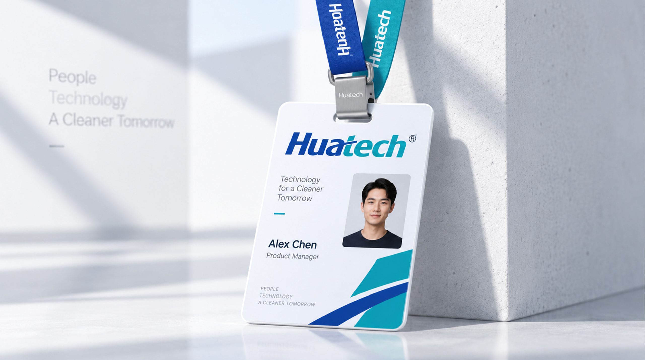
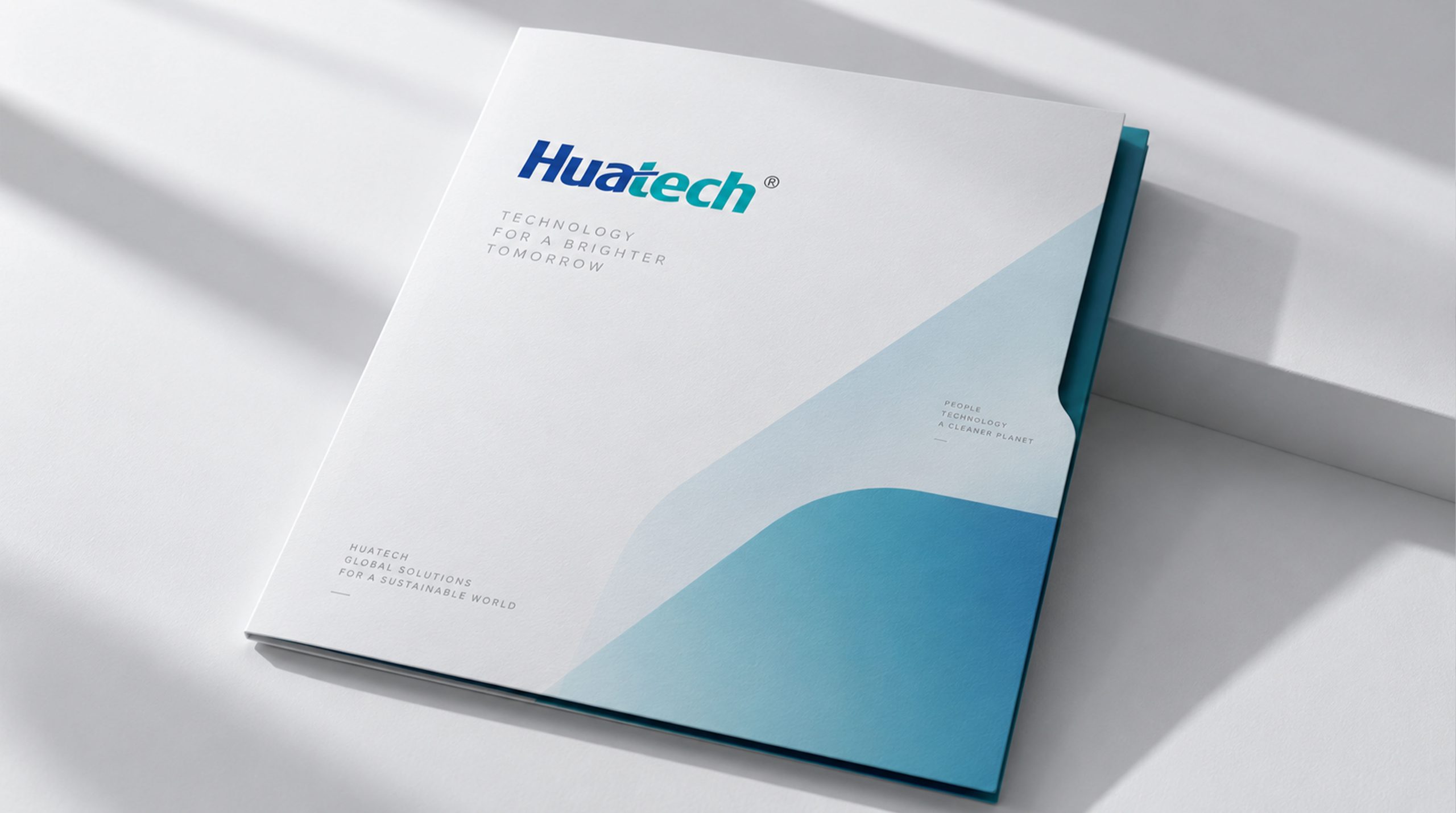
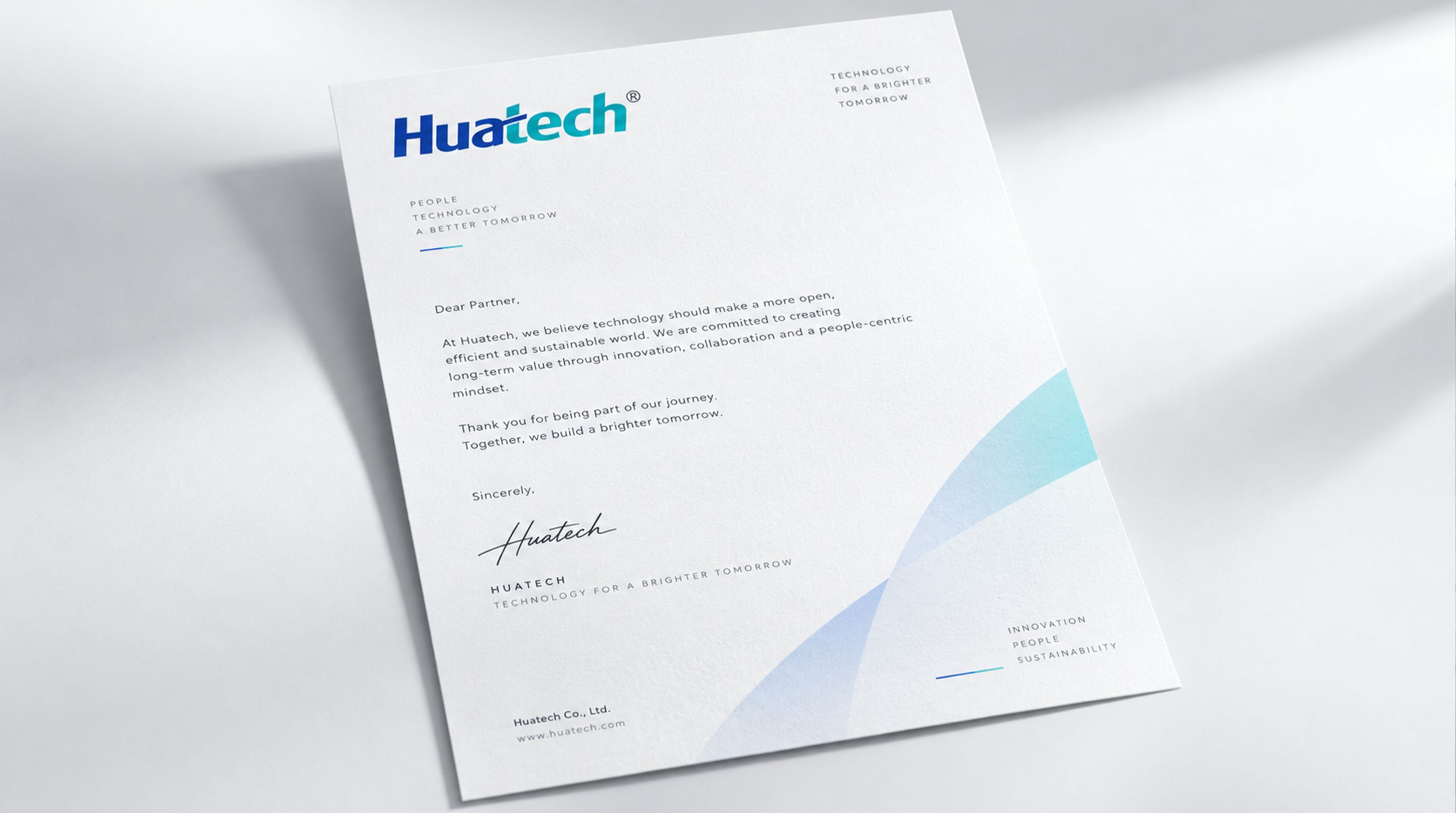
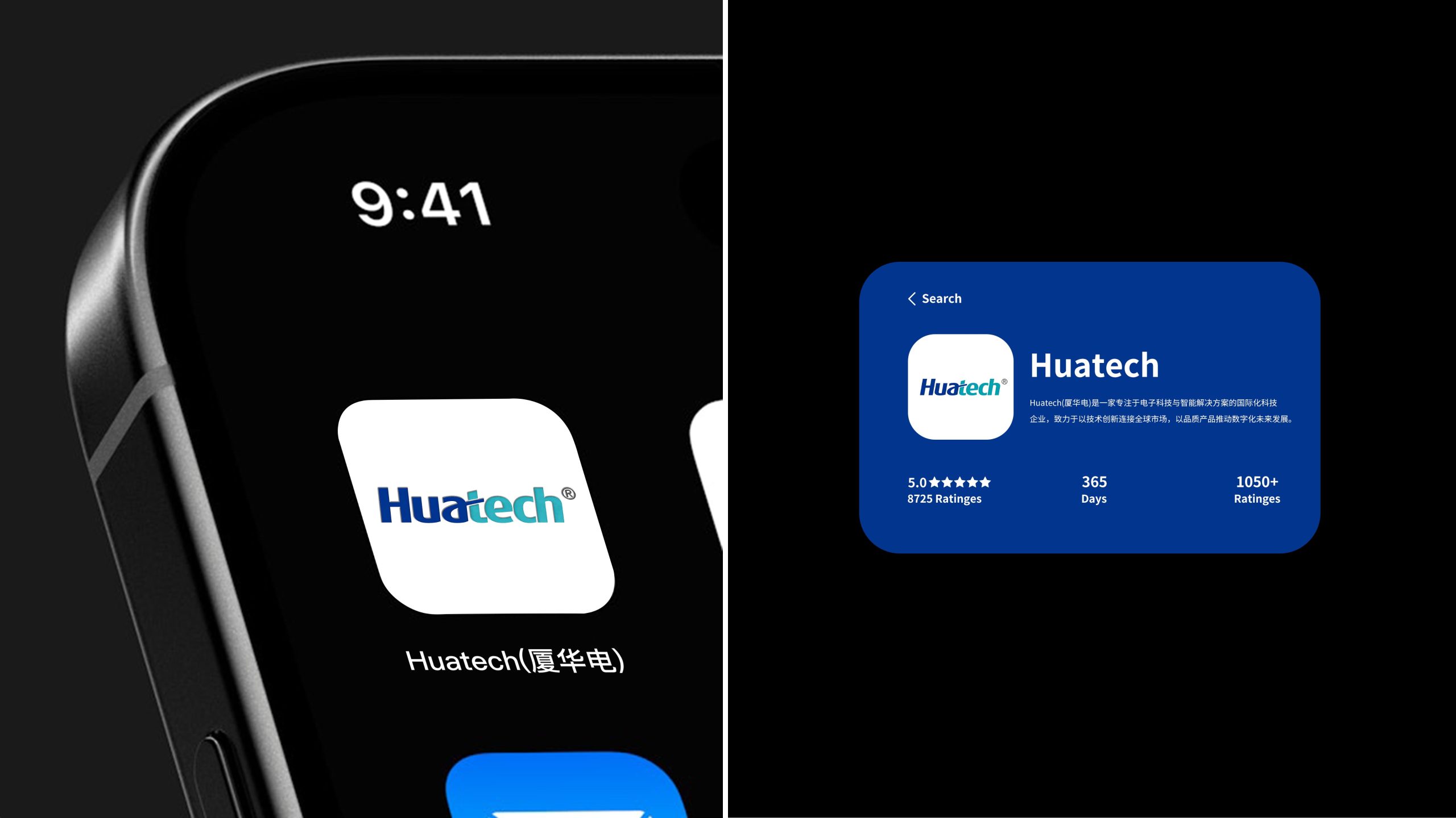
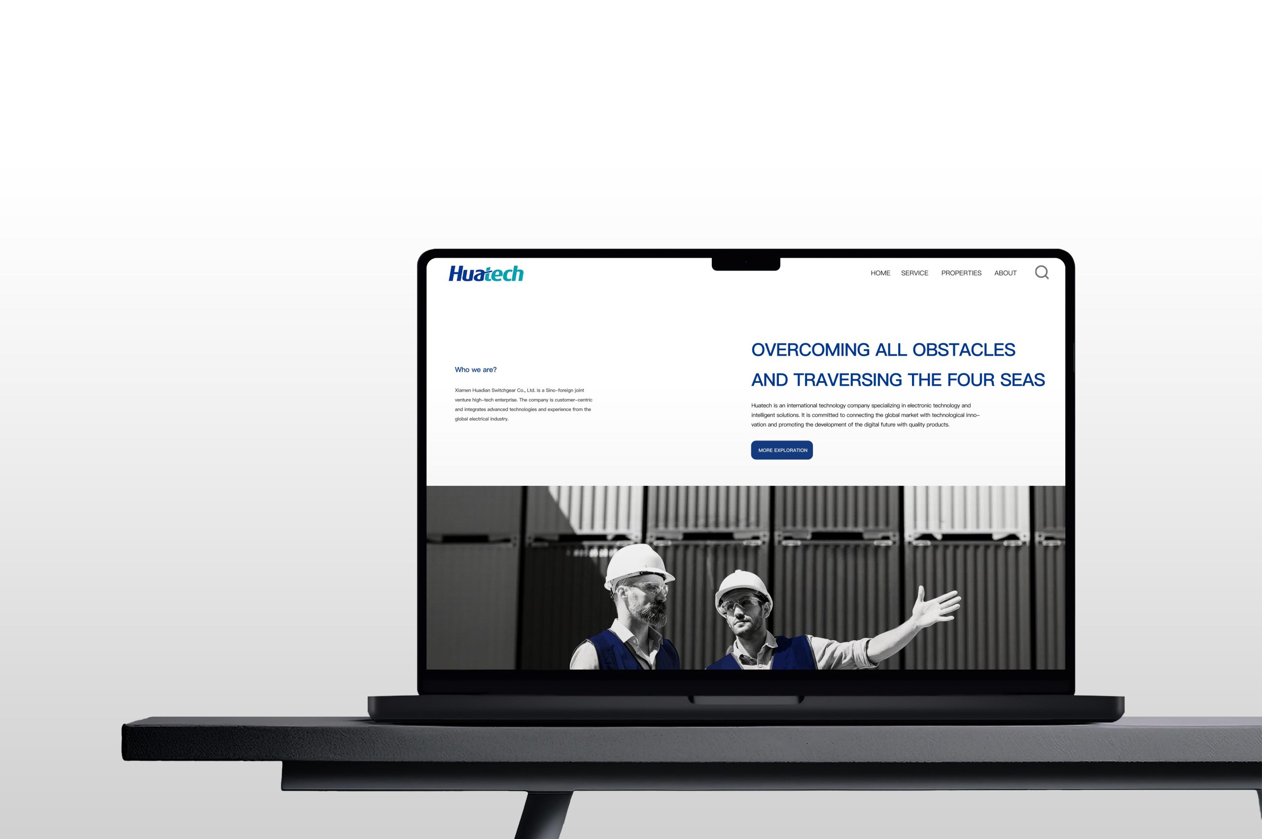
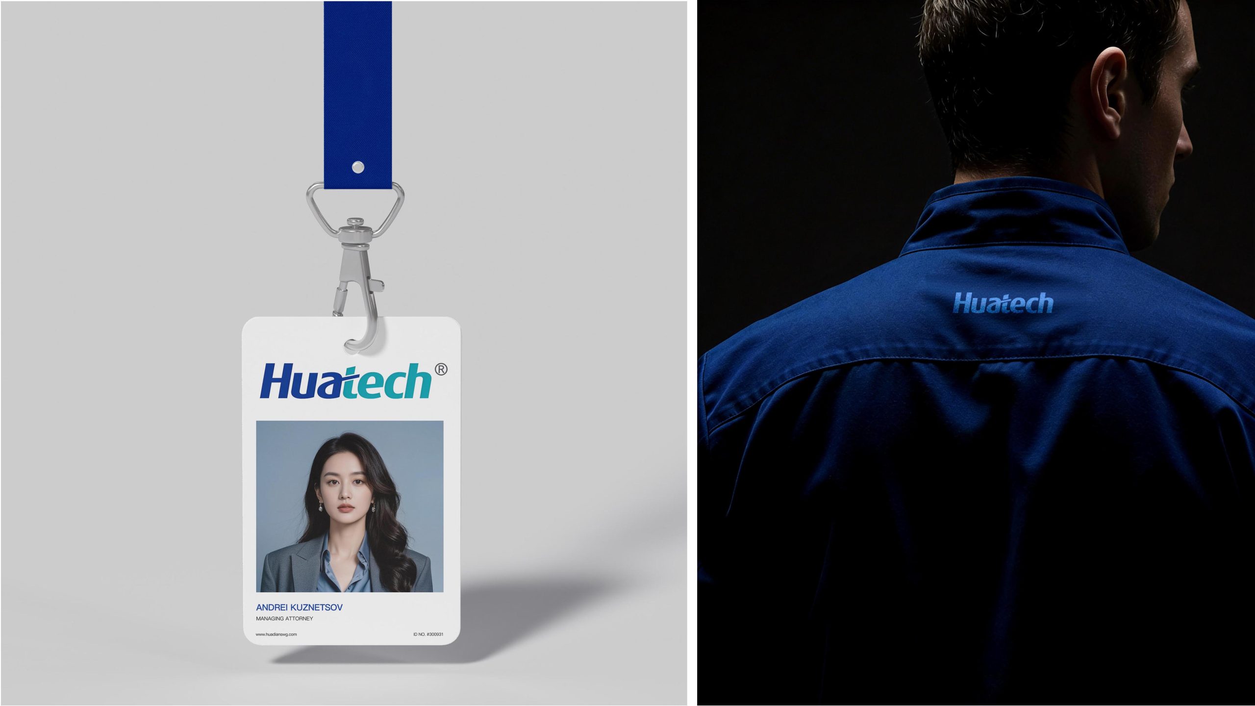
design concept
The core concept of the logo comes from the concept of "In Touch With Technology". The design is based on the brand's English name, using a silver-gray metallic font to present an international, high-end temperament. The red rhombus above the letter "i" becomes the brand's unique logo - symbolizing the spark of innovation and the core highlight of the brand. The overall shape not only has the professional image of an international technology brand, but also is full of the unique personality of a Chinese enterprise, implying Huadian's brand mission of continuing to reach the world and serve the world with technological innovation. The three-dimensional metallic font design shows the international competitiveness and quality commitment of technology companies. The brand slogan "In Touch With Technology" strengthens the core positioning of the close connection between the brand and technology.
Graphic composition and color system
The monogram structure: represents the international positioning of the brand and the professional attributes of the technology industry; the red diamond is the finishing touch: the red diamond above "" shows the brand's uniqueness and innovation spark; the metal three-dimensional font: the silver-gray chrome texture shows technological precision and international quality; the brand slogan: "With" is highlighted in red to strengthen the concept of connecting people and technology.
The brand name "Huatech" uses a modern geometric sans-serif font with smooth fonts and balanced proportions, consistent with the international temperament of the logo. The italic design conveys the brand's "dynamic yet steady". The brand slogan adopts a classic serif font and is arranged horizontally to enhance visual recognition and international communication attributes.
Technical Silver #8A8A8A: Symbolizes technology, precision and international quality; Vibrant Red #E31B23: Represents innovation, enthusiasm and brand highlights; Pure White #FFFFFF: Symbolizes purity, professionalism and technological authenticity. Silver and red are the finishing touches in restraint, forming a visual balance of "international and local" and "stability and vitality", and building a high-end and memorable brand impression.
Application extension and brand significance
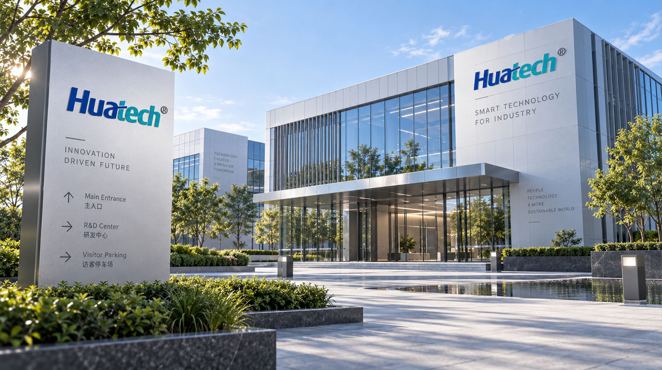
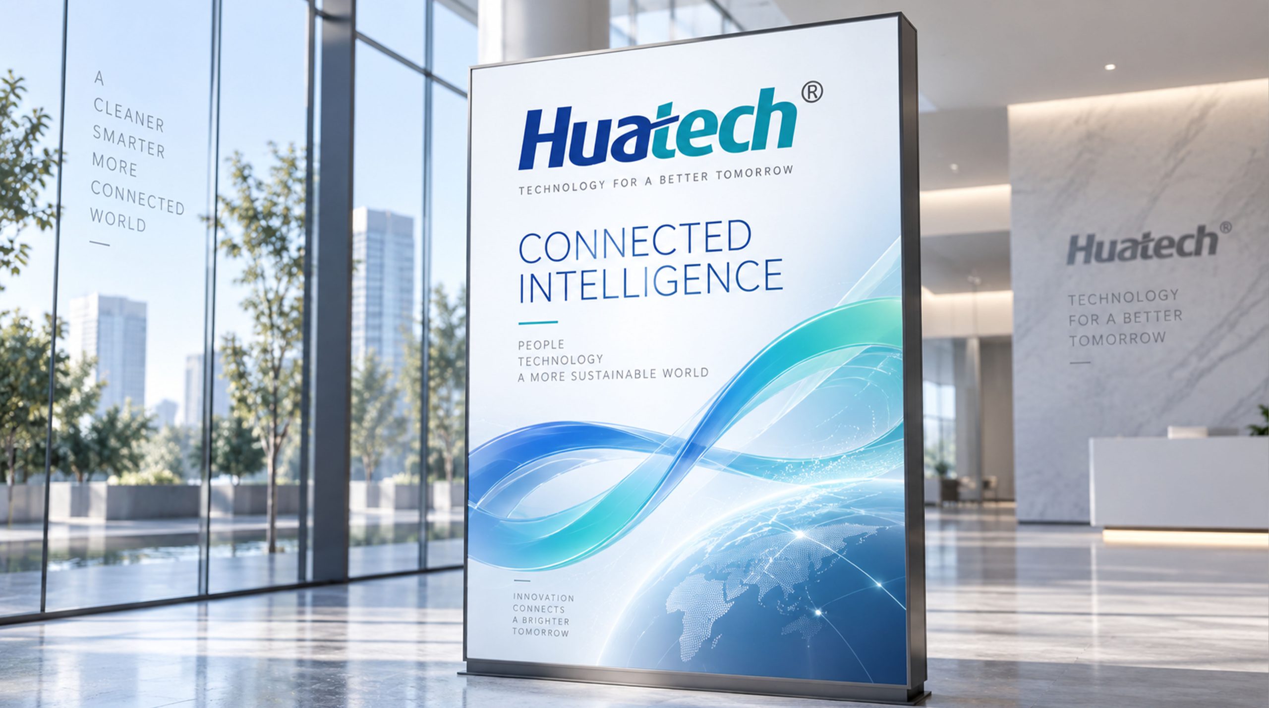
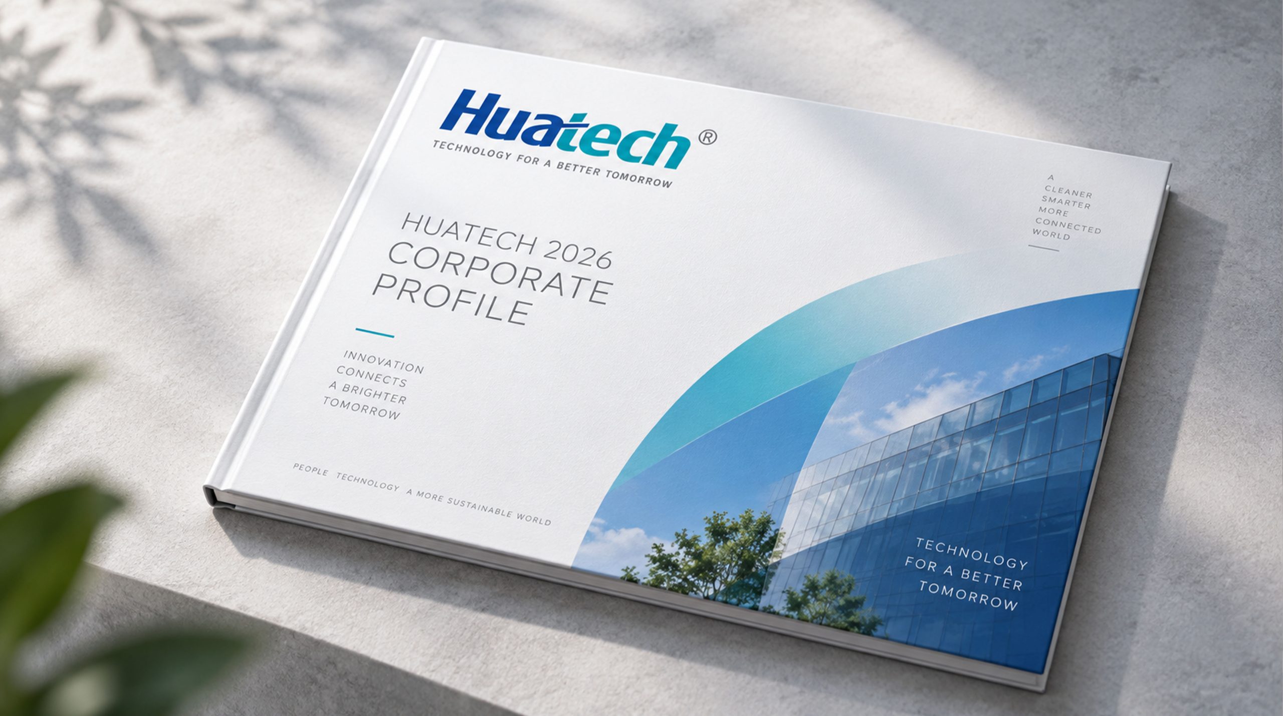
The logo has strong cross-field adaptability: corporate level: used in brand launches, international exhibitions, annual reports and strategic cooperation; product level: suitable for electronic products, packaging design and technical document identification; spatial level: in corporate headquarters, wayfinding systems and brand experience centers to form a unified visual language dynamic version. The red diamond can be used as a "flashing pulse" or innovation spark animation, symbolizing the continued vitality of technological innovation.
The Huatech logo embodies the dual values of "technological strength x international brand": metal font → international quality gene; red accents → innovative brand core; silver and red color matching → symbiosis of professionalism and vitality. This is not only a brand identification symbol, but also a visual expression of a technological philosophy that uses the power of technology to reach the global future.
design results
After the release of the new visual system, Huatech has become an iconic international brand image in the domestic electronic technology field. Metal fonts and red diamonds are widely used in industry exhibitions, brand communications, and international marketing promotions. With the visual expression of "international structure × innovative language", it has established a new aesthetic standard in the technology industry. This case represents the mature expression of the brand in the direction of international technology, electronic innovation and system visual language design, achieving the unification from "brand design" to "technology philosophy".