












LOGO & IDENTITY / Logo and brand identity

NOVDEW
brand identity design

Lily Bio·Natural Skin Care and Biotechnology

NOVDEW product brand screen renderings
Product brand screen renderings

PROJECT BACKGROUND / project background

Connecting nature and technology.

NOVDEW (Lily Bio) is a cosmetics brand originating from the United States that focuses on natural skin care and biotechnology. The project focuses on the brand positioning of natural ingredients and scientific research and innovation, establishing a visual identity with geometric letters, silver gray and blue, and exploring its application in products, space and communication.

brand
NOVDEW / Lily Bio
Project type
Logo and brand identity
Show content
Logo, color and application renderings

DESIGN CONCEPT / Logo concept

Use the "dew of new life" to form identification clues.

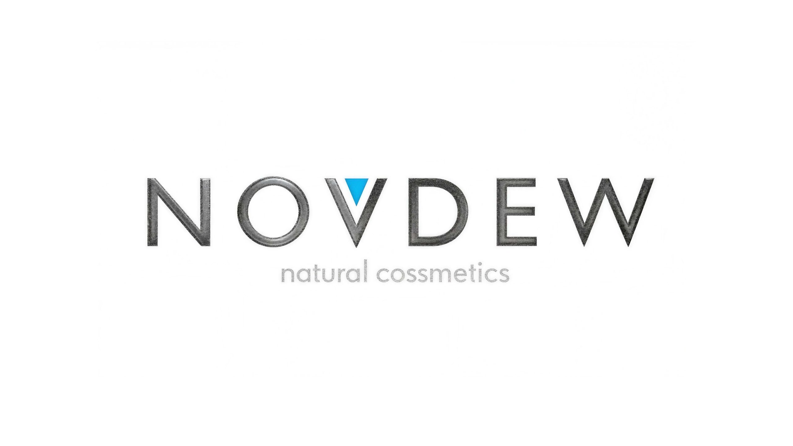
The logo idea of "NOVDEW" comes from "New Dew". The design uses a monogram as the main body, and through a restrained geometric structure, it connects the brand's natural skin care positioning and technological attributes.

A blue triangle is embedded in the letter V, which serves as a visual reminder of the logo. It corresponds to the design meaning of dewdrops and vitality of life, forming a clear color contrast in the silver-gray word mark.

NOVDEW Brand Logo · Blue Identification Element in Letter V
Brand logo · Blue identity element in letter V

The image shows the complete word mark. The silver-gray letters maintain the main order, while the blue elements form local identification.

IDENTITY LANGUAGE / identification rules

Keep fonts, colors, and composition consistent.

Letters and fonts

The brand name uses a modern geometric sans-serif font with concise fonts and balanced proportions, and is arranged horizontally to maintain visual stability. The subtitle "natural cosmetics" uses a slim font to form a hierarchy with the main wordmark.
Identify elements

The blue triangles are clustered within the letter V as local identification cues. It is used in combination with the main letters to maintain the overall unity of the logo.

color relationship

Silver gray constitutes the main body, blue is used for embellishment, and white is responsible for the background and white space. Establish recognition through limited colors rather than adding decoration.

silver gray #8A8A8A

Subject identification color

blue #00A3E0

local identification element

white #FFFFFF

Background and white space

The color values follow the original project description; the material, lighting and screen display in the picture may give a different look and feel.

APPLICATION STUDIES / Application display

The same identification can enter different brand touch points.

Products and packaging

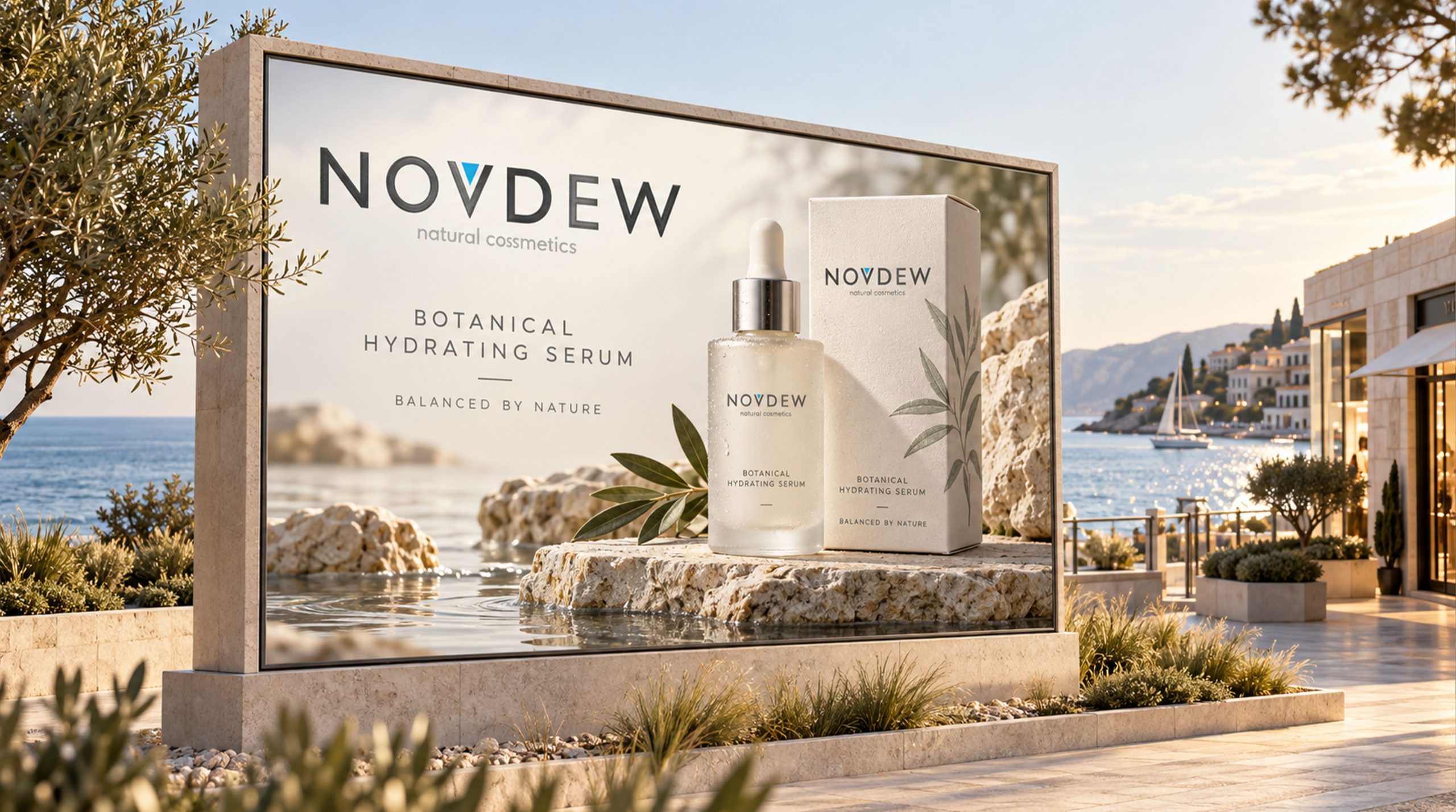
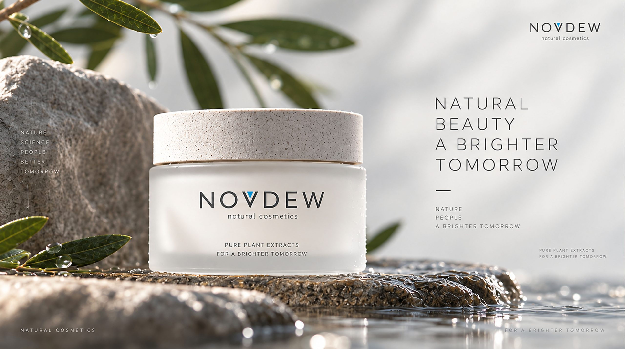
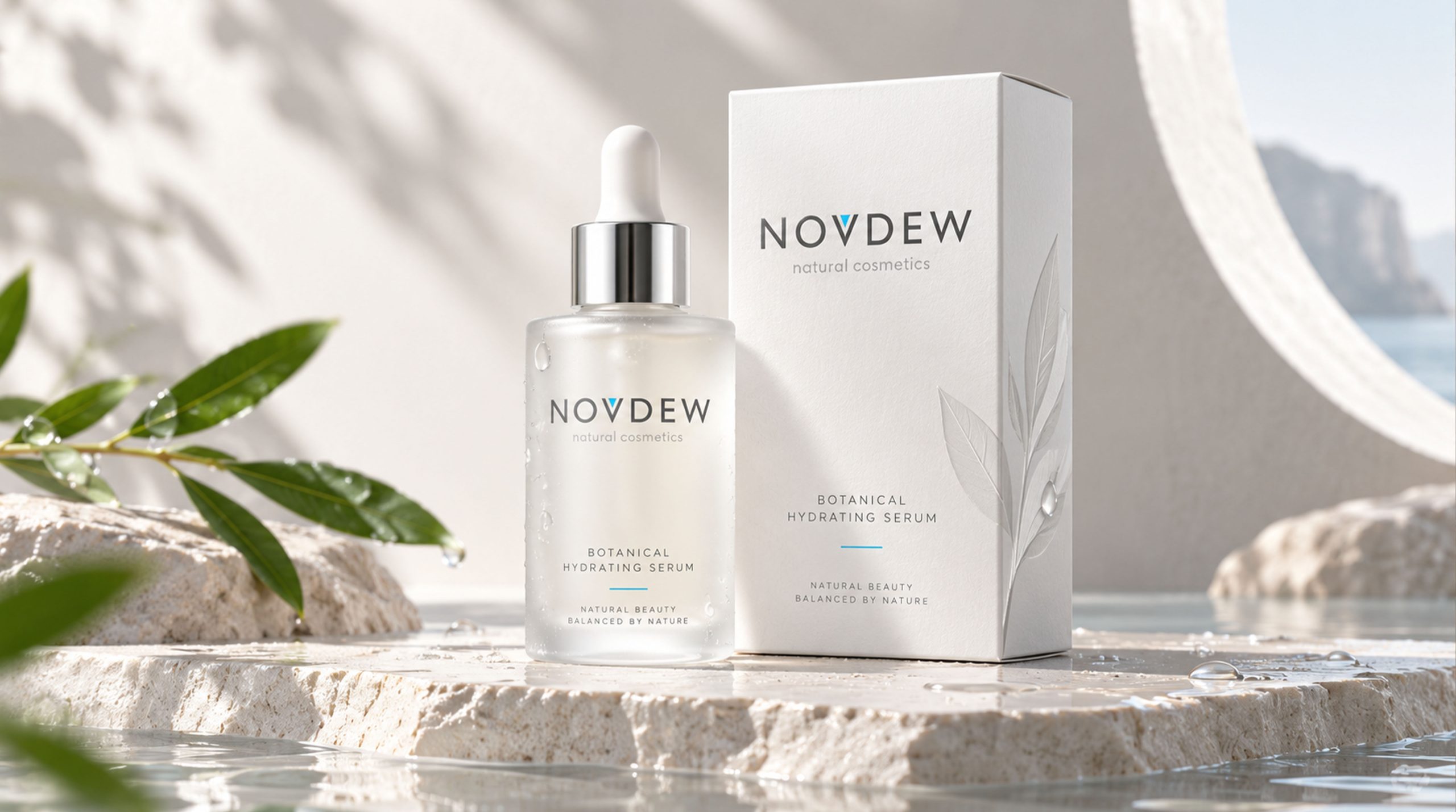
The word mark is used on product bottles and outer packaging, combining white, natural materials and white space to display the brand image. By unifying the word mark and information level, the visual expression of different products is connected.

NOVDEW product bottle and packaging application renderings
Product bottle and packaging application renderings

Stores and spaces

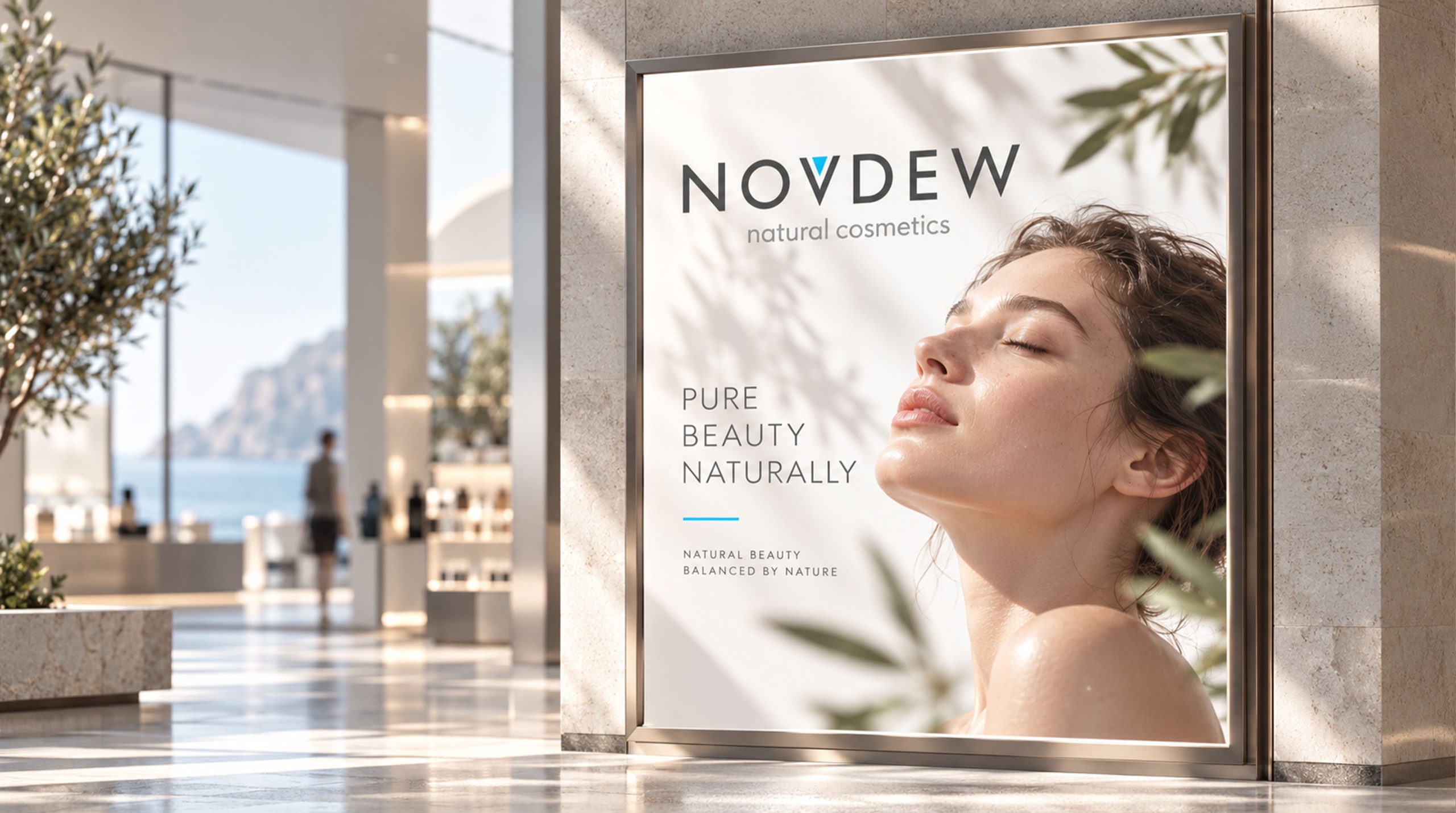
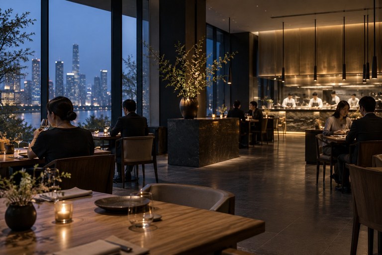
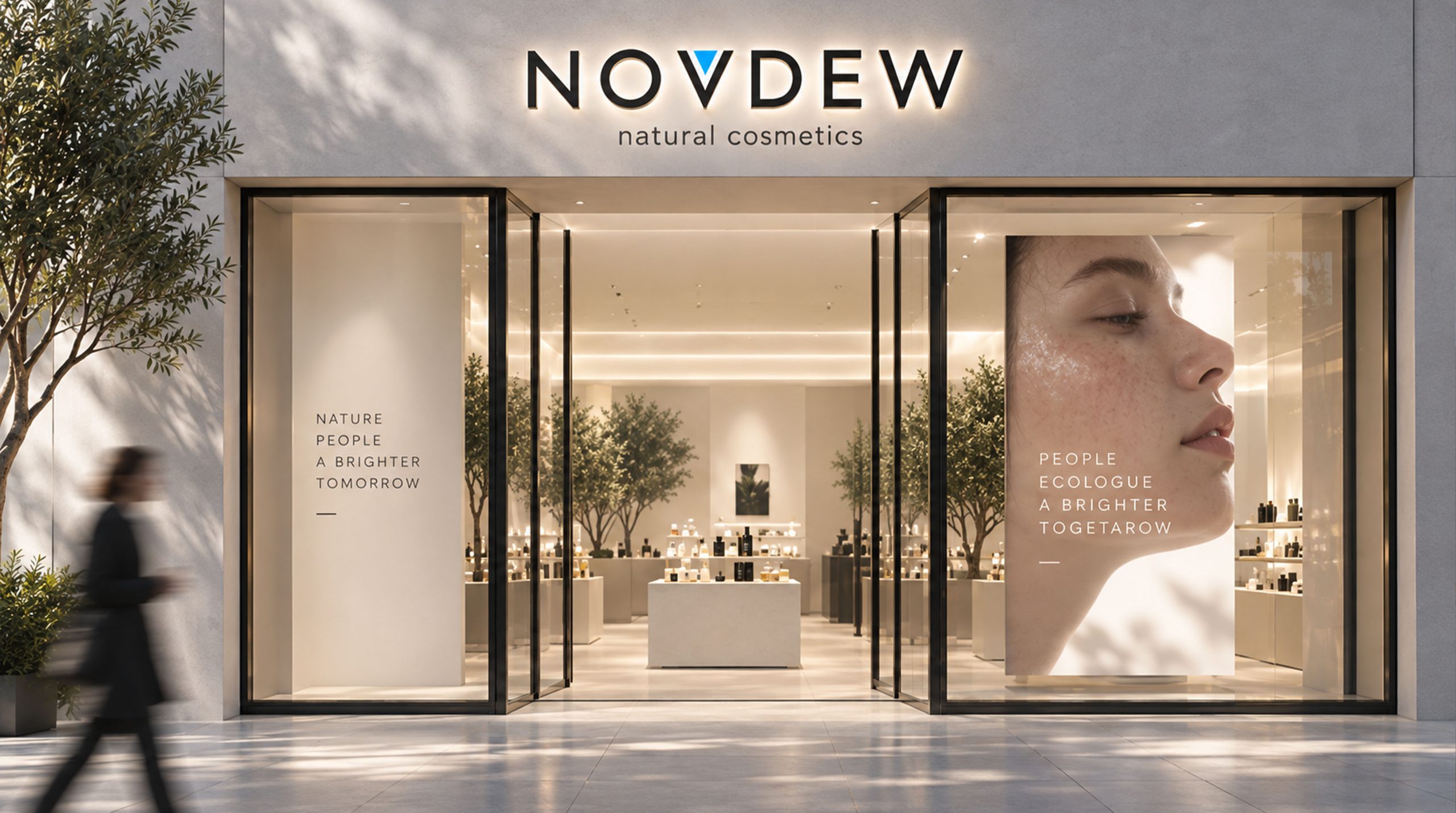
The door logo, in-store display and communication images all use the same word mark to maintain continuous identification of the space entrance and product touch points.

NOVDEW store space application renderings
Store space application renderings

Brand communication

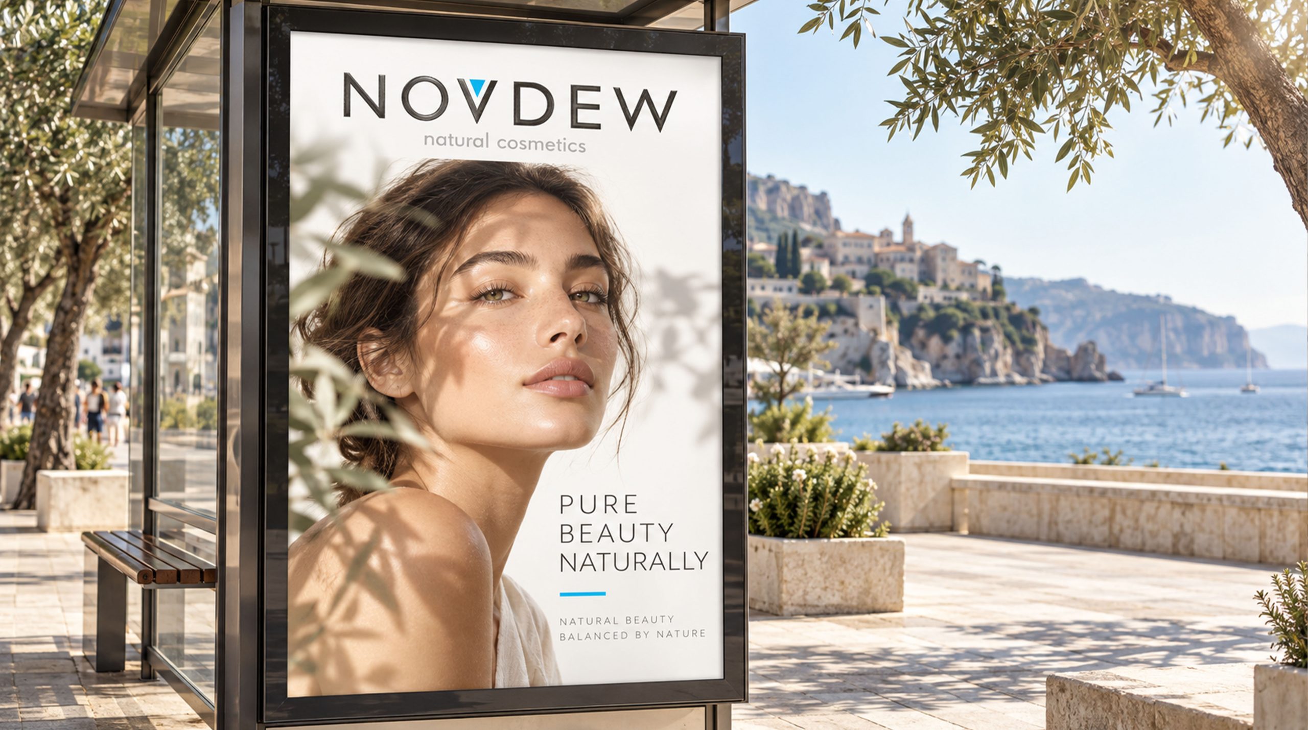
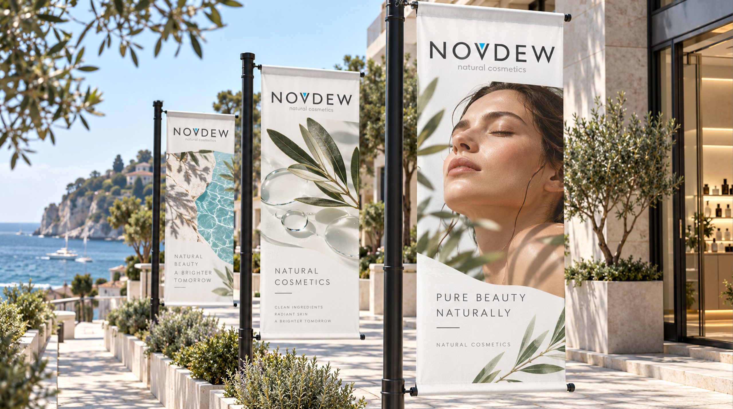
Outdoor images form an information hierarchy with brand names, products and characters. Different frames continue the same recognition language, showing how the logo is used in communication scenarios.

NOVDEW indoor display application renderings
Indoor display application renderings
NOVDEW outdoor light box application renderings
Outdoor light box application renderings
NOVDEW product communication screen renderings
Product communication screen renderings
NOVDEW series outdoor communication renderings
Series of outdoor communication renderings
Further extension direction

The original project description also proposed extension directions such as press conferences, exhibitions, annual reports, gift boxes, guides and brand experience stores. These are application ideas, and the content shown on this page is subject to the existing pictures.

Dynamic expressions explore the shimmer of water droplets or the condensation of dewdrops around blue elements. In subsequent production, the consistency of the word mark structure and color recognition should be maintained.

The design results presented on this page

The geometric word mark, silver-gray main body and blue partial elements form an identification language, and the application relationship is demonstrated through product, space and communication renderings. The above pictures are design displays, and the renderings are not regarded as proof of market performance or actual implementation.

START A CONVERSATION / Start communicating

Discuss your brand identity project.

Communicate project requirements ↗