










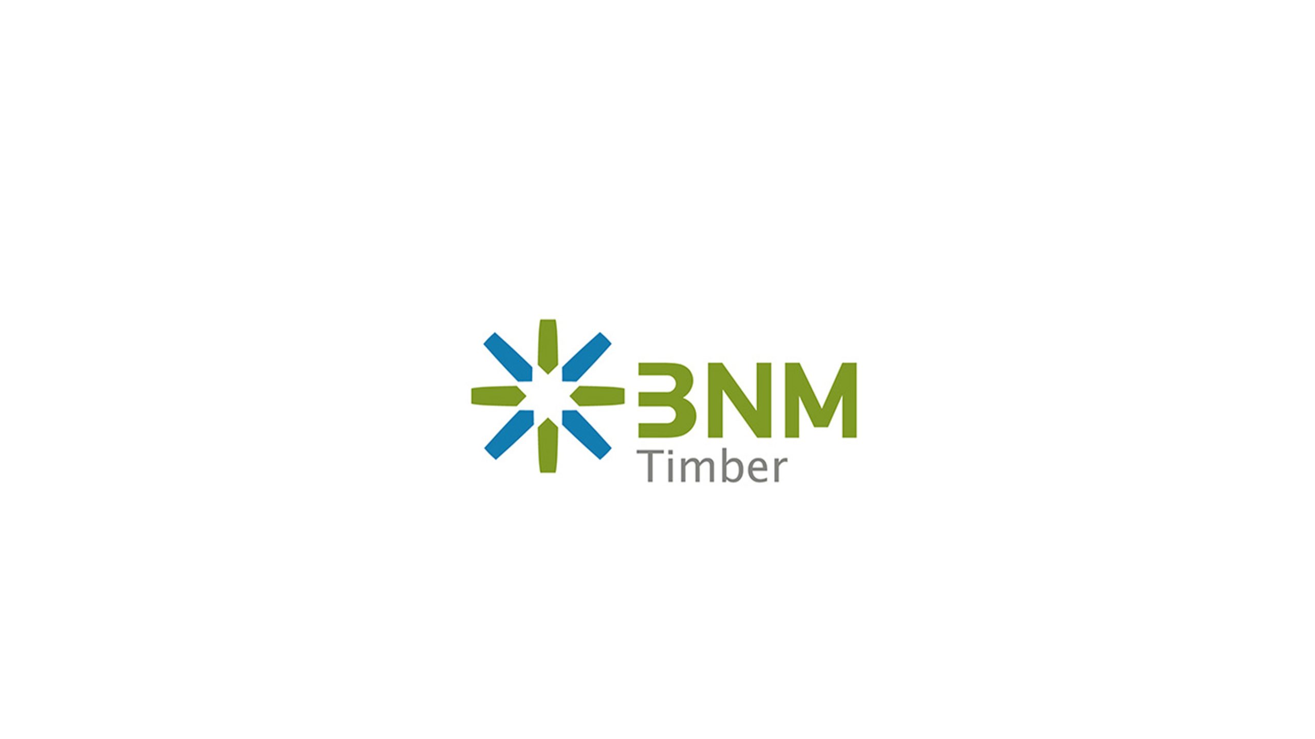
BNMTimber is a trading platform focusing on international timber trade and supply chain services. It is committed to connecting global timber resources with technological innovation and promoting the future development of green trade with sustainable concepts.
The brand hopes to present a balanced state of "green sustainability x technology transaction" through a visual system that combines a sense of technology and ecological concepts.
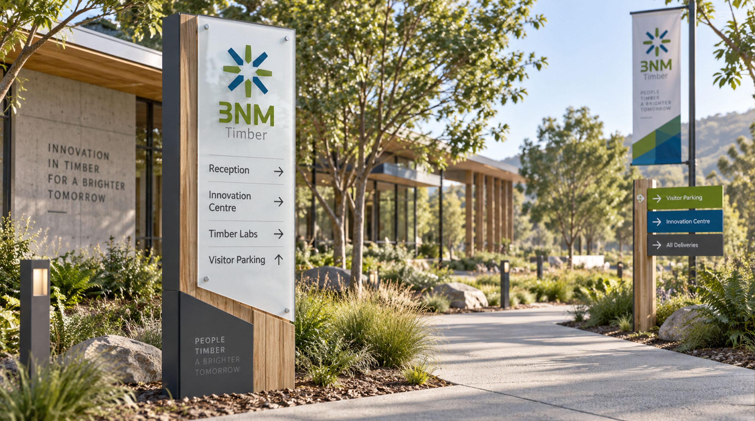
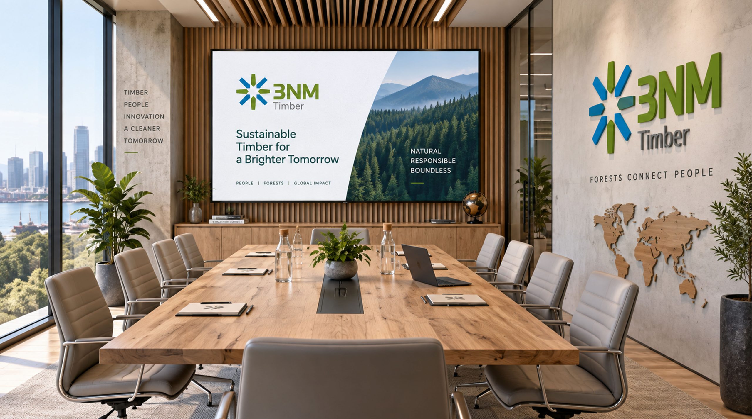
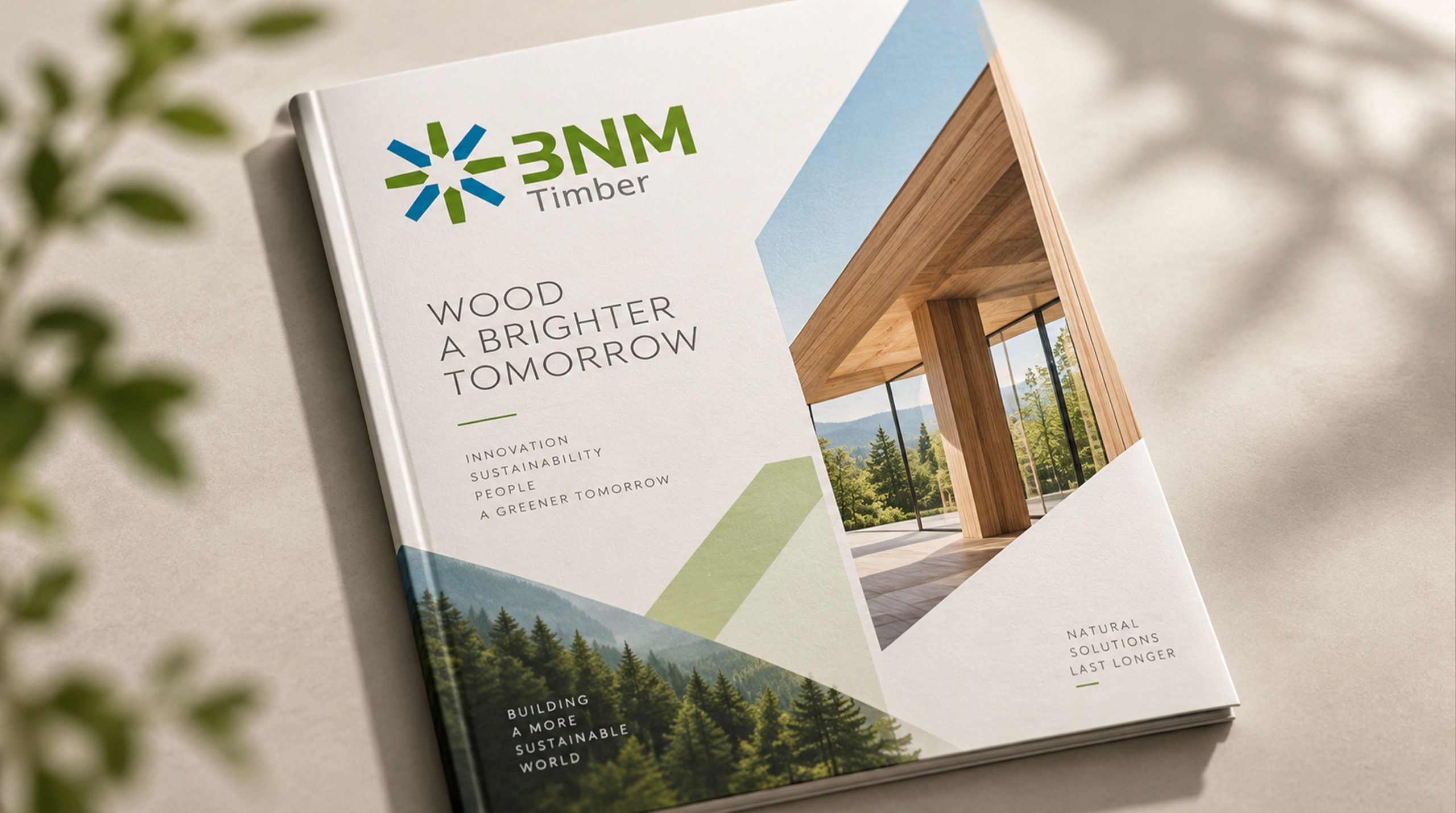
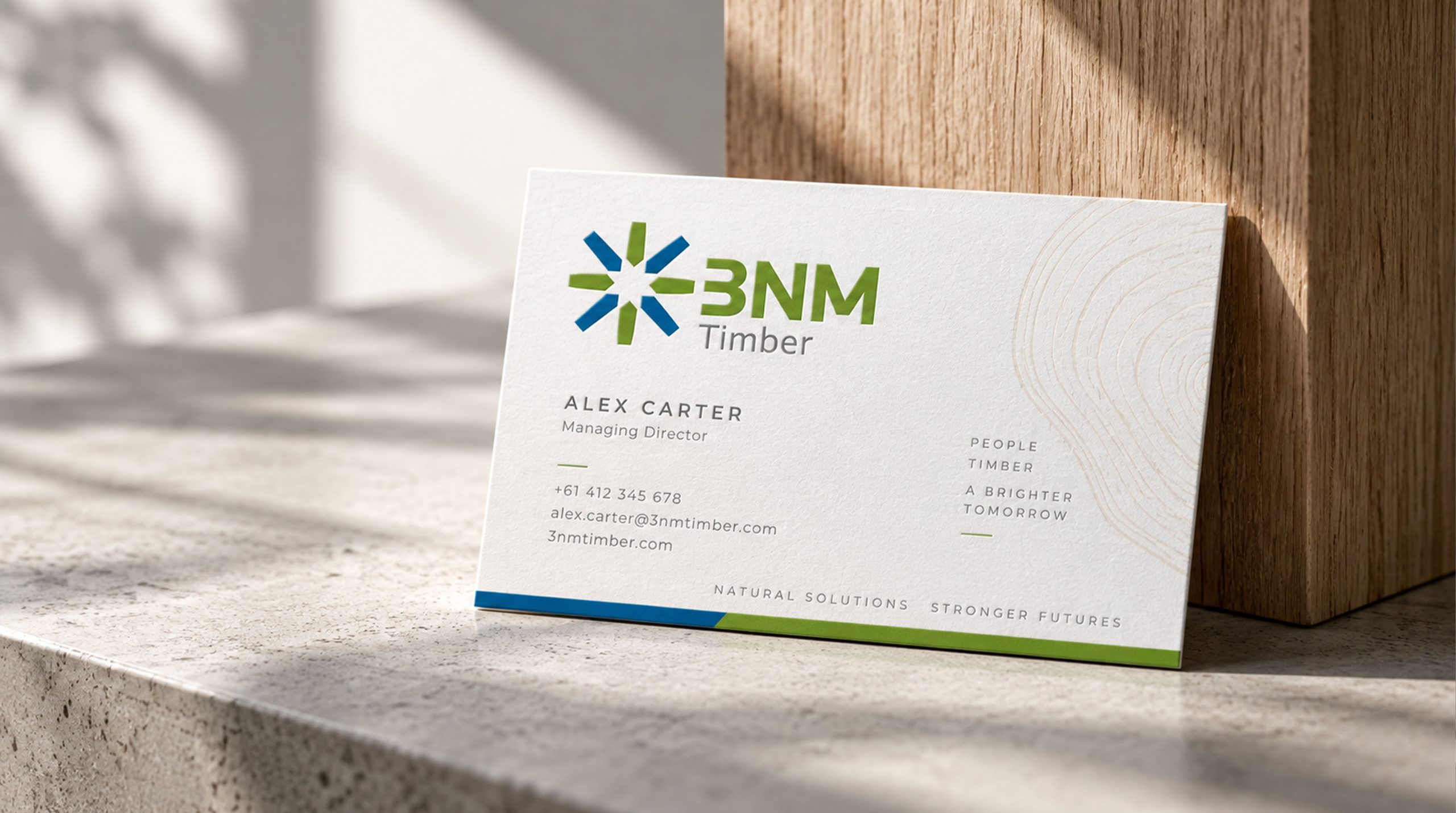
design concept
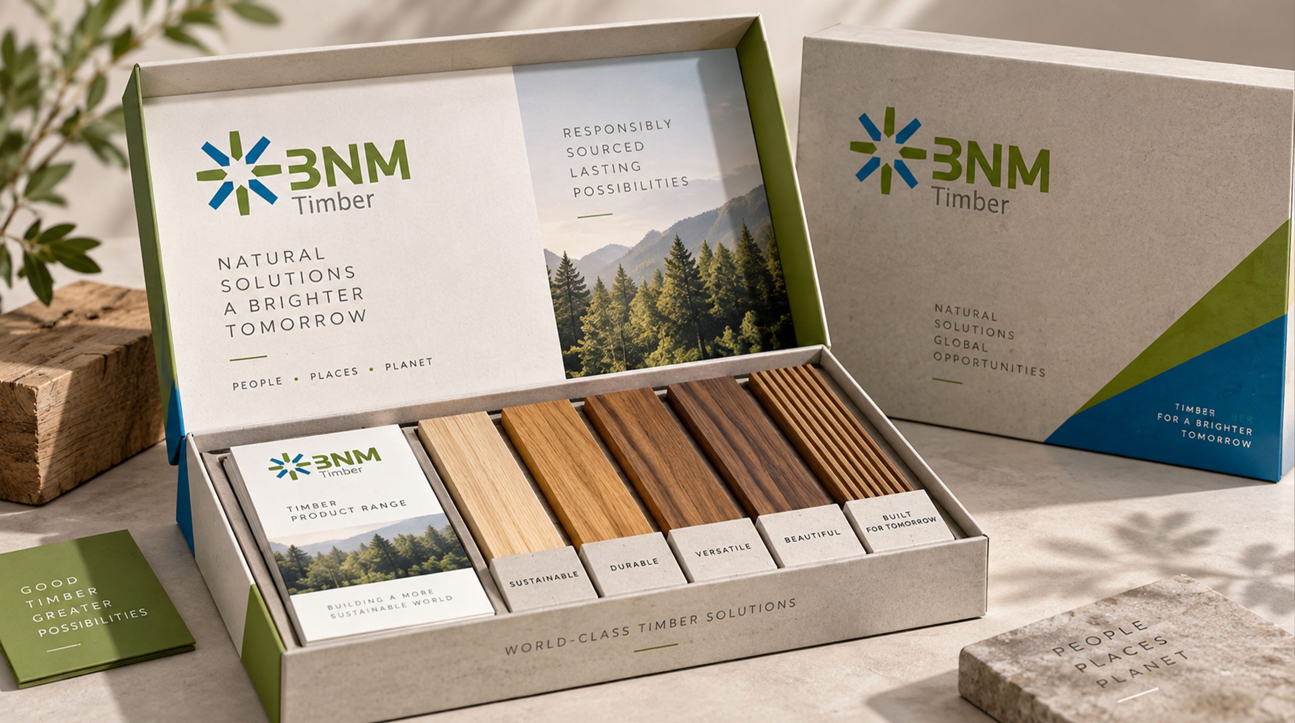
The core concept of the logo is derived from the concept of "Timber Exchange". The design uses a radial pattern as the basic configuration, symbolizing the global circulation and trading network of timber resources that extends in all directions, representing connection and convergence. The staggered arrangement of blue and green colors reflects the fusion of "technology and sustainability" - like the interweaving of wood textures and the growth of annual rings, and the connection of nodes on a digital platform. The overall shape has both the natural attributes of the timber industry and the modern tension of the technology platform, implying BNM Timber's brand mission of continuing to use the power of technology to connect the global timber trade and promote green and sustainable development. The radial open structure presents the open vision and global layout of the international trading platform.
Graphic composition and color system
Radial structure: represents the global circulation and trading network of wood resources extending in all directions; intertwined wood grain imagery: blue and green interweave like the natural growth of wood growth rings and textures; node connection: radial endpoints symbolize the multi-party docking and resource gathering of the trading platform; open layout: the outward extending shape conveys the openness and inclusiveness of the international platform.
The brand name "BNM" uses a modern geometric sans-serif font with a stable shape and balanced proportions, consistent with the international temperament of the logo. "Timber" uses gray thin line font to convey the brand's "professionalism in strength". The overall horizontal arrangement strengthens visual recognition and international communication attributes.
Technology Blue #1E88E5: Symbolizes technology, trust and digital trading platform; Ecological Green #7CB342: Represents sustainability, nature and attributes of the timber industry; Steady Gray #757575: Symbolizes professionalism, stability and industry authority. Blue and green are harmoniously intertwined, forming a visual balance of "technology and nature, innovation and sustainability", and building a professional and ecological brand impression.
Application extension and brand significance
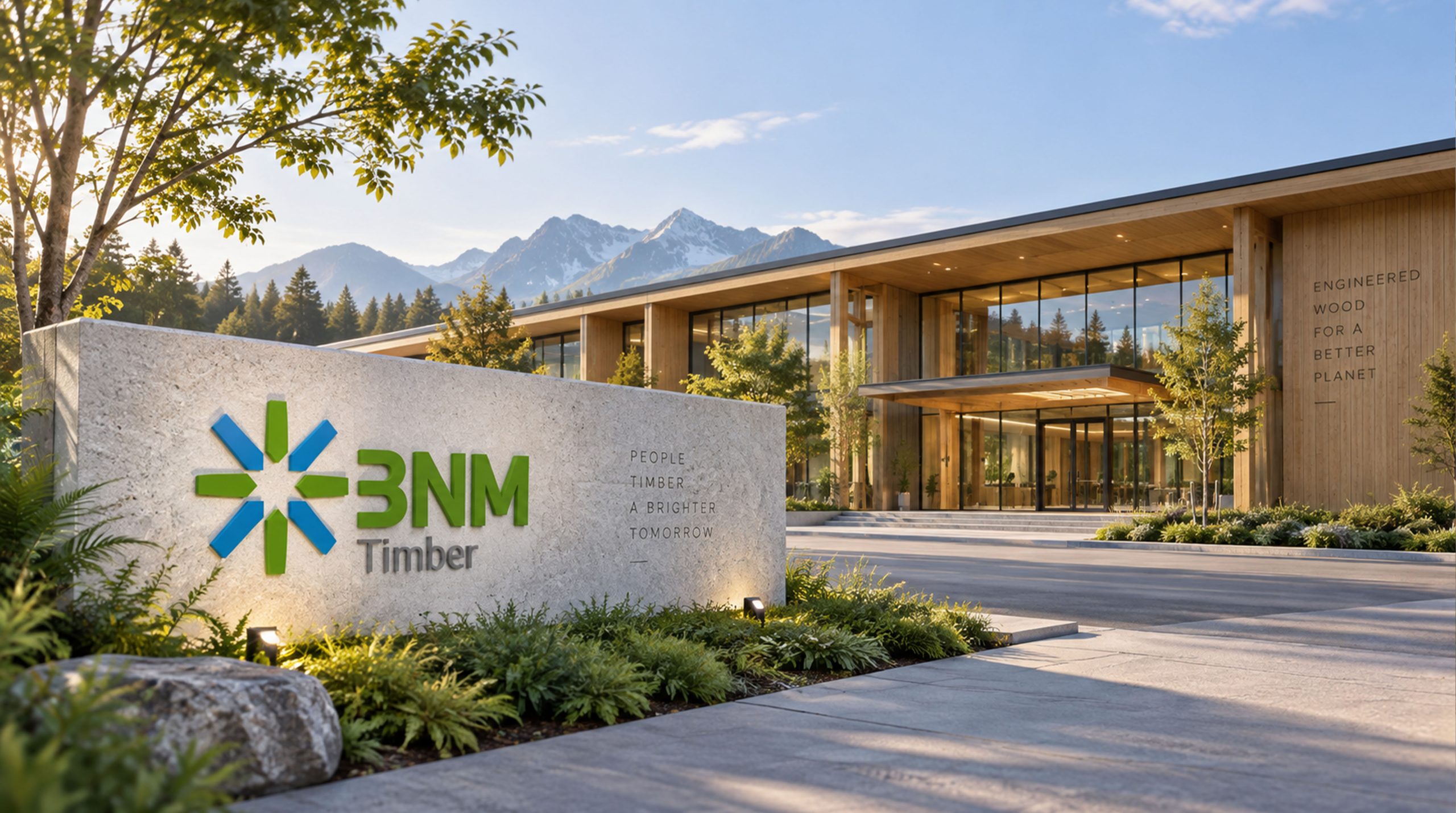
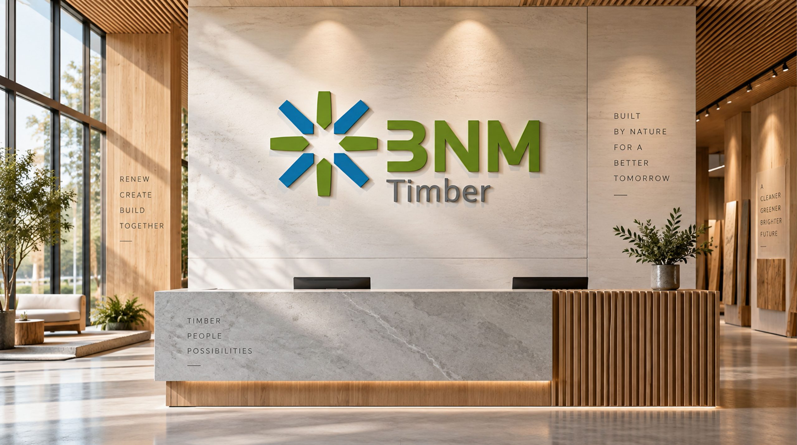
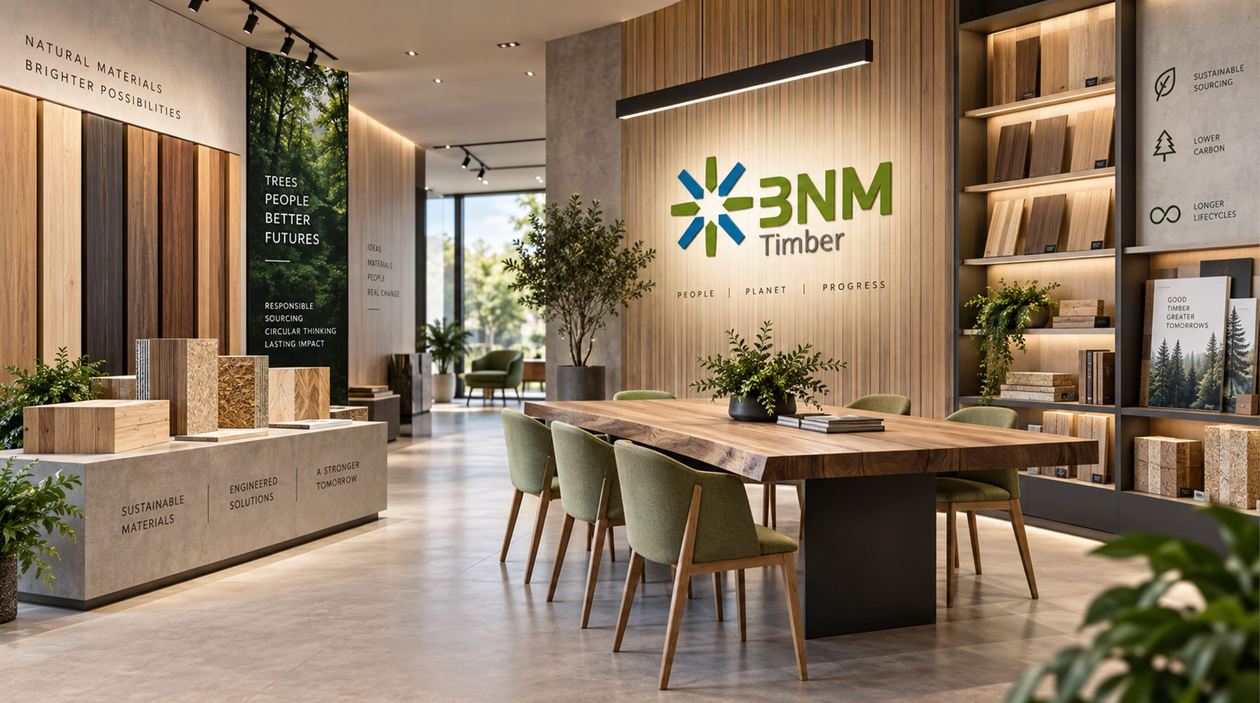
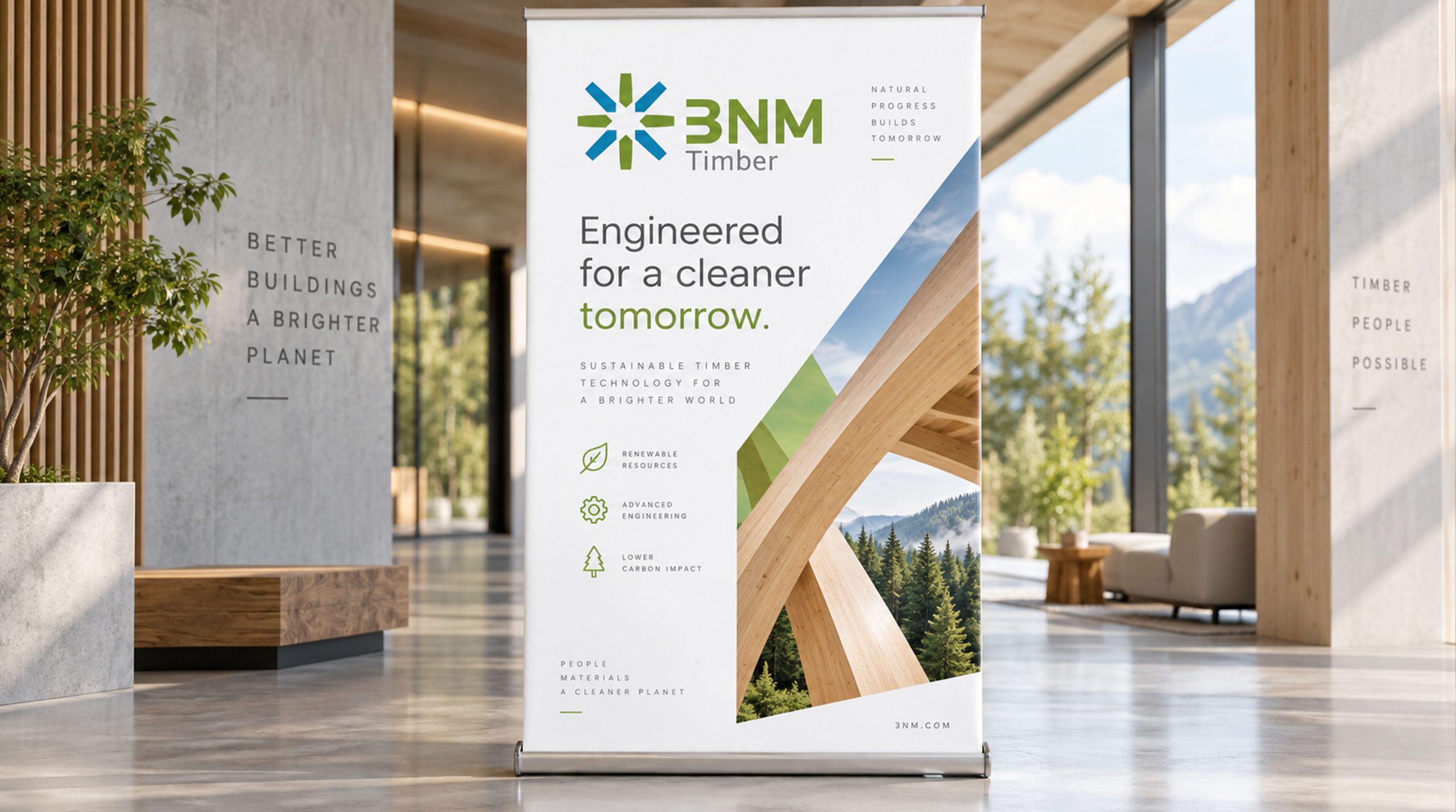
The logo has strong cross-field adaptability: corporate level: applied to brand launches, industry exhibitions, annual reports and strategic cooperation; product level: suitable for trading platform interfaces, business documents and partner materials; spatial level: in corporate headquarters, wayfinding systems and brand experience centers to form a unified visual language dynamic version, the radial graphics can be used as a "rotating convergence" or node connection animation, symbolizing the continued flow of global trade.
The BNMTimber logo embodies the dual values of "green sustainability x technology trading": radial structure → global trading network; blue and green interweaving → integration of technology and ecology; open layout → symbiosis of internationalization and sustainability. This is not only a brand identification symbol, but also a visual expression of a trade philosophy that uses the power of technology to connect the future of green timber.
design results
With the launch of the new visual system, BNM Timber has become an iconic platform brand image in the international timber trade. Blue-green radial graphics are widely used in industry exhibitions, brand communications, and international market promotions. With the visual expression of "ecological structure × scientific and technological language", it has established a new aesthetic standard in the field of timber trading. This case represents the mature expression of the brand in the direction of international trade, green wood and system visual language design, achieving the unification from "brand design" to "trade philosophy".