










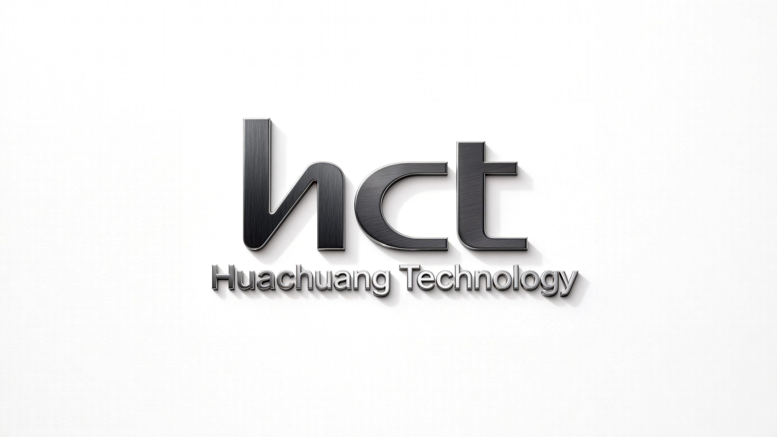
Huachuang Technology is a technology company focused on high-performance chip design and intelligent manufacturing. Its visual identity expresses "Technical Confidence and Precision," establishing a clear, consistent brand presence in the rapidly evolving semiconductor industry.
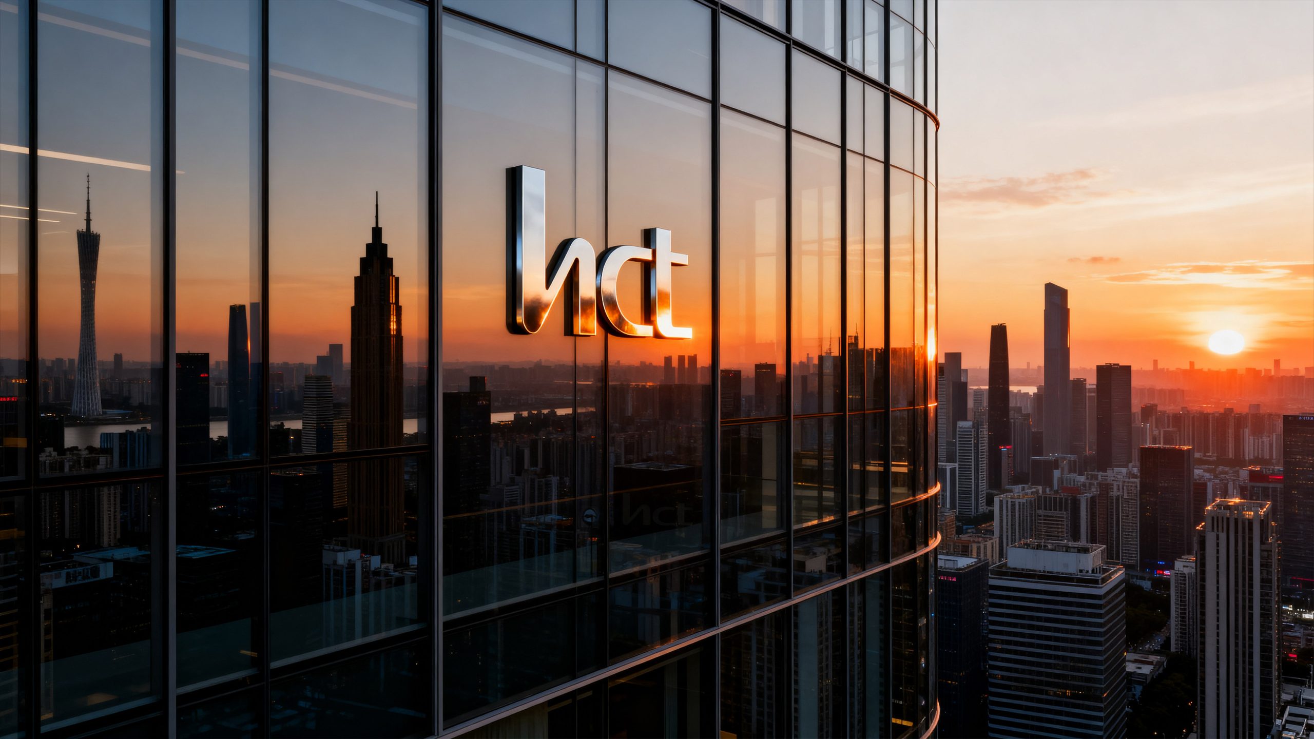
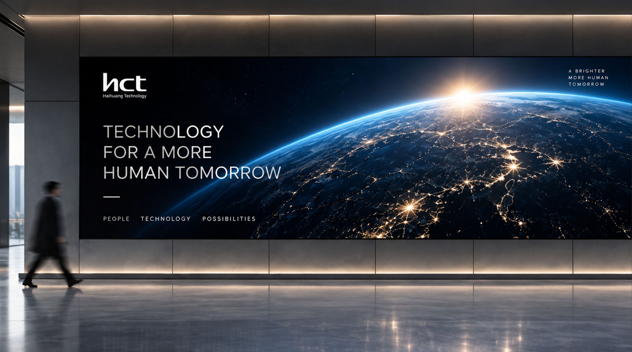
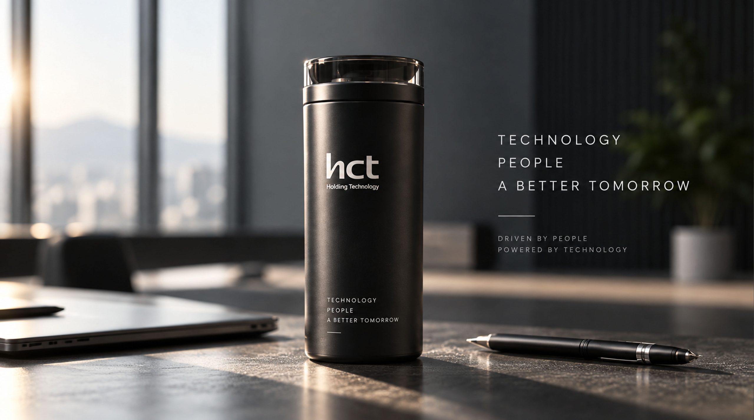
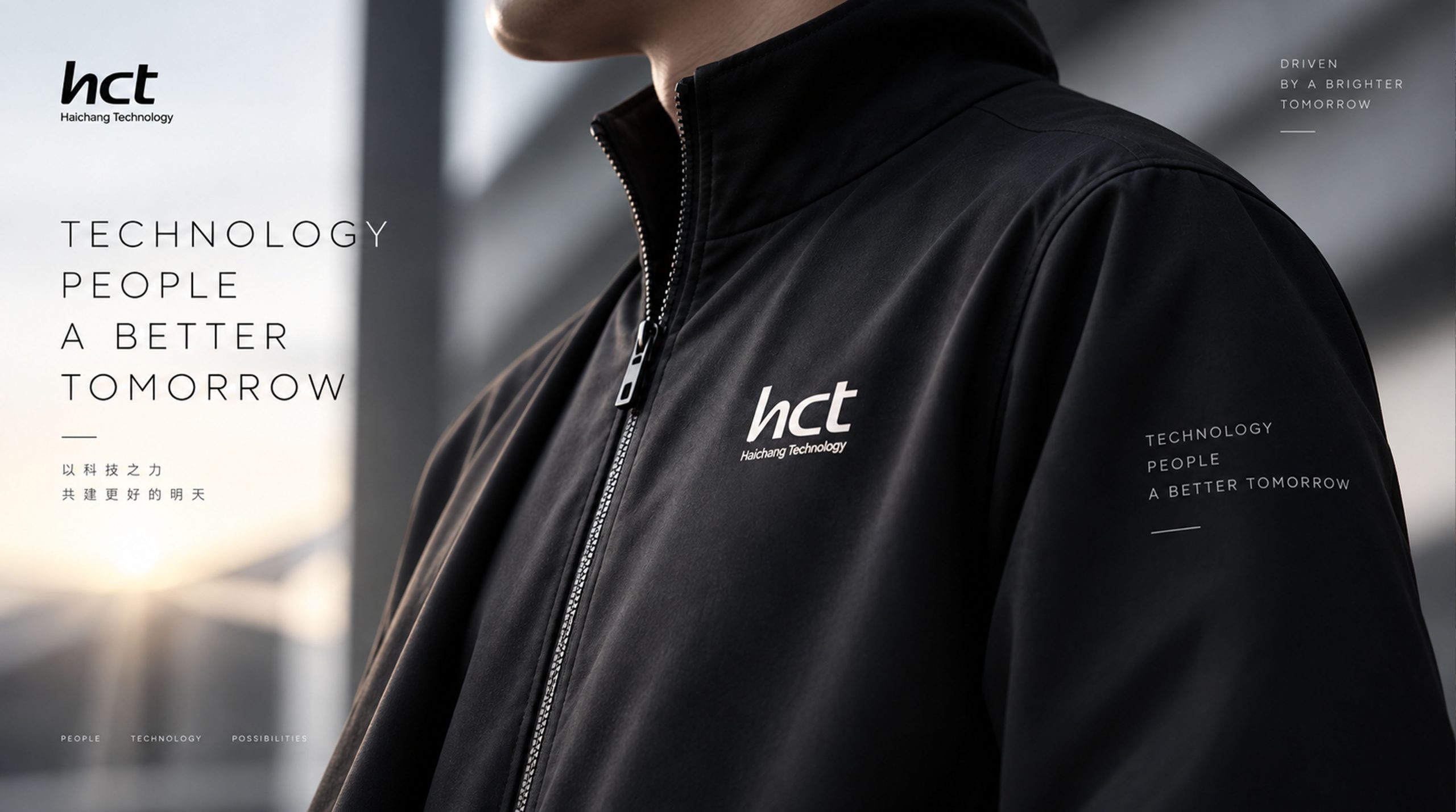
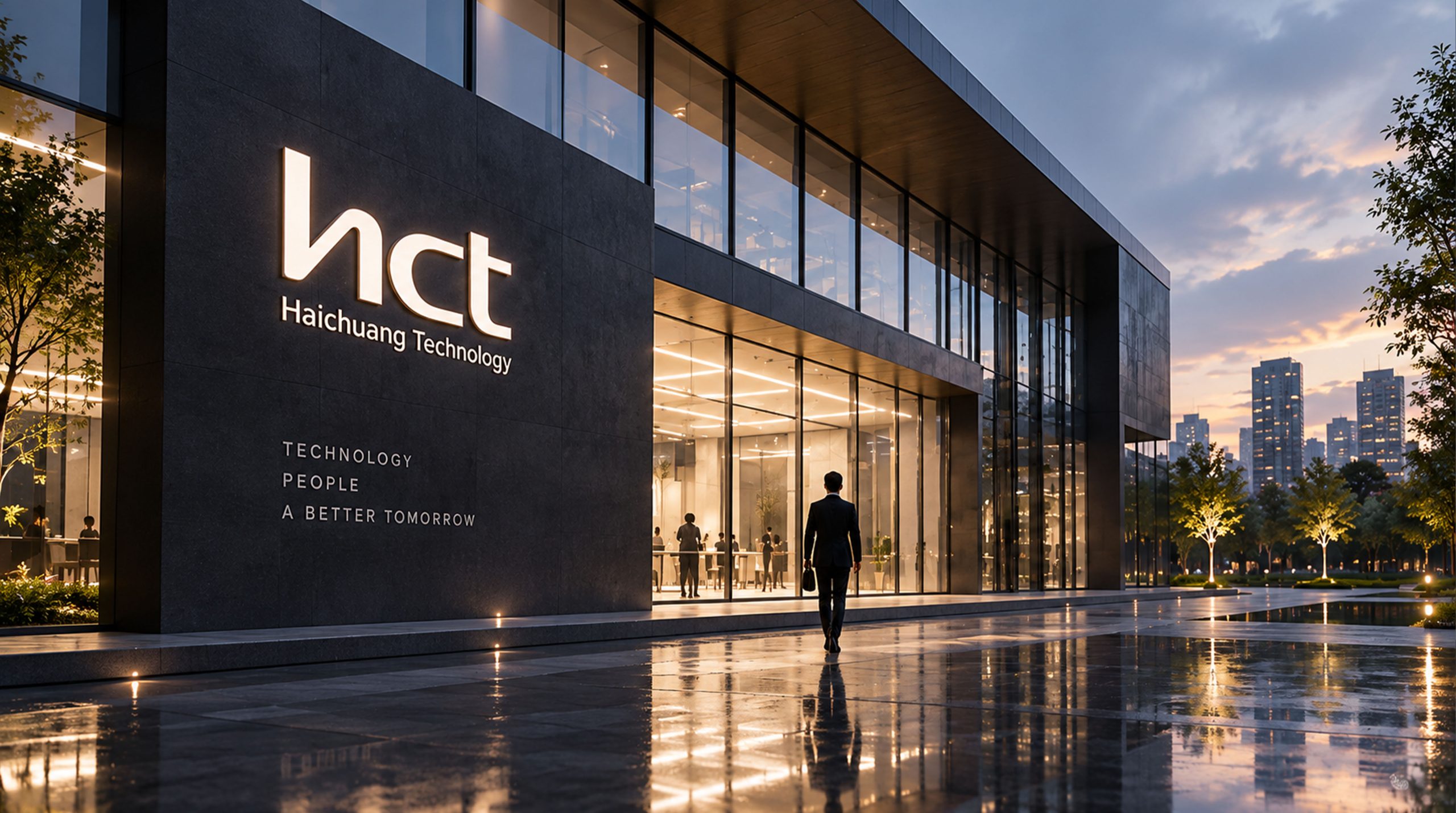
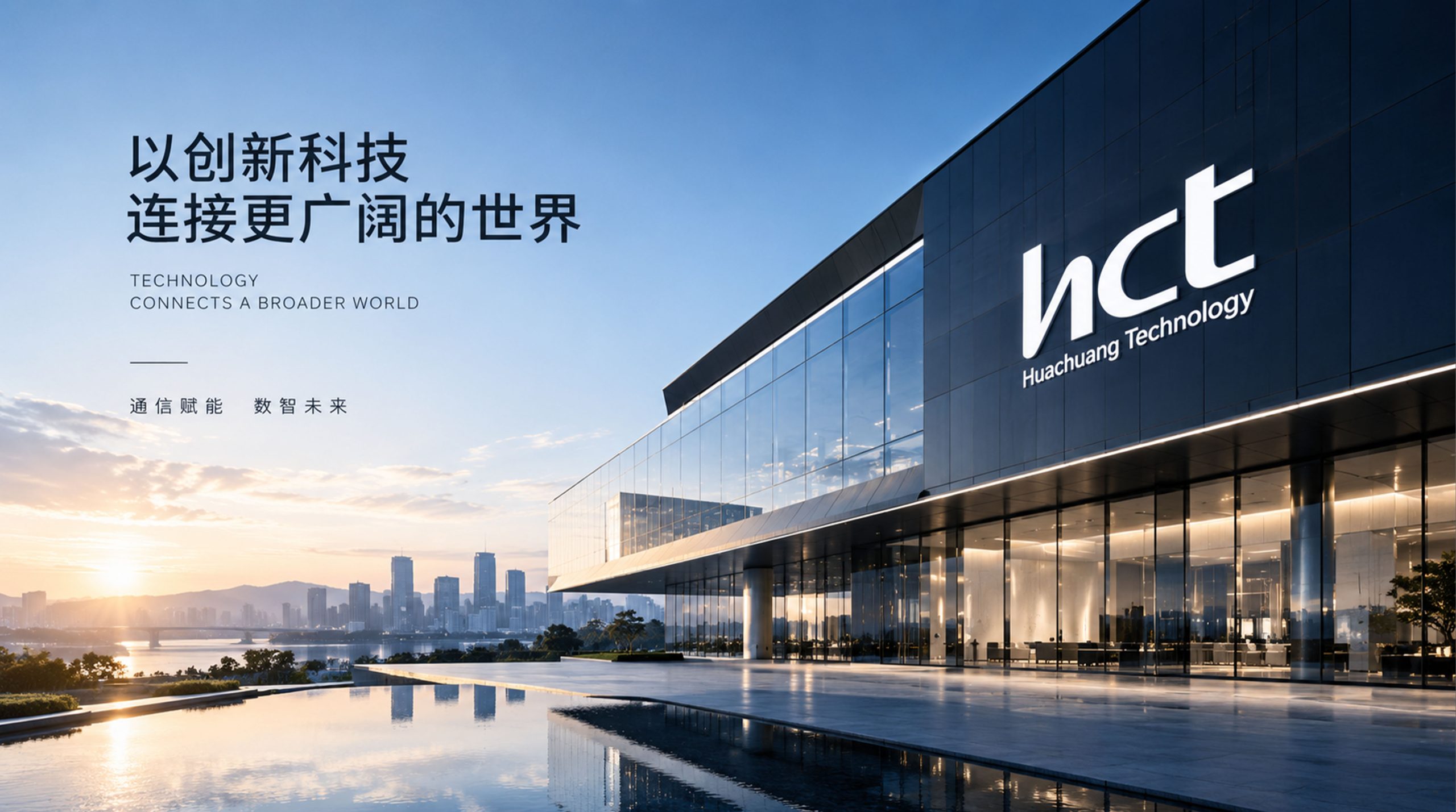
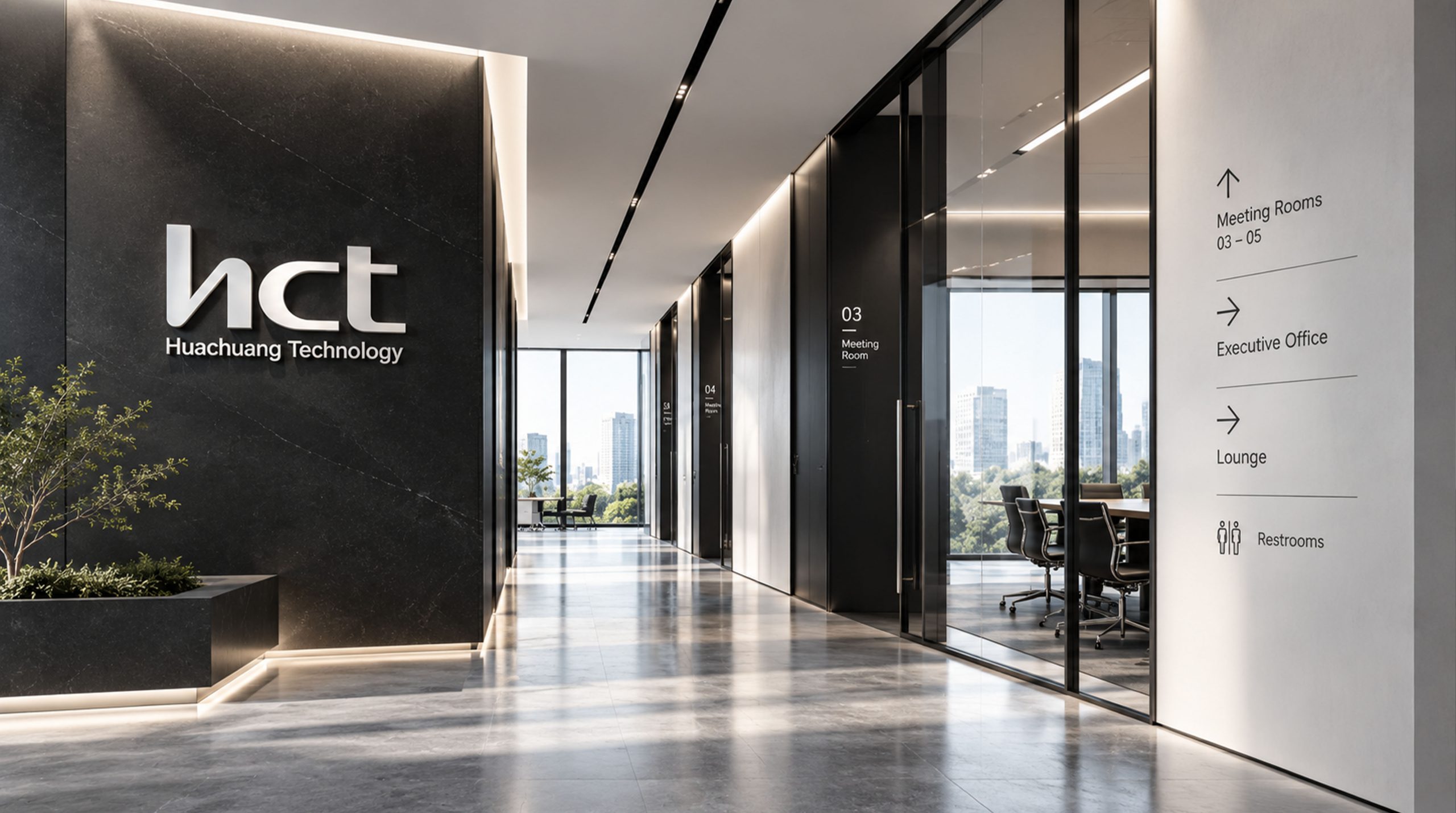
design concept
The mark is built on the company’s English abbreviation, hct, using a continuous-line geometric form that gives the three letters a unified rhythm. Inspired by the traces of chip circuitry, it symbolizes information flow and data connection. The form is simple yet full of tension, reflecting the brand’s belief in “connection driven by technology, a future built by innovation.”
graphic language
Geometric structure: The mark is built on a strict proportional grid, with consistent stroke widths and corner radii, expressing the rational order characteristic of technology. Connected strokes: Letters join subtly, evoking the signal paths and system integration inside a chip. Negative space: Deliberate use of white space strengthens recognition and keeps the mark clear across every size and medium.
Fonts and composition
The custom sans-serif typeface is built on a technical curve grammar, with rounded strokes that soften its mechanical feel and give it a modern warmth. The subtitle "Huachuang Technology" is set in a light weight with wide tracking, balancing the visual weight of the main mark and conveying stability and professionalism.
color system
Primary color: Charcoal #1C1C1C, expressing the depth and rigor of technology. Secondary color: Silver Gray #9EA1A3, extendable to equipment nameplates, packaging, and display backdrops. Monochrome system: ensures strong contrast and production compatibility on surfaces common in semiconductors, such as metal, PCBs, and circuit boards.
Application and extension
The mark is highly system-compatible and works directly on chip packaging, PCB silkscreen, enclosure etching, and digital interfaces. Its line logic and proportion system set a unified standard for future product icons, sub-brands, and motion systems.
brand meaning
The mark carries three meanings: precision, intelligence, and connection. • Precision: rigorous geometry and ordered lines reflect the accuracy of chip manufacturing. • Intelligence: flowing curves express information exchange and computational logic. • Connection: a continuous stroke symbolizes the fusion of technology and industry. It is more than a brand identifier. It is a visual expression of the company's engineering philosophy.
Improper Usage (Protection Specification)
Do not stretch or alter letter spacing. Do not place on complex image backgrounds. Do not replace the primary color with saturated hues such as blue or red. Maintain a minimum display width of ≥ 20 mm.
design results
With this system, Huachuang Technology made the visual leap from a traditional industrial image to a smart manufacturing brand. The logo earned consistent recognition at international trade shows and across its partner ecosystem, becoming a model in China's chip industry for pairing "rational order + technical aesthetics."