










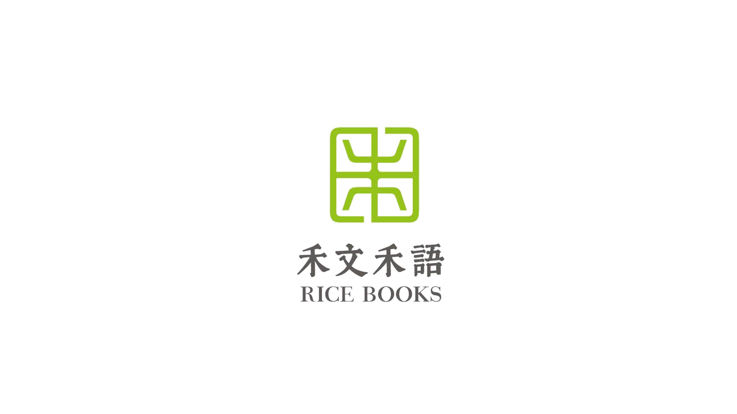
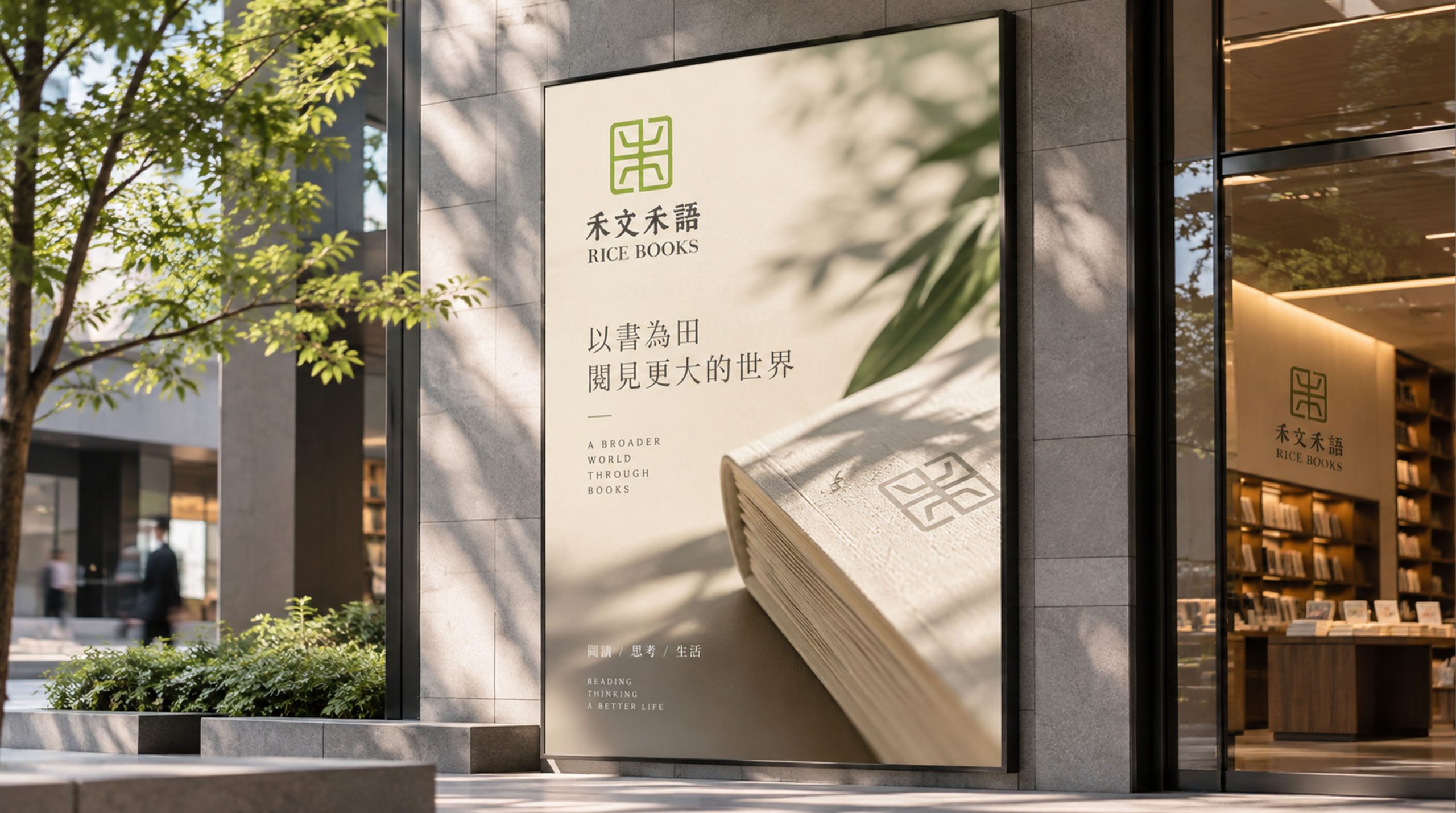
Hewen Heyu is an independent book brand centered on original publishing and cultural curation, devoted to contemporary Eastern lifestyle aesthetics and humanistic reading. The brand sought a visual identity rich in Eastern imagery to express its belief: “Words as grain, culture as nourishment.”
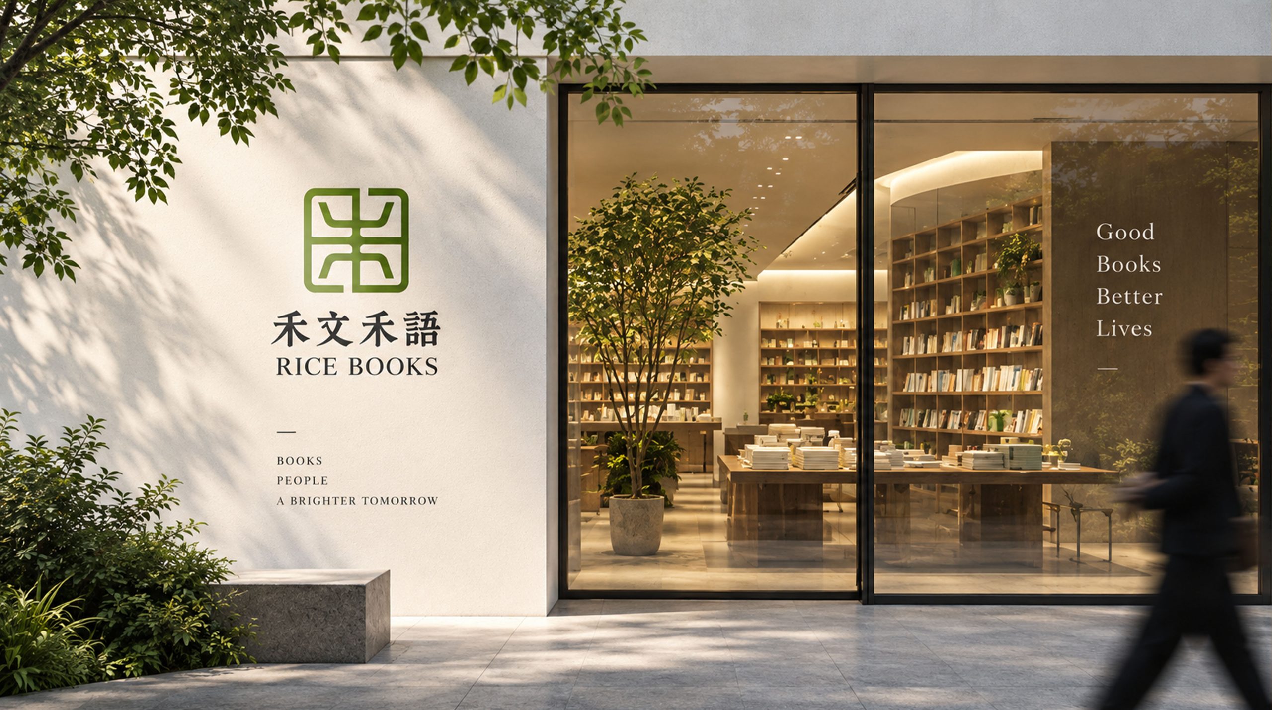
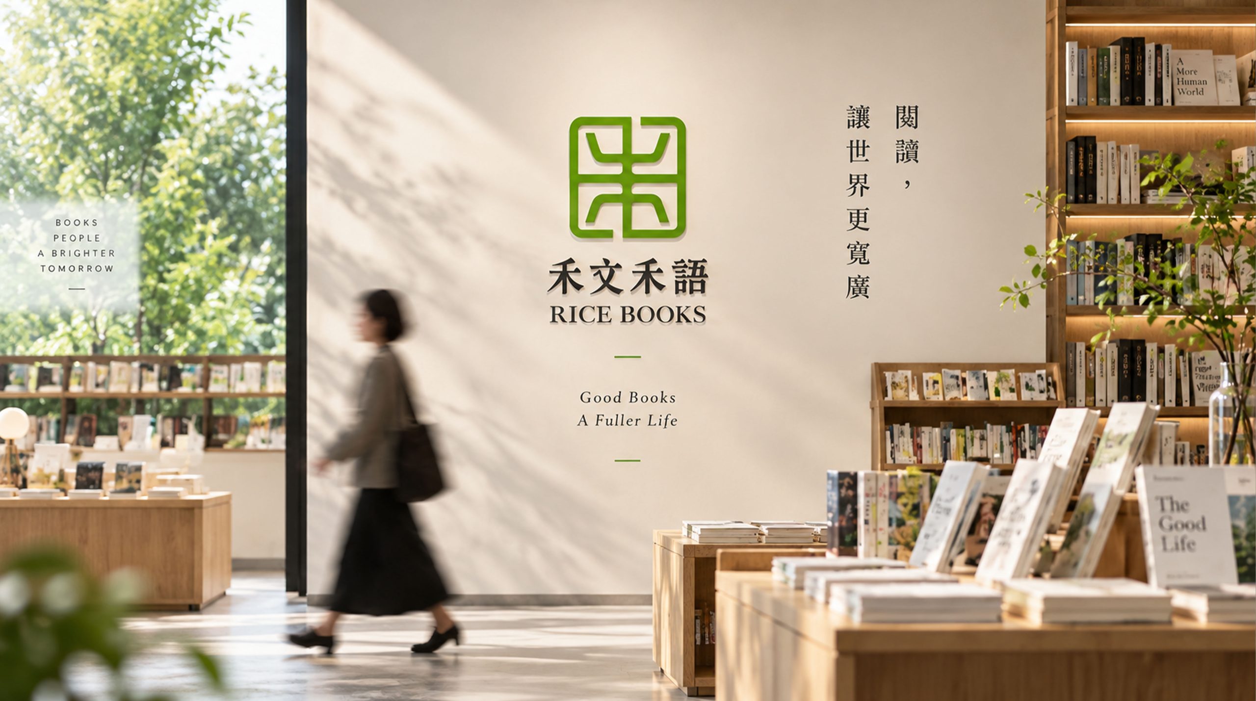
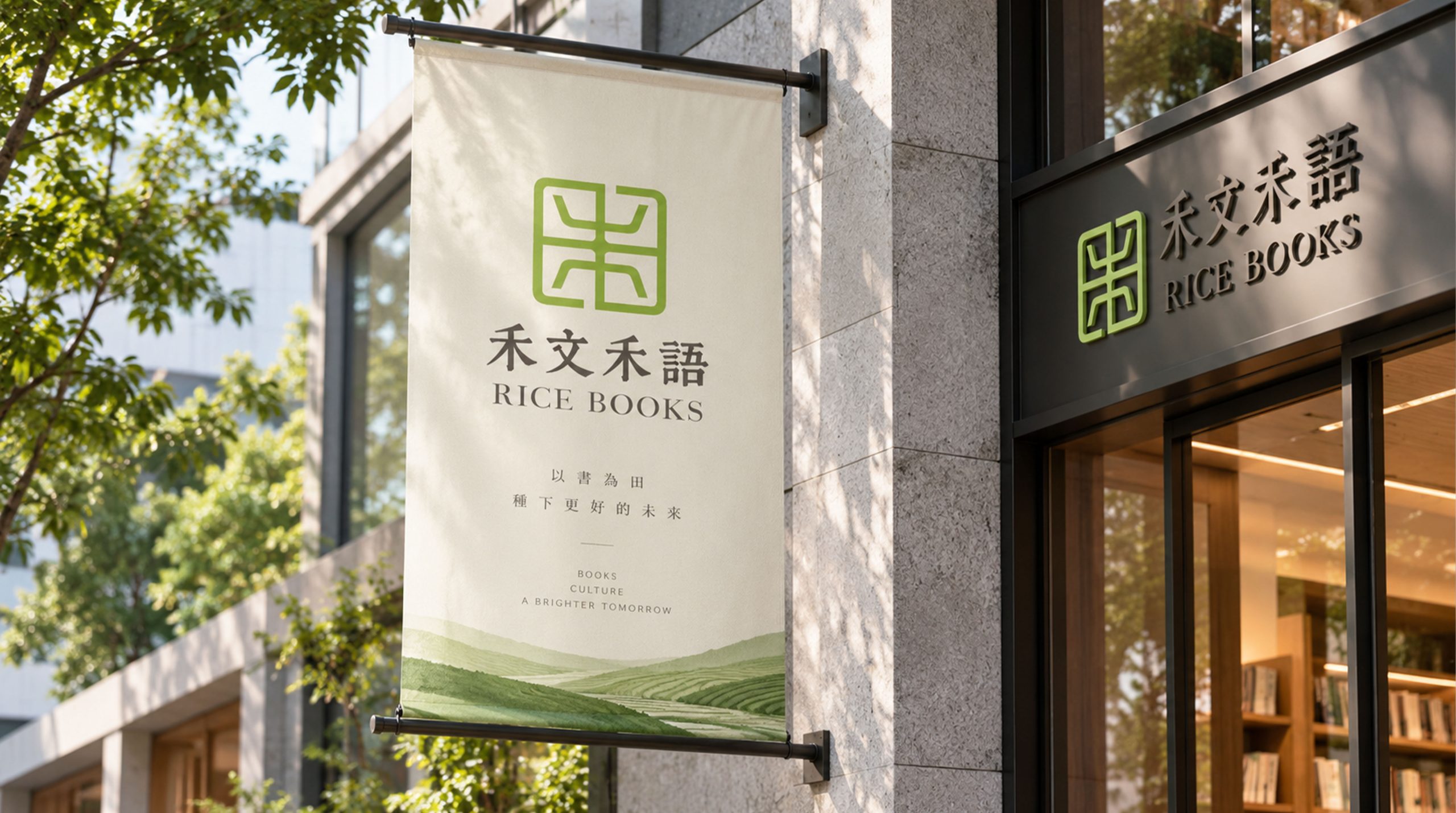

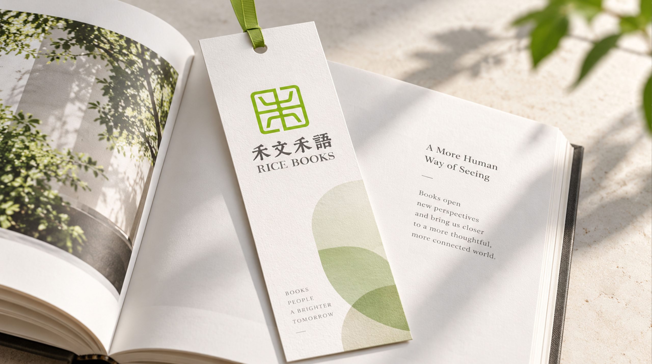
design concept
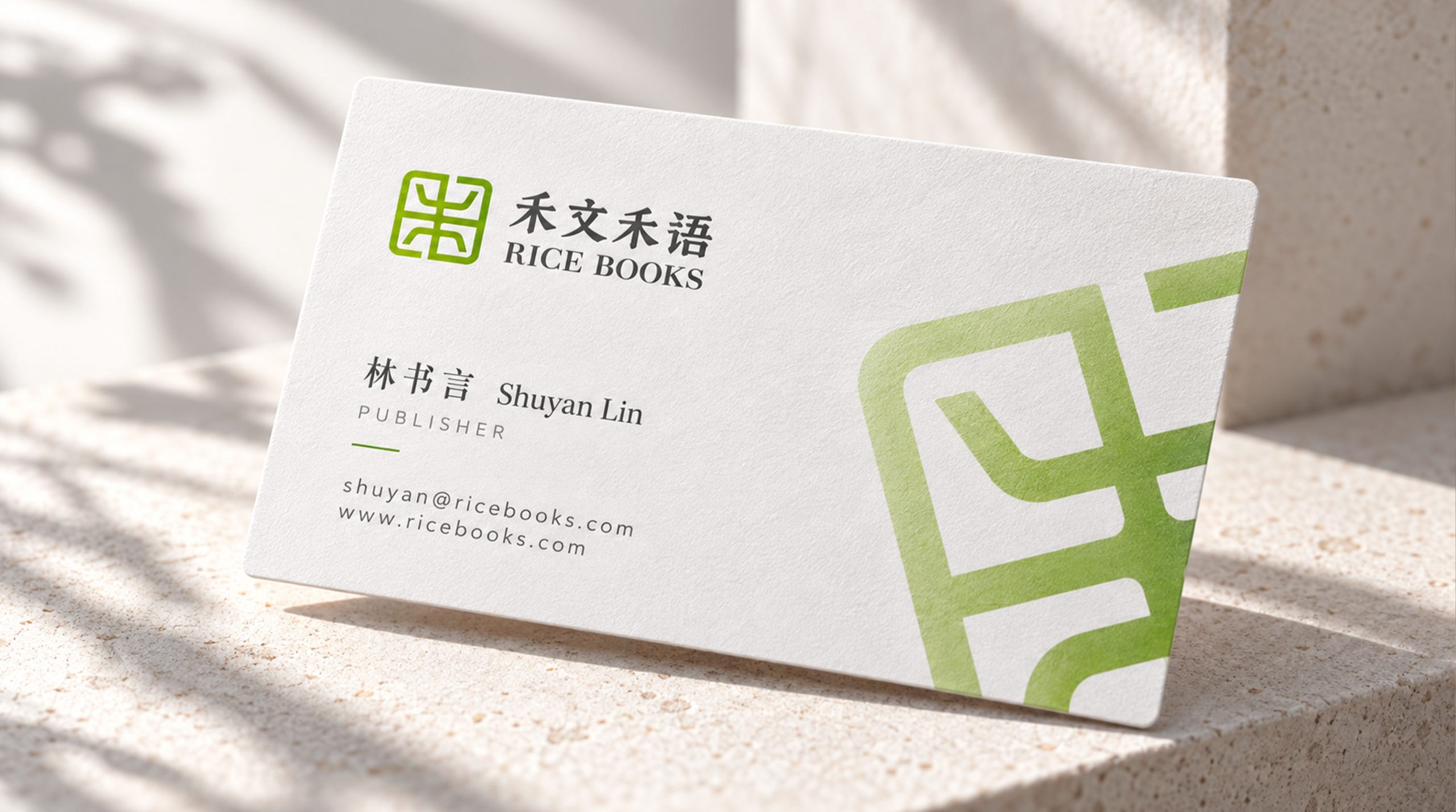
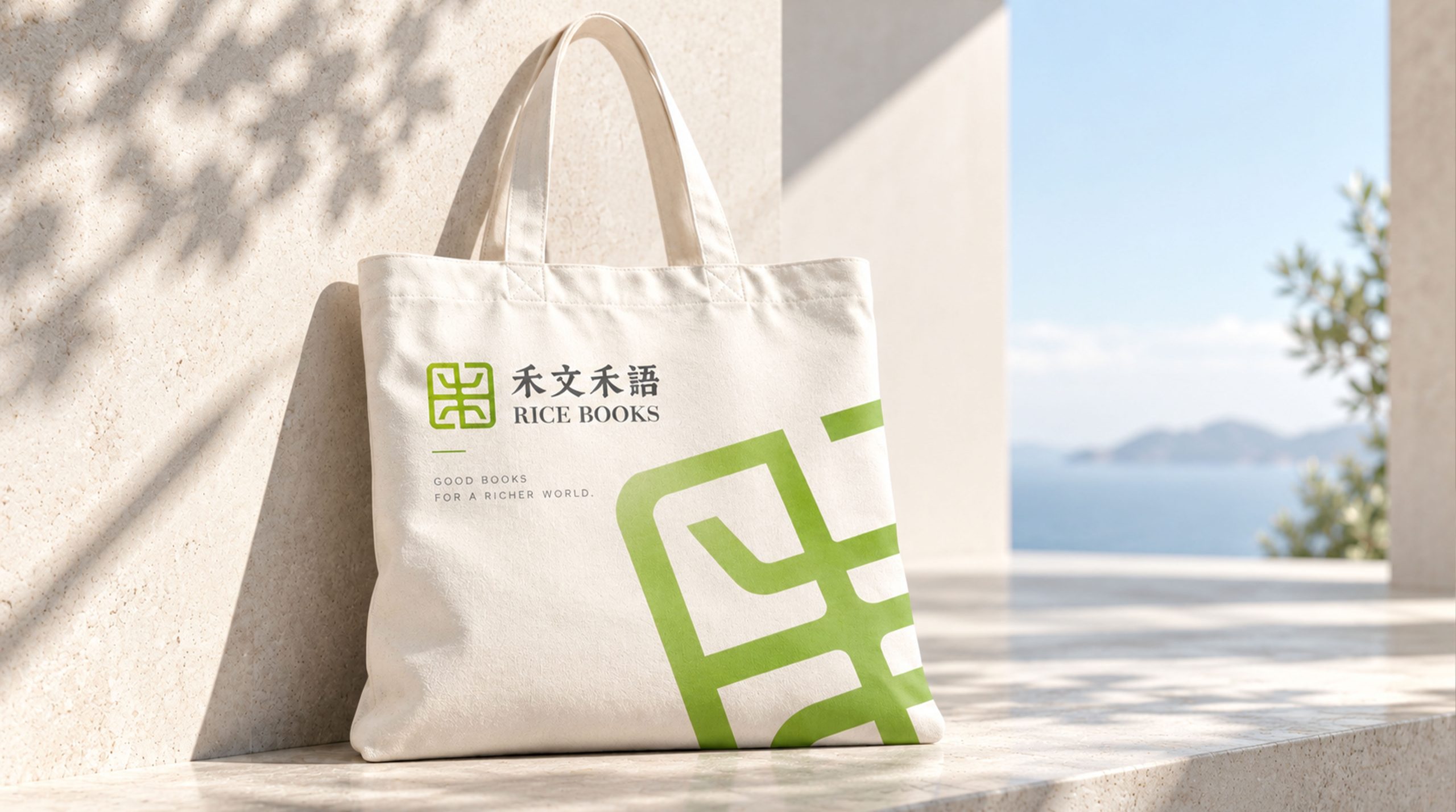
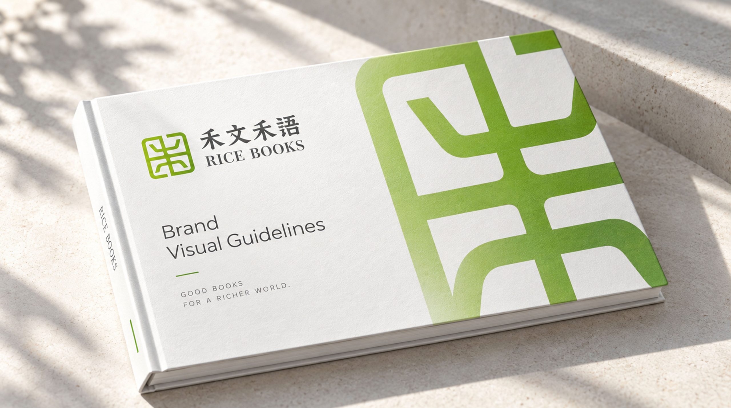
The mark begins with the character He (grain), merging its structure with the form of a bound book. Its geometric, symmetrical core extends in four directions, signifying reading that travels far and wide, while recalling ears of rice: a harvest of knowledge and culture. Simple and Eastern in rhythm, it keeps warmth within a rational structure, expressing the brand’s belief that words nourish life.
graphic language
Geometry: the square frame represents the book and the order of heaven and earth; the inner lines take the form of He, standing for nature and growth. Symmetry: reflects the balance and harmony of Eastern aesthetics. Open space: the empty center signifies openness of thought and room for culture to breathe.
Fonts and composition
The brand name pairs a classical Fangsong typeface with Baskerville. The Chinese name has soft, restrained strokes that carry the warmth of traditional books; the English RICE BOOKS, set in serif, creates a dialog between Chinese and Western cultures. Type proportions echo the square mark, giving the brand a cohesive cultural system.
color system
Primary #9AC65A (fresh green): nature, life and rice paddies. Secondary #444444 (dark gray): text, ink and contemplation. Together they form a contrast of “ink and field,” expressing a balance between culture and nature.
Application and extension
The mark applies across book covers, cultural exhibitions, merchandize and online reading platforms. The square emblem can be used on its own on book spines, seals, badges and digital icons. Combined with different papers and print techniques (such as foil stamping, embossing and letterpress), it forms a highly recognisable cultural brand system.
brand meaning
Through the metaphor of “rice and words,” Rice Books expresses the nourishment of culture and the growth of knowledge. The mark combines the character of a traditional academy with contemporary visual order, giving the brand a clear and distinctive identity at the intersection of Eastern culture and modern publishing.
Improper Usage (Protection Specification)
Do not stretch, rotate or alter the proportions of the mark. Do not change the primary green or add gradients. Do not place over busy image backgrounds. Minimum display width: 25mm.
design results
Following the launch of its visual system, Rice Books gained wide recognition at publishing fairs and across bookstore channels. With its clean, highly recognisable Eastern design language, the brand has become a reference case for visual upgrades among independent publishers.