










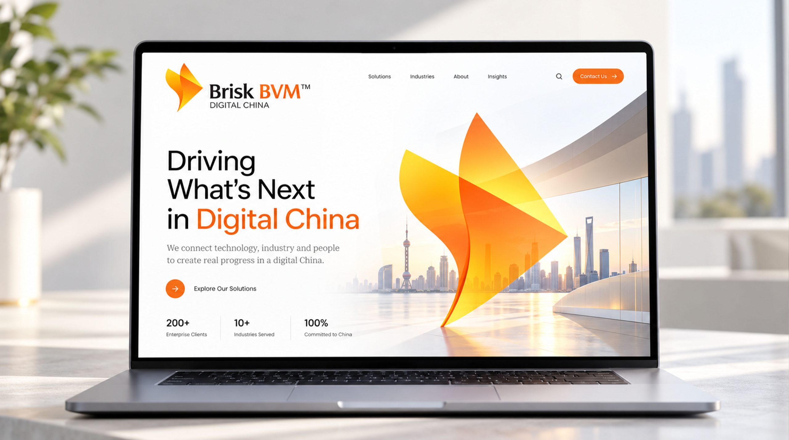
Brisk BVM™ is a high-tech company specializing in digital infrastructure and intelligent systems. Aligned with China’s “Digital China” strategy, the brand sought a new visual identity to express its agile, innovative and international spirit.


design concept
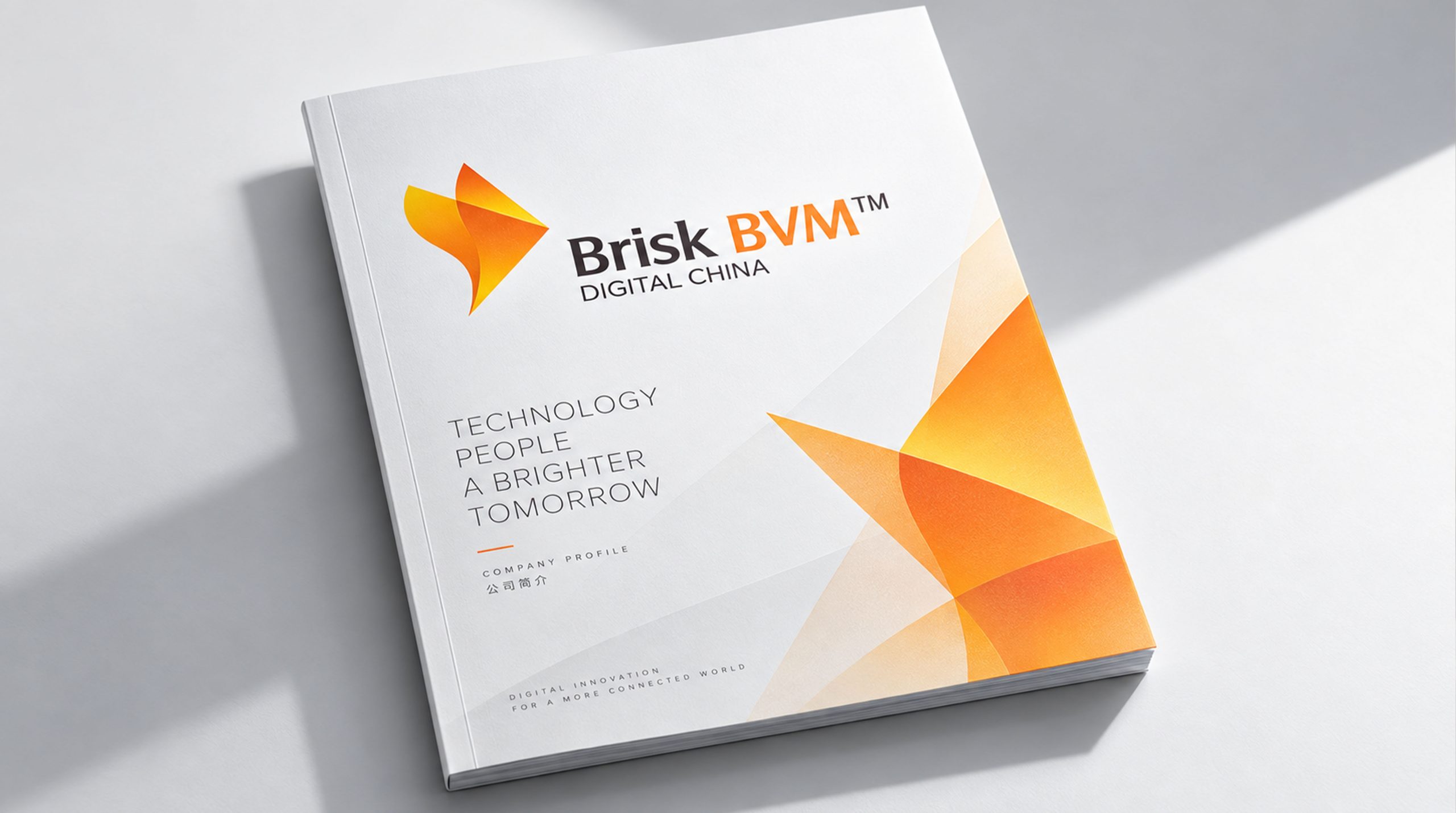
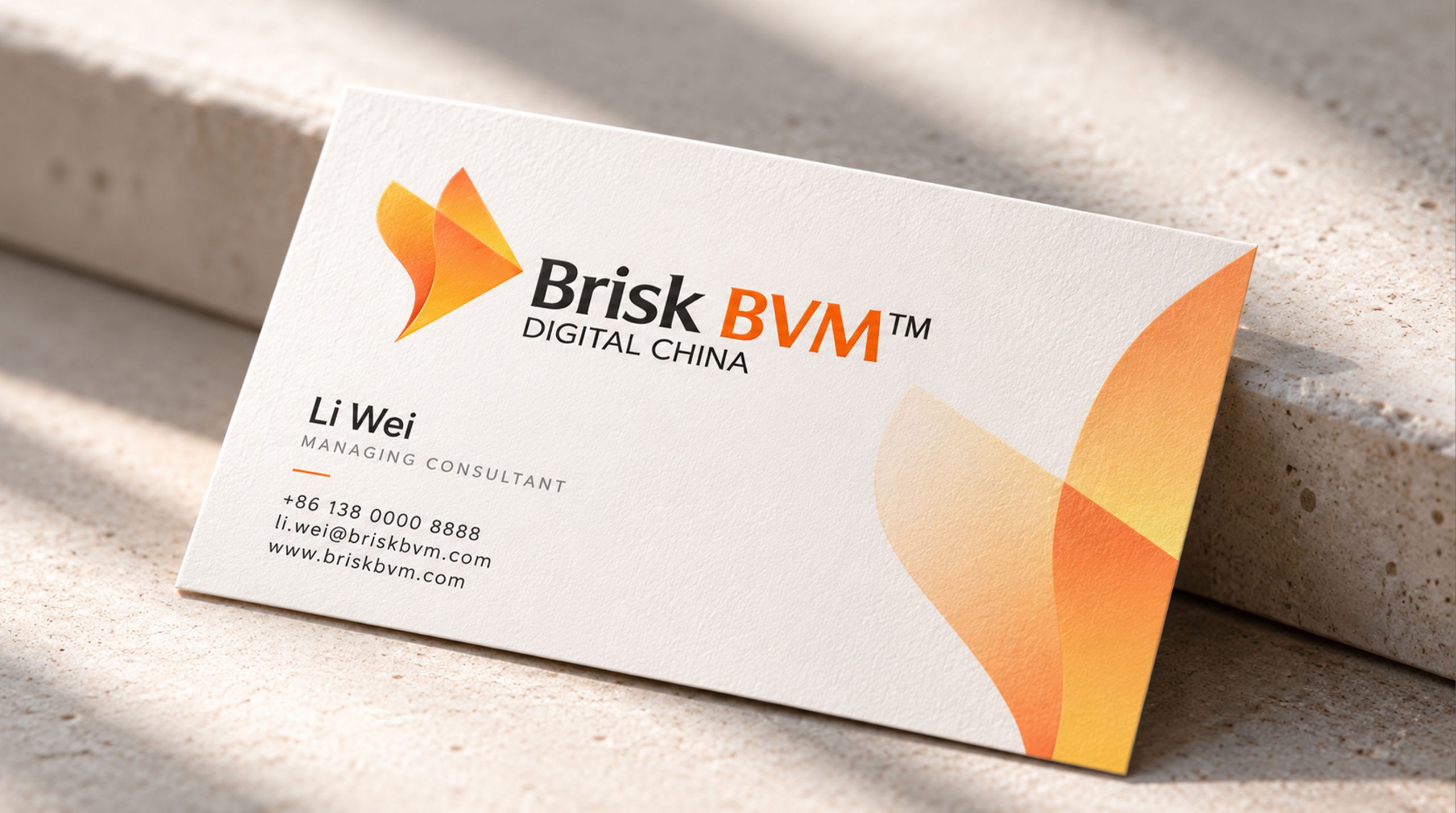
The mark is built on the theme of “speed and intelligent transformation,” its form derived from a fusion of folded paper and a digital arrow, suggesting the convergence of information and the release of energy. “Brisk” stands for speed and efficiency; “BVM” represents the company’s core technology systems. The mark captures the brand’s forward-looking stance in digital technology, data management and intelligent services: moving China’s digital progress forward with agility.
graphic language
Folded arrow-wing: two gradient planes form a flowing “V,” at once a turning page and a surge of energy. Dynamic angle: the folds extend toward the upper right, signaling accelerating innovation and a future-facing direction. Light and depth: an orange-gold gradient creates an “energy pulse,” representing the speed and depth of information transfer.
Fonts and composition
The brand name uses two weights. “Brisk” is set in a soft sans-serif for approachability and agility; “BVM” is set in bold orange to highlight the brand’s technological core. The tagline “DIGITAL CHINA,” in a light gray weight, balances the composition and reinforces an international, technological character. The typography moves from left to right and light to heavy, echoing the direction of the folded graphic.
color system
Primary orange-yellow gradient (#F5B041 → #E67E22): vitality, speed and digital energy. Secondary dark gray (#3B3B3B): technological rigour and system stability. White background: high contrast and clarity on digital displays. The palette expresses “technology with warmth,” combining strength with approachability.
Application and extension
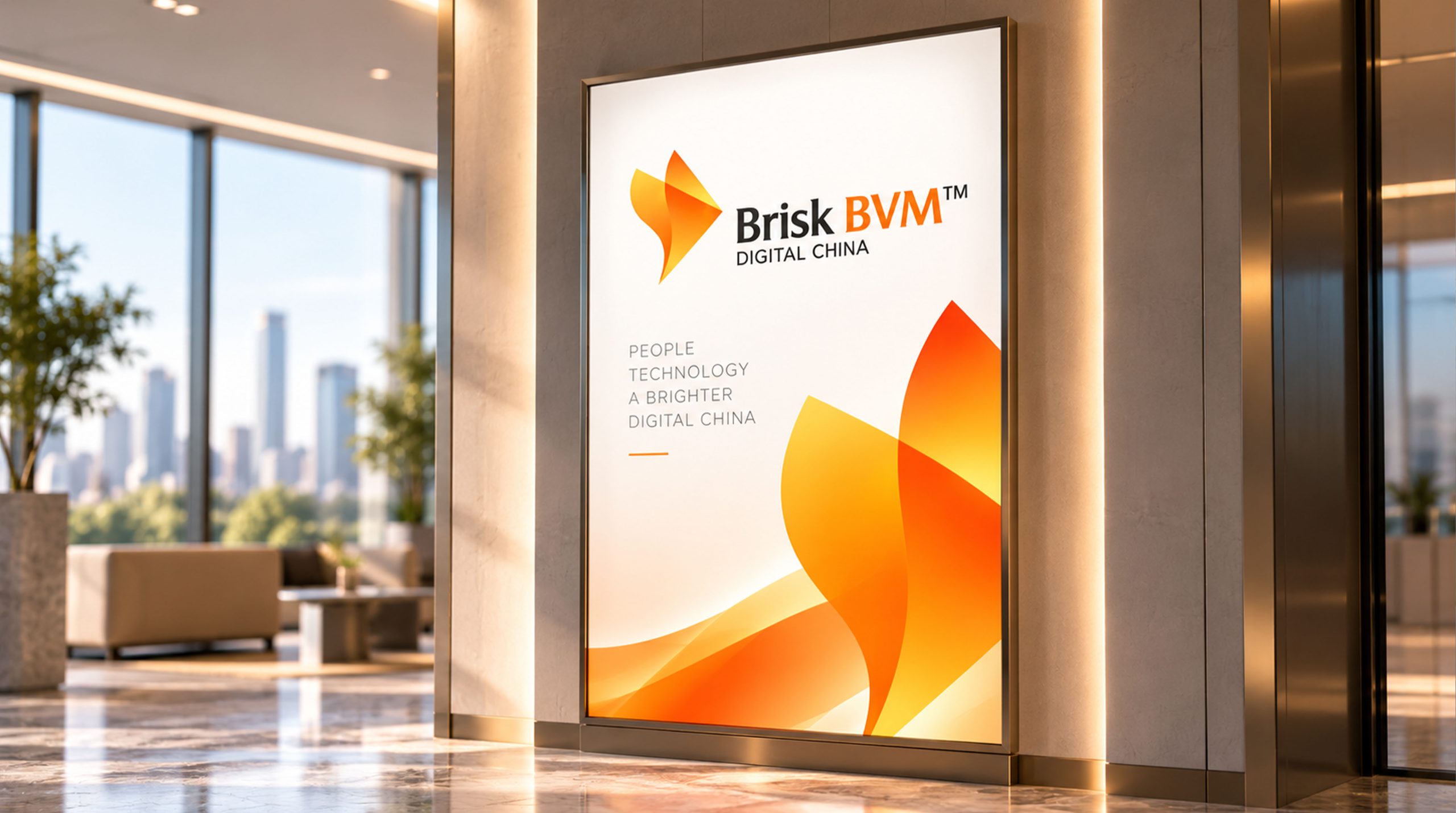
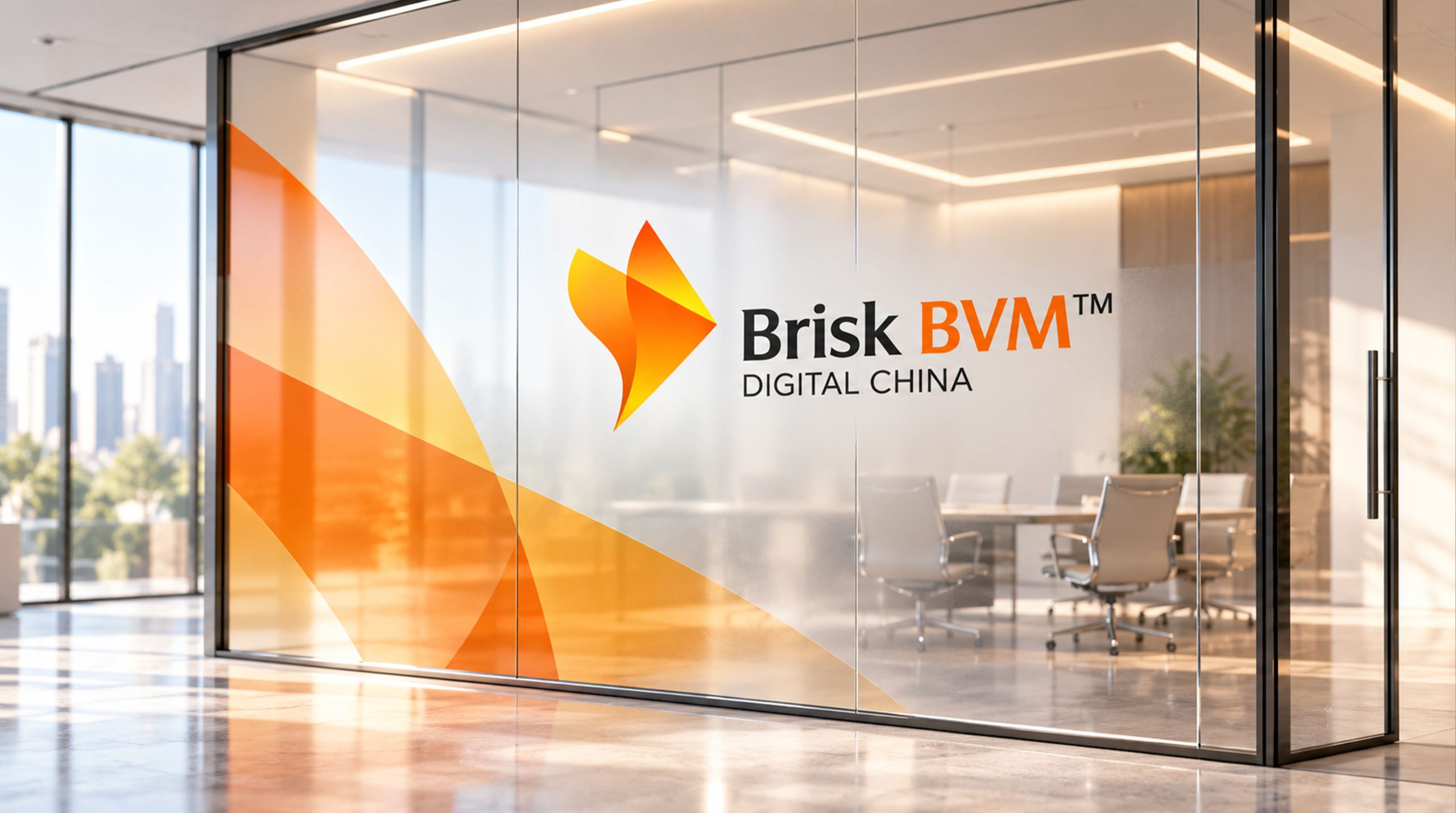
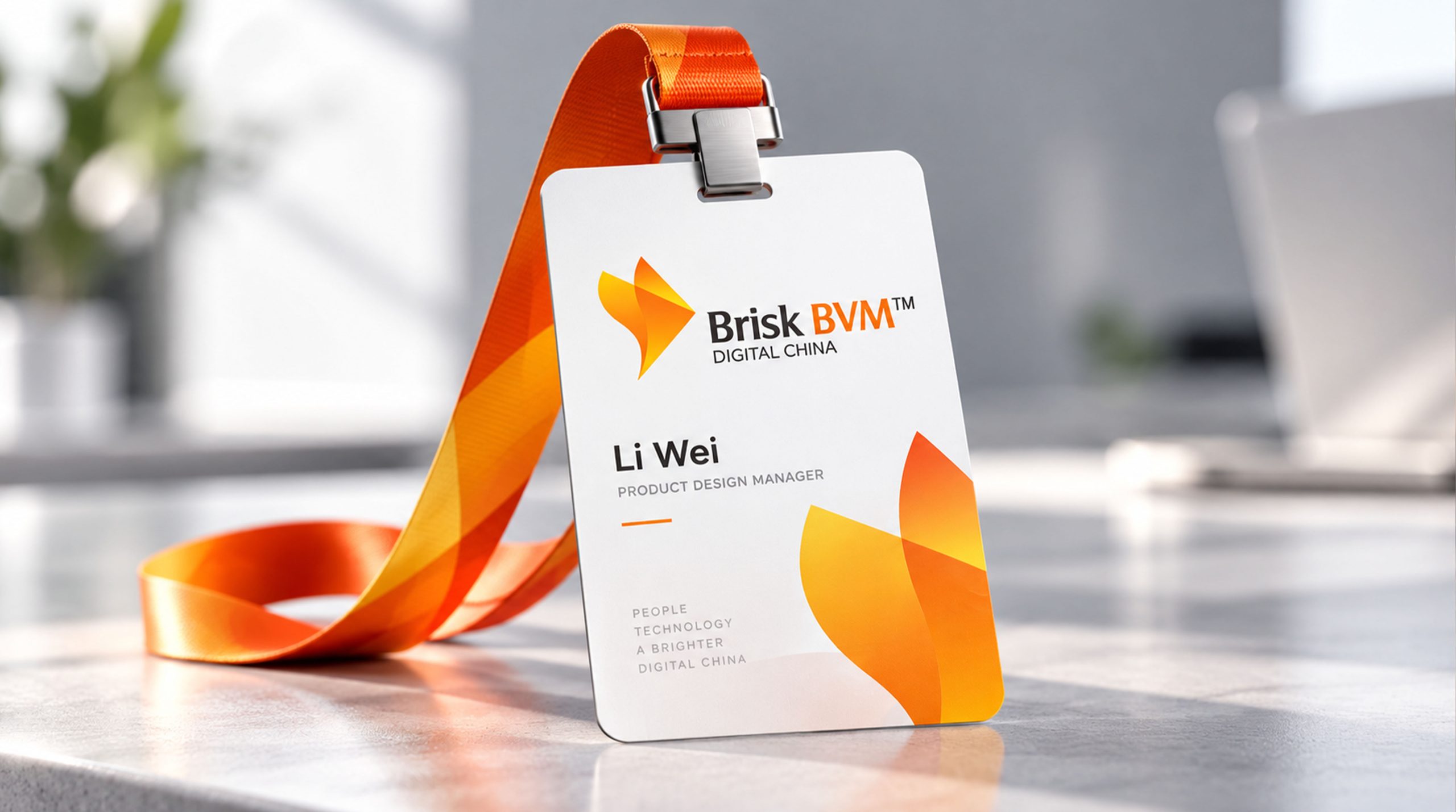
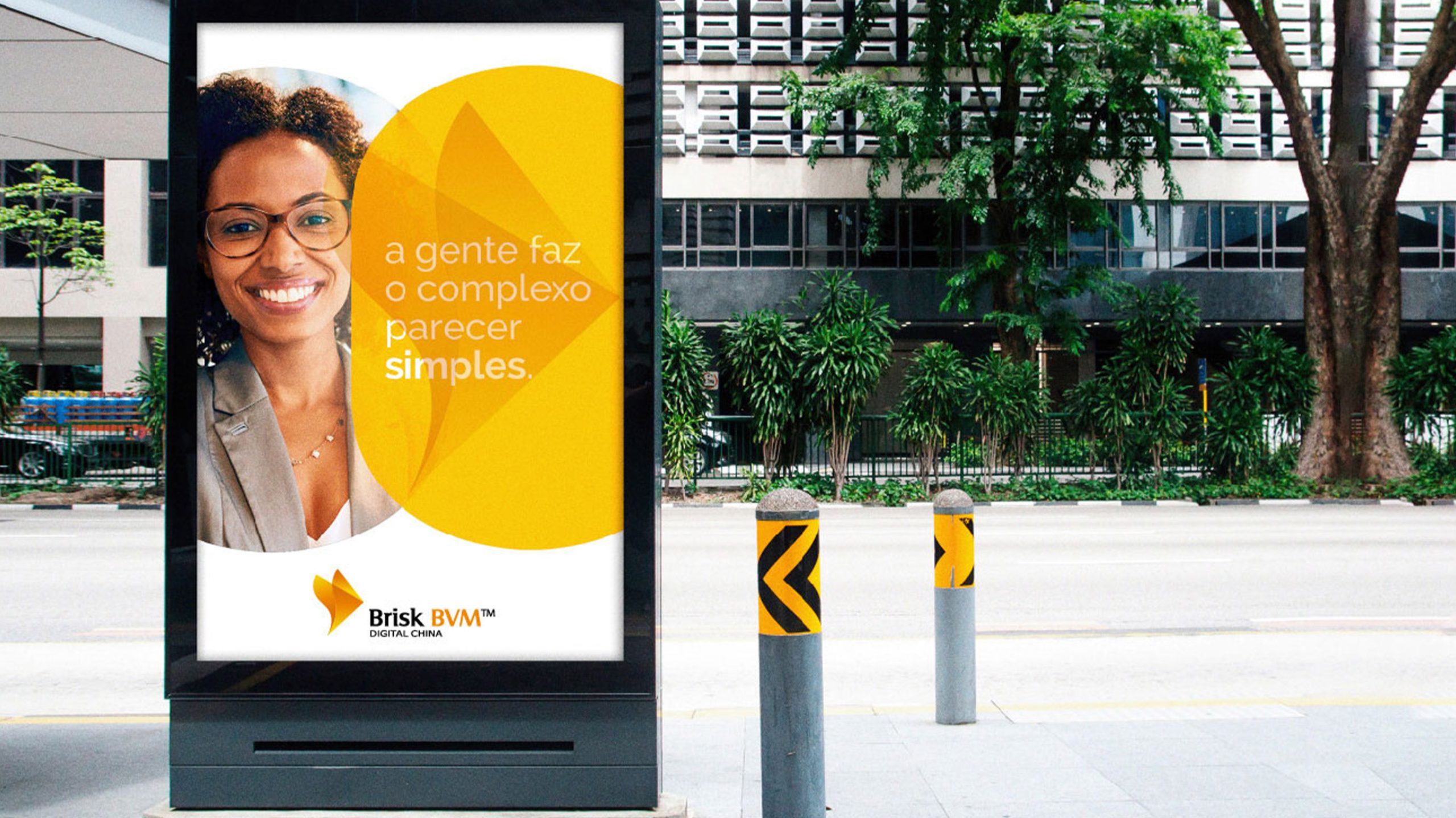
The mark performs strongly across digital interfaces, system terminals, data center wayfinding and international exhibitions. The folded arrow-wing can serve as a supporting brand element in background textures, motion openers and loading animations, forming a complete visual system for a digital-intelligence brand.
brand meaning
Brisk BVM™ is built on the proposition of “speed driving innovation.” The flowing structure of the mark represents the convergence of data, information and value. It reflects not only the company’s technical strength, but also its sense of mission and its drive to advance “Digital China.”
Improper Usage (Protection Specification)
Do not alter the angle or direction of the fold. Do not change the orange-yellow gradient or replace it with a single color. Do not add drop shadows or outlines. Minimum display width: 30mm.
design results
Following the launch of the new visual system, Brisk BVM™ achieved a unified brand upgrade across the digital technology and government-enterprise markets. The “folded arrow-wing” has become the company’s core public symbol, embodying the speed, connectivity and innovation of the digital age.