










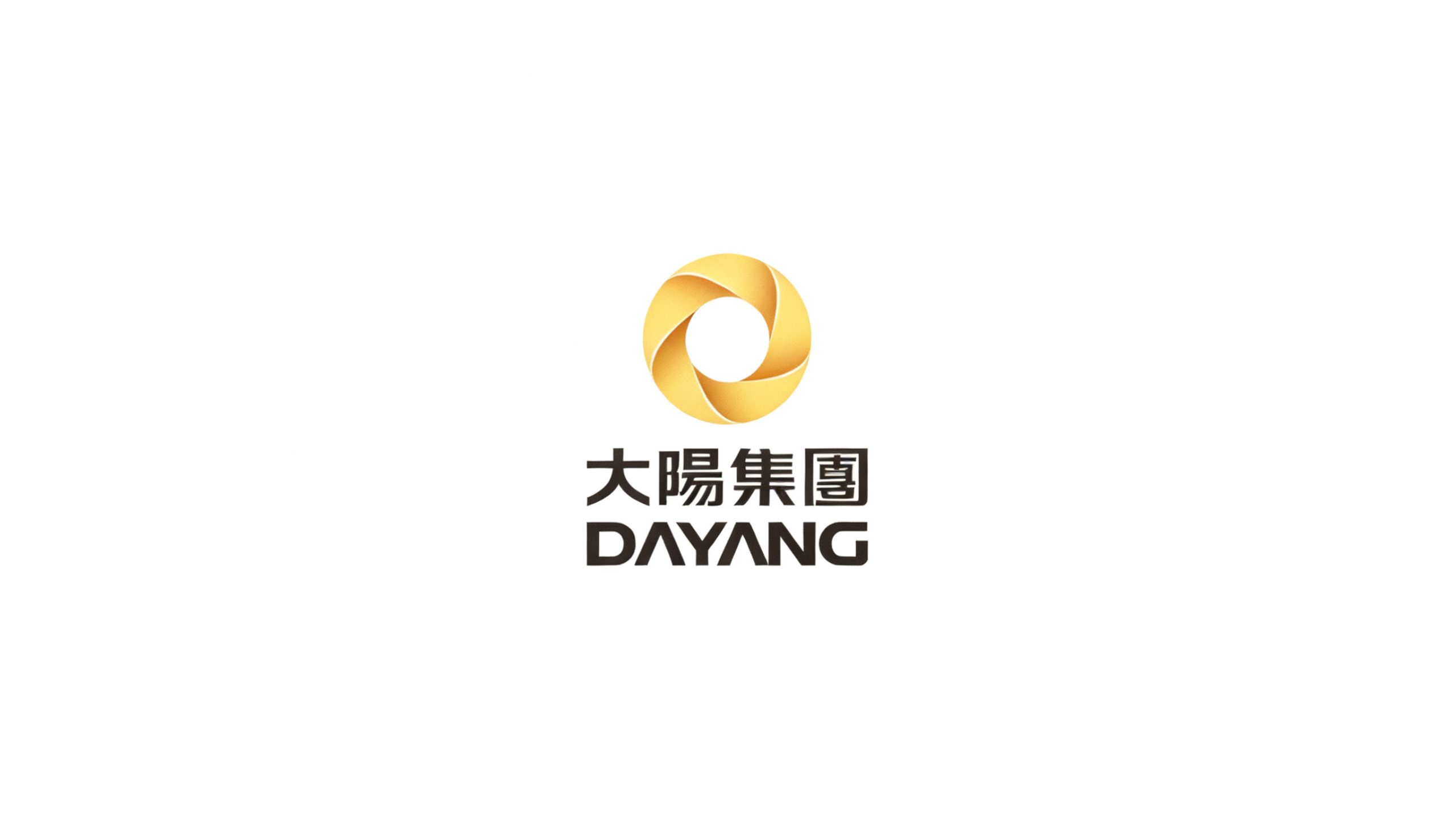
Dayang Group is a diversified enterprise group with core businesses in new energy, intelligent equipment and advanced manufacturing. As its business portfolio expanded, the group sought a new visual identity system to unify the image of its subsidiaries, express its ethos of “powered by light, driven toward the sun,” and build a modern, international brand presence.
design concept
Centered on the idea of “the power of the sun,” the mark is an abstract golden ring formed by six rotating arcs, symbolizing the convergence and continuous cycle of energy. Its circular, cohesive structure represents the group’s unity and centripetal strength, and alludes to the integrated growth of its diverse businesses. Evoking both the radiance of the sun and the turning of a gear, the form embodies the fusion of “Solar × Technology × Manufacturing.”
graphic language
Ring structure: six arc segments enclose a circle, representing the coordinated growth of six core businesses. Gradient layers: a golden gradient creates an interplay of light and shadow, symbolizing innovation, prosperity and future momentum. Rotational movement: a clockwise configuration expresses sustained growth and a circular industrial ecosystem.
Fonts and composition
The brand name uses a bilingual structure. The Chinese name, Dayang Group, is set in a bold sans-serif with broad strokes and a stable center of gravity, conveying strength and steadiness. The English DAYANG uses modified geometric letterforms; the open base of the “A” signifies an open future. Vertically centered, the pairing reinforces balance and international recognition.
color system
Primary gold #D9A63A: sunlight, success and energy. Secondary deep brown #3A2E22: stability, professionalism and industrial substance. Together, the gold-and-brown palette conveys a mature yet modern corporate presence, and adapts well to print, metal embossing and digital media.
Application and extension
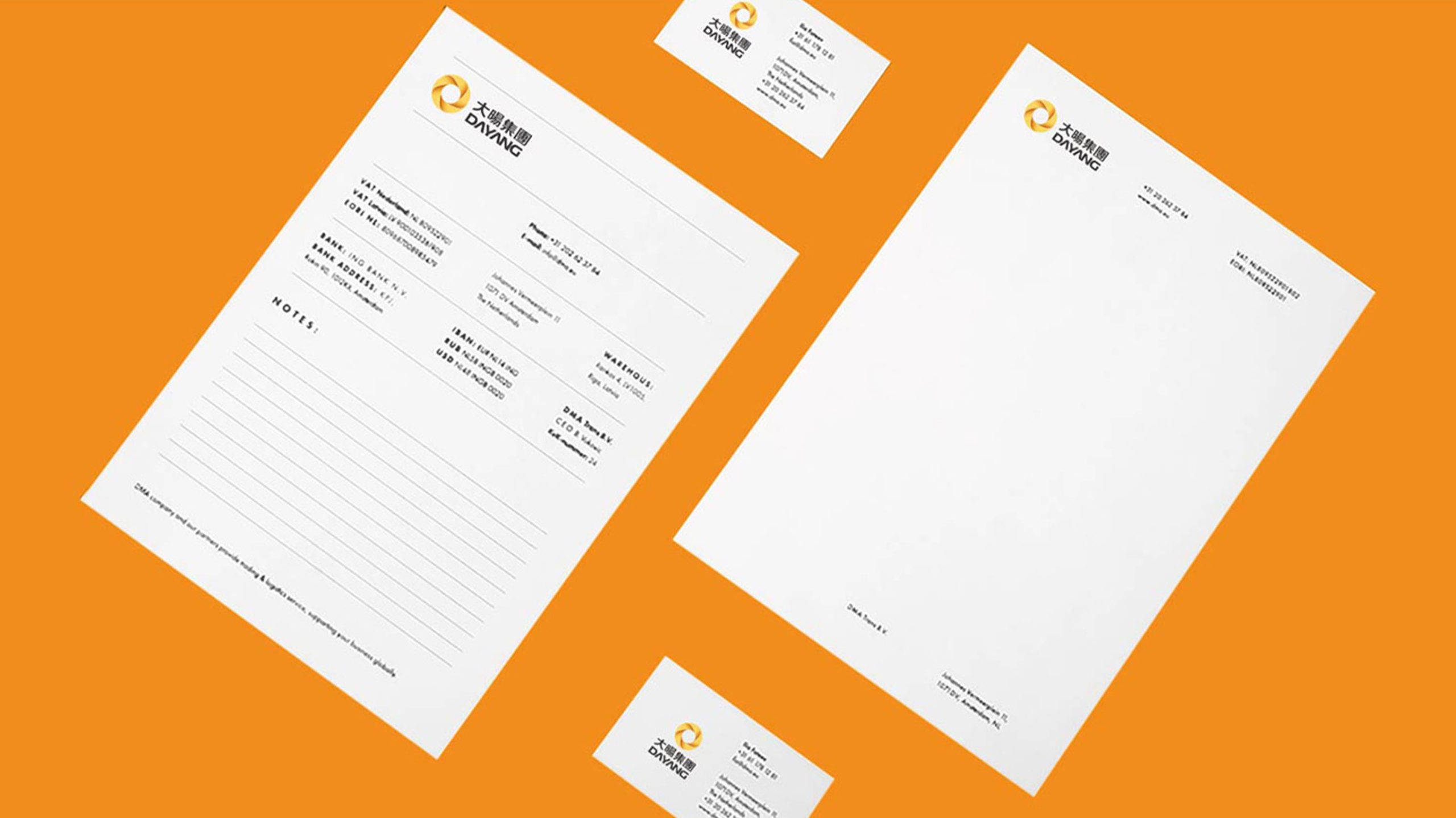
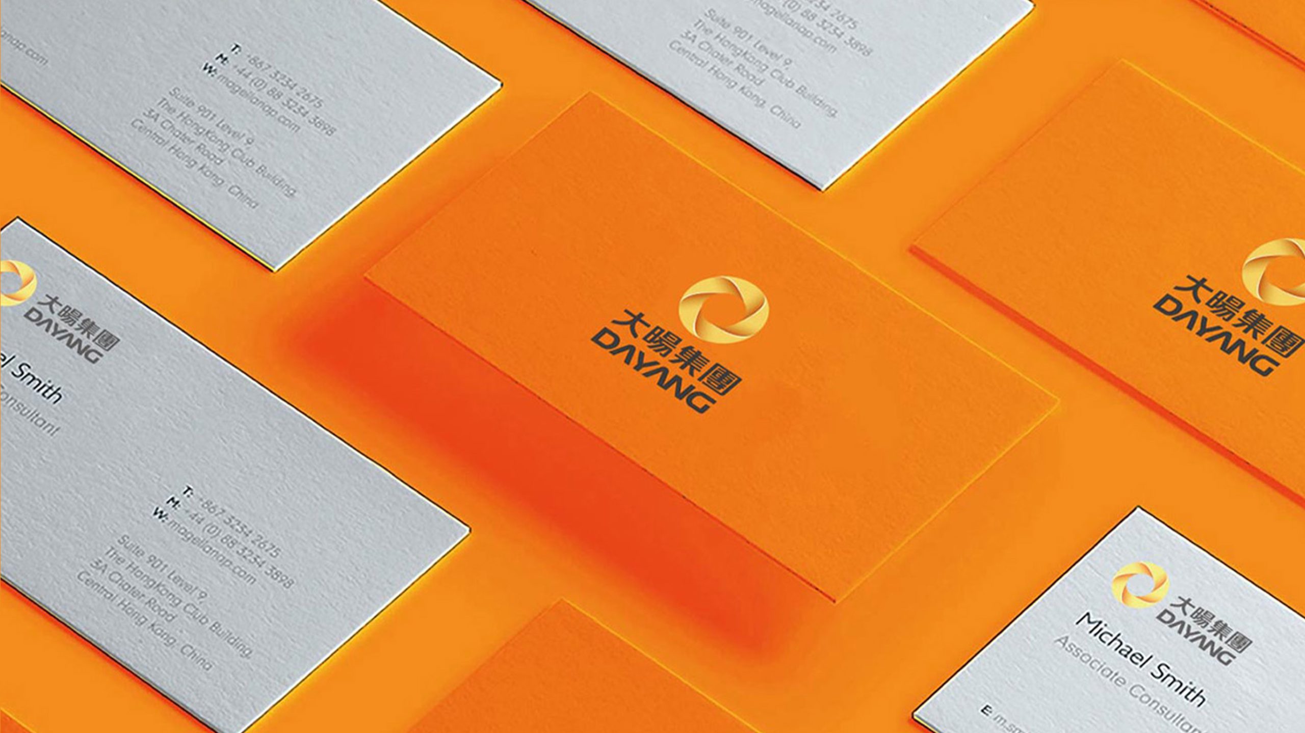
The mark applies across the group’s subsidiaries, office environments, product nameplates and digital channels. The golden ring can stand alone as the group’s emblem in video openers, brand seals or façade wayfinding, reinforcing the brand impression of a “solar cycle.”
brand meaning
The sun is the origin of life and energy. Through a geometric, rotating ring, the mark gives form to the corporate philosophy of “light powering the world,” representing a brand that brings together industrial resources, drives innovation and continually grows toward the sun.
Improper Usage (Protection Specification)
Do not alter the number of arc segments or the angle of rotation. Do not change the direction of the gold gradient. Do not use on pale yellow or busy backgrounds. Minimum display width: 30mm.
design results
Following the launch of the new visual system, Dayang Group’s brand recognition rose significantly across the international energy and equipment manufacturing sectors. The mark has become a key visual asset in external partnerships, unifying the brand image and reinforcing its core idea: “named for light, driven by the sun.”