










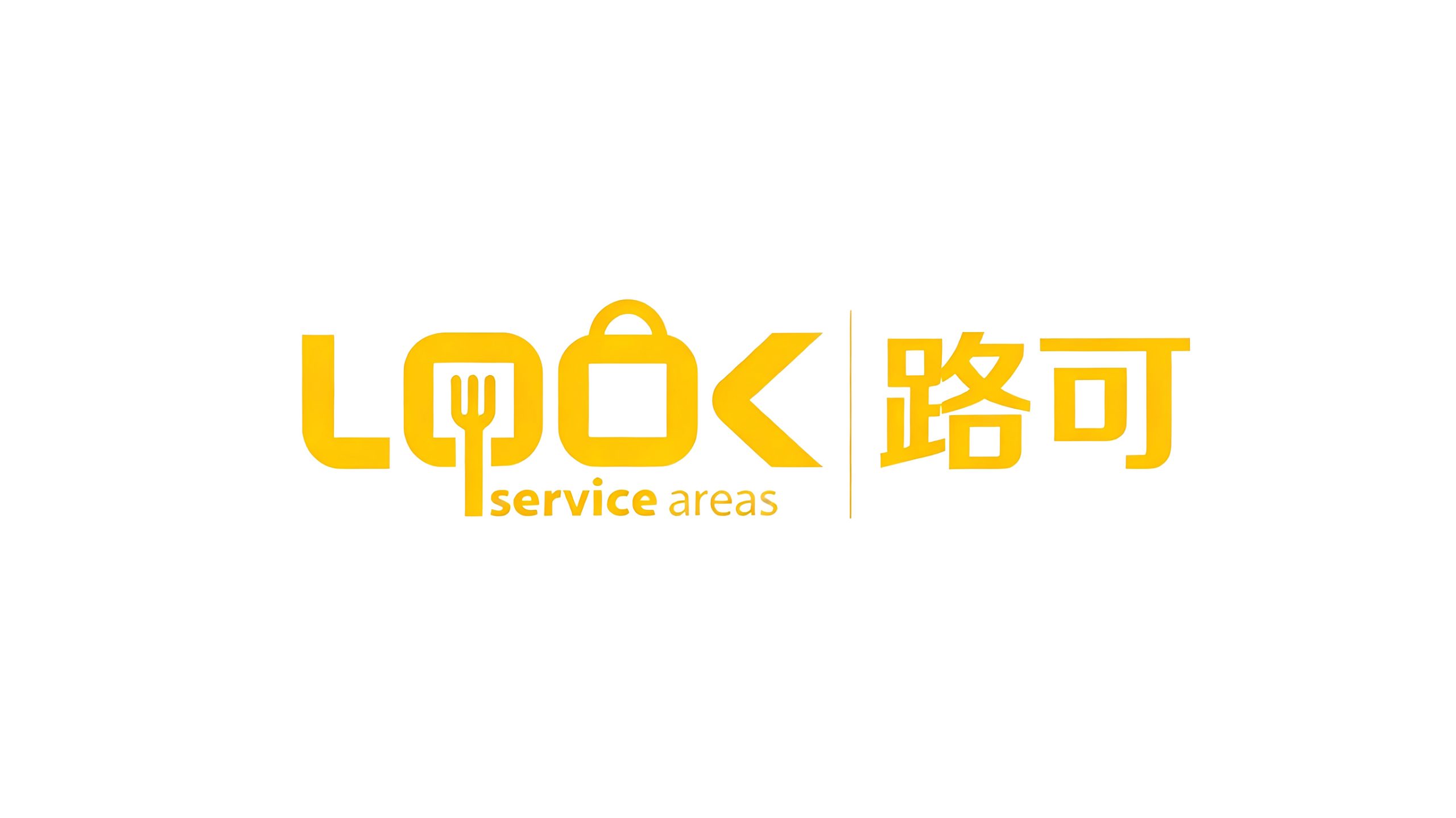
LOOK Service Areas brings together commercial spaces at highway rest stops and service areas, with a focus on dining, retail, relaxation and cultural experiences.
At the outset, the brand faced a familiar challenge: service areas were seen as purely functional places with little warmth. It needed a more contemporary, approachable visual identity to reshape public perceptions.
The new identity needed to establish a recognizable symbol and a wider brand language expressing the pleasure of travel and the ease of everyday living.

design concept
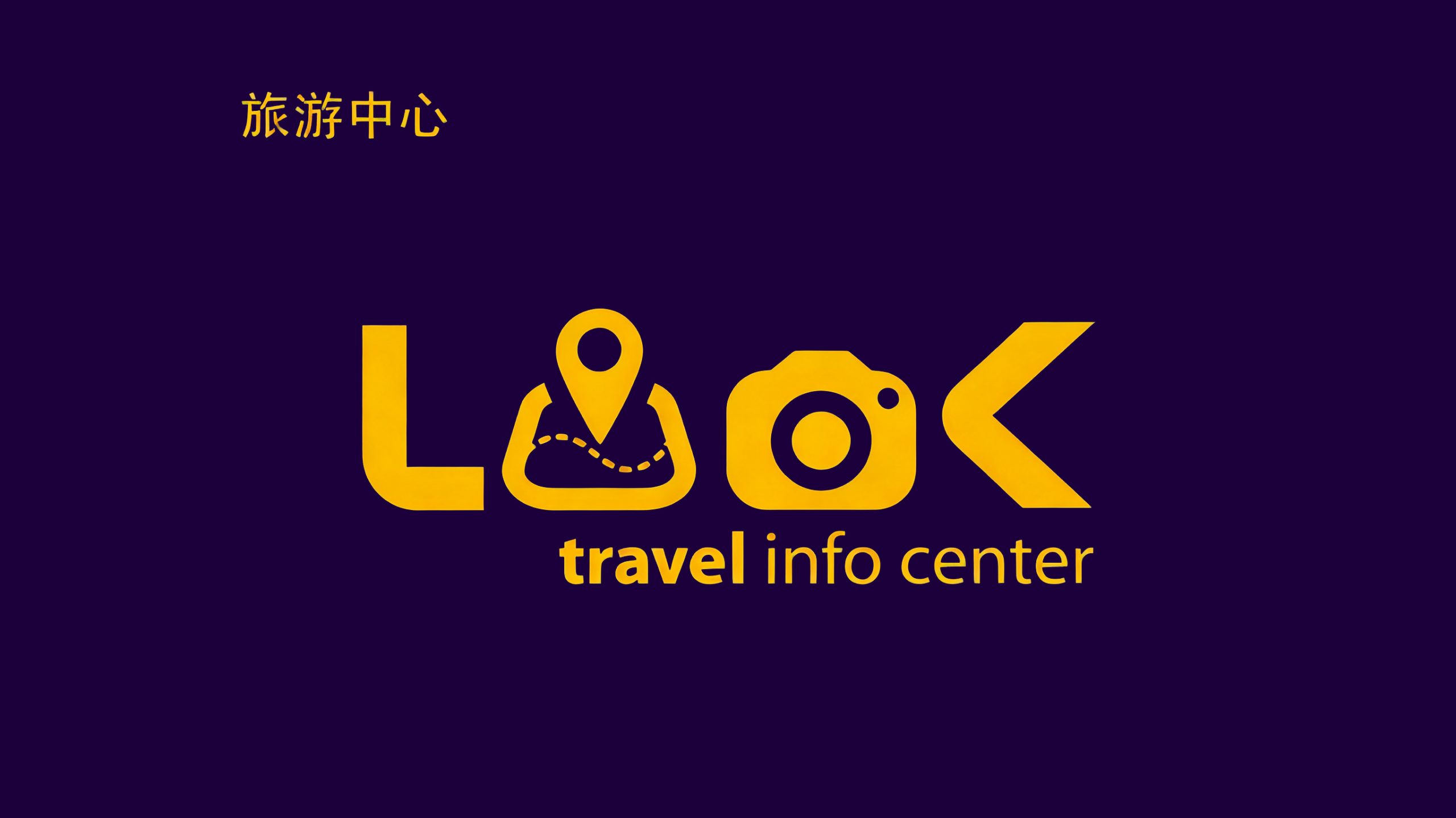
The concept centers on “a place to enjoy along the way.” The name LOOK carries two meanings: the English word suggests exploration and discovery, while its sound echoes the Chinese name Lu Ke, connecting the two languages. Each letter is reimagined with a visual meaning and a reference to the services on offer, creating a contemporary identity that is distinctive, engaging and memorable.
graphic language
The “L” uses square, chamfered geometry to suggest a solid starting point for the journey. Cutlery integrated into the “O” represents dining and service, while a handle above it evokes a shopping bag, convenience and purchases for the road. The sharp strokes of the “K” suggest turns in the road and forward movement. A vertical divider separates LOOK from the Chinese wordmark, giving the bilingual composition a clear structure. Rounded corners throughout soften the geometry and make the brand feel welcoming and inclusive.
Fonts and composition
The Chinese wordmark uses custom rounded sans serif lettering, with substantial strokes and generous counters that convey confidence and simplicity. LOOK is drawn in a custom geometric typeface with uniform stroke widths and regular proportions. The lowercase descriptor “service areas” appears in a muted gray-yellow, its lighter lettering creating a clear hierarchy. The composition is centered horizontally, bringing balance and order to applications within physical spaces.
color system
The primary bright yellow, #FDCB35, evokes sunshine, energy and warmth, establishing the emotional character of the service brand. Supporting light gray, #BFBFBF, is used for secondary text and information, adding clarity, restraint and a sense of space. Together, yellow’s warmth on the journey and gray’s sense of order express a brand that is welcoming and efficient.
Application and extension
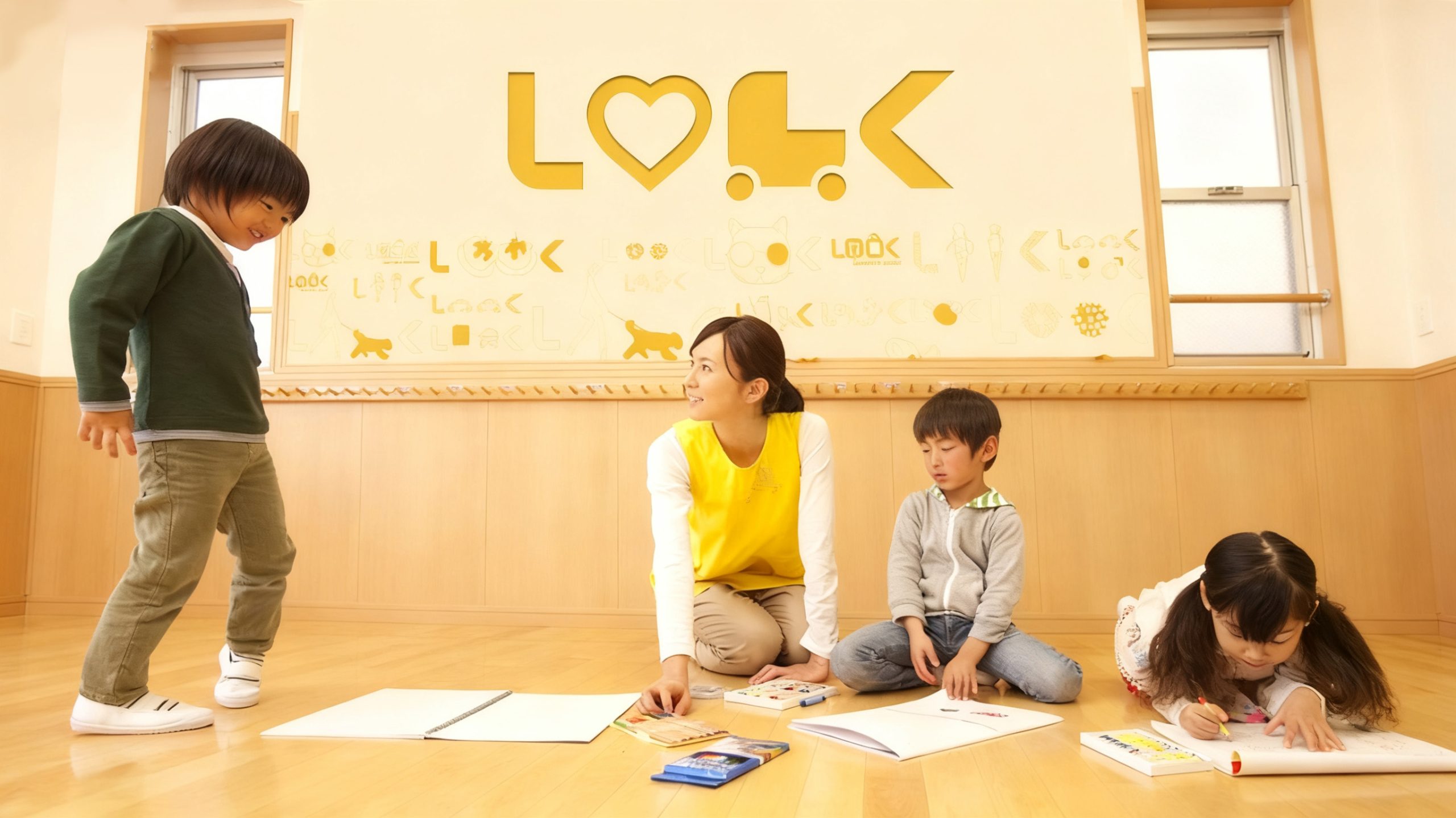
The modular identity adapts across a wide range of applications. On service-area façades, storefront signs, wayfinding and illuminated signage, it creates a consistent physical experience. In apps, mini programs and smart navigation interfaces, the “O” dining motif or shopping-bag symbol can become a functional button. Paper bags, coffee cups, tickets, vehicle stickers and souvenir badges extend the brand into the journey. In motion, the “O” can transform into a rotating road junction, expressing connection and movement.
brand meaning
LOOK offers a place to pause, eat and recharge along the way. Its simple geometry creates a welcoming point of contact for travelers, offering both warmth and a sense of direction. Yellow evokes the sunshine of a daytime journey, while rounded letterforms feel friendly and reassuring. Together, these elements express the brand’s central promise: make every stop a welcome discovery.
Improper Usage (Protection Specification)
Do not stretch or distort the letterforms. Do not alter the primary yellow or place it against backgrounds with insufficient contrast. Do not use the cutlery motif inside the “O” independently. Recommended minimum reproduction width: 30 mm.
design results
Since the launch, LOOK has achieved more consistent recognition across highway service areas and urban transit stops throughout China. Its contemporary visual language and functional letterforms give the brand a distinctive presence where travel, dining and relaxation meet. By turning a functional space into a branded experience, the project has become a reference for visual identity renewal in transport services.