










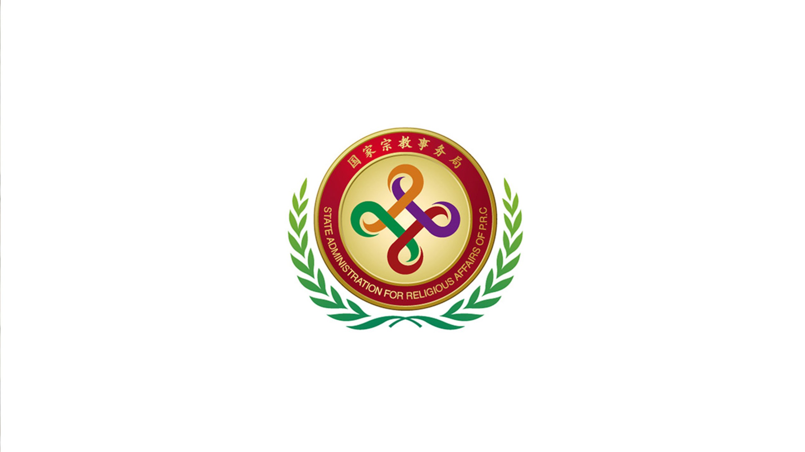
The China Association for Enterprise Education plays an important role in advancing enterprise education, talent development and academic exchange nationwide. As it modernized its institutional identity, it needed a visual system that combined authority, a clear educational focus and an international outlook. The aim was to unify its public communications and event presence while strengthening trust across the sector.
design concept
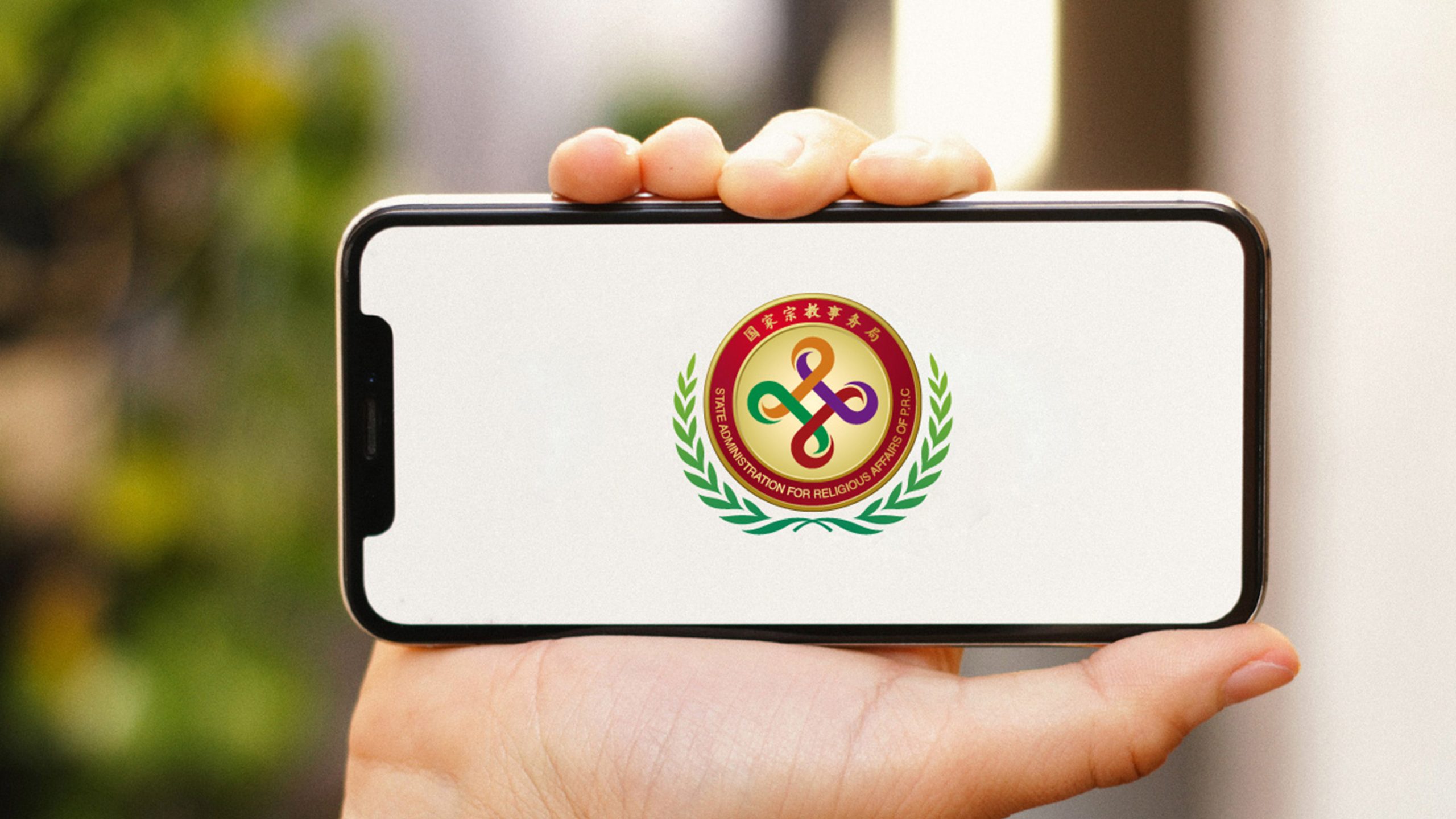
Built around connection, shared progress and a continuous circle of learning, the identity uses interwoven loops to express the interdependence of enterprise and education. The form combines the infinity symbol with a knot, representing lifelong learning and a connected sector that prospers together. A gold outer ring conveys institutional authority and dignity, while four interwoven colors within express collaboration, diversity and innovation in education.
graphic language
At the center, four curves form a continuous loop linking industry, education, research and practical application. The circular seal structure reinforces the association’s institutional and accreditation role, conveying rigor and trust. An outer laurel wreath represents honor, growth and achievement, recognizing educational outcomes and social contribution. Symmetry gives the identity a stable, dignified presence that reflects the structure and principles of education.
Fonts and composition
The bilingual typography combines traditional Chinese lettering with a modern sans serif. The Chinese name is rendered in gold, with forms inspired by regular-script calligraphy that convey cultural depth and institutional dignity. “CHINA ASSOCIATION FOR ENTERPRISE EDUCATION” appears in a clear sans serif for international recognition. Set around the central symbol, the lettering creates a formal emblem with a strong ceremonial presence.
color system
The primary gold, #C8A44A, represents authority, honor and the value of educational achievement. Supporting red #9B1E24 conveys commitment, responsibility and national spirit. Laurel green #3B8B4D suggests growth, hope and vitality. The interwoven blue, orange, purple and green express diversity in education and openness to collaboration across disciplines. Together, the colors give the identity both dignity and vitality.
Application and extension
The identity appears on conference certificates, medals, trophies, the official website, publication covers and event graphics. The central interwoven symbol can also serve as an accreditation seal or visual watermark. It retains its clarity and authority in monochrome and relief, making it suitable for official documents and formal settings.
brand meaning
Combining a continuous circle of learning with an emblem of honor, the identity represents national leadership and support for enterprise education. Its four interwoven paths suggest an ongoing cycle of learning, innovation, growth and sharing, expressing the association’s mission: “Advance development through education; shape the future through collaboration.” The whole embodies the unity, openness and enduring momentum of enterprise education in China.
Improper Usage (Protection Specification)
Do not change the proportions of the primary gold and red or replace them with gradients. Do not alter the central interwoven structure or the angles of the laurel leaves. Do not use the inner symbol independently within an asymmetrical composition. Do not add shadows, outlines or transparent overlays. Minimum reproduction width: 30 mm.
design results
Following the launch, the association strengthened its credibility across China’s education and enterprise sectors, with more than 90% of member organizations adopting the new identity. Extensive use at major education summits and national award ceremonies reinforced its recognition and ceremonial presence. The project is now included in Qingmei Future’s Education and Institutional Branding collection as a reference for organizations whose brands depend on public trust.