










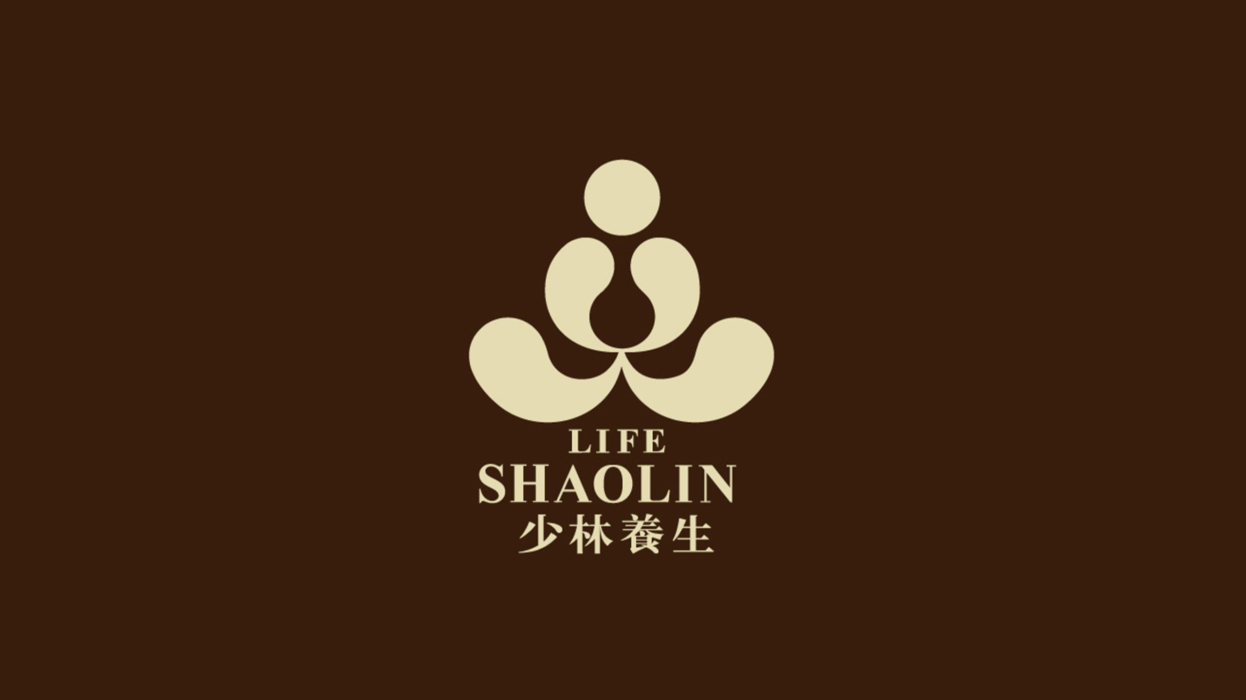
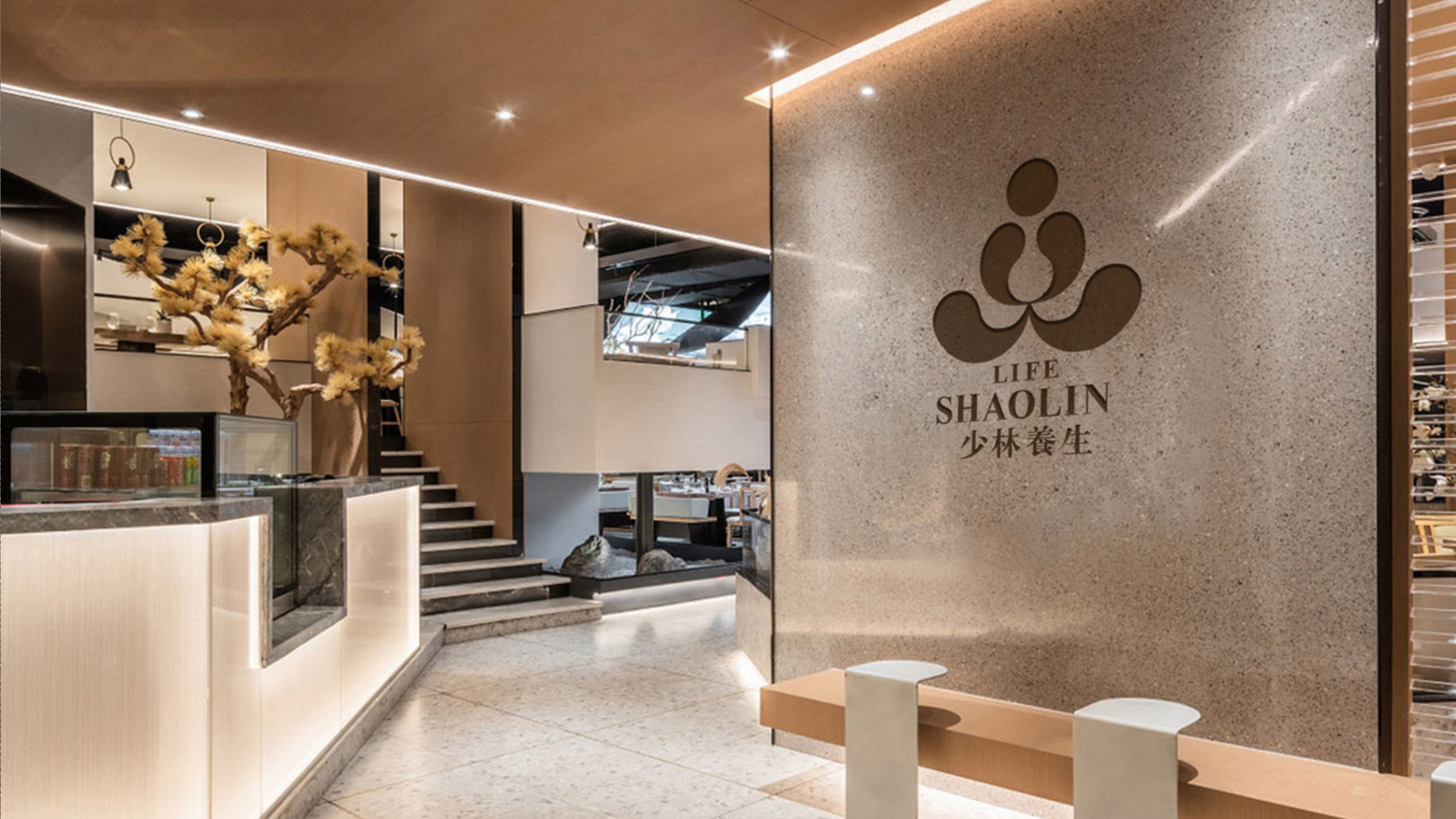
Life Shaolin is built on the core philosophy of “Zen meditation · cultivating qi · unity of body and mind,” bringing traditional Shaolin culture together with modern healthy living. The brand sought a logo infused with Eastern philosophy and contemporary aesthetics to express its wellness ethos — “the heart as the foundation, harmony as the realm” — turning the mark into an image of the inner state.
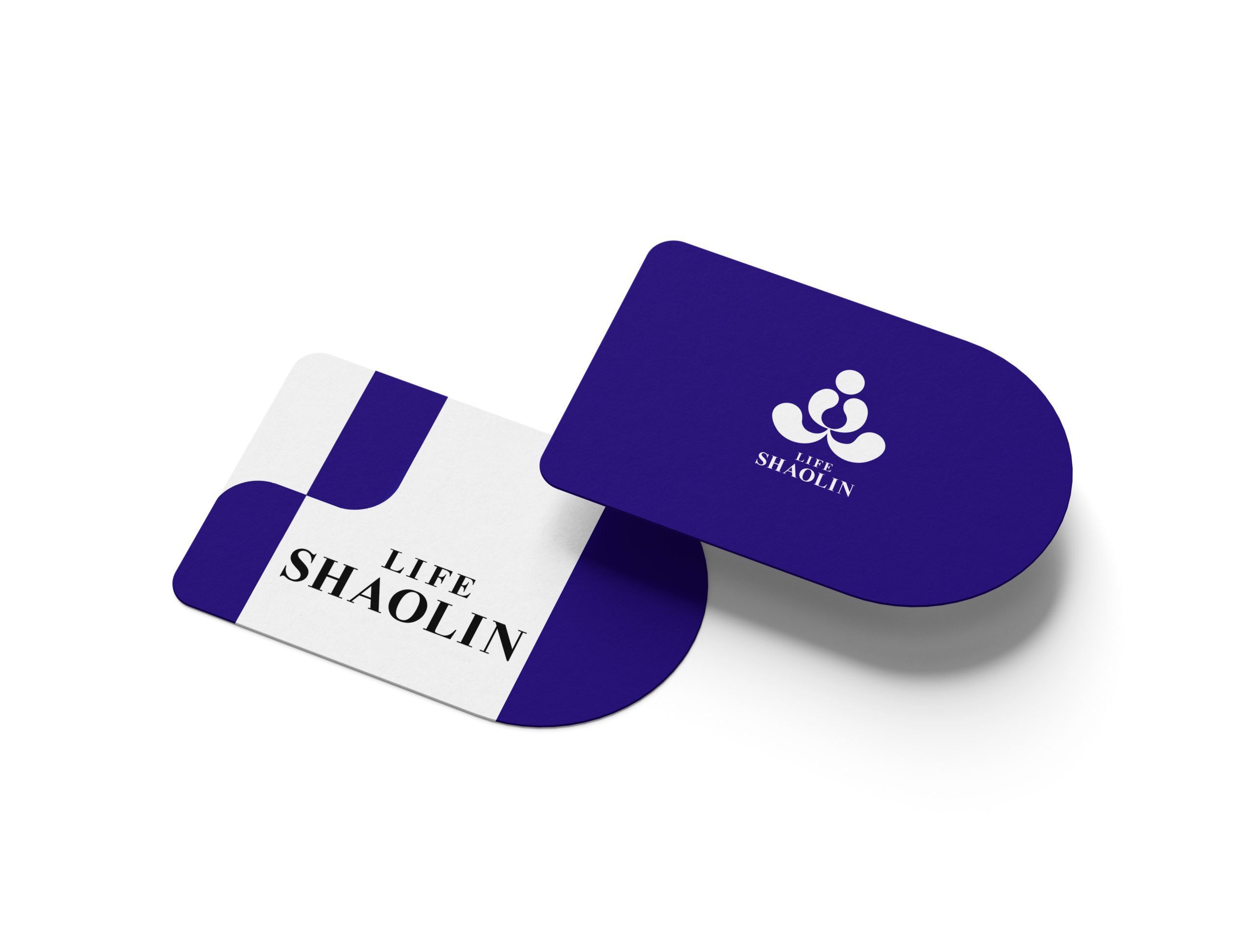
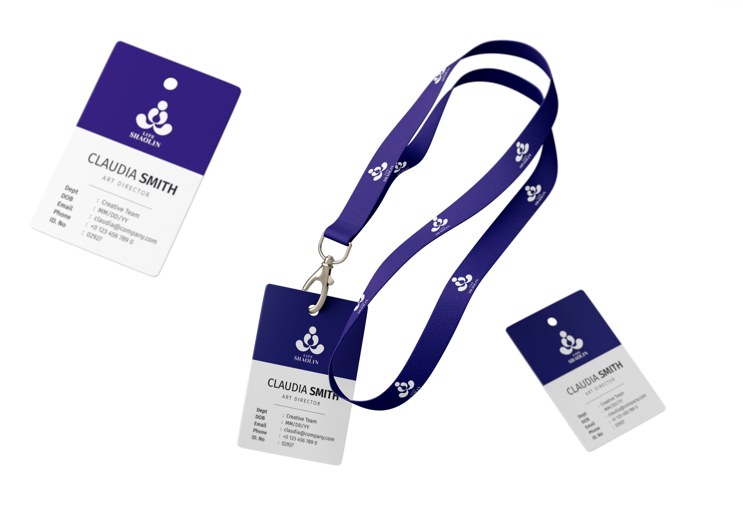
design concept
The design draws inspiration from a Zen saying: “With a flower in your heart, there is a flower; with the Buddha in your heart, there is the Buddha.” The mark combines an abstract seated meditation figure with the form of a lotus — resembling both a practitioner in stillness and a lotus in full bloom. It symbolizes a tranquil mind, an awakened life and the endless renewal of all things. Minimal yet full of tension, the form embodies the Eastern design philosophy of “revealing form through the formless.”
graphic language
Circles and arcs: the upper circle symbolizes a pure mind, the two middle arcs evoke palms pressed together, and the lower arc represents support and stability; Overall form: unfolding layer by layer from the inside out, presenting a visual order of “all phenomena arising from the mind”; Negative space: the empty center represents “emptiness” — all things arise from the mind, the very essence of Zen.
Fonts and composition
The brand name uses a bilingual structure. The English LIFE SHAOLIN is set in a fine serif, conveying balance, stillness, and an international sensibility. The Chinese name, Shaolin Wellness, is a reworked simplified Song typeface whose strokes flow like a brush, evoking calligraphy. A centered vertical layout echoes “the steadiness of practice, the stillness of mind.”
color system
Primary Rice Gold #D9CBA5: Zen, nature and the warmth of life; Secondary Light Ivory #F5F2E9: calm and purity; Together, the two colors eliminate visual noise, giving the logo a soft presence and high recognizability in both physical spaces and digital interfaces.
Application and extension
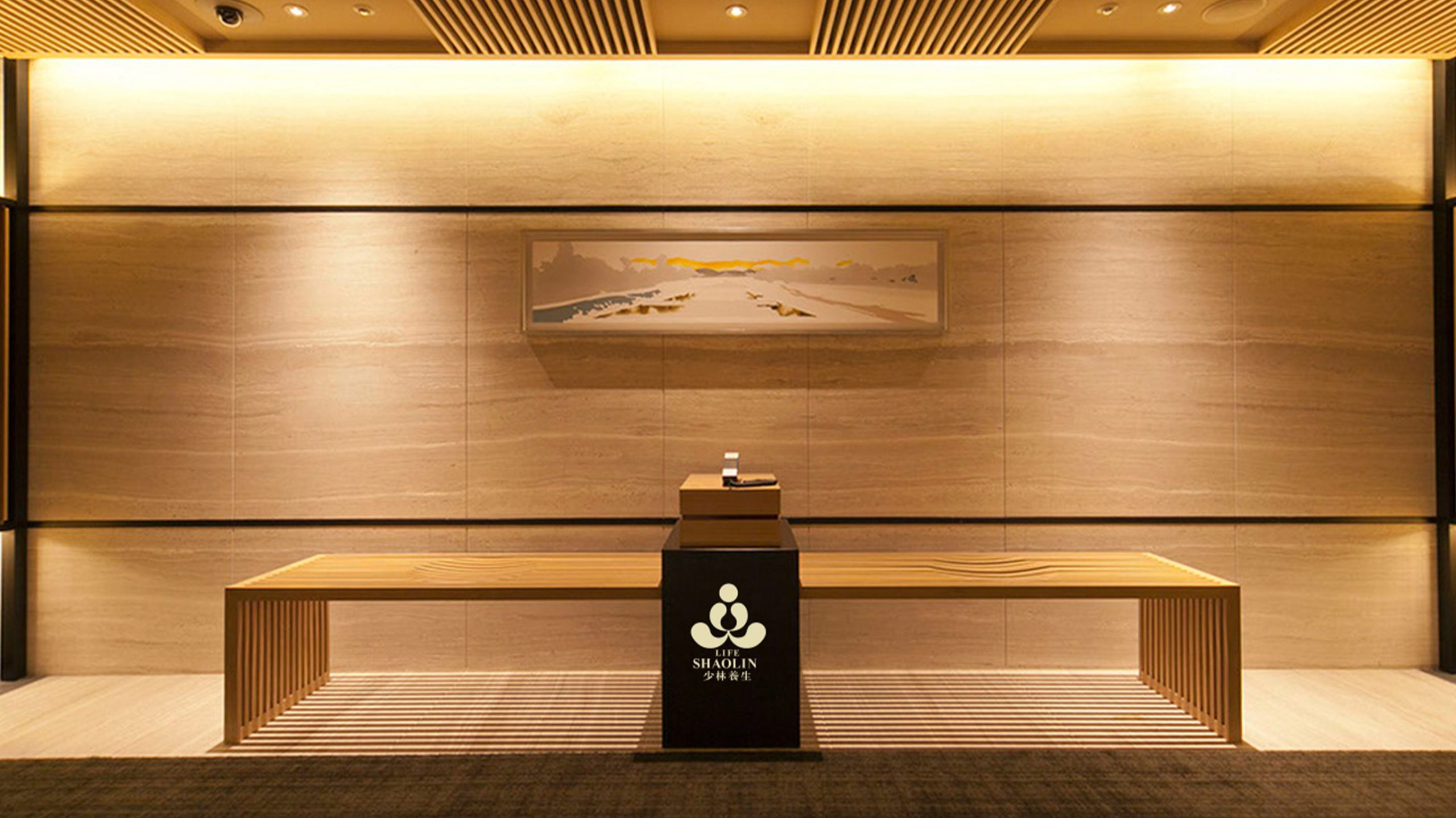
The logo is suited to meditation centers, cultural courses, wellness product packaging and spatial wayfinding. The lotus form can extend into breathing motion graphics for film openings or product interfaces, delivering a brand experience of “in each breath, all things are one.”
brand meaning
The logo embodies the design philosophy of “the mind as form, form revealing the mind.” It is not a religious symbol, but a symbol of inner cultivation and the wisdom of living. Every curve begins at the center, signifying “born of the mind, returning to the mind” — just as Life Shaolin advocates: unity of body and mind; from stillness, wisdom.
Improper Usage (Protection Specification)
Do not change the proportions or spacing of the arcs; do not use bright metallic gold or highly saturated colors; do not add drop shadows, outlines or shadow effects; minimum display width: 25 mm.
design results
Following its launch, the new LIFE SHAOLIN logo became a benchmark for the modern expression of Shaolin culture. At international wellness forums and cultural exchange projects, its visual language of “Eastern Zen + modern minimalism” has successfully shaped a serene, trustworthy and distinctive brand character.