










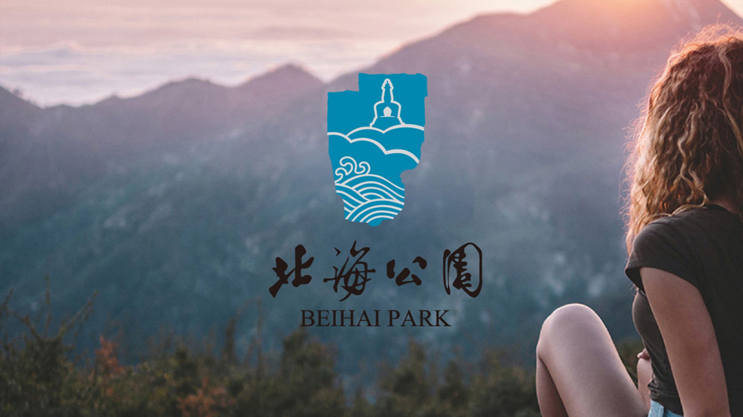
In the heart of Beijing, Beihai Park is one of China’s oldest and best-preserved imperial gardens, with a history spanning nearly a thousand years.
As a nationally recognized cultural destination and part of a World Heritage site, Beihai Park needed an identity that could convey its historical depth while communicating effectively with contemporary audiences.
The new visual identity brings together the elegance of imperial culture and the welcoming character of a public park, presenting Beihai as a cultural landmark rooted in tradition and alive in the present.
design concept
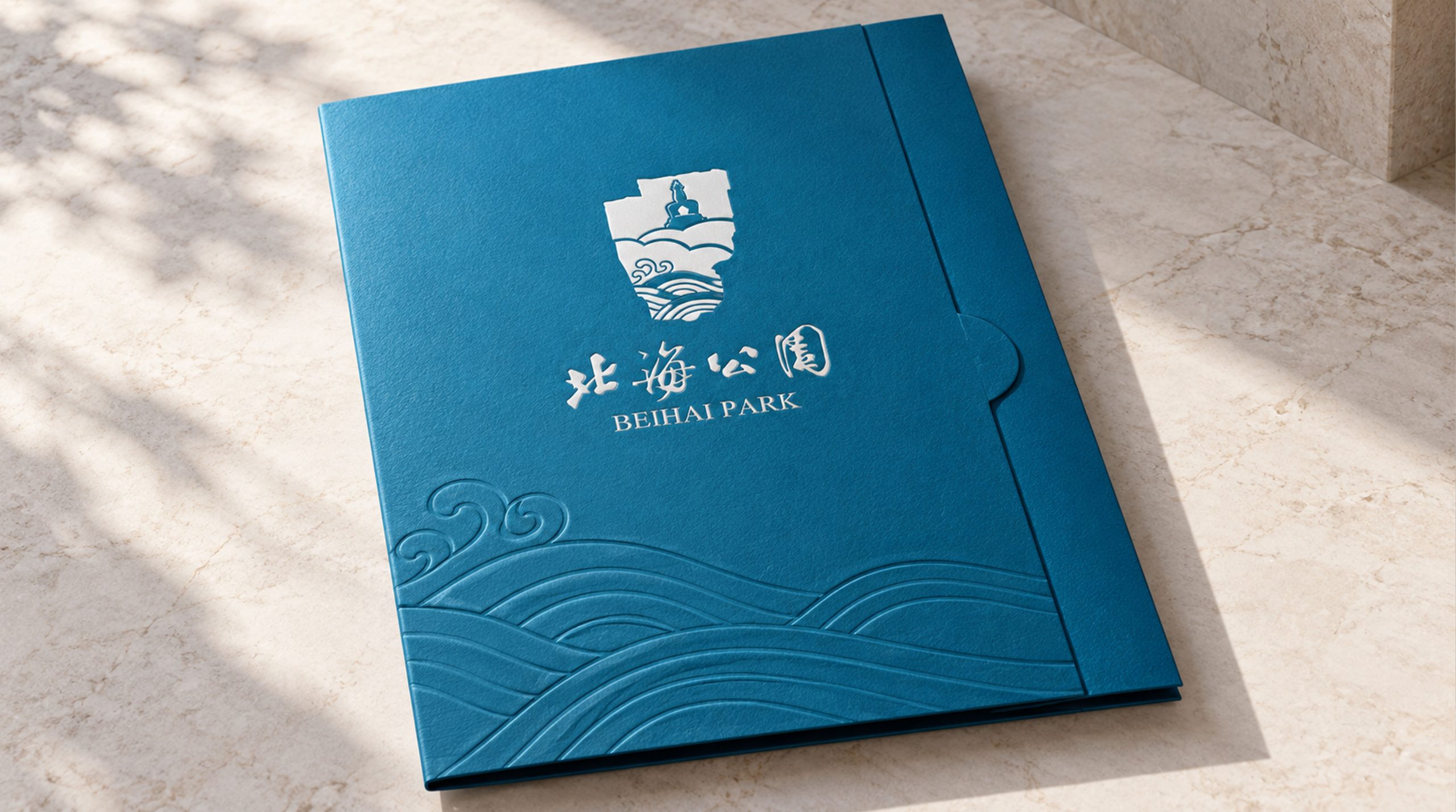
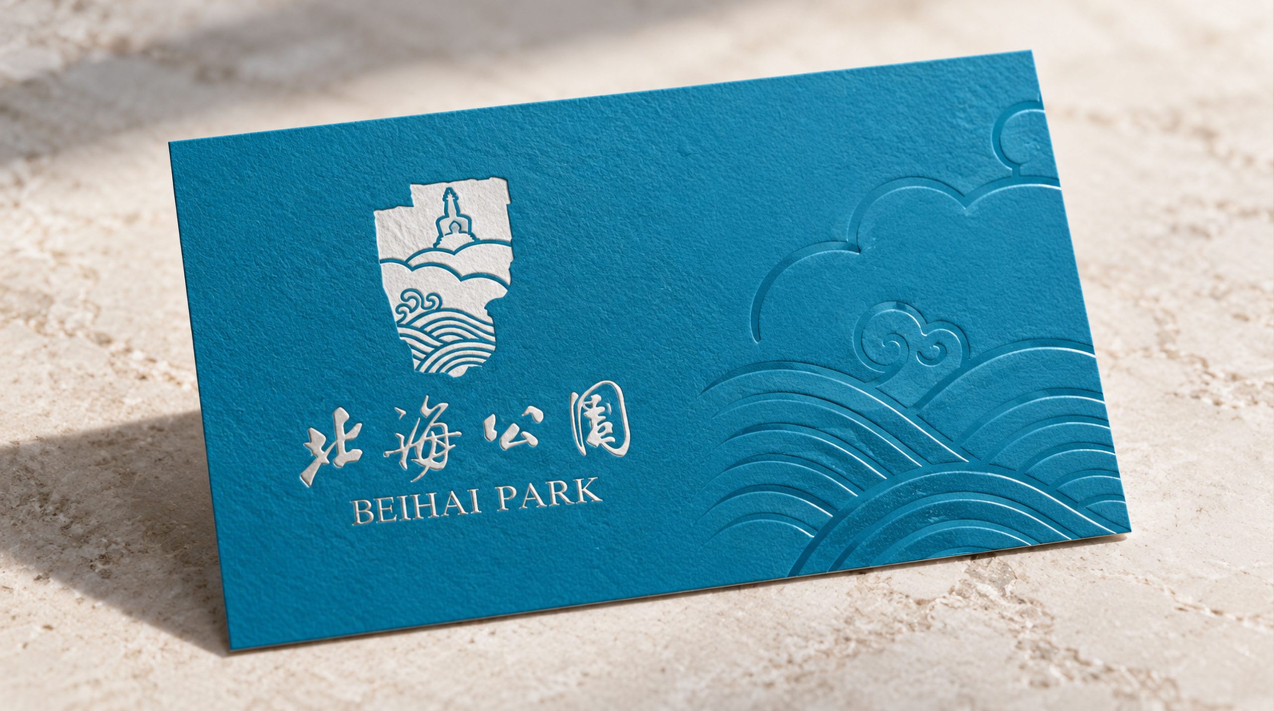
The concept unites landscape and culture, combining the White Dagoba on Qionghua Island with the ripples of the lake in a silhouette shaped by Chinese landscape aesthetics. Drawn from Beihai’s distinctive setting, the tower rises above flowing water, evoking a meeting of sky and earth as light plays across a tranquil lake. The composition reflects the garden’s spatial character—water as its mirror, the dagoba as its spirit—and the traditional Chinese ideal of harmony between humanity and nature. A stable form with an underlying sense of movement expresses the enduring vitality of the ancient capital and its culture.
graphic language
The silhouette of the White Dagoba, Beihai’s defining landmark, evokes faith, tranquility and watchfulness, reflecting Beijing’s cultural spirit. Three layers of waves suggest the lake, the sky and the passage of time, conveying the vitality of the garden’s ecosystem. A solid upper form and more open lower section create a reflection-like composition that recalls traditional brushwork through contemporary geometry. Island and water interlock to express harmony between people and nature. Symmetrical proportions convey the dignity and order of an imperial garden, balanced by poetic softness.
Fonts and composition
The Chinese name is rendered in flowing calligraphy, combining historical character with a lively rhythm. Compact letterforms and decisive opening and closing strokes reflect the garden’s dignity and cultural depth. “BEIHAI PARK” is set in a serif typeface, supporting international recognition and its identity as a cultural landmark. The Chinese and English names share a central axis, creating a balanced composition that adapts easily to wayfinding, tickets and souvenirs.
color system
The primary lake blue, #3A96C8, draws on Beihai’s waters to evoke tranquility, purity and historical continuity. Deep blue #1E4D78 adds depth and dimension, suggesting both the lake’s depths and the richness of its cultural heritage. A gradient from light blue through lake blue to deep blue creates a visual transition from sky to water, reflecting the passage of time and the continuity of culture. Black and gold support typography and formal applications, lending clarity and authority. The palette’s blue and cyan tones draw on Chinese aesthetics while remaining contemporary and versatile across media.
Application and extension
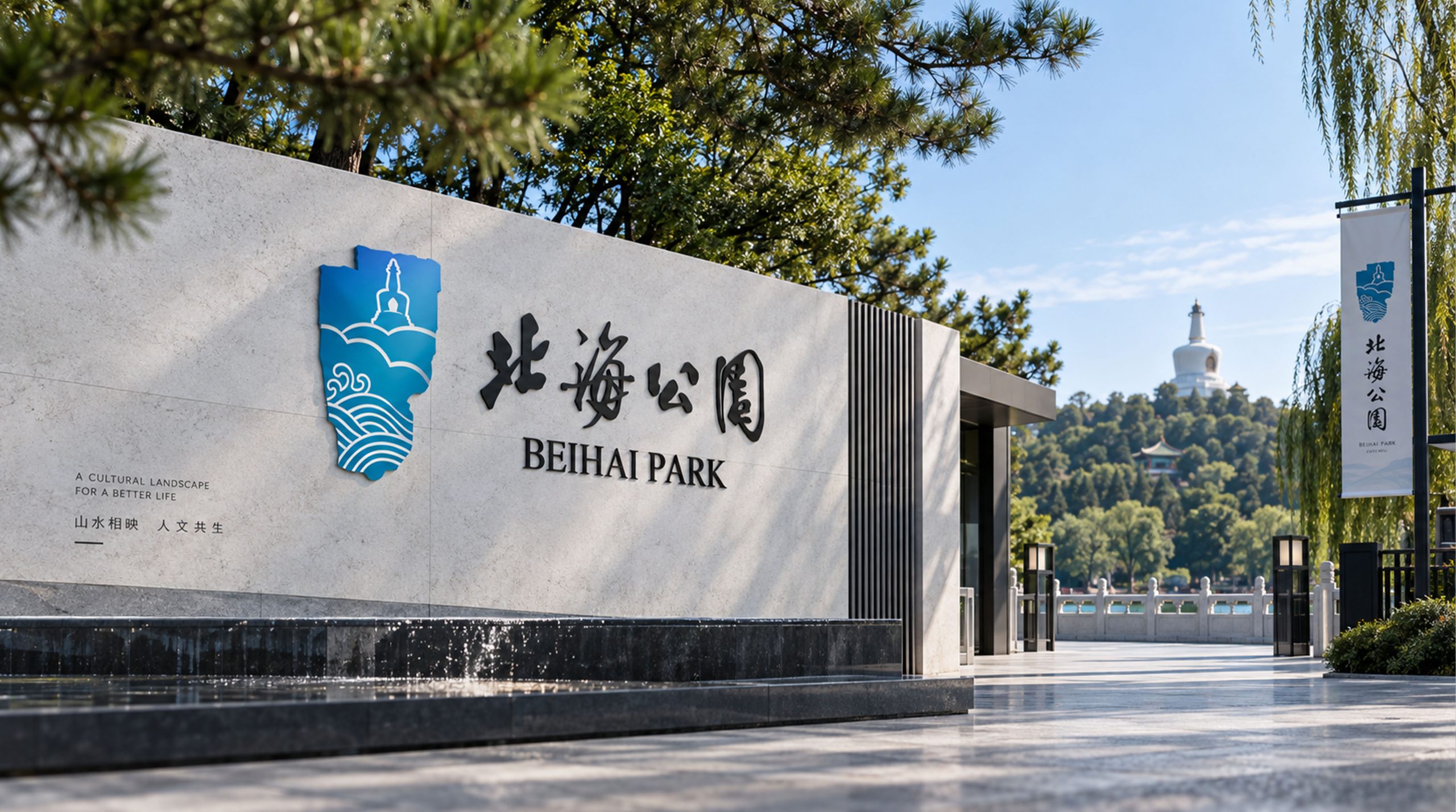
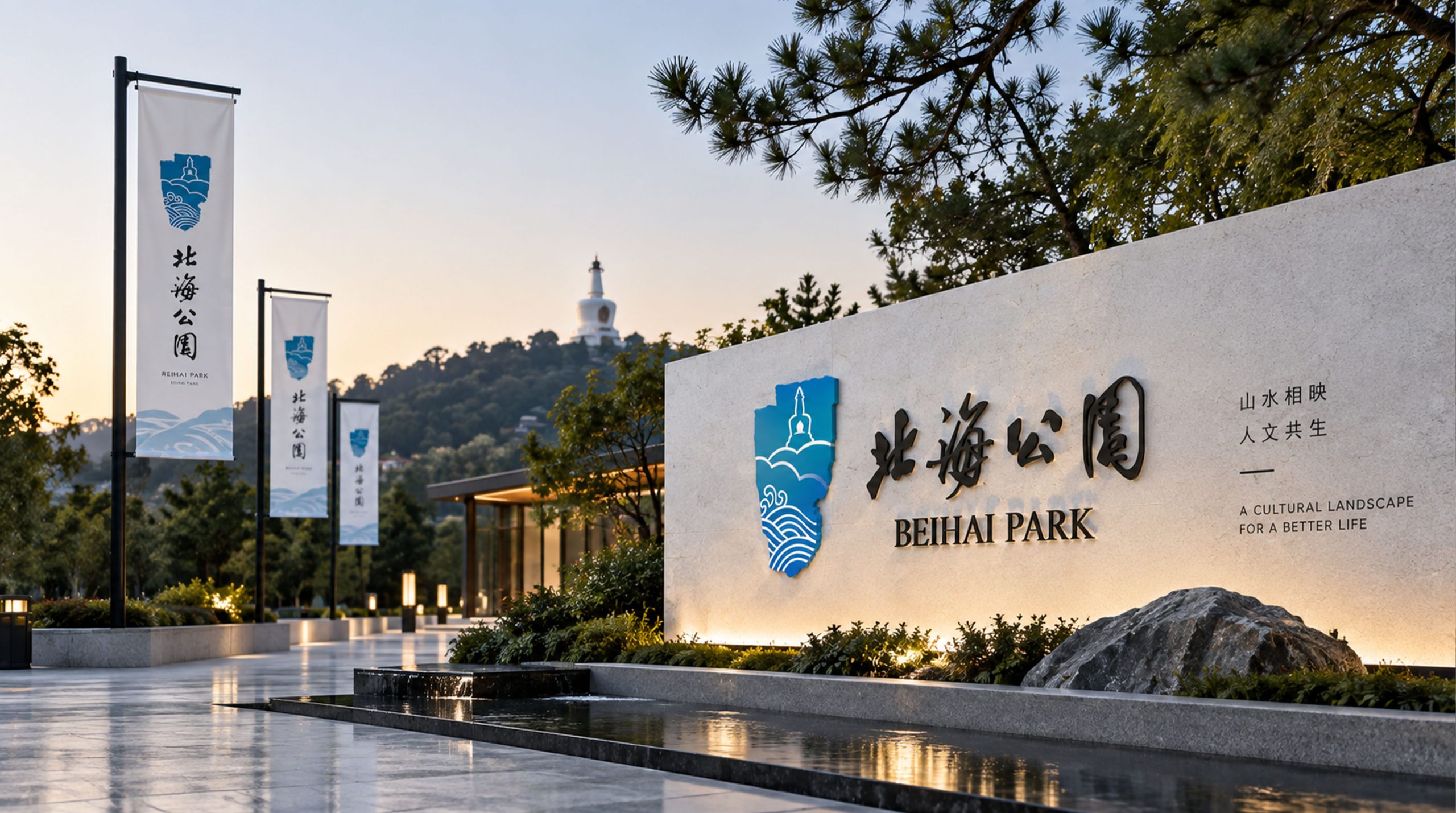
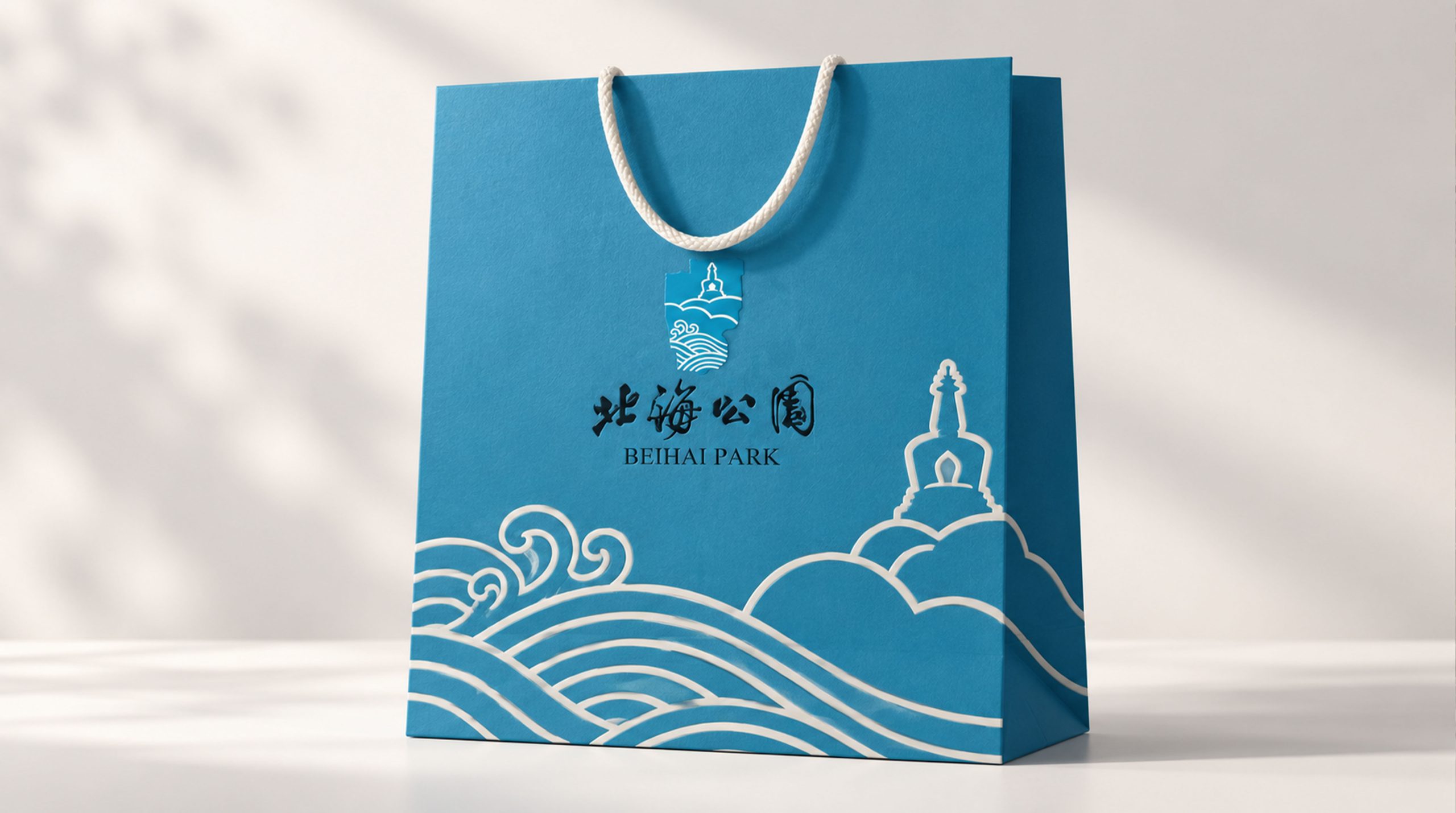
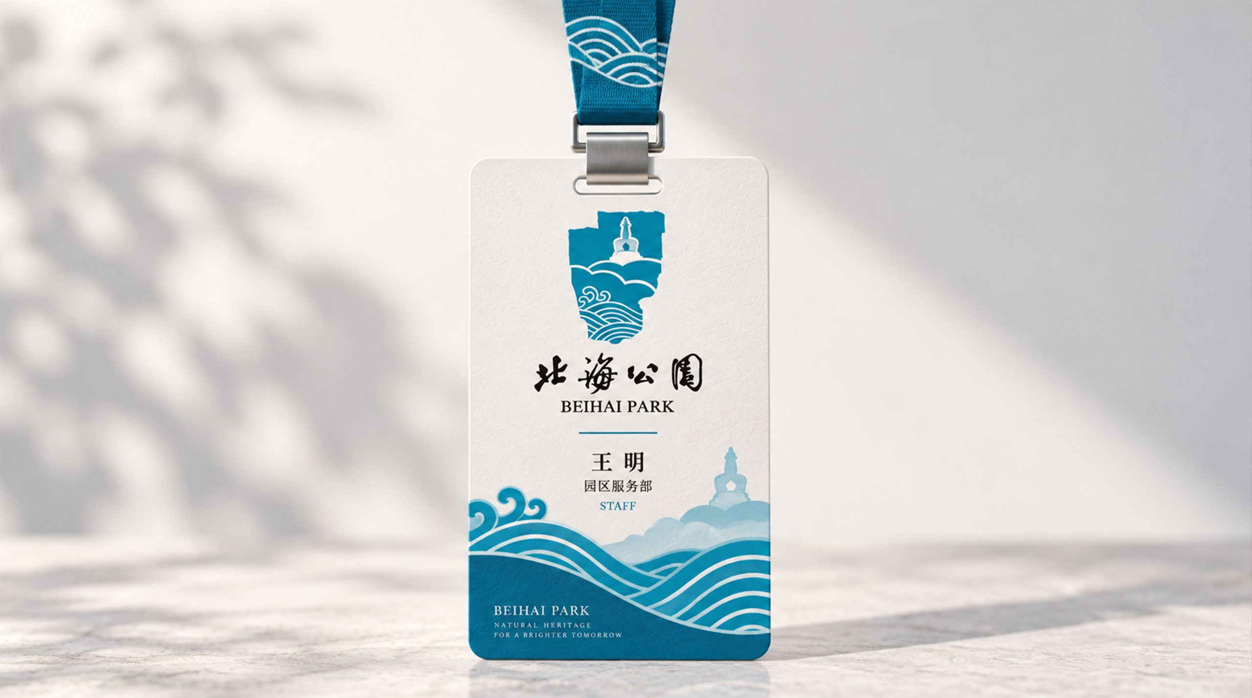
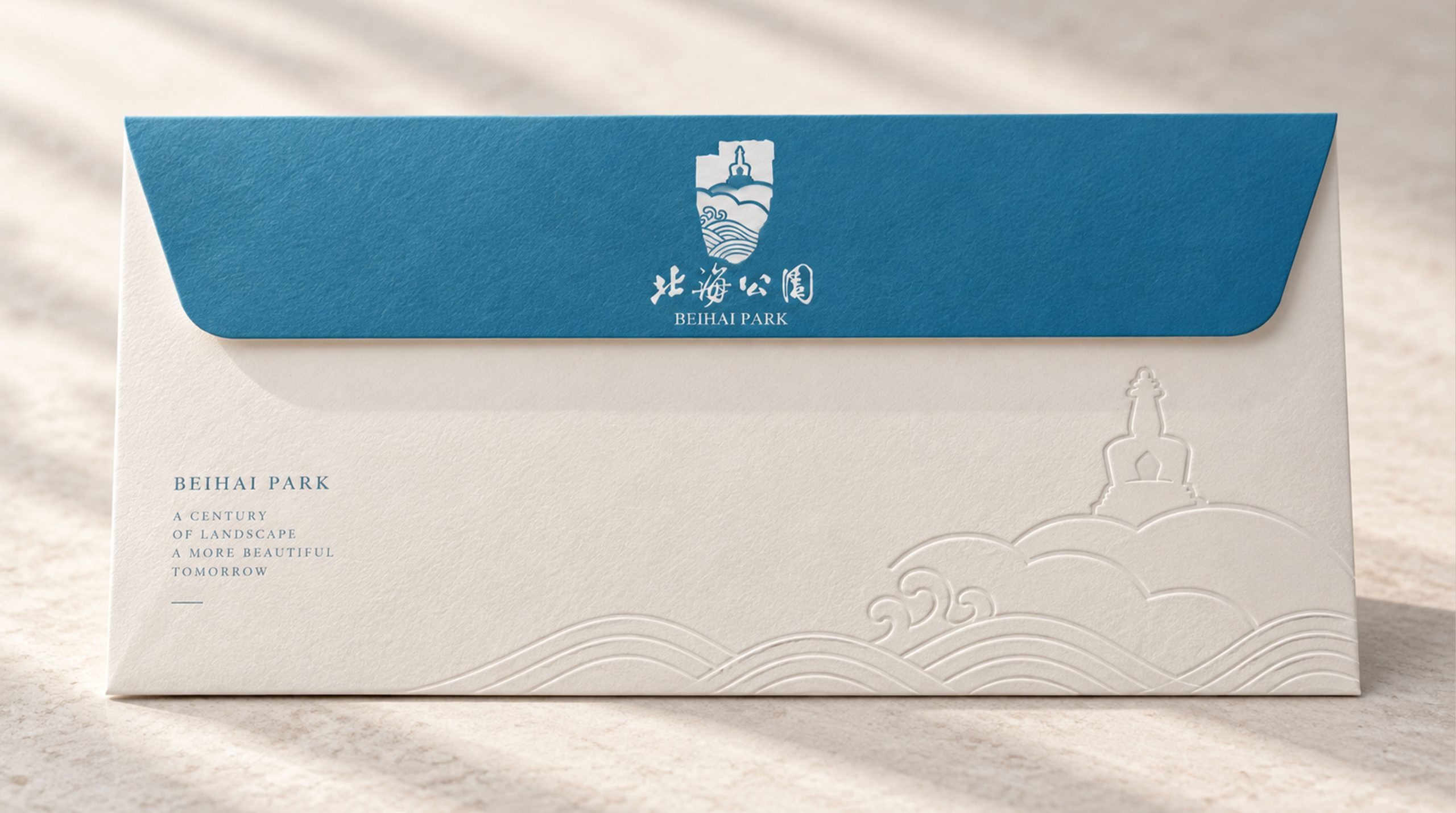
The identity extends across park wayfinding, cultural merchandize, maps, digital media and international promotional materials. The wave motif can become a decorative pattern for scarves, ceramics and souvenir cards. In digital applications, the dagoba and waves can be animated to suggest reflections moving across water, adding an engaging dimension to the experience. The mark retains its clarity and elegance in black and white, relief and cutout applications.
brand meaning
By bringing together the White Dagoba as a cultural symbol and water as a natural one, the identity creates a visual poem of time and place. It represents the history of the imperial garden and the traditional Chinese values of harmony, tranquility and beauty. Beihai’s name evokes a mind as expansive as the sea; the mark gives this idea a simple, resonant form. Rooted in culture and animated by nature, it brings the aesthetics of the ancient capital into a new era.
Improper Usage (Protection Specification)
Do not change the primary lake blue or the proportions of the gradient. Do not rotate or flip the dagoba. Do not add outlines, shadows or excessive effects. Maintain the established proportions between the waves and the dagoba. Minimum reproduction width: 25 mm. Avoid placing the mark over complex images that reduce its clarity.
design results
Following the launch, visitor surveys and brand communication assessments recorded a 52% increase in public recognition and a 43% rise in visitor favorability. The identity has been widely applied to park wayfinding, cultural merchandize and international tourism materials, strengthening Beihai Park’s profile and artistic appeal in domestic and international cultural tourism markets. The project is now a featured example in Qingmei Future’s Cultural Heritage and City Branding collection, demonstrating a contemporary approach to traditional culture.