










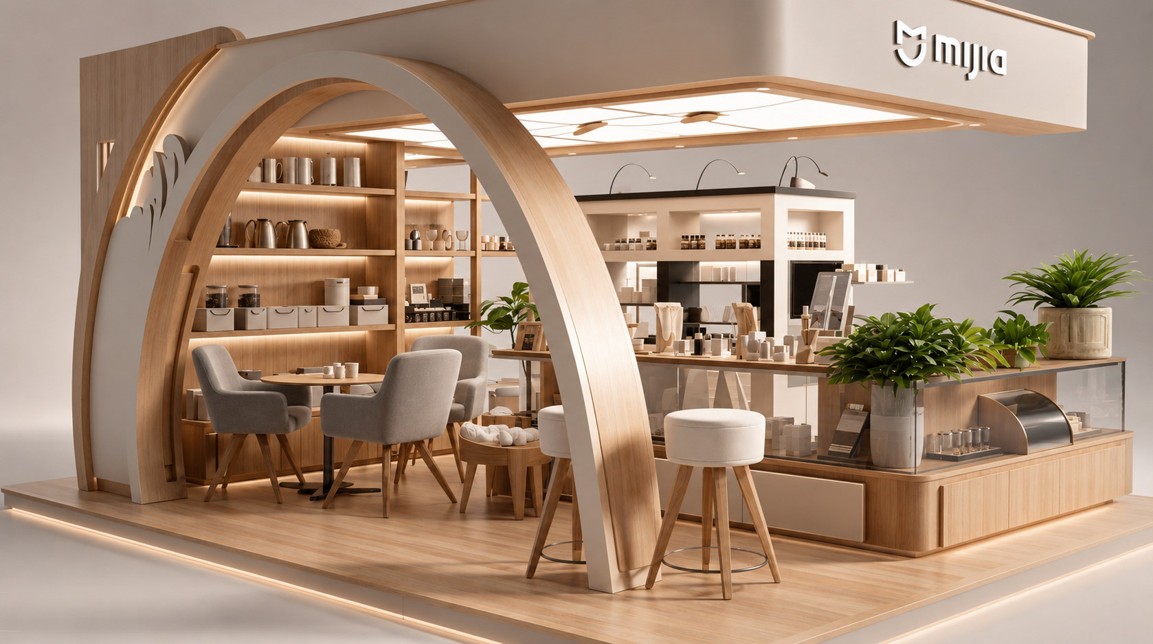
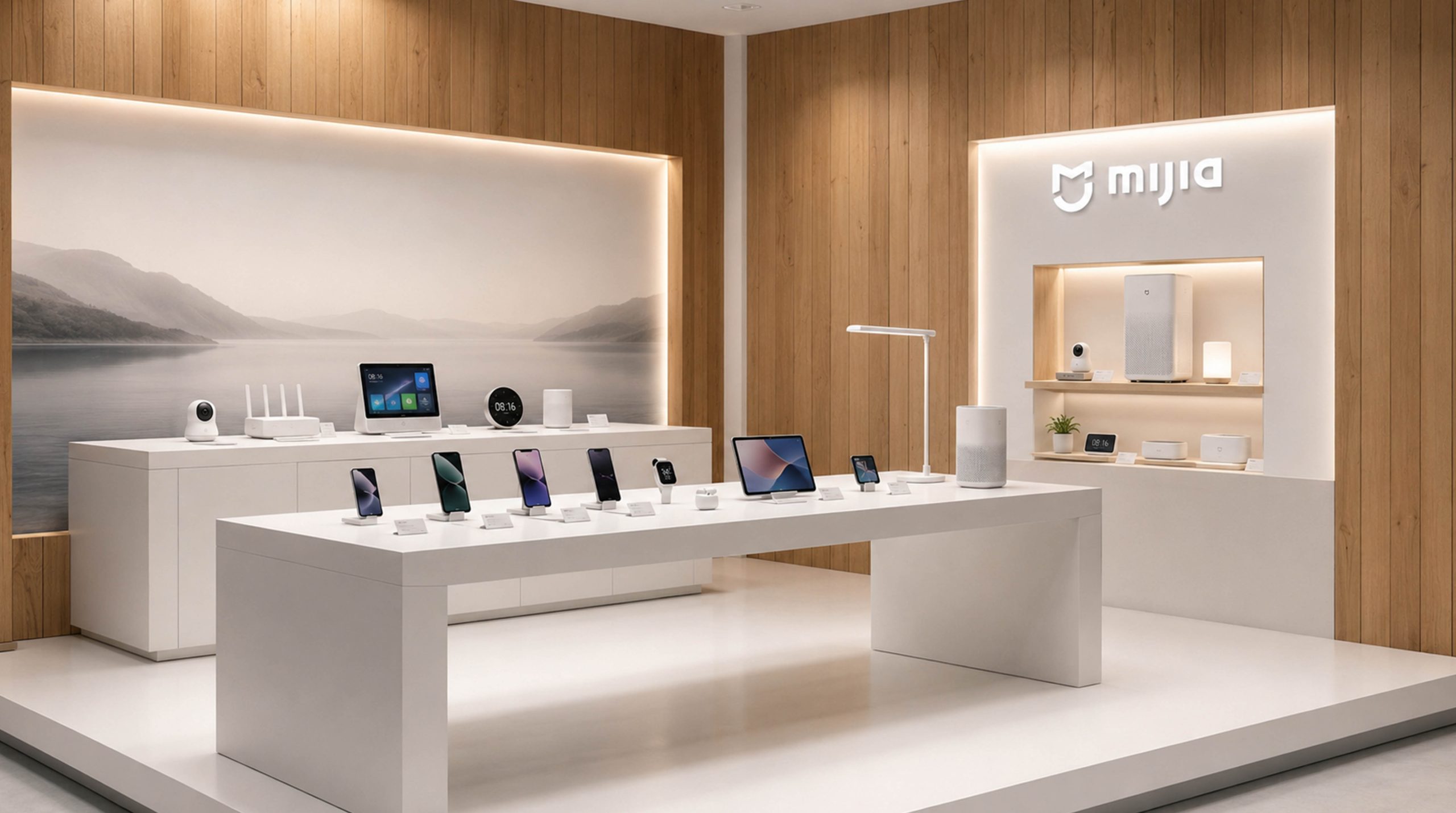
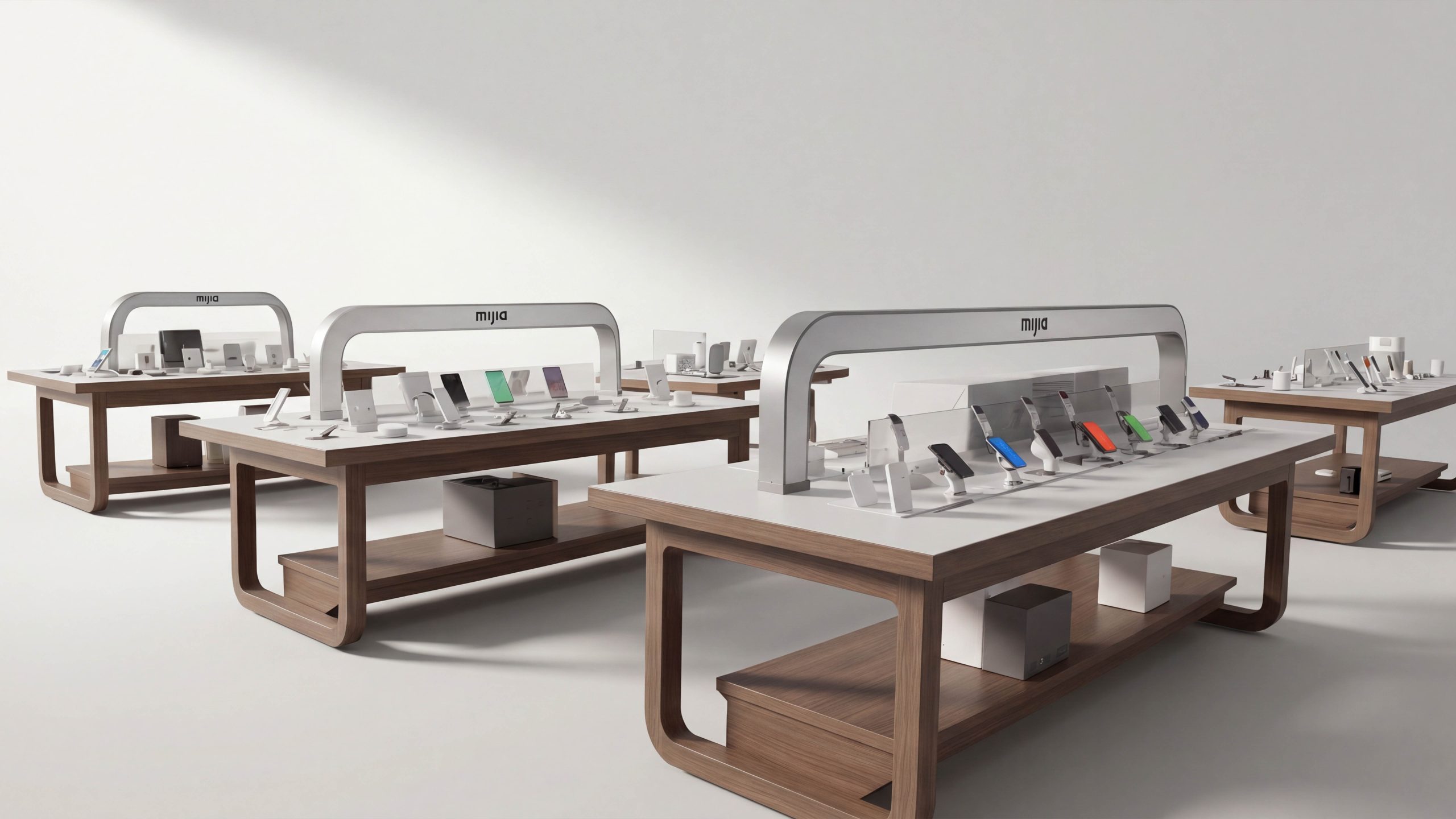
This case is an upgrade of MIJIA’s guidance and environmental recognition system. The source of the case is “Beijing Qingmei Future Advertising Design Company”. The scenes cover shopping mall stores and pop-up booths, urban experience halls, after-sales service points and back-end warehouse distribution.
Core goal: New customers can complete their positioning within three steps and make the correct choice with one visual inspection; repeat visitors can directly reach the target location through "muscle memory".
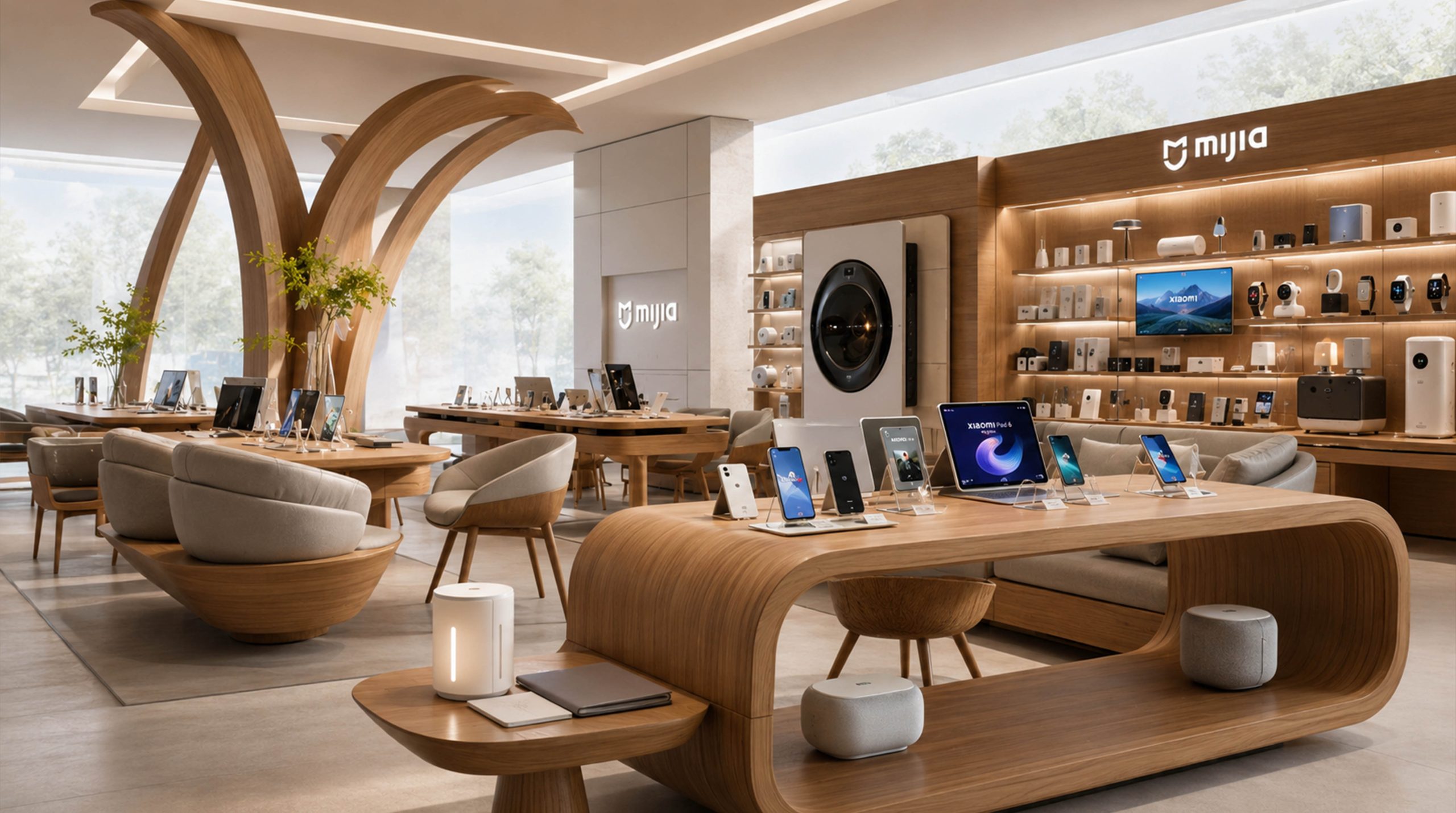
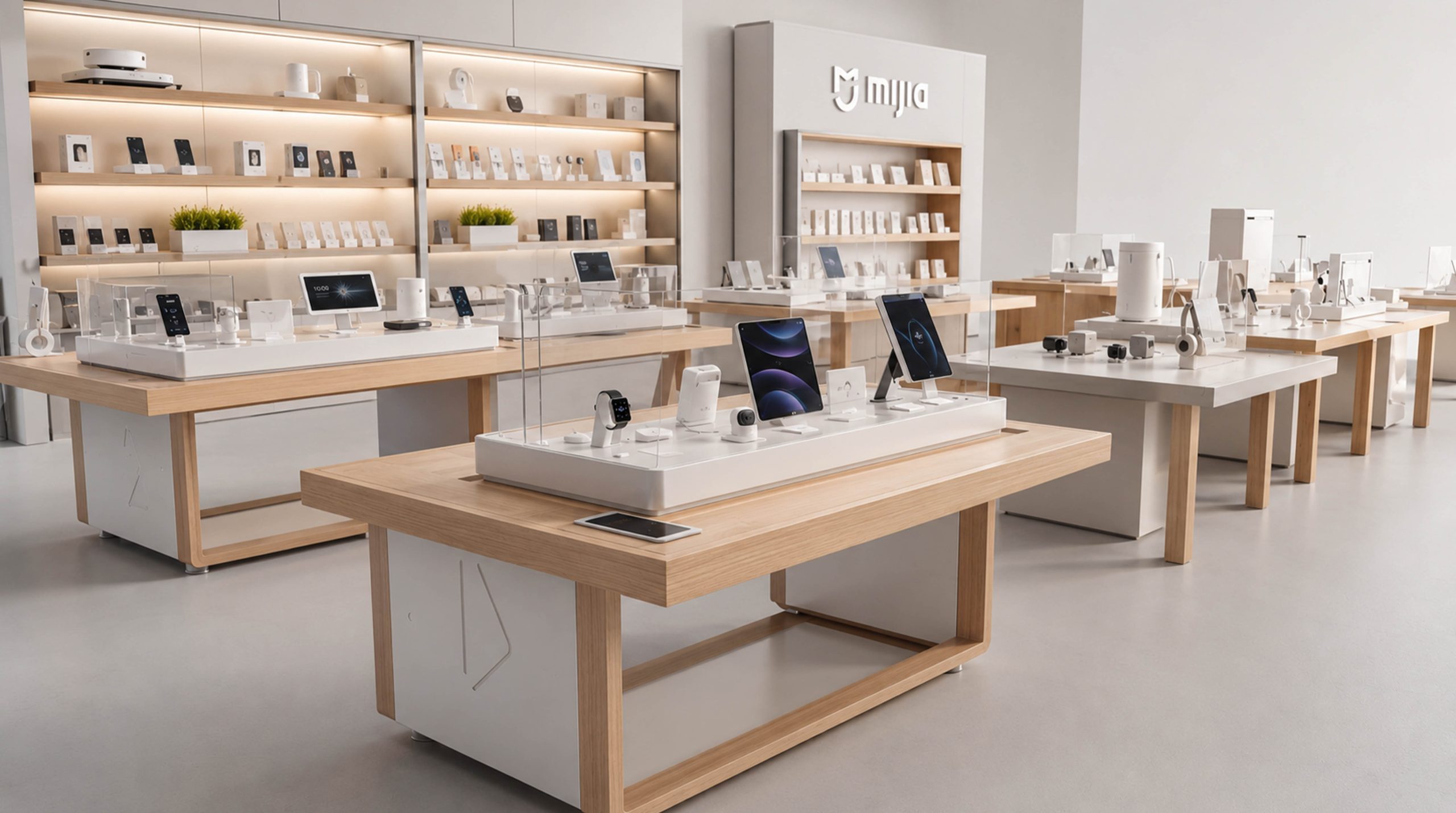
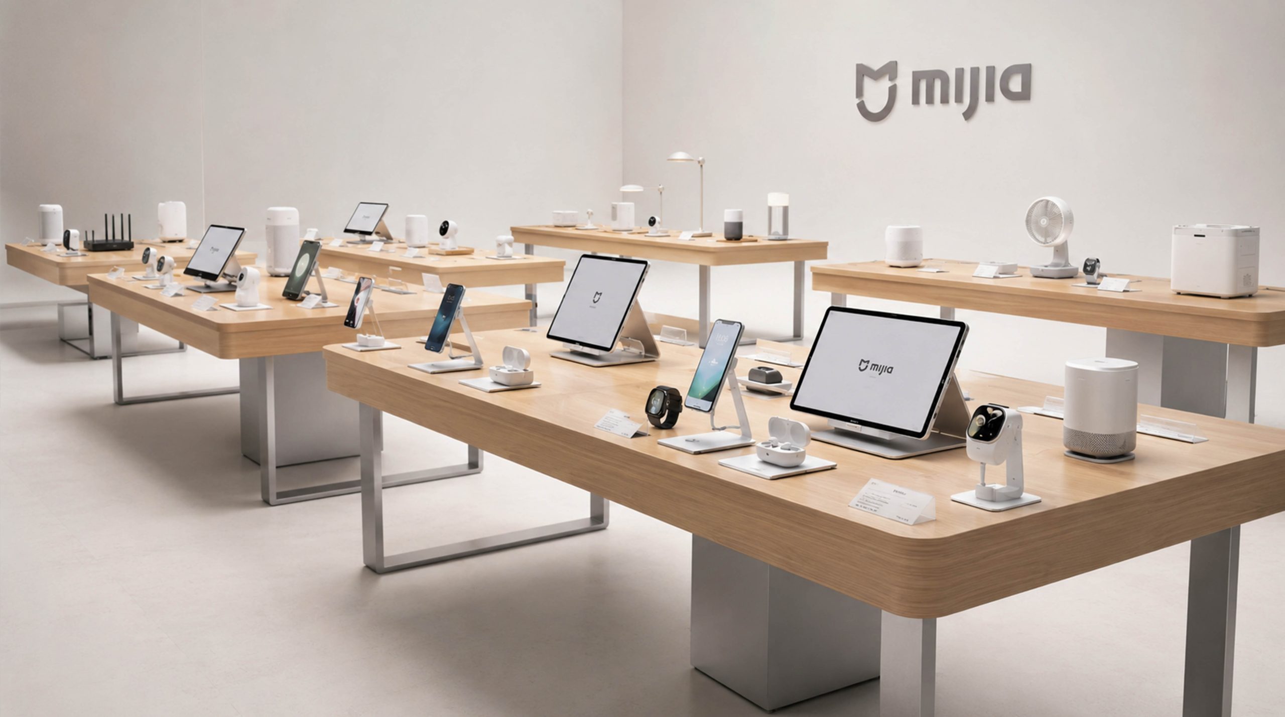
Research and strategy: Who-why-where-how it moves?
Crowd portraits: first-time customers (low familiarity, interest-oriented), repeat customers (direct categories), shopping guides and store managers (circulation, replenishment, demonstrations), installation and warehouse personnel (strong timeliness, night operations). Task chain: arrival-positioning-decision-execution-confirmation. Each link only retains the minimum set of information required to complete the task to avoid redundancy. Performance indicators: misdirection rate, inquiry volume, turning point dwell time, peak period heat map, NPS. Design principles: only give one action instruction at a time; be able to use icons without overloading words; be able to give warnings without pursuing complaints; take "you will know the right move at a glance" as a rigid acceptance criterion.
Information Architecture: 50-15-5 Hierarchical Reading and Semantic Encoding
50m identification layer (where am I): large characters on the lintel and flags on the facade, with simplified skeleton representation to first allow users to locate the brand and region. 15m decision-making layer (where to go): The first/secondary directional sign gives the only instruction (turn left/go straight/turn right), and optional distance prompts (choose one of m or number of steps) to avoid multi-command competition. 5m arrival level (I have arrived/how to do it): house number, shelf arrival, operation and regulation prompts; interactive equipment equipped with "three-step operation card". Semantic coding: adopt the four-segment coding of "Partition-Category-Sequence-Node", such as H-KIT-03-DW (Home Partition-Kitchen-Sequence 03-Dishwasher Position). The front-end interface only presents natural semantics, while the back-end retains full coding to support replenishment, inspections and repair reports. Multi-language strategy: Mainly Chinese, supplemented by English, with Japanese extensions reserved; establish contour baselines and character spacing tolerances, and unify units and numbers (m, F, B1) to prevent cross-language switching and line skipping. Icon library: Prioritize international symbols, expand Mijia scene icons (trial stand, filter element, brush head, energy efficiency demonstration, cloud service desk, trade-in), and output paper and electricity from the same library.
Typographic order: Engineering standards for grid, font, contrast and color
Grid system: 8pt baseline + 4/6 column variable grid, title, direction, description, and coding each occupy a fixed track to form a predictable reading rhythm; arrows are aligned along the main axis, and decorative tilts and gradient strokes are disabled. Font system: Chinese uses high-recognizability modern boldface; English and numbers use humanistic sans-serif with high x-height. The font size is converted to the minimum font height according to the 50-15-5 rule, and the reading of side-viewing and head-down angles is calibrated. Readability: normal contrast ratio ≥4.5:1; outdoor strong light and emergency ≥7:1. Prioritize keywords and directional words, put explanatory information later, and replace long paragraphs with short sentences. Copywriting tone: verb-based, result-oriented - "Go to the cloud service desk", "Go to children's home appliances", "Turn right 20 meters". Color system: Based on off-white-light wood-fog green, the functional colors are low in saturation and only bear the semantics of "zoning". The emergency colors strictly limit their uses to avoid color overload that affects migration.
Contact matrix and scene-based implementation: from entrance to shelf, from paper to screen
External import: shopping mall hanging flags/floor stickers - store entrance lintel - waiting queues, the strategy is "strong entrance identification + shortest moving line". The skeleton of the store: general index - "bone line" of the main channel - partition entrance notice - secondary confirmation of the turning point - arrival point number; set warning arrows 3-5 steps before the turning point to reduce the return rate. Shelves and experience: The top card uses "category + core benefit points", and the small sign between layers is "subcategory + sequence"; the experience area is equipped with a "three-step operation card", with repeated information strips at hand height. Digital consistency: Electronic screens follow the same grid and icon library as paper; QR codes are only responsible for "more information/appointments/repairs" and do not replace key directions. Adaptation of light and material: Use matt micro-textures and "dark edge" closing positions near lamp strips, skylight and high-reflective countertops to stabilize text edge contrast; set "turn back confirmation signs" on circular or looping streamlines to avoid getting lost.