










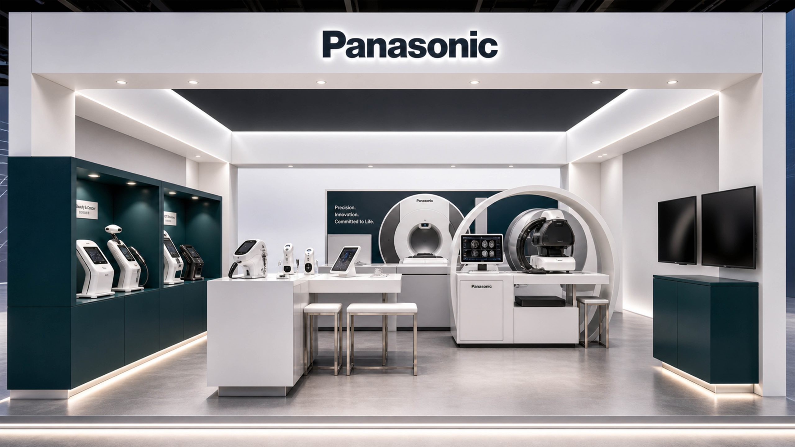
This case is an upgrade of Panasonic’s wayfinding and environmental recognition system. The source of the case is “Beijing Qingmei Future Advertising Design Company”.
Application scenarios include parks and R&D offices, after-sales service outlets, logistics facilities, stores and exhibition spaces. Adopting the path of "strategy first - information-based - order control - data closed loop", the brand's "reliable, precise, people-oriented" temperament is translated into a readable language in the space.
The goal is to allow first-time visitors to complete the orientation in three steps and make the correct choice with one visual inspection, allowing familiar users to quickly pass by relying on muscle memory, while ensuring consistent maintainability across materials, languages, paper and electronics.
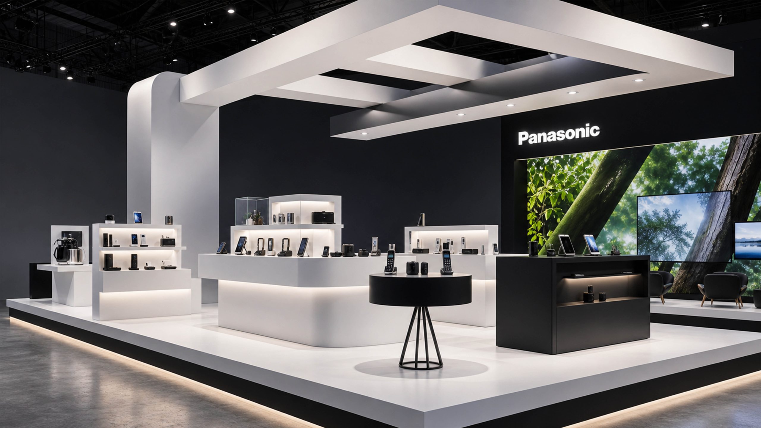
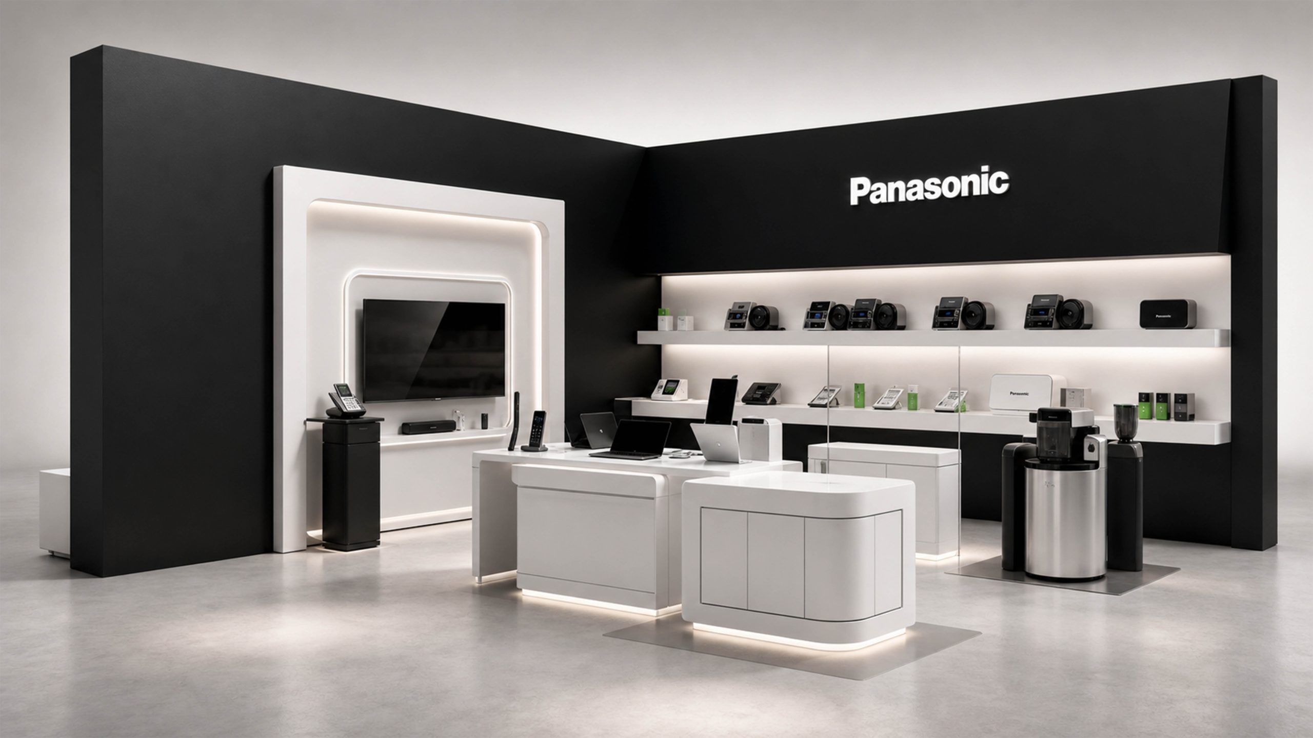
Information Architecture: 50-15-5 Hierarchical Reading and Semantic Encoding
Layered Reading Rules: 50 Meter Identification Layer: Solving “Where Am I?” Establish strong identification with the brand lintel, region name and simplified skeleton diagram. 15-meter decision-making layer: solving "where to go". Only give one action instruction (turn left/go straight/turn right), and provide distance or floor information if necessary. 5 meters to the point level: Solving the “I’ve arrived/what to do”. House number, function and operation prompts, including clear actions such as taking a number, reporting for repairs, making an appointment, etc.
Naming system: Adopt the four-segment coding of "park-building-floor-node", such as P-02-L3-SVC; present natural semantics to the public interface, and retain full coding in the background to support inspection and operation and maintenance.
Multi-language and icons: Chinese is the main language, English is the supplement, and Japanese extensions are reserved; contour baselines and character spacing tolerances are established to prevent line skipping when switching between languages. The icons give priority to international symbols, and supplement the secondary graphics of home appliance service scenarios (installation, trial washing, energy efficiency demonstration, after-sales reception, etc.), and output them from the same library for paper and electricity.
Format order: grid, font, contrast and color
Engineering standards grid system: 8pt baseline and 4/6 column variable grid, with titles, directions, descriptions, and codes each occupying fixed tracks to form a predictable reading rhythm. Arrows are aligned along the main axis of the layout and decorative tilting is prohibited. Font system: Chinese uses high-recognizability modern boldface; English and numbers use high x-height humanistic sans serif. The font size is converted to the minimum font height according to the 50-15-5 rule, and the reading from the side viewing angle and the head angle is calibrated. Readability: normal contrast ratio ≥4.5:1; outdoor strong light and emergency ≥7:1. Prioritize keywords and directions, and place explanatory text later to avoid information stacking. Color strategy: Based on the brand's dark blue and neutral gray, the low-saturated functional colors only carry the semantics of "partition/emergency" and do not convey decorative meanings with color to ensure portability and consistency. Copywriting tone: Verbs and result-oriented, such as "Go to the A2 elevator" and "Go to the after-sales reception desk"; avoid "warm reminder" redundant words and shorten the path of understanding.
Contact matrix: full-link application from campus entrance to device edge
Outdoor introduction: vehicle traffic-pedestrian traffic-building placement-visitor center-emergency evacuation, following "big information, less decision-making". The main card uses anti-UV and replaceable information layers to adapt to road and seasonal changes. Indoor guidance: general index - partition entrance notice - secondary confirmation of the turn - arrival point number - regulatory prompts, set warning arrows 3-5 steps before the turn to reduce backtracking. Stores and displays: Paper and electronics have the same layout, and electronic screens follow the same grid and icon library; SKU update data is driven, and QR codes are only used as "more information/appointments/repairs" and do not replace key directions. Complex light environment: The card surface close to the light strip, skylight and metal reflection area adopts matt micro-texture and "dark edge" closing to suppress halo; a waist-height low-position repeated information strip is added in the noise area to ensure instant recognition in noisy environments.
Project implementation and accessibility: making order deployable and maintainable
Materials and processes: fluorocarbon spray-coated aluminum plate and brushed stainless steel for outdoor use, matte paint and anti-fingerprint coating for indoor use; micro-reflective film is optional for night guidance. The fillet and chamfer radii are standardized, and the exposed edges are safely handled; the information layer adopts a magnetic or sliding structure, and maintenance does not require dismantling the main frame. Construction quality control: paper pattern - scale model - 1:1 prototype, read according to actual measurement of 5m/15m/30m; review glare and reflection at 3000K/4000K/6000K color temperature; check with BIM/electromechanical/fire protection tripartite coordinates, and the construction package has a built-in "tolerance list" and remedial measures. Accessibility: text, icons, colors, and tactile sensations are used together; key nodes are equipped with Braille and tactile strips, and voice prompts are provided where necessary; the installation height takes into account both "standing and sitting" dual sight lines, and a wheelchair turning radius is reserved at the elevator entrance and corners; "Direction/Service" and "Warning/Prohibition" are presented in separate zones to reduce cognitive load.