










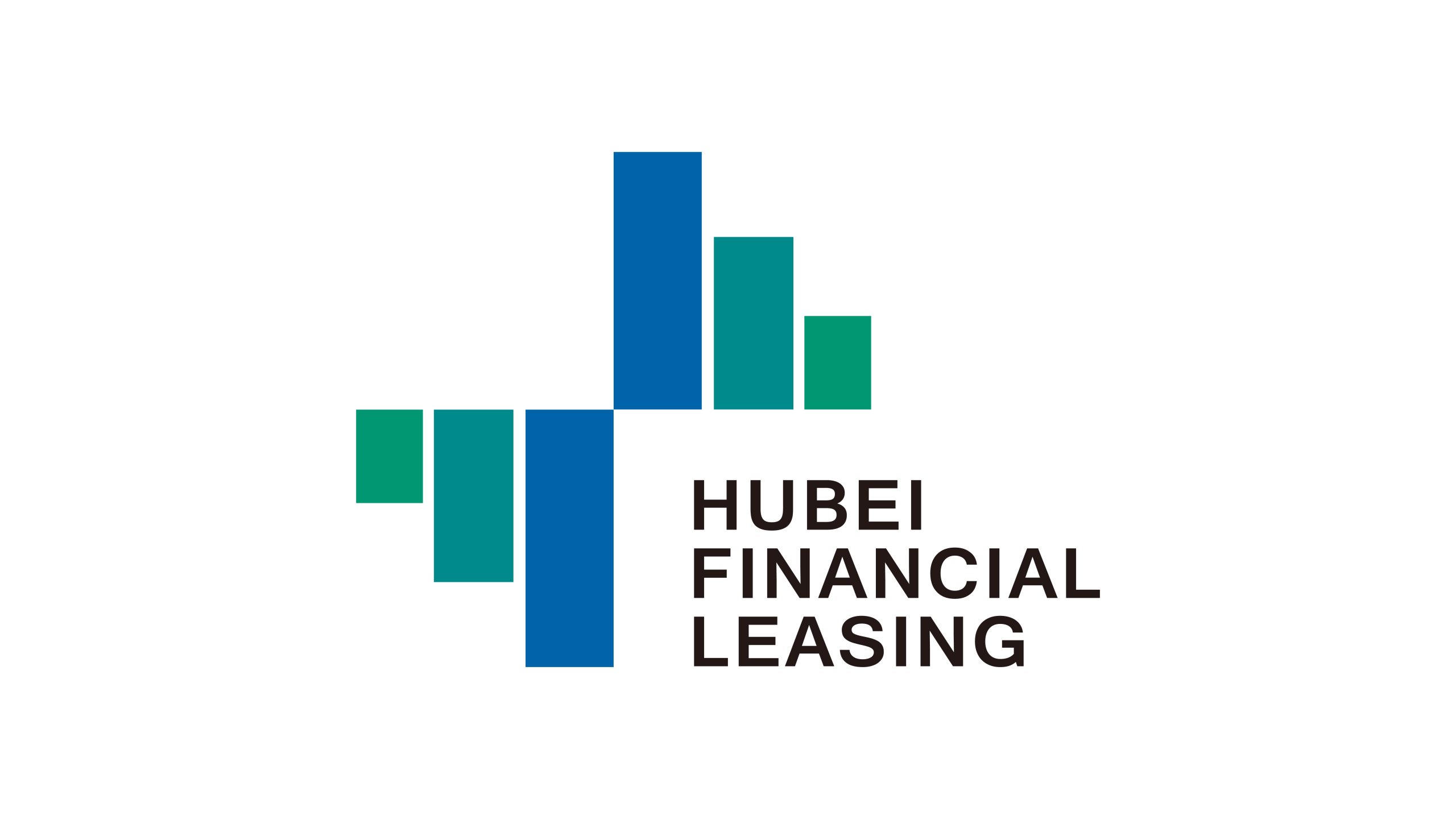
Hubei Financial Leasing Co., Ltd. is a professional financial institution specializing in equipment leasing, industrial finance and asset management.
As financial services digitize and industries accelerate their transformation, the company sought a new brand identity to establish a stable, professional and trustworthy image, while expressing its strategic commitment to “empowering industrial growth through finance.”
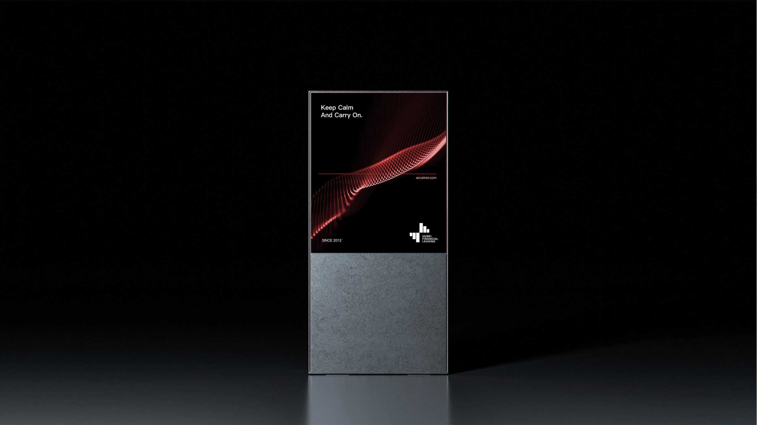
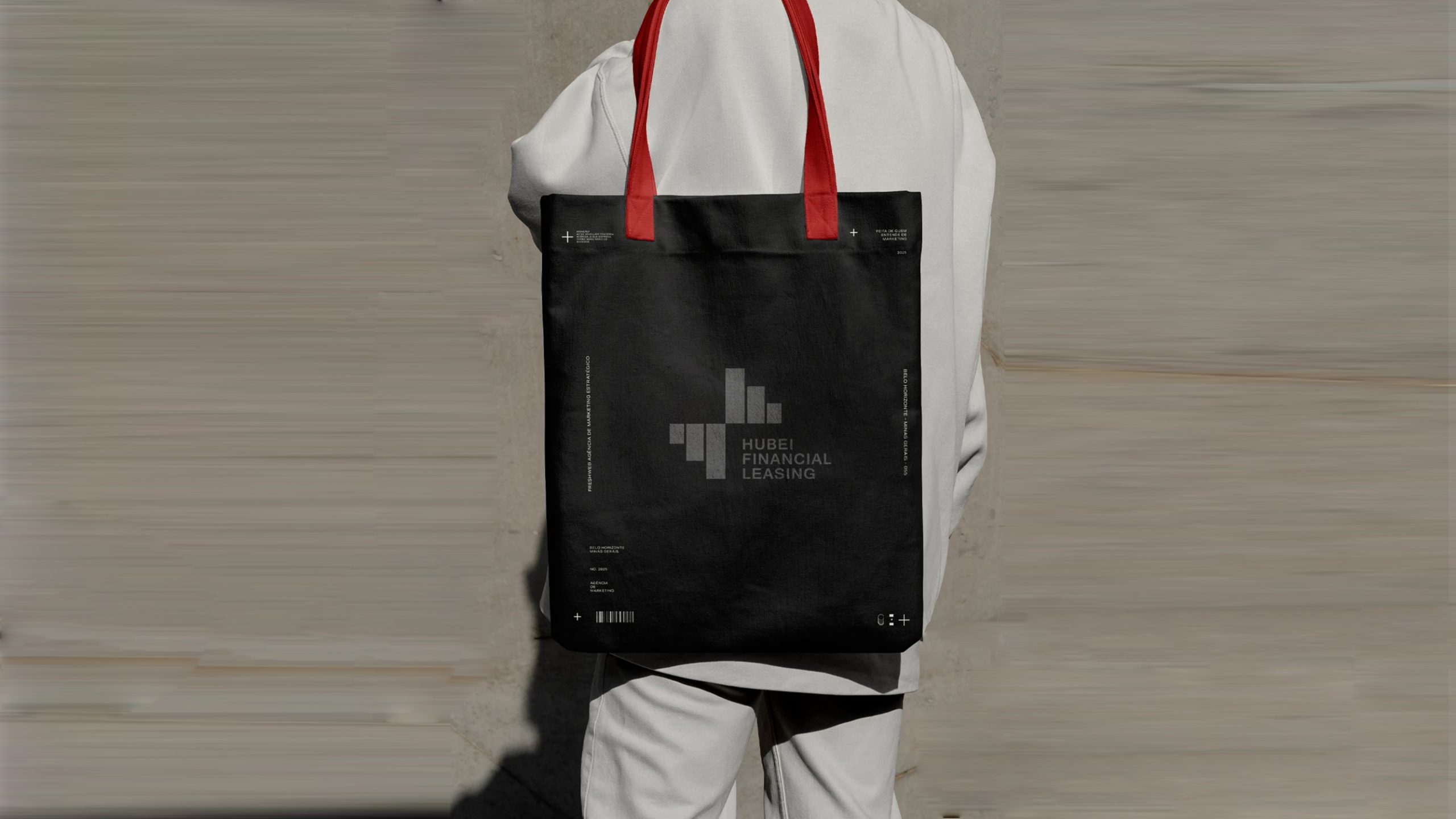
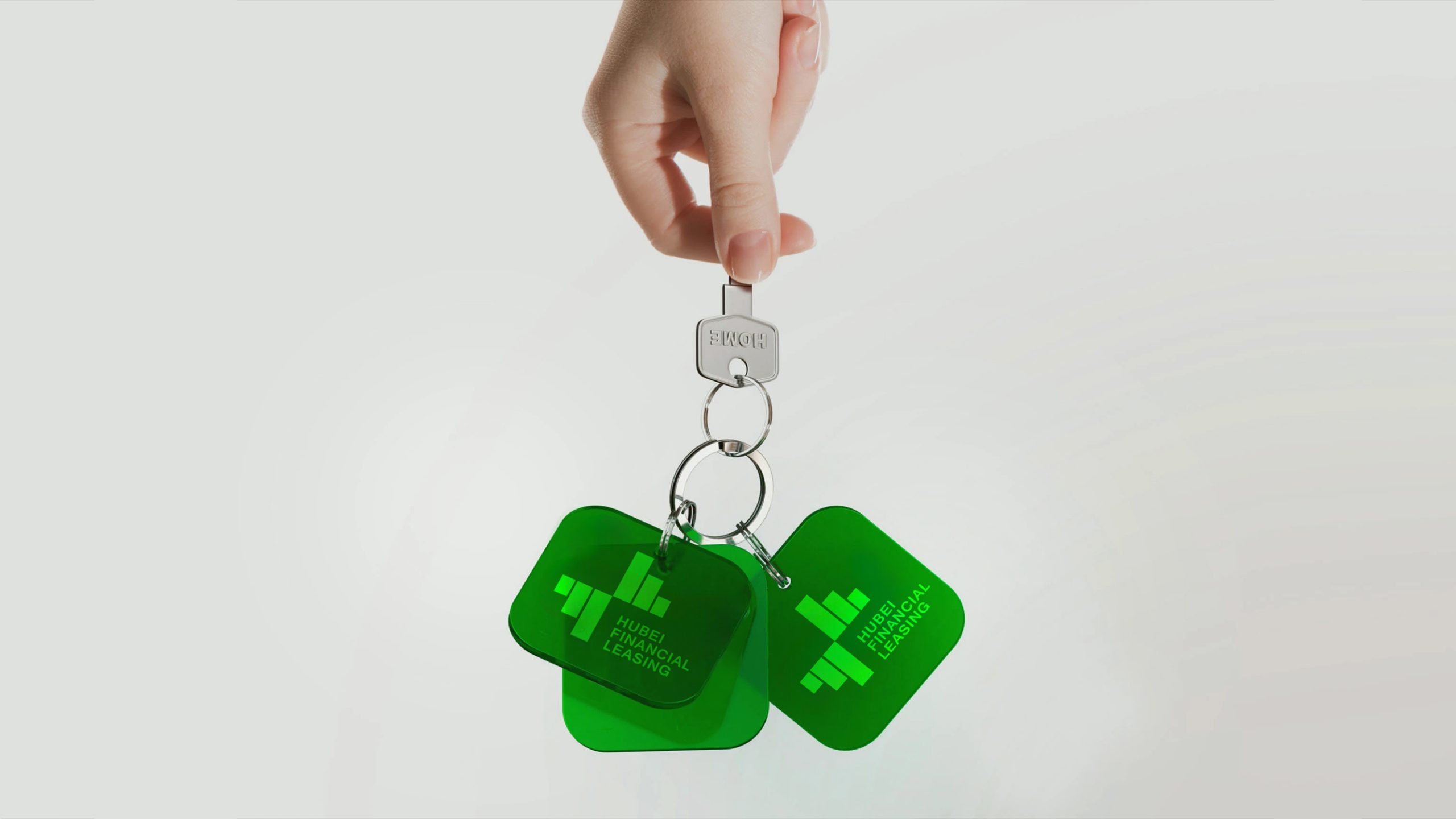
design concept
The logo is built around the idea of “financial order and industrial momentum.” A simple geometric matrix of vertical columns evokes the flow of capital and the growth of industry. Inspired by financial charts and the urban skyline, it expresses the interdependence of capital and industry. The composition rises steadily, suggesting sustained business growth and increasing client value. Its brand promise: “Building new heights of growth through the power of finance.”
graphic language
Vertical columns represent the interconnected dimensions of capital, industry, assets and services. Their rising heights signal steady business growth and the upward momentum of the regional economy. A centrally balanced composition conveys the financial sector’s emphasis on balance, rationality and structured thinking. The open arrangement and central negative space suggest transparency and the free flow of finance. The result is composed yet dynamic, with strong recognition and broad visual potential.
Fonts and composition
The English HUBEI FINANCIAL LEASING is set in a sans-serif with clean lines and precise proportions, conveying the rigor and international character of modern finance. For the Chinese name, a steady sans-serif or Source Han Sans is recommended for visual harmony. A horizontal layout, with the symbol on the left and text on the right, reinforces order and balance. Carefully controlled spacing keeps the logo legible on screen and in print.
color system
Financial Blue #2E6BAF conveys rationality, stability and trust, making it the primary color. Teal Green #3A887E represents growth, partnership and sustainability. Dark Gray #333333 adds authority and professionalism. White space enhances visual clarity and signals transparency and credibility in financial services. The blue-to-green gradient balances composure with energy, expressing a financial brand that is both stable and innovative.
Application and extension
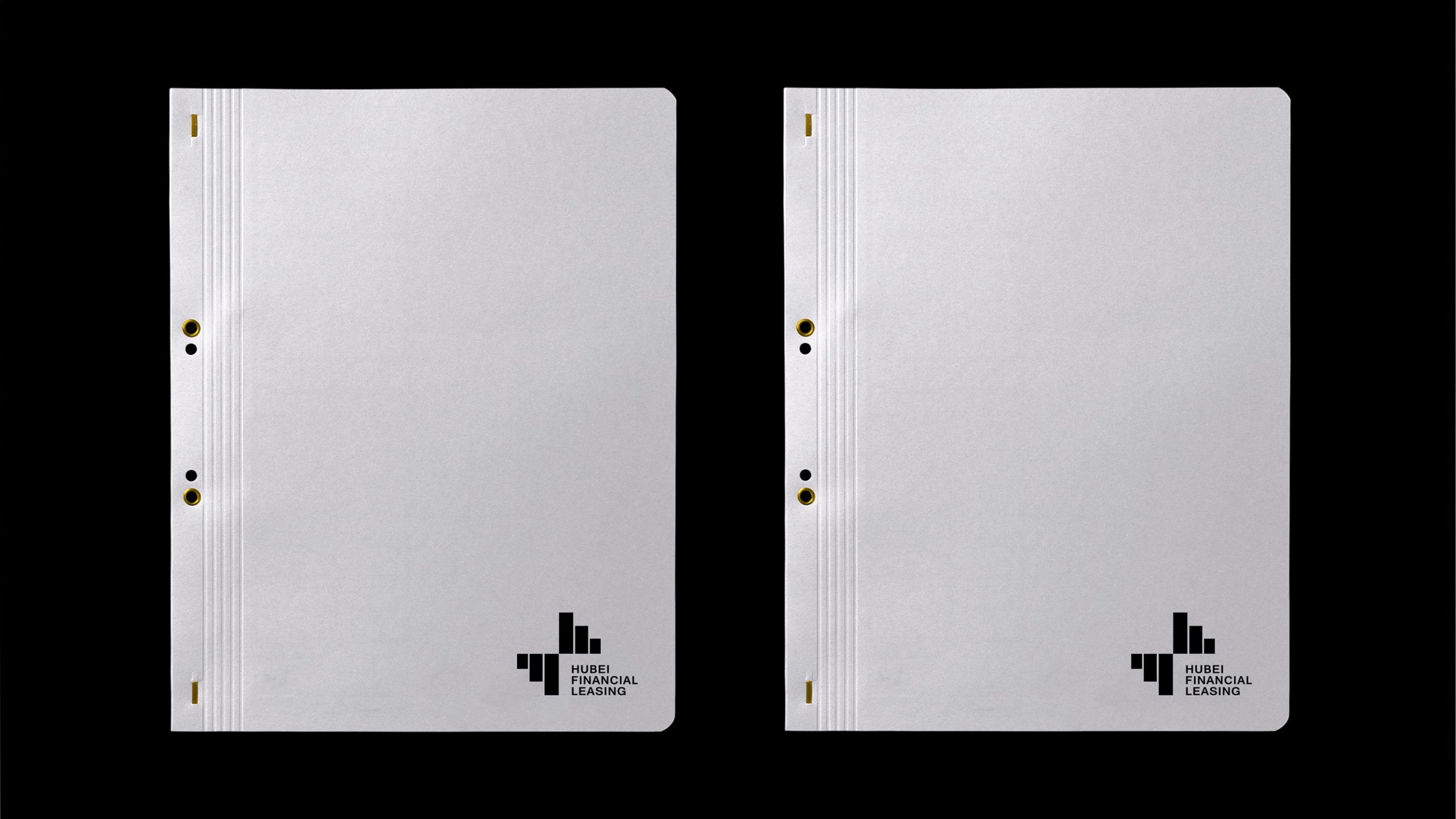
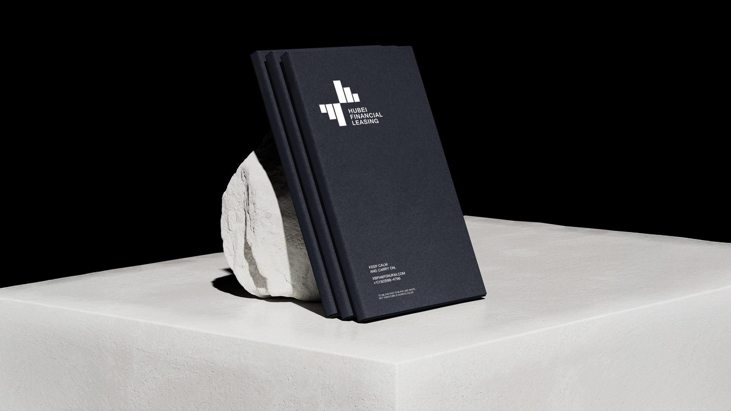
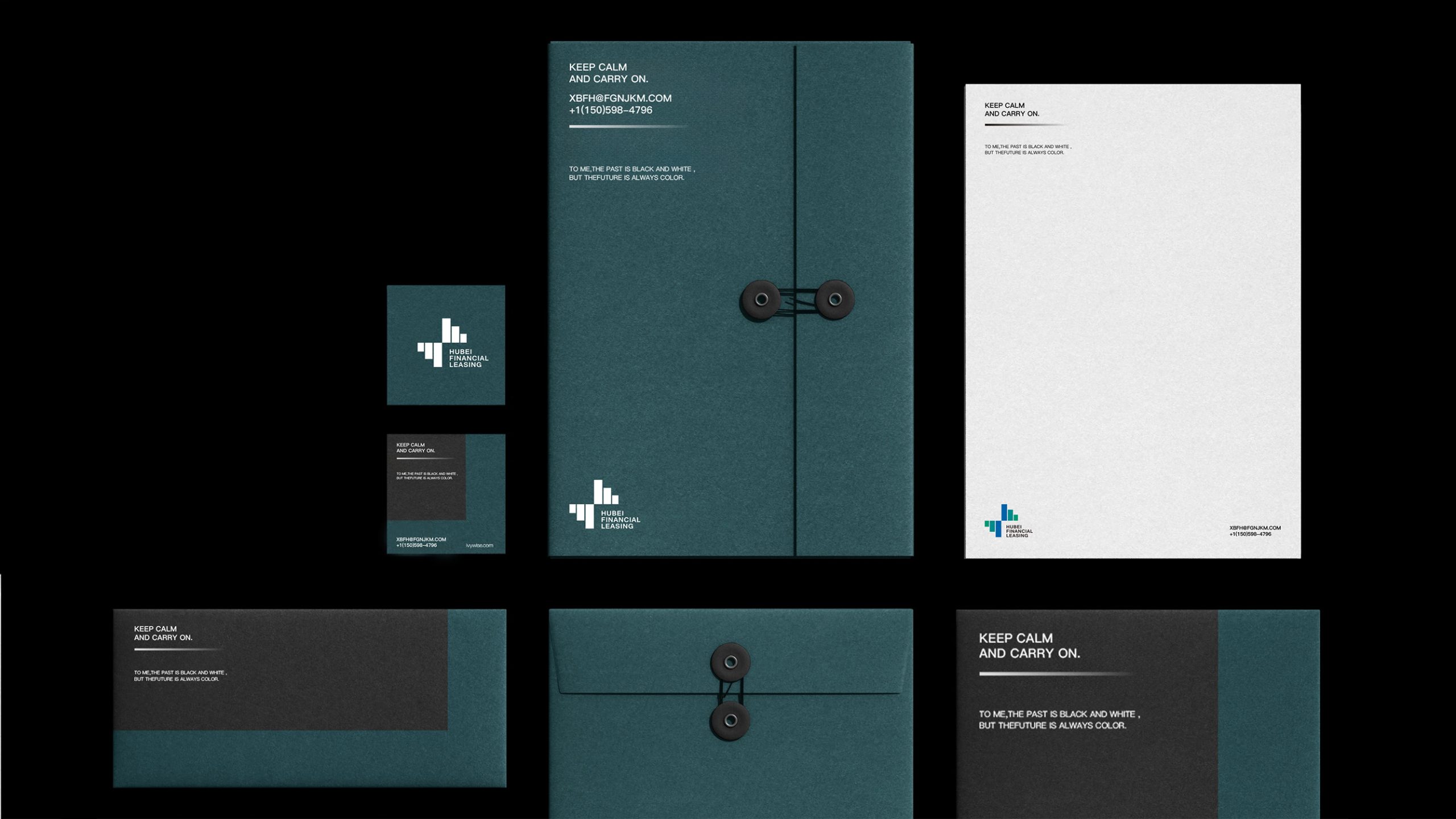
The logo’s systematic structure makes it suitable for corporate stationery, financial reports, websites, payment documents, business cards and building signage. The column motif can stand alone or extend into animated bar charts and data-flow sequences for promotional films and digital platforms. It can also become a matrix-pattern backdrop for financial events and investment materials, strengthening the brand’s technological character. Across print, physical spaces and digital channels, the logo retains a high level of recognition and professionalism.
brand meaning
The logo reflects Hubei Financial Leasing’s pivotal role in the value chain: connecting capital with industry, balancing risk and return, and supporting sustainable regional growth. Blue represents financial discipline; green represents industrial growth. Together, they form a visual metaphor for shared progress. The composition expresses the brand idea: “Finance is the leverage, leasing is the bridge, and growth is the result.” By translating financial logic into visual order, the logo builds trust and strengthens the brand’s international presence.
Improper Usage (Protection Specification)
Do not change the number or proportions of the columns. Do not alter the order of the blue and green colors or the direction of the gradient. Do not add shadows, outlines, reflections or other non-standard effects. Do not tilt, stretch or rotate the logo. Maintain a symbol-to-wordmark proportion of 1:1.3. Minimum display width: 25 mm.
design results
Since the new logo was introduced, Hubei Financial Leasing has increased its recognition among financial peers and partner organizations by 45%. The blue-and-green matrix has become a distinctive asset in the company’s brand communications. The visual system now works cohesively across digital platforms, investment reports and office environments, presenting a stable, modern and international image. Qingmei Future has included the design in its collection of landmark finance and capital brand systems, where it stands as a model for modernizing financial institution identities.