










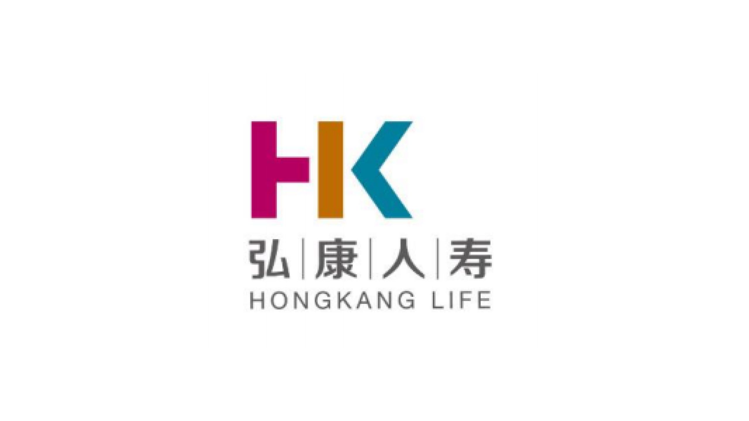
Hongkang Life Insurance Co., Ltd. is a life insurer built on the core strategy of “technology-enabled financial wellbeing.”
The identity conveys a corporate image of stability, warmth and innovation, creating a visual identity system with a modern spirit and a strong sense of trust within the traditional insurance industry.
The mark plays a central role in the brand upgrade, connecting corporate culture, customer trust and the digital service experience.
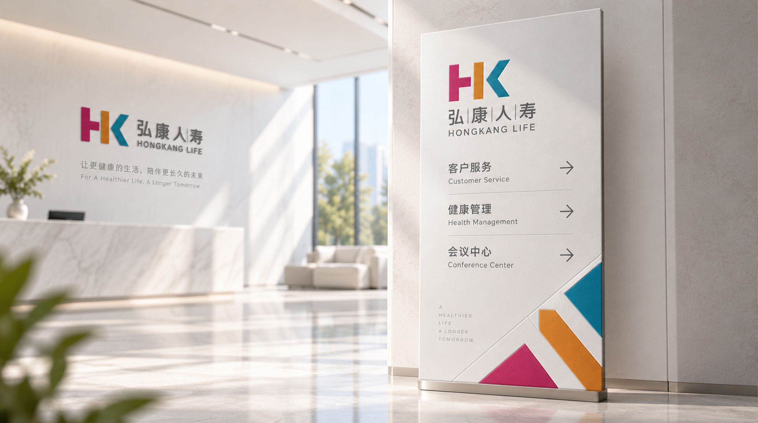
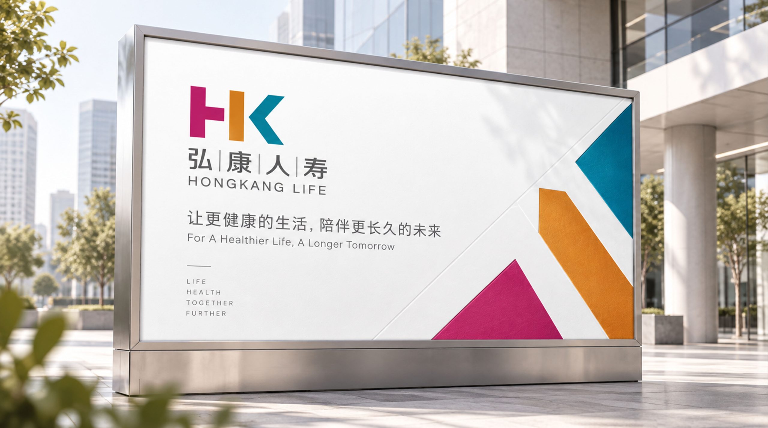
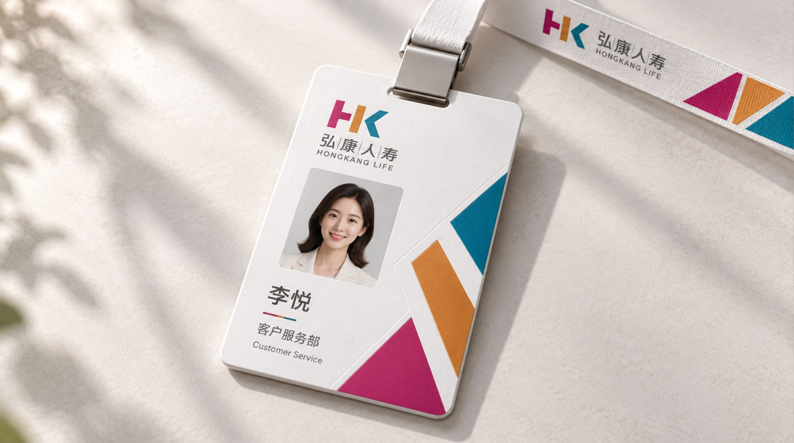
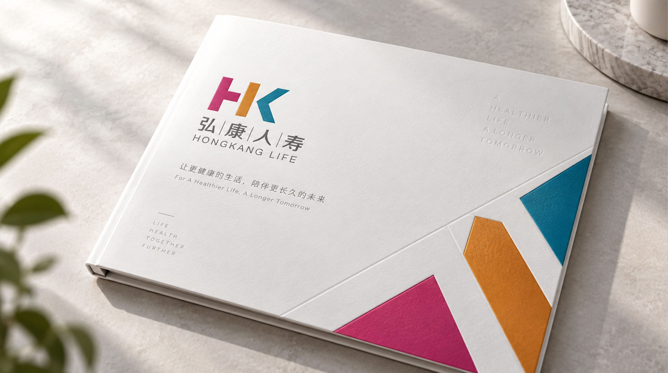
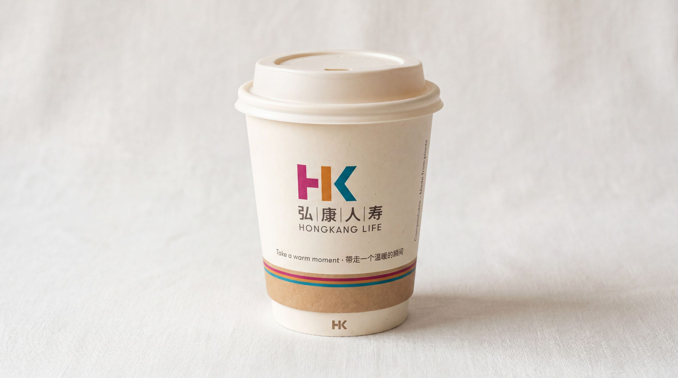
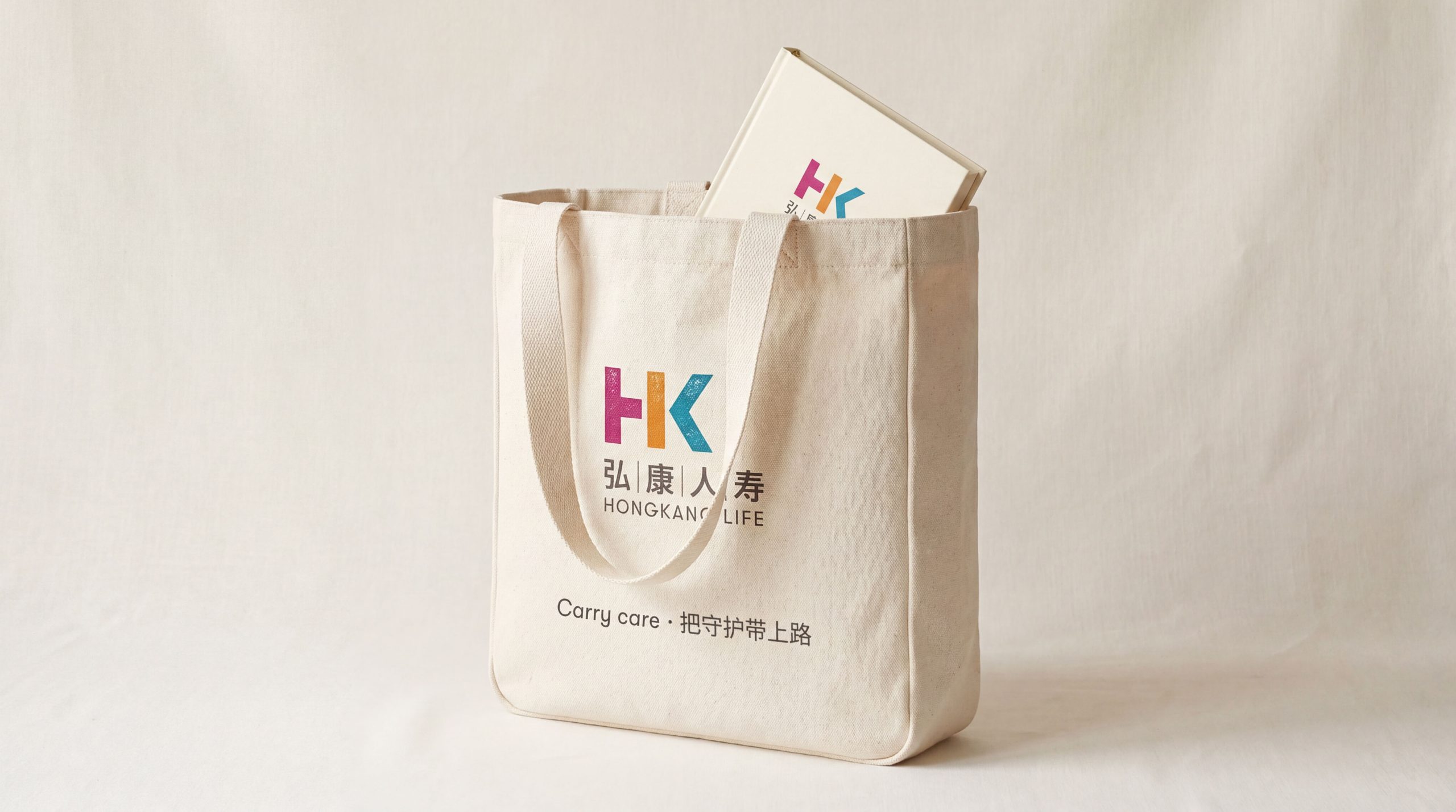
design concept
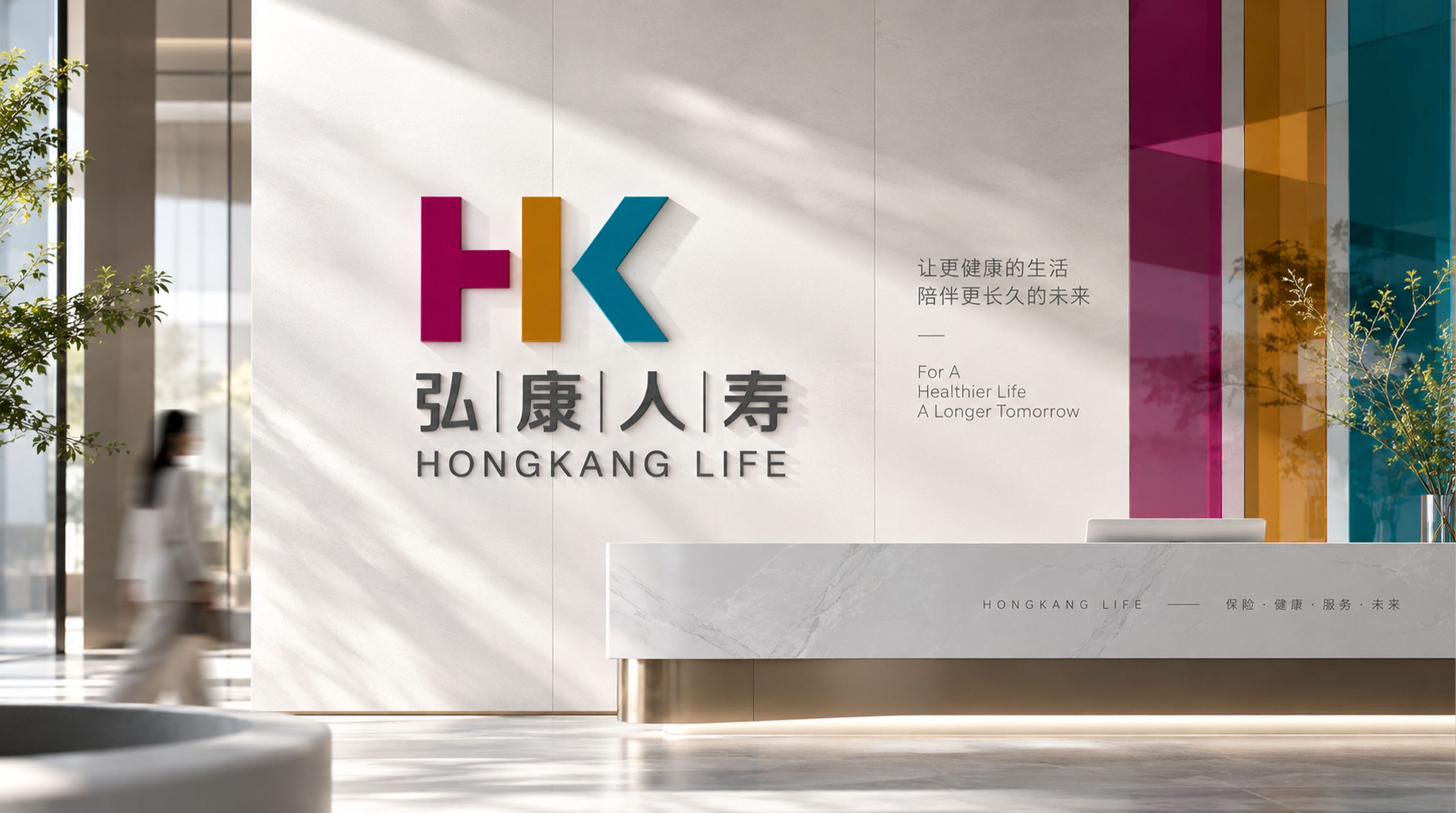
Built on the letters “HK,” the initials of Hongkang, the mark uses geometric segmentation and layered color to express healthy life and balanced growth. The guiding idea: “Color conveys the warmth of life; structure expresses financial strength.” The HK pairing represents the company name while also alluding to the brand values of Harmony and Kindness.
graphic language
Geometric segmentation: vertical and diagonal strokes in the H and K create visual balance, symbolizing stability and drive; Three-part color structure: represents the company’s three core pillars of Protection / Health / Growth; Vertical of the H: the support of life and the company’s stable foundation; Diagonal of the K: innovation, action and future direction; Overall form: clean, modern and international, suited to the professional character of finance and insurance.
Fonts and composition
The Chinese name is set in a steady modern sans-serif with generous spacing and clear strokes, conveying reason and trust. The English HONGKANG LIFE uses a medium-weight sans-serif adapted from Helvetica Neue, proportioned to the symbol for stronger international recognition. The stacked bilingual layout reflects a brand that bridges East and West with openness.
color system
The brand palette is built from three primary colors, creating visual zones and symbolic values: Rose (#C2185B) — passion, care and human warmth; Golden Orange (#F28C28) — vitality, health and a sunny outlook on life; Deep Blue (#0073A8) — the rationality of finance and trust in technology. Together they form a “spectrum of life’s warmth,” highly recognizable and memorable across media.
Application and extension
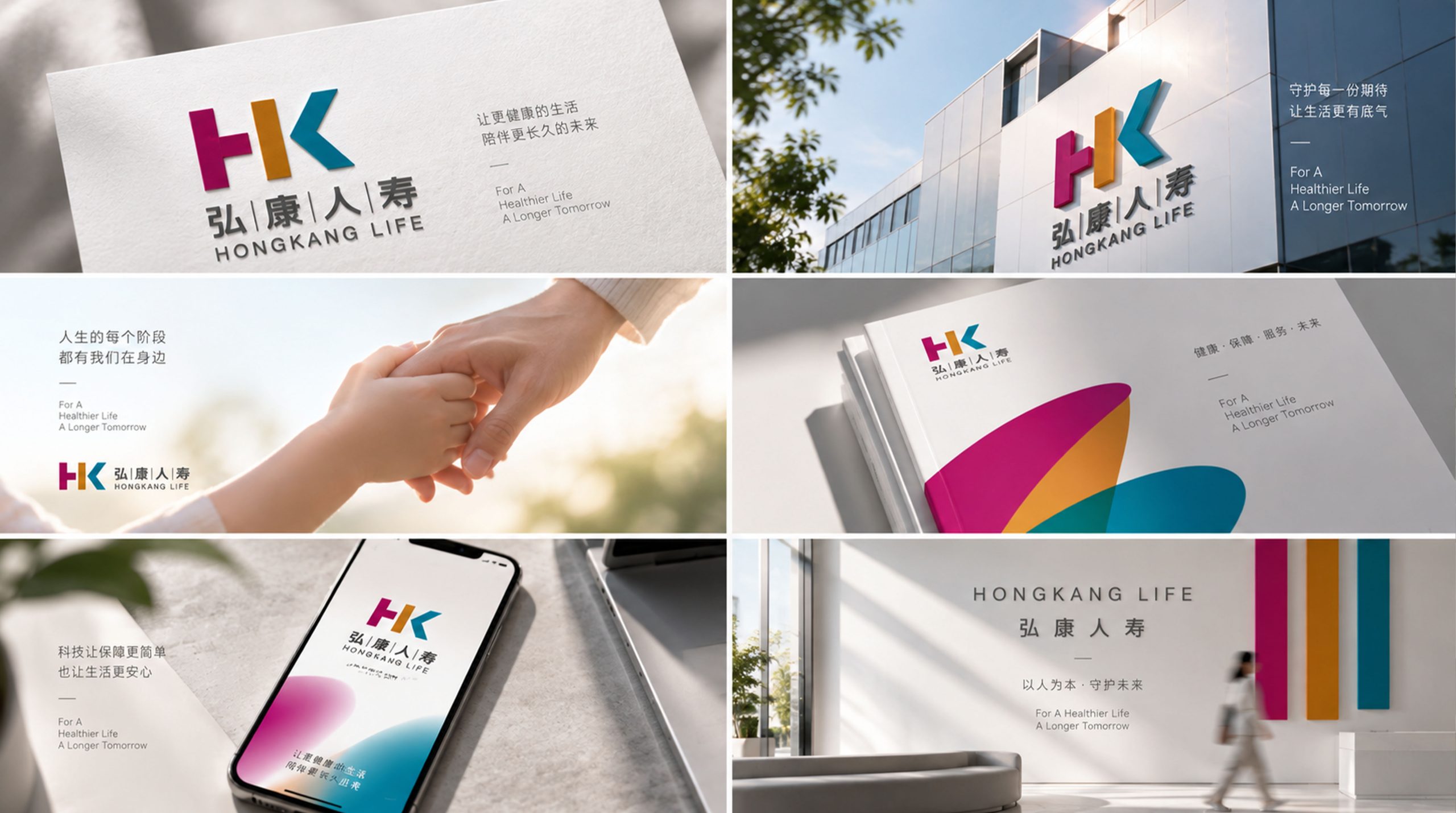
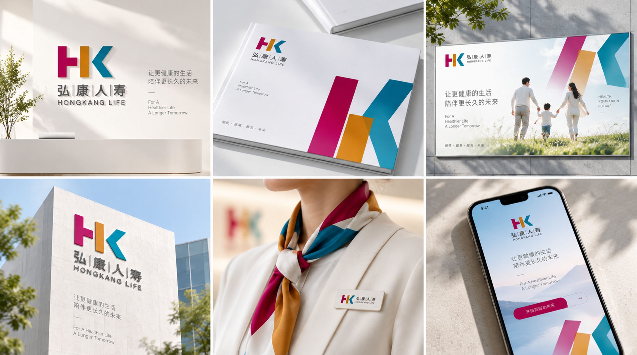
The mark applies to: headquarters, branch offices, policy documents and envelopes; mobile app and digital insurance service platforms; TV advertising, outdoor media and client gift programs; annual reports, brand videos, ESG report covers and more. The HK symbol can also stand alone as a corporate icon across digital touchpoints and brand merchandize.
brand meaning
The Hongkang Life logo reflects three brand values: Broad Vision, foresight and perspective that build an open insurance ecosystem; Health, a focus on health protection and the value of life; Life, respect for the meaning and continuity of each individual life. Together they express a modern insurance brand built on financial stability and care for life.
Improper Usage (Protection Specification)
Do not stretch, skew or alter proportions; do not replace or rearrange the three colors; do not add shadows, outlines or gradients; maintain clear space ≥ 25% of the symbol height; minimum display width: 28mm.
design results
Recognized within the industry as “the warmest visual identity in life insurance,” the mark successfully delivered the brand’s rejuvenation and modernization, and significantly raised brand recognition in customer satisfaction surveys. Qingmei Future led the visual system upgrade and designed its application guidelines.