











As one of China's foremost institutions of operatic art, Beijing Opera House carries the vital mission of preserving and innovating traditional Chinese theatrical culture.
The logo design aims to reshape 'contemporary expression of national art' through modern visual language while preserving the spiritual essence of traditional opera.
The design serves not only the theater's identity system but also posters, cultural products, and international communications, embodying the convergence of 'traditional art × contemporary design.'
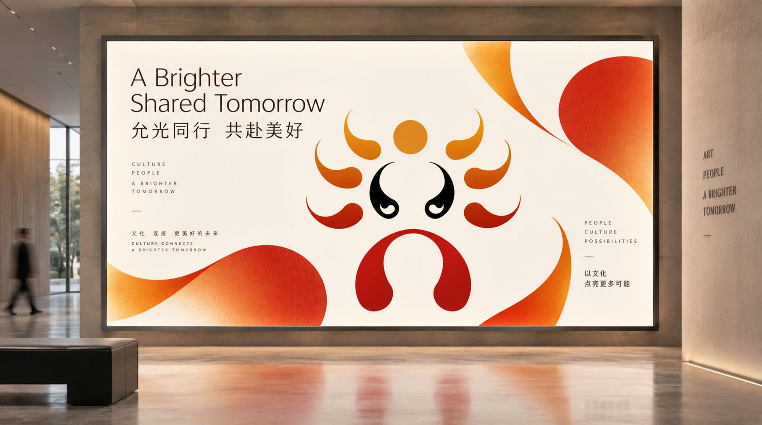
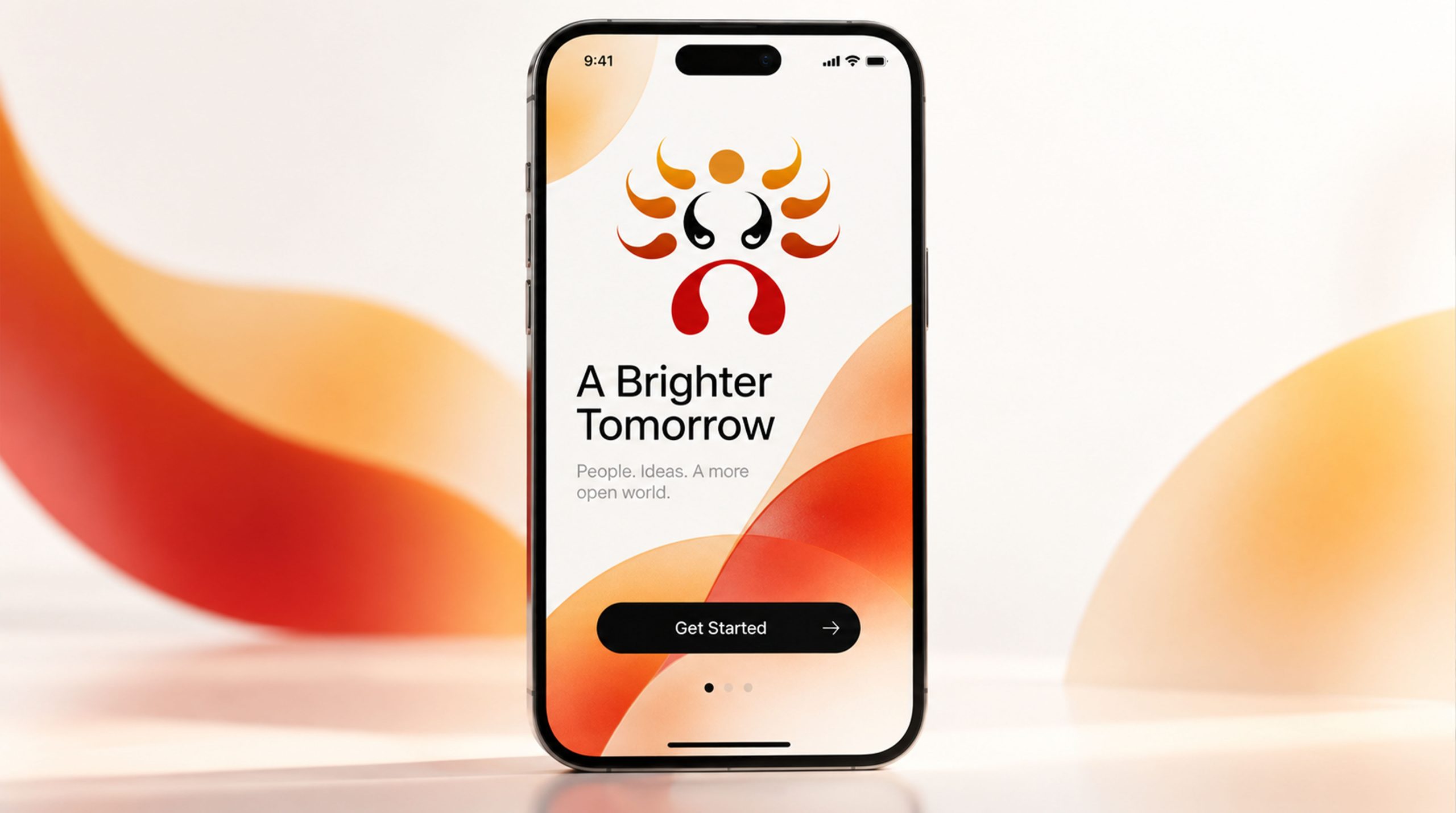
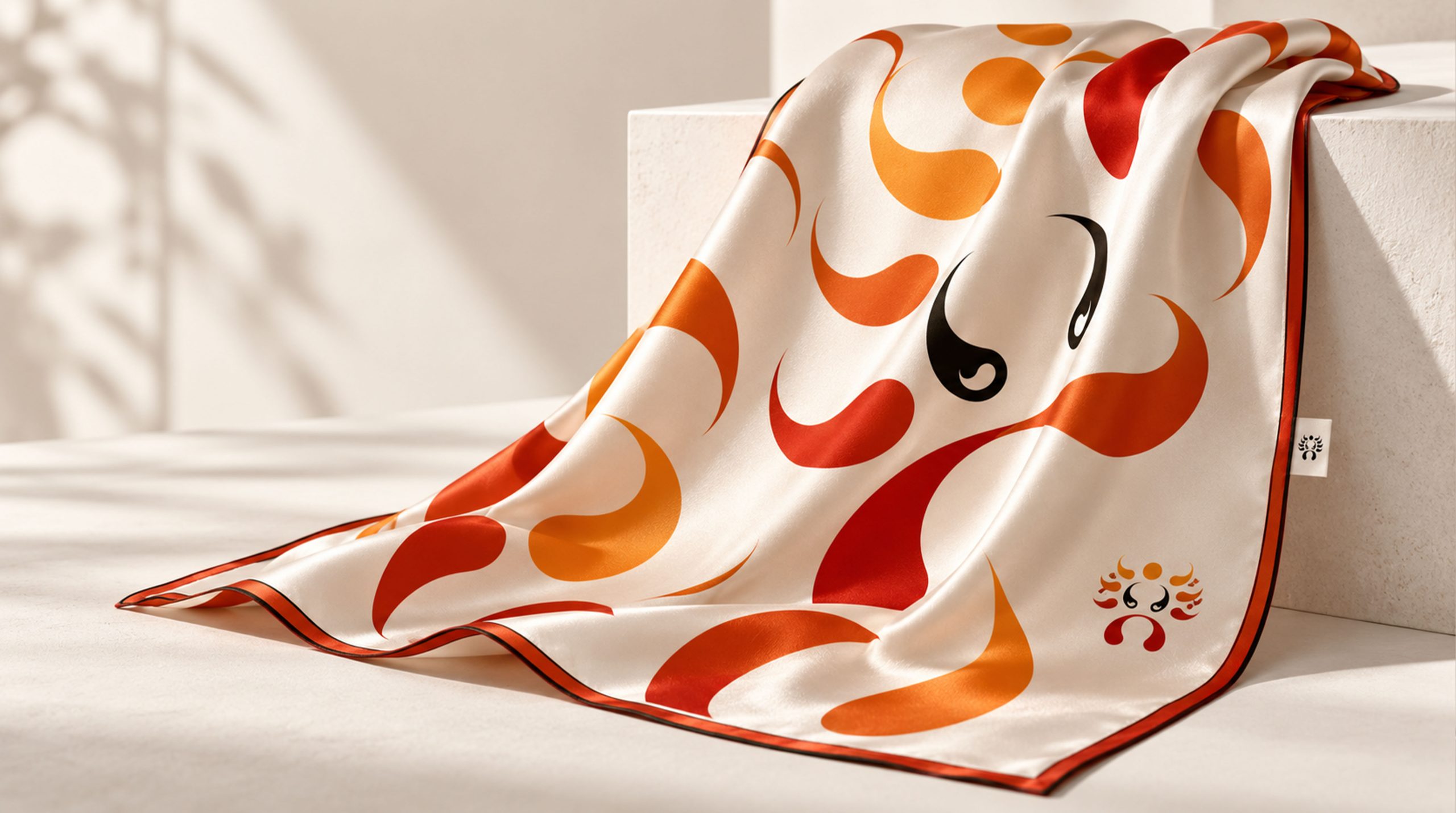
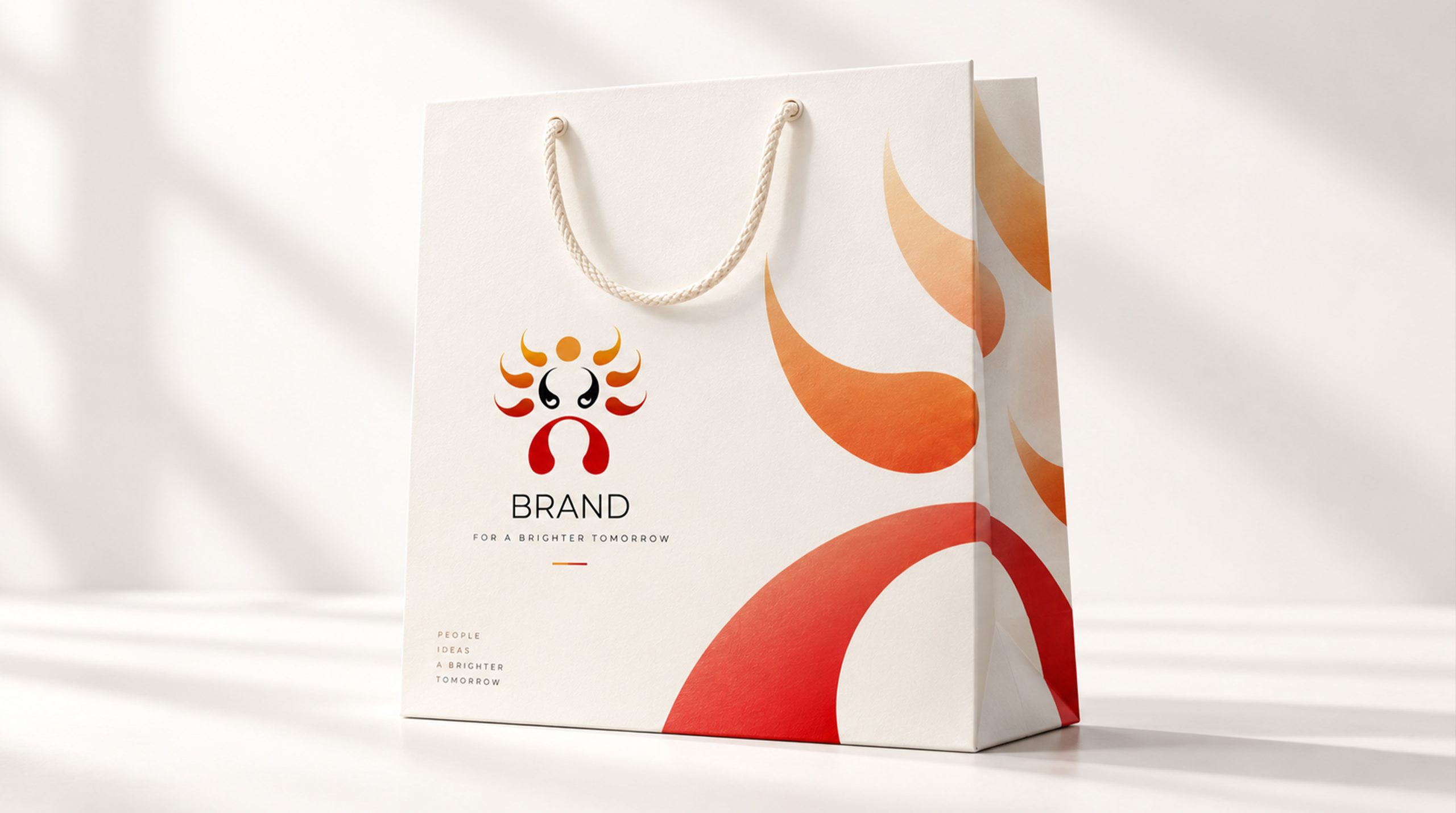
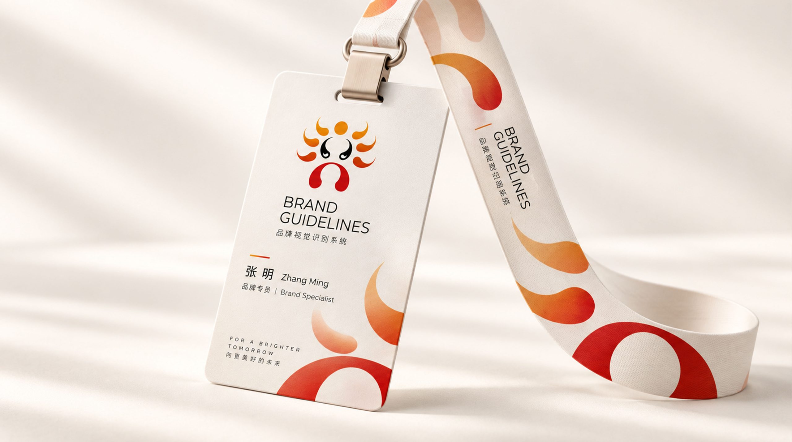
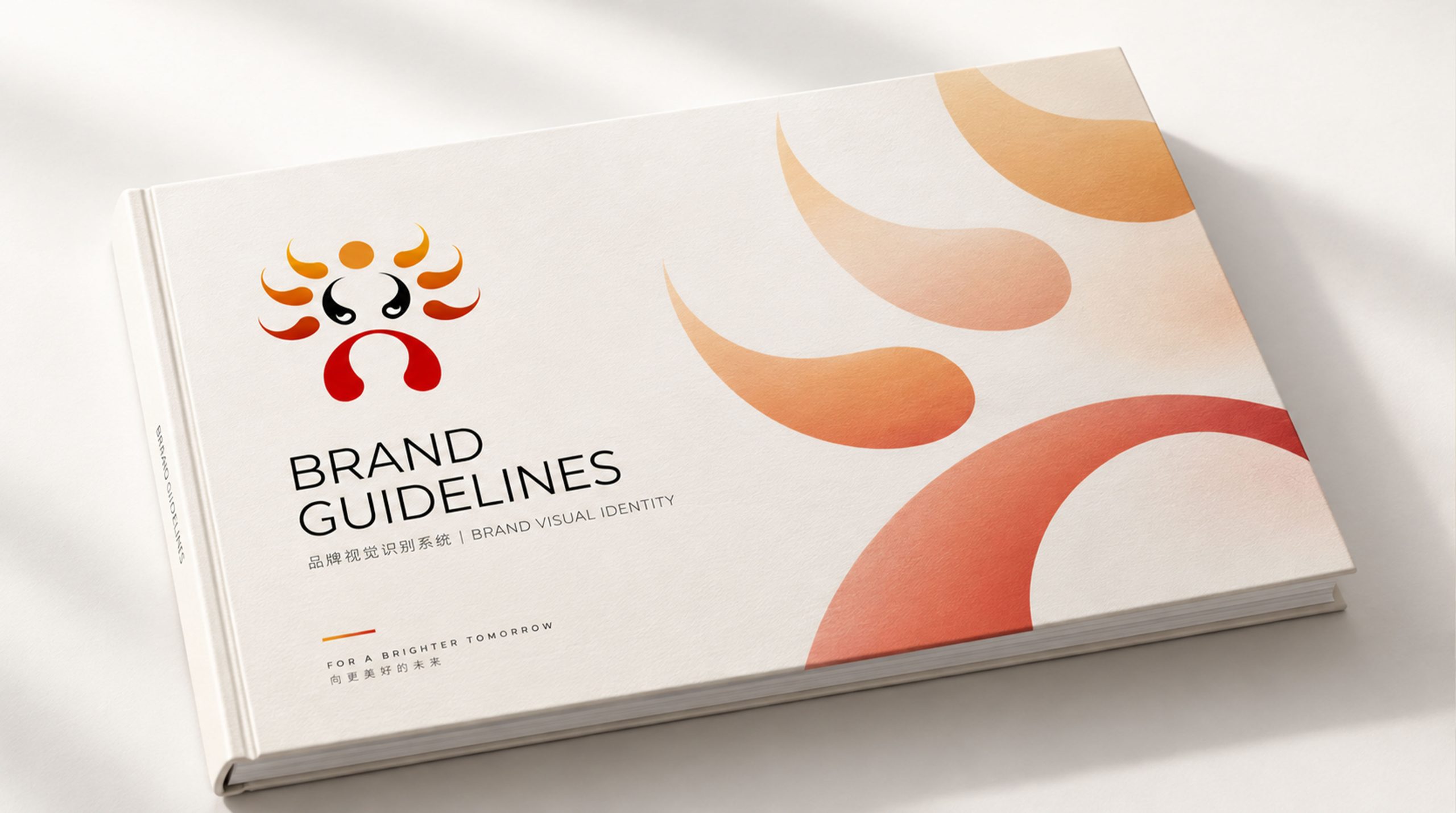
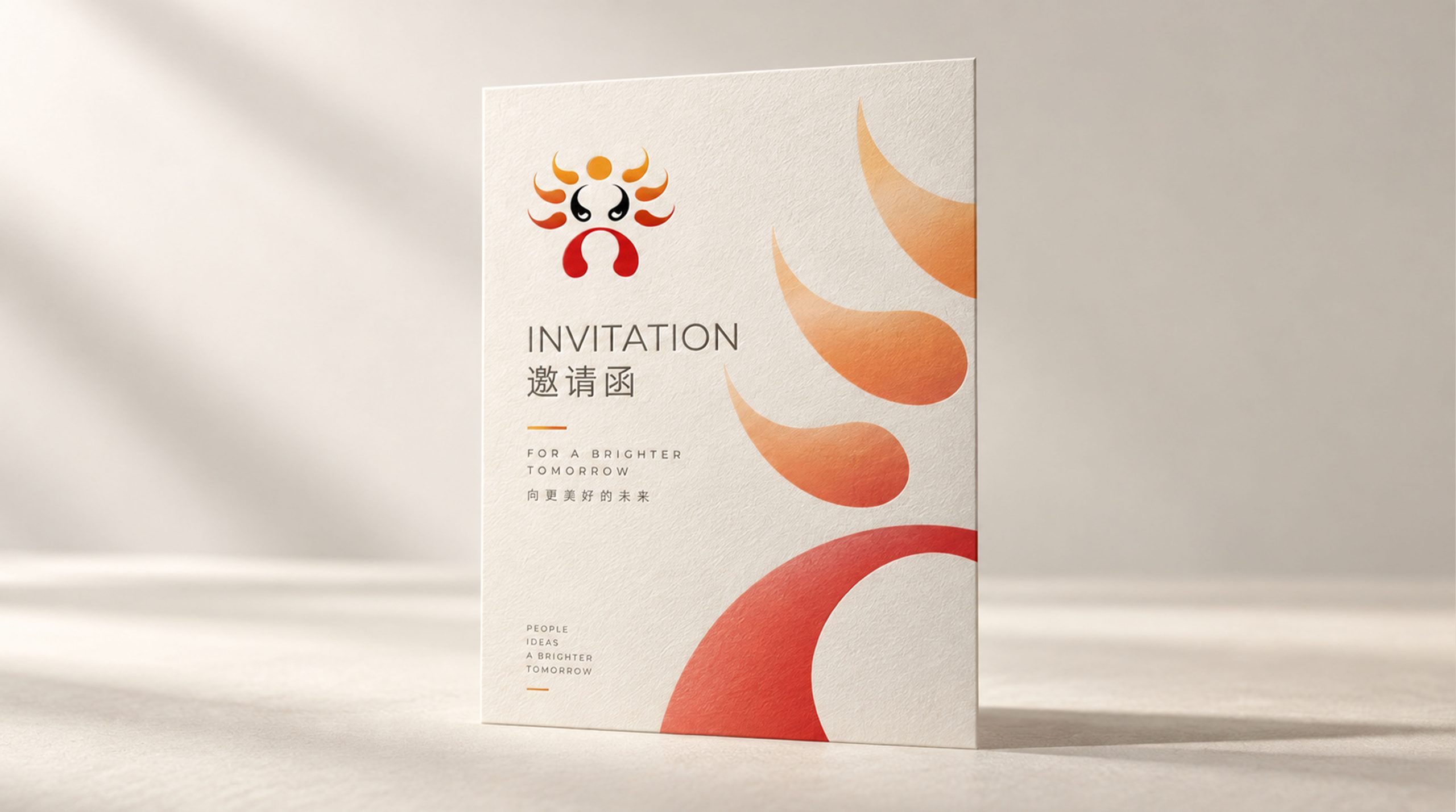
design concept
The logo is rooted in 'opera mask + stage imagery' as its core design concept, constructing an abstracted symbol of the 'soul of theater' through geometric line compositions. The central red, black, and orange palette forms a stylized mask contour, while radiating forms above evoke the 'light of theater' and 'cultural radiance.' The open composition signifies Chinese opera stepping onto the world stage.
graphic language
Central black form: captures the expressive gaze and spirit at the heart of Peking Opera, conveying restraint and strength. Orange rays above: represent the reach of the art form, spreading outward like light. Red arc below: forms the stage proscenium and signifies the exchange between audience and art. As a whole, the mark reads as a figure, a mask and a sun at once, distilling a cultural core of “People · Art · Light.” Its symmetrical composition and rhythmic lines express the rhythm and ceremony of operatic performance.
Fonts and composition
The symbol is the core of the logo. For the wordmark, a calligraphic Song typeface or custom opera-style lettering is recommended to add cultural warmth and memorability. Text and symbol can be stacked or set side by side to suit different media. Bilingual wordmark example: Beijing Opera Theater. Centered or right-aligned layouts maintain an elegant rhythm that works across cultures.
color system
Primary Red #C2211C: the passion, artistic vitality and dramatic tension of Peking Opera. Accent Orange #F59A23: the radiance and cultural reach of the art form. Deep Black #000000: authority and artistic spirit. White background #FFFFFF: reinforces the traditional use of negative space and an Eastern sense of space. The palette draws on Peking Opera makeup and stage lighting, expressing an Eastern aesthetic that is bold yet refined.
Application and extension
Applications: stage curtains, entrance lintels, tickets and costume badges at the Beijing Opera Theater; opera festival posters, promotional films and exhibition wayfinding; cultural merchandize such as tote bags, pins, fans and ticket-stub albums; digital media and international cultural exchange events. The abstract line elements can be extended into dynamic stage-lighting visuals for performance openers and motion backgrounds.
Improper Usage (Protection Specification)
Do not alter the proportions or orientation of the symbol. Do not replace the primary red, black or orange with other colors. Do not add outlines, shadows or gradients. Keep clear space ≥ 25% of the logo width. Minimum size: 28 mm.
design results
Hailed as “a benchmark for the visual expression of contemporary opera,” the mark carries Peking Opera from the traditional stage into a modern brand identity. It has been widely used in stage systems and cultural publications at international culture festivals and art fairs. Designed by Qingmei Future, it was featured in the Yearbook of Eastern Art Brand Identity Systems.