











Named after the German mathematician Carl Friedrich Gauss, Gauss Mathematics uses scientific thinking, logic training and innovative methods to build mathematical literacy and thinking skills in a new generation of students.
The brand wanted a visual system that conveys “the beauty of mathematics, the rationality of structure and the power of thought,” creating an international identity that is both educationally inspiring and technologically rigorous.

design concept
The logo is built around the letter G, assembled from triangular modules that suggest the logical progression from unit to system in mathematics. Blue and gold show reason meeting inspiration: blue stands for logic and thought, and yellow stands for wisdom and insight. The result is a geometric system that is both open and ordered, symbolizing the extensibility and inherent order of mathematical thinking. Core idea: Reason builds structure; inspiration illuminates thought.
graphic language
Triangles: the most basic geometric unit, representing the foundation of mathematics and the starting point of logic. G-shaped construction: six blue and three yellow triangles form the ring of the G, representing the cycle of thinking and exploration. Central highlight: the yellow core triangle marks the “center of wisdom,” the moment of mathematical inspiration. Open form: the open right side suggests that learning mathematics keeps expanding, in a spirit of limitless exploration.
Fonts and composition
The GAUSS MATHEMATICS wordmark uses a modern sans-serif with balanced stroke proportions, expressing rationality and rigor. The bilingual lockup works for educational institutions, textbook publishing and technology exhibitions while keeping recognition consistent across the system. The letterforms echo the geometric logic of the symbol, creating an identity that is unified, scientific and dynamic.
color system
Primary Logic Blue #1A73E8: reason, thought and stability. Secondary Inspiration Yellow #FFC233: wisdom, energy and creativity. Neutral Dark Gray #333333: used for type and supporting information to keep the visual balance. The blue-yellow contrast embodies the brand's dual core of “logic × inspiration,” forming a bright yet rational education identity.
Application and extension
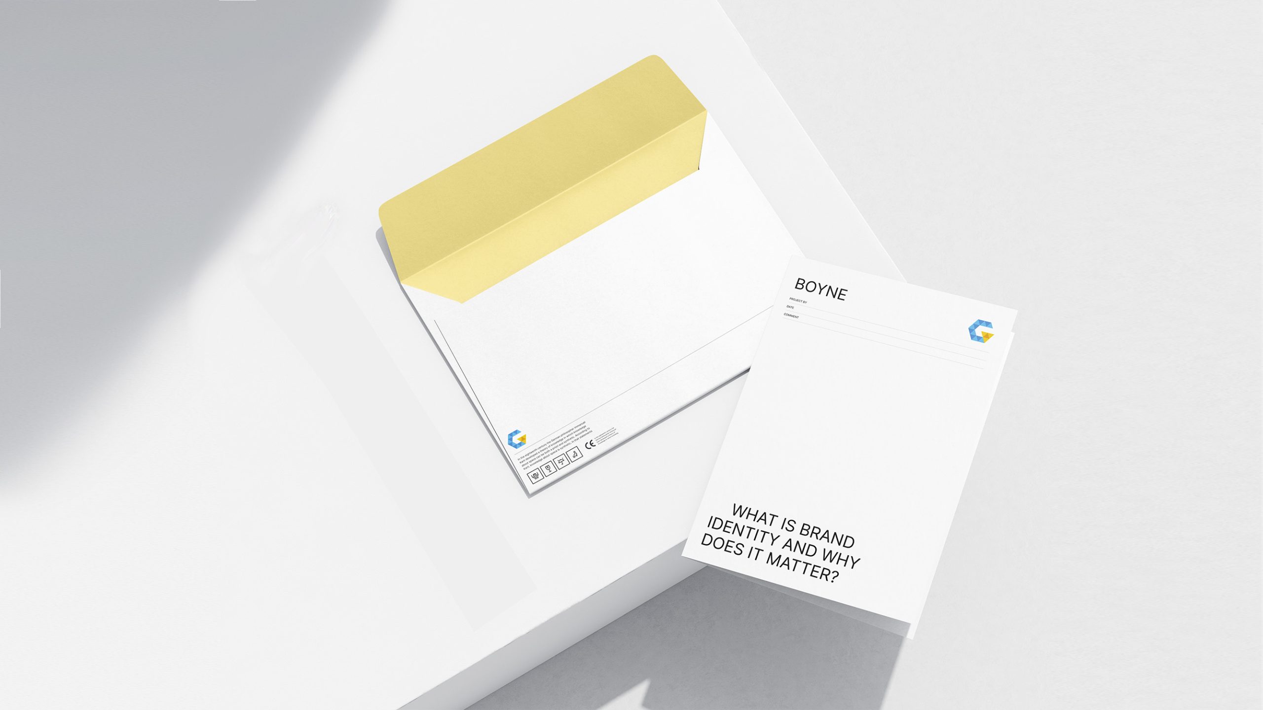
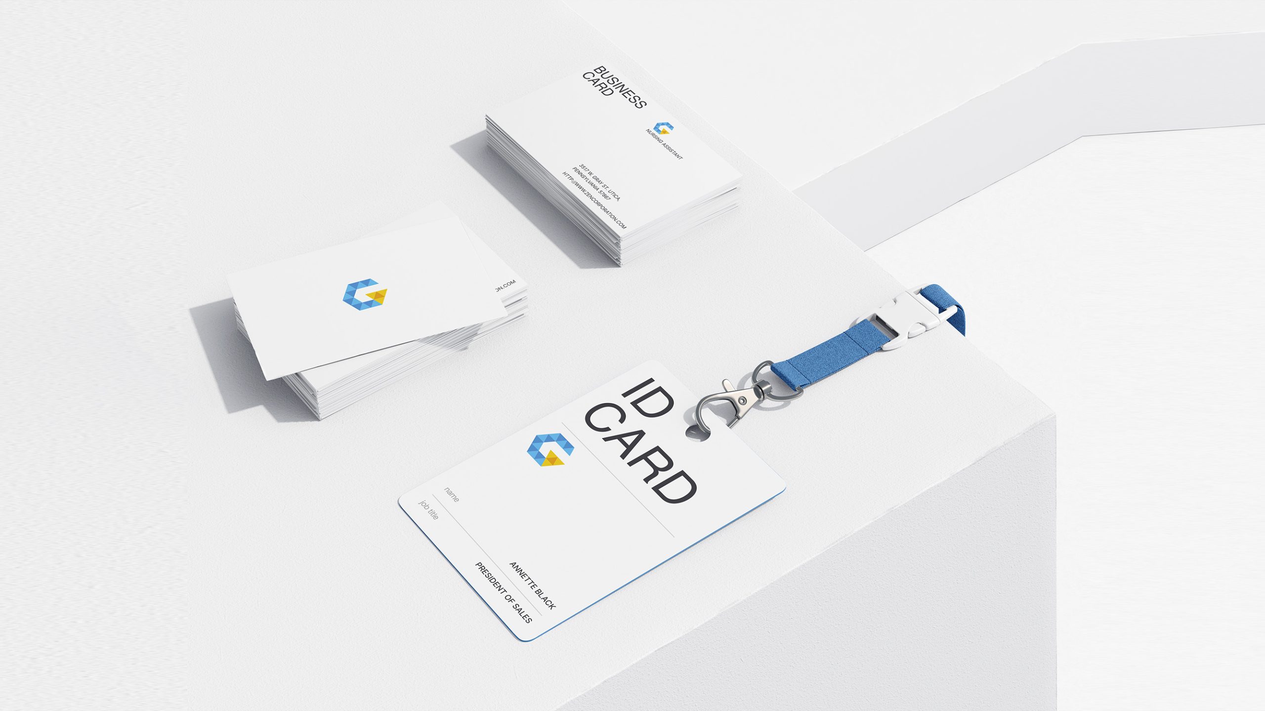
The mark adapts exceptionally well across the entire ed-tech ecosystem. Teaching: textbooks, course cards, handout covers and video intros. Digital: apps, websites, online courses and learning-management platforms. Brand spaces: training-center walls, teaching displays and educational-kit packaging. In motion, the triangular modules assemble into a “logic puzzle” animation, a metaphor for how thinking is built and sparked.
brand meaning
The mark expresses three core values of mathematics education. The beauty of order: a geometric construction that reflects the rigor of mathematical structure. The light of thought: the central yellow triangle stands for discovery and inspiration. The circle of growth: an open form that signals lifelong learning and limitless exploration. By using “structured reason” to express “creative thinking,” it gives the brand both intellectual depth and human warmth.
Improper Usage (Protection Specification)
Do not alter the number or position of the triangles. Do not change the blue-to-yellow ratio or add gradients. Do not skew, rotate or add drop shadows. Recommended minimum width: 30 mm.
design results
Since its launch, the GAUSS MATHEMATICS identity has become one of ed-tech’s defining examples of “logical aesthetics.” Its geometric visual logic keeps the brand instantly and consistently recognizable across classrooms, publishing and digital channels. Hailed as “a visual metaphor for mathematical thinking,” the design turns abstract reasoning into a tangible symbol. It reflects Qingmei Future’s mature approach at the intersection of education, technology and aesthetics, and makes a visual leap from knowledge to inspiration.