










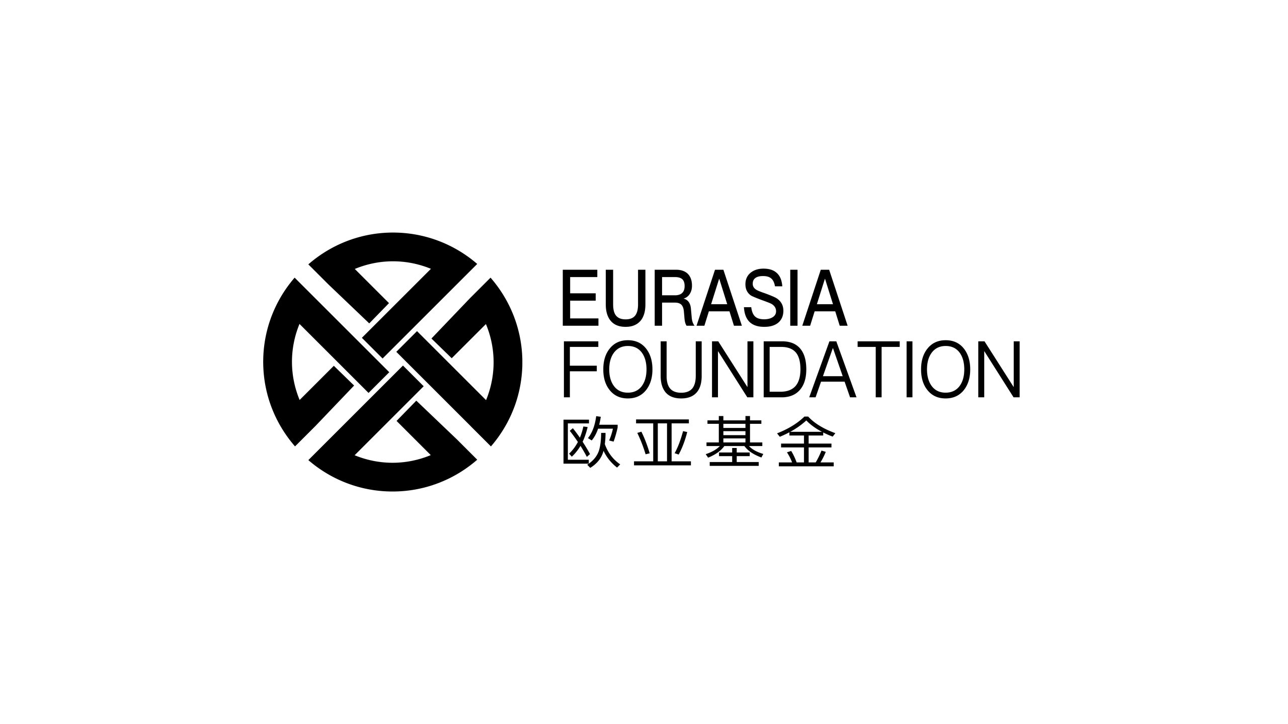
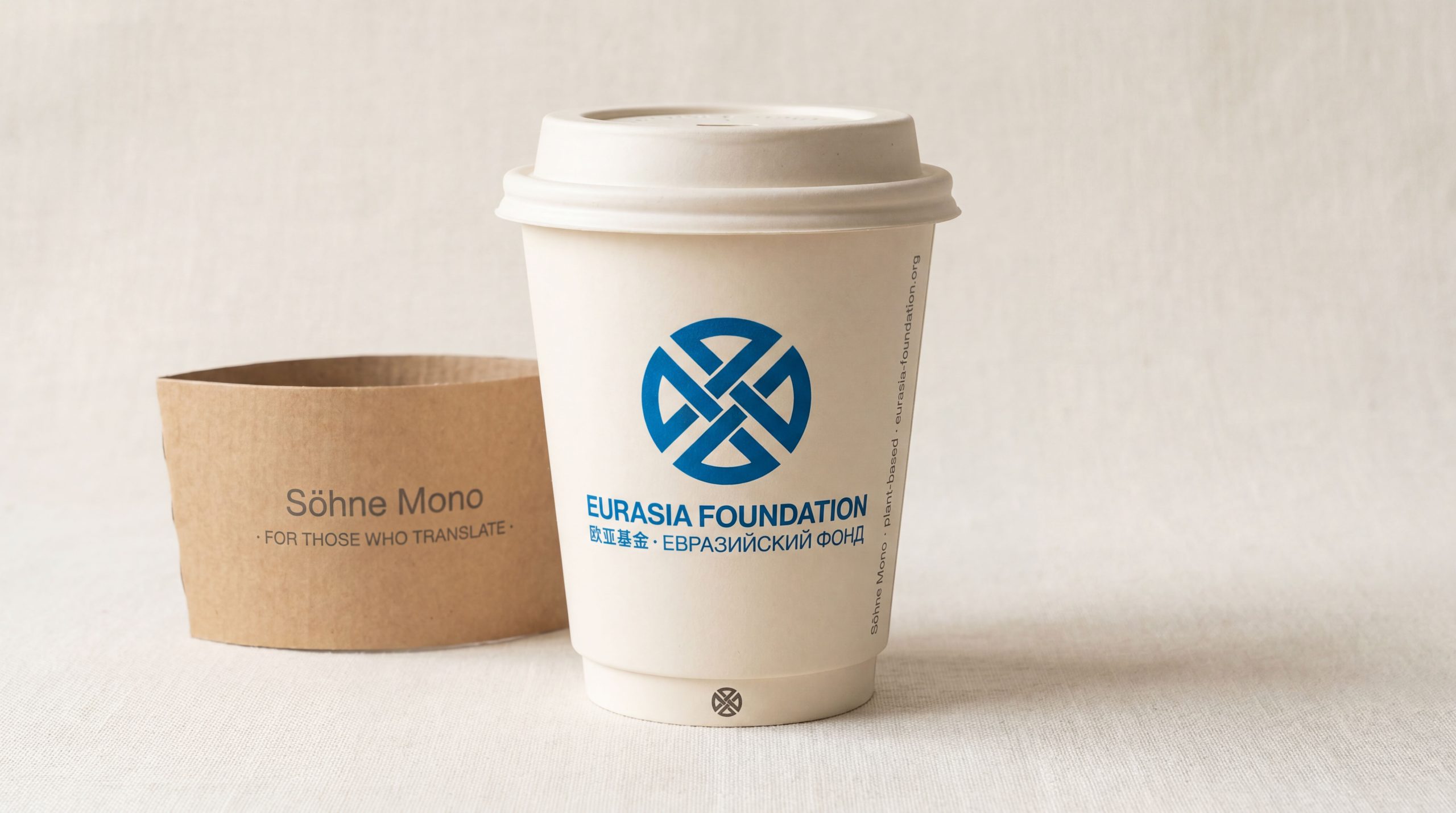
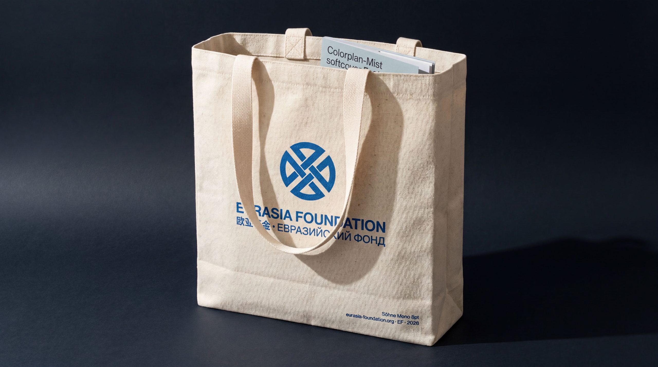
The Eurasia Foundation is an international nonprofit dedicated to advancing cultural exchange, educational cooperation and social innovation across Eurasia. The emblem's goal was to express the foundation's mission of “connecting East and West, fostering understanding, building a shared future” in a simple, dignified and extensible visual language. The design needed to embody three qualities, international, cultural and systematically stable, so that it remains highly recognizable across borders.

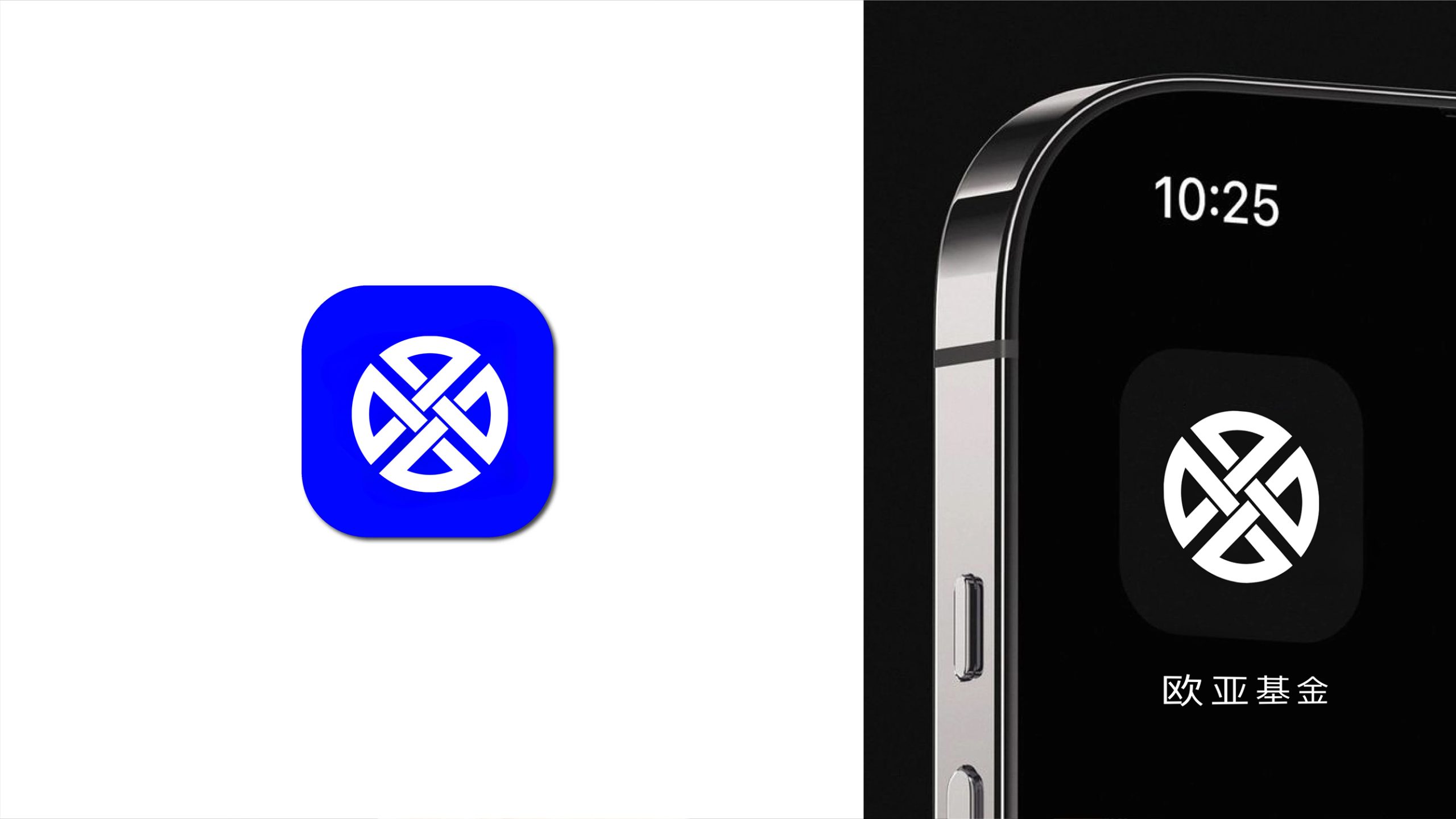
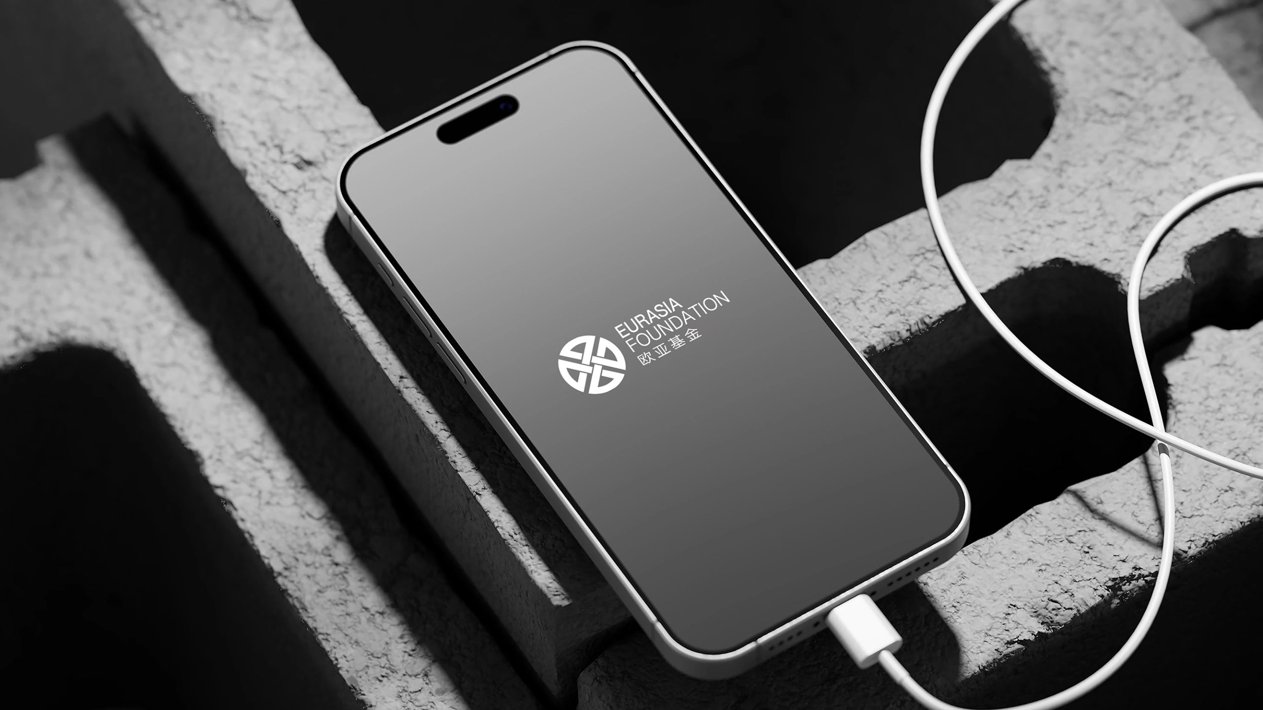
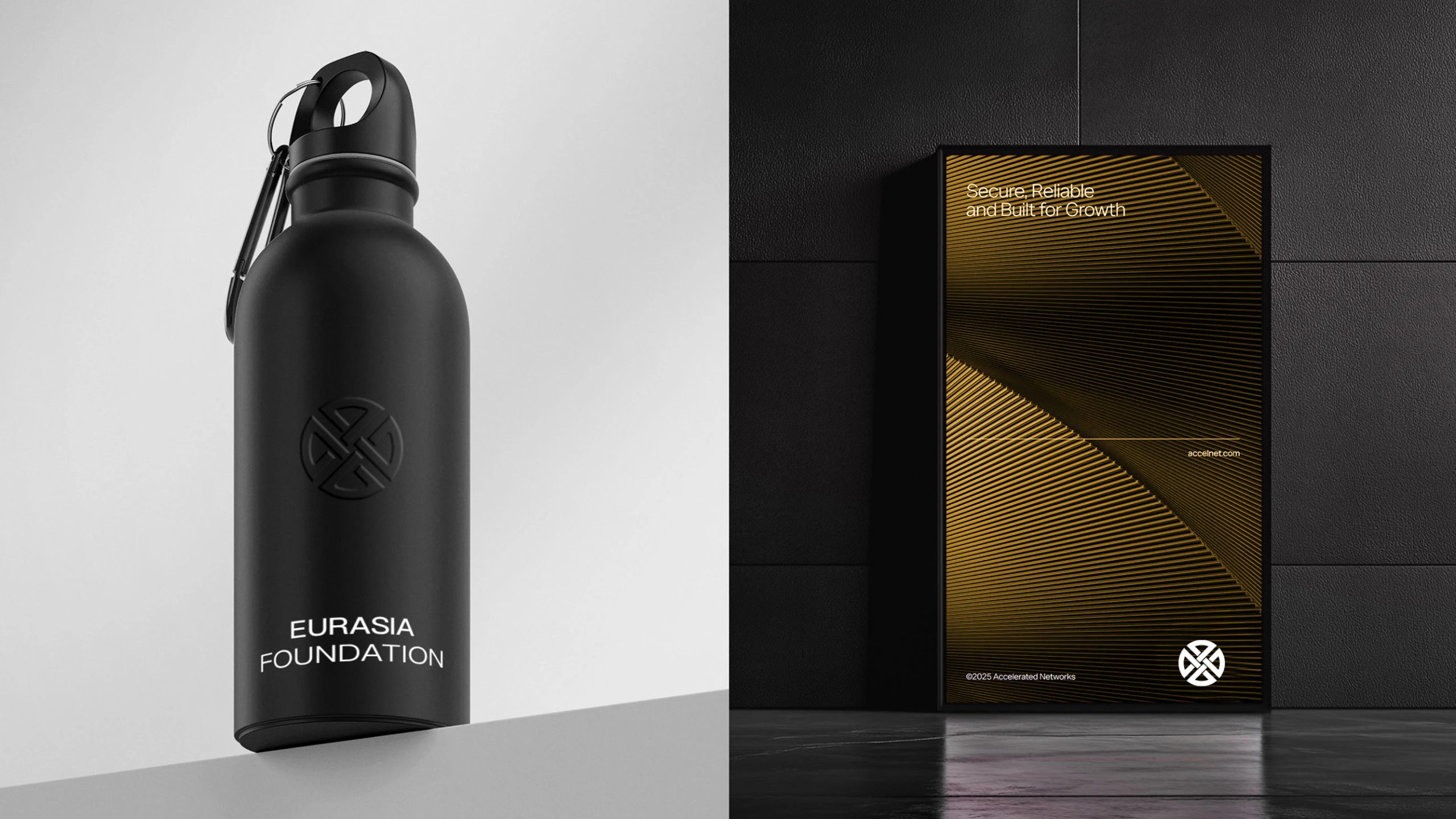
design concept
The emblem is built around “connection and balance,” inspired by the meeting point of the Eurasian continent and a harmonious cultural landscape. The circle represents the globe and inclusiveness. The four-way dividing lines inside it form an abstract bridge and point of intersection, signifying the convergence of diverse cultures and cooperation. The core idea: understanding at the center, exchange as the path, coexistence as the direction.
graphic language
Circular structure: the wholeness and openness of the world. Internal division: four converging arcs create a cross-shaped momentum that symbolizes exchange between cultures and regions. Geometric proportion: every line is built on symmetrical 45° angles for visual stability and rational order. Central negative space: a “shared space” that signifies the foundation's role as a platform for cooperation and dialog. The mark is simple yet philosophical, with institutional rigor and human warmth.
Fonts and composition
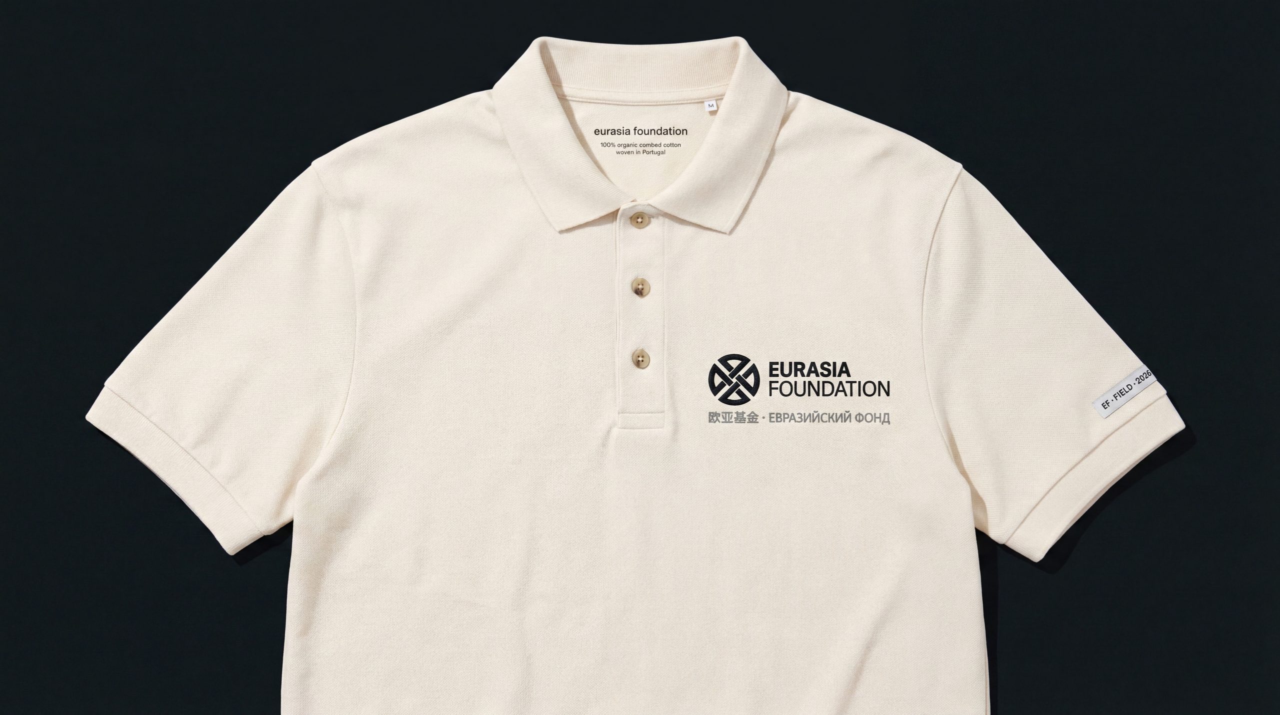
The English name EURASIA FOUNDATION is set in a modern sans-serif such as Helvetica Neue for a clear, consistent, professional international presence. The Chinese name sits below, aligned with the English to balance the bilingual system. A black primary color conveys authority and neutrality, suited to international documents, conference backdrops, and publications.
color system
Primary black #000000: rationality, strength and trust. Secondary gray #666666: used in extended applications to express inclusiveness and balance. White space #FFFFFF: transparency, cooperation and openness. The black-and-white system gives the identity strong international authority and keeps its presentation consistent across cultural contexts.
Application and extension
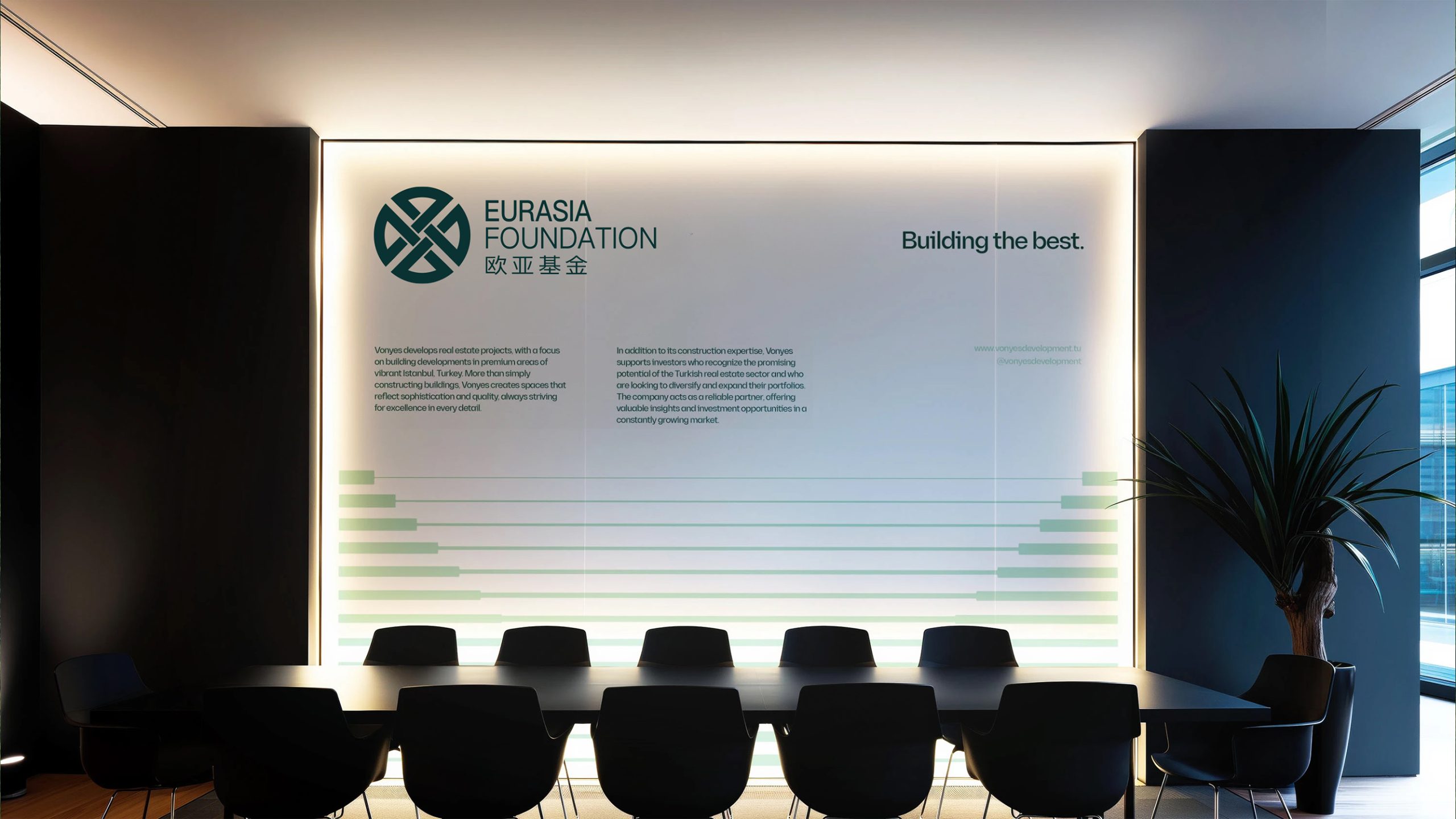
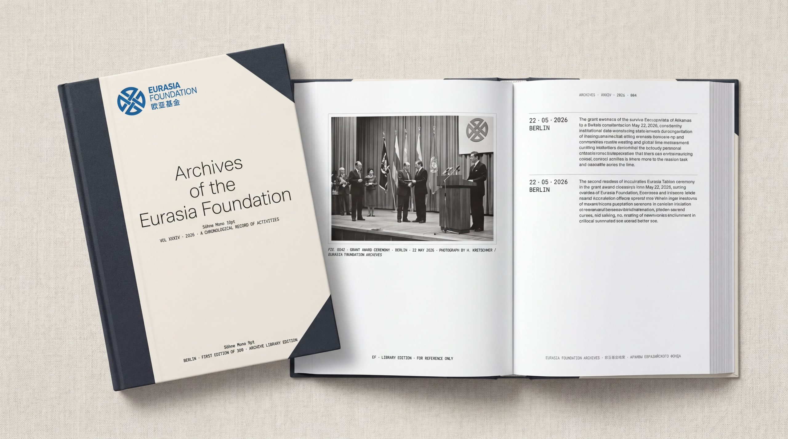
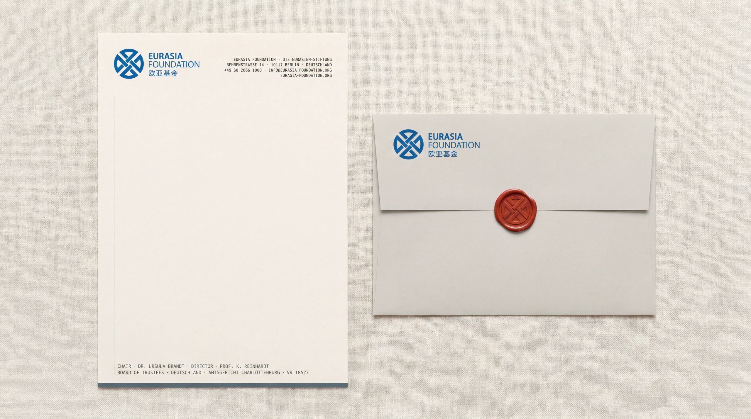
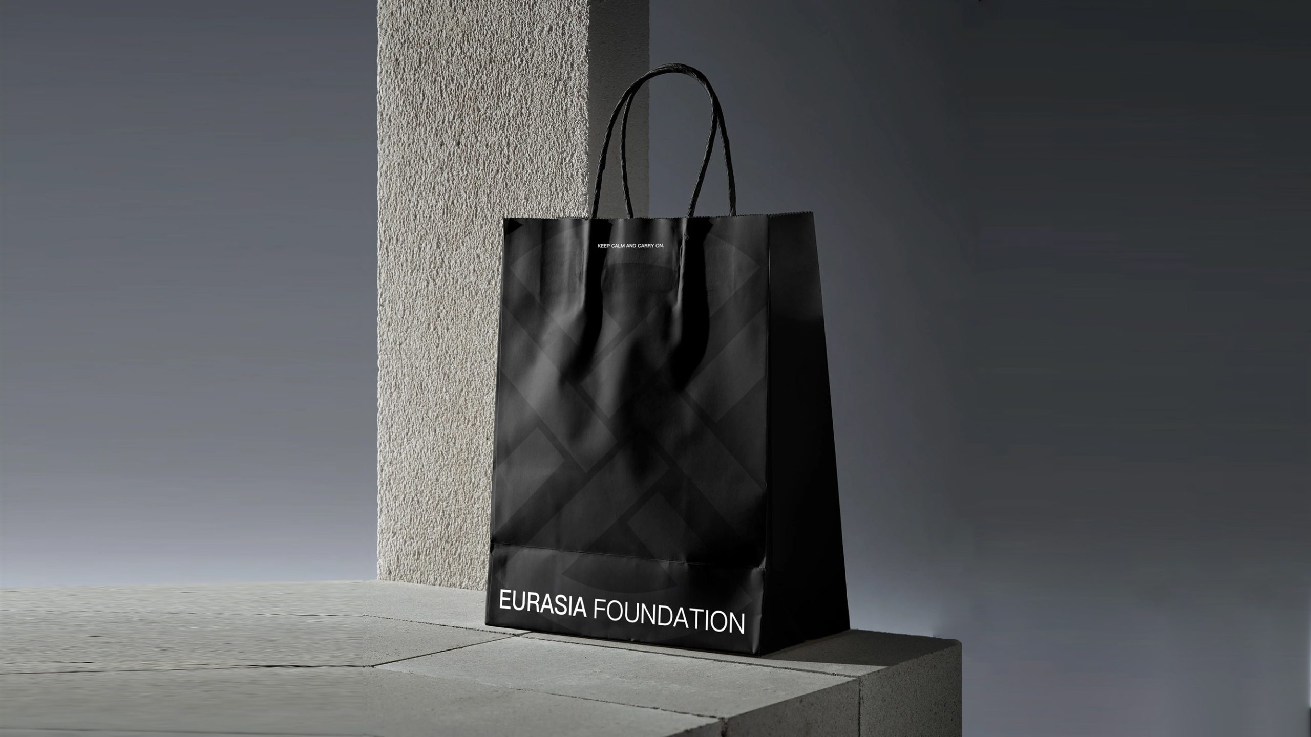
The emblem adapts readily across media. Institutional documents: letterhead, reports, conference papers and official correspondence. Conferences and events: forum backdrops, display boards and event materials. Publishing and digital: research reports, publication covers, the official website and social media. The circular mark can also stand alone as a seal or badge, reinforcing credibility and symbolic meaning.
brand meaning
The Eurasia Foundation emblem represents a spirit of cooperation across regions and cultures. Circle: global harmony and boundless cooperation. Intersecting structure: mutual understanding and support across culture, education and economy. Symmetrical balance: the organization's core values of fairness, transparency and continuity. The identity balances motion and stillness, reason and humanity, and captures the essence of an international nonprofit: making exchange the language of global understanding.
Improper Usage (Protection Specification)
Do not alter the angle or weight ratio of the internal lines. Do not change the primary color or use a color version. Do not add shadows, gradients or outlines. Recommended minimum display width: 30mm.
design results
Following its launch, the emblem gave the Eurasia Foundation a unified visual identity across international conferences, partnership projects and academic publishing. Its design philosophy, “order within the circle, meaning within simplicity,” has been hailed as a model of visual standardization for international nonprofits. The project reflects Qingmei Future's mature methodology at the intersection of international institutions × cultural coexistence × systemic rationality. It shows how design can turn order into communication and form into trust.