











αi (Alpha Intelligence) is a technology company focused on AI algorithm research and cognitive computing. Guided by its mission to “make intelligence more human,” it drives the real-world adoption of AI across education, healthcare, manufacturing and media.
The name combines the Greek letter α (Alpha) with the English “i” (Intelligence), signifying pioneering intelligence and a first generation of thinking. The goal of the mark is to create a future-facing technology symbol within a minimal, intelligent and international context.

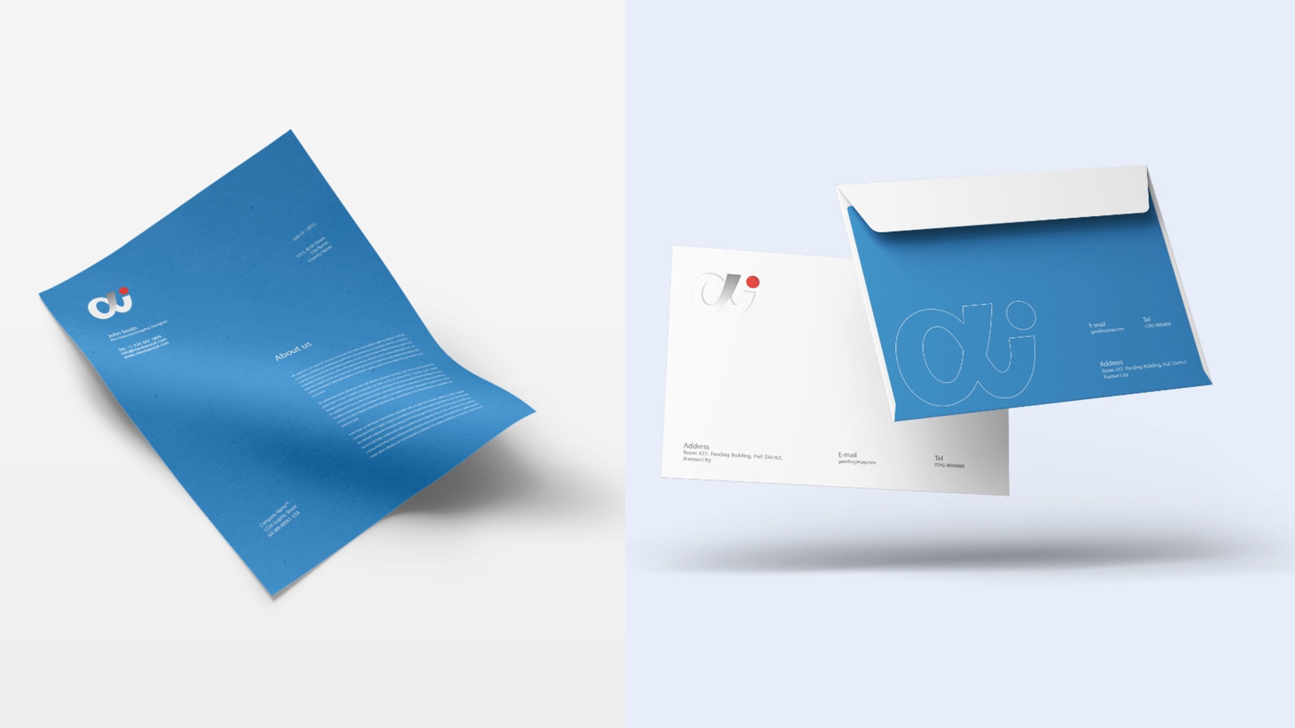


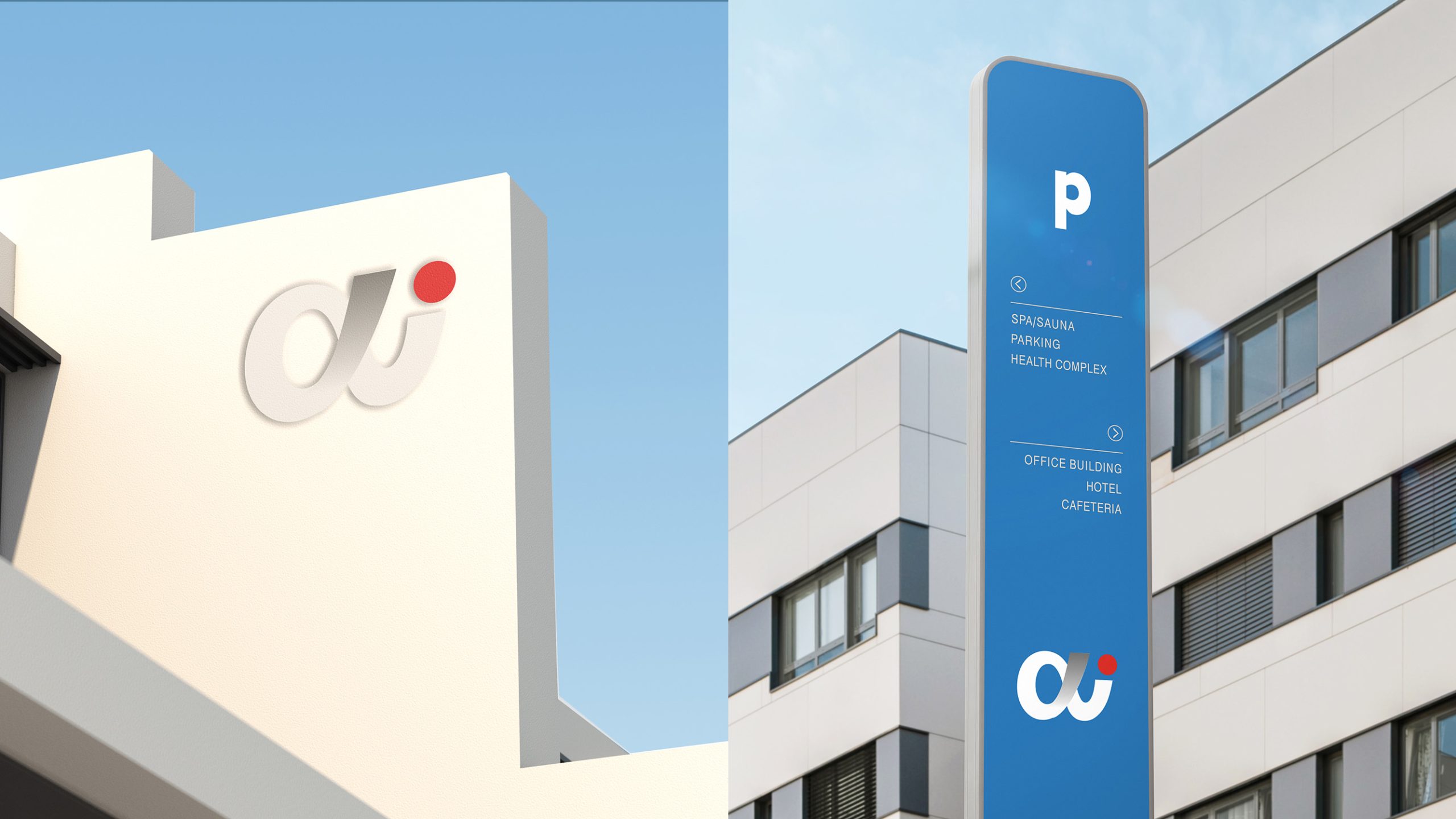

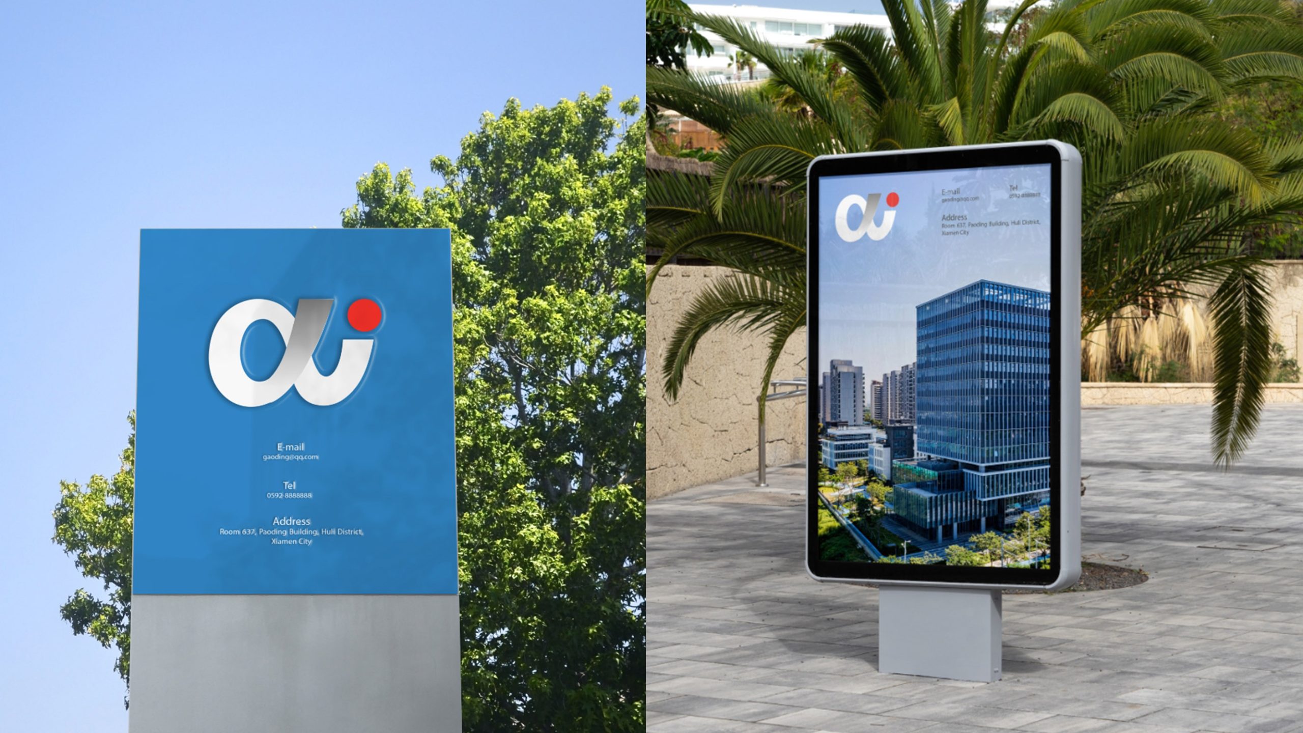
design concept
The mark fuses the Greek α with a lowercase i, symbolizing the symbiosis of human wisdom (alpha) and artificial intelligence (i). Its form is fluid, rounded and minimal, reflecting both the rational aesthetic and the approachability of a technology brand. Inspired by the point where algorithms meet language, it expresses the company’s pursuit of an AI cognition that evolves from logic to emotion.
graphic language
α letterform: origin, pioneering and exploration, reflecting the technology’s foundations and leadership; Dot of the i: an information node, a point of perception, the “aware eye” of AI; Continuous stroke: the flow of data and the seamless interaction of human and machine; Balanced stroke weights: reinforcing stability and strength, echoing the precision and reliability of AI algorithms. Rendered in a single color, the identity emphasizes the brand’s capacity for abstraction and depth of thought.
Fonts and composition
A custom geometric sans serif adapted from Helvetica Now and Futura strips away superfluous strokes and softens the curves, striking a visual balance between strength and intelligence. The symbol can stand alone or combine with the full name “Alpha Intelligence” in standard horizontal or vertical lockups, remaining highly recognizable and versatile across UI, hardware nameplates and technology exhibitions.
color system
Primary Black #000000: reason, technology and depth of thought; Supporting Gray #6E6E6E: algorithmic logic and neutrality; Extended Blue #0061FF (optional): adds energy in digital applications. A predominantly monochrome system reinforces the brand’s positioning in cognitive technology, conveying that “the space between black and white is where intelligence thinks.”
Application and extension
The mark adapts flexibly to: software interfaces, splash screens and algorithm-engine loading animations; smart hardware nameplates and exhibition brand walls; the corporate VI system (presentation templates, website, folders, ID cards and more); motion applications (the interweaving α and i generate an animated launch mark). The dot can extend into data nodes, voice-recognition waveforms or points of AI perception, forming a unified visual language for technology.
brand meaning
The αi mark represents three core dimensions of an AI brand: Alpha (Pioneering) — technological leadership, driven by innovation; Intelligence — rational thinking and algorithmic decision-making; Interface — a cognitive experience of human–machine symbiosis. Together they express the brand promise: “Intelligence as origin, a future shared.”
Improper Usage (Protection Specification)
Do not stretch, skew or alter stroke weight proportions; do not add shadows, gradients or outlines; do not replace the primary color or reverse the letter order; maintain clear space ≥ 20% of the wordmark height; minimum display size: 16mm.
design results
Recognized within the industry as “the AI brand identity with the most elegant logic,” the mark has been widely applied across exhibition spaces and digital channels at international AI developer conferences, conveying the brand’s “minimal yet profound technological intelligence.” Qingmei Future created the overall brand image and VI system.