










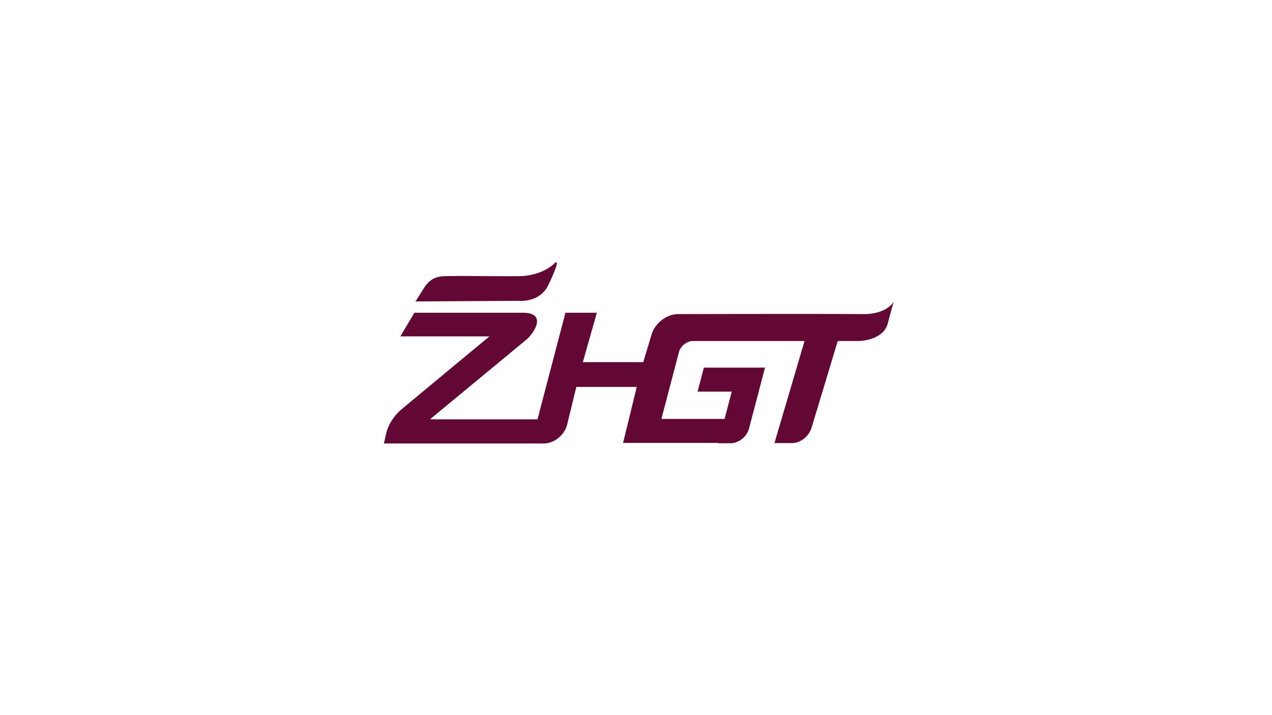
ZHGT is a company specializing in rail transit technology and intelligent manufacturing, with a brand built around one idea: intelligence driving the future of urban mobility.
The identity uses a clean, technical visual language charged with speed to express the company’s innovation in intelligent rail control, vehicle systems and data-driven transit management.

design concept
Built on the letter combination “ZHGT,” the mark uses streamlined letterforms to express the brand’s core of speed, precision and technological strength. Its form draws on the kinetic lines of high-speed trains and the curves of the track; angled cuts and forward-extending strokes create a powerful sense of momentum and technical tension. The guiding idea: “Speed defines the future; intelligence drives the city.” Every stroke reaches up and to the right, signaling continuous innovation and steady progress.
graphic language
Z: the initial is shaped as an arrow-like departure sign, marking the company’s point of origin and leadership in innovation; H: a solid central bar represents the core and reliability of its technology systems; G: an inner curve traces the arc of the track, evoking the fluid movement of the rail network; T: the extended end of the crossbar recalls the end of a rail line, pointing toward what lies ahead. Together the letterforms combine technical character with mechanical precision, and their geometric treatment conveys the brand’s professionalism and industrial aesthetic.
Fonts and composition
The logo uses a custom typeface adapted from Eurostile Extended, with consistent stroke proportions and tight spacing for greater visual strength. A 10° slant adds forward momentum, while rounded cut corners combine a modern feel with distinct brand character. The English wordmark works on its own or in a bilingual lockup, ZHGT Intelligent Transportation Systems, for international communication and industry partnerships.
color system
The primary color is a deep burgundy (#660F2B), supported by technical silver gray and white, creating an industrial-tech character defined by reason, strength and quality. Primary: Zhi Red (#660F2B) — resilience and forward momentum; Secondary: Silver Gray (#BDBDBD) — technology and modernity; White space: Pure White (#FFFFFF) — high-contrast visual balance. The palette gives the identity strong professional distinction, while remaining highly recognizable and durable across digital media and physical vehicles.
Application and extension
The identity system applies across: intelligent train exteriors and cab control panels; headquarters façade signage, vehicle livery, workwear and safety helmets; intelligent signaling systems, monitoring interfaces and data dashboards; exhibition key visuals, promotional films, website interfaces and investment documents. In motion, the “Z” extends into an animated trail, its lines accelerating to assemble the wordmark and reinforce the brand’s sense of technological momentum.
brand meaning
The ZHGT mark stands for three core values: Smart, driven by data and technology; Persistence, stable, reliable, and continuously innovating; Connectivity, a transit network linking cities to the future. Together they represent the innovative strength of a Chinese rail transit company in the age of intelligence, expressed through a minimal visual language that builds a global brand.
Improper Usage (Protection Specification)
Do not stretch, skew or rotate the wordmark; do not alter the primary burgundy; do not replace or separate the letter structure; do not add shadows or gradients; maintain clear space ≥ 25% of the letter height; minimum width: 30mm (print) / 120 px (digital).
design results
Recognized within the industry as “the rail technology identity with the strongest sense of speed,” the ZHGT mark is now widely used across urban rail construction, rolling stock and international exhibitions. Its kinetic, technical language has established a distinctive visual symbol for an intelligent transportation systems brand. Qingmei Future designed the brand identity system and developed its application guidelines.