










Longfa (Longfa Group) is a renowned comprehensive construction and decoration enterprise in China, encompassing residential renovation, commercial space design, building construction, and materials R&D.
As the company expands internationally and upgrades its business, its visual system must balance strength, credibility, and contemporary relevance, reflecting a corporate image of "Chinese quality · global standards."

design concept
The logo centers on the wordmark “Longfa,” set in a modern sans-serif, with a red palette and a gold star as the focal points of the identity. Its simple yet forceful visual language conveys trust and national pride. A gold five-pointed star set within the “o” symbolizes national glory and brand conviction, reflecting how Longfa Group builds on the spirit of Chinese manufacturing to set industry benchmarks through outstanding quality and a global outlook. The core concept: “Built on trust, guided by a star,” lighting the brand’s star with sincere passion and proven strength.
graphic language
Star symbol: set at the center of the “o,” it forms the visual core of the brand, representing Longfa’s industry leadership and the public trust it has earned; Rounded letterforms: softening the hard-edged image common in the construction industry, they convey warmth and a human touch; Red gradient lettering: symbolizes the brand’s leap from tradition to innovation, while signaling steady growth and vitality; Overall composition: balanced and compact, reflecting efficient, well-ordered management.
Fonts and composition
The logo uses a rounded geometric sans-serif, customized in detail: the vertical strokes of L and f end in a subtle curve for warmth and recognition; the extended curves of g and a add flow, expressing innovation and agility; a five-pointed star set in the "o" by the golden ratio forms the visual center. The English wordmark reads clearly worldwide and pairs with the Chinese name, Longfa Decoration Group, keeping one consistent visual standard across languages.
color system
The primary color is China Red (#D81E06), complemented by Gold Star Yellow (#FFD700), creating strong visual recognition and cultural symbolism: China Red stands for passion, strength, trust, and heritage; Gold Star Yellow stands for honor, quality, excellence, and leadership. The palette is distinctly Chinese yet built for global reach, reflecting the company’s strategic vision: rooted in China, serving the world.
Application and extension
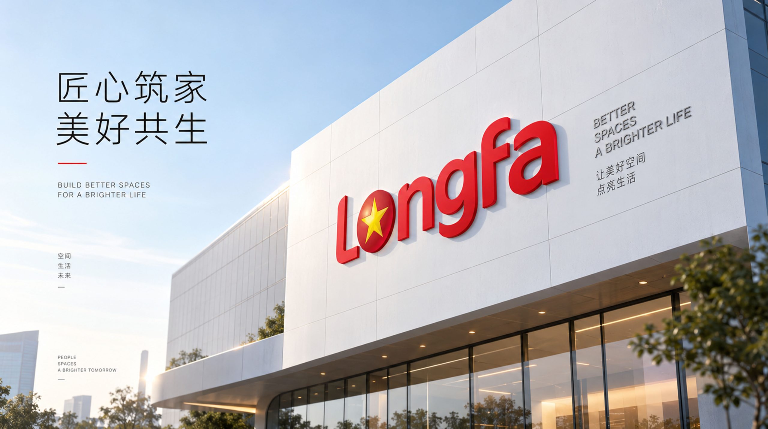
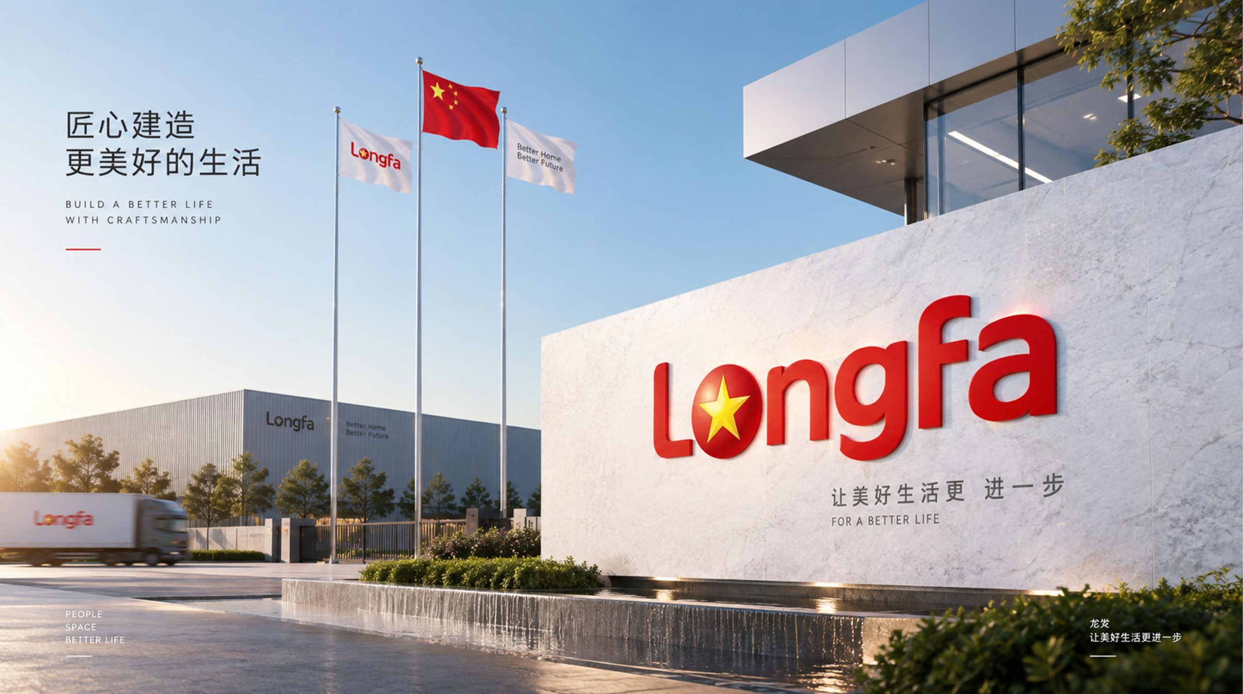
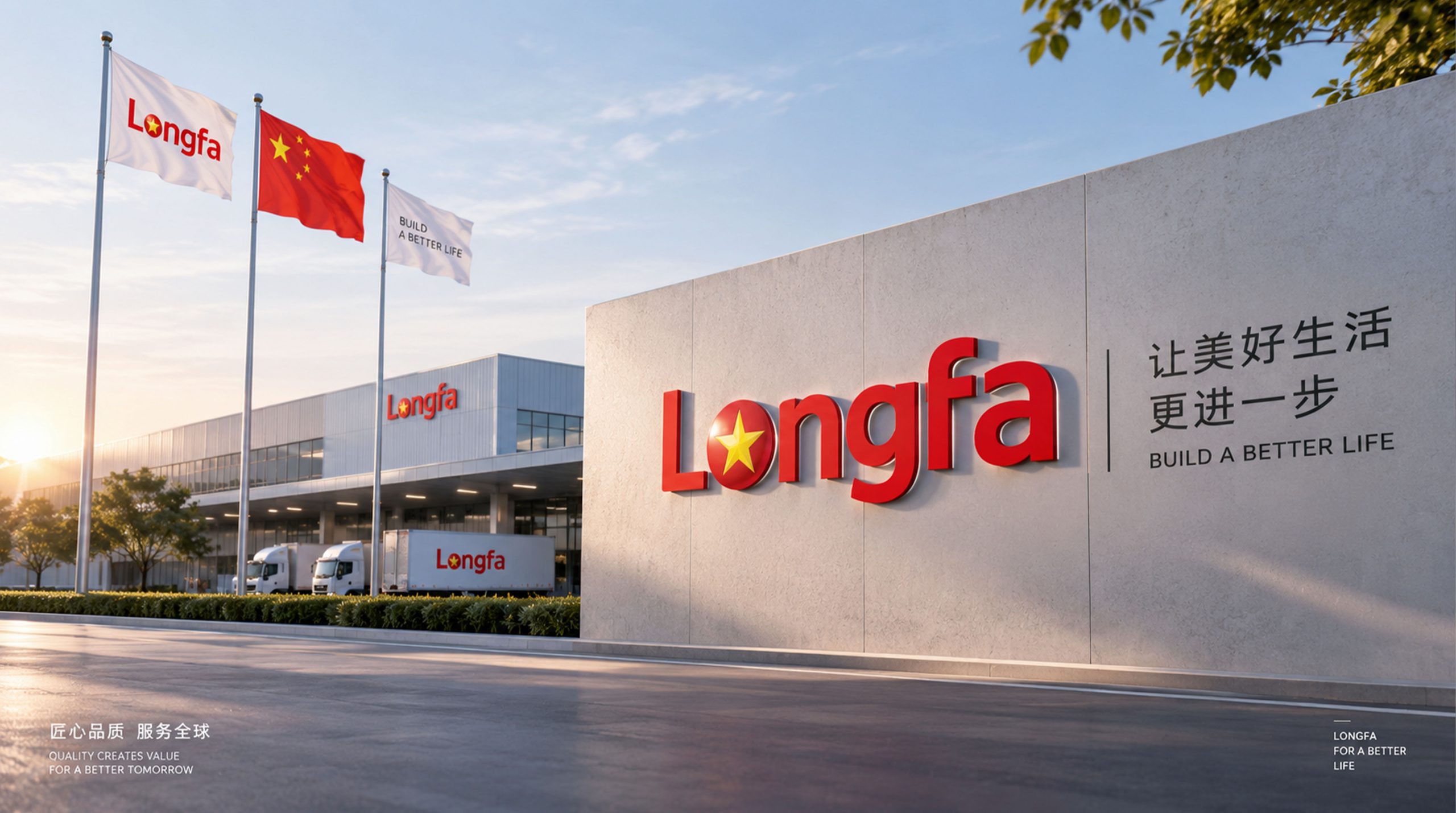
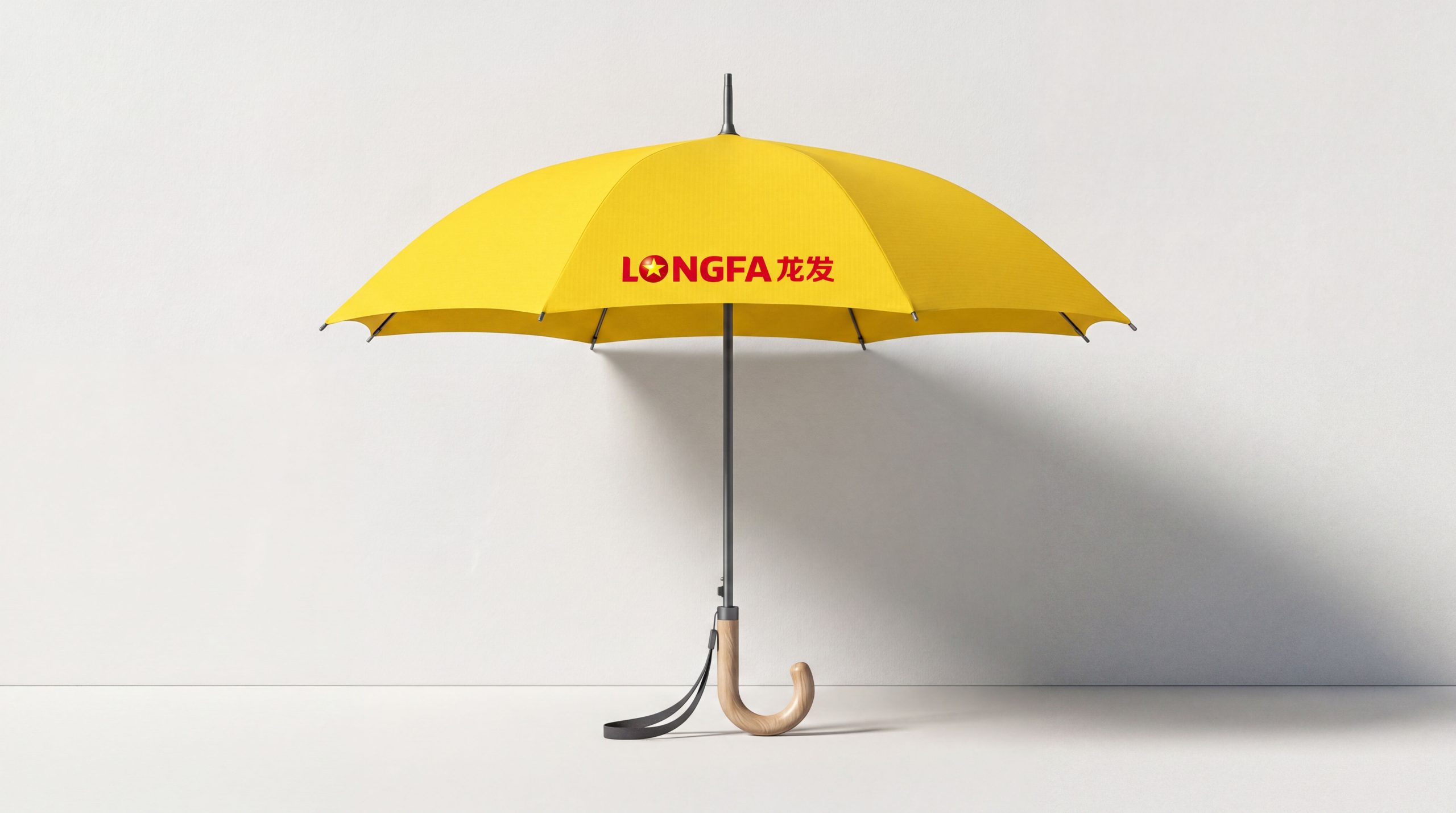
The identity system extends across headquarters façades, office interiors, and construction-site signage; industrial touchpoints such as engineering vehicles, uniforms, and hard hats; brand collateral including business cards, contracts, advertising, and exhibition backdrops; and digital channels, including the website, mobile interfaces, brand animations, and video openers. In motion, the star rotates and sparkles in a signature “brand light” animation, reinforcing the idea of Longfa lighting up the future of home renovation in China.
brand meaning
The Longfa logo embodies three brand values: Trust, with red representing the brand’s credibility and sense of responsibility; Honor, with the starlight signifying its standing as an industry benchmark; and Innovation, with the rounded letterforms expressing a continuous drive for renewal. Blending Chinese cultural confidence with an international brand language, the identity creates a corporate mark that unites national identity with modern aesthetics.
Improper Usage (Protection Specification)
Do not alter the proportions or position of the star; do not change the primary red or the gold star color; do not add shadows, outlines, or background textures; maintain clear space of at least 25% of the logo height; minimum print size is 25 mm, and minimum digital width is 100 px.
design results
Following its launch, the new Longfa logo received widespread industry acclaim and was hailed as one of the most iconic brand marks in China’s building decoration sector. The design strikes a successful balance between national pride and modern visual standards. Qingmei Future delivered the complete brand visual system and VI guidelines.