











Hubei Financial Leasing is a key member of China's regional financial services system, dedicated to providing comprehensive financing solutions for infrastructure, transportation, energy, healthcare, and other industries.
The brand logo aims to convey the enterprise's financial stability, innovation capacity, and regional influence through international visual language, establishing an authoritative image aligned with modern financial regulatory frameworks.
design concept
The logo centers on a spherical kinetic graphic symbolizing the globalized financial perspective and multidimensional capital circulation. The interwoven red-purple dynamic arcs represent the efficient operation of capital flows and value chains, signifying 'capital connects the world, finance empowers industry.' The design fuses technological sensibility with financial gravitas, creating a modern yet authoritative international financial image. The core concept: 'With capital as orbit and innovation as engine, advancing the symbiotic prosperity of finance and industry.'
graphic language
Spherical structure: represents global vision and capital circulation systems; red arc: symbolizes vitality, growth, and capital liquidity; purple arc: expresses stability, intelligence, and financial professionalism; inner core luminosity: embodies the enterprise's service warmth and integrity core. The encircling spherical structure manifests the core logic of 'leasing is connection, finance is empowerment.'
Fonts and composition
Employing the sans-serif typefaces common to international financial enterprises (such as the Helvetica Neue family) to convey rationality, standardization, and transparency. English identification maintains compact arrangement with optimized tracking, projecting stability and efficiency; bilingual proportions are coordinated for flexible adaptation across communication media. The overall layout is clean and commanding, meeting high-end financial industry image standards.
color system
The logo primary color system comprises: Financial Red (#C02026)—symbolizes capital momentum and positive growth; Deep Purple (#641E75)—expresses financial intelligence and professional temperament; Metallic Gray (#999999)—balances technological rationality with brand authority. The gradient fusion of red-purple reinforces the brand's fintech attributes while creating high recognition and an internationalized visual impression.
Application and extension
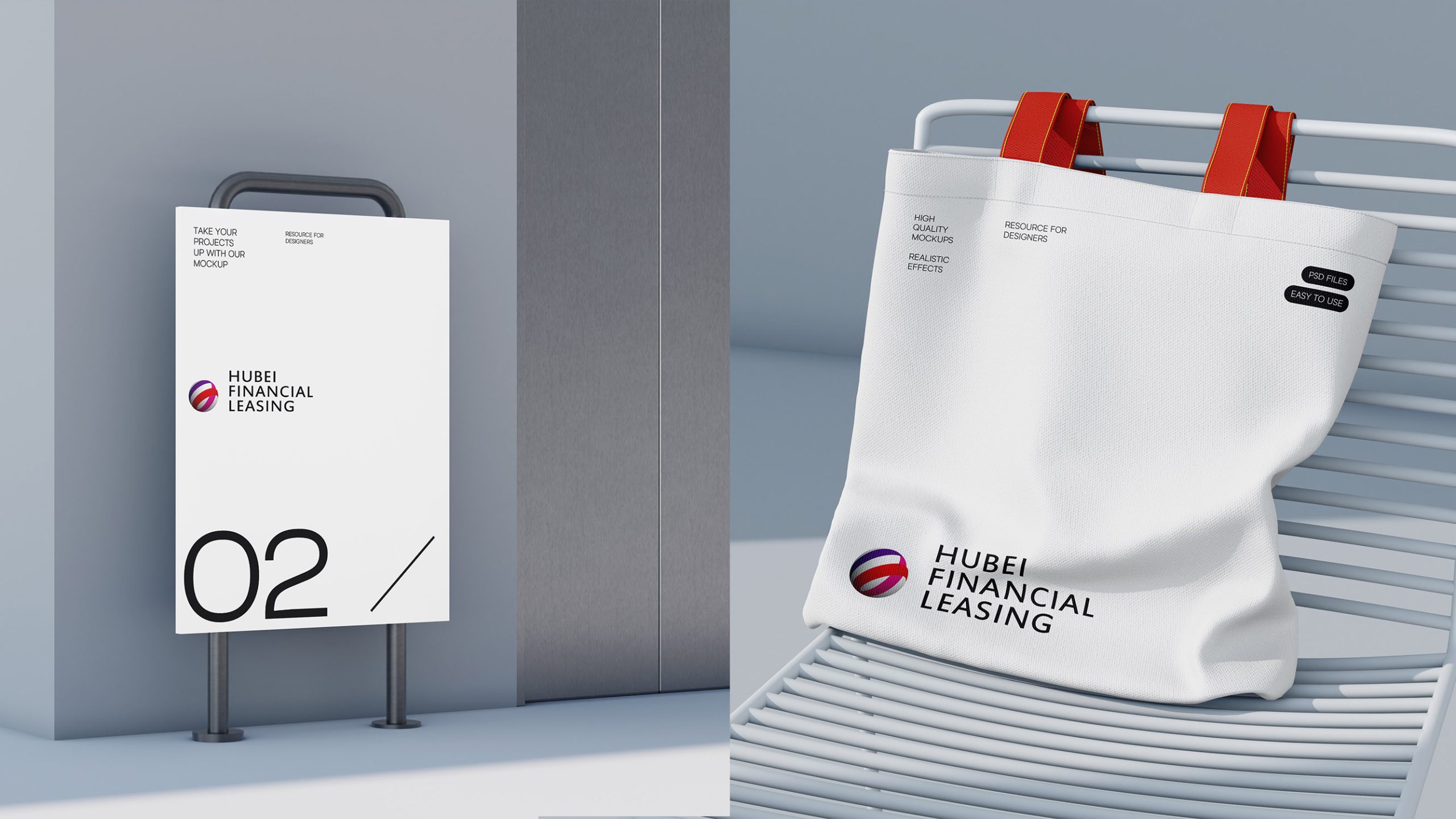
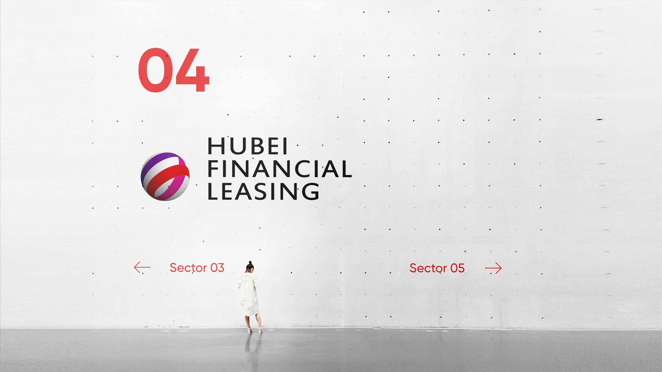
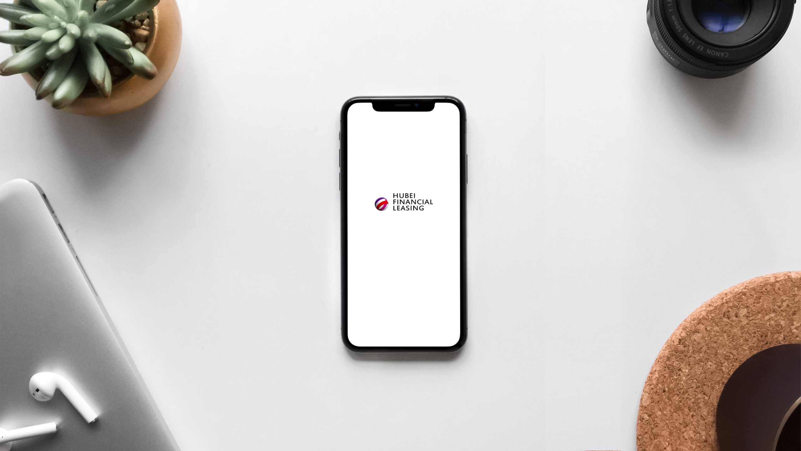
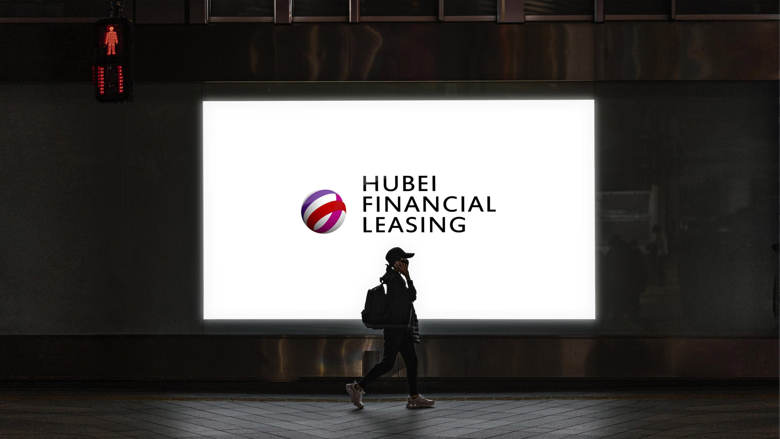
The logo demonstrates strong adaptability and visual versatility across platforms: corporate headquarters lobby and conference space wayfinding systems; leased asset branding (aircraft, vehicles, energy equipment); various instruments, correspondence, contracts, official documents, and investment report covers; mobile and web interface applications (apps, websites, interactive interfaces); financial promotional video titles and data visualization display backgrounds. The spherical motion version can rotate and illuminate in video and digital interfaces, creating a 'symbolic momentum of capital flow.'
brand meaning
The logo embodies three core brand values of Hubei Financial Leasing: Stability—building industry trust through financial professionalism; Innovation—leading regional development through capital innovation; Partnership—constructing a synergistic ecosystem of industry and finance. The logo's sphere is not merely a corporate symbol but represents an 'energy sphere of financial connection to the world,' signifying the enterprise bridging capital to propel sustainable development of China's real economy.
Improper Usage (Protection Specification)
Do not alter sphere arc angles or color proportions; do not add background textures, shadows, or reflective effects; do not adjust typeface tracking or arrangement direction; maintain minimum clearance: 25% of logo height; minimum digital display width: 120px.
design results
Following the new logo system's launch, it has been comprehensively applied across Hubei Financial Leasing's brand communications, asset leasing identification, and annual financial report systems. Its design, benchmarked against international financial standards, has successfully shaped a brand image of 'regional leadership, national influence, global vision,' with visual system design and brand standards implementation by Qingmei Future.