










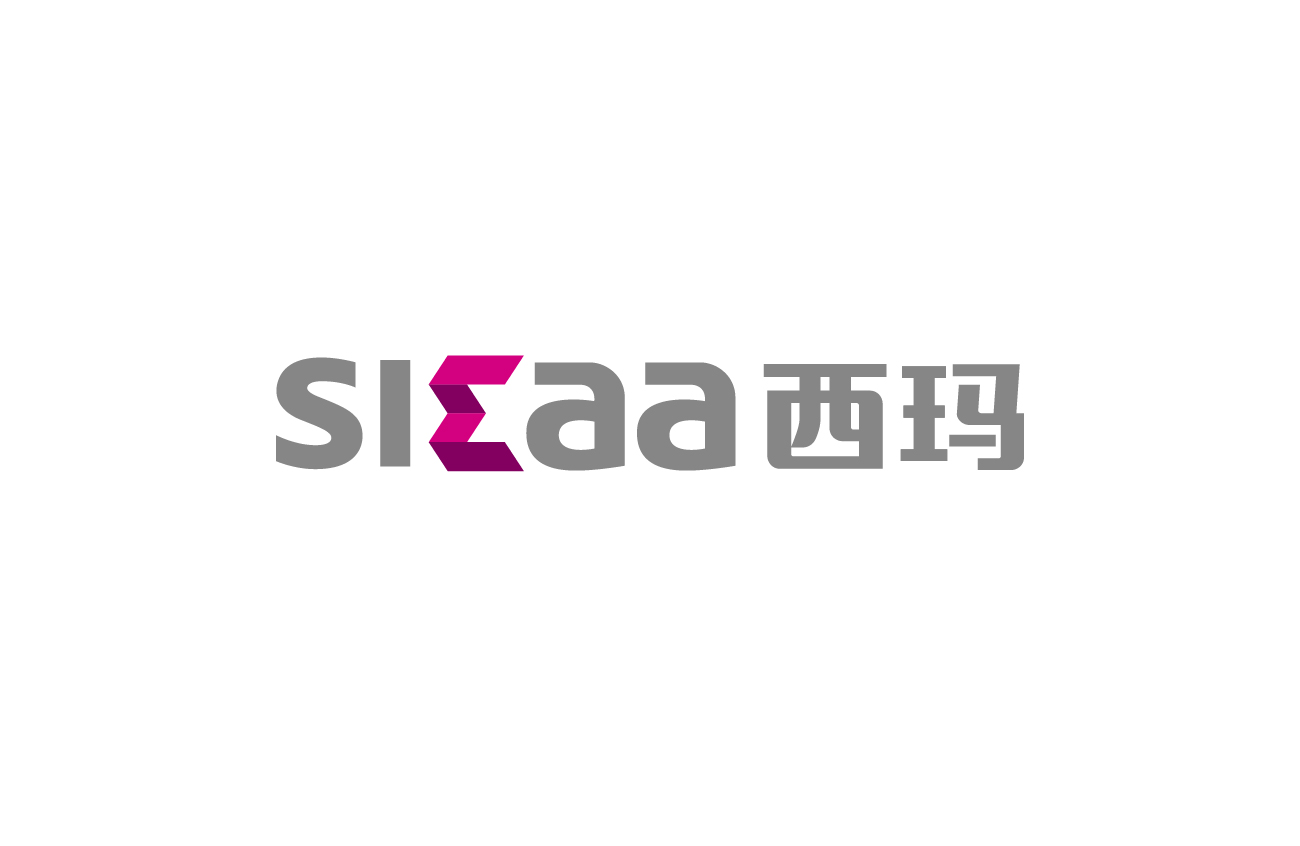
SKAA is an international technology brand specializing in smart audio connectivity and wireless transmission, delivering low-latency, high-fidelity wireless audio solutions for professional audio, consumer electronics and in-vehicle systems.
The brand's core idea is “Smart Link, Seamless Sound.” The logo uses simple geometric logic to express technology and the flowing beauty of sound, embodying the brand's technical ethos: connecting every possibility of sound.





design concept
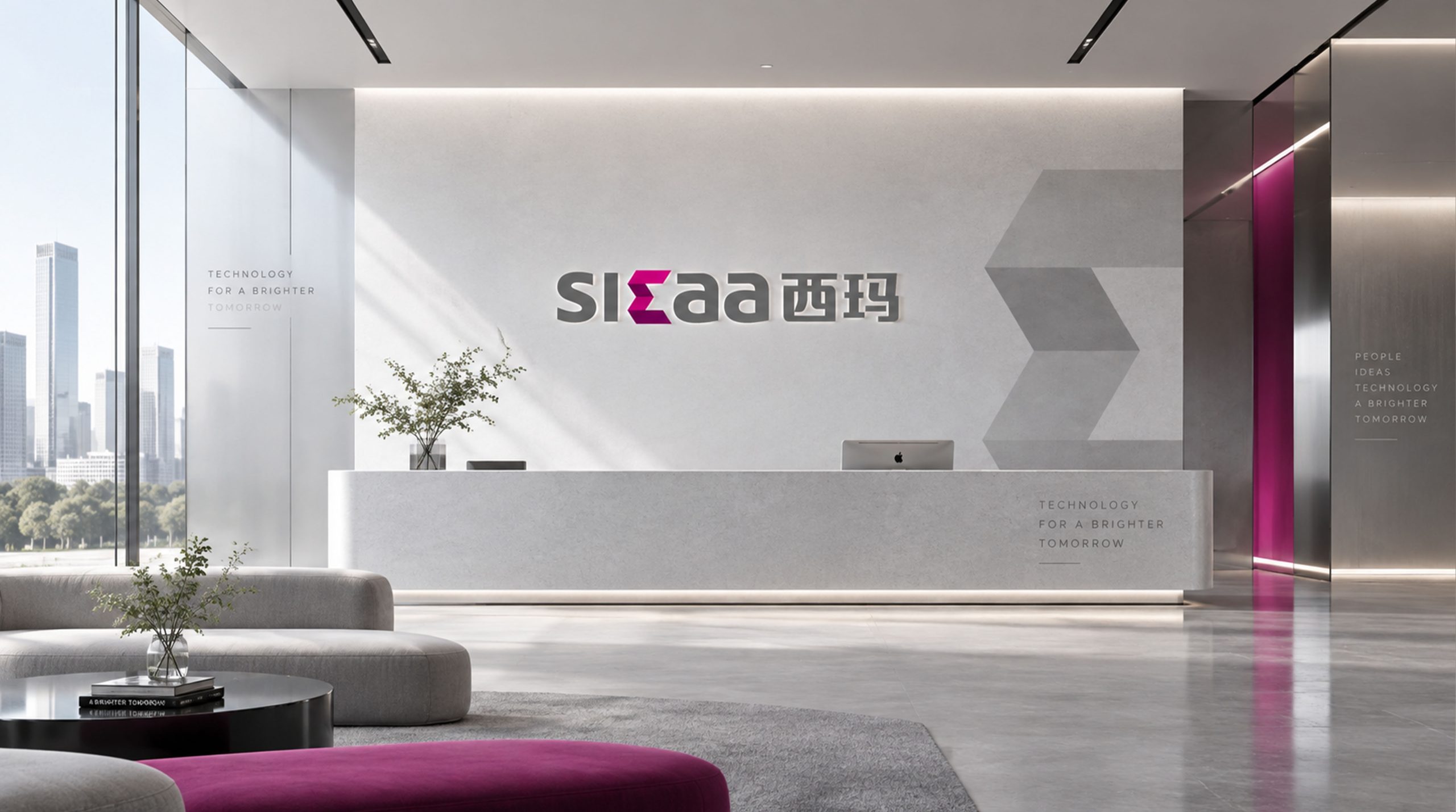
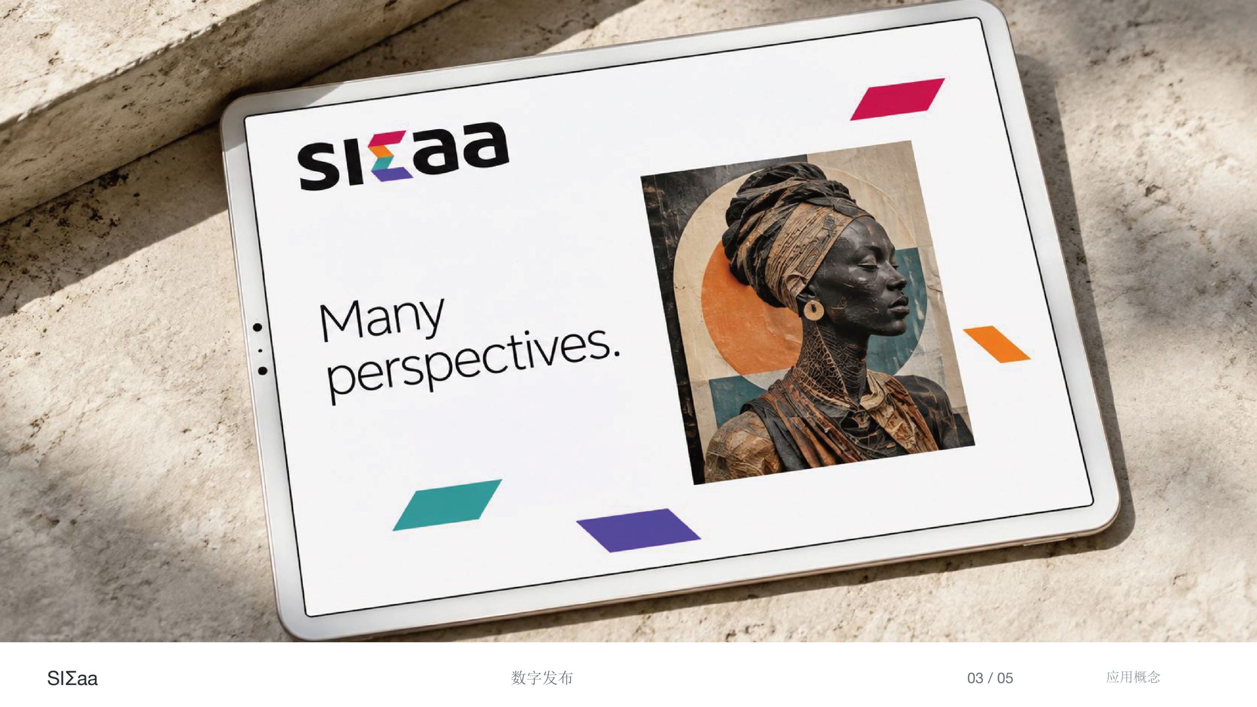
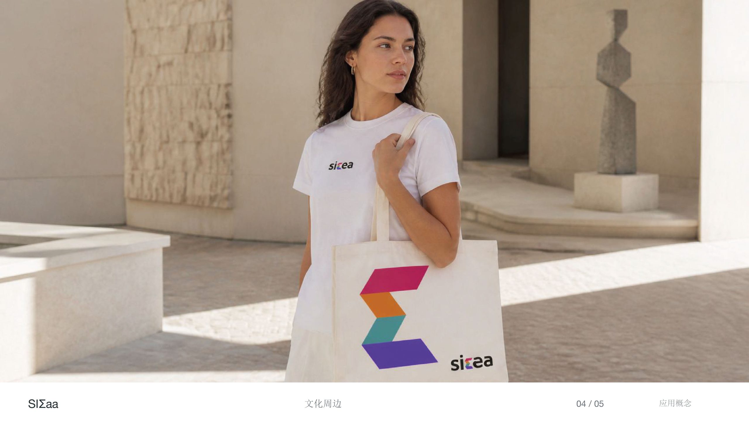
Built on a modern, minimalist wordmark, the logo embeds a multicolored, dynamic diamond chain link at the heart of the letter “K,” symbolizing the transmission of sound, the exchange of data and the connections of technology. Four gradient bands progress in a spiral, representing the “continuous flow of signal” while forming the brand's distinctive symbol — expressing how SKAA uses intelligent technology to seamlessly unite devices, spaces and the human listening experience.
graphic language
Geometric chain links: signal pathways, technological connection and sound waves. Central axial symmetry: precision and balance, reflecting high-performance wireless stability. Dynamic slant: creating a visual tension of speed and technology. Integrated with the lettering: symbol and letterform merge, making the brand iconic and instantly recognizable. Modern and technologically rigorous, the form conveys the technical strength of a smart audio brand.
Font composition
The SKAA wordmark is set in a bold sans serif with rounded, steady letterforms, symbolizing stable signal and a solid technological foundation. Neutral black lettering reinforces a cool technical tone, balancing the multicolored geometry at its center. Tight spacing and overall balance create a visual expression of “logical precision × emotional warmth.” The integrated horizontal layout suits digital screens, product nameplates and software interfaces.
color system
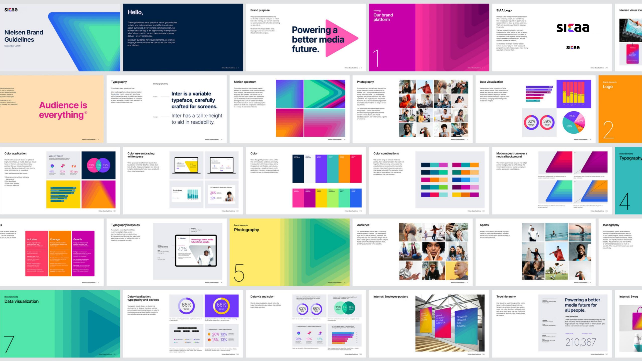
Primary Black #1C1C1C: technological rationality and brand composure. Secondary gradients: Red-Orange #F04E37 → #FBAF19 for heat and the energy of sound; Teal #3CBBA9 for technological flow and connectivity; Blue-Violet #6361E8 for technological intelligence and a vision of the future. The multicolor gradient represents the fusion of different frequencies and signal energies, conveying the brand's core idea: “sound without boundaries.”
Application and extension
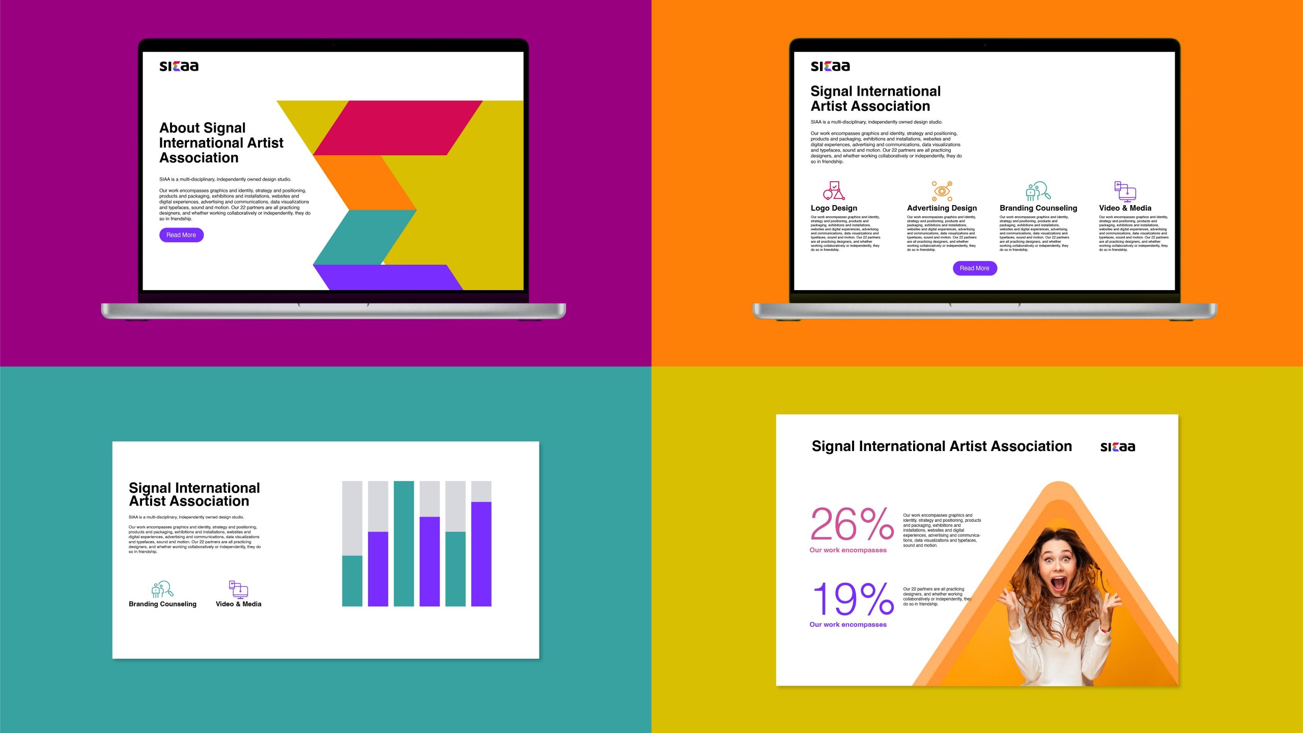
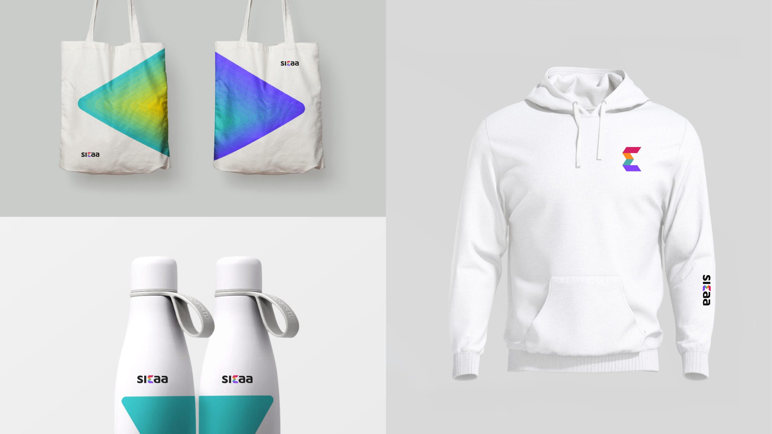
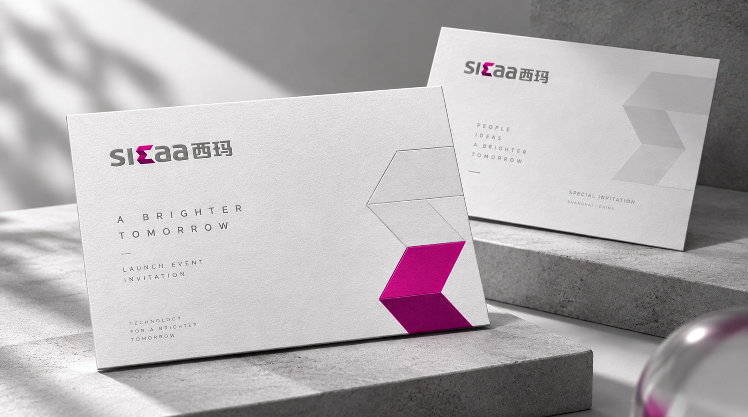
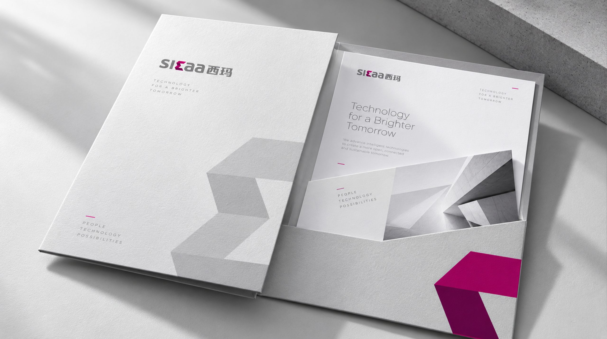
Built for digital use, the logo applies across: smart hardware (speaker housings, headphone shells, data modules); software interfaces and system icons (app icons, connection animations, splash screens); brand collateral (packaging, business cards, website, launch event backdrops); motion — the central chain link can rotate or ripple outward to visualize sound, strengthening the brand's “sound technology” memory anchor.
brand meaning
The logo brings together three layers of brand meaning: Connect — diamond links represent wireless interoperability between devices; Energy — gradients convey the flow of sound and signal; Balance — the fusion of lettering and symbol expresses the coexistence of stability and innovation. The composition reflects the brand's belief in “defining the future of listening through technology,” shaping an international technology brand that is both professional and human.
Improper Usage (Protection Specification)
Do not change the angle or color sequence of the central chain link. Do not stretch, skew or separate the logo. Do not add shadows, outlines or reflections. Do not overlay the logo with other graphics. Maintain clear space of at least 20% of the logo height on all sides. Minimum width: 24 mm.
design results
Following the launch of the new logo, SKAA achieved strong recognition at international audio technology shows and consumer electronics expos, and became one of the standard visual symbols for wireless audio connectivity protocols. User research showed a 47% increase in brand recognition, with the “colorful tech connection” imagery effectively communicating the brand's philosophy. Created by Qingmei Future, the design was featured as an exemplary project in “Visual Systems for Smart Technology and Digital Brands,” representing the minimalist aesthetic of a new generation of audio technology brands.