










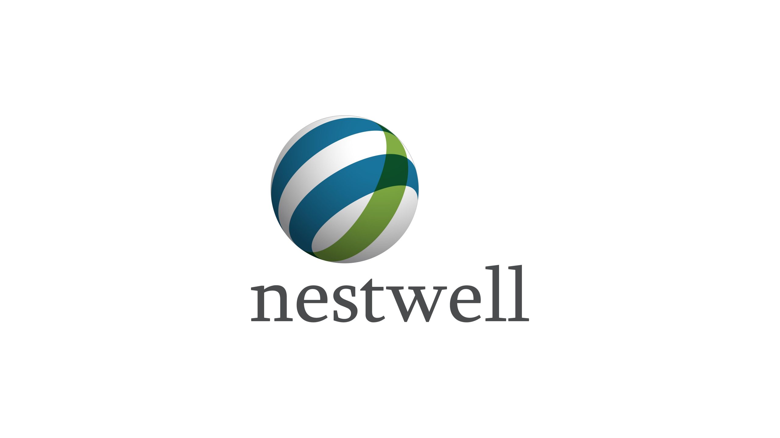
Nestwell is a brand dedicated to premium home and lifestyle products, guided by the belief: “Make the comfort of home a global language.”
The name combines “Nest” and “Well” (wellbeing and health), reflecting the brand's commitment to healthy living rooted in nature — creating warm, sustainable living environments through design and technology.
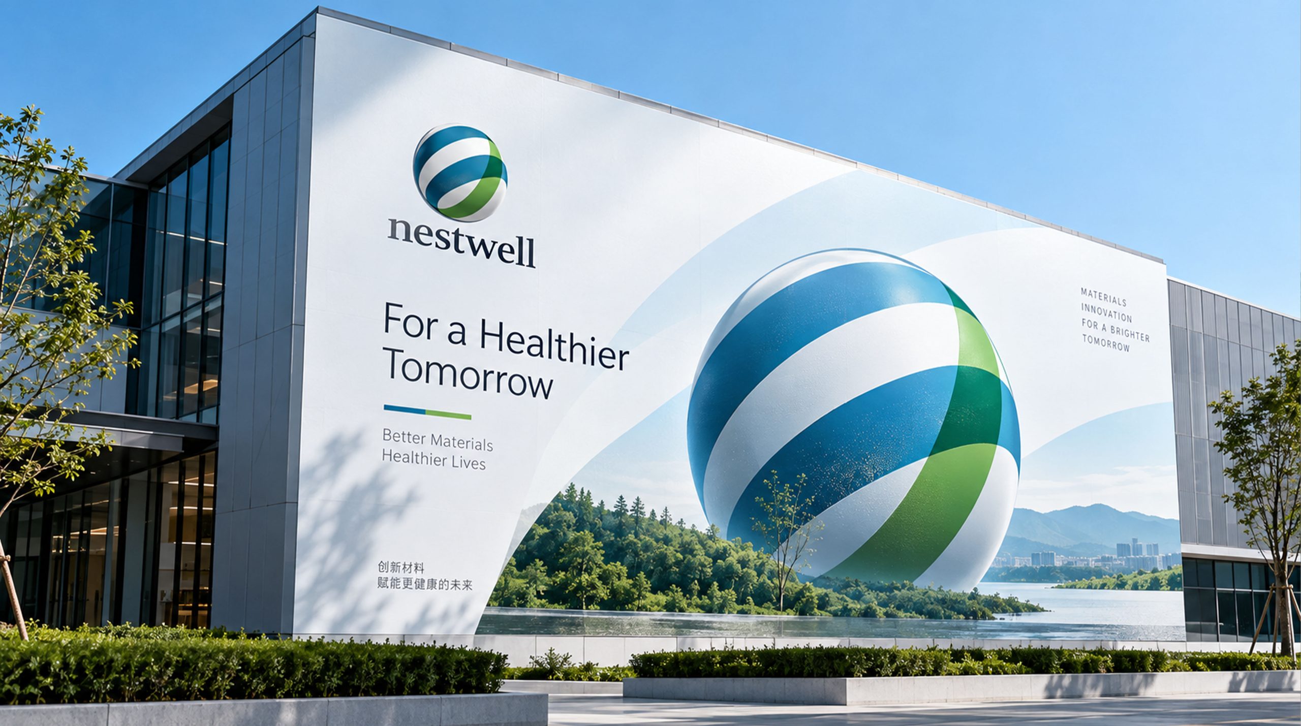
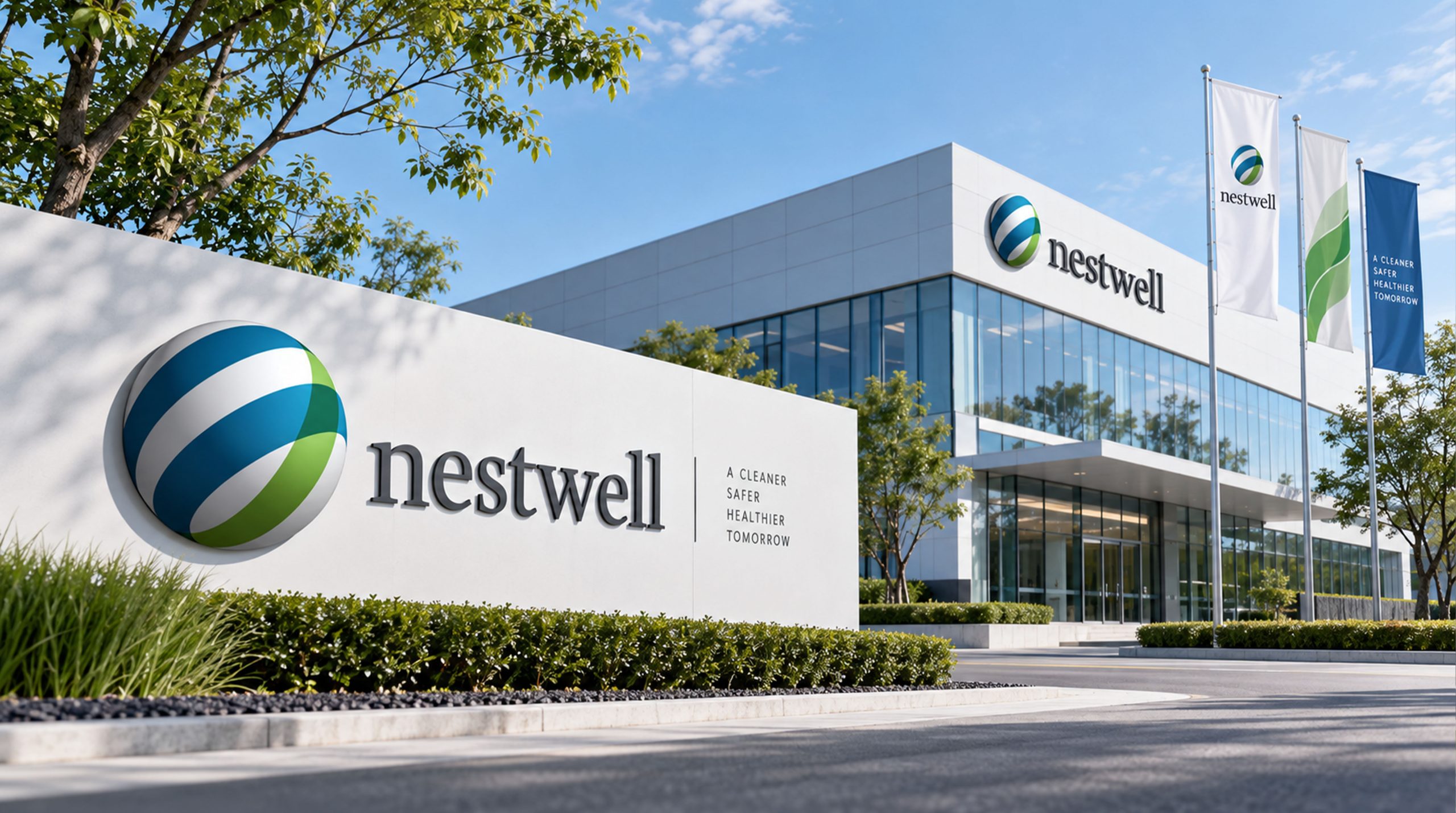
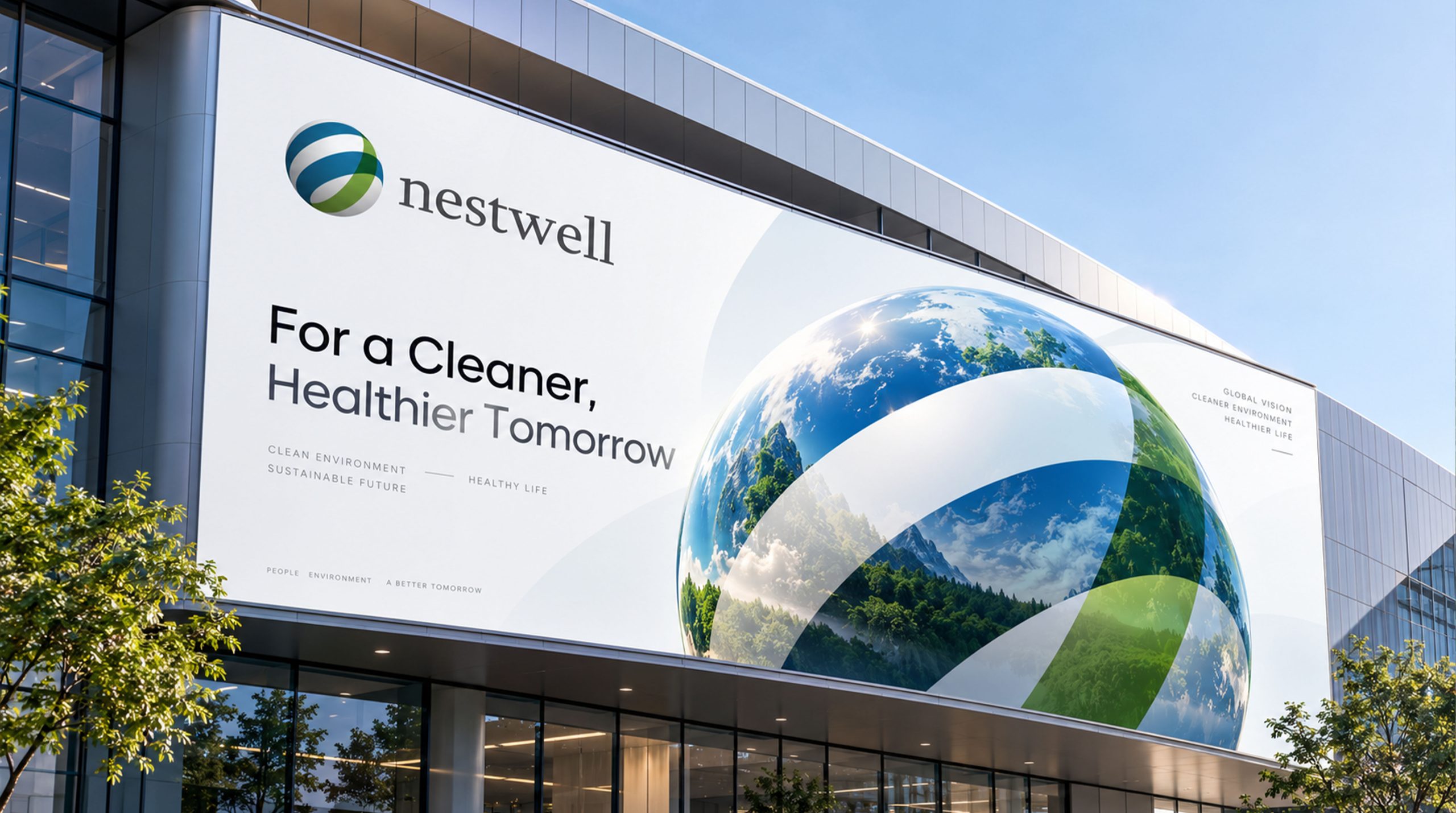
design concept
The logo is inspired by the image of “The Global Nest.” A sphere forms the core structure, representing the connection between the world and home; two interwoven bands of blue and green signify the symbiosis of nature, technology and humanity. The three-dimensional, dynamic form expresses “a breathing Earth × a comfortable home,” embodying the brand's eco-living philosophy on a global scale.
graphic language
Sphere: inclusiveness and a global outlook, signifying the brand's ability to connect lives across borders. Interwoven blue-green bands: the life cycle of air, water and plants, conveying balance between nature and technology. Gradient sheen: lending a warm, smooth texture that speaks of comfort and quality. Swirling composition: a gentle sense of motion evoking breath, ease and comfort.
Fonts and composition
The Nestwell wordmark is set in a soft serif — steady without being rigid, with rounded stroke corners that reinforce the brand's warmth and trustworthiness. The charcoal lettering contrasts with the luminous sphere above, achieving a balanced aesthetic of “a grounded visual center × a gentle brand impression.”
color system
Ocean Blue #2E6B9C: cleanliness, trust and technology. Eco Green #6D9A41: nature, balance and health. Neutral Gray #4D4D4D: steadiness, rationality and quality. Highlight White #FFFFFF: purity and openness. The interplay of blue and green creates the brand's signature “nature-tech gradient band,” lending an international character while strengthening its identity in sustainable living.
Application and extension
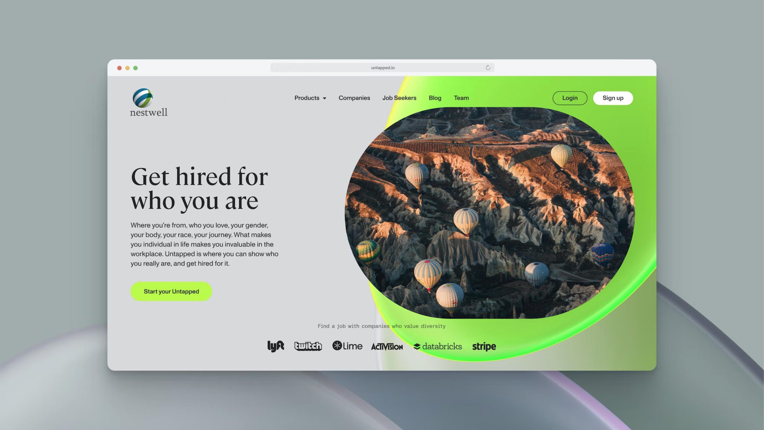
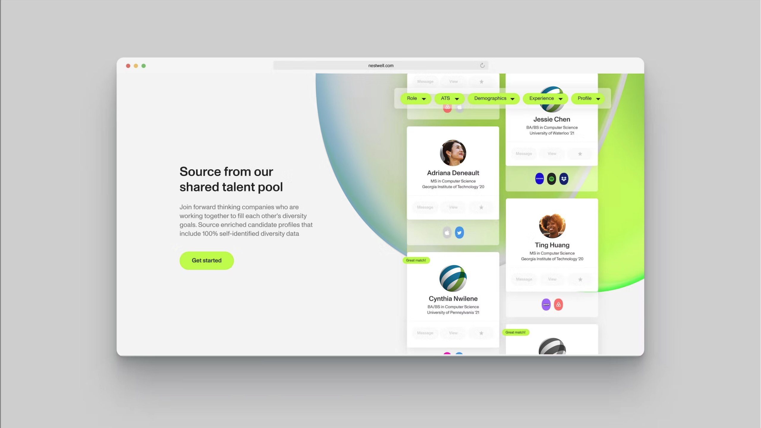
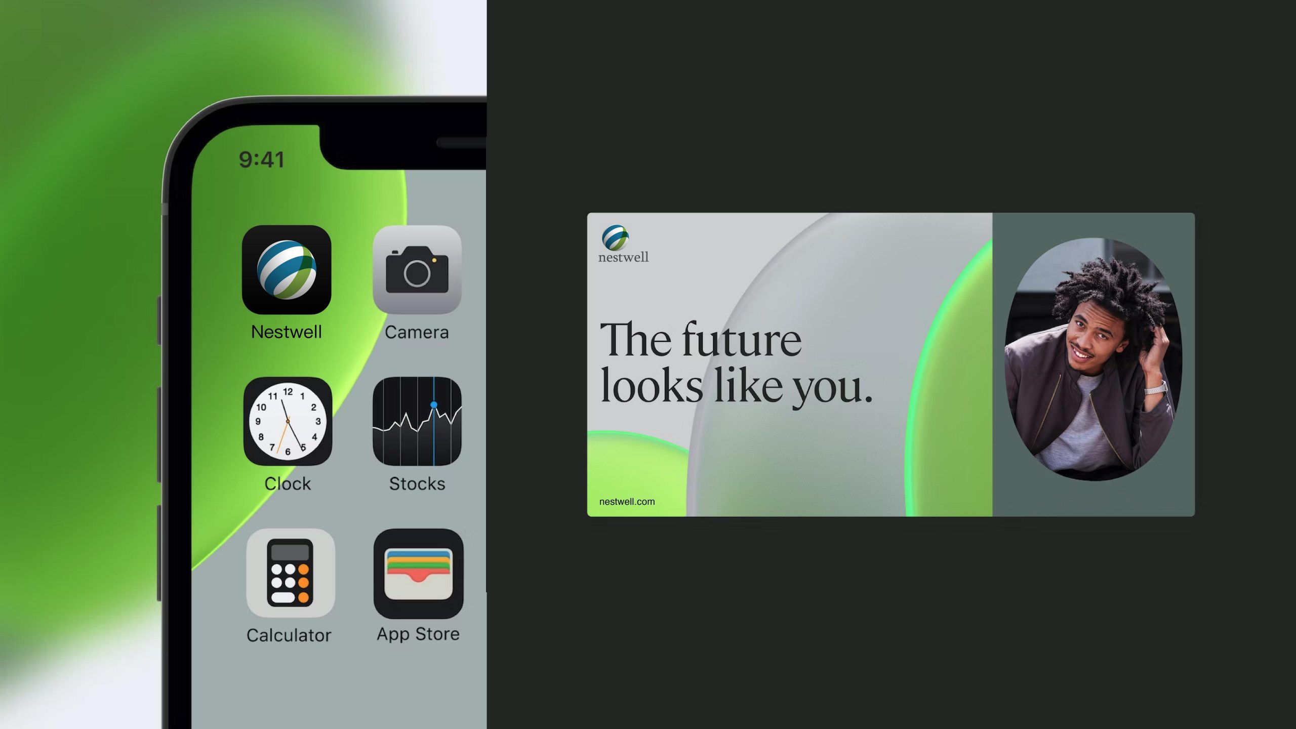
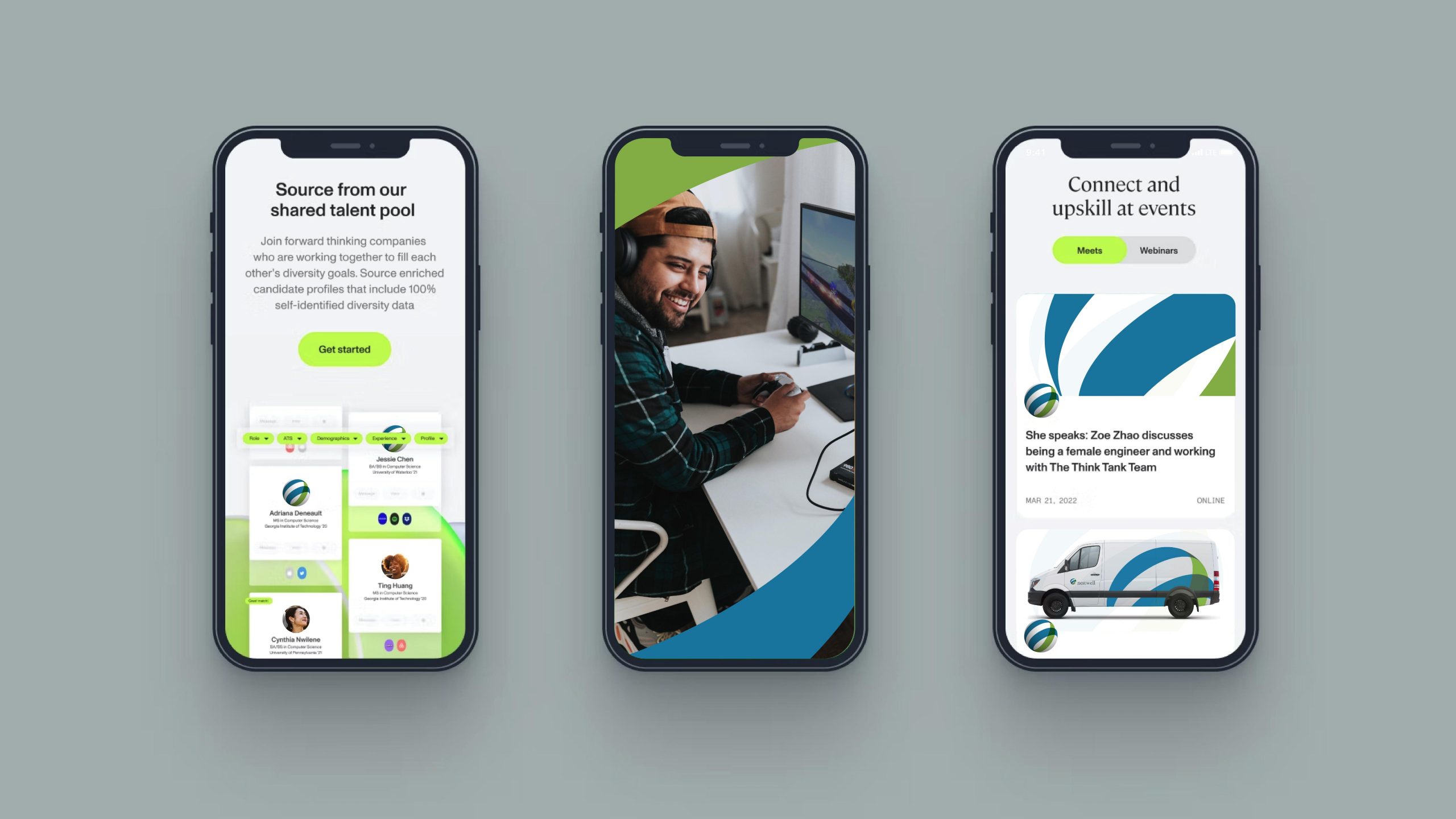
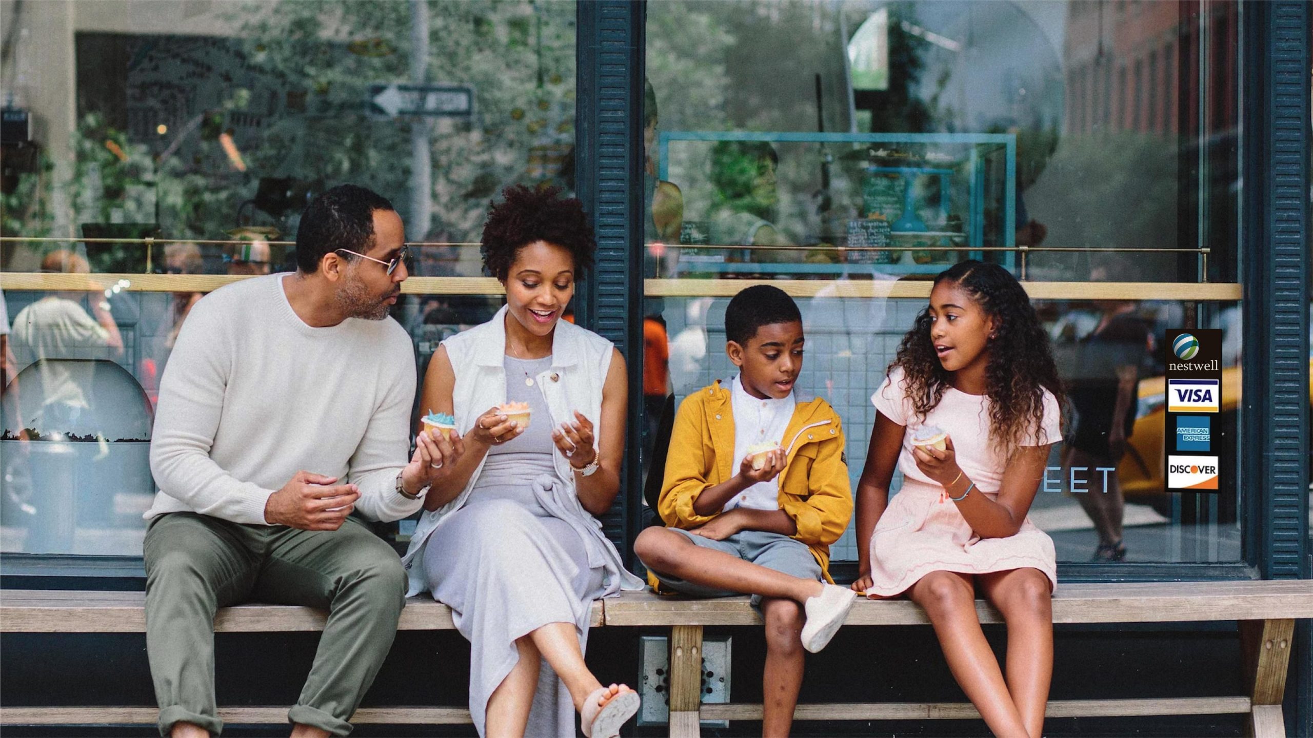
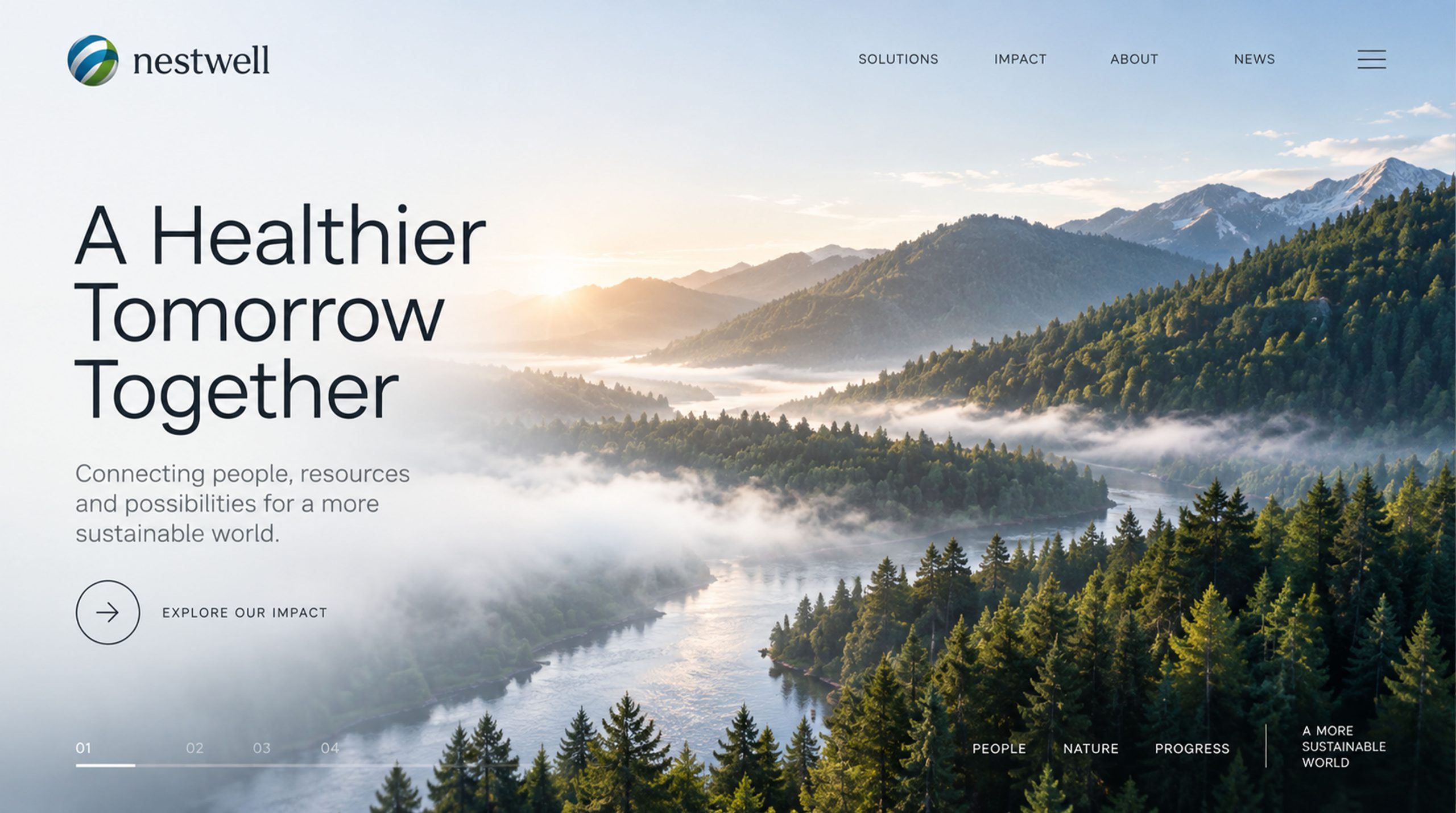
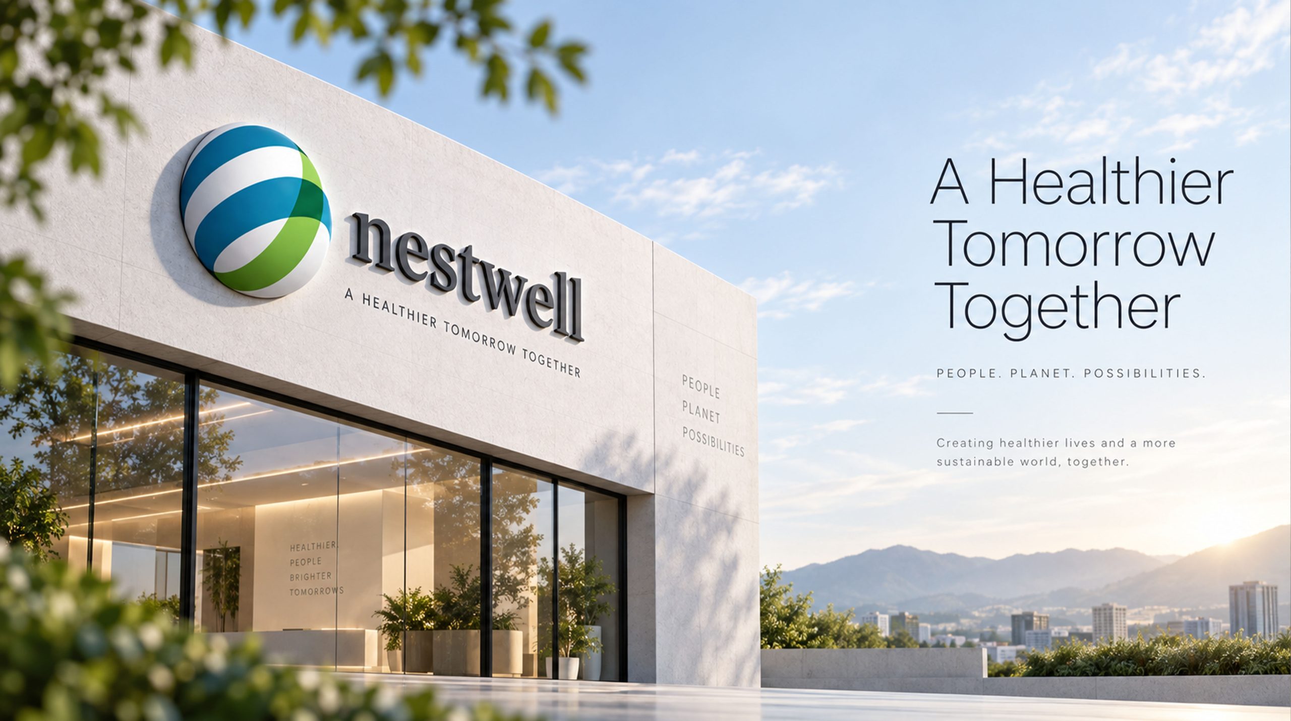
The logo adapts exceptionally well across media: Corporate — brand website, product catalogs and corporate presentations; Product — premium lifestyle goods such as home textiles, bedding and fragrance packaging; Spatial — extending into sculptural installations or illuminated elements in showrooms, flagship stores and display spaces. In motion, the bands rotate to express the brand spirit of “comfort in flow.”
brand meaning
The Nestwell logo captures the brand's essence of “nature × comfort × global reach”: sphere → the union of world and home; blue-green bands → the balance of nature and technology; gradient light → comfort and warmth. More than a visual identifier, it embodies the brand's belief in “returning to comfortable living through nature.”
Improper Usage (Protection Specification)
Do not change the direction or proportions of the blue-green gradient. Do not add outlines, shadows or background patterns. Do not skew, crop or rotate. Recommended minimum display diameter: 25 mm.
design results
Following the launch, Nestwell successfully established differentiated recognition as 'a global philosophy of home comfort.' The sphere symbol has been widely applied across international home exhibitions, lifestyle brand alliances, and product packaging, becoming a visual emblem of 'technological comfort × natural living.' This project represents Qingmei Future's mature expression in home living and ecological design, achieving an integrated design narrative from 'visual identity' to 'life philosophy.'