










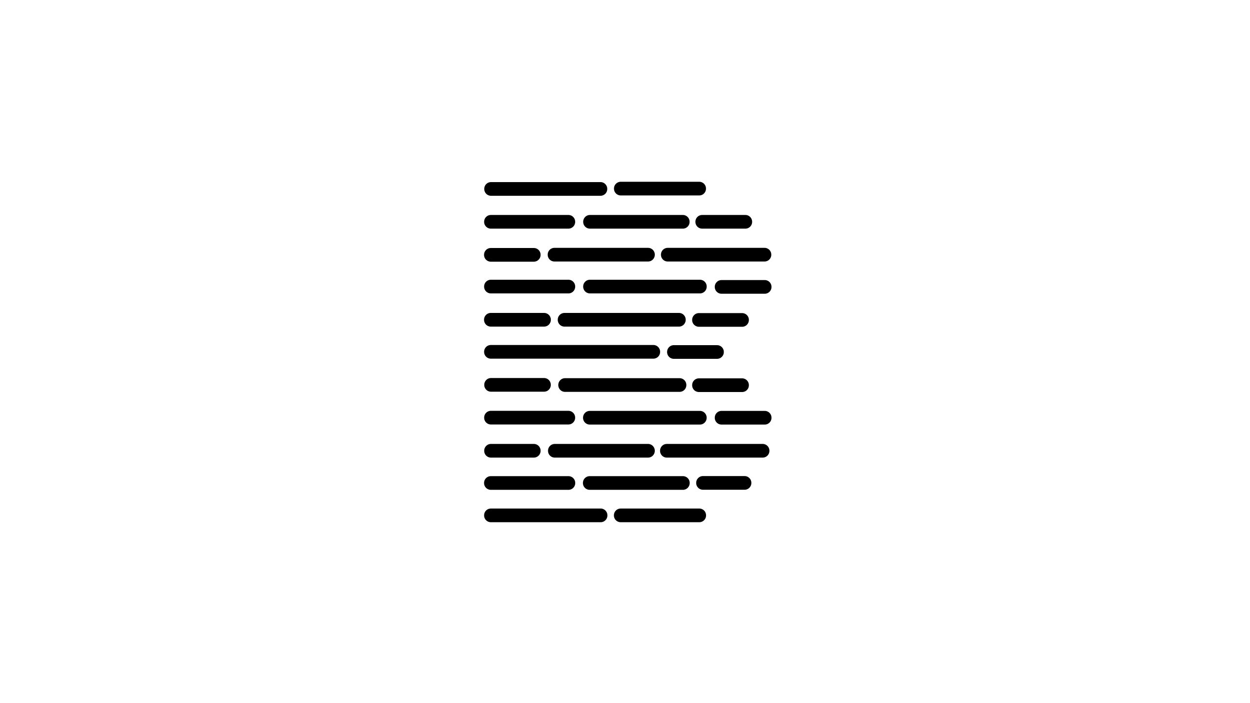
DATAFIELD is a technology company specializing in data security, information algorithms and digital infrastructure.
The brand’s vision is “connecting the future world of information through structured logic.” It called for a concise yet powerful symbol expressing data order, intelligent flow and technological depth.

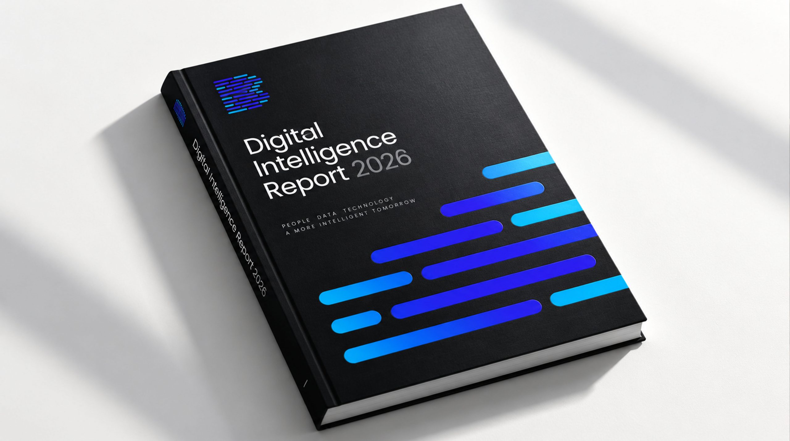
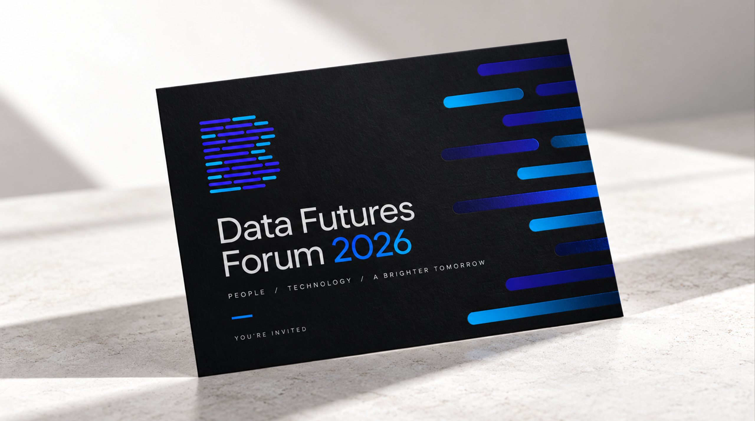
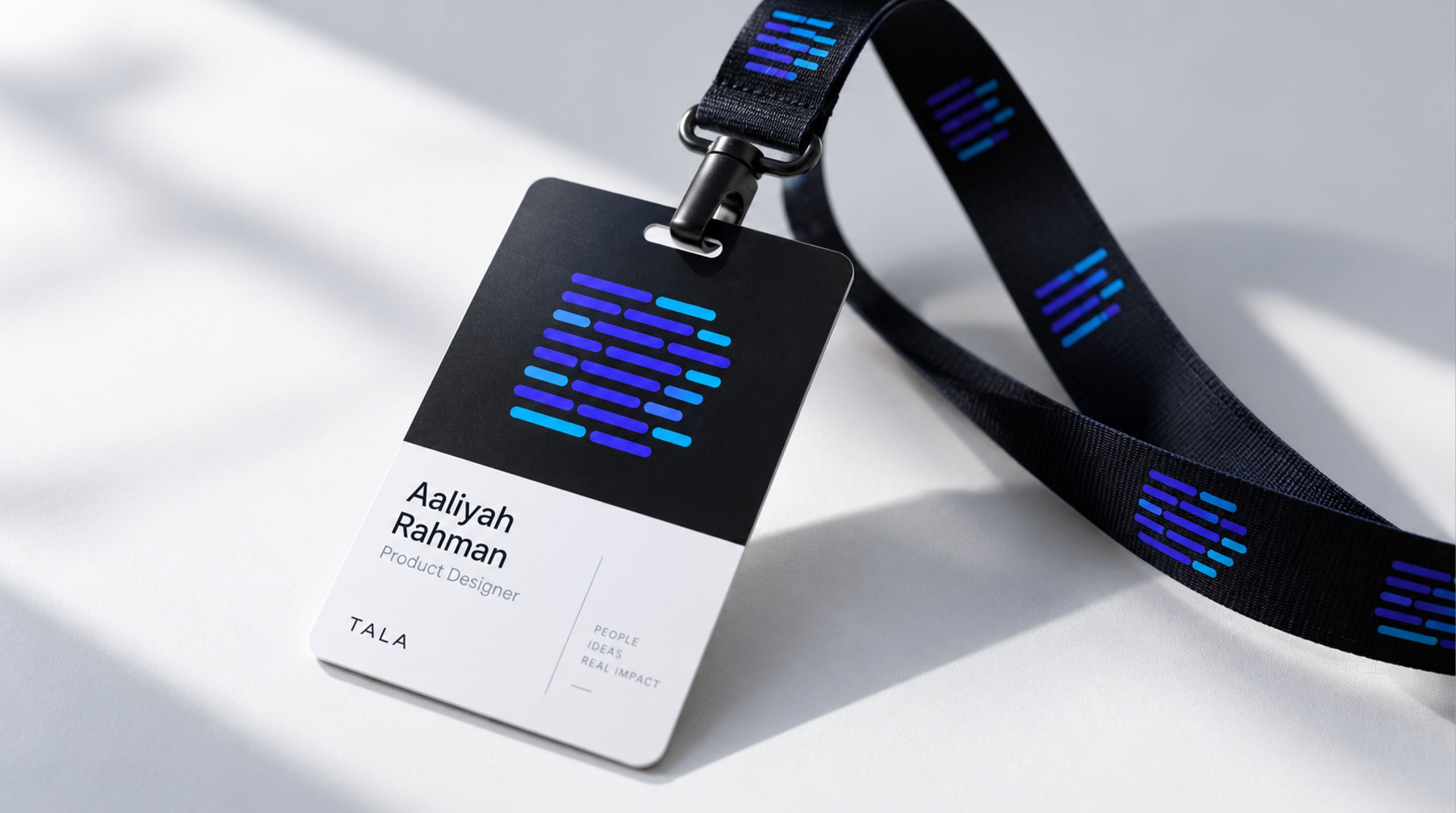
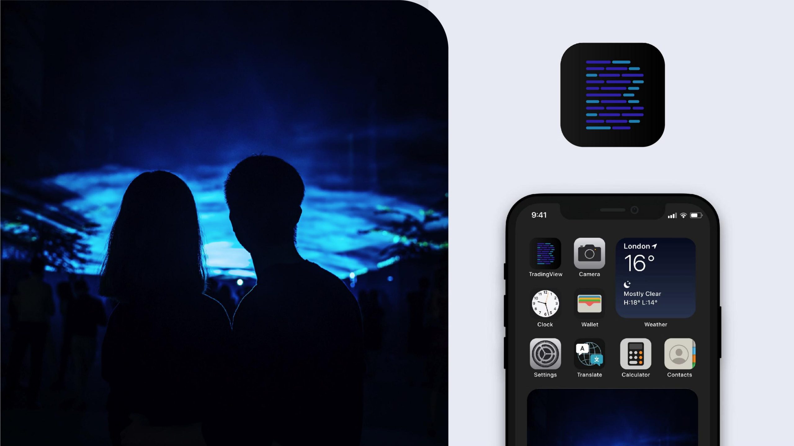
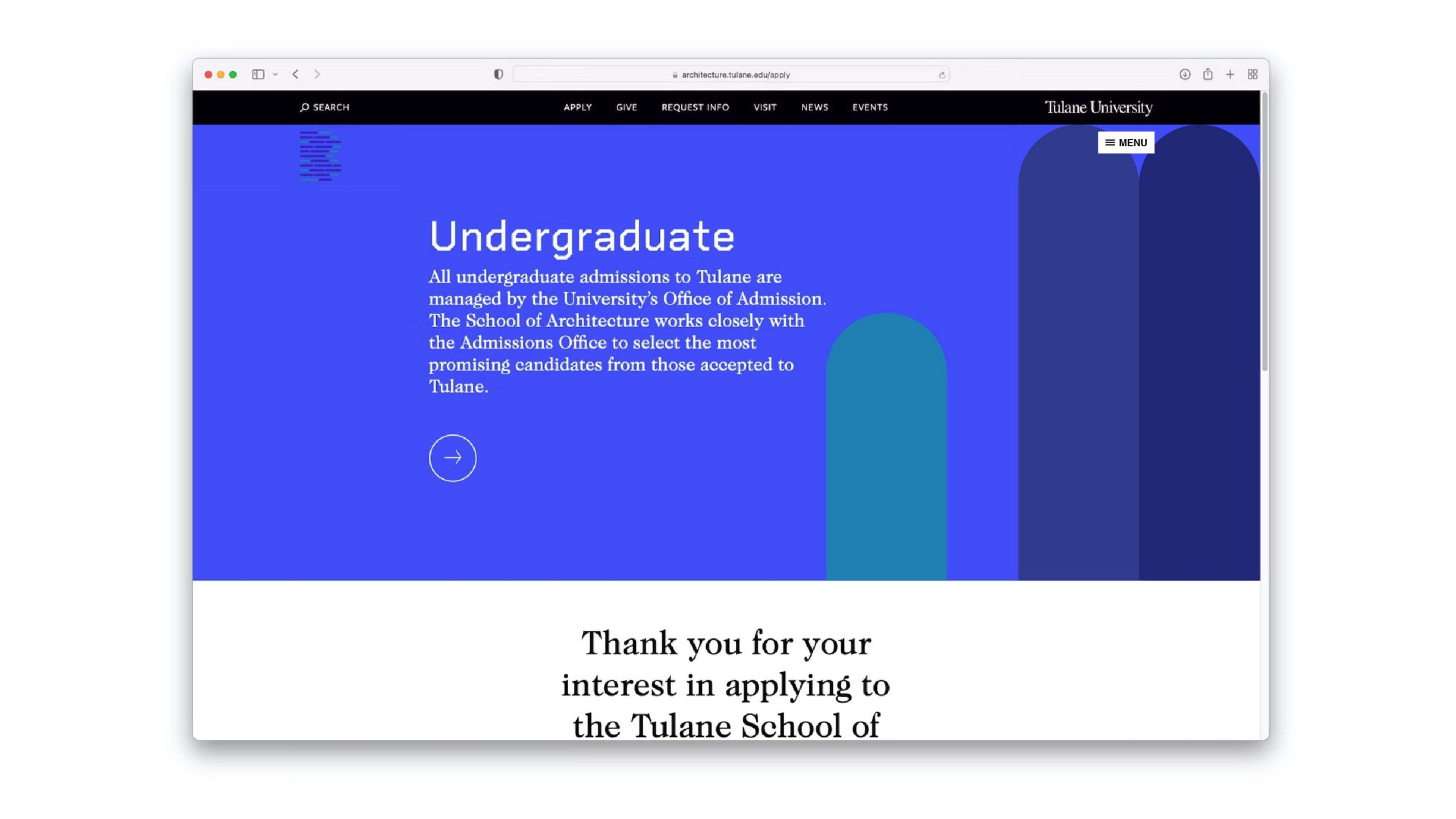
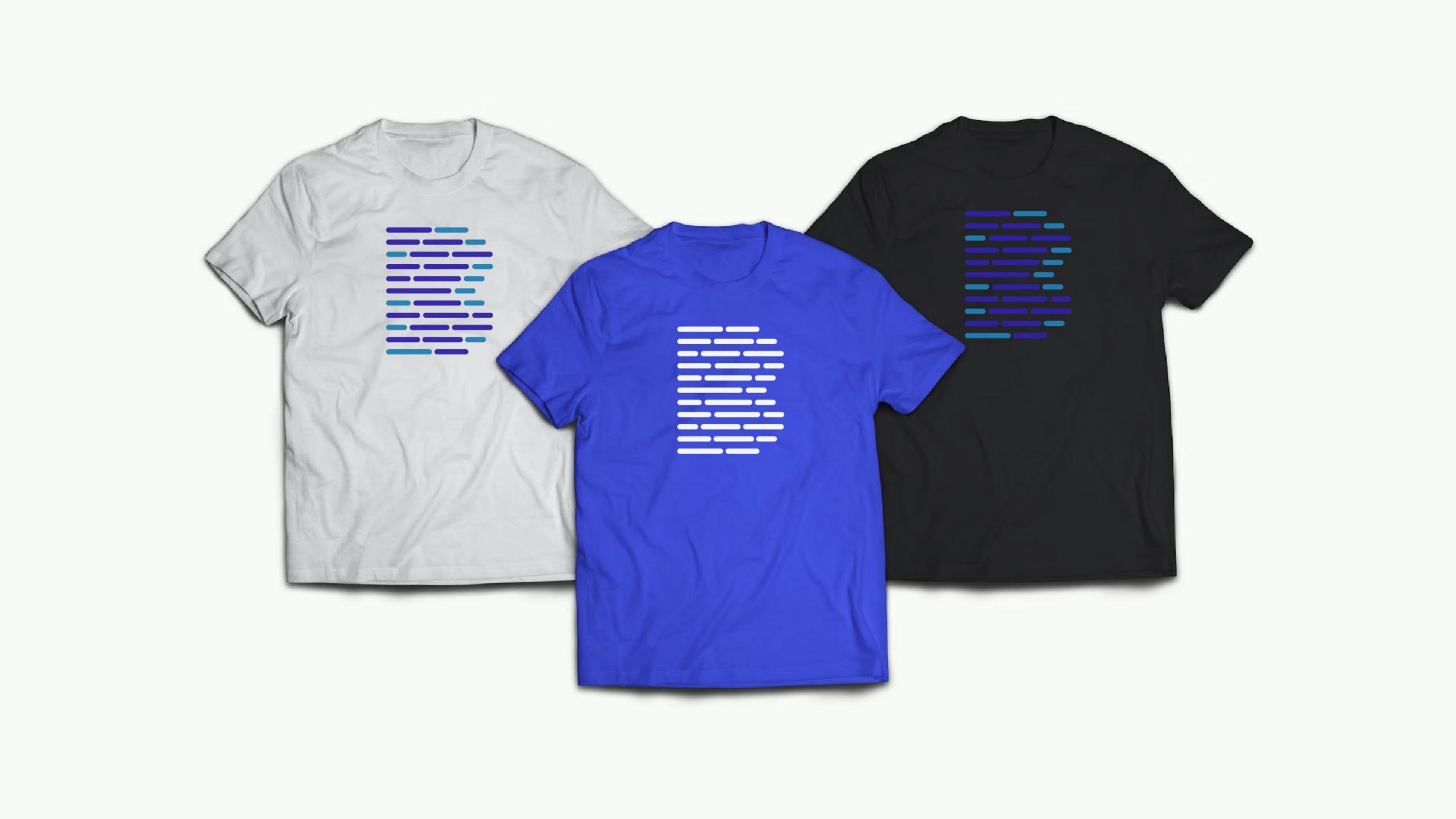
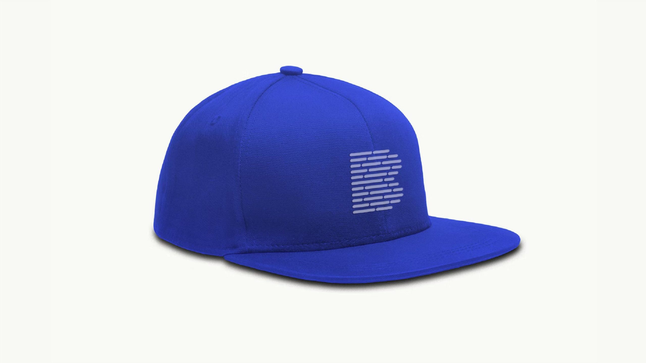
design concept
The mark is inspired by the concept of a “data field.” Horizontal bars of information stack into a layered matrix, tracing the paths of information flow and the logical structure of digital systems. Variations in line weight and density chart the evolution from scattered to aggregated, and from information to intelligence. The overall composition is clean
graphic language
Horizontal line array: data-transmission channels and the logical order of information. Density gradient: the dynamic flow and layered depth of algorithms. Central negative space: the self-regulation and open interfaces of information systems. Modular alignment: the layering, retrieval and systematic management of data. The graphic reads like a “flowing data monolith,” grounded in fact yet unmistakably futuristic.
Font composition
The DATAFIELD wordmark is set in a monospaced geometric typeface whose proportions match the lines of the symbol. Tightened letter spacing creates a sense of compression and dense information flow. A symbol-left, type-right layout reinforces the logical direction of the design.
color system
Deep Black #000000: the rationality, strength and absolute precision of technology. Mid Gray #555555: the blurred transitions between data layers and steps of logic. Light White #FFFFFF: information transparency and open connection. The black-and-white system underscores the composure and high recognizability of a technology brand.
Application and extension
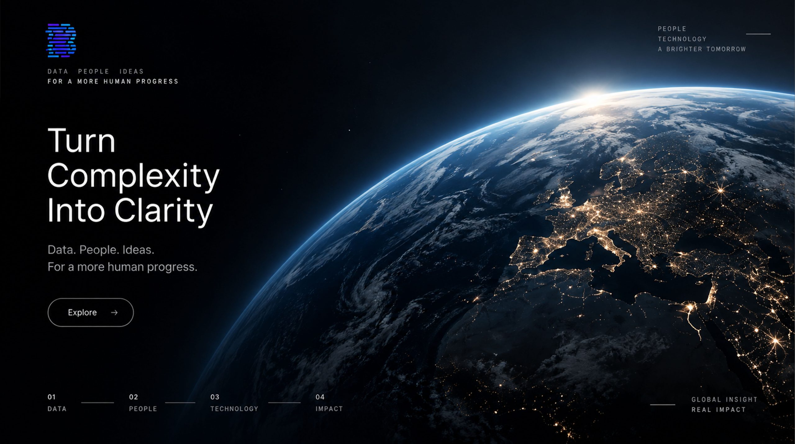
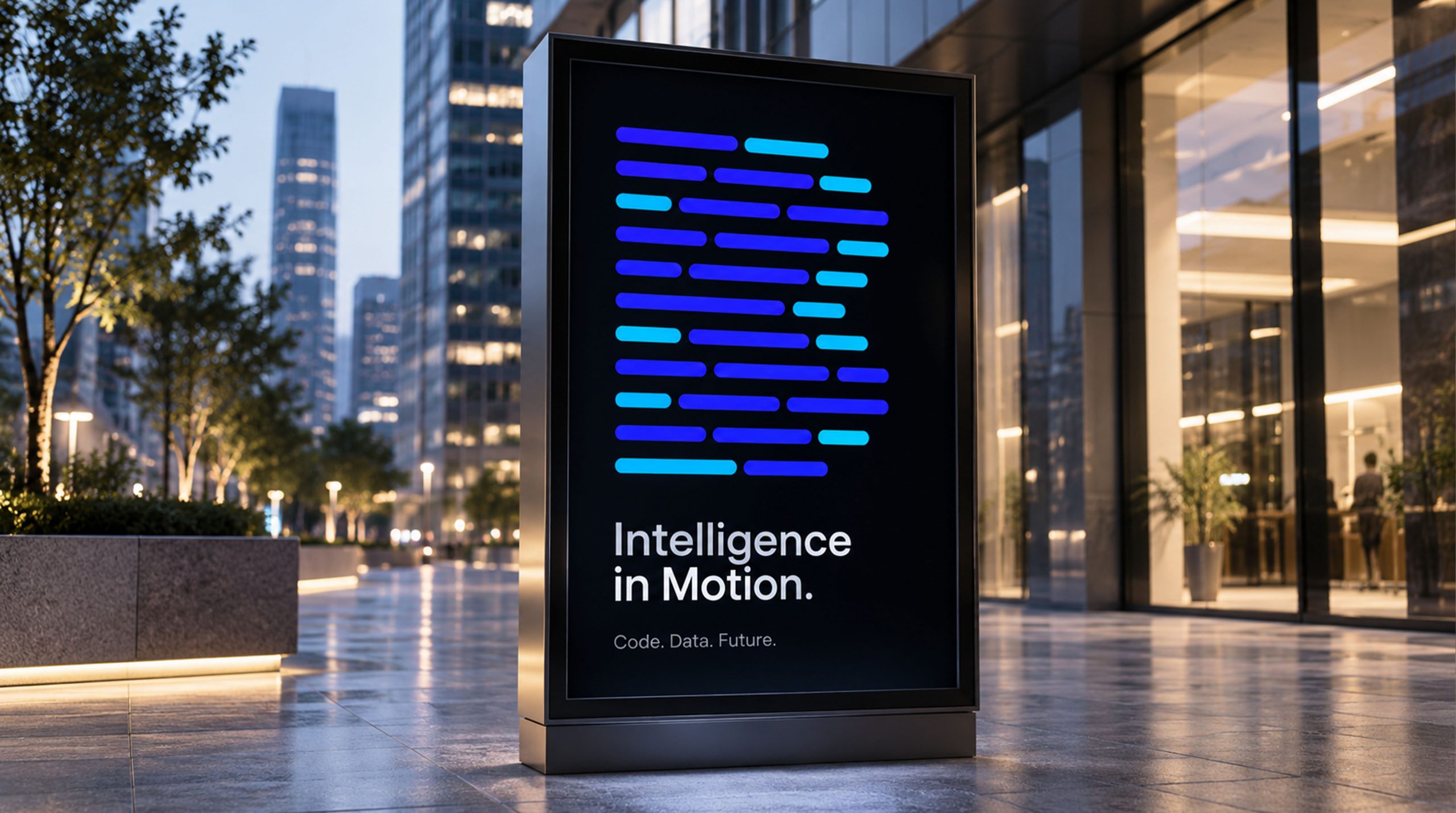
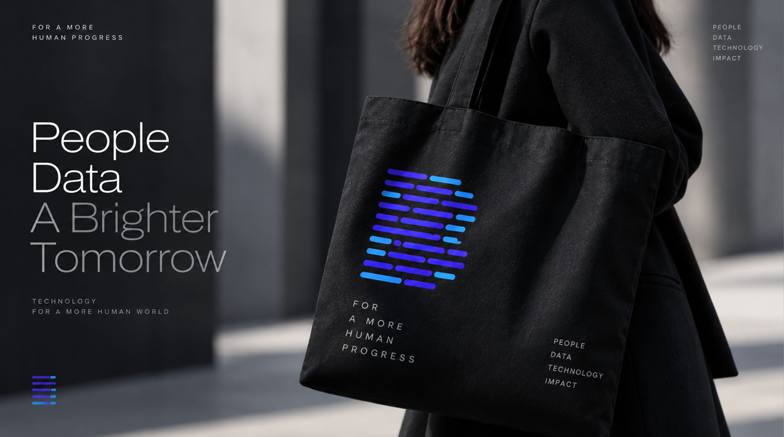
The mark adapts readily across contexts. Corporate: technical white papers, cybersecurity conferences and data-center identity systems. Product: server racks, hardware nameplates and primary UI icons. Spatial: extended as arrays of light strips in offices and showrooms to create a strong technological atmosphere. In motion, the lines can simulate information flow or scanning pulses, conveying the rhythm of intelligent computation.
brand meaning
The DATAFIELD mark expresses the brand’s core belief: “structure is intelligence; order is power.” Stripes → a visualization of information logic. Array → systemic order and self-consistent algorithms. Negative space → room for freedom and expansion. Black-and-white contrast → a balanced tension between reason and innovation. More than a corporate logo, it is a visual language for an information civilization.
Improper Usage (Protection Specification)
Do not alter the number, proportion or spacing of the lines. Do not add drop shadows, gradients or perspective effects. Do not skew, stretch or rotate the mark. Recommended minimum width: 25 mm.
design results
Since its launch, the DATAFIELD mark has become a highly recognizable symbol in information technology. Its graphic language of striped matrix × data logic is widely applied across AI computing, information security and cloud operations. It is another mature case of Qingmei Future’s work in data visualization and rational, ordered design, carrying a single expression from “visual graphic” through to “philosophy of information.”