










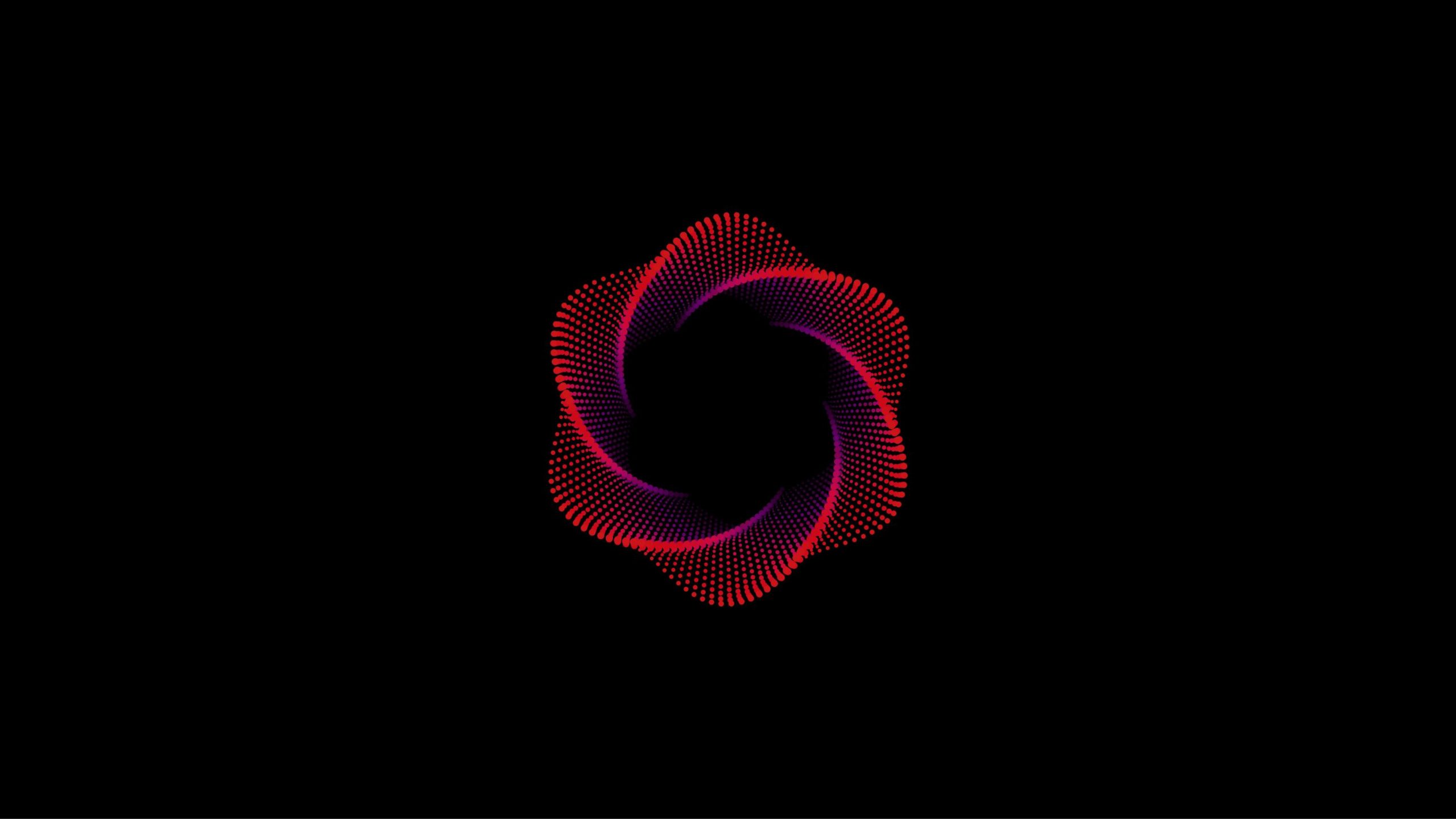
Xingyong Technology is a frontier technology company focused on quantum computing, algorithm optimization and data intelligence. Its vision is to reshape the underlying logic of the future information world through scientific innovation and breakthroughs in computing power.
The rebrand called for a visual identity that simultaneously expresses technological rigor, mathematical order and a sense of flowing energy — supporting the company's international communications across AI, algorithmic science and future computing.
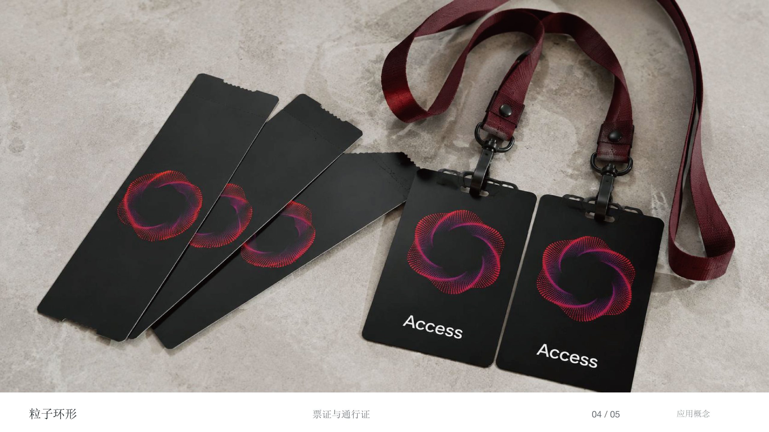
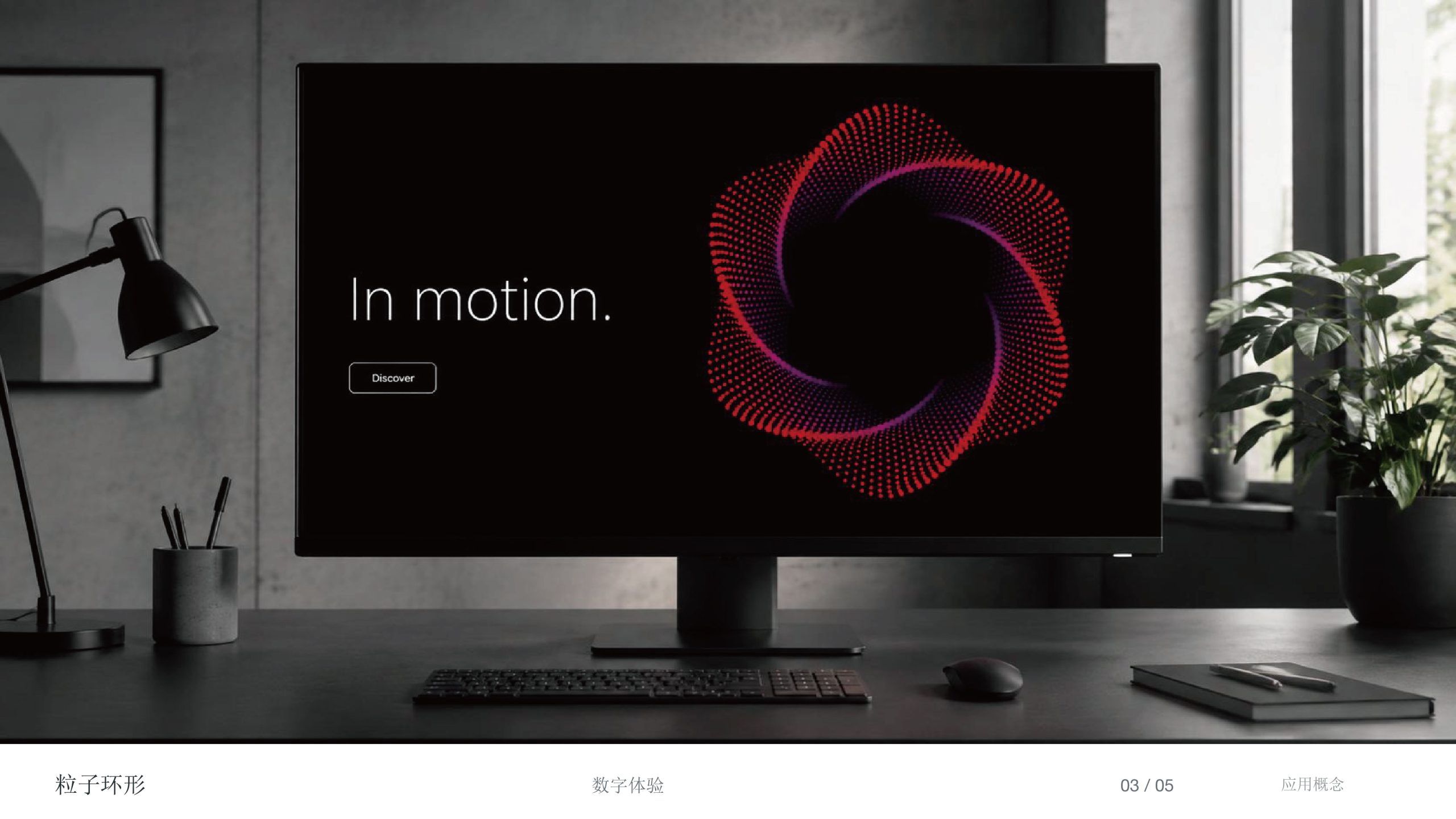
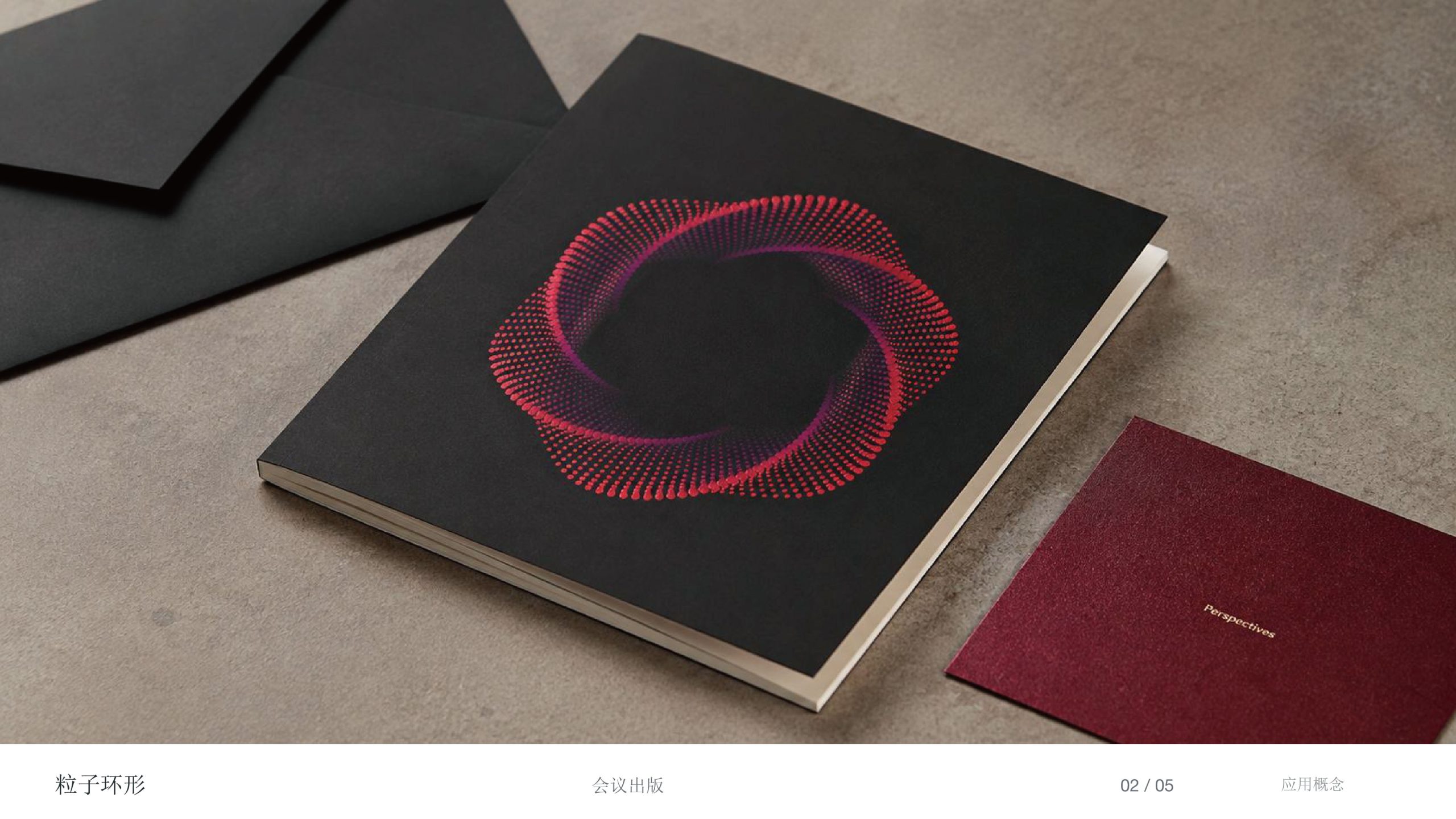
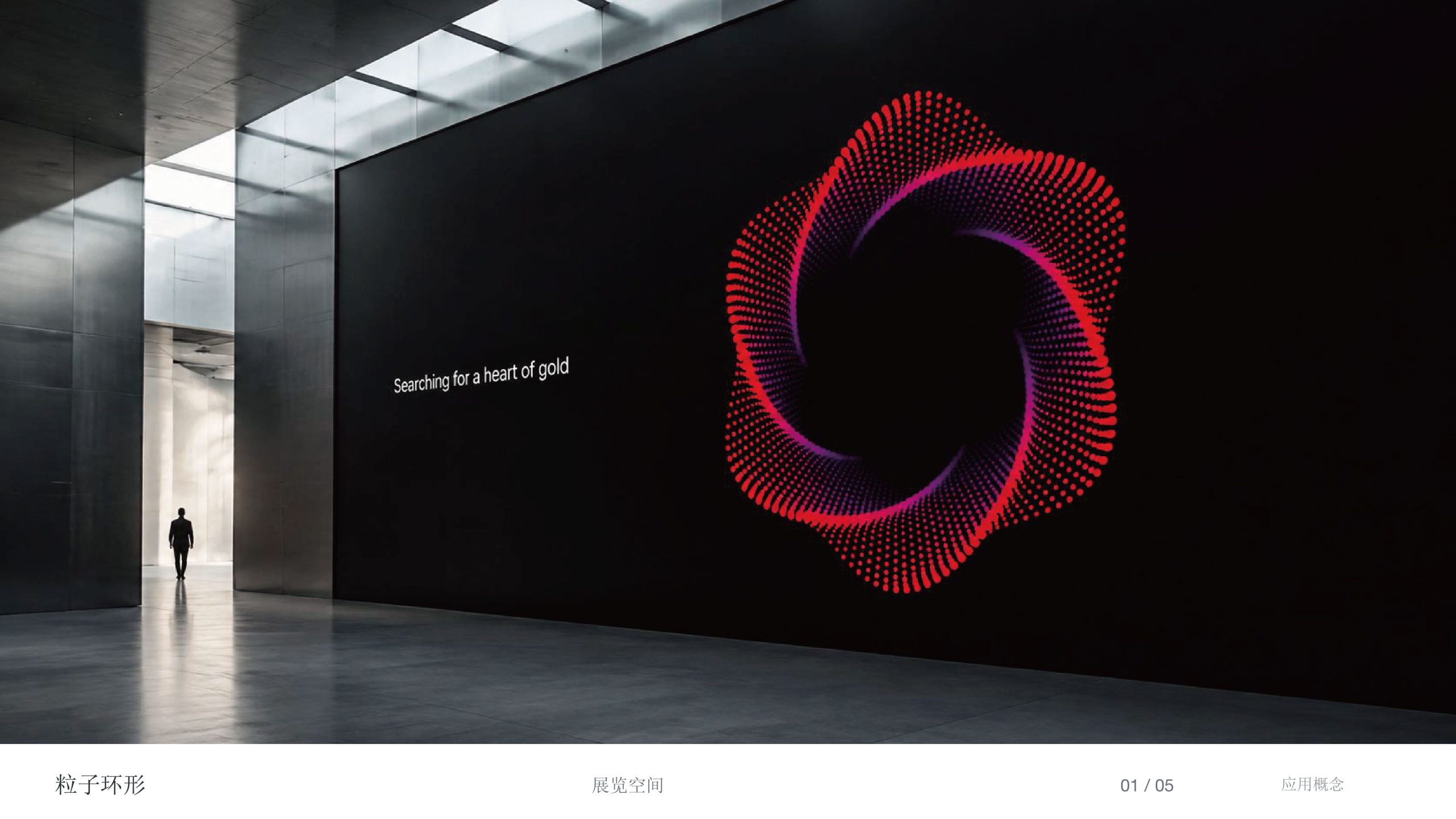
design concept
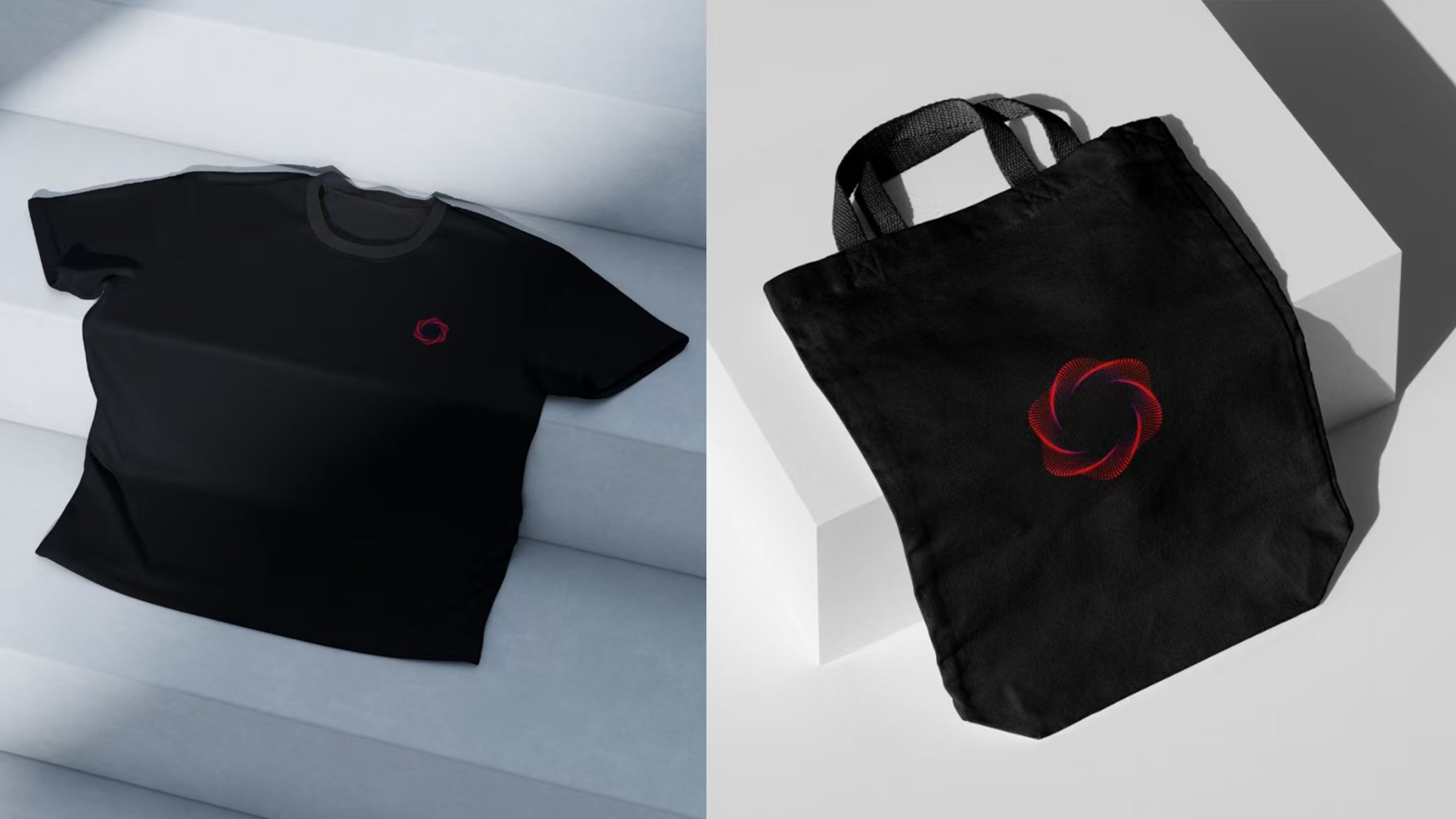
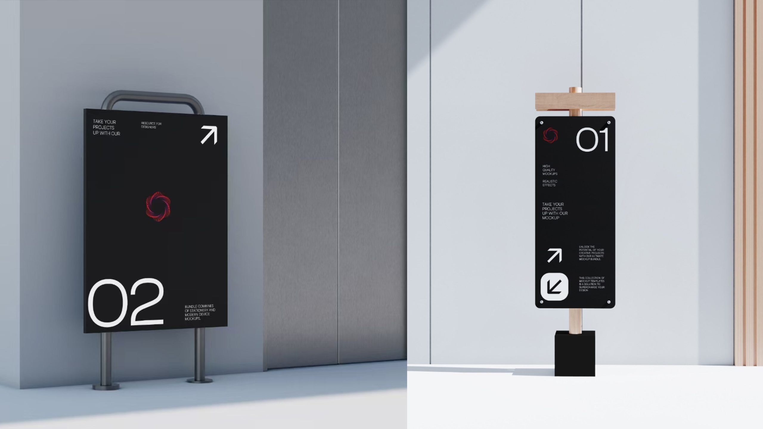
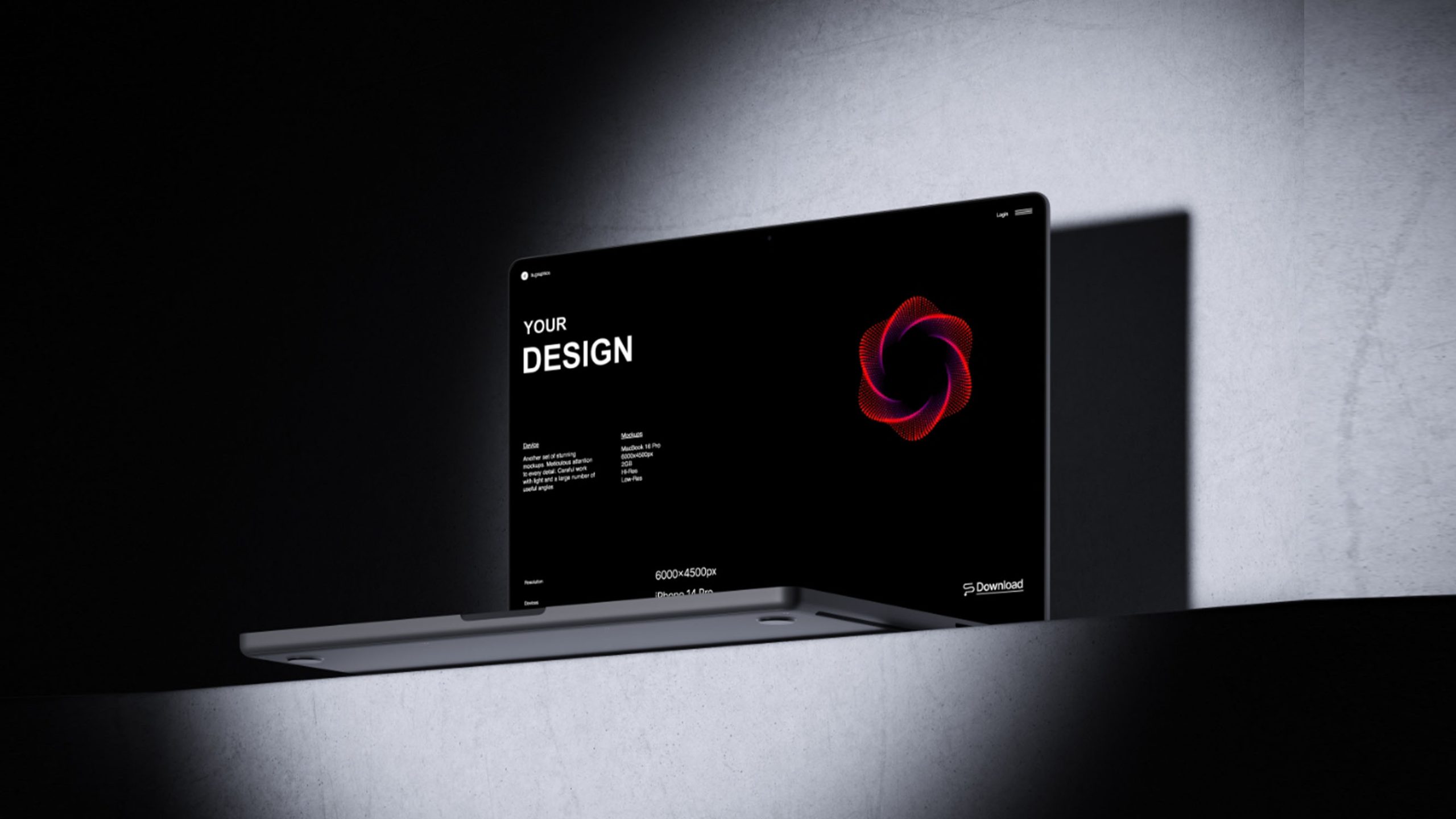
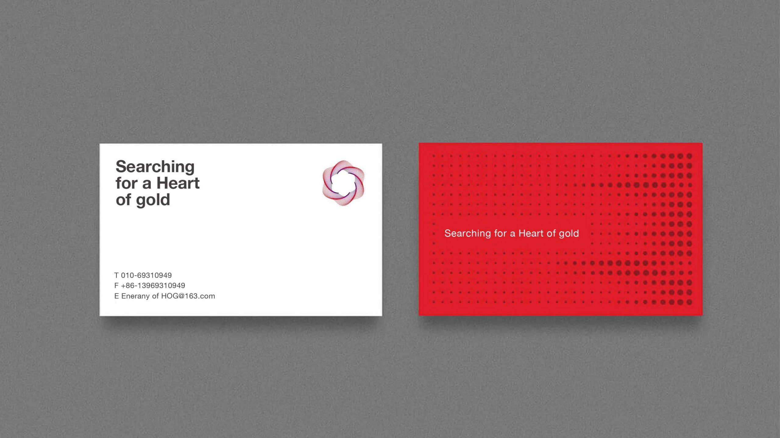
Inspired by “energy vortices” and “data waves,” the logo is composed of hundreds of dot-matrix units converging into a rotating hexagonal structure, symbolizing the aggregation of algorithmic energy and the coordination of intelligent networks. Its spiral form evokes both cosmic energy currents and the trajectories of data computed in the cloud. The mark embodies the brand's core: “Algorithms driving the future, order generating intelligence.”
graphic language
Hexagonal spiral: mathematical logic, algorithmic structure and systemic order. Radiating dot matrix: the diffusion of information and the superposition of quantum states. Gradient streamlines: an energy shift from purple to red, signaling the leap of innovation and the heat of technology. Central negative space: core computing power and limitless potential — “the center of the data universe.” Both scientific and artistic, the form resembles “an intelligently growing organism,” creating a distinctive language of technological aesthetics.
Fonts and composition
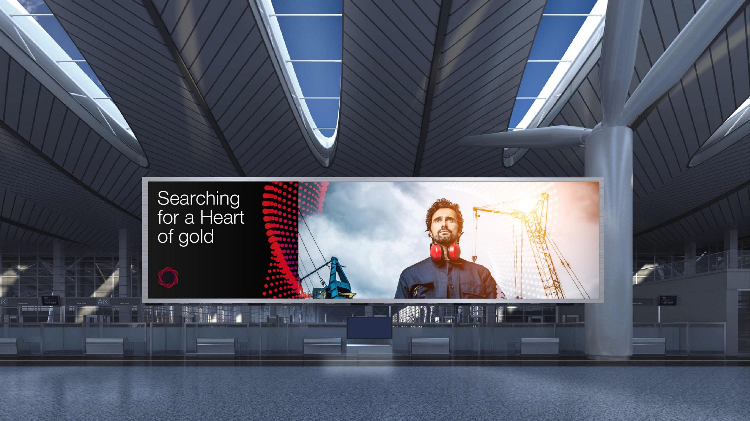
Pair with a clean geometric sans serif (e.g. Gotham / Source Han Sans) for strong legibility and an international feel. Recommended wordmark-to-symbol ratio: 1 : 1.5. The horizontal lockup suits corporate websites and product interfaces; the vertical centered lockup is better suited to exhibition key visuals and brand walls. Heavy strokes and tight letterspacing reinforce a sense of technological stability.
color system
Primary red-purple gradient: Deep Purple #512B76 → Red-Orange #E93A2F, symbolizing the flow of technological energy and the drive of innovation. Secondary Gray-Blue #A6B6C9: used for backgrounds, conveying calm rationality. Neutral Black #1E1E1E: reinforcing professionalism and technological trust. White ground: providing visual breathing room and enhancing a clean, technological feel. The palette balances “technological cool” with “energetic heat,” expressing the coexistence of reason and creativity.
Application extension
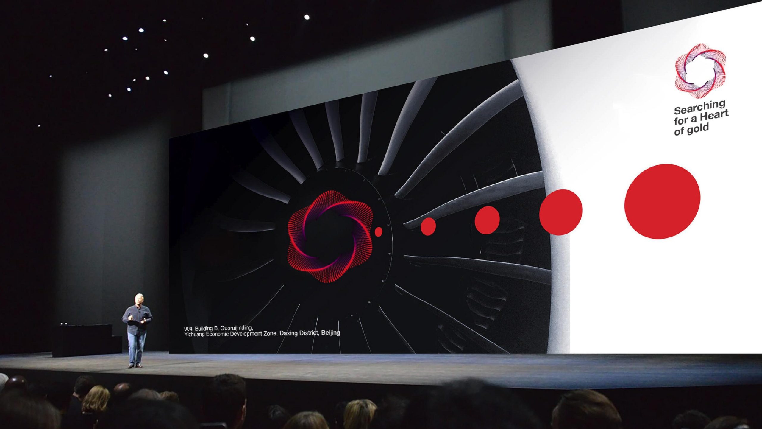
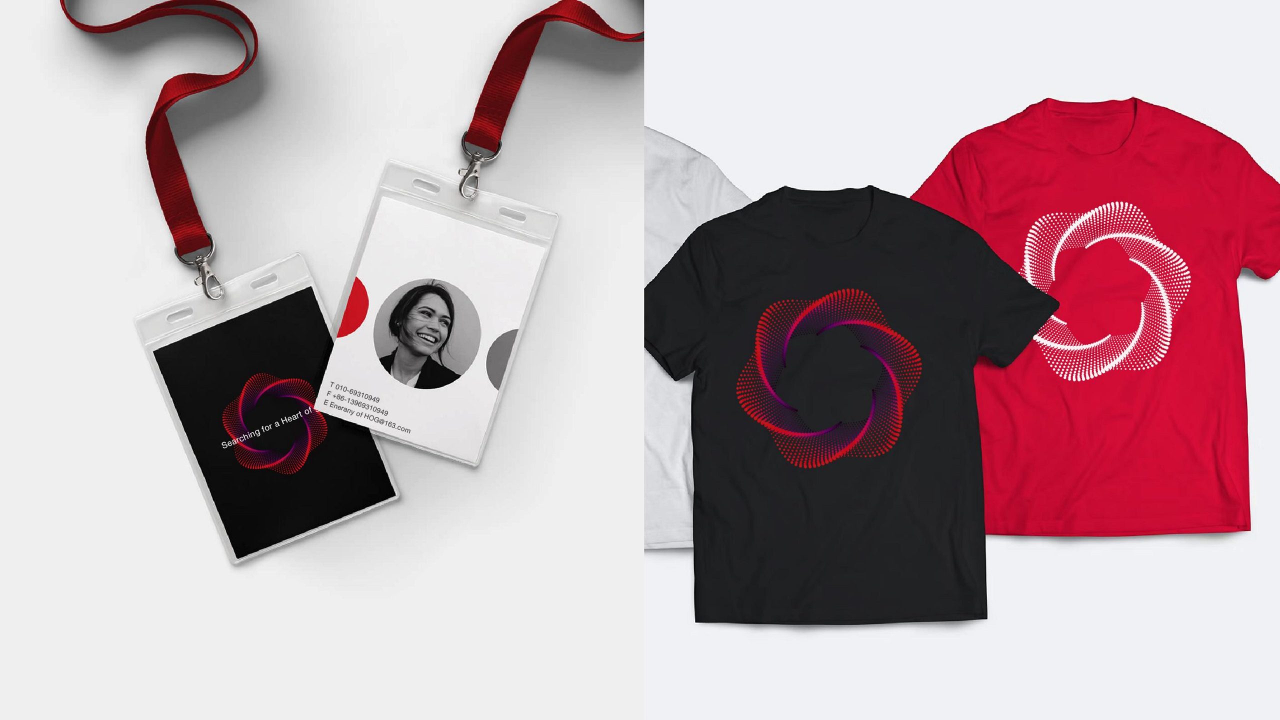
Highly dynamic and built for visualization, the logo applies across: algorithm platforms, AI software splash screens and system icons; annual reports, technical white papers, research display boards and brand films; motion — the dot matrix can animate to simulate data flow and energy diffusion, heightening the tech atmosphere; spatial design — the structure can evolve into light installations or wall grid textures, creating immersive technology environments. More than a visual mark, it is a symbolic system for the company's philosophy of data intelligence.
brand meaning
The logo unites three symbolic pillars of a technology company: Science — mathematical order and symmetry represent rational logic; Innovation — the dynamic spiral conveys continuous evolution and self-propulsion; Connection — the dot-matrix network signifies global intelligent collaboration and shared computing power. Like surging stars or self-generating algorithms, the visual expresses the company's underlying philosophy of “self-organizing intelligence.”
Improper Usage (Protection Specification)
Do not alter the spiral angle or dot-matrix density. Do not reverse the gradient direction or change primary color values. Do not add glows, shadows or outlines. Do not crop, rotate or distort the logo. Maintain clear space of at least 20% of the logo height on all sides. Minimum display width: 30 mm.
design results
Since the launch, Xingyong Technology has presented a highly recognizable, unified identity at international AI and algorithm conferences. The logo's motion visuals have been widely used in data visualization and brand launches, and media have hailed it as “a model fusion of the beauty of technology and mathematics.” The project earned Qingmei Future the “Best Technology Brand Identity Design Award” and was included in the casebook “Annual Selection of Intelligence and Computing Visual Systems.”