











LONTRUE is an integrated enterprise specializing in natural fruit and vegetable products, ecological agriculture and health foods. Guided by the philosophy “nature empowers health,” its core strengths are green cultivation, technology-driven processing and a global supply chain.
This identity upgrade sets out to build an international, ecological and sustainable brand image that reflects LONTRUE's innovation and responsibility across the global agriculture and health value chain.
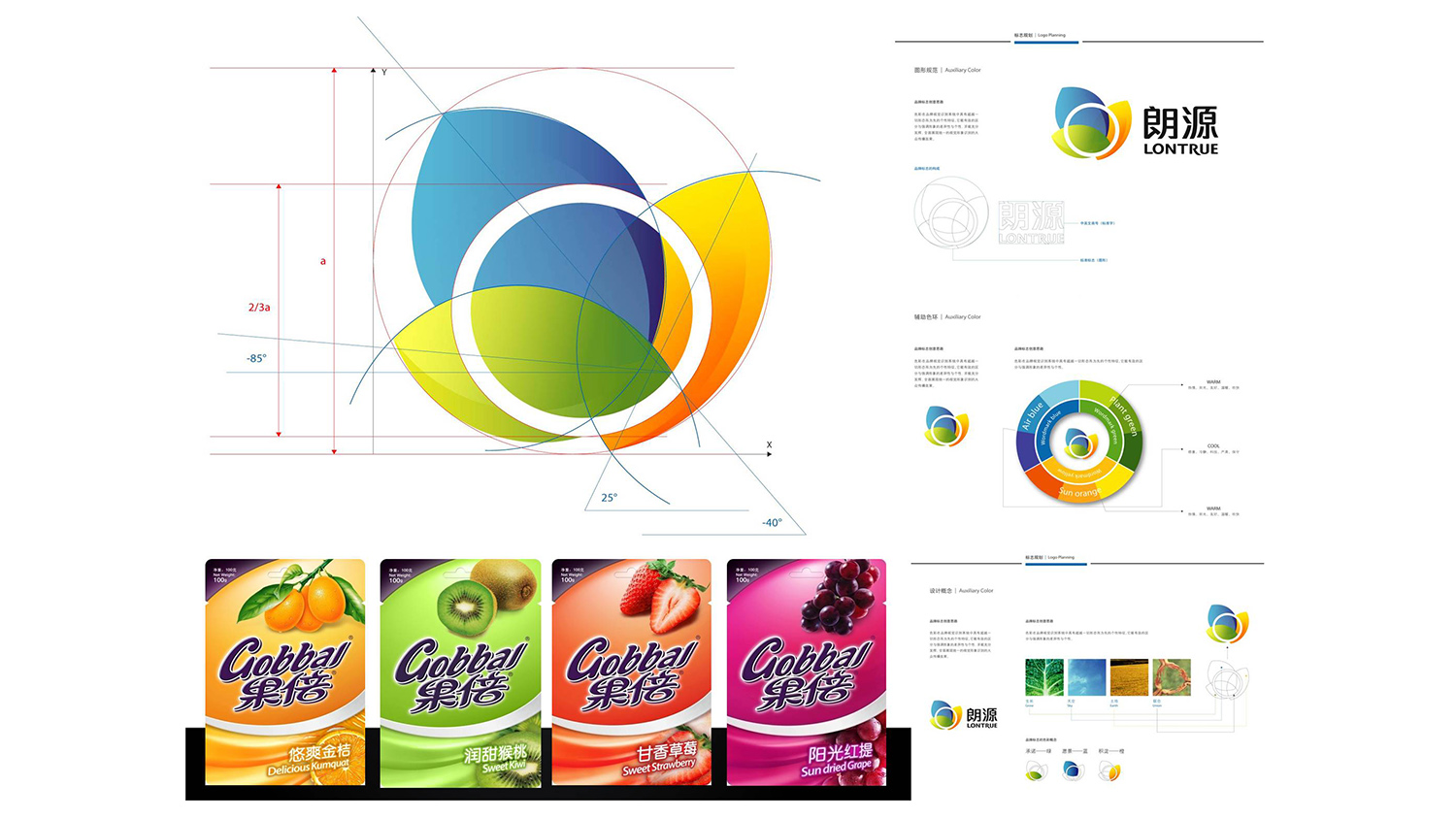
design concept
The mark is built on the concept of “natural cycles and living energy.” Three overlapping gradient leaves form a dynamic ring around a central point, symbolizing natural growth, the nourishment of sunlight and ecological symbiosis. The circular composition reflects the brand's circular farming system and health product chain, while expressing the corporate spirit behind its Chinese name: “bright light, an endless source.”
graphic language
Three overlapping leaves: the three core pillars of nature, technology and health. Inner circular path: ecological cycles and a global supply network. Layered gradients: the transformation of energy from nature to technology, from field to table. Open ring: a stance of open collaboration and continuous innovation. Combining natural softness with modern order, the mark establishes a visual language for sustainable growth.
Font composition
The Chinese name uses a bold gothic structure with steady, straight strokes, conveying stability and professionalism. LONTRUE is set in a custom sans-serif, clean and well-proportioned, for stronger international recognition. The stacked bilingual names form the visual center, balancing the symbol on the left in a composition of motion and stillness that reinforces the system's stability.
color system
Primary Blue #3A8AD7: technology, trust and the sky. Supporting Green #83C256: nature, life and sustainable agriculture. Warm Orange #F5A33A: sunlight, energy and the joy of harvest. White background: cleanliness and food safety. The three-color gradient expresses the ecosystem logic of nature, technology and health, creating a warm yet professional brand impression.
Application and extension
The mark applies across: food packaging, canned fruit and vegetables, health beverages and cold-chain vehicles; agri-tech exhibitions, annual reports, the brand website and digital media; eco-farm wayfinding, gift packaging and export trade labeling. The leaf motif can be abstracted into background textures or data graphics, building a unified ecological visual system for both static and motion contexts.
brand meaning
The mark brings together three layers of meaning: Nature Source — the three leaves represent ecological farming and natural cycles. Tech Empowerment — the ring expresses technological innovation and systematic management. Wellness Light — the luminous gradient evokes solar energy and vitality. Together they convey the brand's core belief: “Follow the way of nature to nourish all life.”
Improper Usage (Protection Specification)
Do not alter leaf proportions, color order or gradient direction. Do not add shadows, light effects or outlines. Do not rotate or skew the logo. Maintain clear space of at least 20% of the symbol height. Minimum display width: 30mm.
design results
Since the launch of the new mark, LONTRUE's brand recognition in international agriculture and health foods has risen by 55%, and export packaging consistency by 40%, with strong feedback from European and Southeast Asian markets. Its “green technology + healthy living” positioning has strengthened the company's international image, and Qingmei Future named it an exemplary case of the year in its Nature & Health Industry Visual Systems collection.