










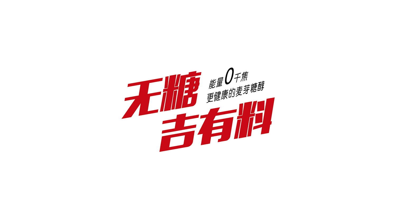
Wutang Jiyouliao is an innovative brand of low-sugar health foods and maltitol beverages, offering today's young consumers healthy choices with “zero burden, real energy.”
Amid the sugar-free consumer wave, the brand is positioned on the promise of “zero-burden energy, no compromise on taste.” The logo uses bold type and a dynamic composition to express a visual language of “new healthy energy × youthful vitality.”
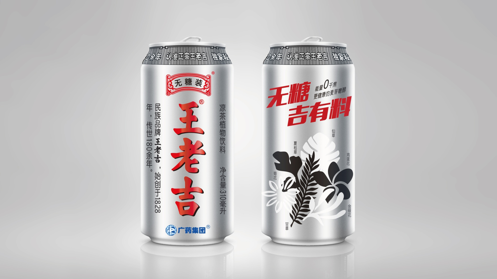
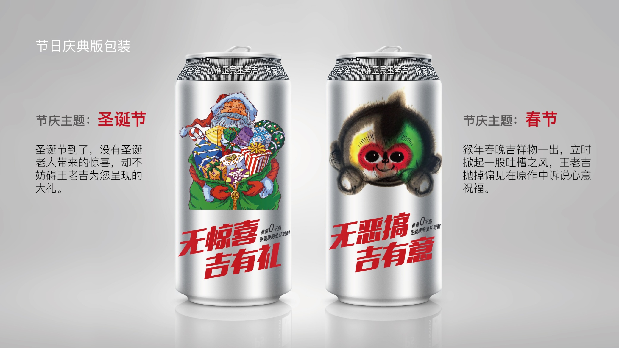
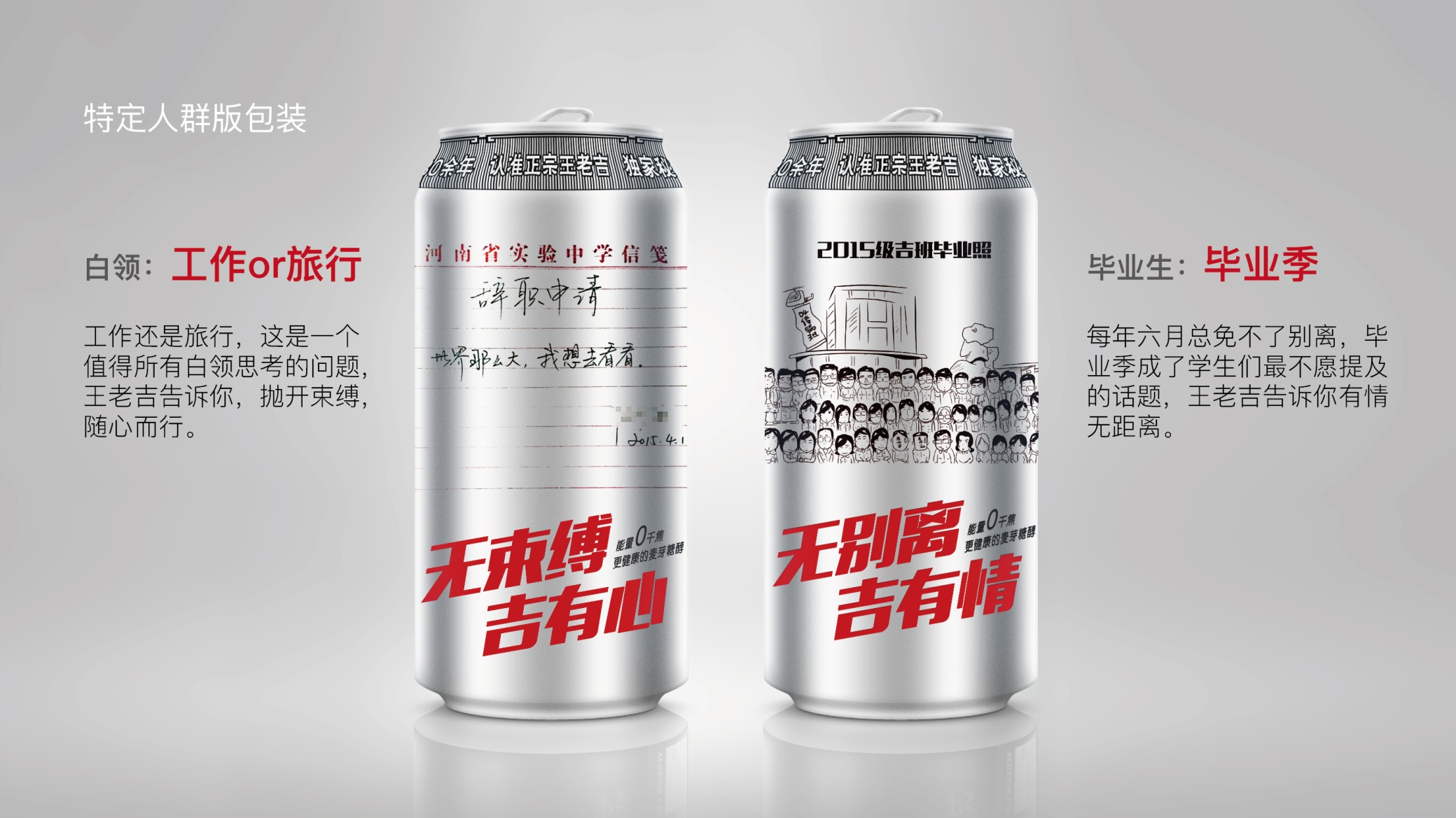
design concept
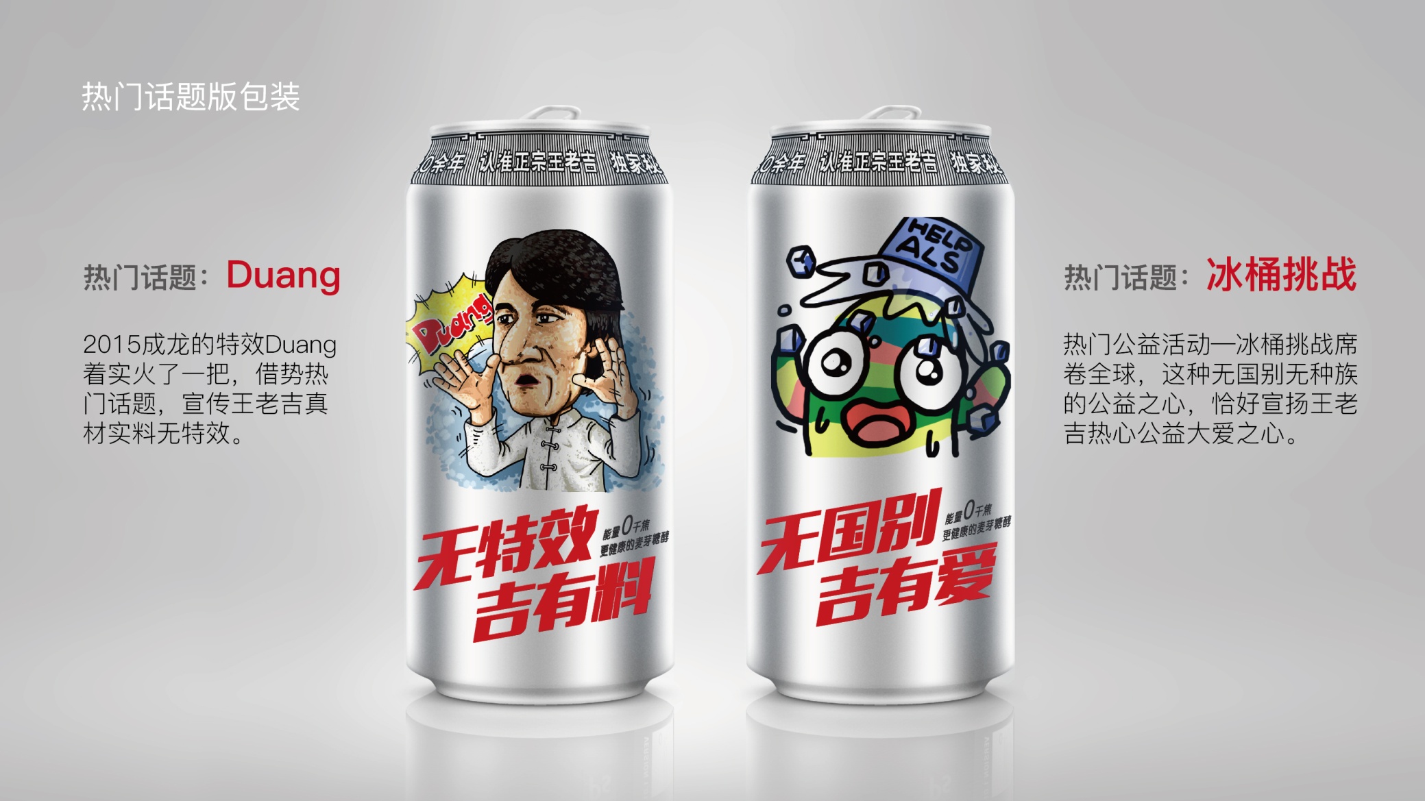
The logo centers on dynamic slanted type and a powerful composition. Bold red lettering, "Sugar-Free · Ji You Liao," forms the main mark, supported by the line "0 kJ energy, healthier maltitol." The result is a visual rhythm of speed × impact. The forward slant expresses a brand sprinting ahead, capturing the energy of a young generation that meets challenges without fear.
graphic language
Italic momentum: energy release and a positive attitude to life. Layered structure: stacked type levels highlight the two core selling points, “sugar-free” and “full of goodness.” Red as the lead color: heat, vitality and emotional drive. The numeral “0” as focal point: reinforces the health message and functional benefit. Dynamic angle: speed, drive and competitive edge. The overall graphic reflects a visual strategy of “functional brand + youth-oriented communication.”
Font composition
The main wordmark is adapted from heavy industrial display type (similar to Impact / HYQiHei Bold), with weighty strokes and strong geometric proportions that emphasize power and presence. Supporting text uses a lightweight sans-serif (such as Source Han Sans Light), creating a heavy/light contrast. An overall slant of roughly 15° drives the eye up and to the right, signifying continuous growth and an upward health trend.
color system
Primary Red #C3281C: passion, vitality and energy. Supporting Black #1B1B1B: balances visual weight and conveys rational, health-tech credibility. White Background #FFFFFF: openness and legibility. Silver Gray #DADADA (optional): for packaging layers and printed gradients. The red-black contrast delivers visual impact and makes the healthy-energy brand instantly memorable.
Application and extension
The mark is highly shareable and adaptable, suitable for: beverage bottles, pouches, posters and shelf displays; FMCG ads, brand film openers and KOL content; offline events such as “Sugar-Free Energy Day” pop-up stores and sports booths; and digital channels, where bouncing type and slanted dash animations heighten the sense of motion.
brand meaning
The logo distills three brand values: Health — "Sugar-Free" stands for sound nutrition and self-control; Energy — "Ji You Liao" stands for vitality and a positive outlook; Youth — the italic structure and intense red express youthfulness and momentum. Together, the visual language shapes a functional drink brand that is both healthy and on-trend.
Improper Usage (Protection Specification)
Do not alter the slant angle or type proportions; do not change the primary red or blend it into the background; do not add outlines, shadows, or gradients; do not separate "Sugar-Free" and "Ji You Liao" for standalone use; keep clear space on all sides ≥ 20% of the logo height; minimum width: 40 mm.
design results
After launch, Wutang Jiyouliao quickly captured the attention of young consumers in the health beverage market. Across sports settings and social media it achieved strong recognition and recall, becoming a benchmark for visual innovation in the “new sugar-free era.” Designed by Qingmei Future, the project was featured in the casebook New Consumer & Health Food Brand Visual Systems and hailed by the industry as “a model of youth-focused design for functional health products.”