










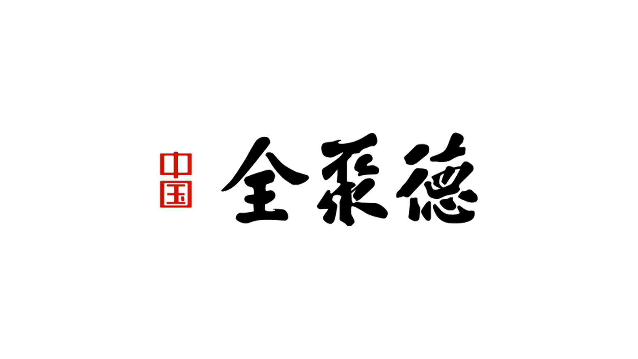
China Quanchengde is an integrated brand built on traditional Chinese culture and a commitment to quality. Its guiding principle—“build the business on virtue, build the product on trust”—drives its mission to champion the Eastern cultural spirit and carry forward the craftsman's way and the foundations of virtue.
The brand sought a visual identity with both cultural depth and modern recognizability, expressing a character defined by “Chinese spirit × the way of virtue × a legacy of quality.”
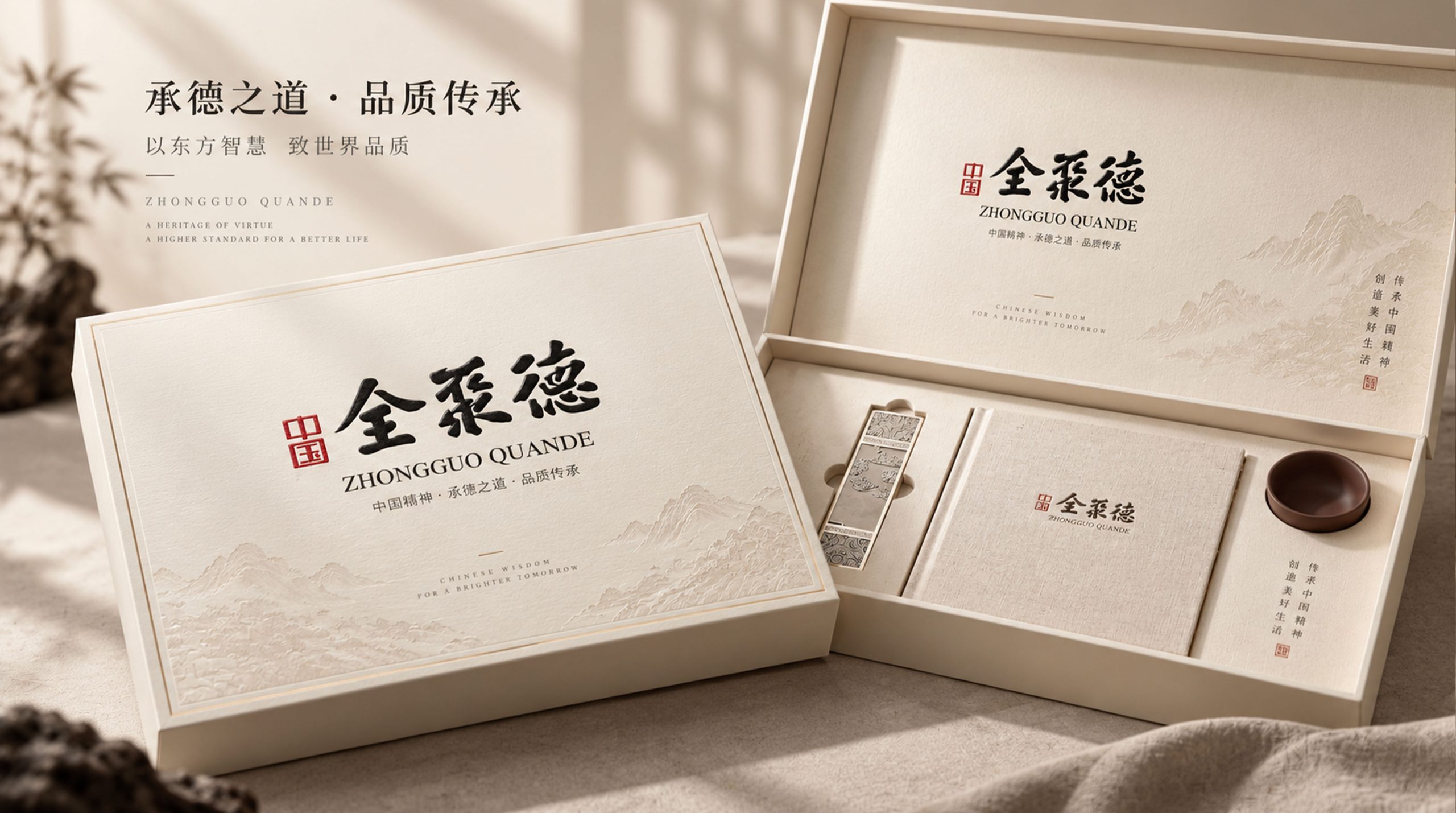
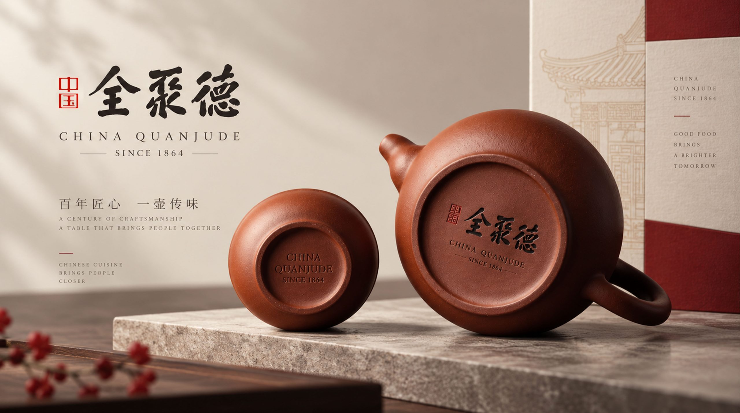
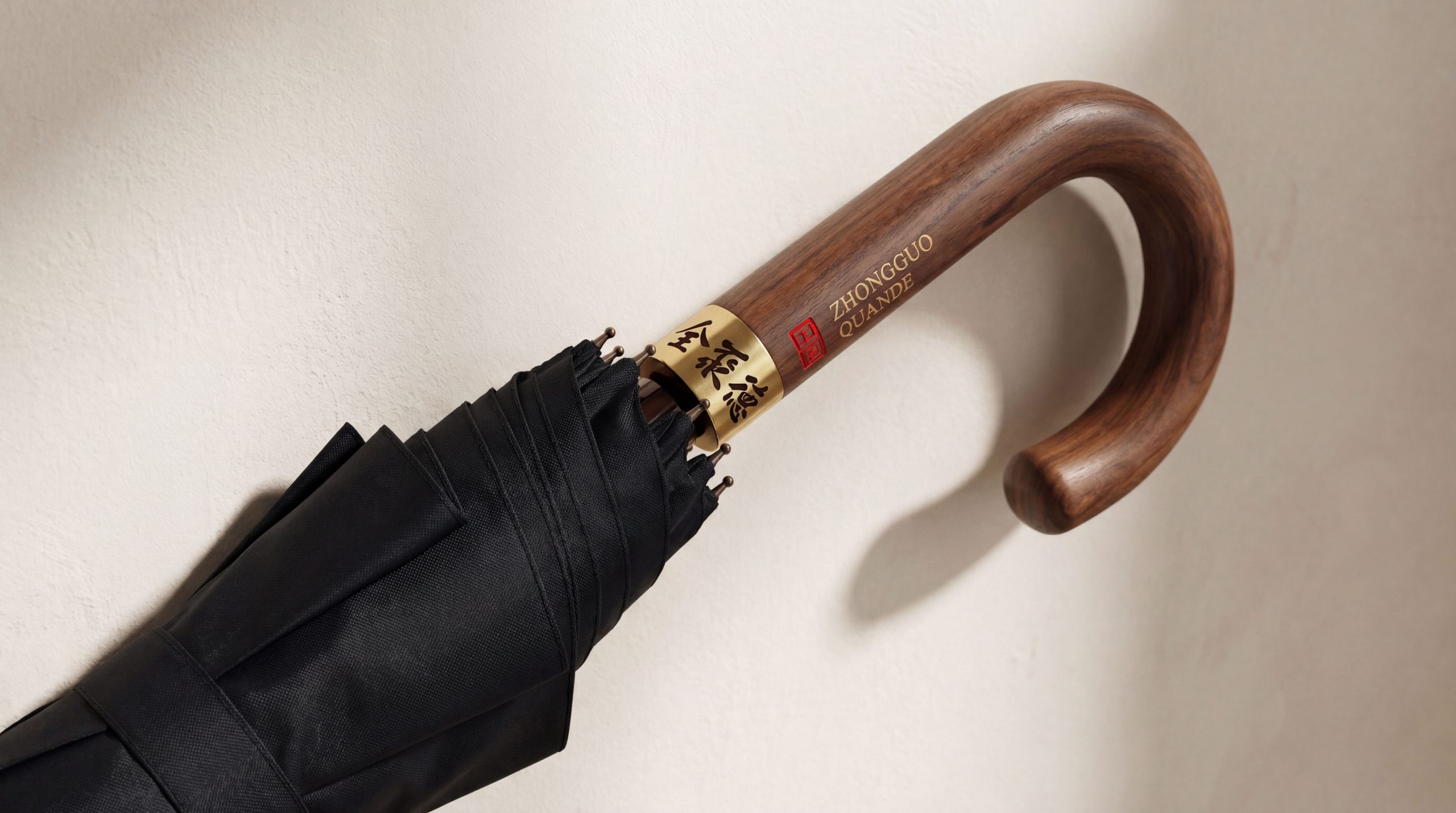
design concept
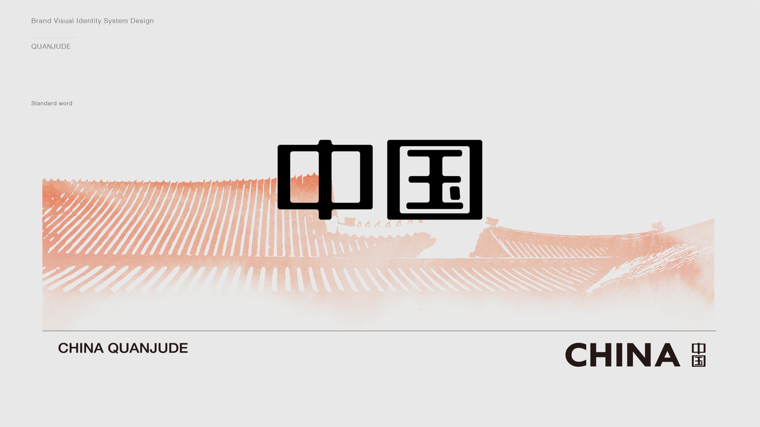
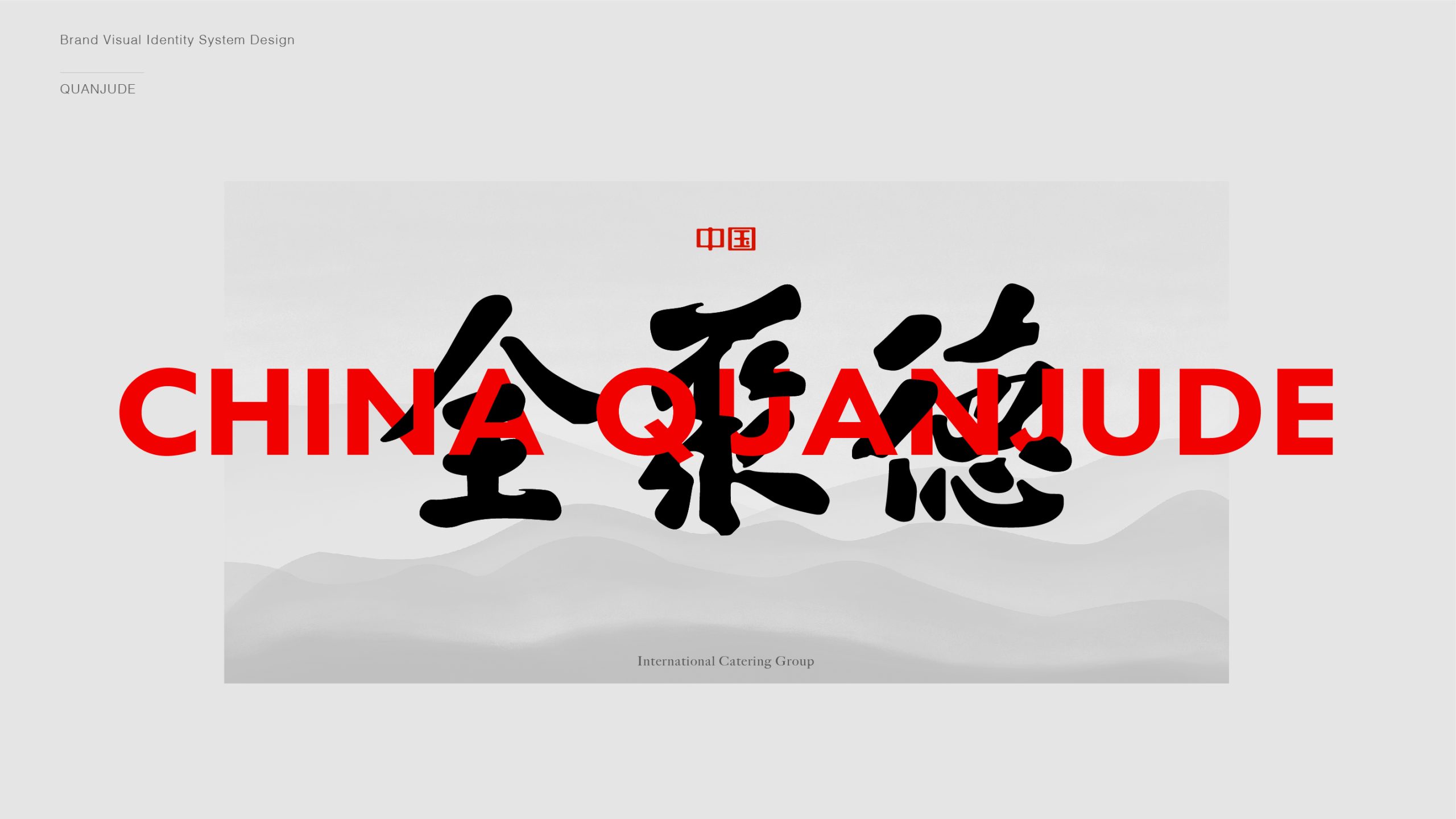
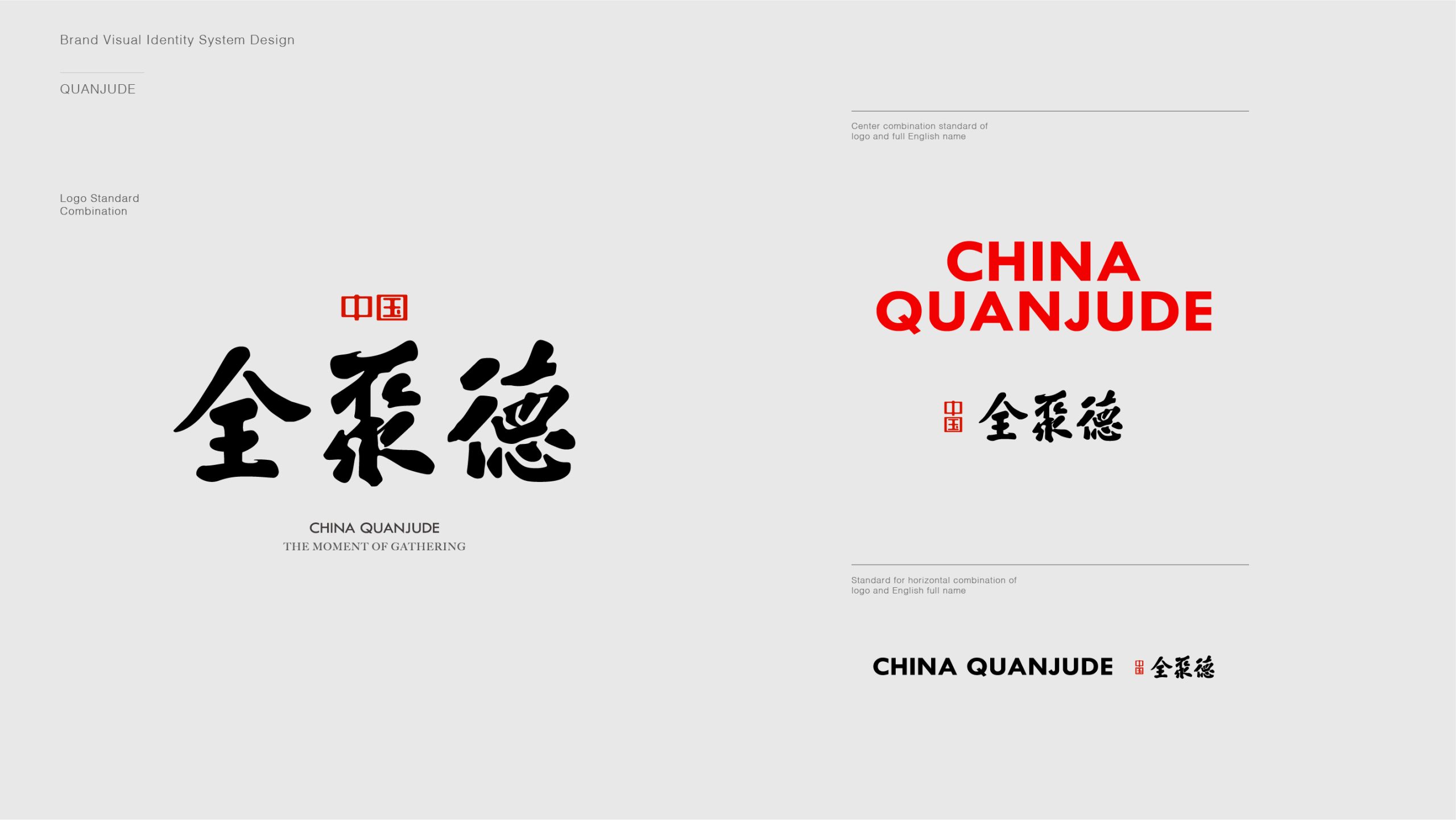
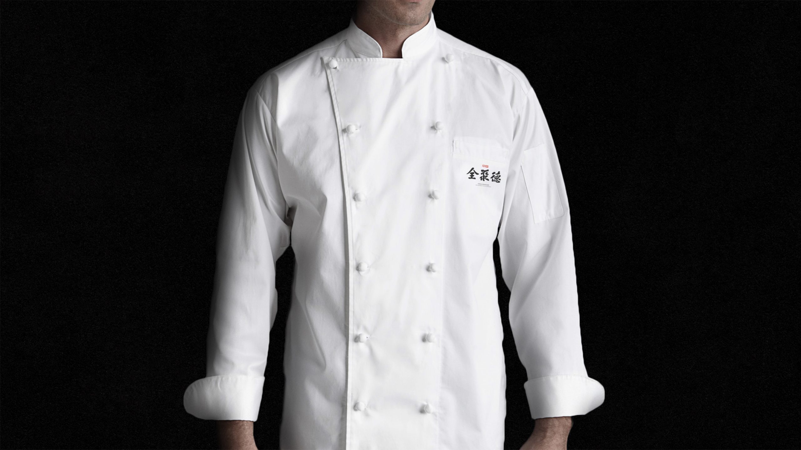
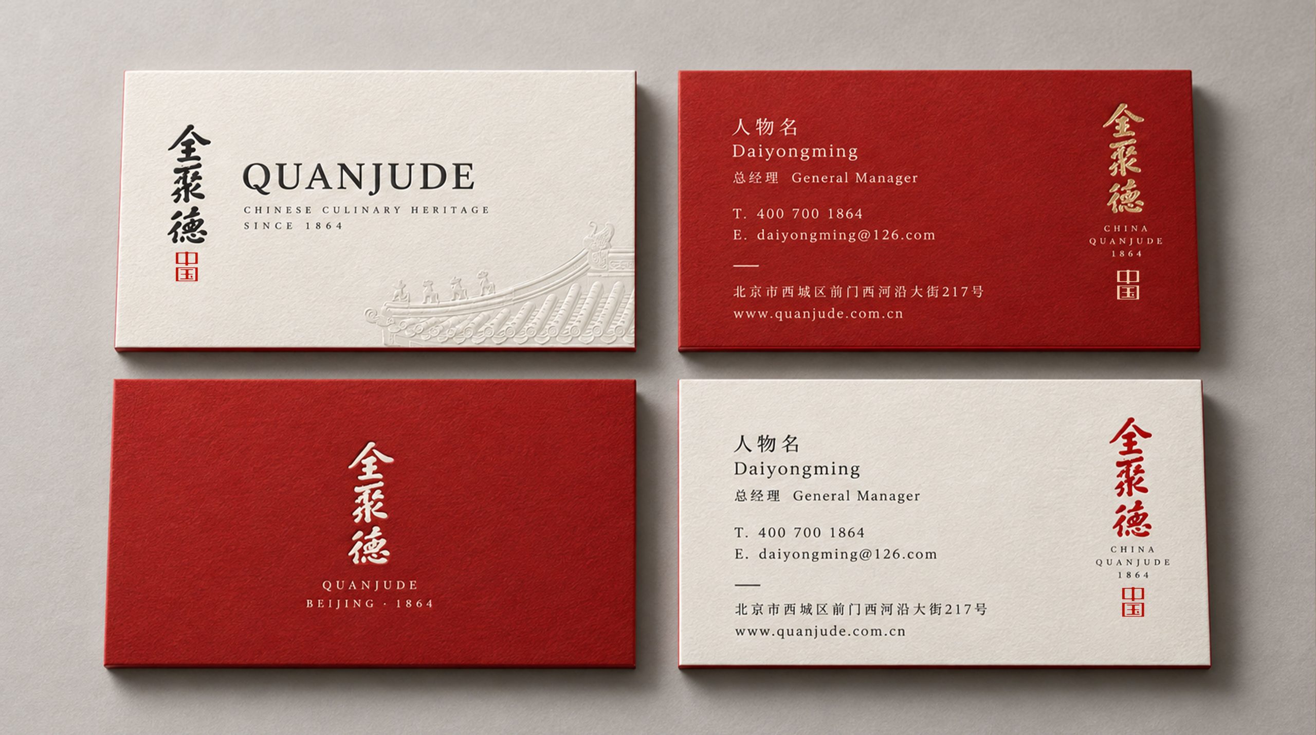
The logo's core idea: "Carry craft with virtue; convey the Way through words." The design centers on calligraphy of the name Quanchengde, with a seal reading Zhongyu as its identifying mark. Together they form a dual structure of script × seal, uniting the soul of the written word with the trust of the seal, and expressing the brand's creed: virtue passed down, integrity on record.
graphic language
Calligraphic core: running-script brushwork, both strong and supple, capturing the vitality and spirit of Chinese calligraphy. Square seal: authority and trust, a visual anchor for cultural identity. Black and red: the classic pairing of ink and vermilion seal, conveying a timeless Eastern aesthetic. Left-right composition: expansive, flowing script against a firm, restrained seal, balancing energy and discipline. The mark reads like a cultural artwork, uniting Eastern grace with brand logic and expressing a spirit of “trust through culture, enterprise through virtue.”
Fonts and composition
The Quanchengde calligraphy is written in custom brushwork, with weighty strokes and natural turns. Every stroke follows the classical rule of a spirited start and a composed finish, expressing the strength of the Eastern spirit. The Zhongyu seal on the left uses seal script, blending square and round to signify strength with grace and cultivation inside and out. The layout follows the traditional composition of seal left, script right, with a stable visual center that reflects the unity of calligraphy, painting, and seal.
color system
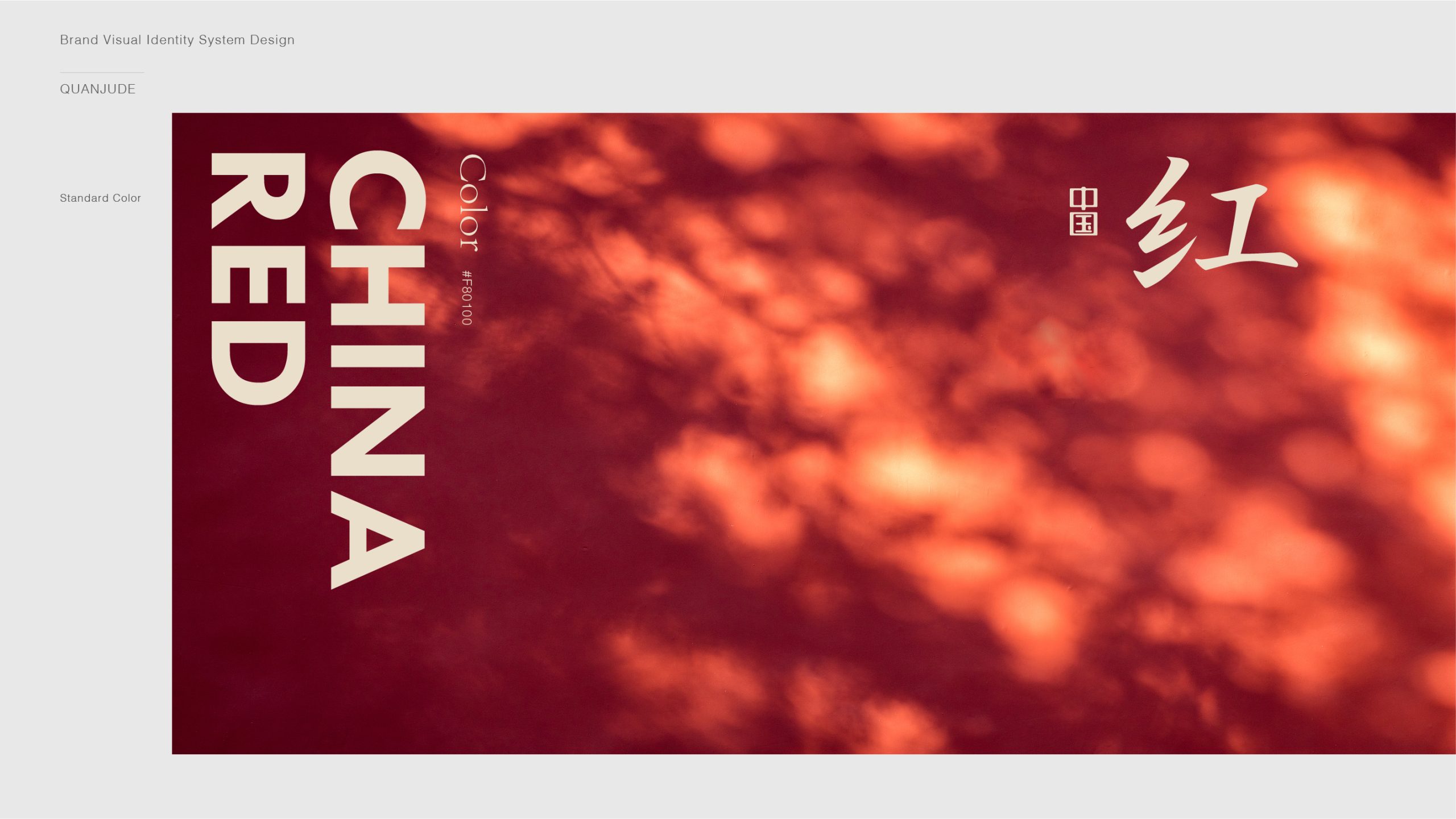
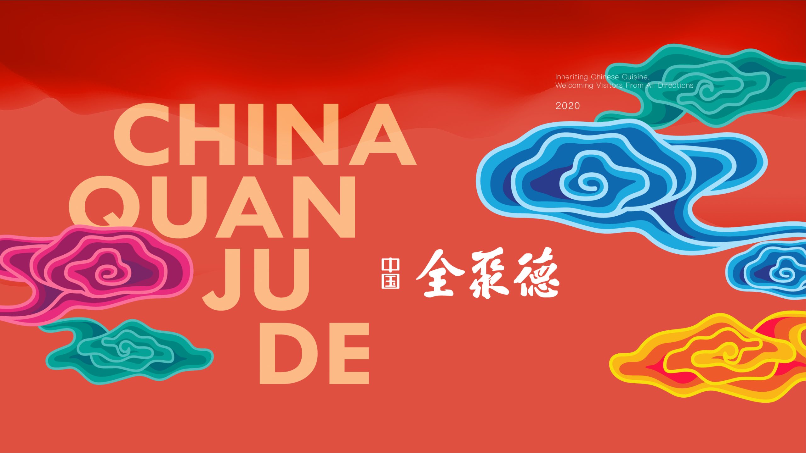
Ink Black #000000: ink, cultural depth, stability and authority. Vermilion #C43C2D: heritage, conviction and spiritual strength. Rice White #F5F2E9 (recommended background): the gentle warmth of classical culture. The contrast of red and black recalls the visual tradition of Chinese calligraphy and symbolizes the brand's core idea: “virtue as the seal, trust as the ink.”
Application and extension
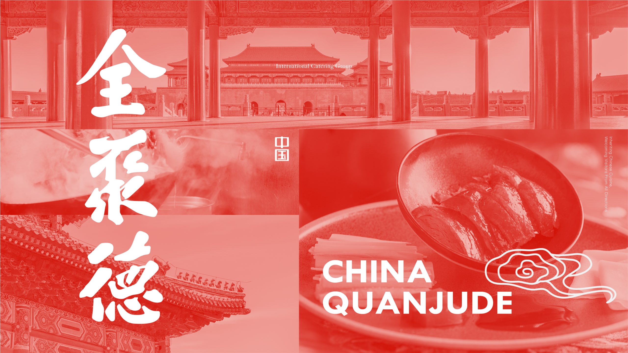
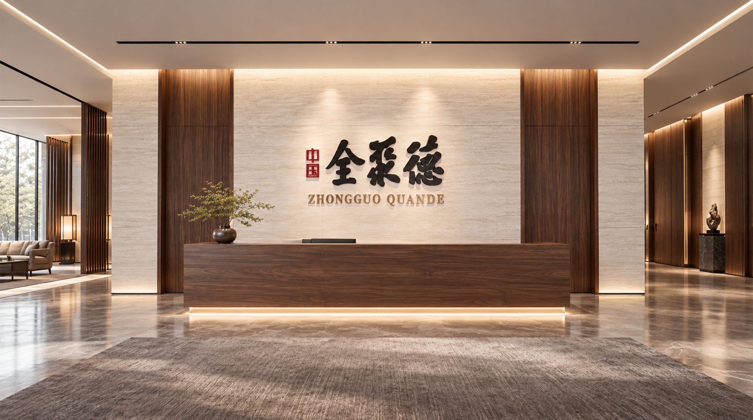
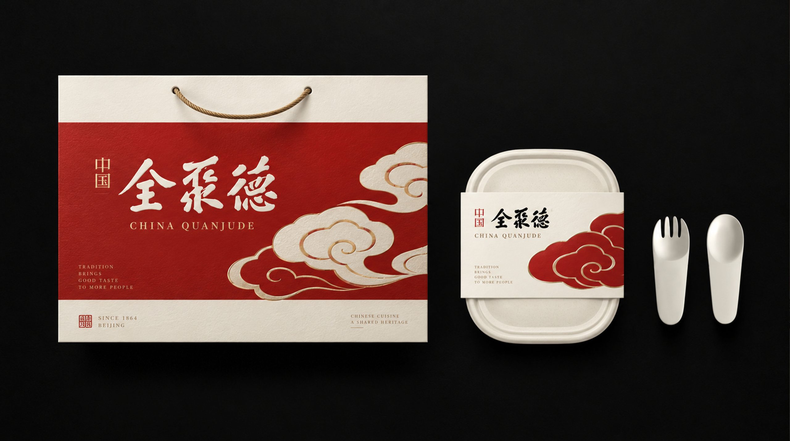
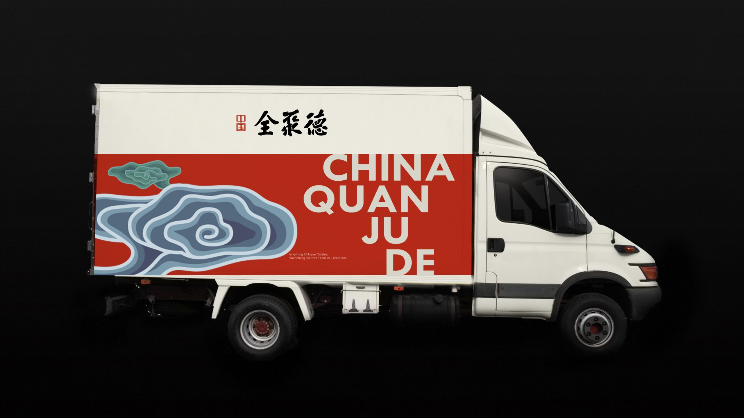
The mark adapts readily to cultural and commercial settings. Corporate: brand identity, certificates of honor and cultural publications. Product: cultural gifts, packaging labels and anti-counterfeiting seals. Spatial: relief or hot-foil applications in showrooms, storefronts and feature walls to enrich cultural texture. In motion, the brushstrokes can “grow” as ink is laid down, conveying the brand's ideal of an unbroken cultural lineage and enduring virtue.
brand meaning
The China Quanchengde mark embodies a spiritual system of “trust through virtue × carrying culture × a legacy of quality”: Ink calligraphy → character and cultivation. Vermilion seal → trust and authority. Black-red contrast → the balance of culture and virtue. Chinese script → cultural identity and belonging. More than a logo, it is a spiritual symbol—carrying the Eastern way and establishing the brand's virtue.
Improper Usage (Protection Specification)
Do not alter or retrace the calligraphic forms. Do not change the seal's proportions or color. Do not add shadows, outlines or gradients. Recommended minimum display width: 40mm.
design results
Since its launch, the China Quanchengde mark—a visual system uniting calligraphic culture, moral spirit and brand stature—has built strong recognition across the cultural, crafts and premium gifting sectors. The pairing of calligraphy and seal gives the brand a profound cultural presence and a coherent visual philosophy: “virtue as the foundation, trust as the root, culture as the brand.” The project represents Qingmei Future's mature work in visualizing Eastern culture and brand spirit, unifying the journey from the art of writing to a philosophy of brand virtue.